BarMember-Only
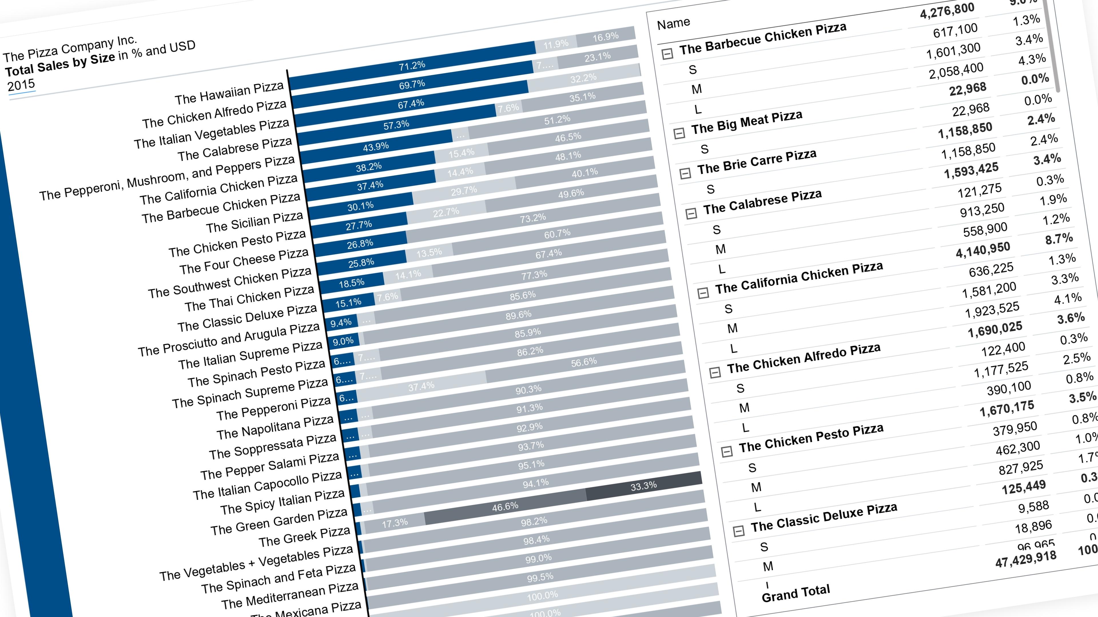
Highlight a Segment in a 100% Stacked Chart and Move It to the Baseline
Let the reader pick which segment is easy to read — it drops to the baseline in color, everything else fades to grey.
27 July 202614 min read
Documented Power BI techniques — the model change, the DAX, and the exact visual settings. Most are free to read; the rest come with the model files for members.
BarMember-Only
Let the reader pick which segment is easy to read — it drops to the baseline in color, everything else fades to grey.
WaterfallMember-Only
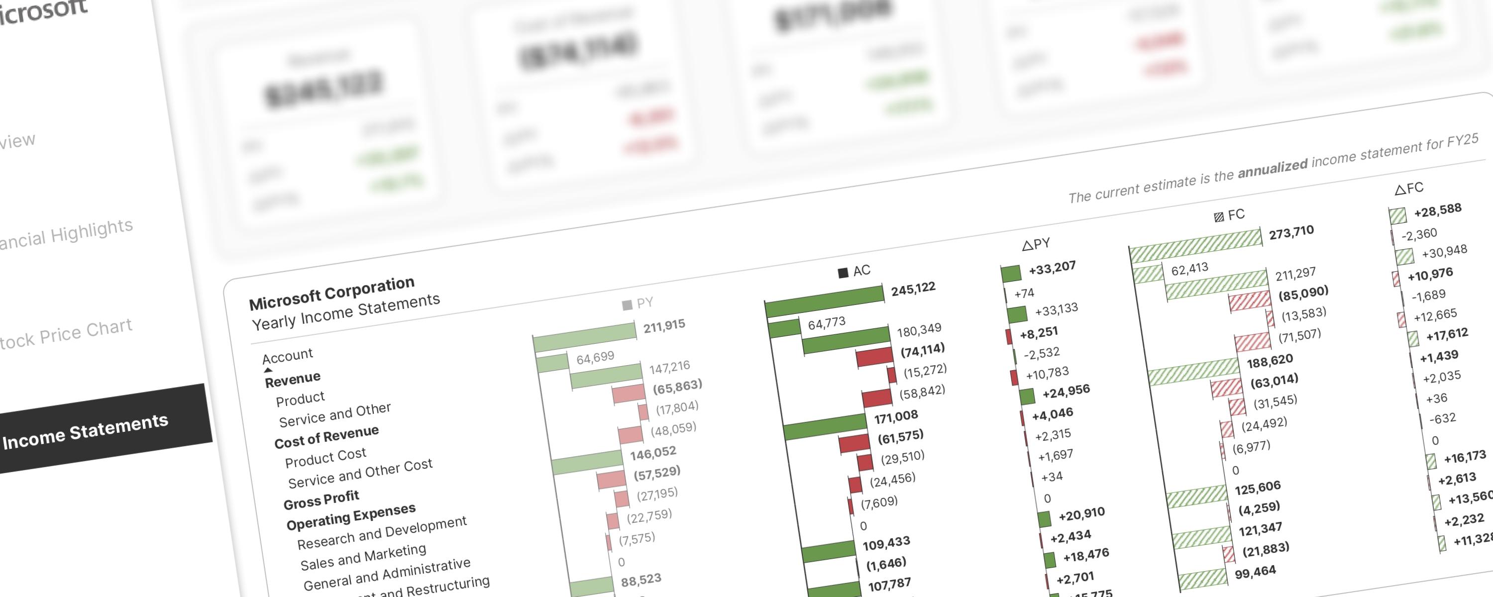
Inspired by Stefanos Chantzis's P&L analysis with native visuals, this approach introduces significant improvements based on community feedback and my own observations.
WaterfallMember-Only
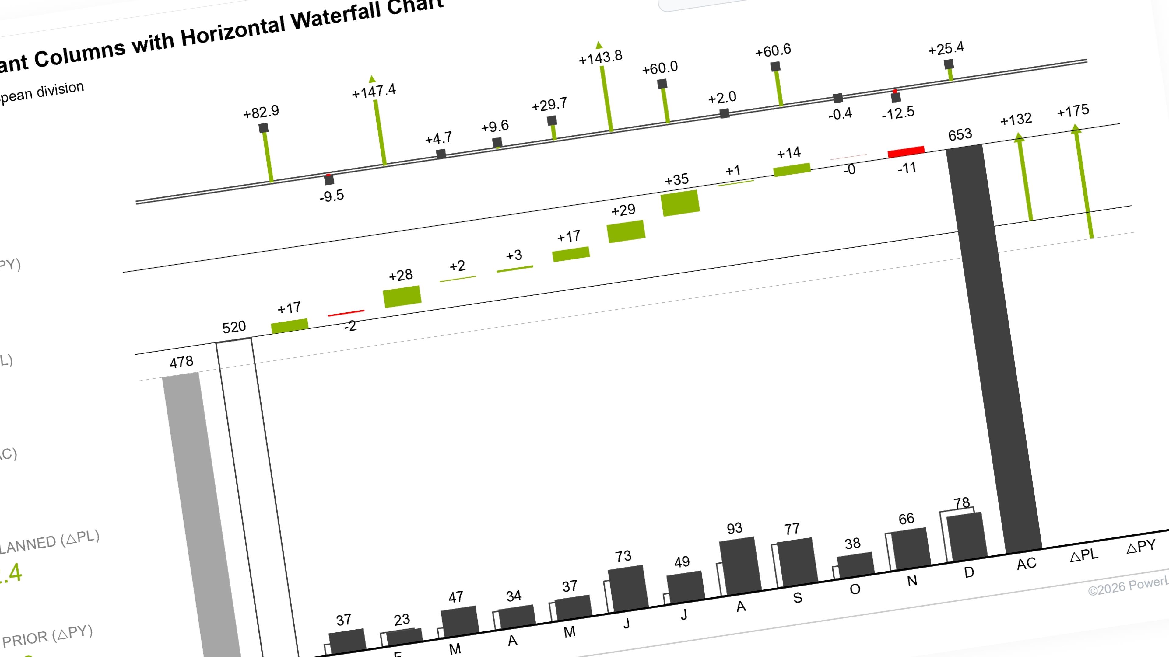
This documentation builds upon the IBCS-compliant Columns with Waterfall Chart, moving from a dual-scenario comparison (Actual vs.
LineMember-Only
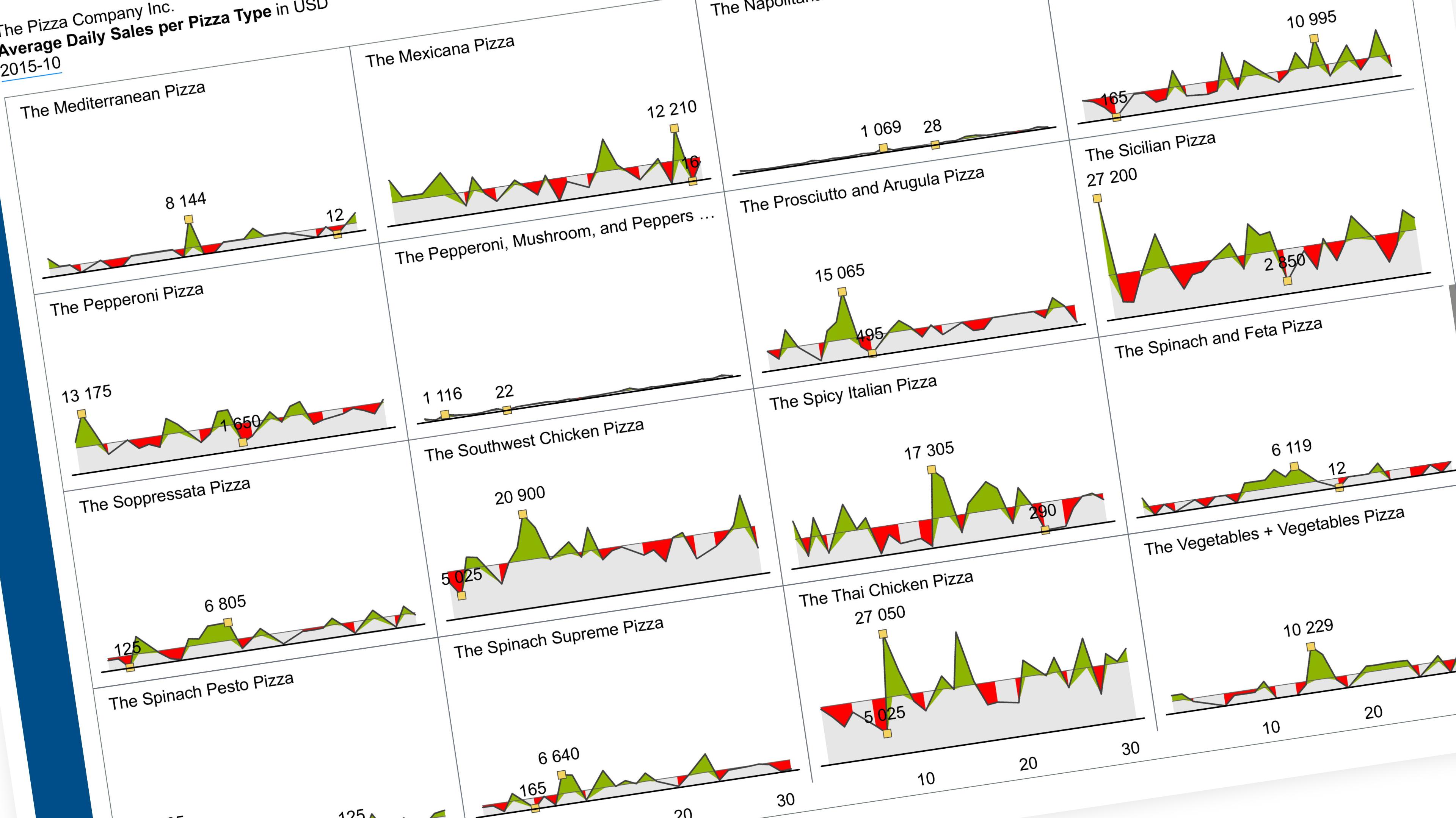
Show one metric’s daily trend, one small chart per category, all on the same scale.
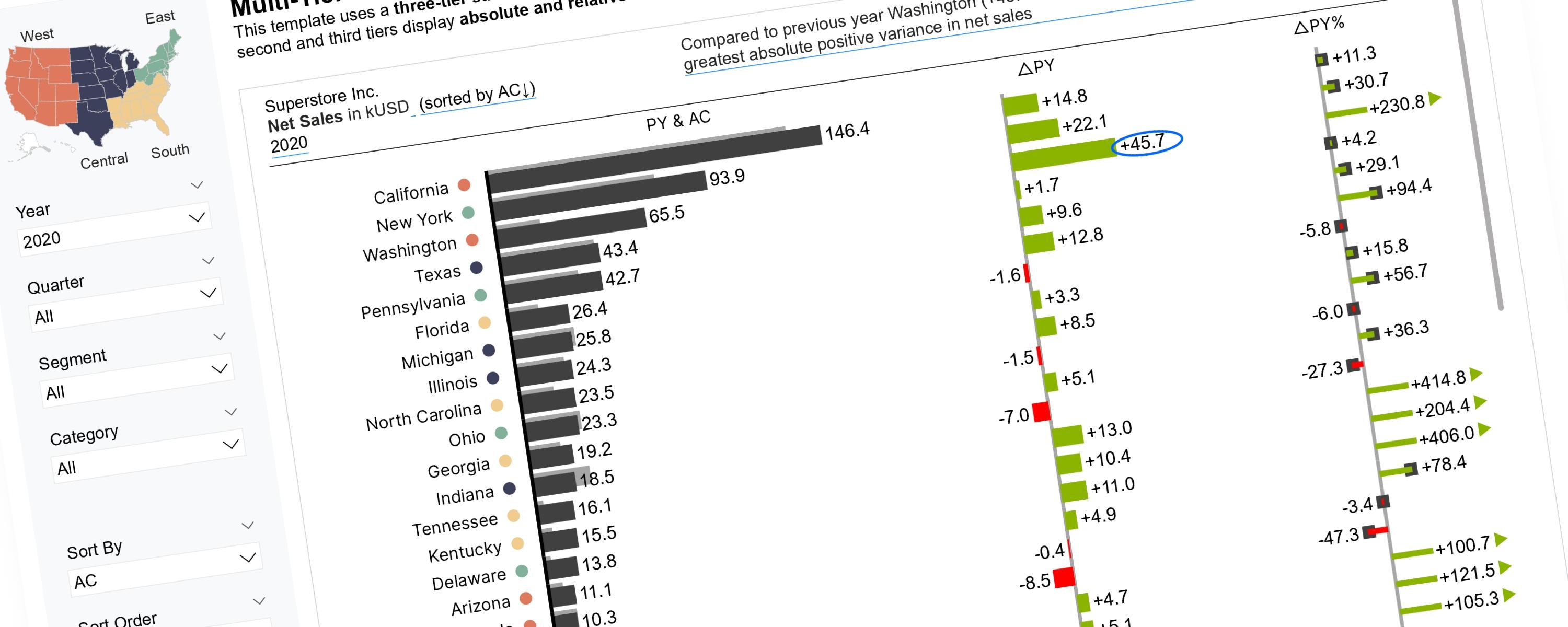
BarMember-Only
Scalable Vector Graphics (SVGs) offer greater flexibility for implementing IBCS Notation than native Power BI visuals.
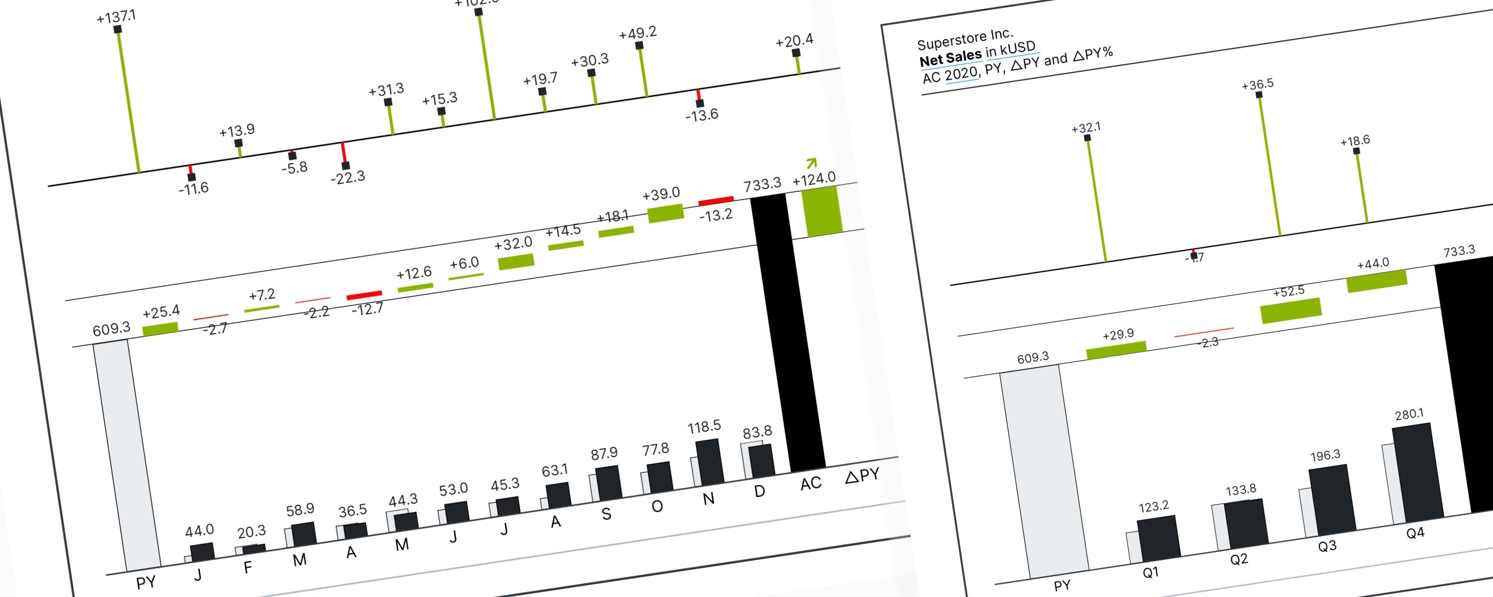
WaterfallMember-Only
When using a waterfall chart, visual direction determines its purpose: Vertical charts break down data by categories or factors (non-time series), while Horizontal charts track…
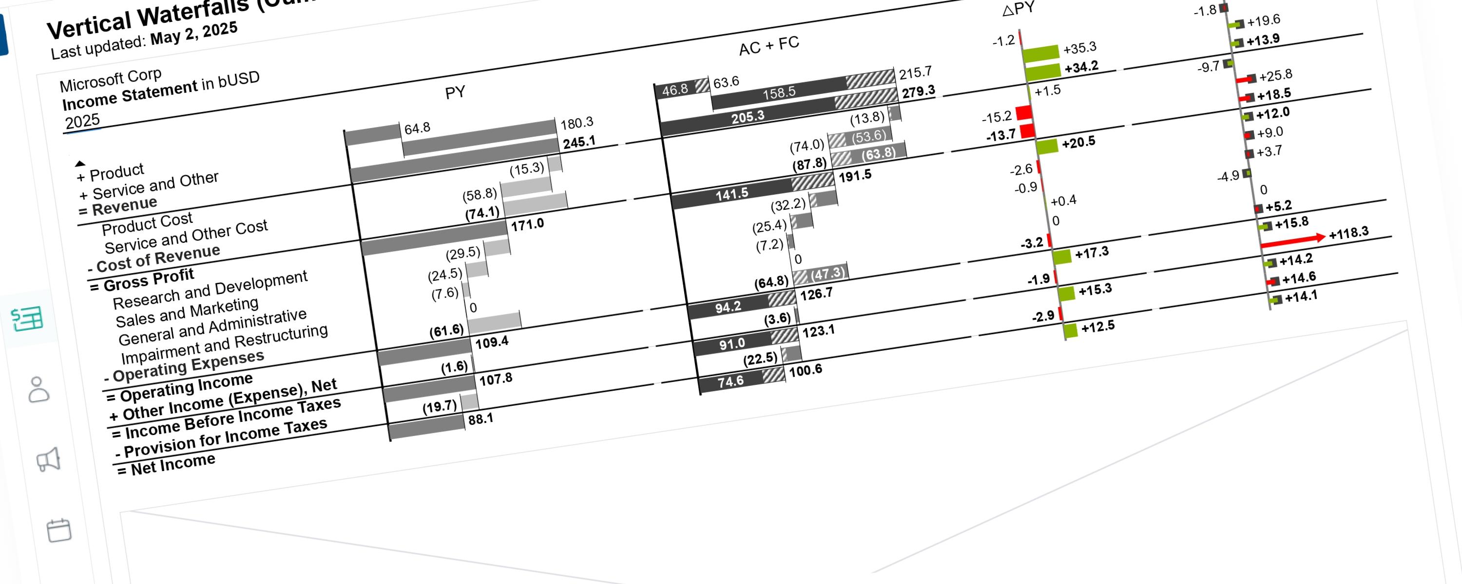
WaterfallMember-Only
This documentation details the enhancements made to the previous visualization version. These updates focus on global scaling logic and cumulative data representation.
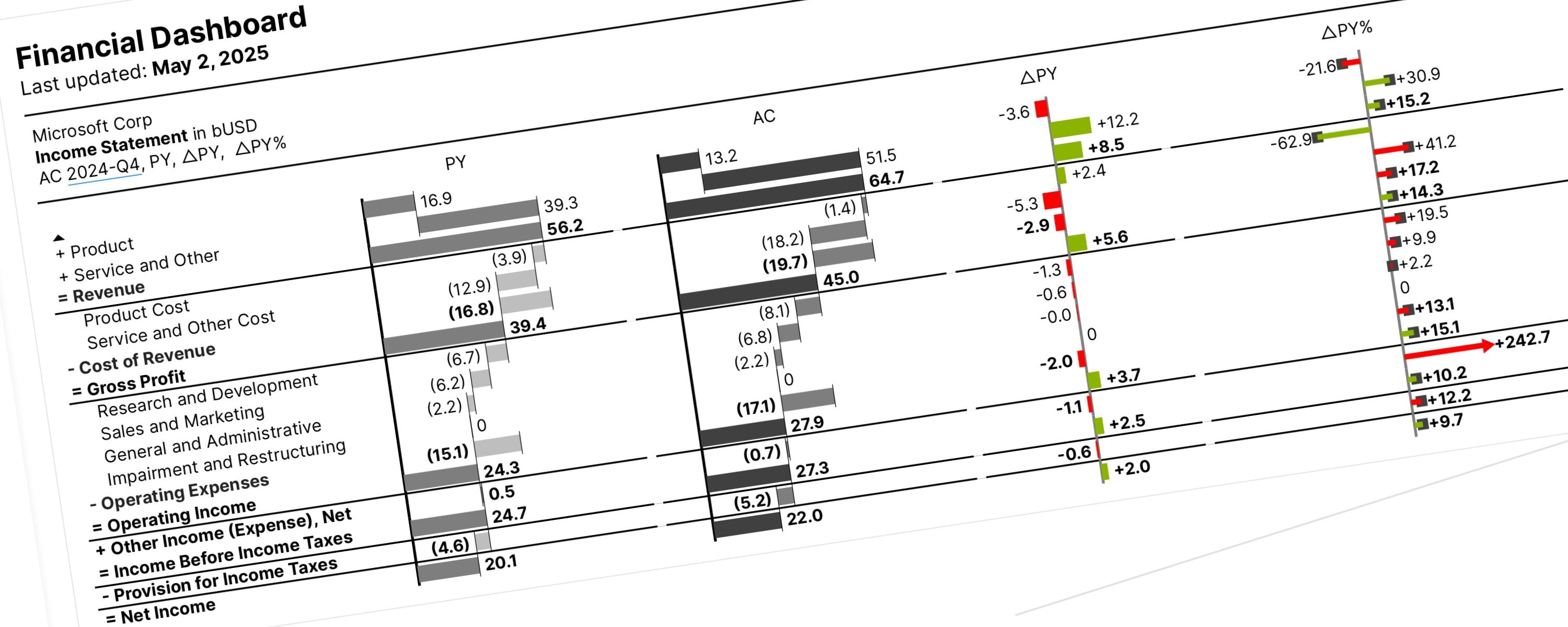
WaterfallMember-Only
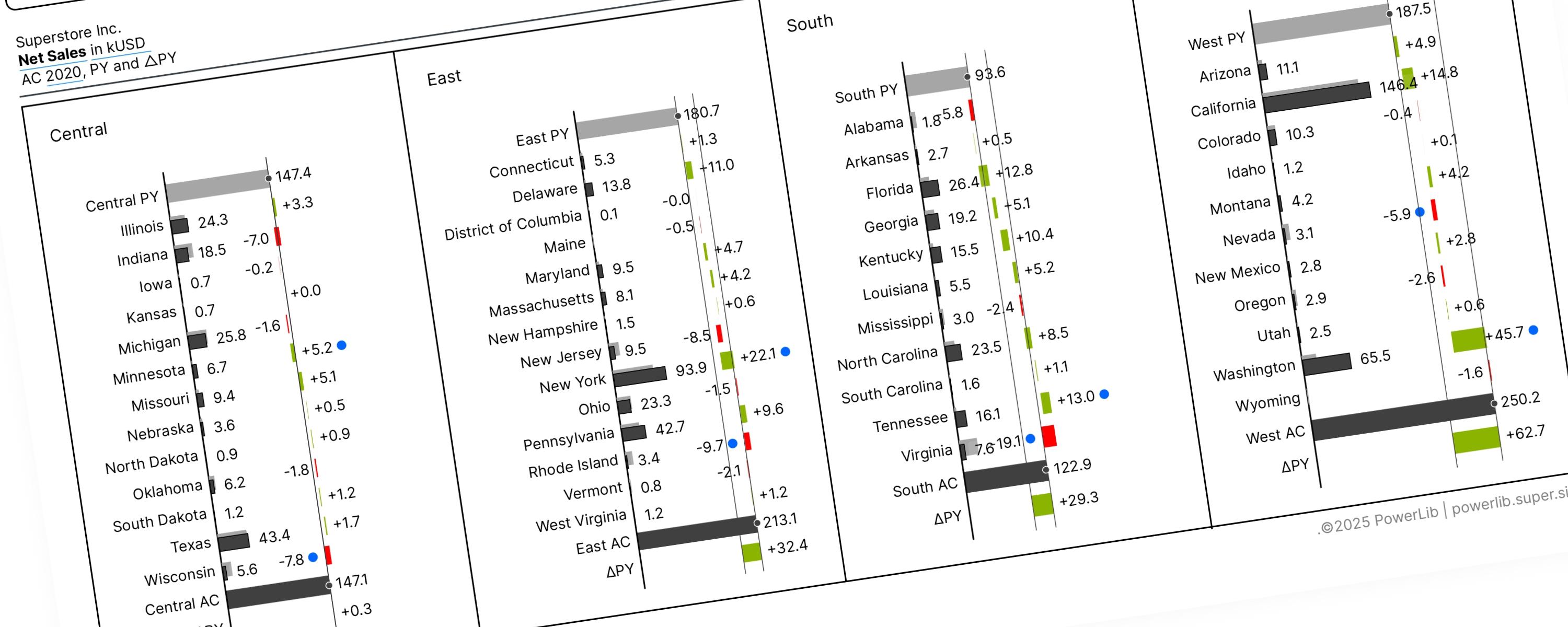
Vertical waterfall charts (also called bar waterfalls) show you why a value changed between two different points. They are read from top to bottom and consist of three main parts:
WaterfallMember-Only
A Vertical Waterfall Chart is a way to clearly show why two numbers are different by breaking down the changes that happened in between.