Foreword
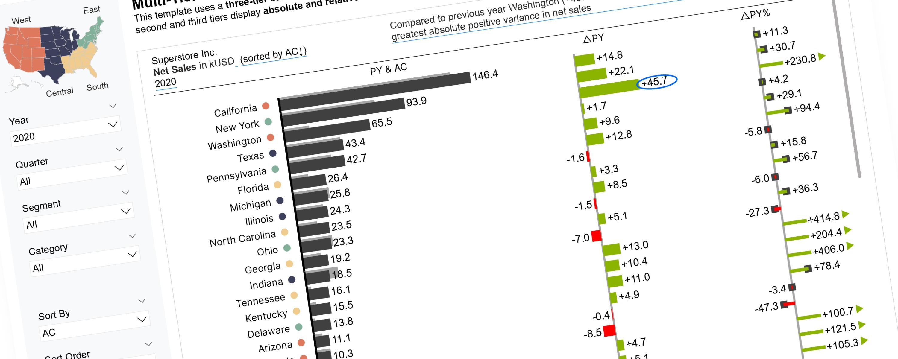
Scalable Vector Graphics (SVGs) offer greater flexibility for implementing IBCS Notation than native Power BI visuals. While multi-tier bar charts can be built natively using three separate bar charts, this approach faces limitations. Specifically, the third tier, which displays the relative variance, often contains extreme outliers. If these are not truncated, the smaller variance values become difficult to compare. Although achieving the desired result with native visuals is possible, it typically requires significant workarounds. Therefore, using SVGs is the proposed alternative to effectively manage this issue.
The original User Defined Function (UDF) codes required to generate the SVG bar charts were contributed by Andrzej Leszkiewicz and are accessible for download at the following link:
The rest of this walkthrough is for members
You have read the problem. What is behind the paywall is the fix:
- The full step-by-step build, from measures to formatting
- Every DAX measure with the reasoning behind it
- The .pbix with the model already wired up
Already a member? Sign in with your email