Foreword
Understanding Visual Direction
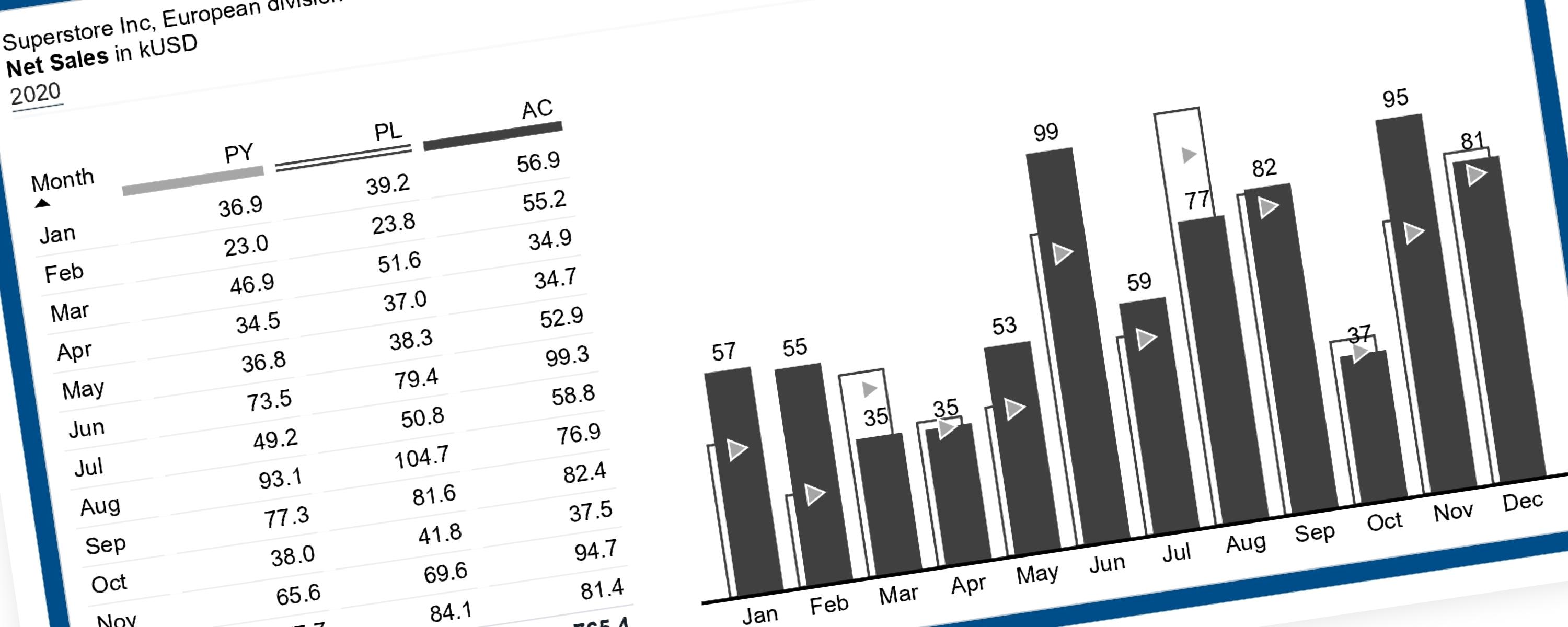
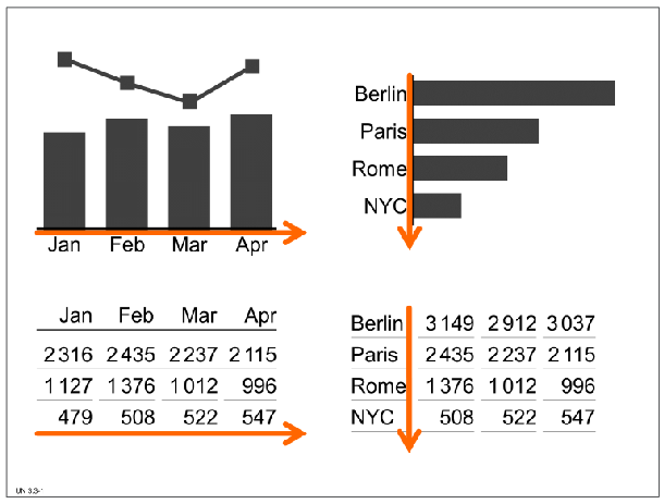 Visualization of Time vs. Structure Example (Source: IBCS Standards 1.2)
-
Time Periods: Time should be visualized along a horizontal axis in charts and presented in columns in tables, with time moving from left to right.
-
Structure (Structural Comparisons): These are typically visualized along a vertical axis (as seen in the bar chart comparison of cities) and presented in rows in tables.
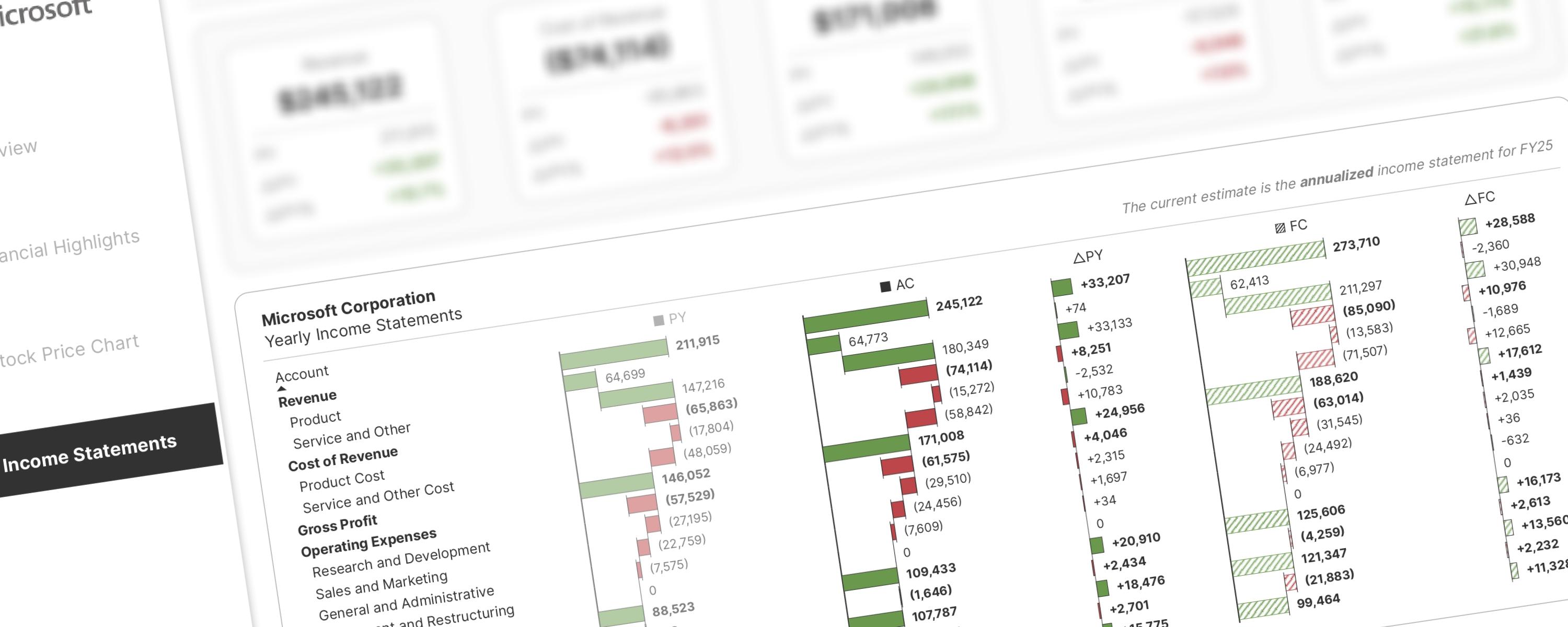
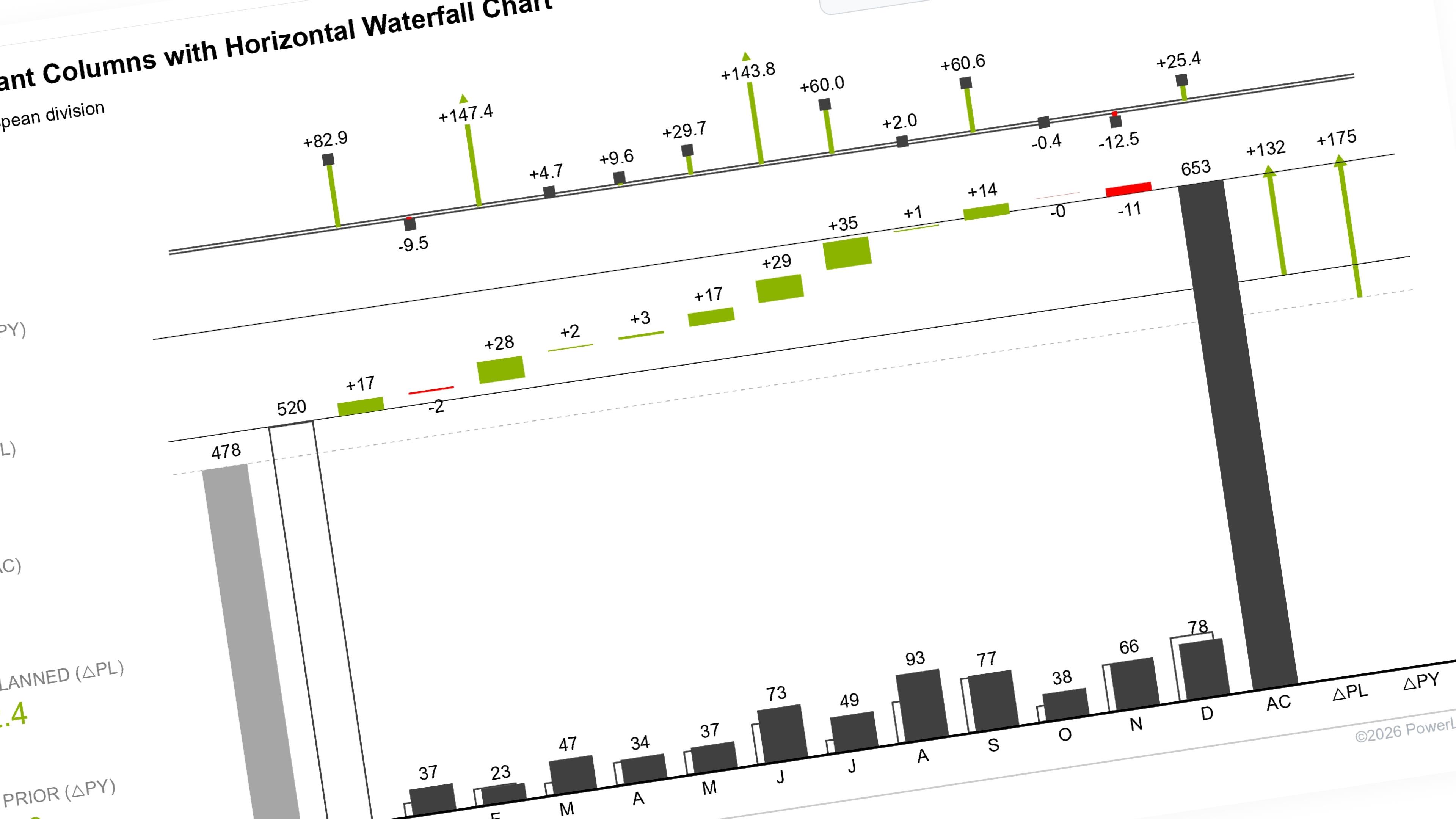
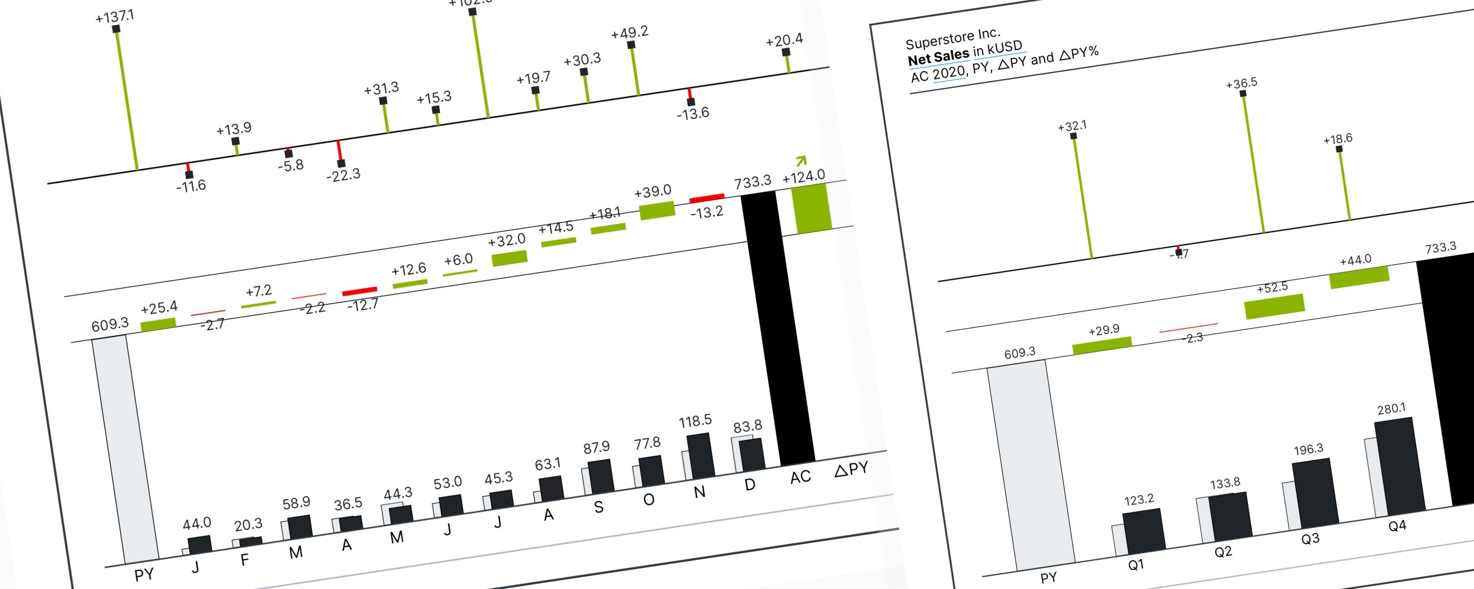
When using a waterfall chart, visual direction determines its purpose: Vertical charts break down data by categories or factors (non-time series), while Horizontal charts track data changes over time (time series).
Horizontal Waterfall Charts Explained
Horizontal waterfall charts (or column waterfalls) are a clear way to show how an initial value changes over time to become a final value. They are used to analyze the root causes of a difference or variance.
The rest of this walkthrough is for members
You have read the problem. What is behind the paywall is the fix:
- The full step-by-step build, from measures to formatting
- Every DAX measure with the reasoning behind it
- The .pbix with the model already wired up
Already a member? Sign in with your email