Foreword
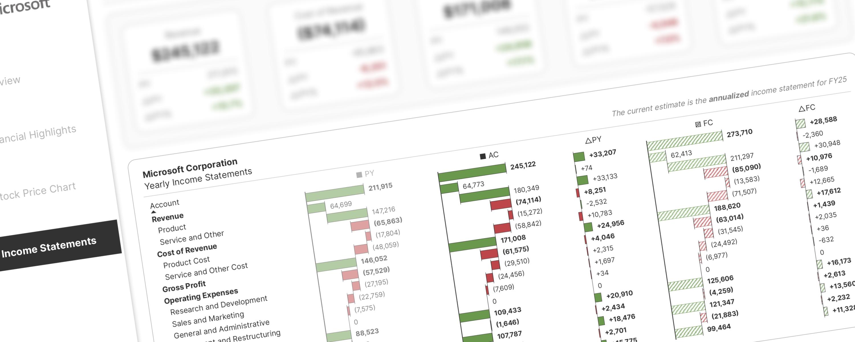
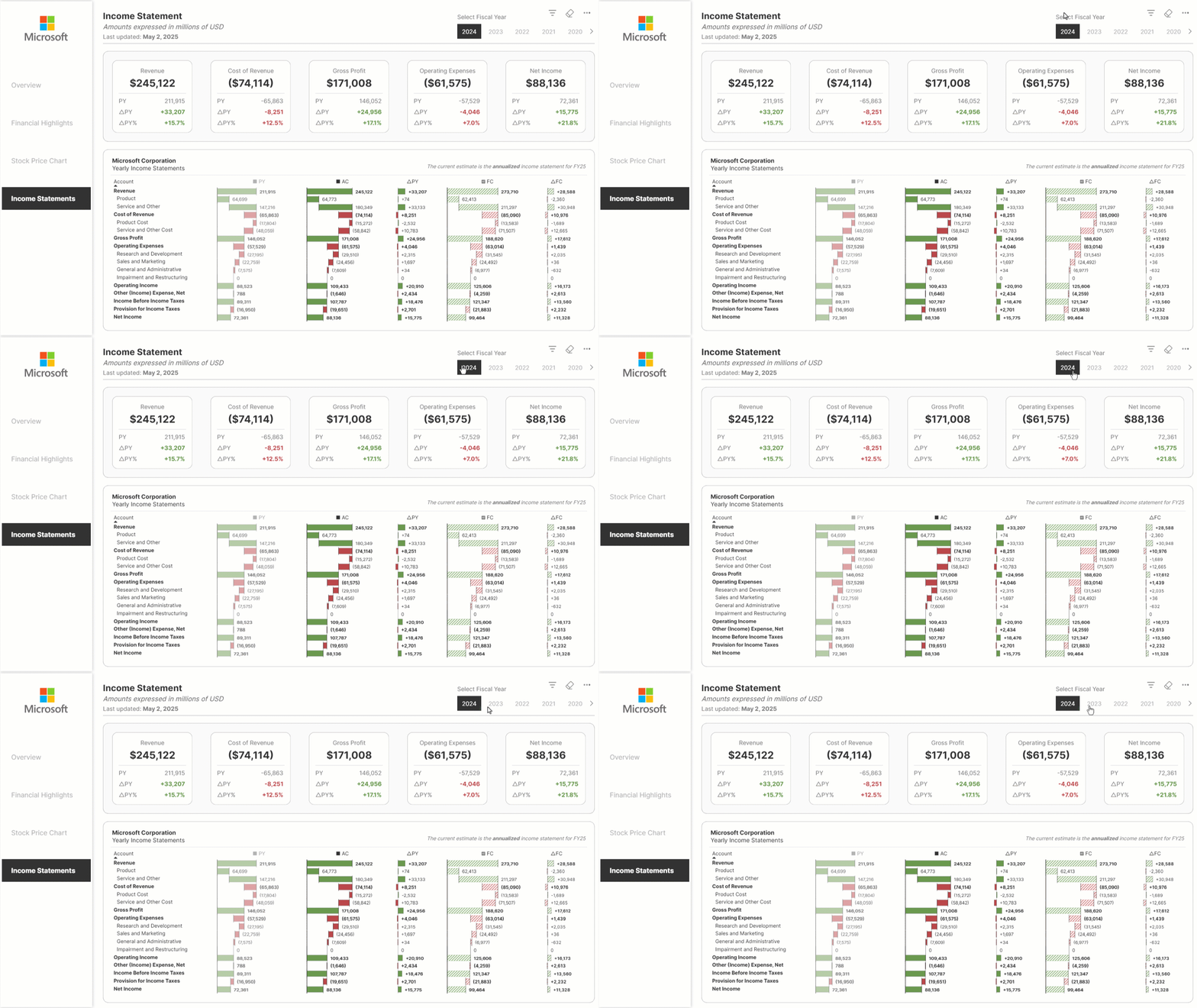
Inspired by Stefanos Chantzis's P&L analysis with native visuals, this approach introduces significant improvements based on community feedback and my own observations. The key enhancements include:
-
Enhanced Financial Logic: Addressing inconsistencies in the original data, I've developed DAX measures to ensure accurate financial logic, even when sub-accounts for revenue and COGS have varying positive or negative values across different periods. This dynamic approach replaces static weighting.
-
Improved Visual Appeal: The charts now feature a clear color-coding system (green for positive/cumulative, red for negative) and distinct visual styles for each period (lighter for previous, solid for current, patterned for forecast) to enhance understanding and comparison.
-
Refined Matrix Layout: The matrix visual has been restructured to mirror the familiar format of common income statements, such as Microsoft Corp.'s, resulting in a simpler and more professional look.
While the fundamental concept originates from Stefanos's work, the underlying DAX measures have undergone a significant transformation to achieve this improved and more user-friendly presentation. I am grateful to Stefanos for sharing his initial concept and the .pbix file, which provided the foundation for this development.
The rest of this walkthrough is for members
You have read the problem. What is behind the paywall is the fix:
- The full step-by-step build, from measures to formatting
- Every DAX measure with the reasoning behind it
- The .pbix with the model already wired up
Already a member? Sign in with your email