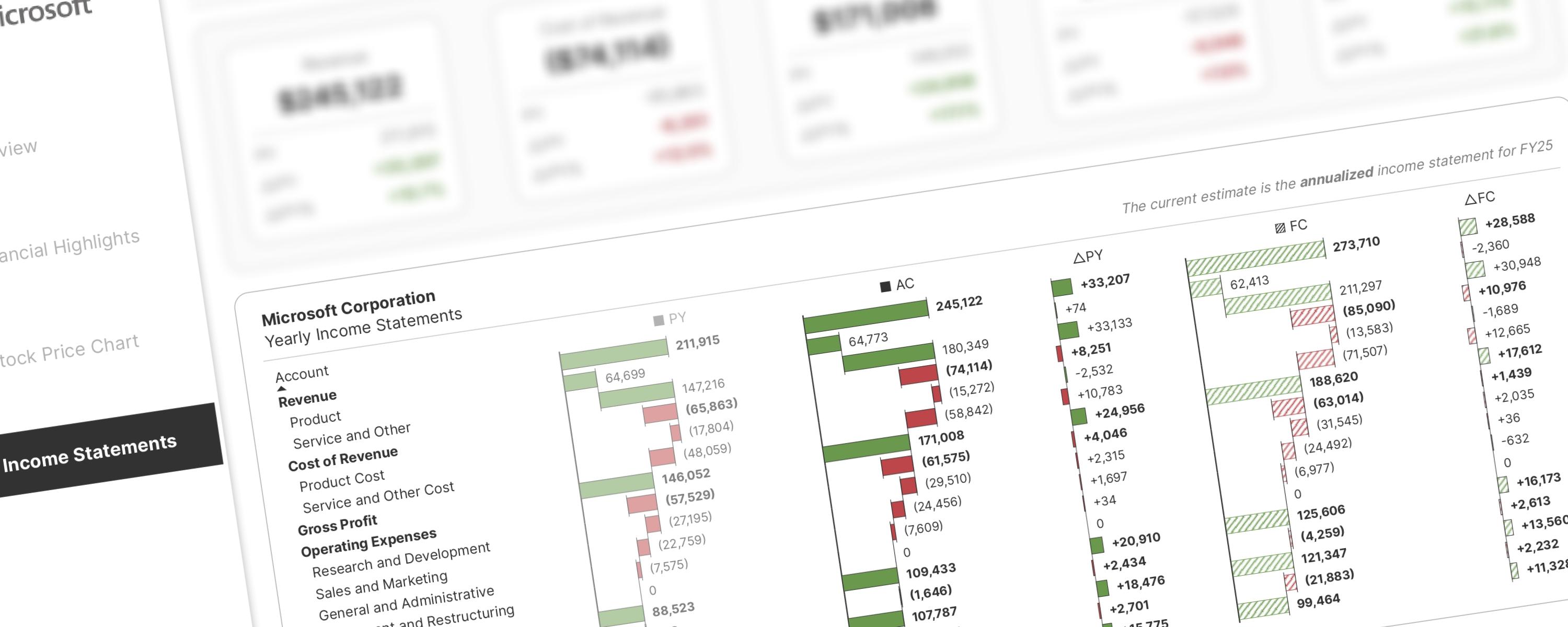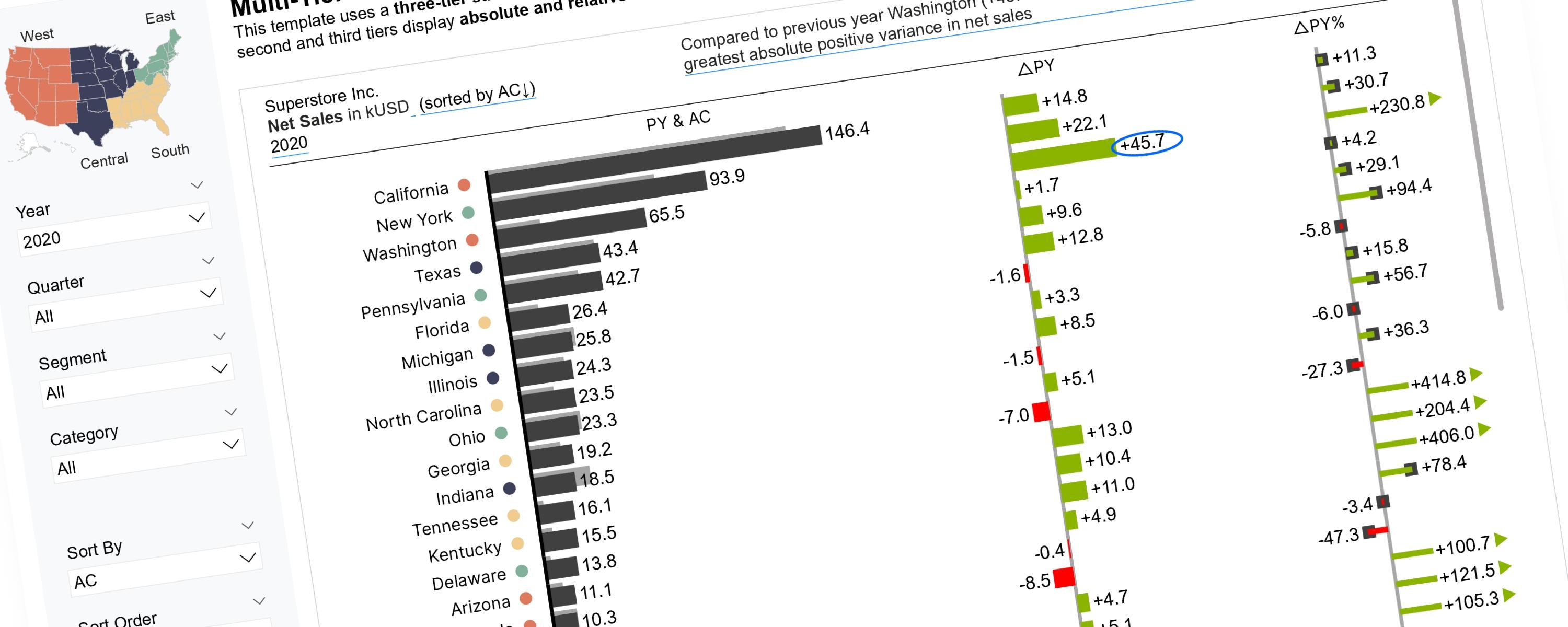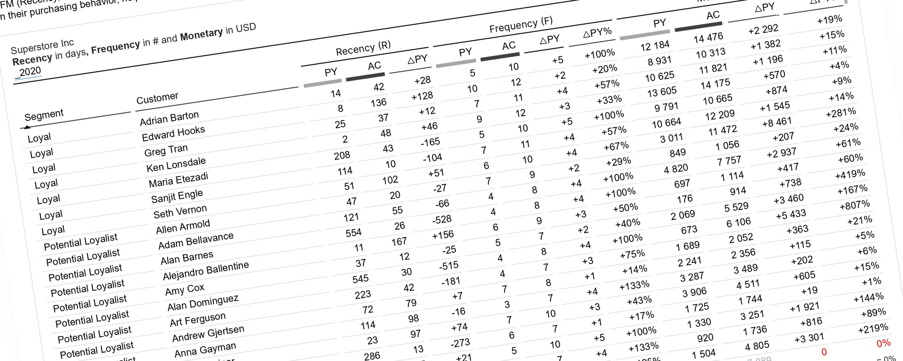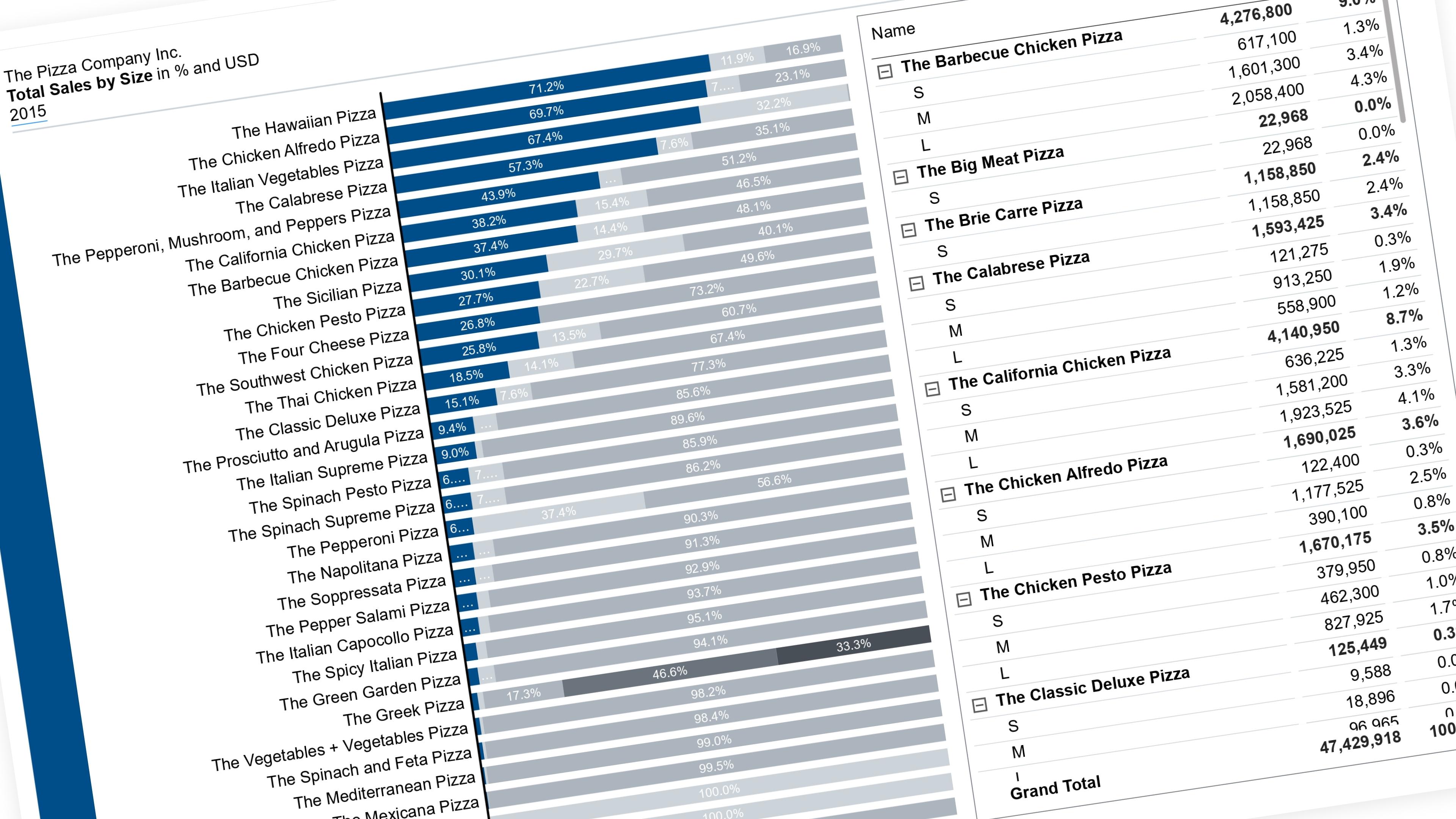
Let the reader pick which segment is easy to read — it drops to the baseline in color, everything else fades to grey. Works on any category with 2 or more segments (status, size, material, whatever you stack).
Method: one measure per stacking position, not one measure split by a category field. A 100% stacked chart bound the normal way (one measure + a category in the Series/Legend field) can never reorder its own segments — the stack order follows the field’s sort order, not the data. So instead, each position in the stack becomes its own measure, and the selected category’s measure always occupies position 1. See Why this method? for the full reasoning.
What you’re building
In a 100% stacked bar or column chart, only the segment sitting right on the baseline is genuinely easy to compare across bars — everything stacked above it “floats,” so its length is hard to judge at a glance once you’re comparing a dozen bars.
This technique lets the reader choose which segment gets that treatment:
The rest of this walkthrough is for members
You have read the problem. What is behind the paywall is the fix:
- The full step-by-step build, from measures to formatting
- Every DAX measure with the reasoning behind it
- The .pbix with the model already wired up
Already a member? Sign in with your email