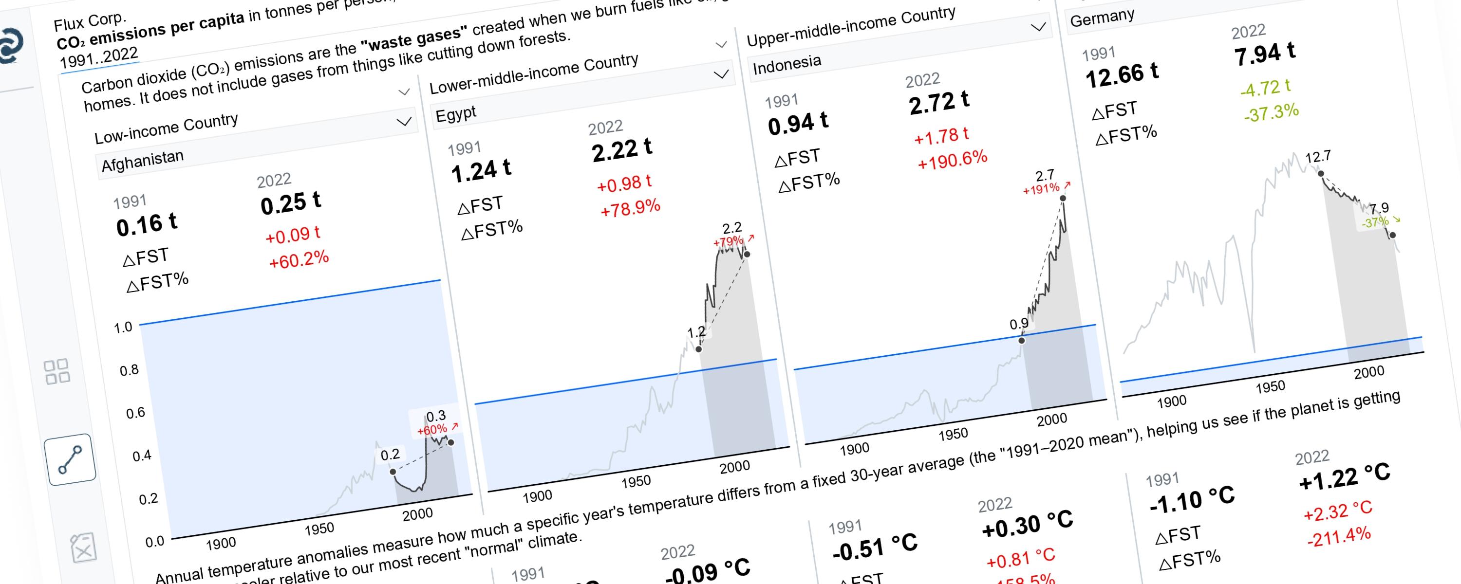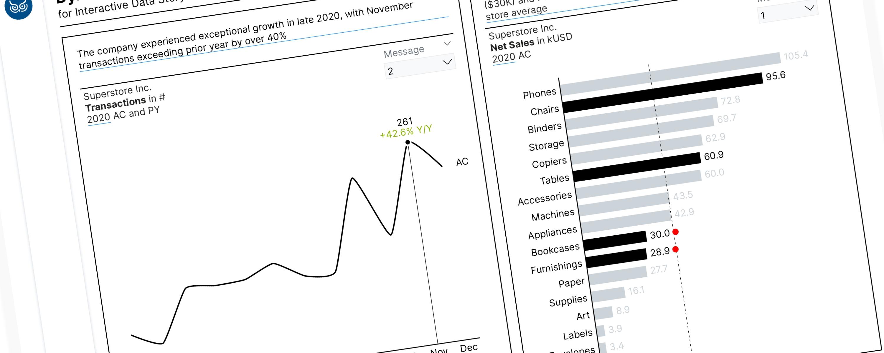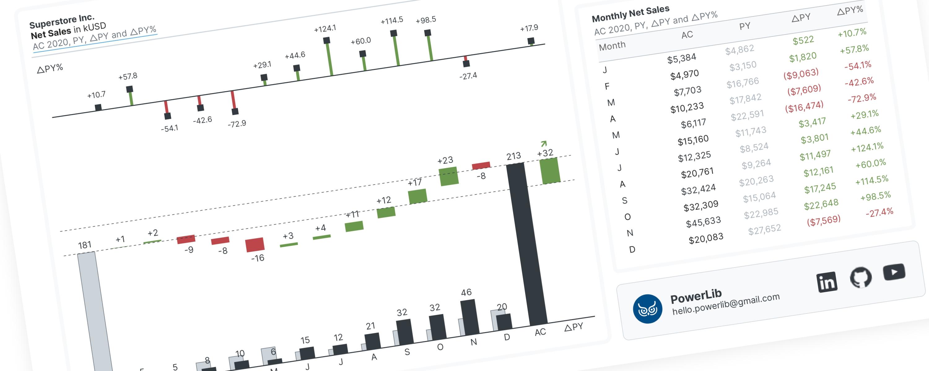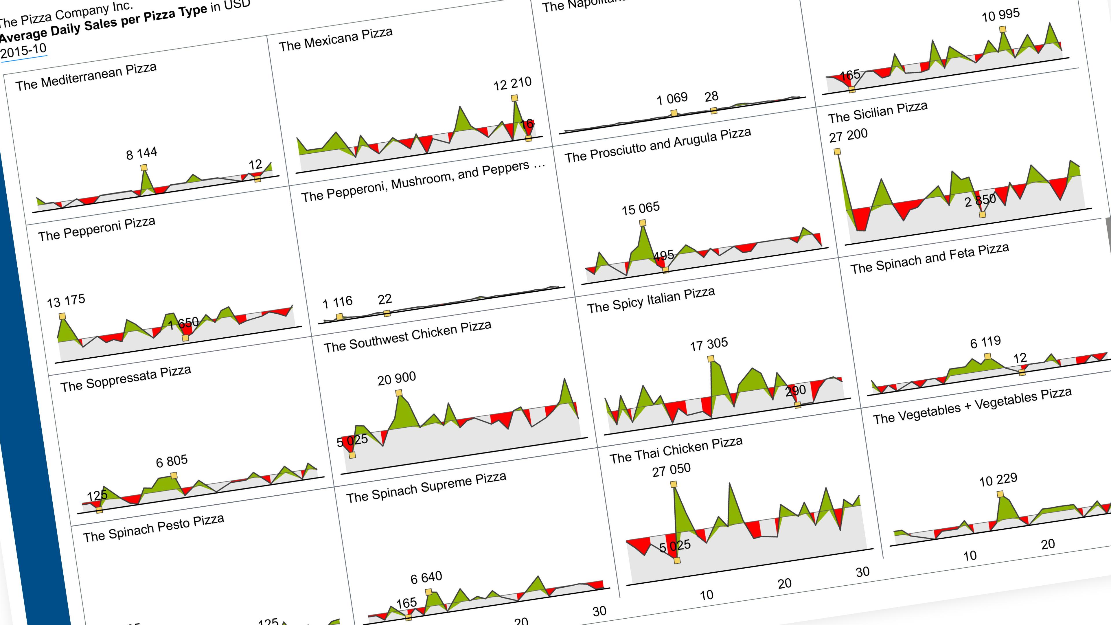
Show one metric’s daily trend, one small chart per category, all on the same scale.
The idea. Instead of stacking many lines on one busy chart, split them into a grid of small charts — one per category — sharing a single scale. Then add two field parameters so the reader can switch the reference line and toggle the markers (min, max, first, last) without touching the visual.
What you’re building
A grid of small line charts — one per category — each showing the same metric’s daily trend within a single month:
| Element | What it does |
|---|---|
| Small multiples | One mini chart per category, same scale, read side by side |
| Reference line | A flat “average” line the reader can switch (each category’s own average, or the overall average) |
| Markers | Dots on the min, max, first and last days — reader picks which to show |
| Shared Y-axis | Every mini chart uses one ceiling, so heights are comparable |
The rest of this walkthrough is for members
You have read the problem. What is behind the paywall is the fix:
- The full step-by-step build, from measures to formatting
- Every DAX measure with the reasoning behind it
- The .pbix with the model already wired up
PowerLib Insideror $99 a year — two months free$9.99 / mo
Get accessAlready a member? Sign in with your email