BarMember-Only
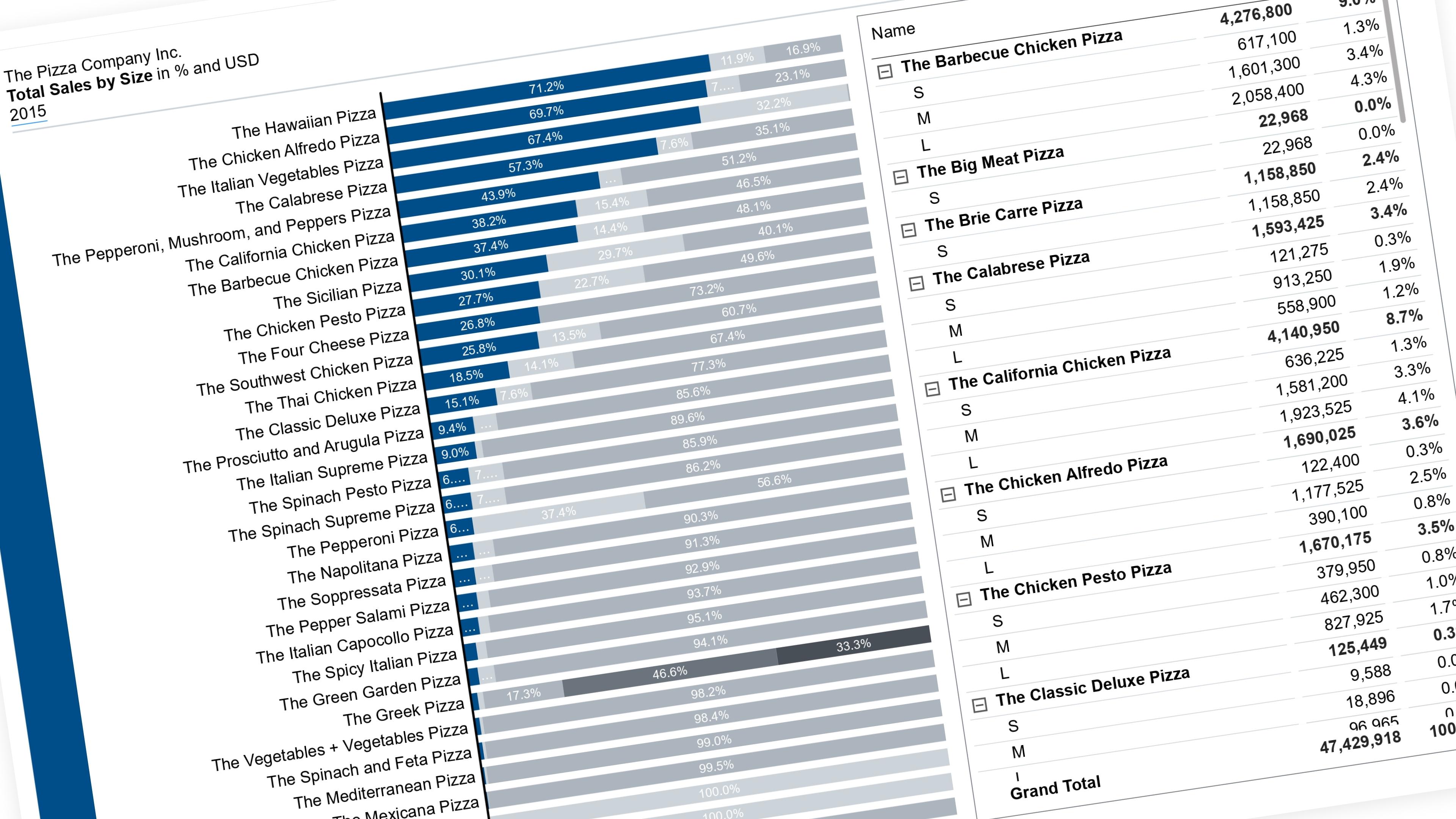
Highlight a Segment in a 100% Stacked Chart and Move It to the Baseline
Let the reader pick which segment is easy to read — it drops to the baseline in color, everything else fades to grey.
27 July 202614 min read
Documented Power BI techniques — the model change, the DAX, and the exact visual settings. Most are free to read; the rest come with the model files for members.
BarMember-Only
Let the reader pick which segment is easy to read — it drops to the baseline in color, everything else fades to grey.
WaterfallMember-Only
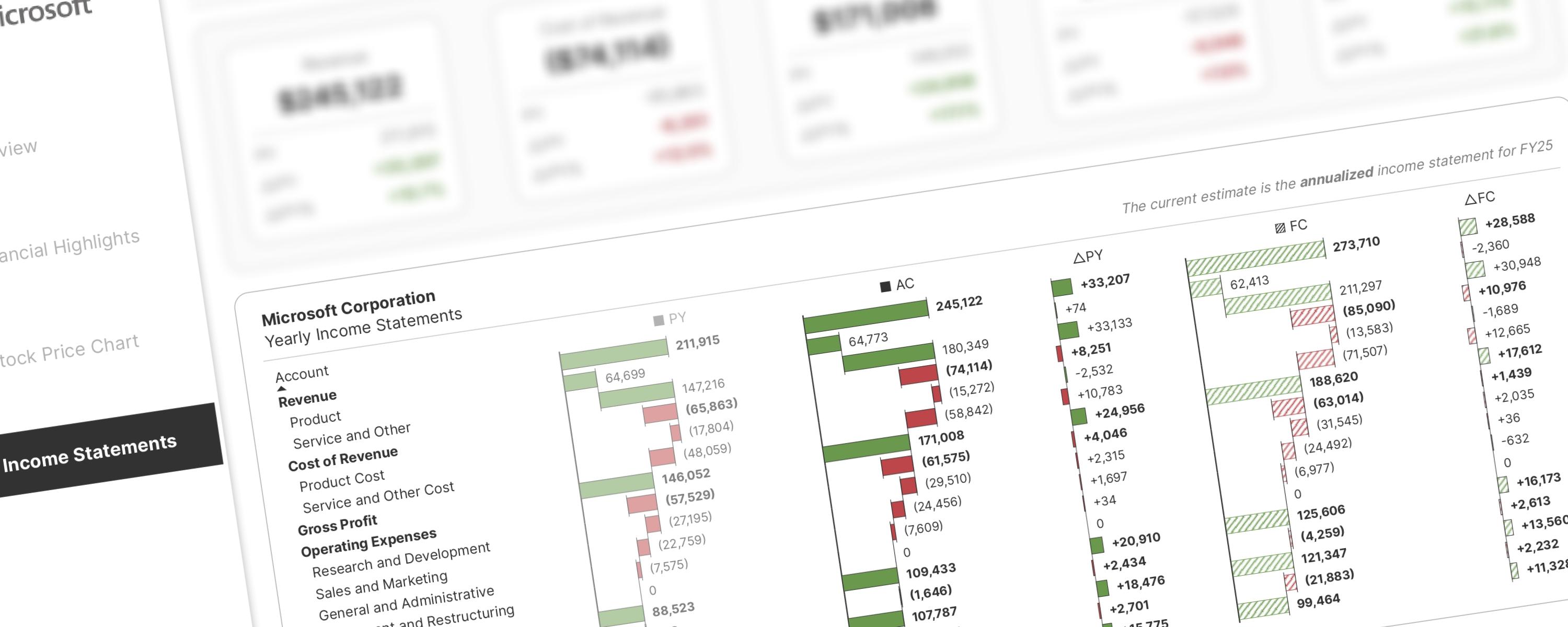
Inspired by Stefanos Chantzis's P&L analysis with native visuals, this approach introduces significant improvements based on community feedback and my own observations.
WaterfallMember-Only
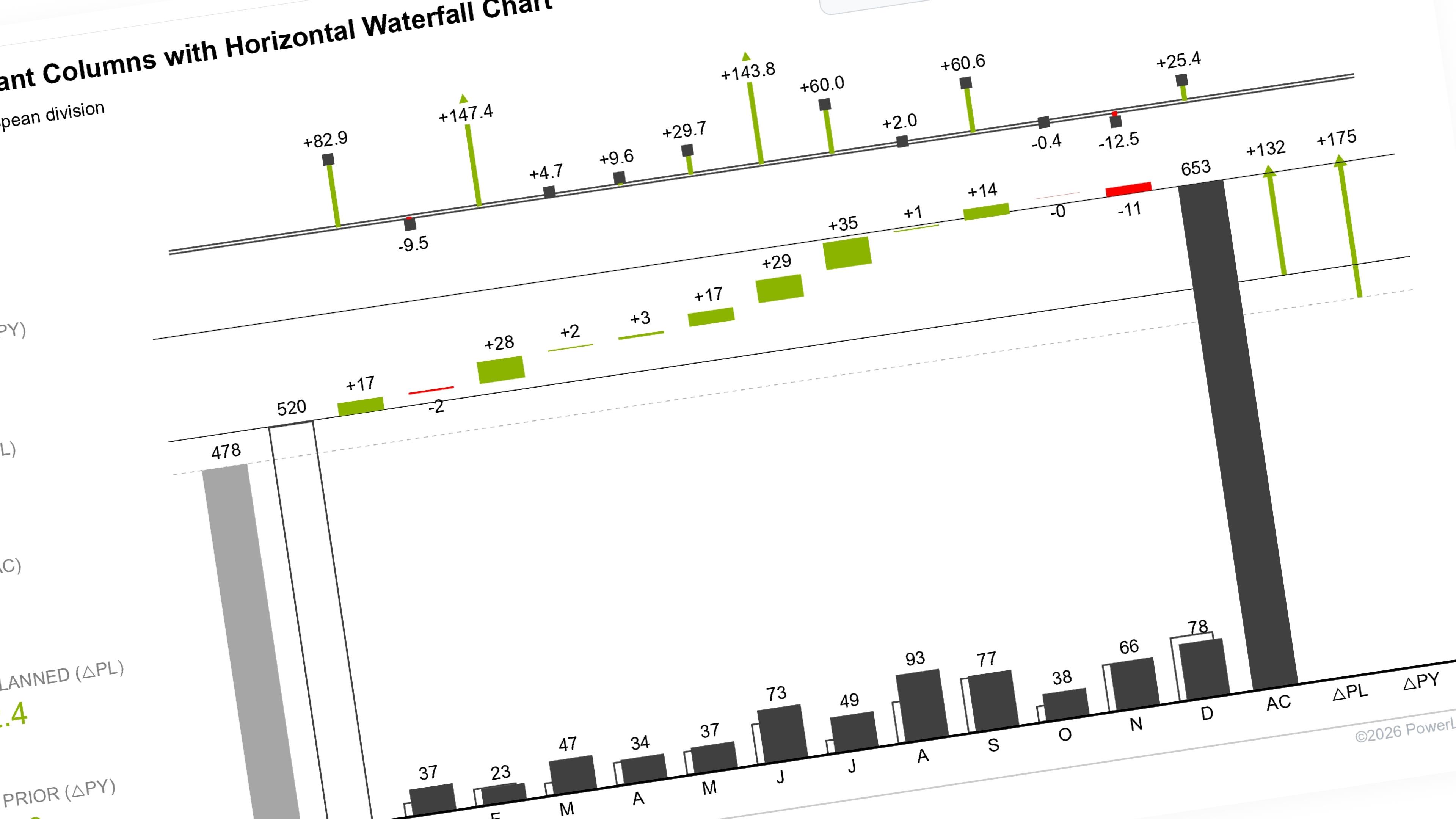
This documentation builds upon the IBCS-compliant Columns with Waterfall Chart, moving from a dual-scenario comparison (Actual vs.
BarMember-Only
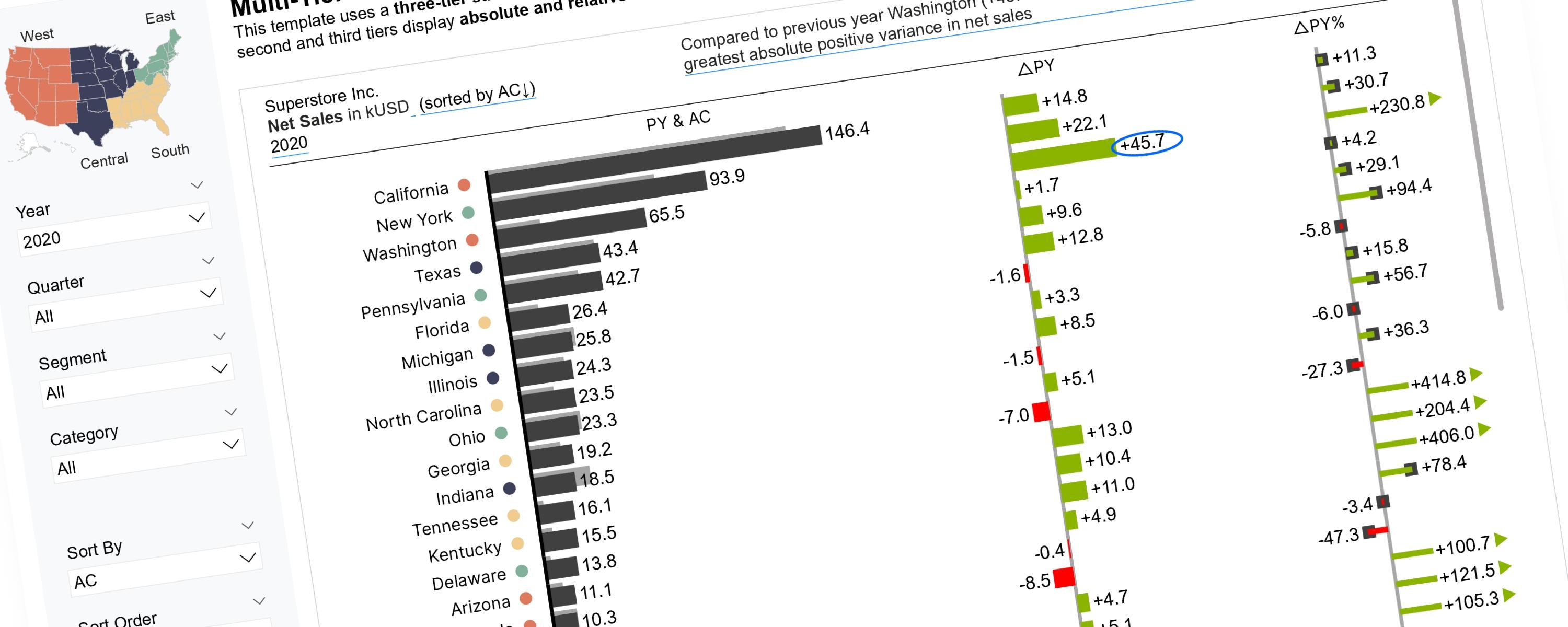
Scalable Vector Graphics (SVGs) offer greater flexibility for implementing IBCS Notation than native Power BI visuals.
WaterfallMember-Only
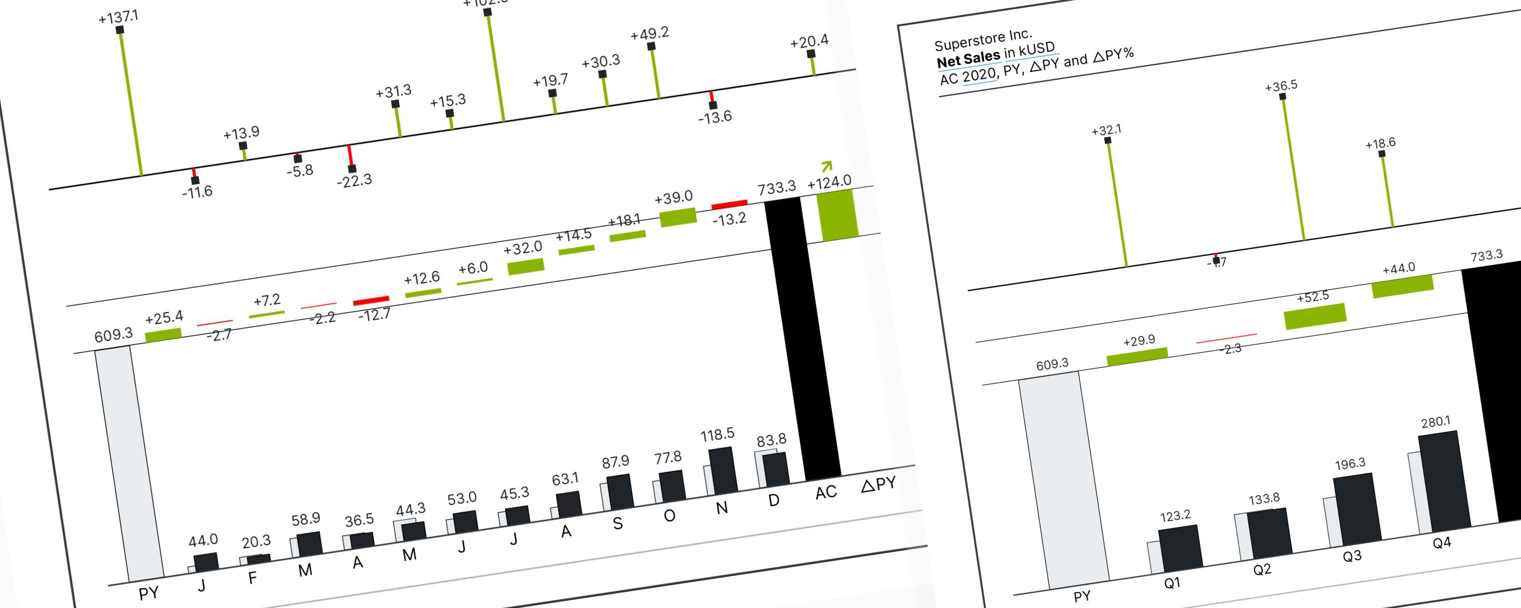
When using a waterfall chart, visual direction determines its purpose: Vertical charts break down data by categories or factors (non-time series), while Horizontal charts track…
Scatter PlotFree
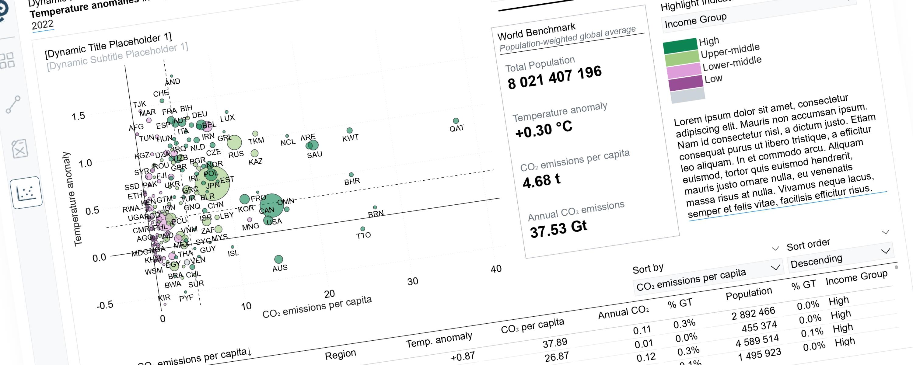
Scatterplots can tell very different stories depending on the perspective we choose to highlight.
BarFree
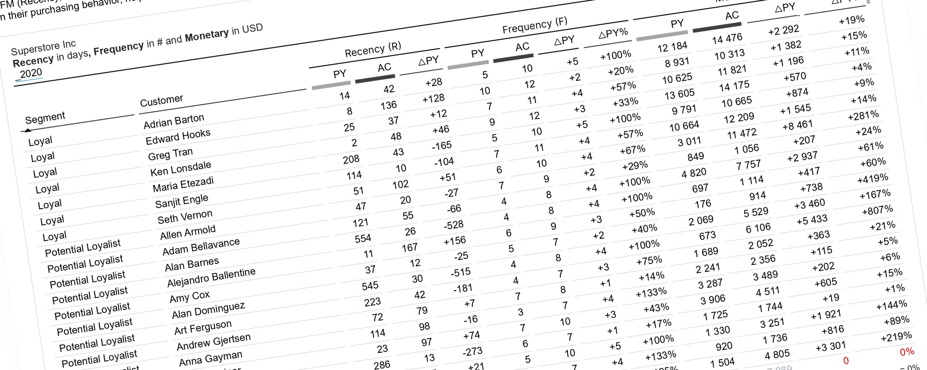
This documentation explains how to perform RFM analysis in Power BI using a dynamic, time-aware approach.
WaterfallMember-Only
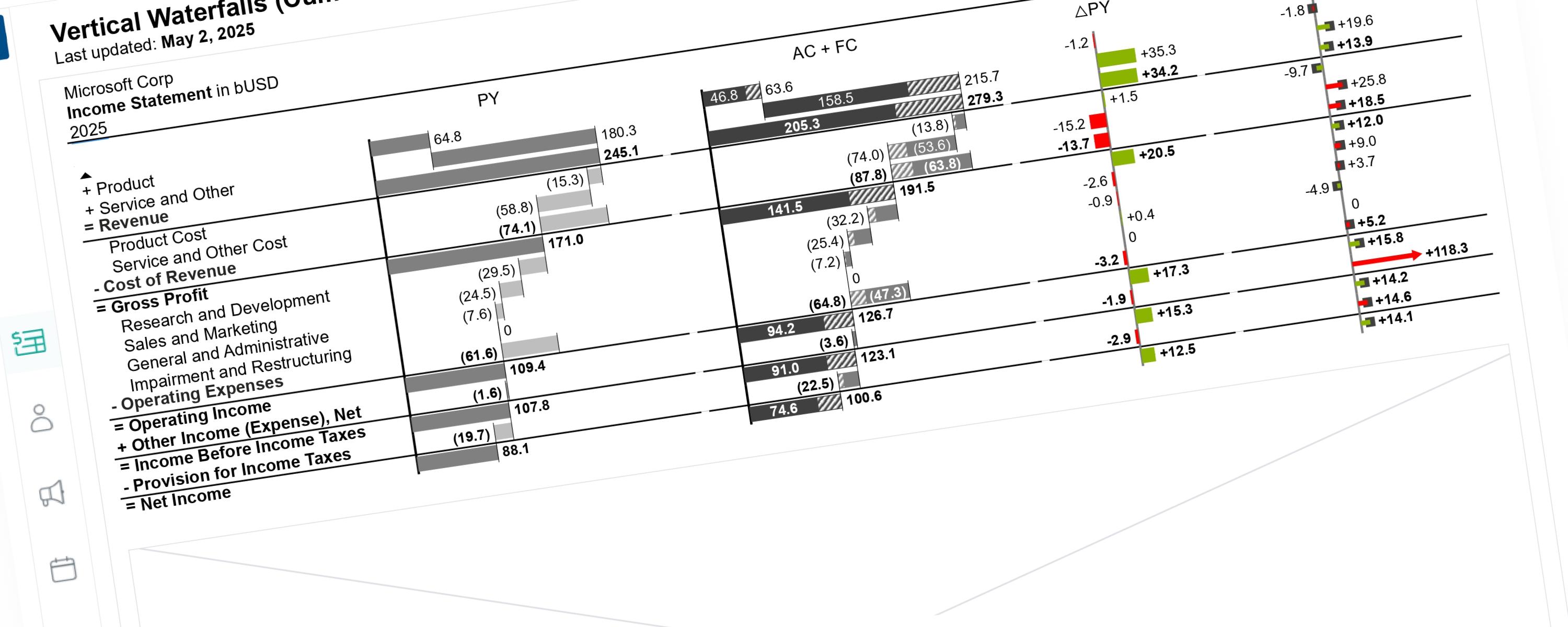
This documentation details the enhancements made to the previous visualization version. These updates focus on global scaling logic and cumulative data representation.
WaterfallMember-Only
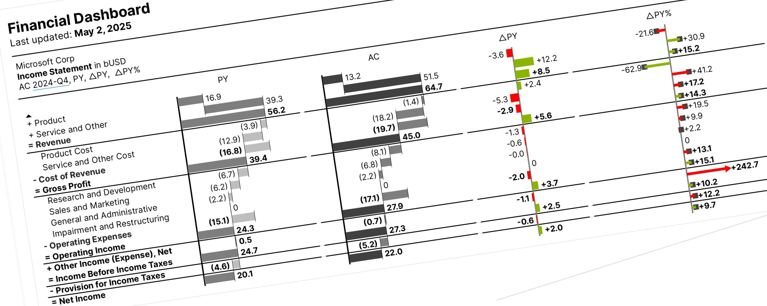
Vertical waterfall charts (also called bar waterfalls) show you why a value changed between two different points. They are read from top to bottom and consist of three main parts: