Foreword
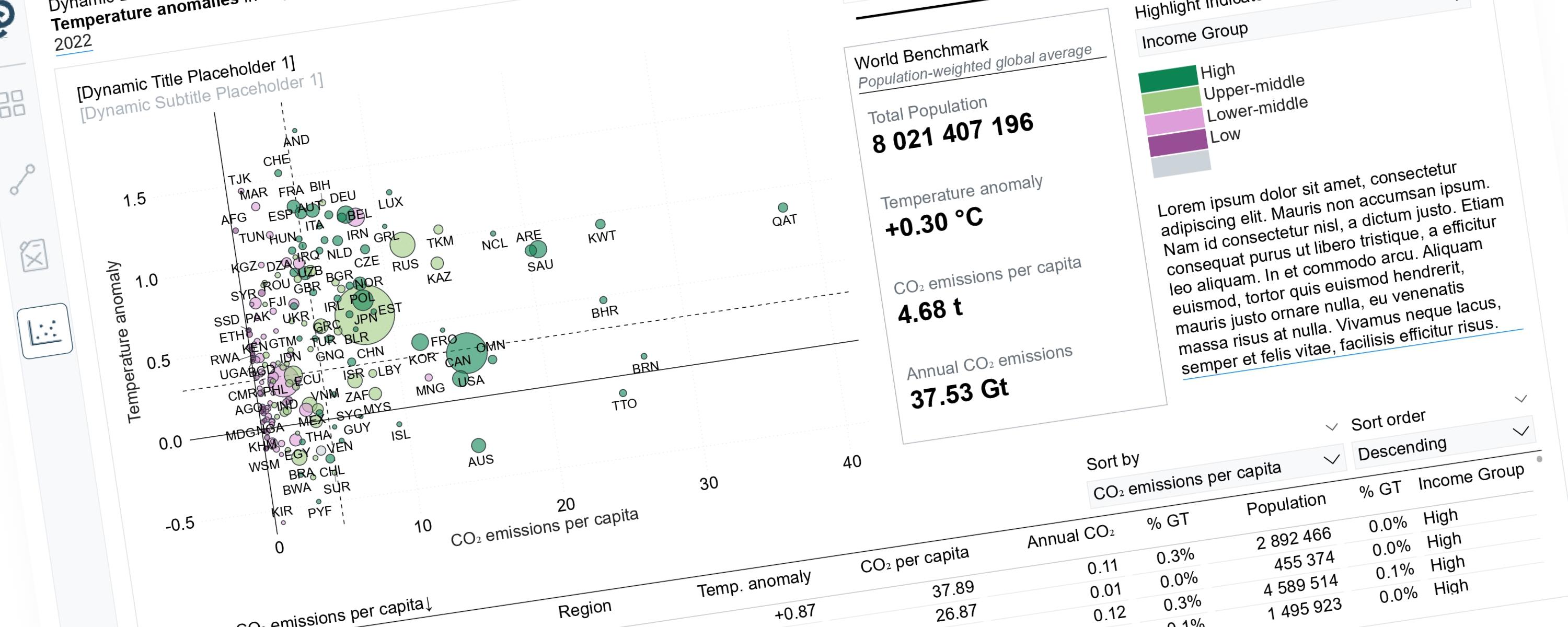
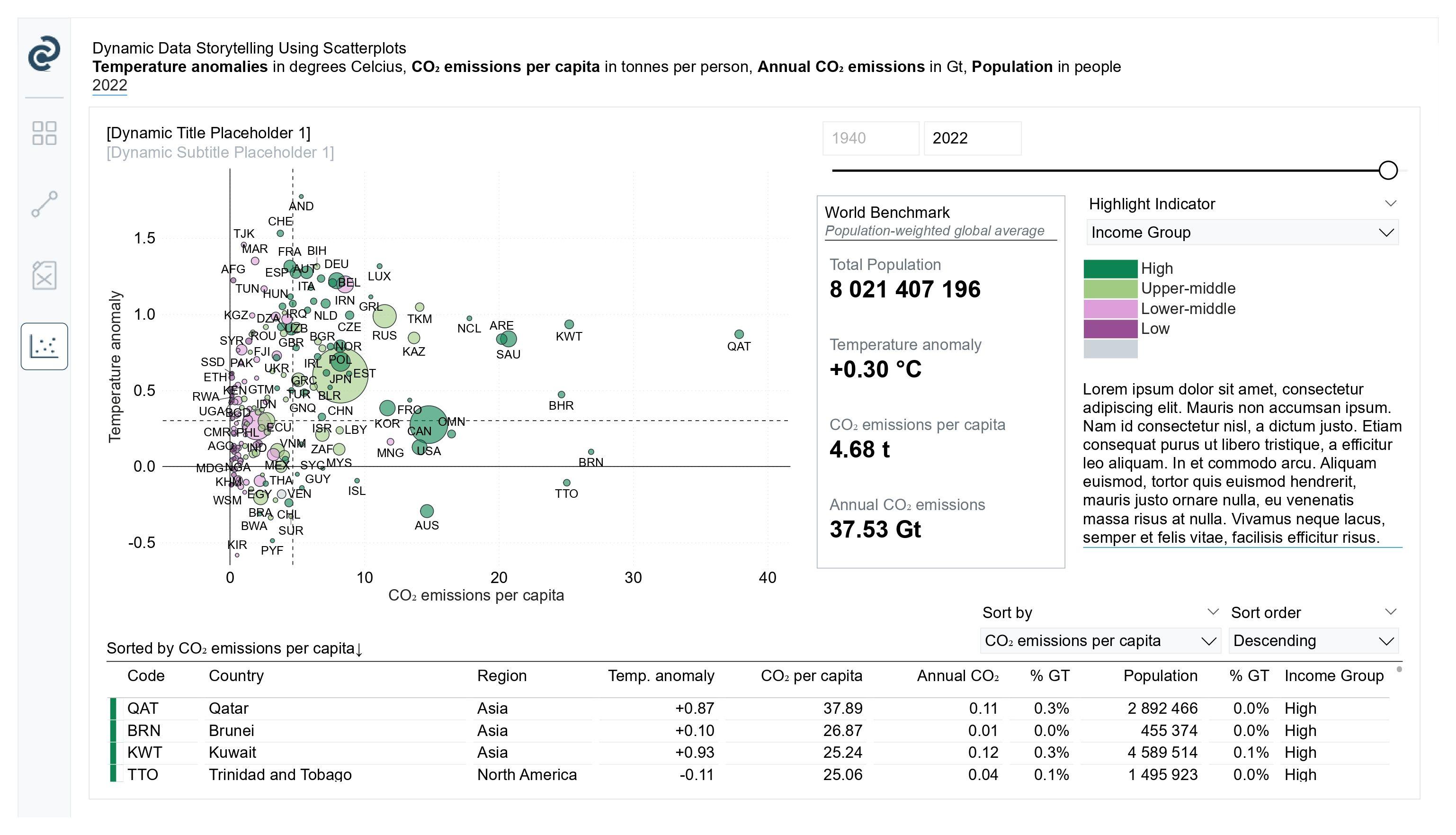
Scatterplots can tell very different stories depending on the perspective we choose to highlight. For example, when Income Group is selected, it becomes evident that most countries with high CO₂ emissions per capita belong to high-income groups, with some coming from upper-middle-income countries. When the indicator is switched to the Top 5 annual CO₂ emitters, the focus shifts to identifying which countries contribute the most to total global CO₂ emissions.
With that in mind, this documentation walks you through how to construct scatterplots that support dynamic storytelling, allowing users to explore different narratives by simply changing the selected indicator.
1. Data Model Setup
Goal: Prepare clean and well-structured data for analysis.
-
Download all required datasets and review their contents.
-
Load the datasets into Power BI.
-
Build the data model: 4. Create dimension tables (e.g., Country, Year) to describe the data. 5. Clean and transform the fact tables (e.g., emissions, temperature). 6. Create relationships between fact and dimension tables.
2. Building the Scatterplots
Goal: Show relationships between key metrics and allow interactive analysis.
-
Create a year slicer so users can choose the time period.
-
Create measures for the x-axis, y-axis, and bubble size.
-
Add world benchmark information to help users compare results: 10. Create measures that calculate global averages or totals. 11. Show benchmark lines on the scatterplot. 12. Display benchmark values using KPI cards.
-
Add conditional formatting based on a selected highlighting option:
-
Create a disconnected table to store highlighting options (e.g., income group, Top N).
-
Add a slicer so users can choose how to highlight the data.
-
Use DAX to change bubble colors dynamically based on the selected option.
-
Update legends automatically to match the selected highlighting option.
-
Change titles, subtitles, and descriptions dynamically to explain what users are seeing.
3. Creating the Table for Extra Context
Goal: Support the scatterplots with detailed and sortable data.
-
Create the measures that will be shown in the table.
-
Allow users to sort the table dynamically:
-
Create disconnected tables for choosing:
- Which metric to sort by
- Sort order (ascending or descending)
-
Create a dynamic ranking measure using DAX.
-
Link the table behavior to the scatterplots:
-
Create a blank helper measure to support conditional formatting.
-
Use DAX to grey out rows that are not selected and highlight the selected ones.
-
Clean up the table layout (remove unnecessary columns, format numbers, improve readability).
Documentation
What You Will Learn
In this case study, you will level up your Power BI skills by mastering the following techniques:
-
Connecting Multiple Data Sources: Learn how to link different "fact tables" together to find hidden relationships between temperature, emissions, and population.
-
Dynamic Storytelling: Build a report that changes its text and visuals based on what the user clicks. You will learn to create:
- Smart Legends: Charts that update their keys automatically.
- Dynamic Text: Report titles, subtitles, and descriptions that rewrite themselves to explain the current data view.
-
Syncing Visuals: Learn how to connect your Table and Scatter Plot so they "talk" to each other—selecting a point in one will instantly highlight it in the other.
-
Advanced Sorting Controls: Empower your users to take control of the data by choosing which metric to sort by and toggling between high-to-low or low-to-high views.
Step 1: Data Model Setup
1. Download all required datasets and review their contents
In this case study, we are building a scatter chart (also called a bubble chart) to see how different factors affect climate change. Think of this chart as a way to see three pieces of information at once:
-
Temperature Rise (Y-axis): How much warmer the Earth is getting (measured in °C).
-
CO₂ per Person (X-axis): The average carbon footprint of a single person in a country.
-
Total CO₂ (Bubble Size): The bigger the bubble on your chart, the more total pollution that country produces.
Adding Context to the Numbers
To make our analysis more meaningful, we aren't just looking at numbers; we’re looking at who is responsible. We will use three extra sets of data to help "slice" our report:
-
Income Groups: This tells us if a country is rich or poor. It helps us see if wealthier nations produce more CO₂ than developing ones.
-
World Regions: This groups countries by location (like Europe or Asia). It helps us spot geographic patterns in the data.
-
Total Population: This is a "reality check" for our bubbles. Even if a person in a specific country uses very little energy, a massive population can still lead to a huge amount of total CO₂ emissions.
Note: All of this information comes from separate "fact tables" (data lists) that you can download from the Our World in Data website. Check the ‘Data Sources’ section for the direct links.
2. Load the datasets into Power BI
Once you have downloaded the datasets, save them in the same folder and load them into Power BI by going to the Home tab → Get Data → Text/CSV, as the files are in CSV format.
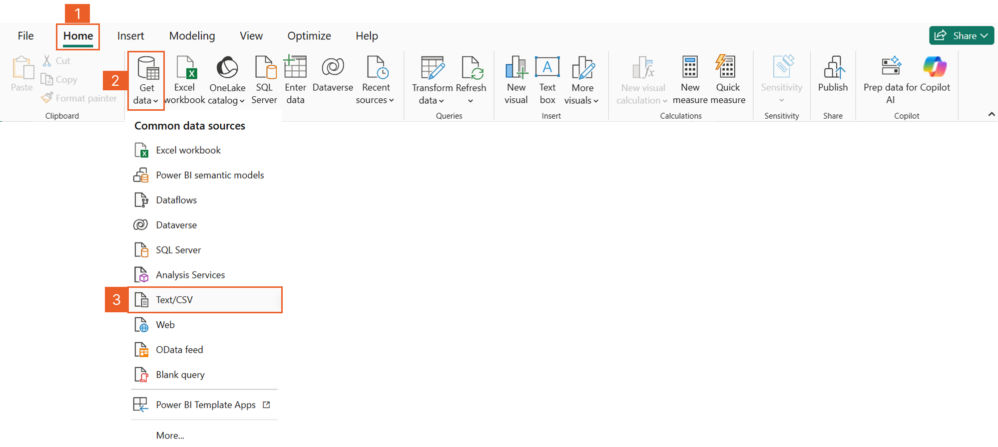 Figure 1.1 Load the datasets into Power BI
3. Build the data model
Once you import your datasets, you need to create Dimension Tables. Think of these as "bridge" tables that allow Power BI to connect different pieces of information (Fact Tables) together.
3.1. Create dimension tables to describe the data
3.1.1. Date Table
Our datasets use years to track time. To make sure the charts work correctly, we need a single Date Table that lists every year used in our project.
-
The Simple Way: If all your data is recorded once per year, your Date Table just needs one row for every unique year.
-
The Pro Way (Handling Different Time Scales): Sometimes, one table might show data by the year, while another shows it by the day. To fix this, we create a "Start of Year" or "Start of Month" column in all tables. This gives every piece of data a common language so they can be linked.
Once your Date Table is ready, you will connect it to your fact tables using a One-to-Many Relationship. This means one year in your Date Table connects to many different records (countries) in your fact tables.
Dimension Table 1: Dim_Year
Dim_Year =
SELECTCOLUMNS(
  GENERATESERIES(1880, 2025, 1),
  "Year", [Value]
)
This measure creates:
-
A single-column table with column name "Year"
-
Contains years: 1880, 1881, 1882, ... 2024, 2025
3.1.2. Entity Table
The next table we need to create is the Entity table. This table acts as a master list of countries and their unique country codes.
Instead of creating this list manually, we generate it directly from the main dataset. This is an important step for data quality. By doing this, only countries that have values for all three key metrics—temperature, CO₂ per capita, and total CO₂ emissions—will appear in the model.
If a country is missing any of these values, it will automatically be excluded from the visuals. This keeps the analysis clean and prevents empty or misleading bubbles from appearing in the report.
Dimension Table 2: Dim_Entity (Country Names & Codes)
Dim_Entity =
FILTER (
  SUMMARIZE (
      'world-bank-income-groups',
      'world-bank-income-groups'[Entity],
      'world-bank-income-groups'[Code]
  ),
  NOT ISBLANK ( 'world-bank-income-groups'[Entity] )
)
This DAX creates a dimension table of unique countries/entities by extracting distinct entity names and their codes from the world-bank-income-groups table, while excluding any blank entries.
Read the explanation
Step 1: SUMMARIZE - Get Unique Combinations
SUMMARIZE (
  'world-bank-income-groups',
  'world-bank-income-groups'[Entity],
  'world-bank-income-groups'[Code]
)
```

What's happening:
- `SUMMARIZE` creates a summary table with unique combinations
- Source Table: `'world-bank-income-groups'`
- Group By Columns: `Entity` and `Code`
- Returns only distinct (unique) pairs of Entity and Code

Example - Before SUMMARIZE:
```
Entity        | Code | Year | Income Group
--------------|------|------|-------------
United States | USA  | 2020 | High
United States | USA  | 2021 | High
United States | USA  | 2022 | High
China         | CHN  | 2020 | Upper-middle
China         | CHN  | 2021 | Upper-middle
India         | IND  | 2020 | Lower-middle
India         | IND  | 2021 | Lower-middle
```

After SUMMARIZE:
```
Entity        | Code
--------------|------
United States | USA
China         | CHN
India         | IND
Key Point: Even though the source table might have multiple rows per country (one for each year), SUMMARIZE collapses them into one row per unique Entity-Code combination.
Step 2: FILTER - Remove Blank Entities
FILTER (
  ... the summarized table ...,
  NOT ISBLANK ( 'world-bank-income-groups'[Entity] )
)
```

What's happening:
- `FILTER` evaluates each row and keeps only those that meet the condition
- `ISBLANK(...)` checks if the Entity column is blank/empty
- `NOT ISBLANK(...)` inverts the logic: keep rows that are NOT blank

Why is this needed?
Sometimes data sources have:
- Empty rows
- Null values
- Placeholder entries
- Data quality issues

This ensures your dimension table only contains valid, actual countries.

Example - Before FILTER:
```
Entity        | Code
--------------|------
United States | USA
China         | CHN
            |      ← Blank row
India         | IND
            | XXX  ← Entity is blank but Code exists
```

After FILTER:
```
Entity        | Code
--------------|------
United States | USA
China         | CHN
India         | IND
```

---

## The Complete Result Table

What Dim_Entity looks like:
```
Entity                      | Code
----------------------------|------
Afghanistan                 | AFG
Albania                     | ALB
Algeria                     | DZA
Argentina                   | ARG
Australia                   | AUS
Brazil                      | BRA
Canada                      | CAN
China                       | CHN
France                      | FRA
Germany                     | DEU
India                       | IND
United States               | USA
...                         | ...
```

Typical size: 200-250 rows (depending on how many countries/entities are in your source data)

---

## How This Table is Used in Your Model

### 1. Relationships - The Hub of Your Star Schema
```
Dim_Entity[Code] ──→ Fact_Emissions[Code]
Dim_Entity[Code] ──→ Fact_Temperature[Code]
Dim_Entity[Entity] ──→ world-bank-income-groups[Entity]
```

This table acts as the central hub connecting all your fact tables.

### 2. Slicers and Filters
```
Country Slicer: Dim_Entity[Entity]
User selects: "United States", "China", "India"
All connected visuals filter automatically
```

### 3. Clean Dropdown Lists
```
Instead of seeing duplicate country names in dropdowns,
users see each country exactly once.
```

### 4. Consistent Naming
```
If "USA" appears as "United States" in one table
and "US" in another, this dimension ensures
one consistent name across all reports.
```

---

## Why Create a Separate Dimension Table?

### ❌ Without Dim_Entity (Problems):
```
Fact tables connect directly to each other
→ Multiple copies of country names
→ Inconsistent naming across tables
→ Duplicate values in slicers
→ Poor performance
→ Difficult to maintain
```

### ✅ With Dim_Entity (Benefits):
```
One authoritative list of countries
→ Single source of truth
→ Consistent naming everywhere
→ Clean, de-duplicated slicers
→ Better query performance
→ Easy to add country attributes (region, continent, etc.)
```

---

## Star Schema Pattern

This follows the **star schema** design pattern:
```
                  ┌─────────────┐
                  │  Dim_Date   │
                  └──────┬──────┘
                         │
      ┌──────────────────┼──────────────────┐
      │                  │                  │
┌───────▼────────┐  ┌──────▼──────┐  ┌───────▼────────┐
│ Fact_Emissions │  │ Dim_Entity  │  │ Fact_Temperature│
└────────────────┘  └──────┬──────┘  └────────────────┘
                         │
                ┌────────▼────────┐
                │ world-bank-     │
                │ income-groups   │
                └─────────────────┘
Dim_Entity is at the center, connecting all climate-related facts.
3.2. Clean and transform the fact tables
Since the datasets are already clean, no additional data cleaning is required. Data transformation is only needed when working with fact tables that use different time scales. For example, if one fact table contains data at a date level, while others are stored at a yearly level, the yearly tables need to be adjusted so they can work together.
To do this, create an additional column in the yearly fact tables that converts the year into a date (using the start of the year). This can be done using the following DAX expression:
Date = DATE( 'annual-temperature-anomalies'[Year], 1, 1 )This new date column is then used as the relationship key to connect the fact tables to the dim_date table through the StartOfMonth column.
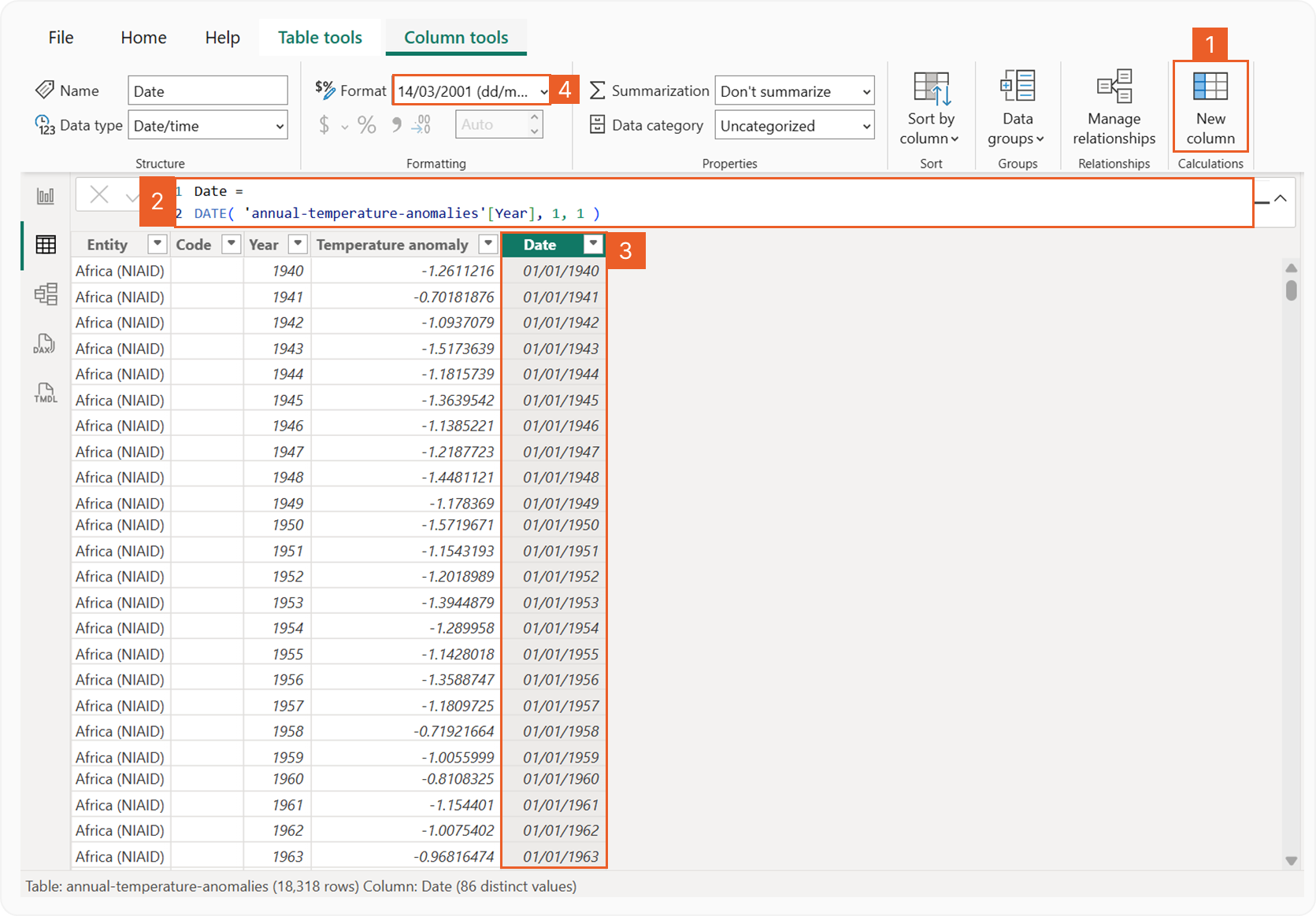 Figure 1.2 Clean and transform the fact tables
3.3. Create relationships between fact and dimension tables
The final step in this section is to create relationships between the fact tables and the dimension tables.
If you are using a year dimension table, connect the Year column from Dim_Year to the corresponding Year column in each fact table. Use a one-to-many relationship (Dim_Year → Fact table), or many-to-one if viewed from the fact table side, and set the filter direction to single.
If you are using a date dimension table, connect the StartOfMonth column from Dim_Date to the Date column in each fact table. Again, use a one-to-many relationship (Dim_Date → Fact table) with a single filter direction.
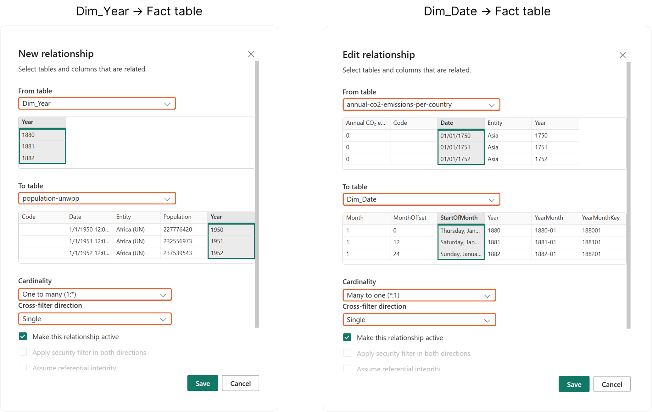 Figure 1.3 Create relationships between fact and dimension tables
Step2: Building the Scatterplots
Pay close attention to the following details when you begin aggregating your data.
-
An annual temperature anomaly isn’t the actual temperature (like 25°C); instead, it shows the difference between that year’s temperature and the historical average (specifically the average from 1991–2020).
- A positive number (+1.5): Means that year was warmer than the long-term average.
- A negative number (-0.5): Means that year was cooler than the long-term average. Since each row in the dataset already provides the pre-calculated anomaly for that year, you don't need to do any complex math to "find" the difference. However, when you bring this field into a Power BI visual, you should use the AVERAGE function. If you accidentally "Sum" these values when looking at a group of countries or a decade, the numbers will become huge and misleading. Averaging ensures the temperature scale stays accurate to real-world conditions.
-
CO₂ emissions per capita is the average amount of carbon dioxide produced by a single person in a country. This includes the pollution caused by:
- Transport (cars, planes, ships)
- Electricity (lighting and powering homes)
- Industry (factories and heating) This metric focuses specifically on fossil fuels and industrial work; it doesn't count changes in how land is used (like cutting down forests). The dataset already does the hard work for you—each row shows the final calculated amount for that year. You don't need to do any manual division. When you add this to your Power BI report, use the AVERAGE function. This allows you to see the typical carbon footprint for a person in a specific region or time block without accidentally adding the numbers together into an impossible total.
-
Annual CO₂ emissions represents the total amount of carbon dioxide a country released into the atmosphere during a specific year. This is measured in tonnes.
- What’s Included: This covers CO₂ from burning fossil fuels (like coal, oil, and gas) and industrial processes (like making cement).
- What’s Excluded: It does not include emissions from "land-use changes," such as cutting down forests or changing how land is farmed. In your dataset, each row shows the emissions for a single year.
- If you want to see a specific year: You don't need to do any math; just look at the value for that year.
- If you want to see a "Grand Total": If you are calculating the total contribution of a country over its entire history (from 1750 to today), you would use the SUM function in Power BI.
- If you want to see an average: If you are comparing decades or regions, use the AVERAGE function to see the typical yearly output.
-
Total Population represents the number of people living in a specific country or region on July 1st of that year. When working with this data in Power BI, keep these two rules in mind:
- Don't Sum the Years: Population is a "snapshot" in time. If a country has 1 million people in 2020 and 1.1 million in 2021, the total population is 1.1 million, not 2.1 million. Adding them together would double-count the people who lived through both years.
- The Latest Year is the "Total": Because each year’s figure is a standalone count of everyone present at that time, the value for the most recent year represents the current total population. You do not need to add previous years to get the final result.
1. Create a year slicer so users can choose the time period
To enable dynamic analysis, we add a year slicer to the dashboard so users can interactively select the time period.
It is important to understand that not all fact tables cover the same range of years. For example, CO₂ emissions per capita and total CO₂ emissions are available from 1750 to 2024, annual temperature anomalies are available from 1940 to 2024, total population data spans 1950 to 2023, and World Bank income group data is available from 1987 to 2024.
Because the scatterplot uses CO₂ emissions per capita on the x-axis and annual temperature anomalies on the y-axis, we must choose a year range where both metrics have data. This ensures the scatterplot always shows valid and complete points.
Based on the overlapping data available for these two metrics, we will set the year slicer range from 1940 to 2024.
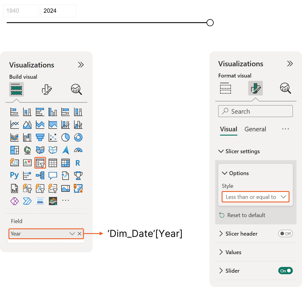 Figure 2.1 Create a year slicer
2. Create measures for the x-axis, y-axis, and bubble size
Scatterplots show the relationship between two different metrics using the X and Y axes. You can also introduce a third metric by changing the size of the bubbles. While the best setup depends on what story you want to tell, here is the recommended configuration:
-
X-Axis: CO₂ Emissions Per Capita → This shows the "intensity" of emissions per person. It’s a great way to compare the efficiency or lifestyle of different countries or years.
-
Y-Axis: Temperature Anomalies → This is the "result" or the impact. By putting it on the vertical axis, you can clearly see if the chart "climbs" higher as emissions increase.
-
Bubble Size: Annual CO₂ Emissions → This represents the "total weight." It helps distinguish between a small country with high per-capita emissions and a massive country (like China or the USA) that is driving the global total.
This setup creates a "story" on your screen. As you move from left to right (Per Capita), you see how individual consumption changes. As you move up (Anomalies), you see the planet warming. The Size of the bubbles then adds the necessary context of scale, ensuring that tiny nations don't look as influential as global superpowers.
⚠️ Important Note ⚠️
You generally should not plot Population against Temperature Anomalies. Temperature anomalies are a global or regional environmental result, while population is a local demographic stat. There isn't a direct logical correlation between one country's population size and its specific temperature anomaly in the same way there is with its carbon output.
Measure #01: Average Temperature Anomalies
_01 Average Temperature Anomaly = AVERAGE( 'annual-temperature-anomalies'[Temperature anomaly] )Measure #02: Average CO₂ Emissions per Capita
_01 Average CO₂ emissions per capita = AVERAGE( 'co-emissions-per-capita'[Annual CO₂ emissions (per capita)] )Measure #03: Annual CO₂ Emissions
_01 Annual CO₂ emissions (Gt) = SUM( 'annual-co2-emissions-per-country'[Annual CO₂ emissions] ) /1000000000The value is divided by 1 000 000 000 for concise display, making the unit gigaton (Gt)
Measure #04: Total Population
_01 Total Population = MAX( 'population-unwpp'[Population] )Our dynamic scatterplot requires values from the most recent year in the selection.
Because the Annual CO₂ Emissions metric is pre-aggregated as a running total, the value for any given year represents the final cumulative amount to date. To avoid double-counting, our measures should retrieve the specific value for the selected year rather than calculating a sum.
Measure #05: Annual CO₂ Emissions for Latest Selected Year
_02 Last_Annual CO₂ emissions =
VAR LastYear =
  MAXX (
      ALLSELECTED ( 'Dim_Date'[Year] ),
      'Dim_Date'[Year]
  )

RETURN
CALCULATE (
  [_01 Annual CO₂ emissions (Gt)],
  'Dim_Date'[Year] = LastYear
  )
This measure calculates the CO₂ emissions for the most recent year in your current filter context, regardless of what's selected in your report.
Read the explanation
Breaking It Down Step-by-Step
Step 1: Find the Most Recent Year
VAR LastYear = MAXX ( ALLSELECTED ( 'Dim_Date'[Year] ), 'Dim_Date'[Year] )What's happening here:
-
ALLSELECTED('Dim_Date'[Year])removes all filters from the Year column but keeps any filters applied by slicers or visual filters -
MAXX(...)finds the maximum (latest) year from those available years -
This value is stored in a variable called
LastYear
Example: If your data contains years 2018-2023 and a user has filtered to 2020-2023, LastYear will be 2023.
Step 2: Calculate Emissions for That Year
RETURN CALCULATE ( [_01 Annual CO₂ emissions (Gt)], 'Dim_Date'[Year] = LastYear )What's happening here:
-
CALCULATEmodifies the filter context to calculate your base measure -
[_01 Annual CO₂ emissions (Gt)]is your existing measure that calculates annual emissions -
'Dim_Date'[Year] = LastYearforces the calculation to only use data from the latest year we found in Step 1
The same logic applies to the remaining metrics to find their values for latest selected year
Measure #06: CO₂ Emissions per Capita for Latest Selected Year
_02 Last_CO₂ emissions per capita =
VAR LastYear =
  MAXX (
      ALLSELECTED ( 'Dim_Date'[Year] ),
      'Dim_Date'[Year]
  )

RETURN
CALCULATE (
  [_01 Average CO₂ emissions per capita],
  'Dim_Date'[Year] = LastYear
  )
This measure calculates the CO₂ emissions per person for the most recent year in your current filter context, regardless of what's selected in your report.
Read the explanation
Breaking It Down Step-by-Step
Step 1: Find the Most Recent Year
VAR LastYear = MAXX ( ALLSELECTED ( 'Dim_Date'[Year] ), 'Dim_Date'[Year] )What's happening here:
-
ALLSELECTED('Dim_Date'[Year])removes all filters from the Year column but keeps any filters applied by slicers or visual filters -
MAXX(...)finds the maximum (latest) year from those available years -
This value is stored in a variable called
LastYear
Example: If your data contains years 2018-2023 and a user has filtered to 2020-2023, LastYear will be 2023.
Step 2: Calculate Per Capita Emissions for That Year
RETURN CALCULATE ( [_01 Average CO₂ emissions per capita], 'Dim_Date'[Year] = LastYear )What's happening here:
-
CALCULATEmodifies the filter context to calculate your base measure -
[_01 Average CO₂ emissions per capita]is your existing measure that calculates emissions per person -
'Dim_Date'[Year] = LastYearforces the calculation to only use data from the latest year we found in Step 1
Measure #07: Temperature Anomalies for Latest Selected Year
_02 Last_Temp. anomaly =
VAR LastYear =
  MAXX (
      ALLSELECTED ( 'Dim_Date'[Year] ),
      'Dim_Date'[Year]
  )

RETURN
CALCULATE (
  [_01 Average Temperature Anomaly],
  'Dim_Date'[Year] = LastYear
  )
This measure calculates the temperature anomaly (deviation from normal temperature) for the most recent year in your current filter context, regardless of what's selected in your report.
Read the explanation
Breaking It Down Step-by-Step
Step 1: Find the Most Recent Year
VAR LastYear = MAXX ( ALLSELECTED ( 'Dim_Date'[Year] ), 'Dim_Date'[Year] )What's happening here:
-
ALLSELECTED('Dim_Date'[Year])removes all filters from the Year column but keeps any filters applied by slicers or visual filters -
MAXX(...)finds the maximum (latest) year from those available years -
This value is stored in a variable called
LastYear
Example: If your data contains years 2018-2023 and a user has filtered to 2020-2023, LastYear will be 2023.
Step 2: Calculate Temperature Anomaly for That Year
RETURN CALCULATE ( [_01 Average Temperature Anomaly], 'Dim_Date'[Year] = LastYear )What's happening here:
-
CALCULATEmodifies the filter context to calculate your base measure -
[_01 Average Temperature Anomaly]is your existing measure that calculates how much temperature has deviated from the baseline (usually measured in degrees Celsius) -
'Dim_Date'[Year] = LastYearforces the calculation to only use data from the latest year we found in Step 1
Measure #08: Total Population for Latest Selected Year
_02 Last_Total Population =
VAR LastYear =
  MAXX (
      ALLSELECTED ( 'Dim_Date'[Year] ),
      'Dim_Date'[Year]
  )

RETURN
CALCULATE (
  [_01 Total Population],
  'Dim_Date'[Year] = LastYear
  )
This measure calculates the total population for the most recent year in your current filter context, regardless of what's selected in your report.
Read the explanation
Breaking It Down Step-by-Step
Step 1: Find the Most Recent Year
VAR LastYear = MAXX ( ALLSELECTED ( 'Dim_Date'[Year] ), 'Dim_Date'[Year] )What's happening here:
-
ALLSELECTED('Dim_Date'[Year])removes all filters from the Year column but keeps any filters applied by slicers or visual filters -
MAXX(...)finds the maximum (latest) year from those available years -
This value is stored in a variable called
LastYear
Example: If your data contains years 2018-2023 and a user has filtered to 2020-2023, LastYear will be 2023.
Step 2: Calculate Total Population for That Year
RETURN CALCULATE ( [_01 Total Population], 'Dim_Date'[Year] = LastYear )What's happening here:
-
CALCULATEmodifies the filter context to calculate your base measure -
[_01 Total Population]is your existing measure that calculates the total population (could be for a country, region, or the world) -
'Dim_Date'[Year] = LastYearforces the calculation to only use data from the latest year we found in Step 1
Countries are not static; a nation that was considered "Low Income" in 1990 might have progressed to "Middle Income" by 2024. Our dataset tracks these changes year-by-year from 1987 to 2024.
To make sure our scatter plot reflects reality, we don't want to show a country’s current status if we are looking at a chart from 1995. We need the income group to "travel in time" with our data. We will use the following DAX measure to identify the specific income group assigned to a country based on the latest year selected in your slicer. This ensures that as you move through time, the colors and categories on your chart update automatically.
Measure #09: Income Group for Latest Selected Year
_02 Last_Income Group =
VAR LastYear =
  MAXX (
      ALLSELECTED ( 'Dim_Date'[Year] ),
      'Dim_Date'[Year]
  )

RETURN
CALCULATE (
  SELECTEDVALUE( 'world-bank-income-groups'[Income Group_Abbr] ),
  'Dim_Date'[Year] = LastYear
  )
This measure retrieves the income group classification (like "High", "Upper-middle", "Lower-middle", "Low") for the most recent year in your current filter context. This is important because countries can move between income categories over time as their economies develop.
Read the explanation
Breaking It Down Step-by-Step
Step 1: Find the Most Recent Year
VAR LastYear = MAXX ( ALLSELECTED ( 'Dim_Date'[Year] ), 'Dim_Date'[Year] )What's happening here:
-
ALLSELECTED('Dim_Date'[Year])removes all filters from the Year column but keeps any filters applied by slicers or visual filters -
MAXX(...)finds the maximum (latest) year from those available years -
This value is stored in a variable called
LastYear
Example: If your data contains years 2018-2023 and a user has filtered to 2020-2023, LastYear will be 2023.
Step 2: Get the Income Group for That Year
RETURN CALCULATE (
  SELECTEDVALUE( 'world-bank-income-groups'[Income Group_Abbr] ),
  'Dim_Date'[Year] = LastYear
)
What's happening here:
-
CALCULATEmodifies the filter context -
SELECTEDVALUE('world-bank-income-groups'[Income Group_Abbr])retrieves the income group abbreviation when exactly one value is in context -
'Dim_Date'[Year] = LastYearforces the lookup to use only the latest year -
Returns the abbreviated income group (e.g., "H" for High, "UM" for Upper-middle, "LM" for Lower-middle, "L" for Low)
3. Add world benchmark information to help users compare results
To add more context to the analysis, we compare each country’s performance against a world benchmark for each metric. This helps readers quickly see which countries are performing above or below the global average.
3.1. Create measures that calculate global averages or totals
Each fact table already includes a single row that represents the world (global) value, which simplifies this step. You can create measures that reference this row and return the corresponding value for the latest year selected in the slicer.
Measure #10: World Benchmark_Temperature Anomalies
World Last_Temp. Anomaly =
VAR LastYear =
MAXX (
  ALLSELECTED ( 'Dim_Date'[Year] ),
  'Dim_Date'[Year]
)

RETURN
CALCULATE (
  [_02 Last_Temp. anomaly],
  REMOVEFILTERS ( 'Dim_Entity' ),
  REMOVEFILTERS ( 'annual-temperature-anomalies'[Entity] ),
  'annual-temperature-anomalies'[Entity] = "World",
  'Dim_Date'[Year] = LastYear
)
This measure returns the latest world (global) temperature anomaly based on the year selected in the slicer. It ignores country-level filters and always shows the World value for the most recent year in the selected range.
Read the explanation
1. Find the latest selected year
VAR LastYear =
MAXX (
  ALLSELECTED ( 'Dim_Date'[Year] ),
  'Dim_Date'[Year]
)-
ALLSELECTED('Dim_Date'[Year])looks at the years currently selected by the year slicer. -
MAXX(...)finds the largest (latest) year from that selection. -
The result is stored in a variable called
LastYear.
This ensures the measure always uses the most recent year the user selected, not just the current filter context.
2. Calculate the world value for that year
RETURN
CALCULATE (
  [_02 Last_Temp. anomaly],
  REMOVEFILTERS ( 'Dim_Entity' ),
  REMOVEFILTERS ( 'annual-temperature-anomalies'[Entity] ),
  'annual-temperature-anomalies'[Entity] = "World",
  'Dim_Date'[Year] = LastYear
)
Inside CALCULATE, we control exactly what data is used:
-
[_02 Last_Temp. anomaly]→ This is the base measure that calculates temperature anomaly. -
REMOVEFILTERS('Dim_Entity')andREMOVEFILTERS('annual-temperature-anomalies'[Entity])→ These remove any country or entity filters (for example, when a specific country is selected). -
'annual-temperature-anomalies'[Entity] = "World"→ Forces the calculation to use the World (global) row only. -
'Dim_Date'[Year] = LastYear→ Limits the calculation to the latest year selected in the slicer.
Measure #11: World Benchmark_CO₂ Emissions per Capita
World Last_CO₂ emissions per capita =
VAR LastYear =
MAXX (
  ALLSELECTED ( 'Dim_Date'[Year] ),
  'Dim_Date'[Year]
)

RETURN
CALCULATE (
  [_02 Last_CO₂ emissions per capita],
  REMOVEFILTERS ( 'Dim_Entity' ),
  REMOVEFILTERS ( 'co-emissions-per-capita'[Entity] ),
  'co-emissions-per-capita'[Entity] = "World",
  'Dim_Date'[Year] = LastYear
)
This measure returns the latest world (global) CO₂ emissions per capita based on the year selected in the slicer. It ignores country-level filters and always shows the World value for the most recent selected year.
Measure #12: World Benchmark_Annual CO₂ Emissions
World Last_Annual CO₂ emissions =
VAR LastYear =
MAXX (
  ALLSELECTED ( 'Dim_Date'[Year] ),
  'Dim_Date'[Year]
)

RETURN
CALCULATE (
  [_02 Last_Annual CO₂ emissions],
  REMOVEFILTERS ( 'Dim_Entity' ),
  REMOVEFILTERS ( 'annual-co2-emissions-per-country'[Entity] ),
  'annual-co2-emissions-per-country'[Entity] = "World",
  'Dim_Date'[Year] = LastYear
)
This measure returns the latest world (global) annual CO₂ emissions based on the year selected in the slicer. It ignores country-level filters and always shows the World value for the most recent selected year.
Measure #13: World Benchmark_Total Population
World Last_Total Population =
VAR LastYear =
MAXX (
  ALLSELECTED ( 'Dim_Date'[Year] ),
  'Dim_Date'[Year]
)

RETURN
CALCULATE (
  [_02 Last_Total Population],
  REMOVEFILTERS ( 'Dim_Entity' ),
  REMOVEFILTERS ( 'population-unwpp'[Entity] ),
  'population-unwpp'[Entity] = "World",
  'Dim_Date'[Year] = LastYear
)
This measure returns the latest world (global) total population based on the year selected in the slicer. It ignores country-level filters and always shows the World value for the most recent selected year.
3.2. Show benchmark lines on the scatterplot
After creating the DAX measures for the world benchmarks, we display these values on the scatterplot. The benchmarks shown on the scatterplot are CO₂ emissions per capita and annual temperature anomalies, as these are the two metrics used on the x-axis and y-axis of the chart.
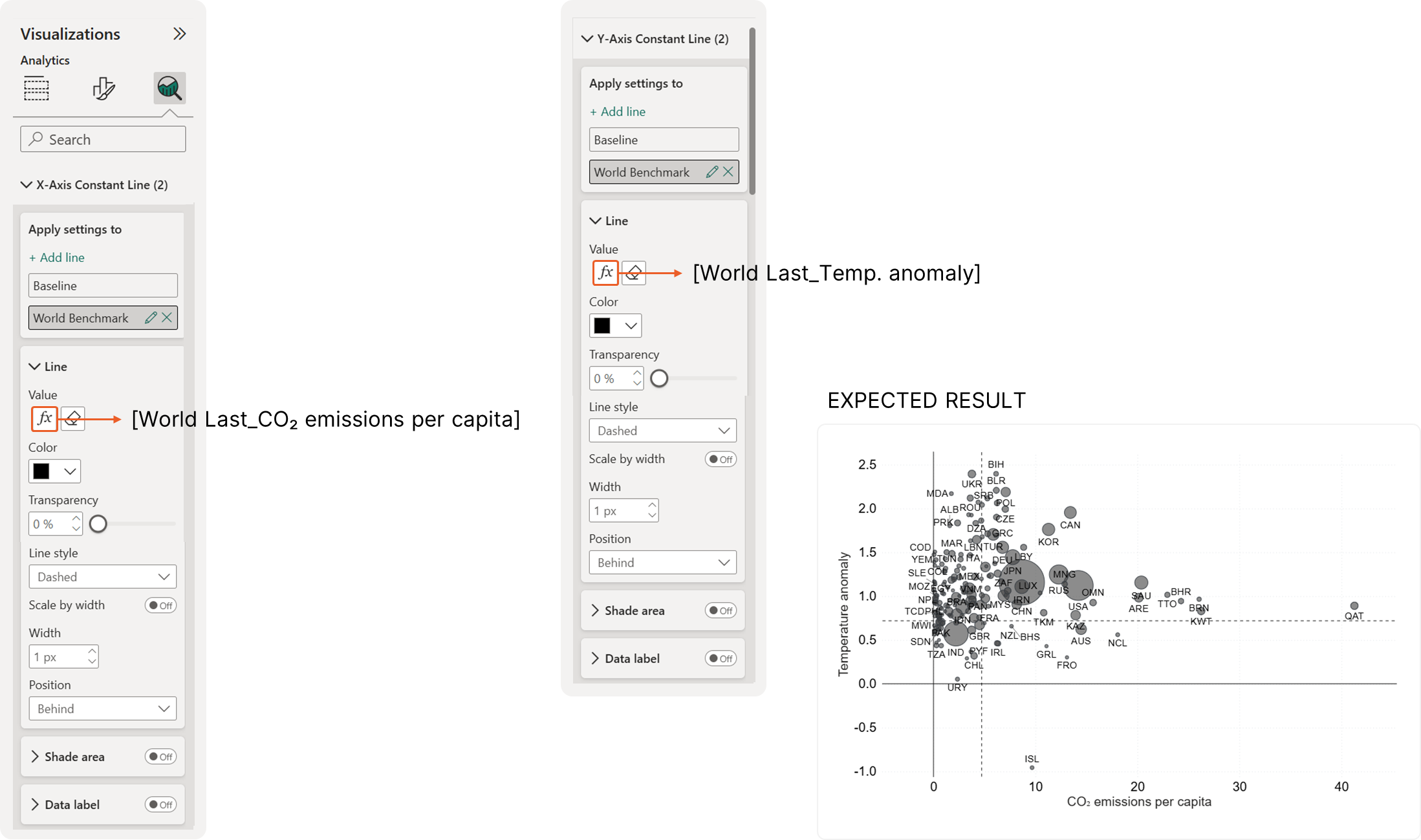 Figure 3.1 Show benchmark lines on the scatterplot
3.3. Display benchmark values using KPI cards
To give more context, we will use a Card visual to display the world benchmark values. Add the following metrics to the Values field: Total Population, Temperature Anomaly, CO₂ Emissions per Capita, and Annual CO₂ Emissions. Then, apply the settings below.
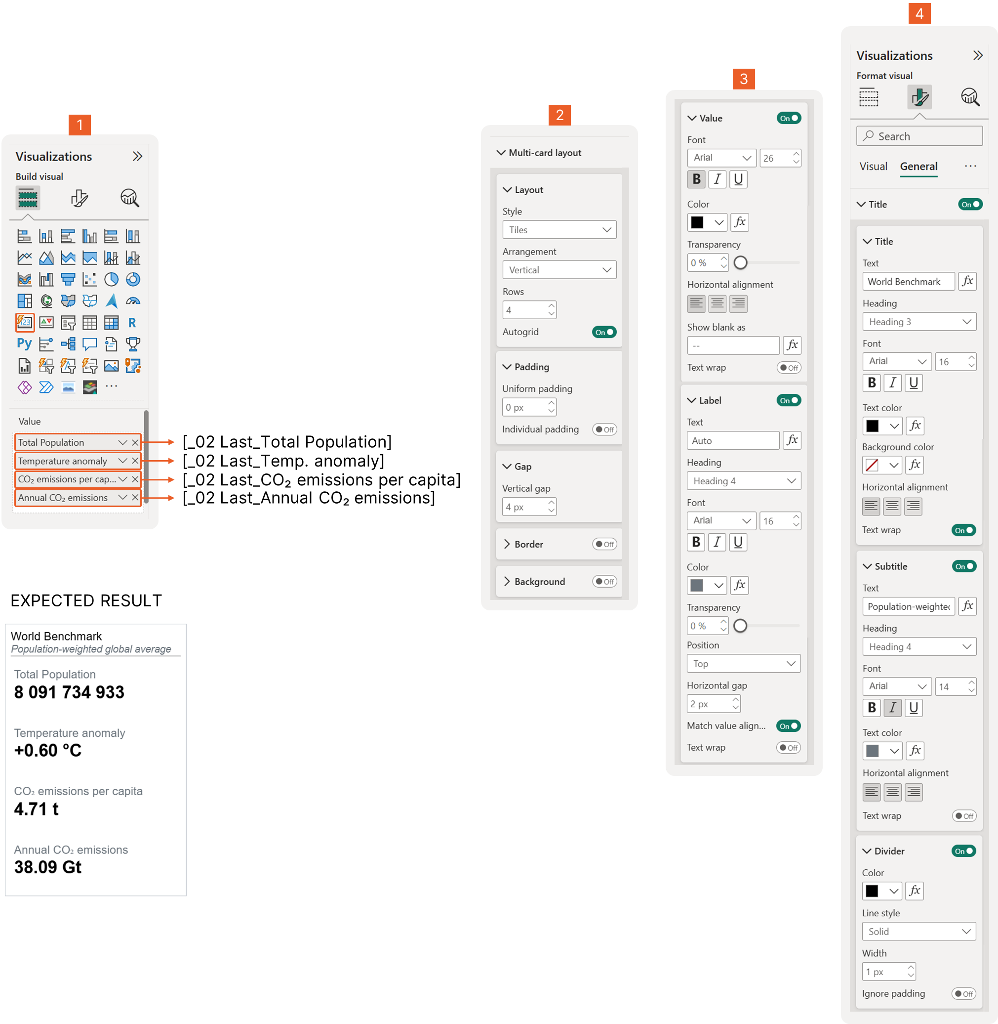 Figure 3.2 Display benchmark values using KPI cards
4. Add conditional formatting based on a selected highlighting option
4.1. Create a disconnected table to store highlighting options
To create a truly interactive scatterplot, we need a way to tell Power BI exactly which bubbles to highlight and which to fade into the background. We do this by creating a Cluster/Segment Table. This is a "disconnected" table—it doesn't link to your data model. Instead, it acts as a style guide for your scatterplot markers.
What each column in this DAX table does:
-
Cluster: This is the "Theme" the user chooses from a slicer (e.g., Top 3 Temperature Anomaly or High Emitters).
-
Segment: This tells Power BI if a marker belongs to the Selected group (the ones we want to pop) or the Unselected group (the ones we want to fade).
-
Color: This contains the specific Hex Codes. Notice that for most clusters, we use Orange (#FF6600) for "Selected" markers and Grey (#CED4DA) for everything else.
-
Segment/Cluster Index: These are hidden "sorting" columns that ensure your slicers and legends appear in a logical order rather than just alphabetically.
How this works for the user:
When a user selects a cluster like "High Warming" from a slicer:
-
Power BI looks at this table to find the color rules for that cluster.
-
The markers (bubbles) that meet your "High Warming" criteria turn bright orange.
-
All other markers turn light grey, making the important data stand out instantly.
Disconnected Table 2: Cluster/Segment Table
Cluster/Segment Table =
DATATABLE (
  "Cluster", STRING,
  "Segment", STRING,
  "Segment Index", INTEGER,
  "Cluster Index", INTEGER,
  "Color", STRING,
  {
      { "None",                                   "All Items",                   1, 1, "#404040" },
      { "Income Group",                           "High",                        2, 2, "#0D8553" },
      { "Income Group",                           "Upper-middle",                3, 2, "#A1CB81" },
      { "Income Group",                           "Lower-middle",                4, 2, "#DF9FDB" },
      { "Income Group",                           "Low",                         5, 2, "#974E94" },
      { "Income Group",                           "",                            6, 2, "#CED4DA" },
      { "High Emitters",                          "Selected",                    7, 3, "#FF6600" },
      { "High Emitters",                          "Unselected",                  8, 3, "#CED4DA" },
      { "High Warming",                           "Selected",                    9, 4, "#FF6600" },
      { "High Warming",                           "Unselected",                  10, 4, "#CED4DA" },
      { "High Emissions, High Warming",           "Selected",                    11, 5, "#FF6600" },
      { "High Emissions, High Warming",           "Unselected",                  12, 5, "#CED4DA" },
      { "High Emissions, Lower Warming",          "Selected",                    13, 6, "#FF6600" },
      { "High Emissions, Lower Warming",          "Unselected",                  14, 6, "#CED4DA" },
      { "Low Emissions, High Warming",            "Selected",                    15, 7, "#FF6600" },
      { "Low Emissions, High Warming",            "Unselected",                  16, 7, "#CED4DA" },
      { "Low Emissions, Lower Warming",           "Selected",                    17, 7, "#FF6600" },
      { "Low Emissions, Lower Warming",           "Unselected",                  18, 7, "#CED4DA" },
      { "Top 3 Temperature Anomaly",              "Selected",                    19, 8, "#FF6600" },
      { "Top 3 Temperature Anomaly",              "Unselected",                  20, 8, "#CED4DA" },
      { "Top 5 CO₂ Annual Emitters",              "Selected",                    21, 9, "#FF6600" },
      { "Top 5 CO₂ Annual Emitters",              "Unselected",                  22, 9, "#CED4DA" },
      { "Top 3 CO₂ Per Capita Emitters",          "Selected",                    23, 10, "#FF6600"},
      { "Top 3 CO₂ Per Capita Emitters",          "Unselected",                  24, 10, "#CED4DA"}
  }
)
This DAX creates a static table called Cluster/Segment Table directly inside Power BI.
→ It is not calculated from your data model.
→ It is a helper (lookup) table used for:
-
Grouping countries/items into clusters
-
Controlling segment labels
-
Managing sorting
-
Driving consistent colors in visuals
Read the explanation
Why use DATATABLE?
DATATABLE ( ... )DATATABLE is used when:
-
You want fixed values
-
The table does not change with filters
-
You need full control over labels, order, and colors
Think of it like manually creating a table in Excel—but using DAX.
Column-by-column explanation
1️⃣ Cluster (STRING)
"Cluster", STRING,-
This is the main category (high-level grouping)
-
Examples:
- Income Group
- High Emitters
- High Warming
- Top 5 CO₂ Annual Emitters
Used for slicers, grouping visuals, and logic in measures
2️⃣ Segment (STRING)
"Segment", STRING,-
This is the sub-category inside each cluster
-
Examples:
- High / Low / Upper-middle
- Selected / Unselected
- All Items
Often used for:
-
Highlighting selected vs unselected countries
-
Legend values
-
Conditional logic
3️⃣ Segment Index (INTEGER)
"Segment Index", INTEGER,-
A sorting column
-
Ensures segments appear in the correct order
Example:
-
“High” comes before “Low”
-
“Selected” comes before “Unselected”
→ This prevents Power BI from sorting alphabetically.
4️⃣ Cluster Index (INTEGER)
"Cluster Index", INTEGER,-
Controls the order of clusters
-
Useful when:
- Displaying clusters in slicers
- Sorting visuals consistently
Best practice: Always add index columns for front-end control.
5️⃣ Color (STRING)
"Color", STRING,-
Stores HEX color codes
-
Used for:
- Conditional formatting
- Dynamic colors in charts
- Highlighting selected groups
Example:
-
#FF6600→ highlight (Selected) -
#CED4DA→ greyed out (Unselected)
Understanding the rows (data part)
Each row follows this structure:
{ "Cluster", "Segment", SegmentIndex, ClusterIndex, "Color" }
Example 1: Income Group
{ "Income Group", "High", 2, 2, "#0D8553" }
Means:
-
Cluster: Income Group
-
Segment: High income
-
Sorted second within Income Group
-
Uses a green color
Example 2: Selected vs Unselected logic
{ "High Emitters", "Selected", 7, 3, "#FF6600" }
{ "High Emitters", "Unselected", 8, 3, "#CED4DA" }
Used to:
-
Highlight selected countries in orange
-
Grey out unselected ones
-
Create focus + context visuals
This is classic advanced Power BI storytelling.
Example 3: Benchmarks (Top N)
{ "Top 5 CO₂ Annual Emitters", "Selected", 21, 9, "#FF6600" }
Typically used when:
-
Showing Top N countries
-
Highlighting leaders
-
Comparing against the rest of the world
How this table is typically used in a report
You would use this table to:
✔ Control slicers
✔ Drive conditional formatting
✔ Handle Selected vs Unselected logic
✔ Maintain consistent colors across visuals
✔ Avoid hard-coding logic in measures
Instead of writing complex IF statements everywhere, you centralize logic here.
4.2. Add a slicer so users can choose how to highlight the data
Next, create a slicer and add the ‘Cluster/Segment Table’[Cluster] column to it. This slicer lets users choose a highlighting option. In the next step, we will connect this slicer to the scatterplots so that, when a selection is made, the scatterplot bubbles change color based on the selected option.
4.3. Use DAX to change bubble colors dynamically based on the selected option
Now that our setup is ready, we need to tell Power BI exactly which colors to use and when. We will create a DAX measure that acts like a set of rules. This measure will check which indicator you’ve selected in your slicer and then "assign" the correct color to the markers on your chart. By using a measure instead of a static color, your scatterplot becomes fully interactive—changing its look instantly based on your selection.
Measure #14: Color Conditional Formatting (based on selected cluster)
CF by Selected Cluster =
VAR SelectedCluster = SELECTEDVALUE ( 'Cluster/Segment Table'[Cluster], "None" )
VAR IncomeGroup = [_02 Last_Income Group]
VAR IsHighEmitter = [_02 Last_CO₂ emissions per capita] > [World Last_CO₂ emissions per capita]
VAR IsLowEmitter = [_02 Last_CO₂ emissions per capita] < [World Last_CO₂ emissions per capita]
VAR IsHighWarming = [_02 Last_Temp. anomaly] > [World Last_Temp. anomaly]
VAR IsLowWarming = [_02 Last_Temp. anomaly] < [World Last_Temp. anomaly]
VAR IsHighEmitterHighWarming = IsHighEmitter && IsHighWarming
VAR IsHighEmitterLowWarming = IsHighEmitter && IsLowWarming
VAR IsLowEmitterHighWarming = IsLowEmitter && IsHighWarming
VAR IsLowEmitterLowWarming = IsLowEmitter && IsLowWarming

VAR TempAnomaly =
  RANKX (
      ALLSELECTED ( Dim_Entity ),
      CALCULATE ( [_02 Last_Temp. anomaly] ),
      ,
      DESC,
      DENSE
  )

VAR IsTopContributorsTemp = TempAnomaly <= 3 && NOT ISBLANK([_02 Last_Temp. anomaly])

VAR AnnualEmissionsRank =
  RANKX (
      ALLSELECTED ( Dim_Entity ),
      CALCULATE ( [_02 Last_Annual CO₂ emissions] ),
      ,
      DESC,
      DENSE
  )

VAR IsTopContributorsAnnual = AnnualEmissionsRank <= 5 && NOT ISBLANK([_02 Last_Annual CO₂ emissions])
--

VAR EmissionPerCapitaRank =
  RANKX (
      ALLSELECTED ( Dim_Entity ),
      CALCULATE ( [_02 Last_CO₂ emissions per capita] ),
      ,
      DESC,
      DENSE
  )

VAR IsTopContributorsPerCapita = EmissionPerCapitaRank <= 3 && NOT ISBLANK([_02 Last_CO₂ emissions per capita])
--

VAR SegmentName =
  SWITCH (
      TRUE (),
      SelectedCluster = "None", "All Items",
      SelectedCluster = "Income Group" && IncomeGroup = "High", "High",
      SelectedCluster = "Income Group" && IncomeGroup = "Upper-middle", "Upper-middle",
      SelectedCluster = "Income Group" && IncomeGroup = "Lower-middle", "Lower-middle",
      SelectedCluster = "Income Group" && IncomeGroup = "Low", "Low",
      SelectedCluster = "Income Group" && IncomeGroup = "", "",
      SelectedCluster = "High Emitters" && IsHighEmitter, "Selected",
      SelectedCluster = "High Emitters" && NOT IsHighEmitter, "Unselected",
      SelectedCluster = "High Warming" && IsHighWarming, "Selected",
      SelectedCluster = "High Warming" && NOT IsHighWarming, "Unselected",
      SelectedCluster = "High Emissions, High Warming" && IsHighEmitterHighWarming, "Selected",
      SelectedCluster = "High Emissions, High Warming" && NOT IsHighEmitterHighWarming, "Unselected",
      SelectedCluster = "High Emissions, Lower Warming" && IsHighEmitterLowWarming, "Selected",
      SelectedCluster = "High Emissions, Lower Warming" && NOT IsHighEmitterLowWarming, "Unselected",
      SelectedCluster = "Low Emissions, High Warming" && IsLowEmitterHighWarming, "Selected",
      SelectedCluster = "Low Emissions, High Warming" && NOT IsLowEmitterHighWarming, "Unselected",
      SelectedCluster = "Low Emissions, Lower Warming" && IsLowEmitterLowWarming, "Selected",
      SelectedCluster = "Low Emissions, Lower Warming" && NOT IsLowEmitterLowWarming, "Unselected",
      SelectedCluster = "Top 3 Temperature Anomaly" && IsTopContributorsTemp, "Selected",
      SelectedCluster = "Top 3 Temperature Anomaly" && NOT IsTopContributorsTemp, "Unselected",
      SelectedCluster = "Top 5 CO₂ Annual Emitters" && IsTopContributorsAnnual, "Selected",
      SelectedCluster = "Top 5 CO₂ Annual Emitters" && NOT IsTopContributorsAnnual, "Unselected",
      SelectedCluster = "Top 3 CO₂ Per Capita Emitters" && IsTopContributorsPerCapita, "Selected",
      SelectedCluster = "Top 3 CO₂ Per Capita Emitters" && NOT IsTopContributorsPerCapita, "Unselected",
      "All Items"
  )

RETURN
  CALCULATE (
      SELECTEDVALUE ( 'Cluster/Segment Table'[Color] ),
      'Cluster/Segment Table'[Cluster] = SelectedCluster,
      'Cluster/Segment Table'[Segment] = SegmentName
  )
CF by Selected Cluster is a conditional formatting measure. Its job is to return a color (HEX code) based on what the user selects in the Cluster slicer and how each country/entity compares to the world benchmark
This is typically used to color bubbles in a scatterplot:
-
Highlight selected countries in orange
-
Fade out the rest in grey
-
Change logic dynamically based on slicer choice
Read the explanation
Step 1: Read the slicer selection
VAR SelectedCluster =
SELECTEDVALUE ( 'Cluster/Segment Table'[Cluster], "None" )-
Gets the value selected in the Cluster slicer
-
If nothing is selected → defaults to
"None"
This controls which highlighting rule is active.
Step 2: Read base data for the current country
VAR IncomeGroup = [_02 Last_Income Group]Gets the income group of the current entity (e.g., country)
Step 3: Compare country vs world benchmark
These variables classify each country.
Emissions comparison
VAR IsHighEmitter =
  [_02 Last_CO₂ emissions per capita] > [World Last_CO₂ emissions per capita]

VAR IsLowEmitter =
  [_02 Last_CO₂ emissions per capita] < [World Last_CO₂ emissions per capita]
Checks if a country emits more or less CO₂ per capita than the world average.
Temperature comparison
VAR IsHighWarming =
  [_02 Last_Temp. anomaly] > [World Last_Temp. anomaly]

VAR IsLowWarming =
  [_02 Last_Temp. anomaly] < [World Last_Temp. anomaly]
Checks if a country is warming more or less than the world average.
Step 4: Combined conditions (advanced clustering)
VAR IsHighEmitterHighWarming = IsHighEmitter && IsHighWarming
VAR IsHighEmitterLowWarming  = IsHighEmitter && IsLowWarming
VAR IsLowEmitterHighWarming  = IsLowEmitter && IsHighWarming
VAR IsLowEmitterLowWarming   = IsLowEmitter && IsLowWarming
These create four quadrants:
-
High emissions + high warming
-
High emissions + low warming
-
Low emissions + high warming
-
Low emissions + low warming
This is very common in scatterplot storytelling.
Step 5: Rank entities (Top N logic)
Top 3 temperature anomaly
VAR TempAnomaly =
  RANKX (
      ALLSELECTED ( Dim_Entity ),
      CALCULATE ( [_02 Last_Temp. anomaly] ),
      ,
      DESC,
      DENSE
)-
Ranks countries by temperature anomaly
-
Respects slicers (
ALLSELECTED) -
Highest anomaly = rank 1
VAR IsTopContributorsTemp =
  TempAnomaly <= 3 && NOT ISBLANK([_02 Last_Temp. anomaly])
Flags Top 3 warming countries.
Top 5 annual CO₂ emitters
VAR AnnualEmissionsRank =
  RANKX (
      ALLSELECTED ( Dim_Entity ),
      CALCULATE ( [_02 Last_Annual CO₂ emissions] ),
      ,
      DESC,
      DENSE
  )

VAR IsTopContributorsAnnual =
  AnnualEmissionsRank <= 5 && NOT ISBLANK([_02 Last_Annual CO₂ emissions])
Flags Top 5 total CO₂ emitters.
Top 3 CO₂ per capita emitters
VAR EmissionPerCapitaRank =
  RANKX (
      ALLSELECTED ( Dim_Entity ),
      CALCULATE ( [_02 Last_CO₂ emissions per capita] ),
      ,
      DESC,
      DENSE
  )

VAR IsTopContributorsPerCapita =
  EmissionPerCapitaRank <= 3 && NOT ISBLANK([_02 Last_CO₂ emissions per capita])
Flags Top 3 per-capita emitters.
Step 6: Decide the segment name
This is the core decision logic.
VAR SegmentName =
  SWITCH (
      TRUE (),
      ...
  )
How this works
-
SWITCH(TRUE())checks conditions top to bottom -
The first TRUE condition wins
-
Returns a Segment name like:
"High""Selected""Unselected""All Items"
Example logic (simplified)
SelectedCluster = "High Emitters" && IsHighEmitter, "Selected"
SelectedCluster = "High Emitters" && NOT IsHighEmitter, "Unselected"
Meaning:
-
If the slicer is High Emitters
-
Countries above world average → Selected
-
Everyone else → Unselected
Same pattern applies to:
-
Income groups
-
Warming categories
-
Combined emission + warming groups
-
Top N contributors
Step 7: Return the color
RETURN
  CALCULATE (
      SELECTEDVALUE ( 'Cluster/Segment Table'[Color] ),
      'Cluster/Segment Table'[Cluster] = SelectedCluster,
      'Cluster/Segment Table'[Segment] = SegmentName
  )
What happens here
-
Looks up the Color from the
Cluster/Segment Table -
Matches:
- Selected Cluster
- Calculated Segment name
-
Returns a HEX color code
This color is then used in:
-
Scatterplot bubbles
-
Conditional formatting rules
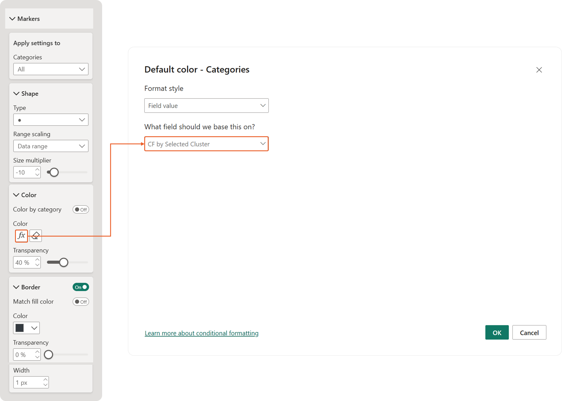 Figure 4.3 Applying Dynamic Color Formatting for Scatterplot Bubbles
4.4. Update legends automatically to match the selected highlight indicator
Standard legends in Power BI can be rigid. To make our report feel premium and interactive, we will build a custom legend using a Table visual. This legend will update automatically to show only the categories related to the user's selection.
How to build it:
-
Create the Table: Add a new Table visual to your report. Place it next to your scatterplot.
-
Add the Fields: Drag
[Segment Index]and[Segment]from your Cluster/Segment Table into the "Columns" field. -
Color the "Markers": We want the index numbers to look like color swatches.
- Go to the Format Pane and navigate to Cell elements.
- Select the Segment Index column from the dropdown.
- Turn on both Background color and Font color.
- In the settings for both, choose Field value as the style and select the
[Color]column. (By making the font and background the same color, the number disappears and becomes a solid colored square!)
- Clean Up the Visual: Remove gridlines and the total row to make it look like a seamless part of the chart.
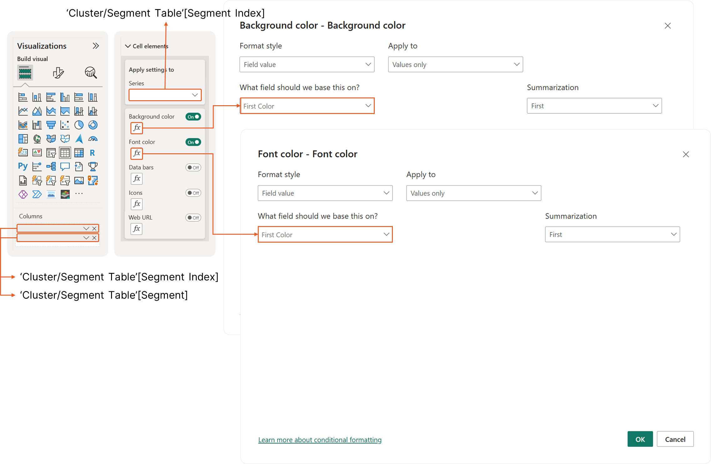 Figure 4.4 Update legends automatically to match the selected highlight indicator
4.5. Change titles, subtitles, and descriptions dynamically to explain what users are seeing
In this step, we will add dynamic chart titles, subtitles, and descriptions that update automatically based on the selected highlighting indicator. To do this, create DAX measures that use the SWITCH function to change each title, subtitle, and description according to the user’s selection.
Measure #15: Dynamic Scatterplot Title
_01 Dynamic Scatterplot Title (based on selected highlighting indicator) =
VAR _SelectedIndicator = SELECTEDVALUE( 'Cluster/Segment Table'[Cluster] )

RETURN
  SWITCH (
      TRUE (),

      _SelectedIndicator = "Income Group",
      "[Dynamic Title Placeholder 1]", -- change the title here

      _SelectedIndicator = "High Emitters",
      "[Dynamic Title Placeholder 2]",

      _SelectedIndicator = "High Warming",
      "[Dynamic Title Placeholder 3]",

      _SelectedIndicator = "High Emissions, High Warming",
      "[Dynamic Title Placeholder 4]",

      _SelectedIndicator = "High Emissions, Lower Warming",
      "[Dynamic Title Placeholder 5]",

      _SelectedIndicator = "Low Emissions, High Warming",
      "[Dynamic Title Placeholder 6]",

      _SelectedIndicator = "Low Emissions, Lower Warming",
      "[Dynamic Title Placeholder 7]",

      _SelectedIndicator = "Top 3 Temperature Anomaly",
      "[Dynamic Title Placeholder 8]",

      _SelectedIndicator = "Top 5 CO₂ Annual Emitters",
      "[Dynamic Title Placeholder 9]",

      _SelectedIndicator = "Top 3 CO₂ Per Capita Emitters",
      "[Dynamic Title Placeholder 10]",

      /* default */
      BLANK()
  )
This is a text measure used to create a dynamic chart title. The chart title changes automatically based on what the user selects in the Highlighting Indicator (Cluster) slicer. This measure will be placed in: Scatterplot → Title → fx (Conditional formatting)
Read the explanation
Step 1: Read the slicer selection
VAR _SelectedIndicator =
SELECTEDVALUE ( 'Cluster/Segment Table'[Cluster] )-
Gets the currently selected value from the Cluster slicer
-
Example values:
- Income Group
- High Emitters
- High Warming
- Top 5 CO₂ Annual Emitters
If nothing is selected, this returns BLANK().
Step 2: Use SWITCH(TRUE()) to control the title
RETURN
  SWITCH (
      TRUE (),
      ...
  )
Why SWITCH(TRUE())?
-
This pattern works like an IF / ELSE IF chain
-
Each condition is checked top to bottom
-
The first TRUE condition wins
This is the cleanest way to handle multiple slicer options.
Step 3: Assign a title for each indicator
Example:
_SelectedIndicator = "Income Group",
"[Dynamic Title Placeholder 1]"
Meaning:
-
If the user selects Income Group
-
The scatterplot title becomes Dynamic Title Placeholder 1
Each block follows the same logic:
_SelectedIndicator = "High Emitters",
"[Dynamic Title Placeholder 2]"_SelectedIndicator = "Top 3 Temperature Anomaly",
"[Dynamic Title Placeholder 8]"You replace the placeholder text with:
-
A clear chart title
-
A business-friendly explanation
-
Or a storytelling headline
Step 4: Default behavior
/* default */
BLANK()-
If nothing is selected in the slicer
-
Or the selection doesn’t match any rule
-
The title will be blank
This avoids showing misleading or incorrect titles.
How this is used in the report
-
Create this DAX measure
-
Select the scatterplot
-
Go to Title → fx
-
Set:
- Format by → Field value
- Based on field → this measure
Now the title reacts instantly to slicer changes
Measure #16: Dynamic Scatterplot Subtitle
_01 Dynamic Scatterplot Subtitle (based on selected highlighting indicator) =
VAR _SelectedIndicator = SELECTEDVALUE( 'Cluster/Segment Table'[Cluster] )

RETURN
  SWITCH (
      TRUE (),

      _SelectedIndicator = "Income Group",
      "[Dynamic Subtitle Placeholder 1]", -- change the subtitle here

      _SelectedIndicator = "High Emitters",
      "[Dynamic Subtitle Placeholder 2]",

      _SelectedIndicator = "High Warming",
      "[Dynamic Subtitle Placeholder 3]",

      _SelectedIndicator = "High Emissions, High Warming",
      "[Dynamic Subtitle Placeholder 4]",

      _SelectedIndicator = "High Emissions, Lower Warming",
      "[Dynamic Subtitle Placeholder 5]",

      _SelectedIndicator = "Low Emissions, High Warming",
      "[Dynamic Subtitle Placeholder 6]",

      _SelectedIndicator = "Low Emissions, Lower Warming",
      "[Dynamic Subtitle Placeholder 7]",

      _SelectedIndicator = "Top 3 Temperature Anomaly",
      "[Dynamic Subtitle Placeholder 8]",

      _SelectedIndicator = "Top 5 CO₂ Annual Emitters",
      "[Dynamic Subtitle Placeholder 9]",

      _SelectedIndicator = "Top 3 CO₂ Per Capita Emitters",
      "[Dynamic Subtitle Placeholder 10]",

      /* default */
      BLANK()
  )
This is a text measure used to create a dynamic chart subtitle. The chart subtitle changes automatically based on what the user selects in the Highlighting Indicator (Cluster) slicer. This measure will be placed in: Scatterplot → Subtitle → fx (Conditional formatting)
Measure #17: Dynamic Scatterplot Description
_01 Dynamic Scatterplot Description (based on selected highlighting indicator) =
VAR _SelectedIndicator = SELECTEDVALUE( 'Cluster/Segment Table'[Cluster] )

RETURN
  SWITCH (
      TRUE (),

      _SelectedIndicator = "Income Group",
      "Lorem ipsum dolor sit amet, consectetur adipiscing elit. Mauris non accumsan ipsum. Nam id consectetur nisl, a dictum justo. Etiam consequat purus ut libero tristique, a efficitur leo aliquam. In et commodo arcu. Aliquam euismod, tortor quis euismod hendrerit, mauris justo ornare nulla, eu venenatis massa risus at nulla. Vivamus neque lacus, semper et felis vitae, facilisis efficitur risus.", -- change the description here

      _SelectedIndicator = "High Emitters",
      "Morbi et consectetur sapien. In lectus nunc, lacinia nec convallis id, interdum ut lacus. Sed hendrerit risus nec ante laoreet, nec suscipit odio vulputate. Morbi pellentesque, sapien ut ornare cursus, mi lacus laoreet risus, ac pulvinar lorem purus ut purus. Phasellus vel massa ut magna blandit pulvinar nec ut mi.",

      _SelectedIndicator = "High Warming",
      "Aliquam bibendum iaculis velit, vitae bibendum leo tristique quis. Maecenas sit amet nisl faucibus, tempor lectus vel, ultrices arcu. Sed posuere urna sed elementum feugiat. Cras ultricies finibus felis, et rutrum tortor sagittis dignissim. Nullam ullamcorper neque venenatis maximus iaculis. Proin eget auctor arcu. Orci varius natoque penatibus et magnis dis parturient montes, nascetur ridiculus mus.",

      _SelectedIndicator = "High Emissions, High Warming",
      "Vivamus a arcu sit amet arcu porttitor blandit a vel ipsum. Aenean pretium est sit amet lorem euismod, id cursus lorem fringilla. Aenean elementum metus eu euismod finibus. Proin consectetur sem vel lectus viverra, vitae pulvinar mauris efficitur. Quisque sed est sollicitudin eros fermentum varius a nec enim.",

      _SelectedIndicator = "High Emissions, Lower Warming",
      "Nam nec mi eget tortor feugiat congue. Integer ut viverra justo. Vestibulum elementum mi et ipsum convallis congue. Morbi quis risus velit. Morbi iaculis condimentum mauris sit amet semper. Duis id urna tortor. Nulla facilisi. Etiam nec erat quis elit sodales ornare. Fusce vel purus bibendum, porta ipsum vel, elementum urna. Integer auctor justo tempor elit euismod, nec pharetra enim congue.",

      _SelectedIndicator = "Low Emissions, High Warming",
      "Maecenas eu blandit eros, vitae facilisis odio. Morbi nec sapien non risus finibus tincidunt nec nec augue. Proin eu dui faucibus, rhoncus libero sit amet, sagittis quam. Sed vehicula elementum leo, sit amet sollicitudin turpis venenatis quis. Phasellus ultricies nunc eu nulla tempor, sed pulvinar orci elementum. Donec hendrerit quam et augue varius auctor.",

      _SelectedIndicator = "Low Emissions, Lower Warming",
      "Sed id dictum lacus. Nullam eu auctor leo, in efficitur sapien. Fusce porttitor ante diam, eu porttitor dolor aliquam quis. Curabitur viverra vel purus ut tristique. In hac habitasse platea dictumst. Cras posuere ac elit quis finibus. Nullam aliquet ex vel massa consequat porta. Phasellus enim ligula, accumsan id eleifend eu, commodo sit amet metus. Fusce rutrum nec magna et eleifend.",

      _SelectedIndicator = "Top 3 Temperature Anomaly",
      "Curabitur nec sapien eu nisl varius condimentum. Aenean quis tincidunt nulla, nec pellentesque neque. Ut nec vulputate nisl. Fusce est turpis, aliquam sit amet vulputate sit amet, aliquam ac dui. Nam dictum in metus a condimentum. Donec sapien metus, egestas vitae lacus vitae, convallis finibus nisi.",

      _SelectedIndicator = "Top 5 CO₂ Annual Emitters",
      "Pellentesque habitant morbi tristique senectus et netus et malesuada fames ac turpis egestas. Nulla rhoncus sem ac sapien tempor facilisis. Pellentesque eget neque non mauris pellentesque luctus. Phasellus ut orci eros. Aenean et nulla in mauris luctus vehicula ut pellentesque justo. Praesent vel auctor diam, eu vehicula arcu. Interdum et malesuada fames ac ante ipsum primis in faucibus.",

      _SelectedIndicator = "Top 3 CO₂ Per Capita Emitters",
      "Sed vel convallis quam. Maecenas at massa fringilla, gravida dui eu, dignissim nulla. Cras at purus dui. Nunc ante ipsum, dapibus ac elit at, dignissim consectetur est. Duis pulvinar quam odio. In enim justo, fermentum et placerat sit amet, faucibus ut nulla. Duis aliquam tellus sem, ac fringilla nisi consectetur vitae.",

      /* default */
      BLANK()
  )
This is a text measure used to create a dynamic description. The chart description changes automatically based on what the user selects in the Highlighting Indicator (Cluster) slicer. This measure will be placed in: Text Box → Value (Conditional formatting)
4.6. Define dynamic X- and Y-axis minimum and maximum range
To ensure our scatterplot looks professional and is easy to read, we need to carefully control the range of our X and Y axes.
-
Preventing "Cut-Off" Bubbles (X-Axis Minimum) We set the X-axis minimum range to -5 → Many bubbles sit very close to the zero line (the baseline). Without this "buffer" or extra space, the left side of those bubbles would be truncated (cut off). Setting it to -5 ensures every bubble is fully visible.
-
Dynamic Ranges (The Rest of the Axes) The maximum range for the X-axis, as well as both the minimum and maximum for the Y-axis, are a bit more complex. Because these ranges need to "stretch" or "shrink" depending on which highlighting indicator you pick, we will define them using specific DAX measures.
A Note on Advanced Dynamic Charts
You might be wondering: "Can I let the user choose which metric appears on the X or Y axis?"
The answer is yes, using tools like Field Parameters or a SWITCH function. However, these advanced methods require a lot of extra "under-the-hood" work. For example, if you switch from Temperature (small numbers) to Total CO₂ (millions), the chart axes won't always adjust perfectly. You would also need to write complex code to update your titles and highlights automatically.
To keep things clear and focused for this tutorial, we will stick to a single, fixed metric for each axis. This ensures your report remains easy to read and your analysis stays accurate.
When designing a scatterplot, one of the first things to consider is how users will interact with it. User interaction directly influences how we should set the minimum and maximum values of the X- and Y-axes. Our goal is not just to show data, but to guide users’ attention to the story we want to tell, especially when certain data points are highlighted.
In this scenario, the main interaction comes from the year slicer. Users are expected to move the slider back and forth to see how countries change over time in terms of CO₂ emissions per capita (X-axis) and annual temperature anomalies (Y-axis). Because users will likely scrub through the years repeatedly, the key insight we want to support is how values progress over time, rather than focusing on a single year in isolation.
Next, let’s consider what happens when we add a highlighting indicator, such as showing the Top N countries based on a chosen metric (for example, highest CO₂ emissions per capita or highest temperature anomalies). Using conditional formatting, these countries are highlighted with different colors. Naturally, users will focus on these highlighted bubbles and try to follow how they move as the year changes.
By default, Power BI automatically adjusts axis ranges so that all data points fit within the view for each selected year. While this is helpful in many situations, it causes problems here. As users move the year slicer, the axes may expand or shrink depending on the data for that specific year. This constant rescaling makes it difficult to visually track changes over time, because the chart itself keeps changing its frame of reference.
To make trends easier to follow—especially for highlighted countries—we need stable (constant) axis ranges. When the axes stay the same across years, users can clearly see whether a country is moving up, down, left, or right. This makes it much easier to understand long-term trends without being distracted by shifting scales.
However, dynamic axes still have an important role. They work well when the goal is to understand the overall or “big picture” patterns across all countries. For example, when the Income Group indicator is selected, countries are colored based on income level rather than singled out individually. In this case, the focus is on understanding relationships and correlations, such as:
-
How do income groups relate to CO₂ emissions per capita? Do higher-income countries generally emit more CO₂ per person?
-
Do higher CO₂ emissions per capita always mean higher total annual CO₂ emissions? Not necessarily. Population size matters. A country with low per-capita emissions but a large population (such as China) can still produce very high total emissions. On the other hand, a country with high per-capita emissions but a small population may contribute less overall.
-
How do total annual CO₂ emissions relate to temperature anomalies? While global temperature anomalies increase with rising total global emissions, per-capita emissions at the country level do not directly translate into local temperature changes. Climate change is driven by cumulative global emissions, not isolated country-level values.
In these cases, dynamic axes help users explore the full range of the data and better understand how countries compare to one another over time.
Based on this reasoning, we apply the following design approach:
-
Use constant axes when highlighting focuses on a specific set of countries, such as Top N countries, and the goal is to track their movement over time.
-
Use dynamic axes when highlighting is meant to show the overall distribution or broader trends, such as income groups or when no highlighting indicator is selected.
There are also a few important edge cases to consider:
-
If we highlight the Top 3 countries by CO₂ emissions per capita or temperature anomalies, the countries in the Top 3 may change from year to year. Since the highlighted countries are not consistent, dynamic axes are acceptable here.
-
However, when the same countries remain highlighted across all years, constant axes become essential. They allow users to clearly see how those countries increase or decrease in CO₂ emissions per capita and temperature anomalies over time.
Measure #17: Dynamic X-Axis Maximum Range
Dynamic X-axis max. range =
VAR _SelectedIndicator = SELECTEDVALUE ( 'Cluster/Segment Table'[Cluster], "None" )

RETURN
  SWITCH (
      TRUE (),

      _SelectedIndicator = "Top 5 CO₂ Annual Emitters",
          40,

      /* default */
      [X-axis Max. Range_CO₂ emissions per capita (selected indicator: Annual CO₂ emissions)]
  )
Measure #18: Dynamic Y-Axis Minimum Range
Dynamic Y-axis min. range (Temperature Anomalies) =
VAR _SelectedIndicator = SELECTEDVALUE ( 'Cluster/Segment Table'[Cluster], "None" )

RETURN
  SWITCH (
      TRUE (),
      _SelectedIndicator = "Income Group",
          [Y-axis Min. Range_Temp. anomaly (Scatterplot)],

      _SelectedIndicator = "Top 3 Temp. anomaly",
          [Y-axis Min. Range_Temp. anomaly (Scatterplot)],

      /* default */
      -3
  )
Measure #19: Dynamic Y-Axis Maximum Range
Dynamic Y-axis max. range (Temperature Anomalies) =
VAR _SelectedIndicator = SELECTEDVALUE ( 'Cluster/Segment Table'[Cluster], "None" )

RETURN
  SWITCH (
      TRUE (),
      _SelectedIndicator = "Income Group",
          [Y-axis Max. Range_Temp. anomaly (Scatterplot)],

      _SelectedIndicator = "Top 3 Temp. anomaly",
          [Y-axis Max. Range_Temp. anomaly (Scatterplot)],

      /* default */
      3
  )
How to configure the visual:
-
X-Axis: Drag your
[_02 Last_CO₂ emissions per capita]measure here. -
Y-Axis: Drag your
[_02 Last_Temp. anomaly]measure here. -
Values: Drag the
[Code]field from your Dim_Entity table here. (This tells Power BI to create a bubble for every country).
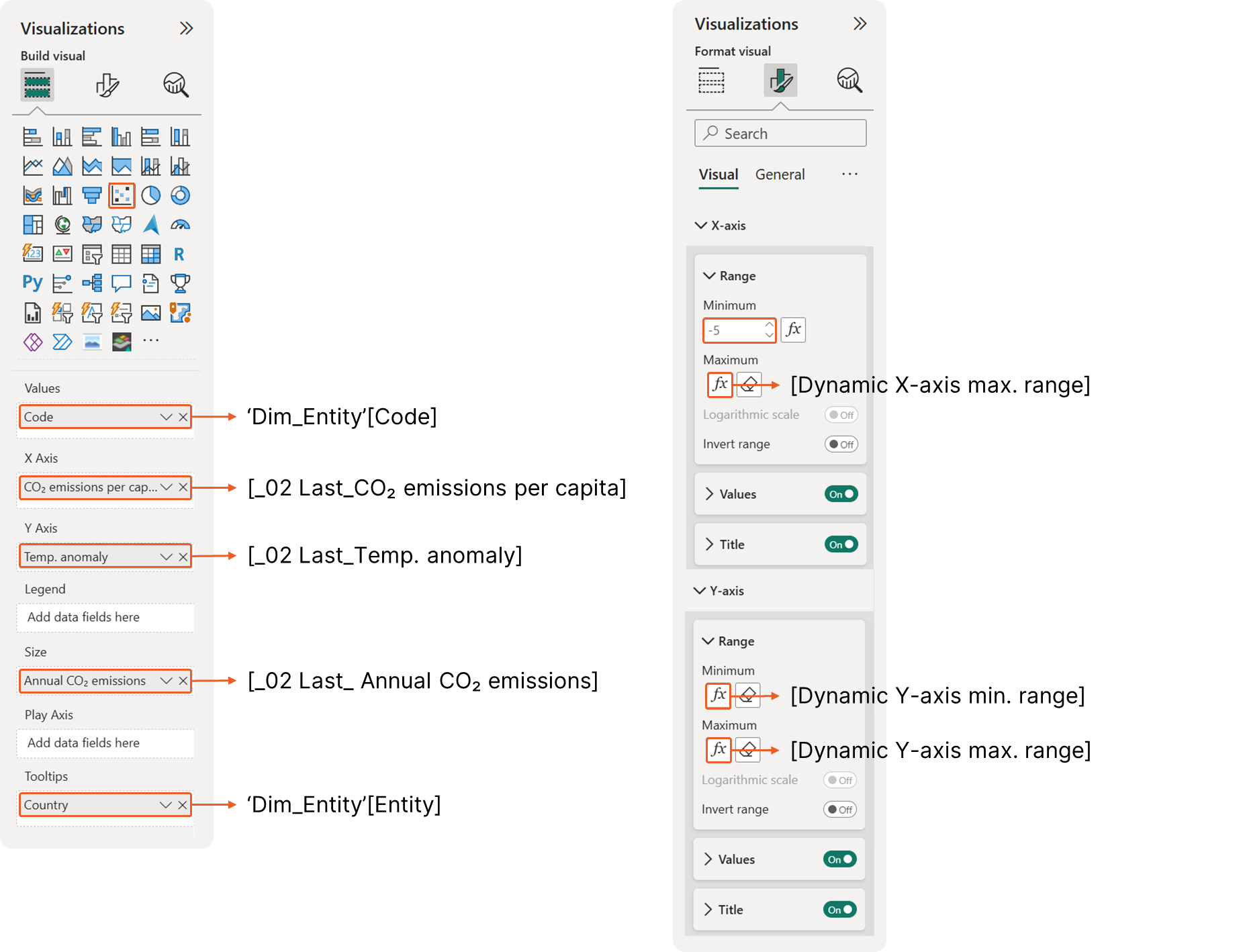 Figure 4.1 Scatterplots Initial Configuration
Step 3: Creating the Table for Extra Context
The last step is to add table below the scatterplot to display information
1. Create the measures that will be shown in the table
At this point, we already have all the required measures displayed in the table visual. To provide additional context, we can define the following measures to calculate the percentage of the grand total for population and annual CO₂ emissions, helping users better understand each country’s contribution to the global total.
Measure #20: % of World Annual CO₂ emissions
_03 % of World Annual CO₂ emissions = [_02 Last_Annual CO₂ emissions] / [World Last_Annual CO₂ emissions]Measure #22: % of World Annual Population
_03 % of World Population = [_02 Last_Total Population] / [World Last_Total Population]In addition, we want to display the region each country belongs to. We use the same logic to return the region for the latest selected year, even though the available data currently only covers 2023. This approach is intentionally designed to handle scenarios where regional classifications may change over time, ensuring the correct region is returned when data for multiple years is available.
Measure #23: Region for the Latest Selected Year
_02 Last_Region =
VAR LastYear =
  MAXX (
      ALLSELECTED ( 'Dim_Date'[Year] ),
      'Dim_Date'[Year]
  )

RETURN
CALCULATE (
  SELECTEDVALUE( 'continents-according-to-our-world-in-data'[World region according to OWID] ),
  'Dim_Date'[Year] = LastYear
  )
Next, create a table visual and add the following fields in the order shown below:
-
Dim_Entity[Code] -
Dim_Entity[Entity] -
_02 Last_Region -
_02 Last_Temp. anomaly -
_02 Last_CO₂ emissions per capita -
_02 Last_Annual CO₂ emissions -
_03 % of World Annual CO₂ emissions -
_02 Last_Total Population -
_03 % of World Population -
_02 Last_Income Group
2. Allow users to sort the table dynamically
2.1. Create disconnected tables
This technique was introduced in the previous documentation. Instead of manually clicking table column headers, it allows users to sort a table dynamically based on the metric and sort order selected from slicers. To begin, create disconnected tables that store:
-
The list of metrics users can sort by
-
The sort order (ascending or descending)
These tables act as front-end controls and are used by DAX measures to drive the sorting logic. To create the table that stores the metric options, add a new table and use the following DAX expression:
Disconnected Table 3: Sort Metric Table
Sort Metrics =
DATATABLE (
  "Metric", STRING,
  "Order", INTEGER,
  {
      {"Temperature anomaly", 1},
      {"CO₂ emissions per capita", 2},
      {"Annual CO₂ emissions", 3},
      {"Total Population", 4}
  }
)
This is a helper (disconnected) table used to:
-
Control the order of metric options shown in a slicer
-
Provide a stable and predictable sorting logic for user selections
It does not store data values. It only stores labels and their display order.
Read the explanation
What DATATABLE does here
DATATABLE (
  "Metric", STRING,
  "Order", INTEGER,
  { ... }
)-
DATATABLEcreates a manual table directly in DAX -
No data source, no relationships required
-
Perfect for slicers, toggles, and UI controls
This table has:
-
Metric → the text users see in the slicer
-
Order → the numeric value used to sort those options
Why each row exists
{"Temperature anomaly", 1},
{"CO₂ emissions per capita", 2},
{"Annual CO₂ emissions", 3},
{"Total Population", 4}
Each row represents one selectable metric
-
The number defines how the metrics are ordered in the slicer
-
Lower number = appears earlier
So the slicer will display metrics in this exact order:
-
Temperature anomaly
-
CO₂ emissions per capita
-
Annual CO₂ emissions
-
Total Population
This avoids:
-
Alphabetical sorting
-
Random or confusing metric order
How this table is used in the report
In practice, this table is:
-
Used as a single-select slicer
-
Read by measures using
SELECTEDVALUE('Sort Metrics'[Metric]) -
Connected logically (not physically) to ranking or sorting measures
This makes it a front-end control table, not a data model table.
The Sort Order table does not require a DAX expression, as it can be hard-coded using Enter Data. Simply create a table with the following columns:
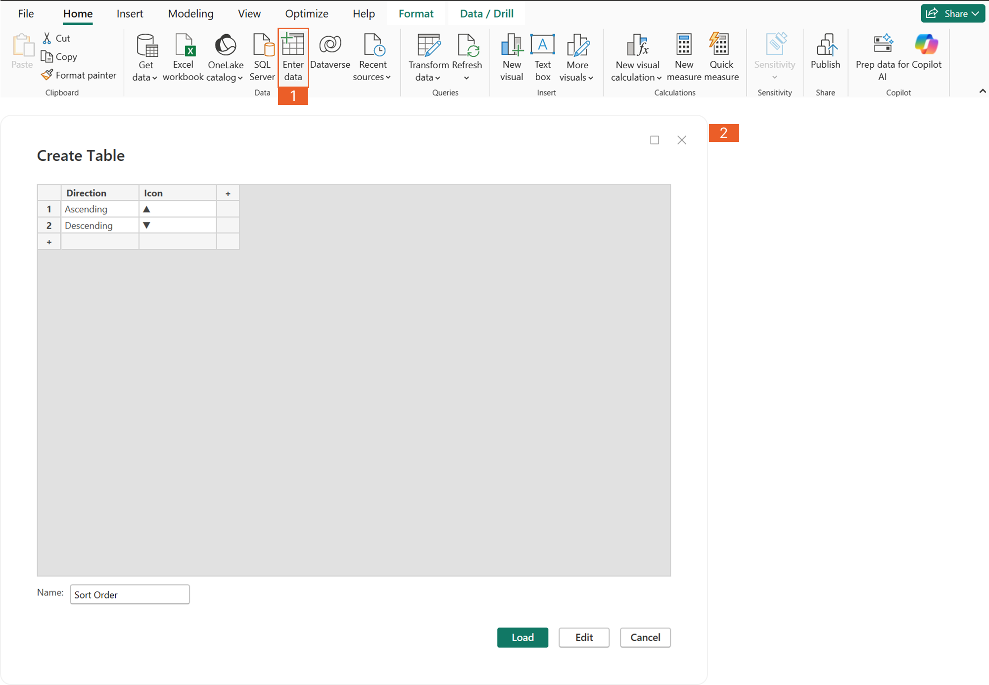 Figure 2.1 Creating Sort Order table
After creating the tables, add two slicers to the report:
-
One slicer for selecting the metric
-
One slicer for selecting the sort order (ascending or descending)
Make sure both slicers are set to single select to ensure consistent sorting behavior.
2.2. Create a dynamic ranking measure using DAX
Now that the metric selector and sort order tables are in place, we can use them as references to create a dynamic ranking based on the user’s selected metric. Using the following DAX measure, place the dynamic rank measure in the Columns field of the table visual, then click its column header to sort the table by this rank.
Measure #24: Dynamic Rank
Dynamic Rank =
VAR __SelectedMetric = SELECTEDVALUE ( 'Sort Metrics'[Metric] )
VAR __SelectedDirection = SELECTEDVALUE ( 'Sort Order'[Direction] )
VAR __CurrentEntity = SELECTEDVALUE ( Dim_Entity[Code] )

VAR __Metric =
  SWITCH (
      __SelectedMetric,
      "CO₂ emissions per capita", [_02 Last_CO₂ emissions per capita],
      "Temperature anomaly", [_02 Last_Temp. anomaly],
      "Annual CO₂ emissions", [_02 Last_Annual CO₂ emissions],
      "Total Population", [_02 Last_Total Population]
  )

VAR __RankResult =
  SWITCH (
      TRUE(),
      __SelectedMetric = "CO₂ emissions per capita" && __SelectedDirection = "Ascending",
          RANKX (
              ALLSELECTED ( Dim_Entity ),
              CALCULATE ( [_02 Last_CO₂ emissions per capita] ),
              ,
              ASC,
              DENSE
          ),

      __SelectedMetric = "CO₂ emissions per capita",
          RANKX (
              ALLSELECTED ( Dim_Entity ),
              CALCULATE ( [_02 Last_CO₂ emissions per capita] ),
              ,
              DESC,
              DENSE
          ),

      __SelectedMetric = "Temperature anomaly" && __SelectedDirection = "Ascending",
          RANKX (
              ALLSELECTED ( Dim_Entity ),
              CALCULATE ( [_02 Last_Temp. anomaly] ),
              ,
              ASC,
              DENSE
          ),

      __SelectedMetric = "Temperature anomaly",
          RANKX (
              ALLSELECTED ( Dim_Entity ),
              CALCULATE ( [_02 Last_Temp. anomaly] ),
              ,
              DESC,
              DENSE
          ),

      __SelectedMetric = "Annual CO₂ emissions" && __SelectedDirection = "Ascending",
          RANKX (
              ALLSELECTED ( Dim_Entity ),
              CALCULATE ( [_02 Last_Annual CO₂ emissions] ),
              ,
              ASC,
              DENSE
          ),

      __SelectedMetric = "Annual CO₂ emissions",
          RANKX (
              ALLSELECTED ( Dim_Entity ),
              CALCULATE ( [_02 Last_Annual CO₂ emissions] ),
              ,
              DESC,
              DENSE
          ),

      __SelectedMetric = "Total Population" && __SelectedDirection = "Ascending",
          RANKX (
              ALLSELECTED ( Dim_Entity ),
              CALCULATE ( [_02 Last_Total Population] ),
              ,
              ASC,
              DENSE
          ),

      __SelectedMetric = "Total Population",
          RANKX (
              ALLSELECTED ( Dim_Entity ),
              CALCULATE ( [_02 Last_Total Population] ),
              ,
              DESC,
              DENSE
          ),

      BLANK()
  )

RETURN
  IF (
      ISBLANK ( __CurrentEntity ) || ISBLANK ( __Metric ),
      BLANK (),
      __RankResult
  )
This measure creates a dynamic ranking of entities (e.g., countries) based on:
-
Which metric the user selects (CO₂ per capita, temperature anomaly, etc.)
-
Which sort direction the user selects (ascending or descending)
-
The current filters and slicer selections on the report
In simple terms, rank each entity based on the selected metric and sort order, and update the ranking automatically when the user changes slicers.
Read the explanation
Step 1: Read what the user selected from slicers
VAR __SelectedMetric = SELECTEDVALUE ( 'Sort Metrics'[Metric] )
VAR __SelectedDirection = SELECTEDVALUE ( 'Sort Order'[Direction] )
VAR __CurrentEntity = SELECTEDVALUE ( Dim_Entity[Code] )
These variables capture user interaction
- They read the current slicer selections:
- Metric slicer → what are we ranking by?
- Sort order slicer → ascending or descending?
- Current entity → which row (country) is being evaluated
This allows the measure to react to front-end controls, not hard-coded logic.
Step 2: Pick the correct metric value dynamically
VAR __Metric =
  SWITCH (
      __SelectedMetric,
      "CO₂ emissions per capita", [_02 Last_CO₂ emissions per capita],
      "Temperature anomaly", [_02 Last_Temp. anomaly],
      "Annual CO₂ emissions", [_02 Last_Annual CO₂ emissions],
      "Total Population", [_02 Last_Total Population]
)-
This section translates the selected metric name into an actual measure
-
The user selects text in a slicer
-
DAX converts that text into the correct numeric value to rank
Think of this as: “If the user clicks Temperature anomaly, use the Temperature anomaly measure for ranking.”
Step 3: Calculate the rank based on metric and direction
VAR __RankResult =
  SWITCH ( TRUE(), ... )
This is the core logic.
What’s happening here?
-
SWITCH(TRUE())acts like a series of IF statements -
Each block handles:
- A specific metric
- A specific sort direction
For example:
RANKX (
  ALLSELECTED ( Dim_Entity ),
  CALCULATE ( [_02 Last_CO₂ emissions per capita] ),
  ,
  ASC,
  DENSE
)
Plain explanation of RANKX:
-
ALLSELECTED ( Dim_Entity ) → Rank only within what the user can currently see (after slicers)
-
CALCULATE ( metric ) → Get the metric value for each entity
-
ASC / DESC → Follow the user’s chosen sort direction
-
DENSE → Avoid gaps in ranking (1, 2, 2, 3 instead of 1, 2, 2, 4)
Each metric is handled separately because:
-
DAX cannot dynamically switch measures inside
RANKX -
This explicit approach keeps the logic clear and predictable
Step 4: Prevent incorrect or empty results
RETURN
  IF (
      ISBLANK ( __CurrentEntity ) || ISBLANK ( __Metric ),
      BLANK (),
      __RankResult
  )
Plain explanation:
- This prevents the rank from showing:
- On totals
- On empty rows
- When no metric is selected
This is important for clean visuals and avoids confusing numbers in:
-
Cards
-
Totals
-
Tooltips
3. Link the table behavior to the scatterplots
We also apply conditional color formatting to the table so users can focus on the highlighted information based on the selected highlighting indicator. To emphasize only the rows that correspond to the highlighted scatterplot bubbles, we use two DAX measures: one to display accent bars beside the country codes, and another to grey out unselected rows while emphasizing the selected ones.
To create the accent bars, start by creating a blank measure and place it in the Columns field of the table visual. Then enable background color conditional formatting for this column and use the [CF_Selected by Cluster] measure. This is the same measure used to conditionally format the scatterplot bubble colors, ensuring consistent highlighting between the scatterplot and the table.
Measure #25: Blank Measure
_00 Blank Measure = BLANK()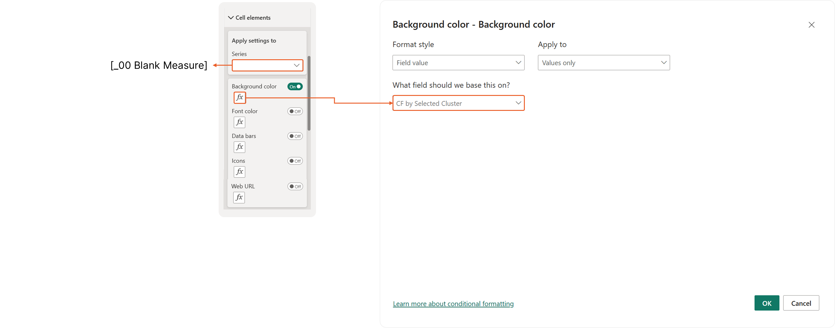 Figure 3.1 Using background color conditional formatting to create accent bars
For the font color, we reuse the same logic from the [CF_by Selected Cluster] measure for conditional formatting, but with different color assignments. Selected (highlighted) rows are shown in black, while unselected rows are displayed in grey to visually de-emphasize them.
Measure #26: CF by Selected Cluster (for Font Color)
CF by Selected Cluster (for Font Color) =
VAR SelectedCluster = SELECTEDVALUE ( 'Cluster/Segment Table'[Cluster], "None" )

VAR IncomeGroup = [_02 Last_Income Group]

VAR IsHighEmitter = [_02 Last_CO₂ emissions per capita] > [World Last_CO₂ emissions per capita]

VAR IsLowEmitter = [_02 Last_CO₂ emissions per capita] < [World Last_CO₂ emissions per capita]

VAR IsHighWarming = [_02 Last_Temp. anomaly] > [World Last_Temp. anomaly]

VAR IsLowWarming = [_02 Last_Temp. anomaly] < [World Last_Temp. anomaly]

VAR IsHighEmitterHighWarming = IsHighEmitter && IsHighWarming

VAR IsHighEmitterLowWarming = IsHighEmitter && IsLowWarming

VAR IsLowEmitterHighWarming = IsLowEmitter && IsHighWarming

VAR IsLowEmitterLowWarming = IsLowEmitter && IsLowWarming

VAR TempAnomaly =
  RANKX (
      ALLSELECTED ( Dim_Entity ),
      CALCULATE ( [_02 Last_Temp. anomaly] ),
      ,
      DESC,
      DENSE
  )

VAR IsTopContributorsTemp = TempAnomaly <= 3 && NOT ISBLANK([_02 Last_Temp. anomaly])

VAR AnnualEmissionsRank =
  RANKX (
      ALLSELECTED ( Dim_Entity ),
      CALCULATE ( [_02 Last_Annual CO₂ emissions] ),
      ,
      DESC,
      DENSE
  )

VAR IsTopContributorsAnnual = AnnualEmissionsRank <= 5 && NOT ISBLANK([_02 Last_Annual CO₂ emissions])

VAR EmissionPerCapitaRank =
  RANKX (
      ALLSELECTED ( Dim_Entity ),
      CALCULATE ( [_02 Last_CO₂ emissions per capita] ),
      ,
      DESC,
      DENSE
  )

VAR IsTopContributorsPerCapita = EmissionPerCapitaRank <= 3 && NOT ISBLANK([_02 Last_CO₂ emissions per capita])

VAR FontColor =
  SWITCH (
      TRUE (),
      SelectedCluster = "None",
          "#000000",  -- Black for all items
      -- High Emitters
      SelectedCluster = "High Emitters" && IsHighEmitter,
          "#000000",  -- White for red background (#D1495B)
      SelectedCluster = "High Emitters" && NOT IsHighEmitter,
          "#CED4DA",  -- Darker gray for light gray background
      -- High Warming
      SelectedCluster = "High Warming" && IsHighWarming,
          "#000000",  -- White for red background
      SelectedCluster = "High Warming" && NOT IsHighWarming,
          "#CED4DA",  -- Darker gray for light gray background
      -- High Emissions, High Warming
      SelectedCluster = "High Emissions, High Warming" && IsHighEmitterHighWarming,
          "#000000",  -- White for red background
      SelectedCluster = "High Emissions, High Warming" && NOT IsHighEmitterHighWarming,
          "#CED4DA",  -- Darker gray for light gray background
      -- High Emissions, Lower Warming
      SelectedCluster = "High Emissions, Lower Warming" && IsHighEmitterLowWarming,
          "#000000",  -- White for colored background
      SelectedCluster = "High Emissions, Lower Warming" && NOT IsHighEmitterLowWarming,
          "#CED4DA",  -- Darker gray for light gray background
      -- Low Emissions, High Warming
      SelectedCluster = "Low Emissions, High Warming" && IsLowEmitterHighWarming,
          "#000000",  -- White for colored background
      SelectedCluster = "Low Emissions, High Warming" && NOT IsLowEmitterHighWarming,
          "#CED4DA",  -- Darker gray for light gray background
      -- Low Emissions, Lower Warming
      SelectedCluster = "Low Emissions, Lower Warming" && IsLowEmitterLowWarming,
          "#000000",  -- White for colored background
      SelectedCluster = "Low Emissions, Lower Warming" && NOT IsLowEmitterLowWarming,
          "#CED4DA",  -- Darker gray for light gray background
      SelectedCluster = "Top 3 Temperature Anomaly" && IsTopContributorsTemp,
          "#000000",  -- White for colored background
      SelectedCluster = "Top 3 Temperature Anomaly" && NOT IsTopContributorsTemp,
          "#CED4DA",  -- Darker gray for light gray background
      SelectedCluster = "Top 5 CO₂ Annual Emitters" && IsTopContributorsAnnual,
          "#000000",  -- Black for selected (top 3)
      SelectedCluster = "Top 5 CO₂ Annual Emitters" && NOT IsTopContributorsAnnual,
          "#CED4DA",  -- Darker gray for unselected
      SelectedCluster = "Top 3 CO₂ Per Capita Emitters" && IsTopContributorsPerCapita,
          "#000000",  -- Black for selected (top 3)
      SelectedCluster = "Top 3 CO₂ Per Capita Emitters" && NOT IsTopContributorsPerCapita,
          "#CED4DA",  -- Darker gray for unselected

      "#000000"  -- Default black
  )

RETURN FontColor
This measure controls the font color used in tables and visuals based on:
-
The cluster or segment selected by the user
-
Whether each entity (e.g. country) belongs to that cluster
This ensures visual consistency between:
-
Scatterplot highlights
-
Table rows
-
Text emphasis
Read the explanation
Step 1: Read the selected cluster from the slicer
VAR SelectedCluster =
SELECTEDVALUE ( 'Cluster/Segment Table'[Cluster], "None" )-
Reads the cluster selected by the user
-
If nothing is selected, it defaults to
"None" -
This value drives all highlighting logic in the measure
Step 2: Define emission and warming conditions
VAR IsHighEmitter = [_02 Last_CO₂ emissions per capita] > [World Last_CO₂ emissions per capita]
VAR IsLowEmitter  = [_02 Last_CO₂ emissions per capita] < [World Last_CO₂ emissions per capita]

VAR IsHighWarming = [_02 Last_Temp. anomaly] > [World Last_Temp. anomaly]
VAR IsLowWarming = [_02 Last_Temp. anomaly] < [World Last_Temp. anomaly]-
Each entity is compared to the world average
-
This classifies entities into:
- High vs low emitters
- High vs low warming
These simple comparisons are the building blocks for all clusters.
Step 3: Create combined cluster conditions
VAR IsHighEmitterHighWarming = IsHighEmitter && IsHighWarming
VAR IsHighEmitterLowWarming  = IsHighEmitter && IsLowWarming
VAR IsLowEmitterHighWarming  = IsLowEmitter  && IsHighWarming
VAR IsLowEmitterLowWarming = IsLowEmitter && IsLowWarming-
Combines emission and warming logic
-
Matches the quadrants used in the scatterplot
-
Ensures the same clustering logic is reused across visuals
Step 4: Identify top contributors using ranking
Temperature anomaly (Top 3)
VAR TempAnomaly =
  RANKX (
      ALLSELECTED ( Dim_Entity ),
      CALCULATE ( [_02 Last_Temp. anomaly] ),
      ,
      DESC,
      DENSE
  )

VAR IsTopContributorsTemp =
  TempAnomaly <= 3 && NOT ISBLANK([_02 Last_Temp. anomaly])
Annual CO₂ emissions (Top 5)
VAR AnnualEmissionsRank =
  RANKX (
      ALLSELECTED ( Dim_Entity ),
      CALCULATE ( [_02 Last_Annual CO₂ emissions] ),
      ,
      DESC,
      DENSE
  )

VAR IsTopContributorsAnnual =
  AnnualEmissionsRank <= 5 && NOT ISBLANK([_02 Last_Annual CO₂ emissions])
CO₂ per capita (Top 3)
VAR EmissionPerCapitaRank =
  RANKX (
      ALLSELECTED ( Dim_Entity ),
      CALCULATE ( [_02 Last_CO₂ emissions per capita] ),
      ,
      DESC,
      DENSE
  )

VAR IsTopContributorsPerCapita =
EmissionPerCapitaRank <= 3 && NOT ISBLANK([_02 Last_CO₂ emissions per capita])-
Each block ranks entities within the current filters
-
Only the top N entities are flagged as selected
-
ALLSELECTEDensures the ranking respects slicers -
DENSEavoids gaps in ranking numbers
Step 5: Assign font colors based on selection
VAR FontColor =
  SWITCH (
      TRUE (),
      ...
      "#000000",
      "#CED4DA"
)-
SWITCH(TRUE())works like a long IF-ELSE statement -
For each selected cluster:
- Matching entities → black font
- Non-matching entities → grey font
-
Greyed text visually de-emphasizes unselected rows
Key design principle:
-
Black = important / selected
-
Grey = context / not selected
This makes highlighted rows stand out without hiding data.
Step 6: Return the final color
RETURN FontColorThis value is then used in:
-
Font color conditional formatting
-
Tables and matrix visuals
-
In sync with scatterplot highlights
For the remaining columns, enable the conditional formatting for the font color and assign the [CF by Selected Cluster (for Font Color)] measure
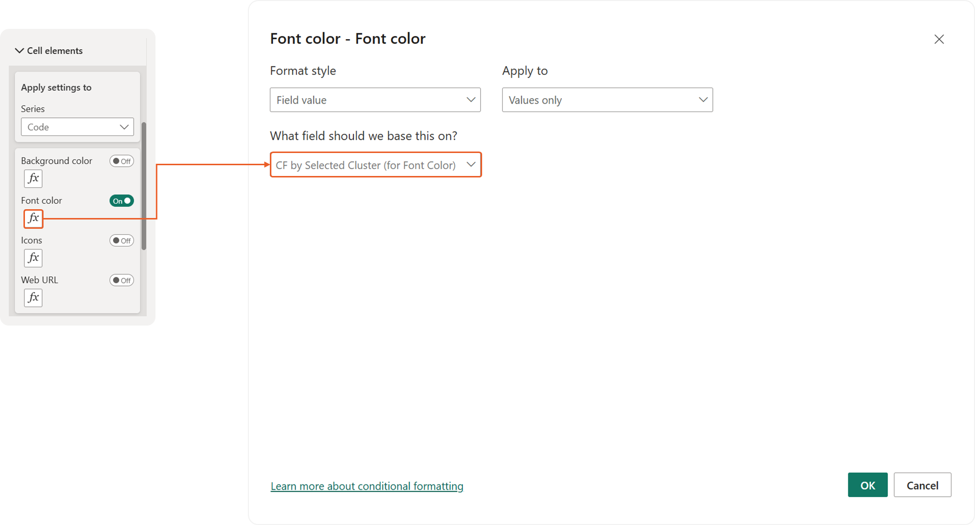 Figure 3.2 Using font color conditional formatting to emphasize selected rows
Data Sources
-
Annual temperature anomalies The difference of a specific year's average surface temperature from the 1991-2020 mean, in degrees Celsius. Source: Contains modified Copernicus Climate Change Service information (2025) – with major processing by Our World in Data Last updated: January 7, 2025 Date range: 1940–2025 Unit: °C
-
CO₂ emissions per capita Carbon dioxide (CO₂) emissions from burning fossil fuels and industrial processes. This includes emissions from transport, electricity generation, and heating, but not land-use change. Source: Global Carbon Budget (2025); Population based on various sources (2024) – with major processing by Our World in Data Last updated: November 13, 2025 Date range: 1750–2024 Unit: tonnes per person
-
Annual CO₂ emissions Annual total emissions of carbon dioxide (CO₂), excluding land-use change, measured in tonnes. Source: Global Carbon Budget (2025) – with major processing by Our World in Data Last updated: November 13, 2025 Date range: 1750–2024 Unit: tonnes
-
Population, total (UN WPP) De facto total population in a country, area or region as of 1 July of the year indicated. Source: UN, World Population Prospects (2024) – processed by Our World in Data Last updated: July 12, 2024 Date range: 1950–2023 Unit: people
-
World Bank income groups Income classification based on the country's income each year. Source: World Bank (2025) – with major processing by Our World in Data Last updated: July 1, 2025 Date range: 1987–2024
-
World regions according to Our World in Data Regions defined by Our World in Data, which are used in OWID charts and maps. Source: Our World in Data Last updated: January 1, 2023 Date range: 2023–2023