Matrix/TableMember-Only
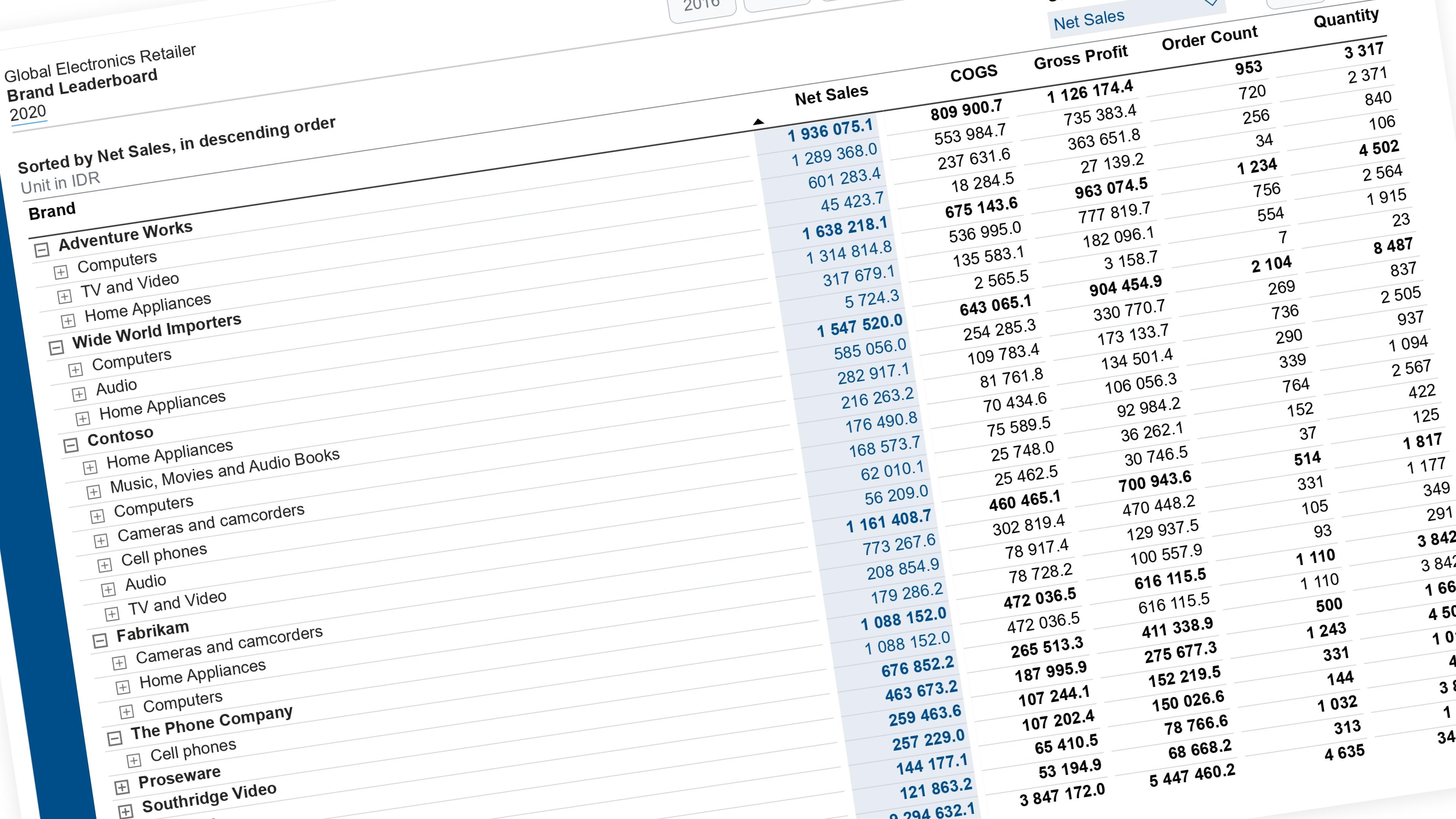
Sort and Highlight Specific Column by Selected Metric
Let the reader pick a metric from a slicer — the matrix re-sorts by it, and that metric’s column lights up so it’s obvious what’s driving the order.
Documented Power BI techniques — the model change, the DAX, and the exact visual settings. Most are free to read; the rest come with the model files for members.

Matrix/TableMember-Only
Let the reader pick a metric from a slicer — the matrix re-sorts by it, and that metric’s column lights up so it’s obvious what’s driving the order.

BarMember-Only
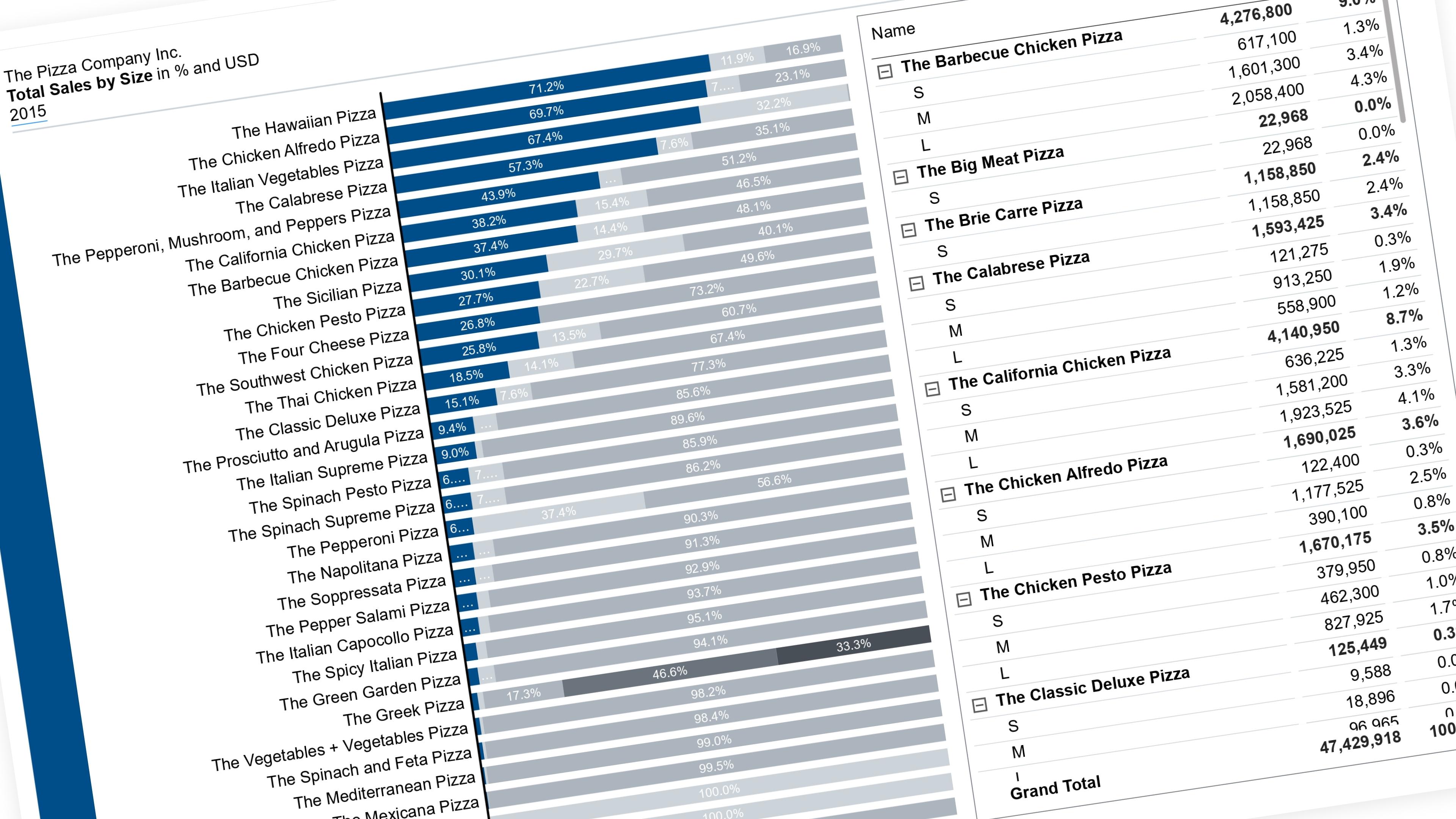
Let the reader pick which segment is easy to read — it drops to the baseline in color, everything else fades to grey.

Matrix/TableMember-Only
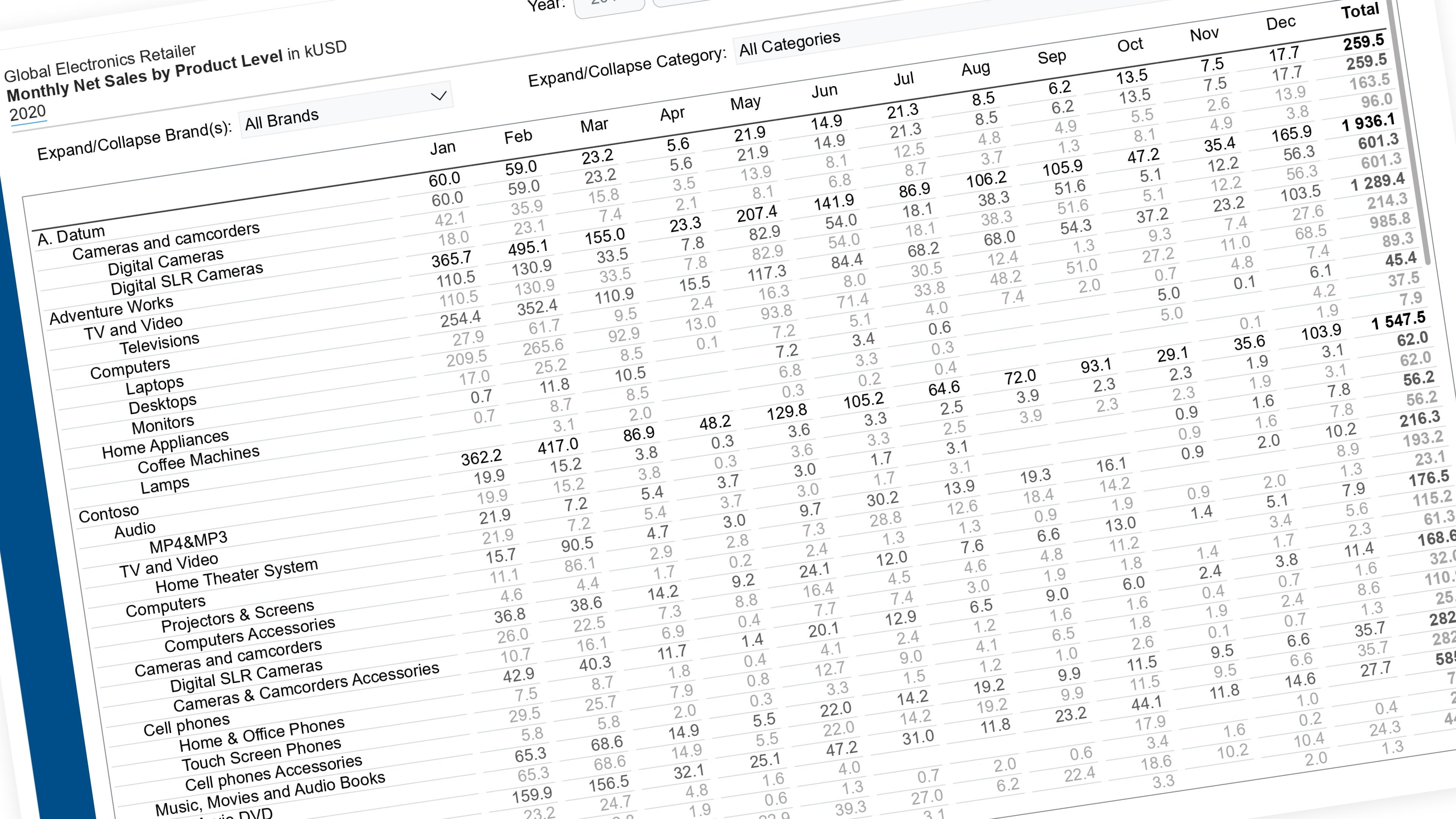
Let the reader expand and collapse individual branches of a matrix — not just one global depth.

BarMember-Only
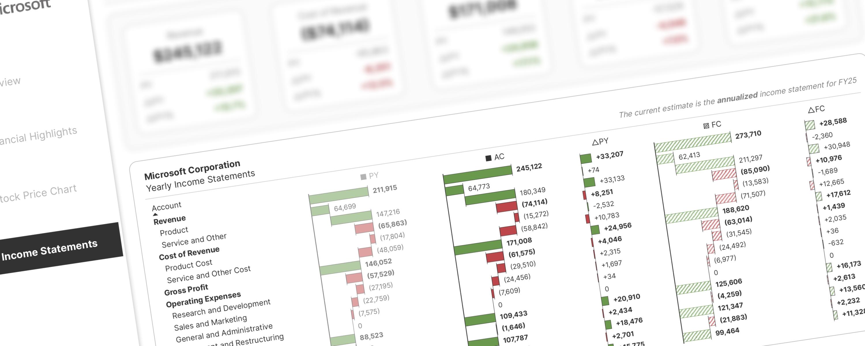
Inspired by Stefanos Chantzis's P&L analysis with native visuals, this approach introduces significant improvements based on community feedback and my own observations.

Matrix/TableMember-Only
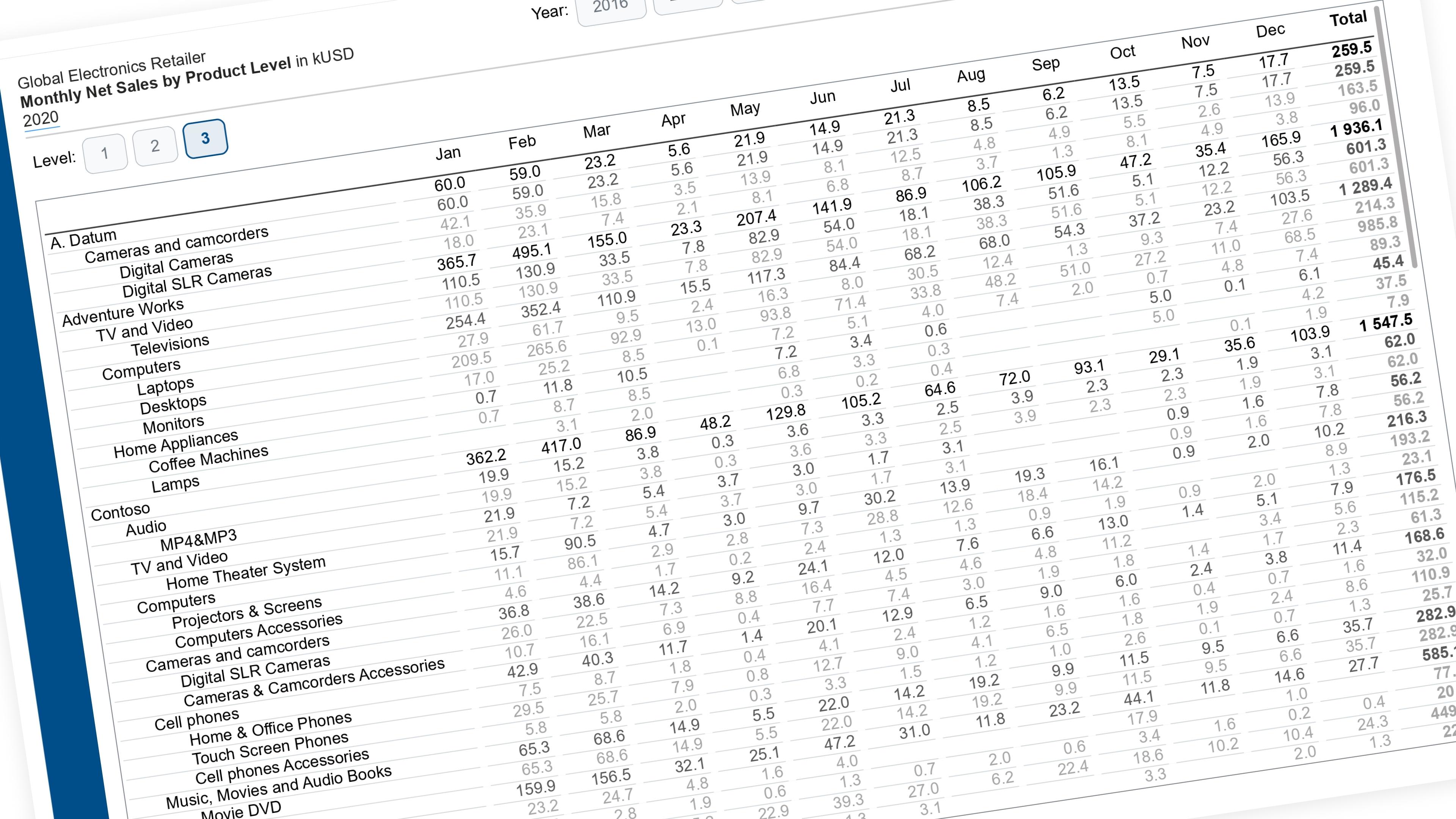
Let the reader choose how deep a matrix goes — with a single slicer. Works on any dimension with a 2–3 level hierarchy.

LineMember-Only
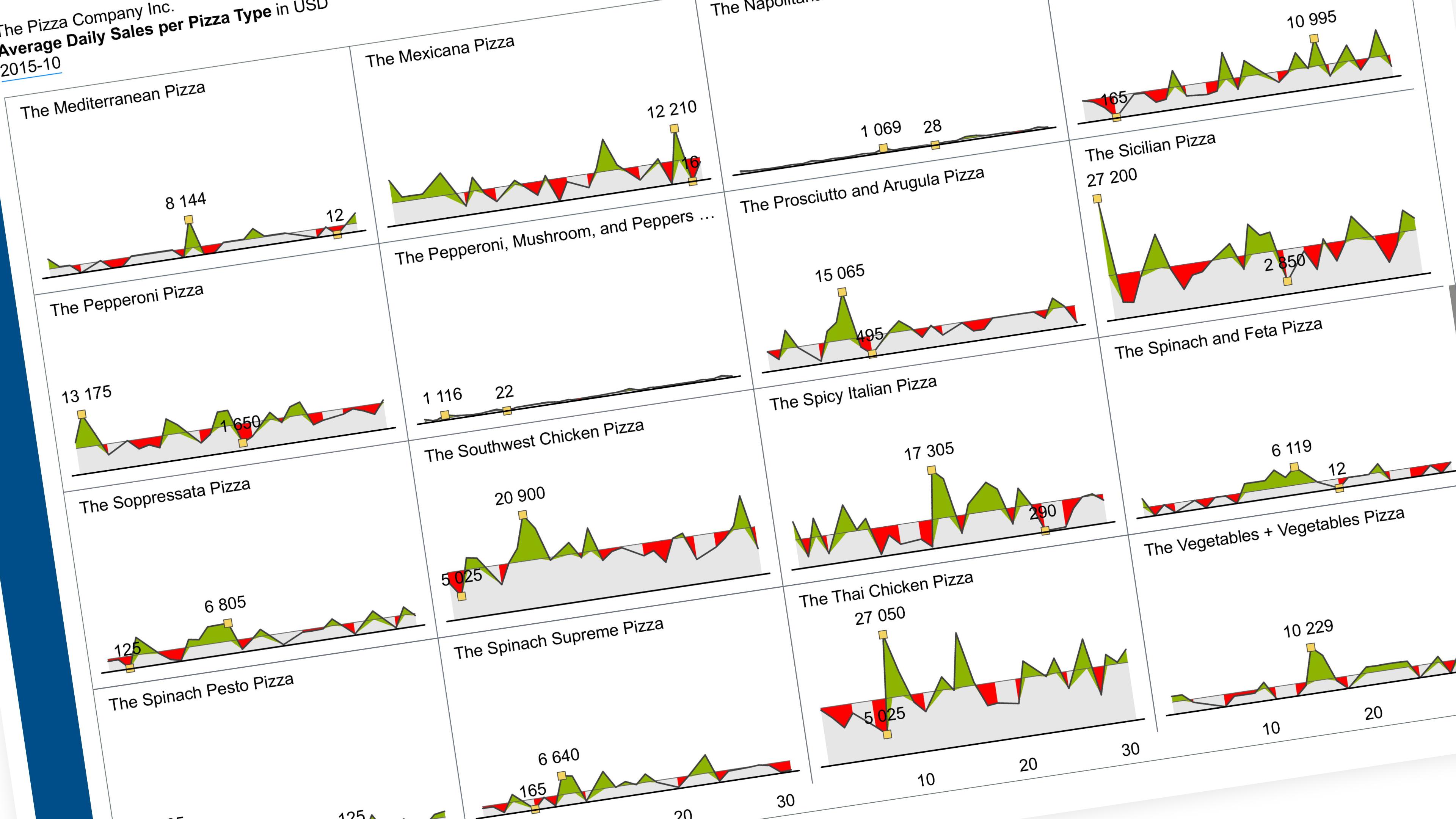
Show one metric’s daily trend, one small chart per category, all on the same scale.

BarMember-Only
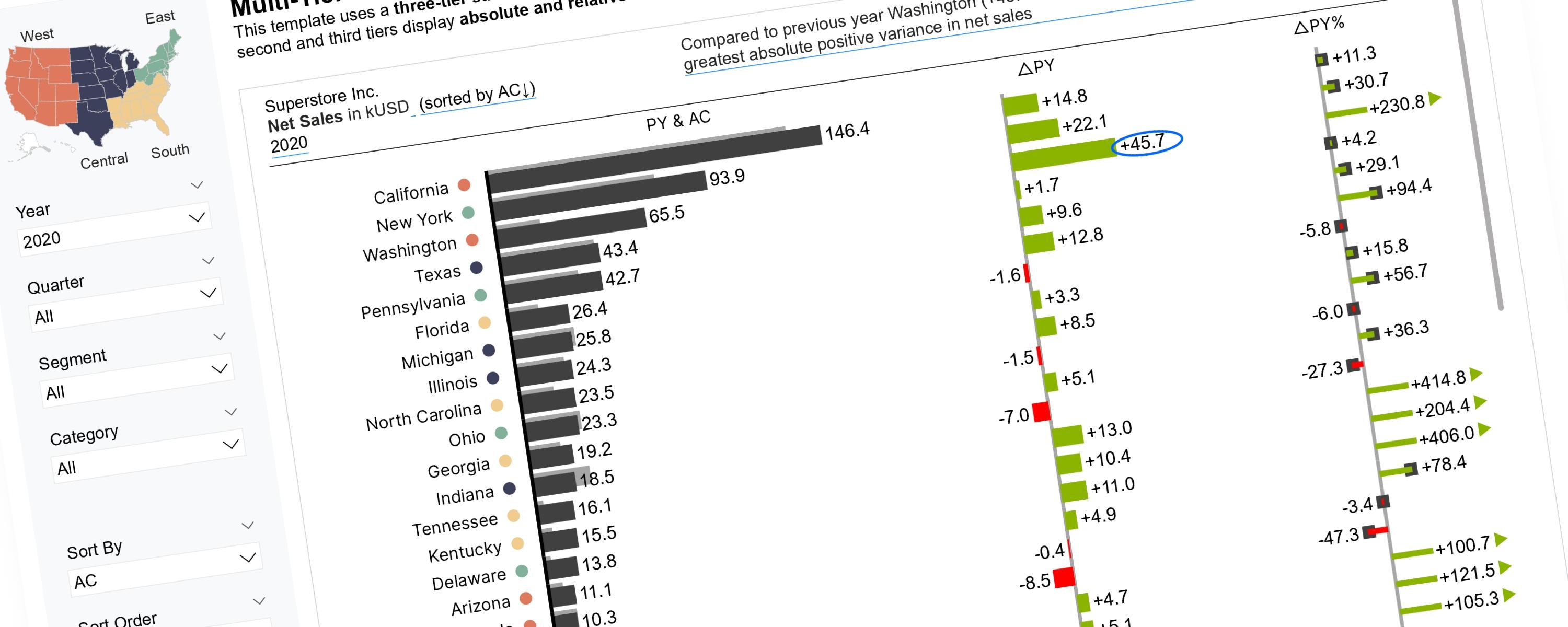
Scalable Vector Graphics (SVGs) offer greater flexibility for implementing IBCS Notation than native Power BI visuals.

Scatter PlotFree
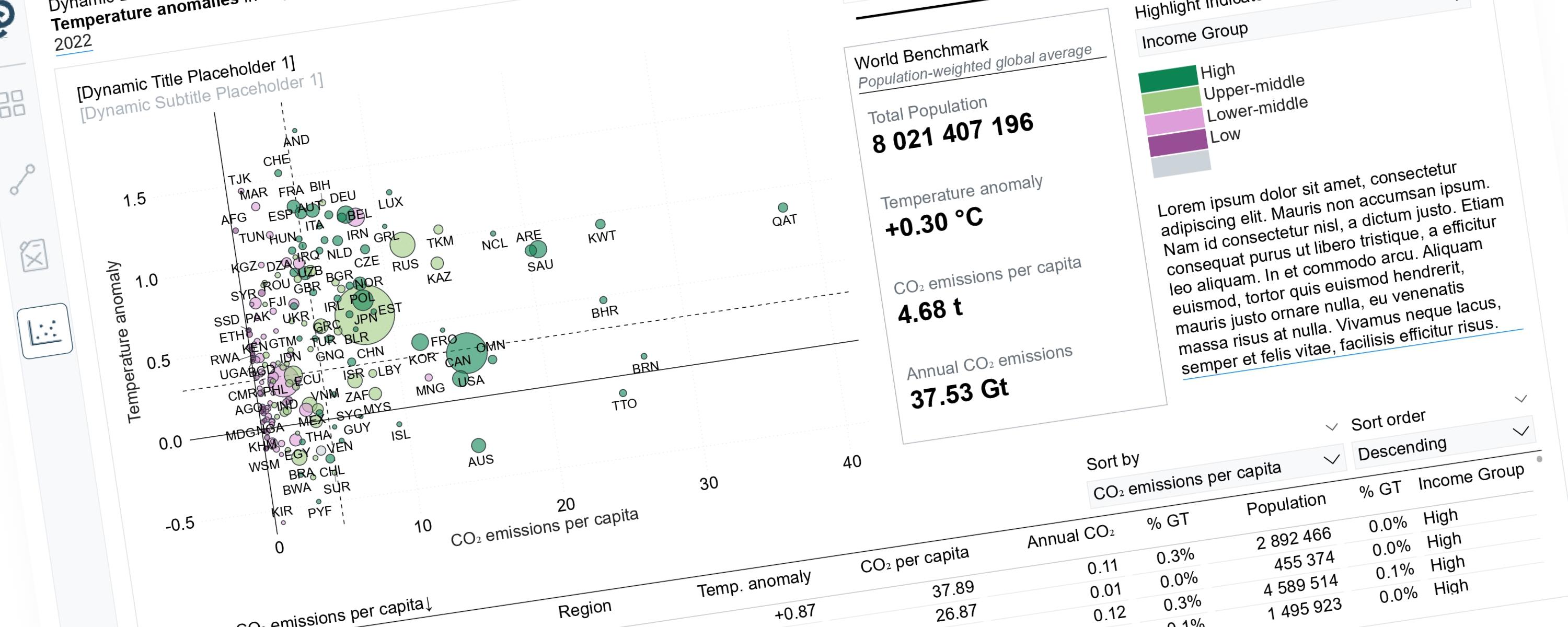
Scatterplots can tell very different stories depending on the perspective we choose to highlight.

LineFree
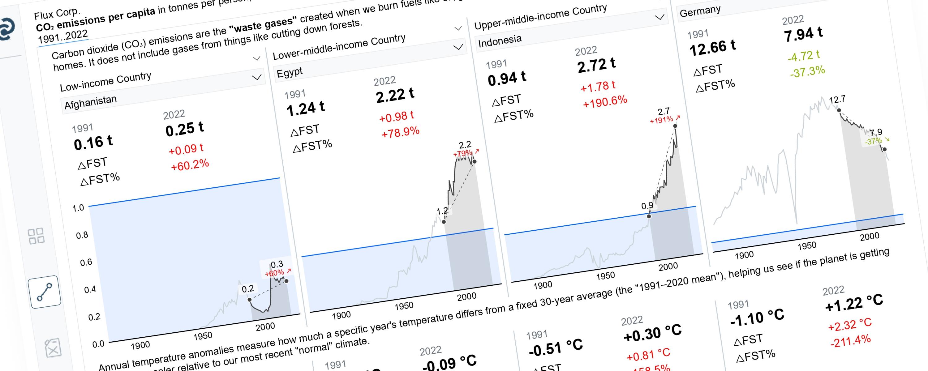
This article demonstrates how to build a Power BI line chart that dynamically highlights a selected year range while greying out the rest.