Foreword
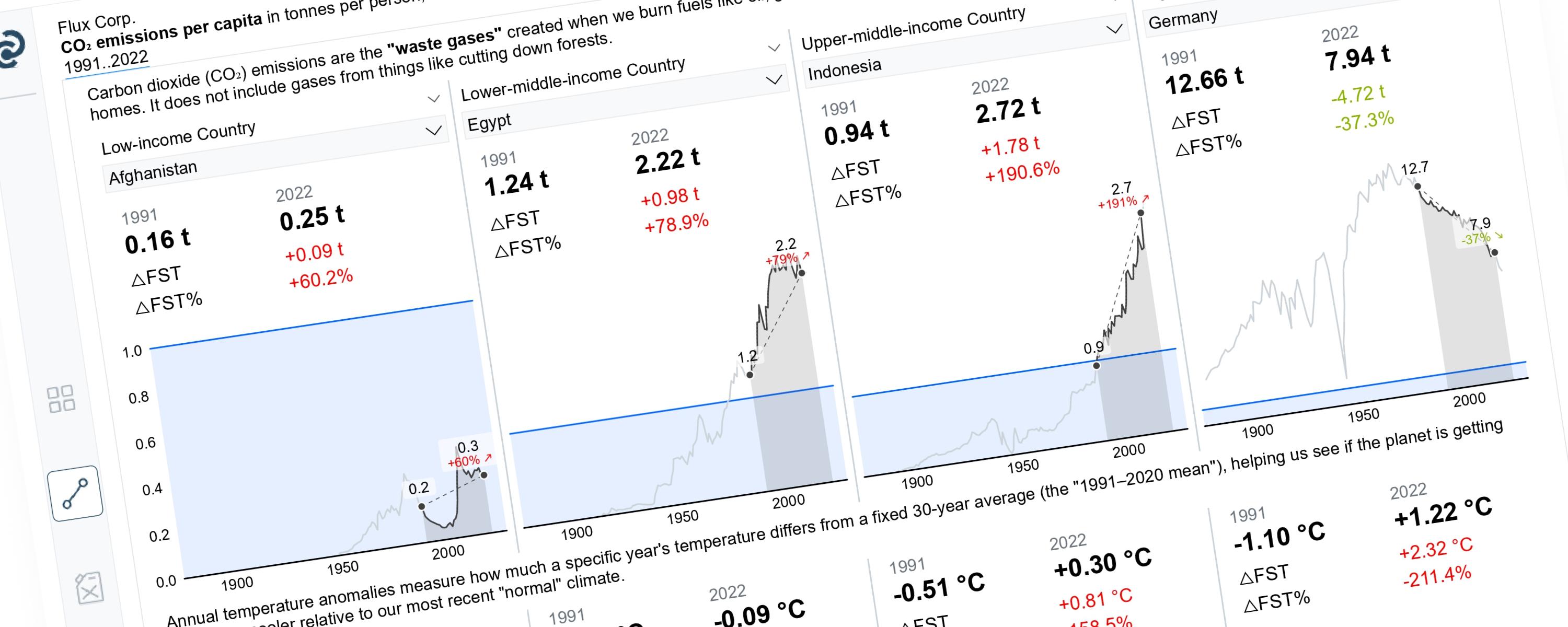
This article demonstrates how to build a Power BI line chart that dynamically highlights a selected year range while greying out the rest. While the highlighting technique was pioneered by Ashish Babaria and Injae Park, I have expanded on their methods by integrating a slope graph. This addition allows you to visualize the direct change between the start and end of your selected period within the same chart.
Documentation
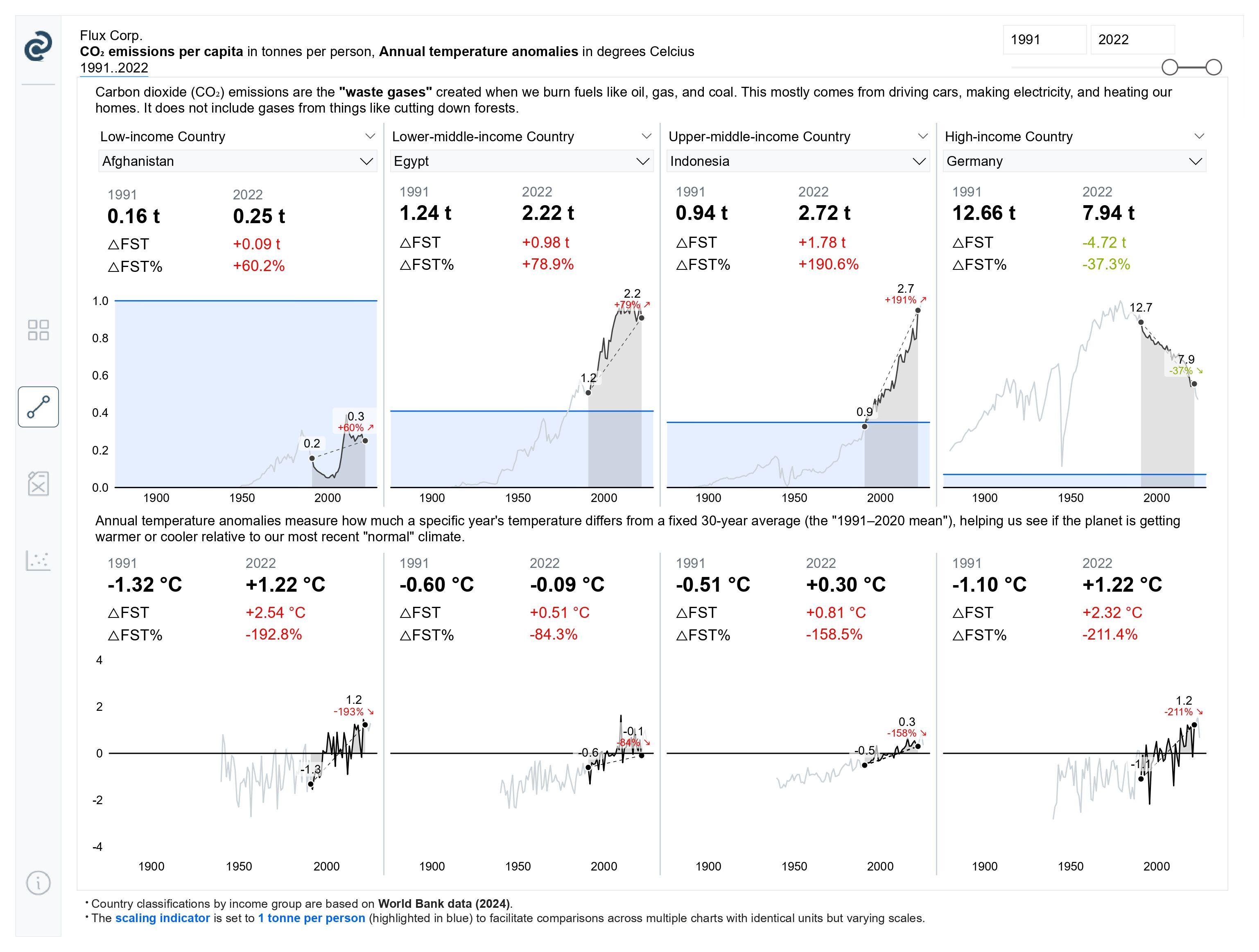 Power BI Data Viz World Championship 26 Week 2 Entry by Author (Page 2)
A slope graph simplifies comparisons by focusing on just two points in time. By integrating it with a traditional line chart, you can display granular temporal trends alongside the direct change for a selected period. This method — which I created for my Power BI Data Viz World Championship ’26 entry — provides a powerful, dual-layered view of your data. This guide will show you how to implement it.
Step 1: Setting up the Base Measure
Step 2: Creating a Disconnected Date Table
Why a disconnected table? Because we want to show the entire timeline while only highlighting the period you select. A standard relationship would simply hide the unselected years. Here, I’m using a Year hierarchy, but the logic works just as well for quarters or months. Run this DAX command to create a standalone table that pulls values from your main calendar:
Disconnected Year Table =
FILTER (
  VALUES ( 'Date'[Year] ),
  NOT ISBLANK ( 'Date'[Year] )
)
This measure creates a list of unique years from your Date table that can be used independently (disconnected) from your main data model.
Read the explanation
What it does:
-
VALUES(‘Date’[Year]) — Extracts all unique years from the Year column in your Date table
-
NOT ISBLANK(‘Date’[Year]) — Checks that the year value is not blank/empty
-
FILTER(…) — Keeps only the years that meet the condition (not blank)
Result: A clean list of unique years with no blank values
Common Use Case: This is typically used to create a slicer or parameter table that isn’t directly connected to your data model. This allows users to select a year for comparison purposes (like comparing current year vs. selected year) without affecting the main relationships in your model.
d
Step 3: Defining the Start and End Points
To make the chart dynamic, we need to “capture” the years you pick in the slicer. By creating these two measures, we are essentially marking the two points in time we want to compare. The first measure finds the earliest year in your selection, while the second measure finds the latest. These become the "anchors" for our highlighted line chart and slope graph.
Measure #02: Earliest (minimum) selected year
_02 Slicer Selection Min. Year =
MINX(
  'Disconnected Year Table',
  'Disconnected Year Table'[Year]
)
This measure finds the smallest (earliest) year that a user has selected in the slicer.
Read the explanation
What it does:
-
‘Disconnected Year Table’ — Looks at your disconnected year table (the one we created before)
-
‘Disconnected Year Table’[Year] — References the Year column from that table
-
MINX(…) — Finds the minimum (smallest/earliest) value from the selected years
Result: Returns the lowest year number currently selected in the slicer.
Measure #03: Latest (maximum) selected year
_02 Slicer Selection Max. Year =
MAXX(
  'Disconnected Year Table',
  'Disconnected Year Table'[Year]
)
This measure finds the largest (latest) year that a user has selected in the slicer.
Read the explanation
What it does:
-
‘Disconnected Year Table’ — Looks at your disconnected year table
-
‘Disconnected Year Table’[Year] — References the Year column from that table
-
MAXX(…) — Finds the maximum (largest/latest) value from the selected years
Result: Returns the highest year number currently selected in the slicer.
Step 4: Displaying the Values for the Historical, Selected and Latest Periods
Now that we know the start and end years from our slicer, we need to split our data into three distinct segments: Historical (Earliest), Selected, and Latest. This segmentation is what allows us to apply different colors — like greying out the background while highlighting the focus area.
Step 4.1: Calculating the Historical Period Values (Before the Selection)
This measure captures all data points occurring on or before your minimum selected year. In your final chart, this part of the line will typically be “muted” or greyed out.
Measure #04: Values for years ≤ minimum selected (Historical/Before)
_03 Historical Period Value (CO₂ emissions per capita) =
CALCULATE(
  [_01 Average CO₂ emissions per capita],
  FILTER(
      'Date', MAX( 'Date'[Year] ) <= [_02 Slicer Selection Min.]
  )
)
This measure calculates the average CO₂ emissions per capita for years that are less than or equal to the minimum year selected in the slicer.
Read the explanation
What it does:
-
[_01 Average CO₂ emissions per capita] — Takes your base measure that calculates average CO₂ emissions
-
FILTER(‘Date’, …) — Filters the Date table based on a condition
-
MAX(‘Date’[Year]) <= [_02 Slicer Selection Min.] — The condition checks if the maximum year in the current context is less than or equal to the lowest year selected in the slicer
-
CALCULATE(…) — Applies the filter and recalculates the base measure
Result: Returns the CO₂ emissions average for data that falls within or before the selected year range.
Step 4.2: Calculating the Latest Period Values (After the Selection)
Similarly, this measure captures everything from the maximum selected year onward. This represents the “future” relative to your selection and will also be muted in the visual.
Measure #05: Values for years ≥ maximum selected (Current/After)
_03 Latest Period Value (CO₂ emissions per capita) =
CALCULATE(
  [_01 Average CO₂ emissions per capita],
  FILTER(
      'Date', MAX( 'Date'[Year] ) >= [_02 Slicer Selection Max.]
  )
)
This measure calculates the average CO₂ emissions per capita for years that are greater than or equal to the maximum year selected in the slicer.
Read the explanation
What it does:
-
[_01 Average CO₂ emissions per capita] — Takes your base measure that calculates average CO₂ emissions (replace this with your metric)
-
FILTER(‘Date’, …) — Filters the Date table based on a condition
-
MAX(‘Date’[Year]) >= [_02 Slicer Selection Max.] — The condition checks if the maximum year in the current context is greater than or equal to the highest year selected in the slicer
-
CALCULATE(…) — Applies the filter and recalculates the base measure
Result: Returns the CO₂ emissions average for data that falls within or after the selected year range.
Step 4.3: Calculating the Selected Period Values (The Highlight Zone)
This is the “active” range chosen in your slicer. By isolating this segment, we can make it stand out with a bold color to draw the reader’s attention.
Measure #06: Values for years within selection (Actual Selection)
_03 Selected Period Value (CO₂ emissions per capita) =
CALCULATE(
  [_01 Average CO₂ emissions per capita],
  KEEPFILTERS(
      FILTER(
          ALL('Date'[Year]),
          'Date'[Year] >= [_02 Slicer Selection Min. Year]
              && 'Date'[Year] <= [_02 Slicer Selection Max. Year]
      )
  )
)
This measure calculates the average CO₂ emissions per capita for ONLY the years that fall within the selected range in the slicer (between minimum and maximum).
Read the explanation
What it does:
-
[_01 Average CO₂ emissions per capita] — Takes your base measure that calculates average CO₂ emissions
-
ALL(‘Date’[Year]) — Removes any existing filters on the Year column to start fresh
-
‘Date’[Year] >= [_02 Slicer Selection Min.] && ‘Date’[Year] <= [_02 Slicer Selection Max.] — Creates a condition that keeps only years within the selected range (from min to max, inclusive)
-
FILTER(…) — Applies this condition to filter the years
-
KEEPFILTERS(…) — Ensures this filter respects and combines with any other filters in the visual context
-
CALCULATE(…) — Recalculates the base measure with the applied filters
Result: Returns the CO₂ emissions average for ONLY the years selected in the slicer.
Step 5: Constructing the Line Chart
With our measures ready, it’s time to build the visual. Follow these steps to set up the “highlight and mute” effect:
-
Set up the Slicer: Create a slicer using the ‘Disconnected Year Table’[Year] column. Ensure you set the slicer style to “Between.” This enables the range slider, allowing you to select a specific start and end year. Note: It is crucial to use the disconnected table here. This allows the slicer to “talk” to your measures without filtering the entire chart visual.
-
Define the X-Axis: Drag your primary ‘Date’[Year] column onto the X-axis of your line chart.
-
Add the Measures: Drag the Historical, Selected, and Latest period measures into the Y-axis field.
-
Style with Color: for historical & latest periods, set these line colors to a light gray. This keeps the full timeline visible for context while moving non-selected years into the background. For selected period, set this to black (or a bold brand color). Optionally, you can display the shade area for the selected period to further emphasize your selection. This segment will now “pop,” dynamically moving as you adjust the slicer.
-
Hide the Markers (For Now): Keep the markers turned off. We want the three segments to appear as one continuous, color-coded line. We will add specific markers later when we layer in the slope graph.
Because the slicer uses the Disconnected Year Table, Power BI doesn’t automatically filter the ‘Date’ table. Instead, your DAX measures “read” the slicer’s values and decide which parts of the line to color black and which to color gray.
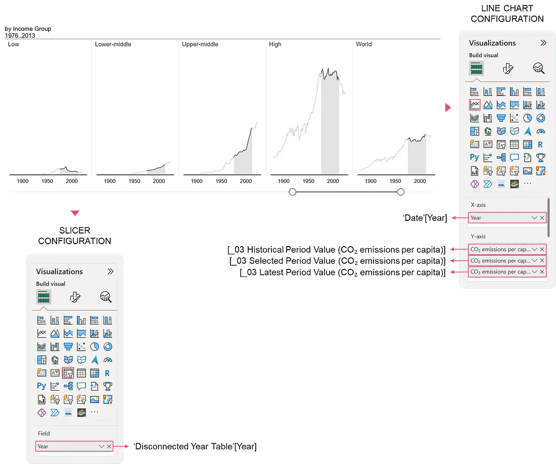 Figure 5.1 Line Chart Configuration
Step 6: Integrating the Slope Graph
Now that our background line chart is ready, we will overlay the slope graph. This visual addition provides a direct “bridge” between your start and end points, making the total change immediately obvious.
Step 6.1: The “Two-Point” Measure Trick
In Power BI, if you use two separate measures for the start and end points, the chart cannot connect them with a single line. To solve this, we create a single measure that only returns values for the minimum and maximum years, leaving everything in between blank. This forces Power BI to draw a straight line between those two points.
Measure #07: Integrated Slope Graph
Slope Graph_CO₂ Emissions per Capita =
VAR MinYear = [_02 Slicer Selection Min. Year]
VAR MaxYear = [_02 Slicer Selection Max. Year]
VAR CurrentYear = SELECTEDVALUE ( 'Date'[Year] )
RETURN
  IF(
      CurrentYear = MinYear || CurrentYear = MaxYear,
      [_01 Average CO₂ emissions per capita],
      BLANK()
  )
This measure is specifically designed for creating slope graph visualizations. It only shows values for the minimum and maximum selected years, hiding everything in between to create clean “slope” lines.
Read the explanation
What it does:
-
VAR MinYear = [_02 Slicer Selection Min. Year] — Stores the earliest selected year in a variable
-
VAR MaxYear = [_02 Slicer Selection Max. Year] — Stores the latest selected year in a variable
-
VAR CurrentYear = SELECTEDVALUE(‘Date’[Year]) — Gets the year being evaluated in the current row/context of the visual
-
IF(CurrentYear = MinYear || CurrentYear = MaxYear, …) — Checks if the current year matches either the min OR (||) max selected year
-
[_01 Average CO₂ emissions per capita] — If YES (it’s min or max), show the CO₂ value
-
BLANK() — If NO (it’s a year in between), return blank/nothing
Result: Returns CO₂ values ONLY for the first and last selected years; all other years show blank
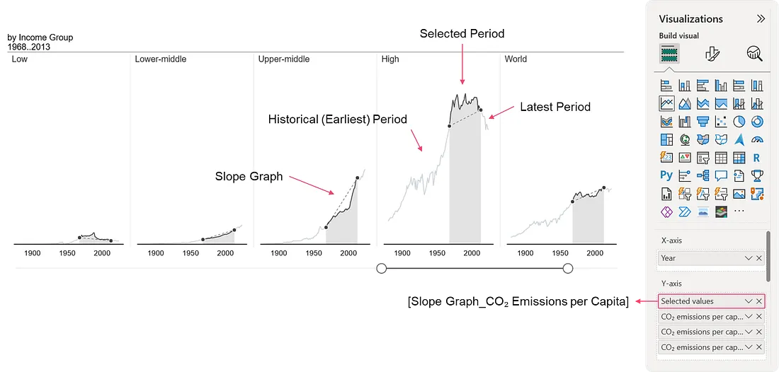 Figure 6.1 Integrating the Slope Graph Within a Line Chart
Once you’ve added this measure to your Y-axis, follow these formatting steps to make it look professional:
-
Line Style: Change the line for this specific measure to Dashed. This distinguishes the “direct change” (the slope) from the “actual trend” (the solid line).
-
Enable Markers: Turn on markers for this measure only. This highlights the specific “start” and “end” values.
-
Data Labels: Turn on data labels and set their position to Above.
-
Readability Tip: To ensure the labels are readable when they overlap with the lines, enable the Label Background and adjust the opacity.
Step 6.2: Displaying the Relative Percentage Change
To make the slope graph even more informative, we can add a label that shows the percentage change between the two selected years. This tells the reader not just that the data changed, but by how much.
Note: We want a label to appear only at the end of the slope line, showing the growth or decline percentage along with a visual indicator (an arrow).
Measure #08: Slope Graph Relative Change Label
Slope Graph_Relative Change_CO₂ emissions per capita =
VAR MinYear = [_02 Slicer Selection Min.]
VAR MaxYear = [_02 Slicer Selection Max.]
VAR CurrentYear = SELECTEDVALUE( 'Date'[Year] )

VAR FirstYearValue =
  CALCULATE(
      [_01 Average CO₂ emissions per capita],
      'Date'[Year] = MinYear
  )

VAR LastYearValue =
  CALCULATE(
      [_01 Average CO₂ emissions per capita],
      'Date'[Year] = MaxYear
  )

VAR YoYChange =
  IF(
      NOT ISBLANK(FirstYearValue) && FirstYearValue <> 0,
      DIVIDE(LastYearValue - FirstYearValue, FirstYearValue),
      BLANK()
  )

VAR AbsYoYChange = ABS(YoYChange)

VAR FormatString =
  SWITCH(
      TRUE(),
      AbsYoYChange < 0.1, "+0%;-0%;0%",
      AbsYoYChange >= 0.1 && AbsYoYChange < 1, "+0%;-0%;0%",
      AbsYoYChange >= 1 && AbsYoYChange < 10, "+0%;-0%;0%",
      AbsYoYChange >= 10 && AbsYoYChange < 100, "+# ##0%;-# ##0%;0%",
      AbsYoYChange >= 100 && AbsYoYChange < 1000, "+## ##0%;-## ##0%;0%",
      AbsYoYChange >= 1000 && AbsYoYChange < 10000, "+### ##0%;-### ##0%;0%",
      "+0%;-0%;0%"  // Fallback
  )

VAR FormattedValue = FORMAT(YoYChange, FormatString)

RETURN
  IF(
      CurrentYear = MaxYear,  // Show only on the last year point
      IF(
          NOT ISBLANK(YoYChange),
          IF(
              YoYChange > 0,
              FormattedValue & " 🡕",
              IF(
                  YoYChange < 0,
                  FormattedValue & " 🡖",
                  FormattedValue
              )
          ),
          BLANK()
      ),
      BLANK()
  )
This measure calculates and displays the percentage change in CO₂ emissions between the first and last selected years, showing it ONLY at the endpoint of the slope graph with directional arrows.
Read the explanation
What it does (Step by Step):
Step 1: Capture Key Years
VAR MinYear = [_02 Slicer Selection Min. Year]
VAR MaxYear = [_02 Slicer Selection Max. Year]
VAR CurrentYear = SELECTEDVALUE('Date'[Year])
Stores the minimum selected year, maximum selected year, and the current year being evaluated.
Step 2: Get Start and End Values
VAR FirstYearValue = CALCULATE([_01 Average CO₂ emissions per capita], 'Date'[Year] = MinYear)
VAR LastYearValue = CALCULATE([_01 Average CO₂ emissions per capita], 'Date'[Year] = MaxYear)
Retrieves the CO₂ emission values for both the first year and last year of the selection.
Step 3: Calculate Percentage Change
VAR YoYChange =
  IF(
      NOT ISBLANK(FirstYearValue) && FirstYearValue <> 0,
      DIVIDE(LastYearValue - FirstYearValue, FirstYearValue),
      BLANK()
)-
Calculates the relative change: (Last — First) / First.
-
Example: First = 5.0, Last = 6.0 → (6.0–5.0) / 5.0 = 0.20 (20% increase).
-
Returns BLANK if first year has no data or is zero (to avoid division errors).
Step 4: Get Absolute Value for Formatting
VAR AbsYoYChange = ABS(YoYChange)Converts the change to a positive number to determine the appropriate format. Example: -0.35 becomes 0.35
Step 5: Dynamic Format String
VAR FormatString =
  SWITCH(
      TRUE(),
      AbsYoYChange < 0.1, "+0%;-0%;0%",
      AbsYoYChange >= 0.1 && AbsYoYChange < 1, "+0%;-0%;0%",
      ...
)-
Selects the appropriate number format based on the magnitude of change
-
Smaller changes (< 1%) → Simple format like “+0%”
-
Larger changes (≥ 10%) → Includes thousand separators like “+# ##0%”
Step 6: Format the Value
VAR FormattedValue = FORMAT(YoYChange, FormatString)Applies the format string to display the percentage nicely. Example: 0.2547 becomes “+25%”
Step 7: Add Directional Arrows and Display Logic
RETURN
  IF(
      CurrentYear = MaxYear,  // Show only on the last year point
      IF(NOT ISBLANK(YoYChange),
          IF(YoYChange > 0, FormattedValue & " 🡕",  // Up arrow for increase
             IF(YoYChange < 0, FormattedValue & " 🡖",  // Down arrow for decrease
                FormattedValue  // No arrow if zero
             )
          ),
          BLANK()
      ),
      BLANK()
  )
```
- Shows the percentage change ONLY at the maximum (end) year point
- Adds an up arrow (🡕) for increases
- Adds a down arrow (🡖) for decreases
- Returns BLANK for all other years

---

## Result Examples:

**Scenario 1:** User selects 2020-2023, CO₂ goes from 5.0 to 6.5
- **2020:** BLANK (no label)
- **2021:** BLANK
- **2022:** BLANK
- **2023:** **"+30% 🡕"** (displayed at endpoint)

**Scenario 2:** User selects 2020-2023, CO₂ goes from 8.0 to 6.0
- **2020:** BLANK
- **2021:** BLANK
- **2022:** BLANK
- **2023:** **"-25% 🡖"** (displayed at endpoint)

---

## Common Use Case:

This measure is designed for **slope graph data labels** where you want to:
- Show the percentage change at the end of each slope line
- Indicate direction of change with visual arrows
- Keep the graph clean by only showing labels at endpoints
- Automatically format percentages appropriately (small vs. large changes)

---

## Visual Example:
```
Country A:  ●────────────● +45% 🡕
Country B:  ●────────────● -12% 🡖
Country C:  ●────────────● +3% 🡕
         2020        2023

Each country's slope line shows the percentage change with a directional indicator only at the ending point (2023).
Step 6.3: Adding Conditional Color Formatting
To make the percentage change label even more impactful, we will use a DAX measure to dynamically change its color. For CO₂ emissions, an increase is a negative trend (Red), while a decrease is a positive trend (Green).
Measure #09: Conditional Color Formatting
CF_Relative Variance_CO₂ emission per capita (Disconnected Year Table) =
VAR MinYear = [_02 Slicer Selection Min.]
VAR MaxYear = [_02 Slicer Selection Max.]
VAR CurrentYear = SELECTEDVALUE( 'Date'[Year] )

VAR FirstYearValue =
  CALCULATE(
      [_01 Average CO₂ emissions per capita],
      'Date'[Year] = MinYear
  )

VAR LastYearValue =
  CALCULATE(
      [_01 Average CO₂ emissions per capita],
      'Date'[Year] = MaxYear
  )

VAR YoYChange =
  IF(
      NOT ISBLANK(FirstYearValue) && FirstYearValue <> 0,
      DIVIDE(LastYearValue - FirstYearValue, FirstYearValue),
      BLANK()
  )

RETURN
  IF(
      CurrentYear = MaxYear,  // Only apply color where label shows
      SWITCH(
          TRUE(),
          ISBLANK(YoYChange), "#000000",
          YoYChange < 0, "#8cb400",      // Negative = Green (decrease in CO2 is good)
          YoYChange = 0, "#000000",      // No change = Black
          YoYChange > 0, "#FF0000",      // Positive = Red (increase in CO2 is bad)
          "#000000"                       // Default
      ),
      "#000000"  // Default color for non-label points
  )
This is a conditional formatting measure that assigns colors to the percentage change labels on the slope graph based on whether CO₂ emissions increased (bad = red) or decreased (good = green).
Read the explanation
What it does (Step by Step):
Step 1: Capture Key Years
VAR MinYear = [_02 Slicer Selection Min. Year]
VAR MaxYear = [_02 Slicer Selection Max. Year]
VAR CurrentYear = SELECTEDVALUE('Date'[Year])
Stores the minimum selected year, maximum selected year, and current year being evaluated.
Step 2: Get Start and End Values
VAR FirstYearValue = CALCULATE([_01 Average CO₂ emissions per capita], 'Date'[Year] = MinYear)
VAR LastYearValue = CALCULATE([_01 Average CO₂ emissions per capita], 'Date'[Year] = MaxYear)
Retrieves CO₂ emission values for the first and last years of selection.
Step 3: Calculate Percentage Change
VAR YoYChange =
  IF(
      NOT ISBLANK(FirstYearValue) && FirstYearValue <> 0,
      DIVIDE(LastYearValue - FirstYearValue, FirstYearValue),
      BLANK()
)-
Calculates relative change: (Last — First) / First
-
Returns BLANK if data is missing or first year is zero
Step 4: Apply Color Logic
RETURN
  IF(
      CurrentYear = MaxYear,  // Only color the endpoint label
      SWITCH(
          TRUE(),
          ISBLANK(YoYChange), "#000000",        // No data = Black
          YoYChange < 0, "#8cb400",             // Decrease = Green (Good!)
          YoYChange = 0, "#000000",             // No change = Black
          YoYChange > 0, "#FF0000",             // Increase = Red (Bad!)
          "#000000"                              // Default = Black
      ),
      "#000000"  // All non-endpoint years = Black
  )
```

---

## Color Logic (Environmental Context):

| Change Type | Color | Hex Code | Meaning |
|-------------|-------|----------|---------|
| **Decrease** (negative) | 🟢 Green | #8cb400 | Good - CO₂ emissions went down |
| **No change** (zero) | ⚫ Black | #000000 | Neutral - No change |
| **Increase** (positive) | 🔴 Red | #FF0000 | Bad - CO₂ emissions went up |
| **Missing data** | ⚫ Black | #000000 | Default |
| **Other years** | ⚫ Black | #000000 | Not the endpoint |

---

## Result Examples:

**Scenario 1:** CO₂ decreased from 8.0 to 6.0 (change = -25%)
- Endpoint label shows: **"-25% 🡖"** in **GREEN** 🟢

**Scenario 2:** CO₂ increased from 5.0 to 7.5 (change = +50%)
- Endpoint label shows: **"+50% 🡕"** in **RED** 🔴

**Scenario 3:** CO₂ stayed at 6.0 (change = 0%)
- Endpoint label shows: **"0%"** in **BLACK** ⚫

---

## Common Use Case:

This measure is used for **conditional formatting** on data labels in your slope graph to:
- Visually reinforce positive trends (emissions down = green)
- Highlight concerning trends (emissions up = red)
- Apply colors only to the endpoint labels where percentage changes appear
- Keep all other data points in neutral black color

---

## How to Apply in Power BI:

1. Select your data label element in the slope graph visual
2. Go to **Format** > **Data labels** > **Color**
3. Choose **Conditional formatting (fx)**
4. Select **Field value**
5. Choose this measure: `CF_Relative Variance_CO₂ emission per capita`

---

## Visual Example:
```
Country A:  ●────────────● -15% 🡖  (GREEN - emissions decreased)
Country B:  ●────────────● +28% 🡕  (RED - emissions increased)
Country C:  ●────────────● 0%      (BLACK - no change)
         2020        2023
How to Apply the Color:
-
Select your line chart and go to the Format pane.
-
Navigate to Data labels > Values.
-
Ensure you are editing the series for the Slope Graph measure.
-
Click the fx icon (Conditional Formatting) next to the Color picker.
-
In the dialog box, set “Format style” to Field value and select this new measure (
CF_Relative Variance...).
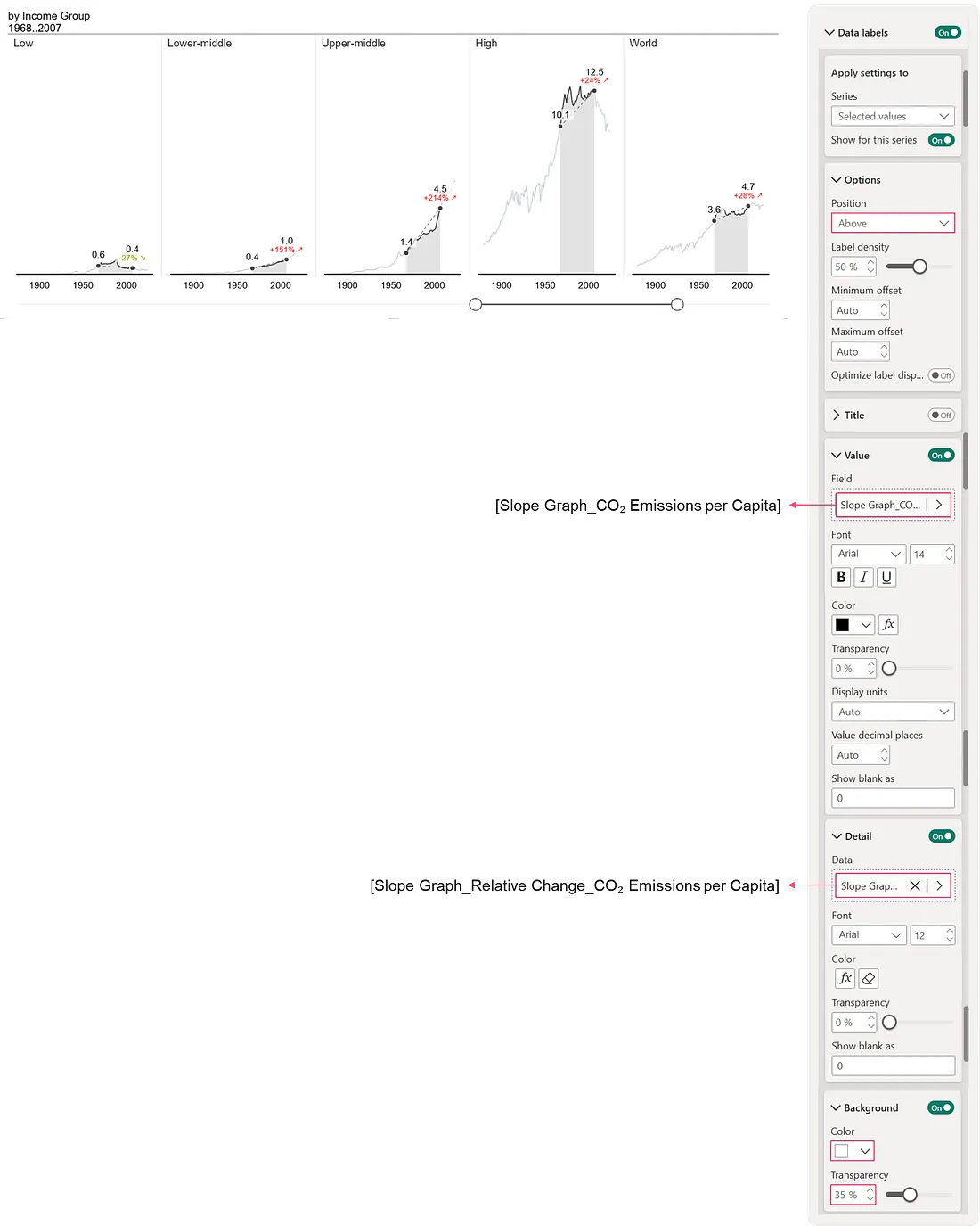 Figure 6.2 Displaying Values and Relative Change on the Slope Graph Points
References
How PBIX can boost sales growth | Ashish Babaria posted on the topic | LinkedIn
How to show Growth over Time - Native Power BI (with pbix file)