Matrix/TableFree
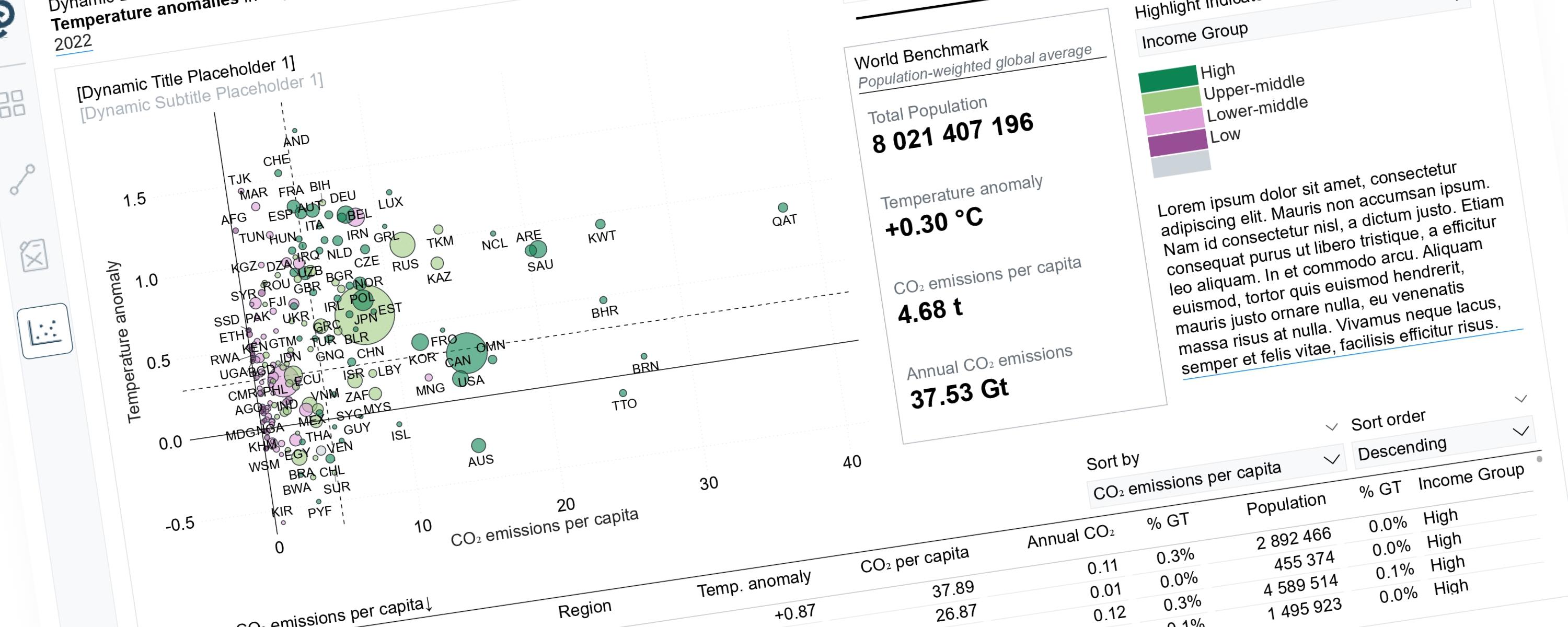
Dynamic Storytelling Using Scatterplots
Scatterplots can tell very different stories depending on the perspective we choose to highlight.
4 February 202667 min read
Documented Power BI techniques — the model change, the DAX, and the exact visual settings. Most are free to read; the rest come with the model files for members.
Matrix/TableFree
Scatterplots can tell very different stories depending on the perspective we choose to highlight.
LineFree
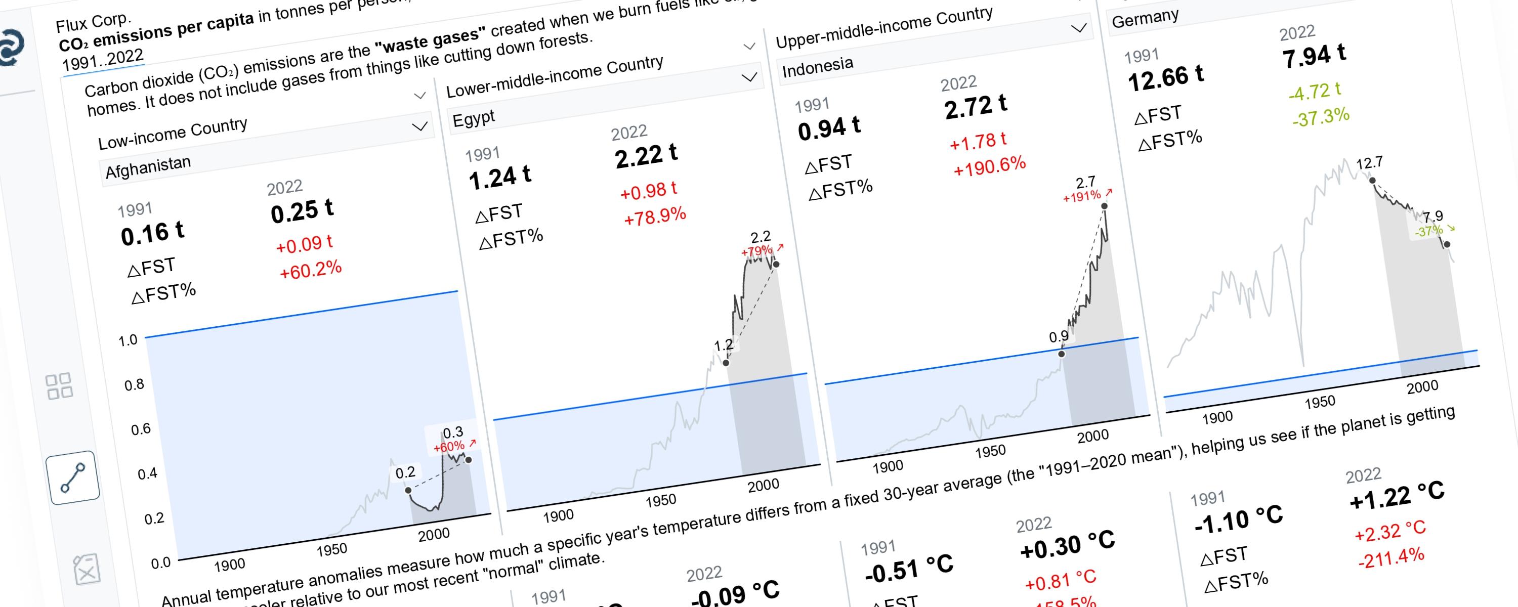
This article demonstrates how to build a Power BI line chart that dynamically highlights a selected year range while greying out the rest.
Matrix/TableFree
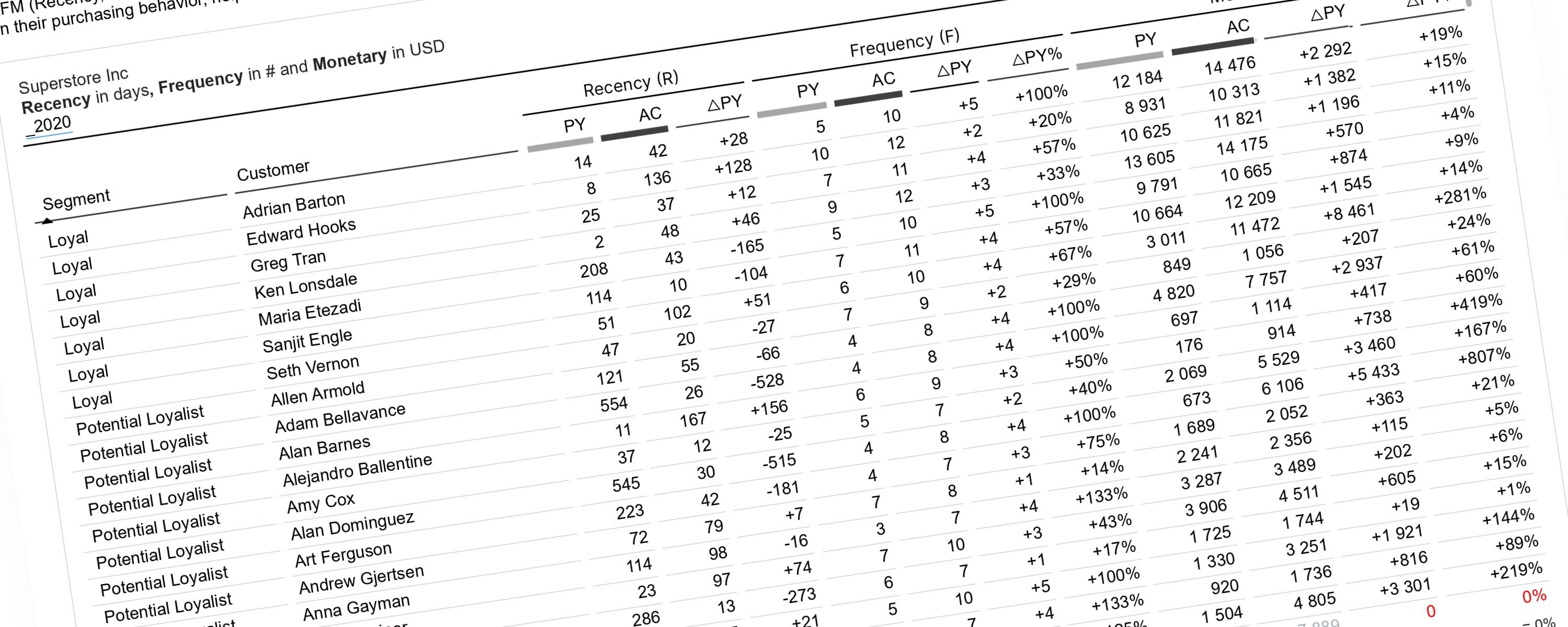
This documentation explains how to perform RFM analysis in Power BI using a dynamic, time-aware approach.
LineFree
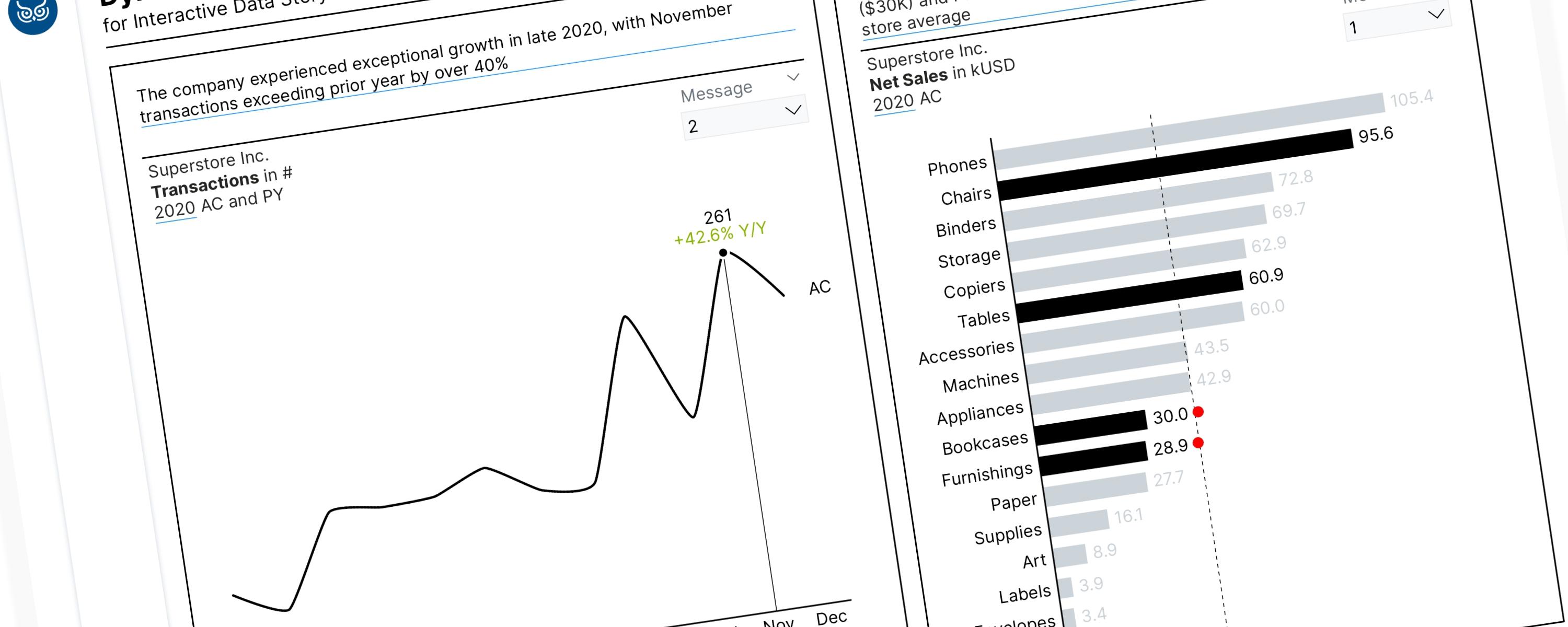
Field parameters are a powerful feature in Power BI. When combined with the SWITCH() function, these tools allow us to tell a compelling data story by dynamically highlighting…
LineFree
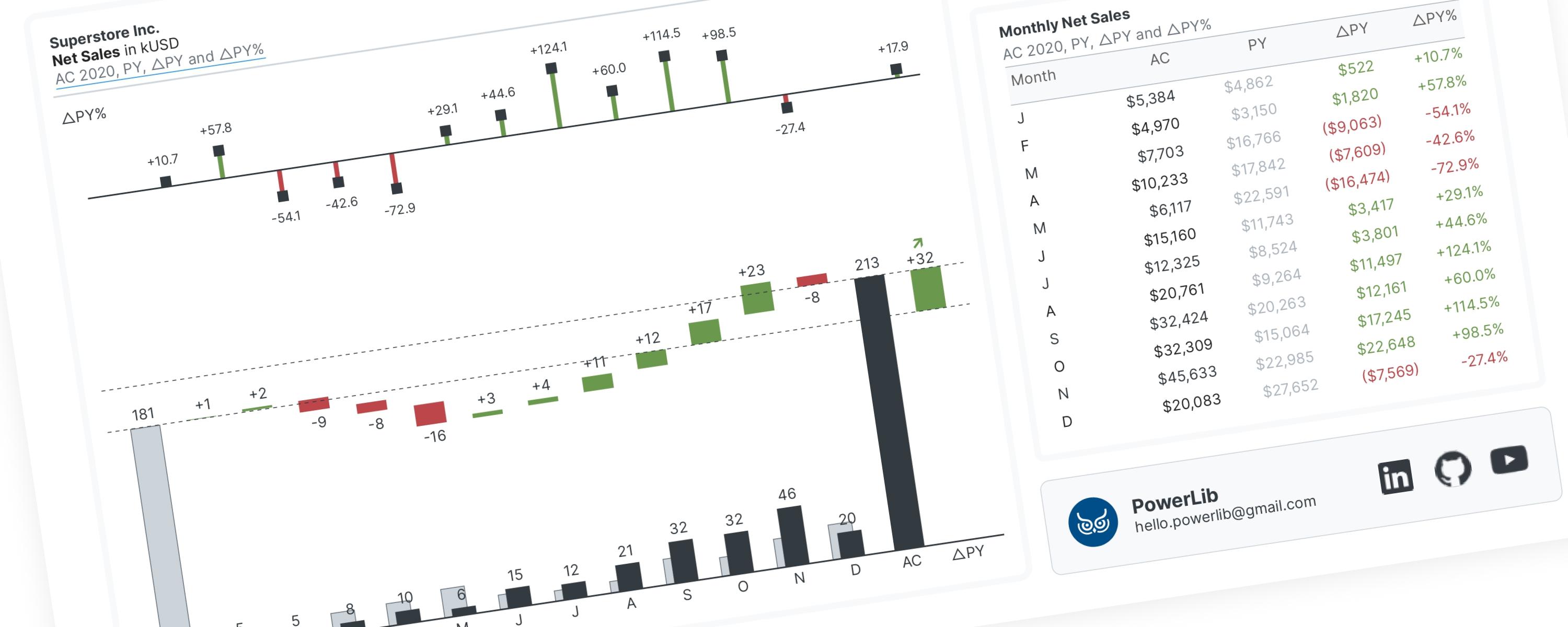
A waterfall chart is a special type of bar chart that shows you the story behind how a number changed from one point to another.
LineFree
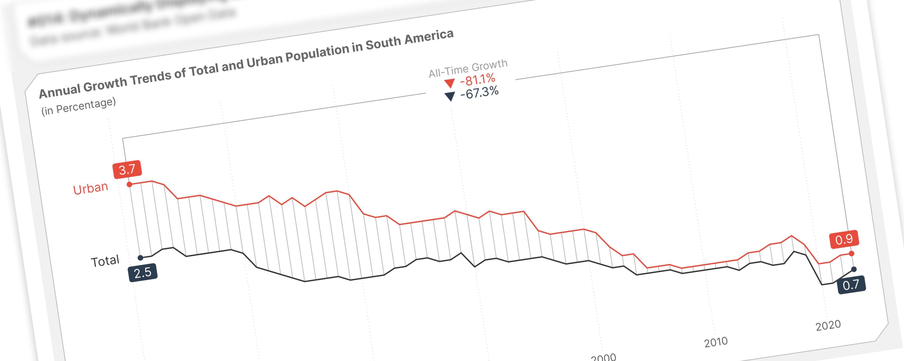
This documentation provides a guide on marking the earliest and latest selected years on a line chart and visualizing growth over time with reference lines.
Matrix/TableFree
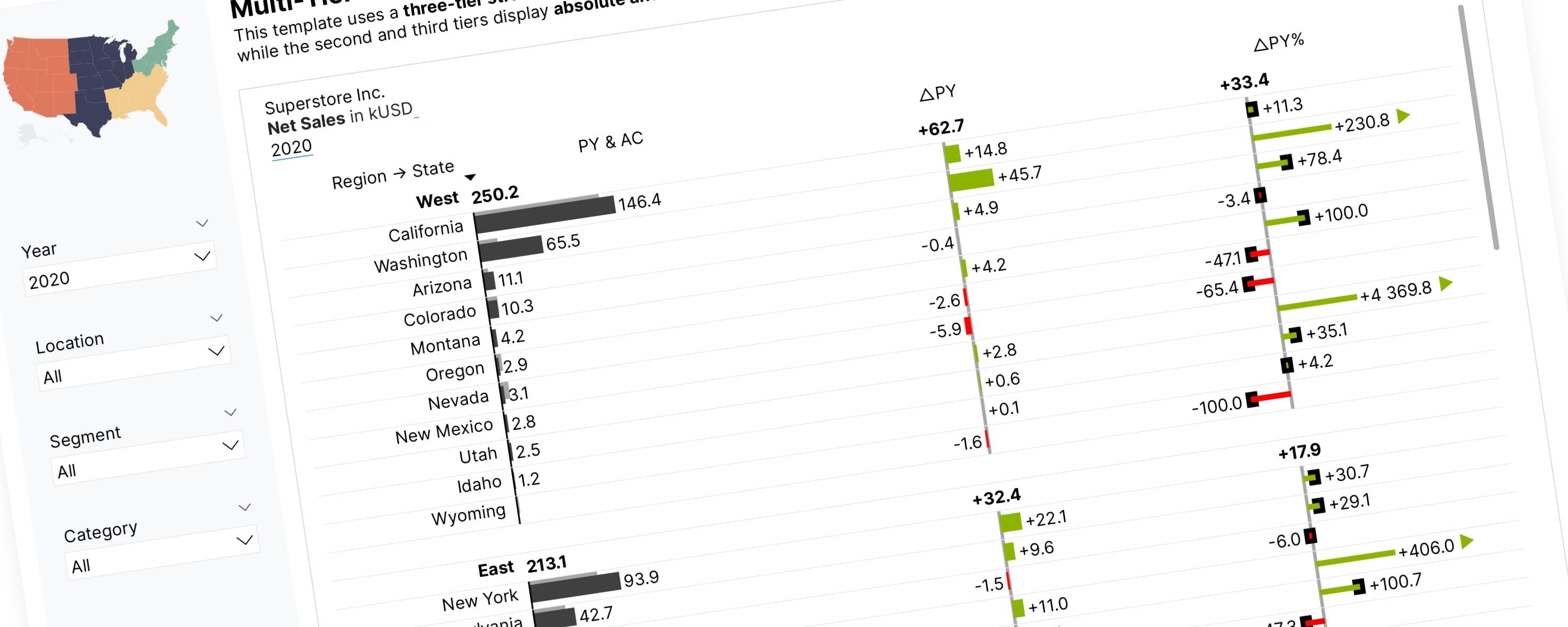
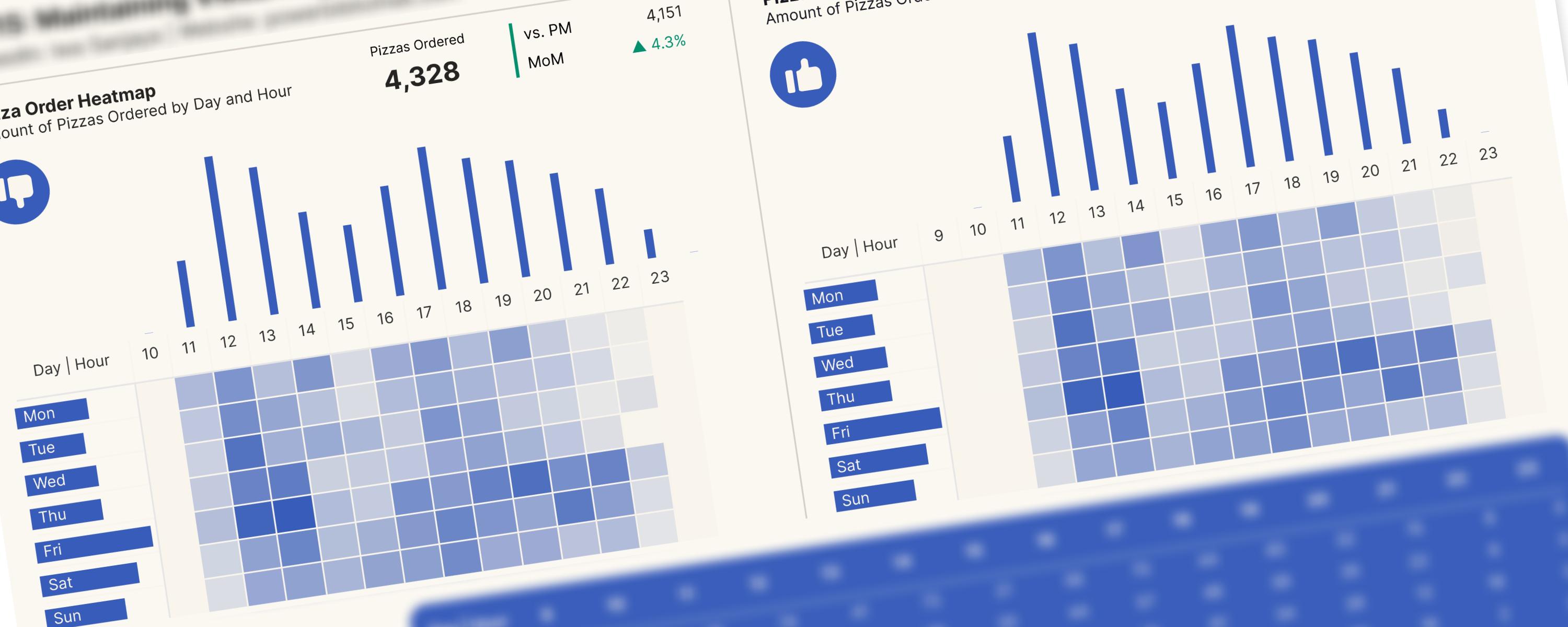
This documentation will walk you through the process of creating a combined visualization using a matrix and bar/column charts, ensuring they remain visually aligned regardless of…
Matrix/TableFree
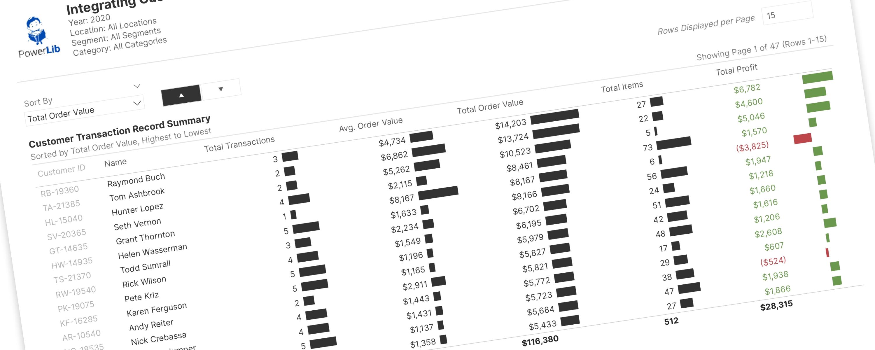
This documentation details advanced pagination techniques, extending my previous tutorial and documentation.