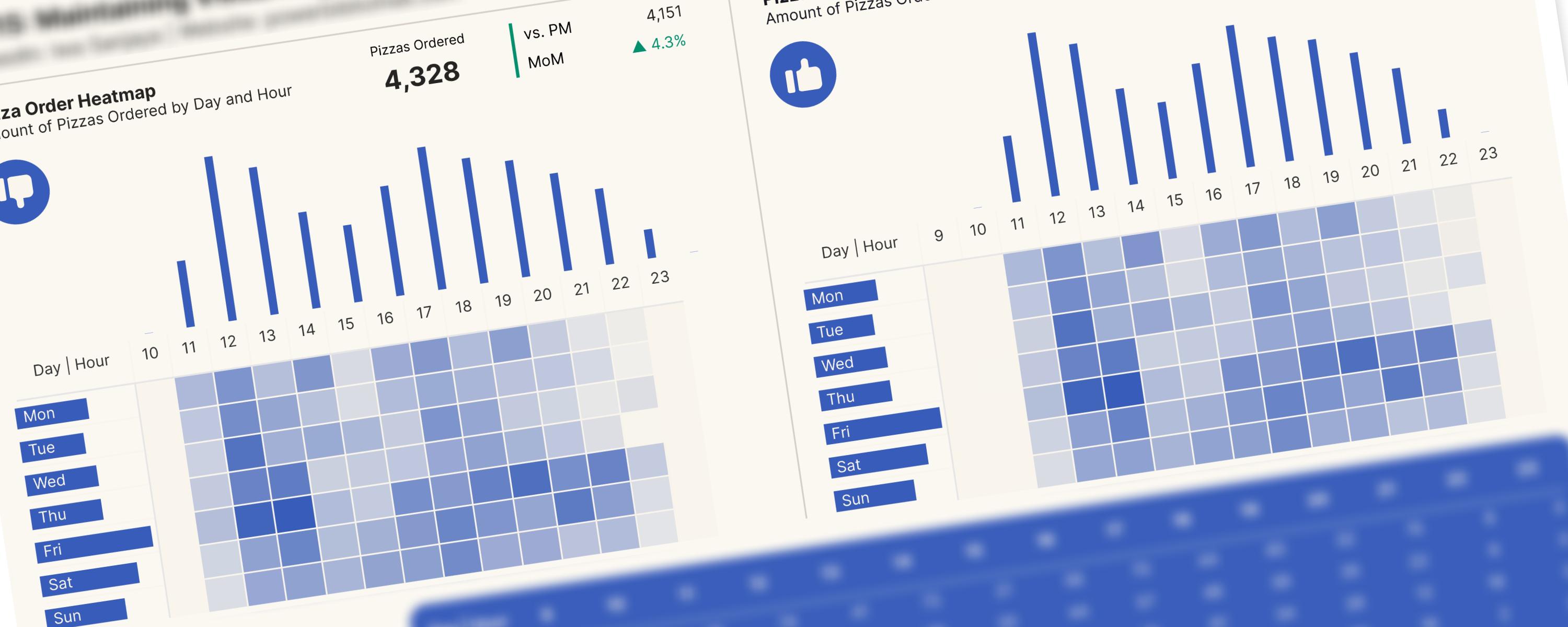
This documentation will walk you through the process of creating a combined visualization using a matrix and bar/column charts, ensuring they remain visually aligned regardless of filtering.
Use Case and Limitations
Use Case
Heatmaps provide a clear visual representation of data using color gradients. The intensity of the color corresponds to the data value, with warmer hues for higher values and cooler hues for lower values, instantly highlighting “hot spots” where values are highest.
Limitation
Using heatmaps for data visualization can be highly effective, but they also come with certain limitations. Here are some key limitations to consider:
-
Heatmaps focus on relative comparisons rather than absolute values, which can make it difficult to understand the context or magnitude of the data.
-
Users may struggle to distinguish between similar shades, leading to potential misinterpretation of the data.
-
Without additional annotations or supporting visuals, key insights may be missed.
Problem Statement
Solution
Documentation
This documentation covers six crucial steps to maintain visual alignment in matrix-chart combinations.
Step 1: Extracting Hour from Date Column
Step 2: Generating a Reference Hour Table
Step 3: Defining a DAX Measure to Show Total Quantity Ordered for All Hours (Including Blanks)
First, to ensure that all hours, including those with no data, are displayed in our matrix visualization (hours in columns, days of the week in rows), we’ll define the following DAX measure.
Total Qty (Hour Matrix) =
SUMX(
    HourTable,
    CALCULATE(
        COALESCE([Total Qty], 0),
        TREATAS(VALUES(HourTable[Hour]), orders[Hour])
    )
)
The measure goes through each hour in our HourTable. For each hour, it checks the orders table to see how many orders there are for that hour. If there are no orders for that hour, it counts the quantity as 0. The SUMX then adds up all these quantities for each hour, ensuring that even hours with no orders are included in the final result, thus preventing gaps in your heatmap.
Why is TREATAS used?
TREATAS is crucial here because a simple filter would not work as intended within the SUMX. A regular filter would only consider hours that already exist in the orders table. TREATAS allows you to introduce hours from your HourTable even if they are not present in your orders table, ensuring complete coverage in your visualization.
Example:
Let’s say your HourTable has hours 9, 10, 11, and 12. Your orders table only has orders for hours 9 and 11.
-
The measure iterates through
HourTable. -
For hour 9,
TREATASfiltersordersto only include orders whereorders[Hour]is 9.[Total Qty]calculates the quantity for hour 9. -
For hour 10,
TREATASfiltersordersto only include orders whereorders[Hour]is 10. Since there are no orders for hour 10,[Total Qty]returns BLANK, andCOALESCEconverts it to 0. -
For hour 11,
TREATASfiltersordersto only include orders whereorders[Hour]is 11.[Total Qty]calculates the quantity for hour 11. -
For hour 12,
TREATASfiltersordersto only include orders whereorders[Hour]is 12. Since there are no orders for hour 12,[Total Qty]returns BLANK, andCOALESCEconverts it to 0. -
SUMXadds up the quantities for all hours (including the 0s), giving you the total quantity for each hour, including zero for the missing hours.
This measure is very effective for creating heatmaps or other visualizations where you need to show data for all categories (in this case, hours), even if some categories have no corresponding data.
Step 4: Generating a Date Dimension (DimDate) Table
Similar to how we created the hour table, we’ll now generate a date dimension table. We’ll specifically use the day-of-week column from this new table. The hour table is kept separate from the date dimension table because our date table doesn’t include time information.
Note: When working with time-intelligence functions, it’s always important to have a date table that serves as a calendar table.
The following DAX measure will be used to generate the date table.
DimDate =
ADDCOLUMNS (
    CALENDAR ("2015-01-01", "2015-12-31"),
    "DateInt", FORMAT ( [Date], "YYYYMMDD" ),
    "Year", YEAR ( [Date] ),
    "Monthnumber", FORMAT ( [Date], "MM" ),
    "MonthNameShort", FORMAT ( [Date], "mmm" ),
    "MonthNameLong", FORMAT ( [Date], "mmmm" ),
    "DayOfWeekNumber", WEEKDAY ( [Date], 2 ), -- Monday = 1, Sunday = 7
    "DayOfWeek", FORMAT ( [Date], "dddd" ),
    "DayOfWeekShort", FORMAT ( [Date], "ddd" ),
    "Quarter", "Q" & FORMAT ( [Date], "Q" ),
    "YearQuarter", FORMAT ( [Date], "YYYY" ) & "/Q" & FORMAT ( [Date], "Q" ),
    "EndOfMonth", EOMONTH([Date], 0)
)
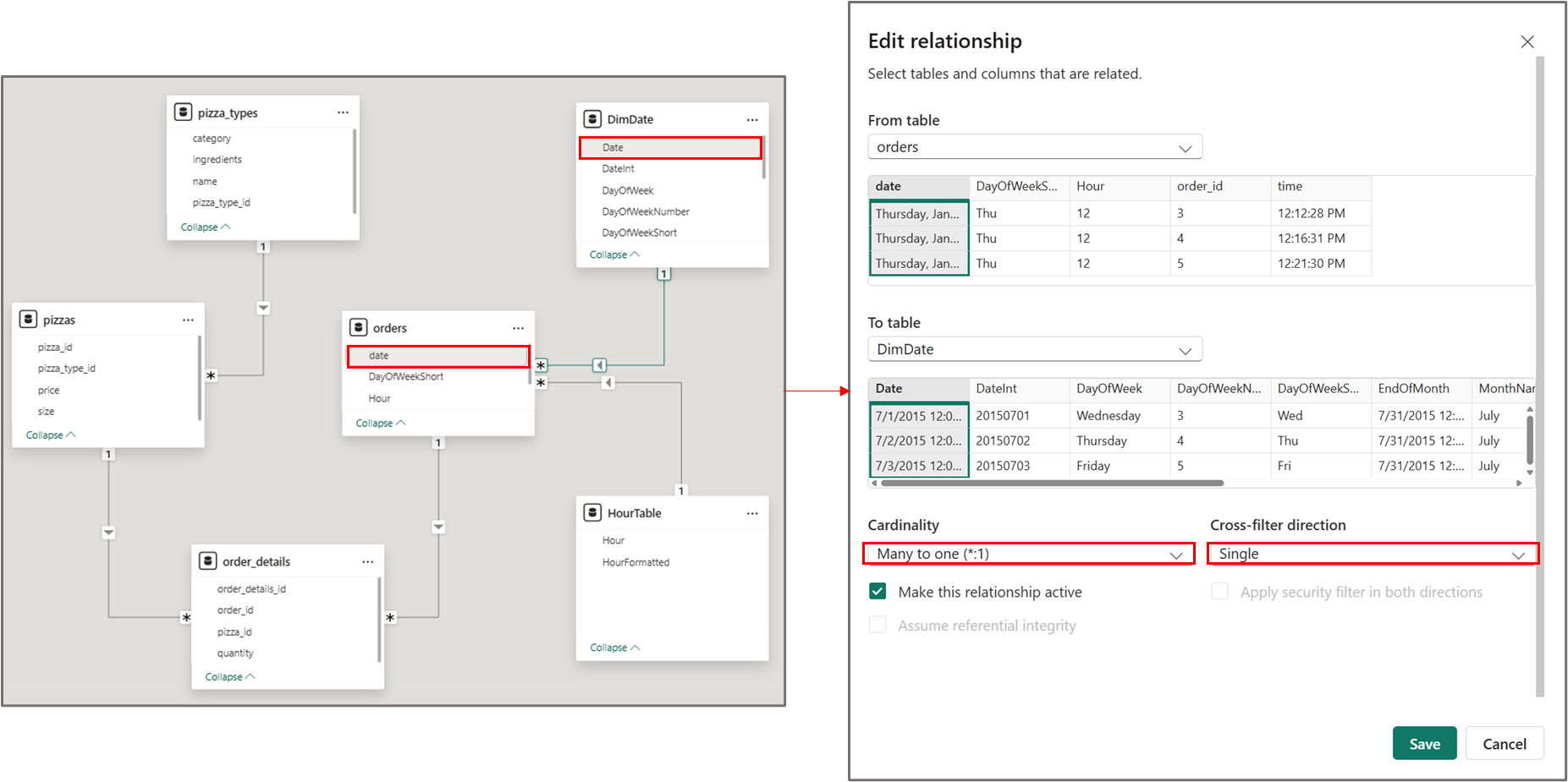 Connecting the date dimension (dimDate) table to the main table
Step 5: Defining a DAX Measure to Show Total Quantity Ordered for All Days of Week (Including Blanks)
To ensure that all days of the week, including those with no data, are displayed in our matrix visualization, we’ll define the following DAX measure.
Total Qty (Day of Week Matrix) =
SUMX(
    DimDate,
    CALCULATE(
        COALESCE([Total Qty], 0),
        TREATAS(VALUES(DimDate[DayOfWeekShort]), orders[DayOfWeekShort])
    )
)
The measure goes through each day of the week. For each day, it looks at all the dates in your date table. For each of those dates, it counts the quantity of orders that happened on that day of the week. If there are no orders for a particular day of the week, it shows 0. This ensures that all days of the week are shown in our matrix, even if they have no quantity ordered.
Step 6: Configuring the Matrix-Chart Combo
Now that we’ve defined all the required measures, we’ll create the matrix visual. Start by placing the [Hour] column from the hour table in the rows of the matrix visual. Then add the [DayofWeekShort] column from the DimDate table to the columns. Finally, place the [Total Qty (Hour Matrix)] measure that we defined earlier into the values area.
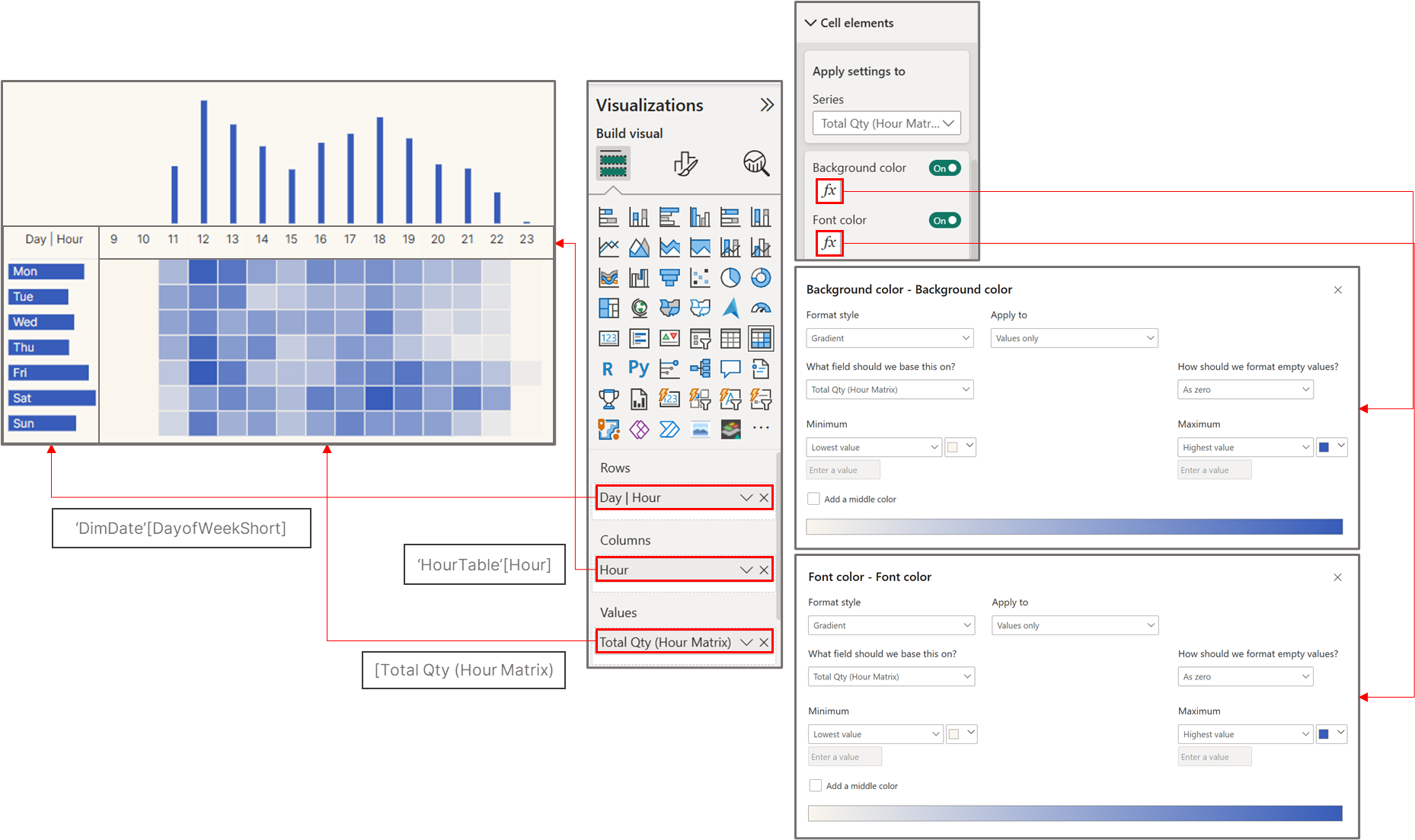 Configuring the matrix visual
Next, we’ll create two visualizations: a column chart showing total quantity ordered by hour, and a bar chart showing total quantity ordered by day of week. Since we already display days of the week in the matrix rows and hours in the matrix columns, we can hide the x-axis of the column chart and the y-axis of the bar chart.
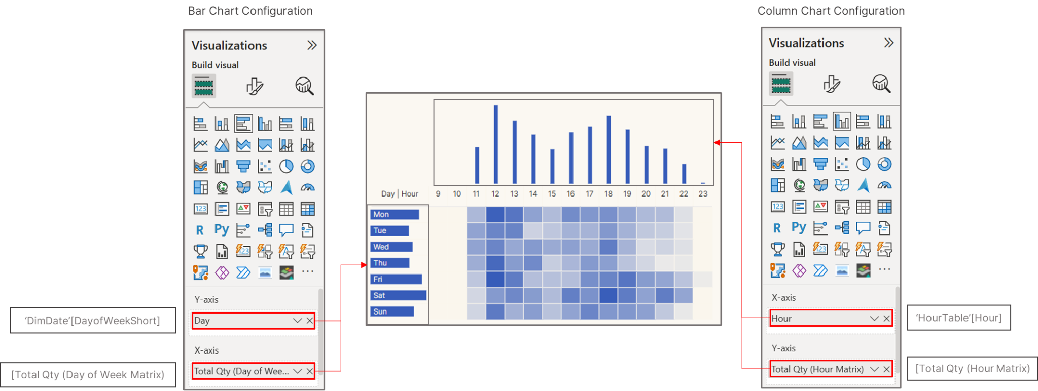 Bar and column charts configuration
The bar chart will be placed behind the matrix visual. Since the bars are blue, the row font color will contrast with the bars’ blue hue.