Foreword
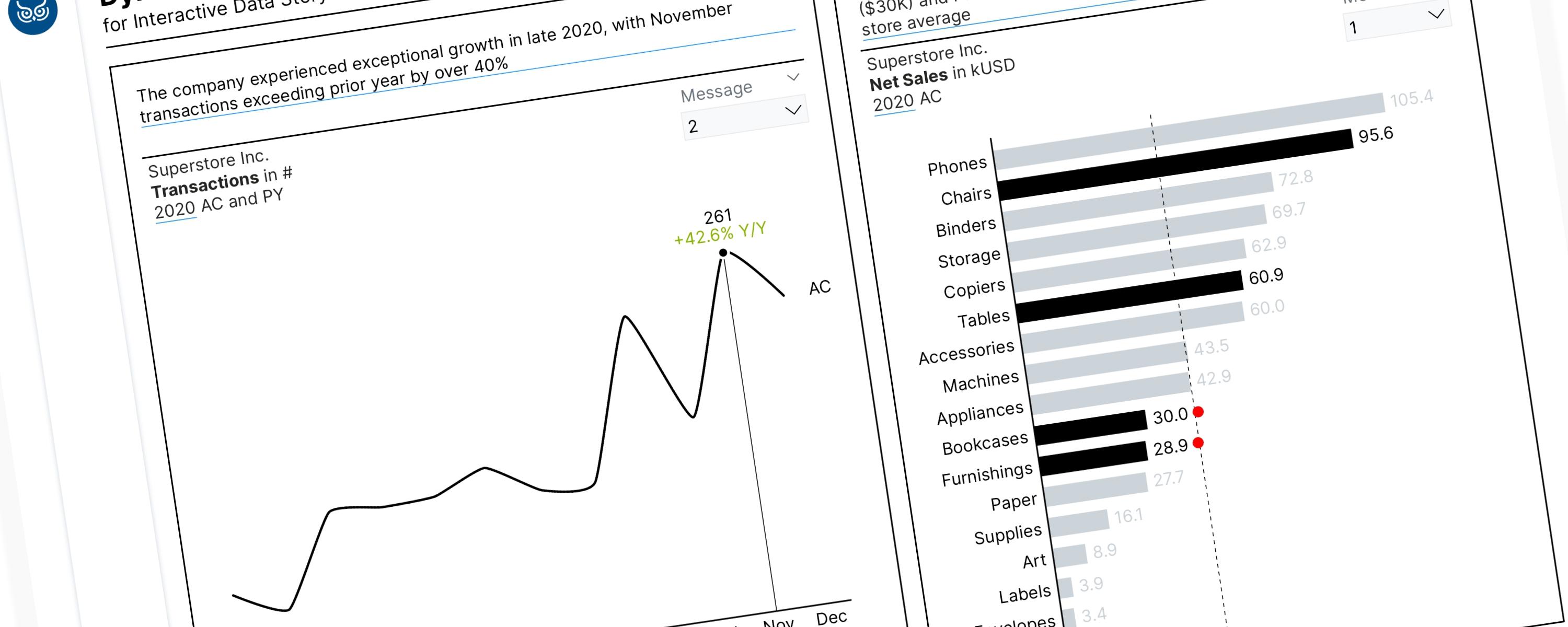
Field parameters are a powerful feature in Power BI. When combined with the SWITCH() function, these tools allow us to tell a compelling data story by dynamically highlighting visuals and conveying precise key messages on our charts. This documentation provides a step-by-step guide on enabling dynamic visual highlighting and key message integration for effective data storytelling in Power BI. We will begin by demonstrating how to integrate key messages when only a single slicer is applied to the dashboard.
DAX Measures
DAX Measures for Line Chart
Total Transactions
_01 Total Transactions = DISTINCTCOUNT(Superstore[Order ID])Transaction for the Latest Month
_01 Latest_Transactions (Months) =
VAR latest_month =
  CALCULATE(
      MAX(DimDate[MonthNumber]),
      ALLSELECTED(DimDate)
  )
VAR current_month = SELECTEDVALUE(DimDate[MonthNumber])
VAR check =
  IF(
      current_month = latest_month,
      [_01 Total Transactions],
      BLANK()
  )
RETURN
  check
Month with the Highest Number of Transactions
_01 Max_Transactions (Months) =
VAR max_val =
MAXX(
  ALLSELECTED(DimDate[MonthNameShort], DimDate[Monthnumber]),
  [_01 Total Transactions]
)
VAR check =
  IF(
      max_val = [_01 Total Transactions],
      max_val,
      BLANK() )

RETURN
check
Peak Months
_01 Peak_Transactions (Months) =
VAR current_month = SELECTEDVALUE(DimDate[MonthNameShort])
VAR check =
  IF(
      current_month IN {"Sep", "Nov"},
      [_01 Total Transactions],
      BLANK()
  )
RETURN
  check
Y-Axis Maximum Range (Total Transactions Across Months)
Y-Axis Max_Transactions (Months) =
VAR _HighestValue =
MAXX(
  ALLSELECTED(DimDate[MonthAbbr]),
  [_01 Total Transactions]
  )

RETURN
  IF(
      NOT ISBLANK(_HighestValue),
      _HighestValue * 1.2
  )
Previous Year Total Transactions
_03 PY Transactions =
IF(
  HASONEVALUE(DimDate[Year]),
  CALCULATE(
      [_01 Dynamic Selected Metric],
      SAMEPERIODLASTYEAR(DimDate[Date])
  ),
  BLANK()
)
YoY Percentage Net Change in Total Transactions
_04 △PY% Transactions =
IF(
  ISBLANK([_01 Total Transactions]) || [_01 Total Transactions] = 0,
  "--",
  DIVIDE([_01 Total Transactions] - [_02 PY Transactions], [_02 PY Transactions], 0)
)
MoM Percentage Net Change in Total Transactions
MoM % Change in Transactions =
VAR CurrentMonth =
  MAX('DimDate'[MonthNumber])
VAR CurrentYear =
  MAX('DimDate'[Year])
VAR CurrentValue =
  CALCULATE(
      [_01 Total Transactions],
      FILTER(
          ALL('DimDate'),
          'DimDate'[Year] = CurrentYear &&
          'DimDate'[MonthNumber] = CurrentMonth
      )
  )
VAR PrevMonthValue =
  CALCULATE(
      [_01 Total Transactions],
      FILTER(
          ALL('DimDate'),
          'DimDate'[Year] * 12 + 'DimDate'[MonthNumber] =
              CurrentYear * 12 + CurrentMonth - 1
      )
  )
RETURN
DIVIDE(CurrentValue - PrevMonthValue, PrevMonthValue)
Dynamic Message for Line Chart
_01 Dynamic Message (Line Chart) =
VAR SelectedMetricOrder = SELECTEDVALUE('PDataPoints'[PDataPoints Order])
VAR SelectedYear = SELECTEDVALUE(DimDate[Year])
RETURN
  SWITCH(
      TRUE(),
      SelectedMetricOrder = 0 && SelectedYear = 2020,
          "The transactions declined 14.2% month-over-month in December 2020, breaking the strong growth momentum established earlier in the year",

      SelectedMetricOrder = 0 && SelectedYear = 2019,
          "December 2019 transactions declined 3.8% month-over-month—continuing the downturn that began after September's spike",

      SelectedMetricOrder = 0 && SelectedYear = 2018,
          "December 2018 transactions reached 161—up 1.9% from November and finishing the year on a high note",

      SelectedMetricOrder = 0 && SelectedYear = 2017,
          "Transaction volume dropped from 151 in November to 141 in December 2017—a 6.6% decline that requires investigation",

      SelectedMetricOrder = 1 && SelectedYear = 2020,
          "The company experienced exceptional growth in late 2020, with November transactions exceeding prior year by over 40%",

      SelectedMetricOrder = 1 && SelectedYear = 2019,
          "2019 showed volatile transaction patterns with a September peak of 192, followed by sharp declines through year-end",

      SelectedMetricOrder = 1 && SelectedYear = 2018,
          "Transaction volume in 2018 maintained steady upward trajectory, reaching 161 in December with 14.2% year-over-year growth",

      SelectedMetricOrder = 1 && SelectedYear = 2017,
          "2017 transaction volume remained stable until Q4, when business accelerated sharply to 151 transactions in November",

      SelectedMetricOrder = 2 && SelectedYear = 2020,
          "2020's dual-peak pattern (September: 226, November: 261) represents the strongest performance across all years analyzed",

      SelectedMetricOrder = 2 && SelectedYear = 2019,
          "2019 transactions peaked at 192 in September but remained volatile, with November rebounding to 183 after October's dip",

      SelectedMetricOrder = 2 && SelectedYear = 2018,
          "2018 transactions showed healthy Q4 progression with sequential gains: 140 (September) to 158 (December)",

      SelectedMetricOrder = 2 && SelectedYear = 2017,
          "Q4 2017 delivered breakthrough performance—transactions jumped from 130 in September to 151 in November",

      BLANK()
  )
DAX Measures for Horizontal Bar Chart
Total Net Sales
_01 Total Net Sales = SUM(Superstore[Sales]) / 1000CF for “Furniture” Category
CF_Furniture Category =
VAR _category = SELECTEDVALUE(DimProduct[Category])
RETURN
  SWITCH(
      _category,
      "Furniture", "#000000",      // Black
      "#CED4DA"                     // Default gray
  )
CF for “Office Supplies” Category
CF_Office Supplies Category =
VAR _category = SELECTEDVALUE(DimProduct[Category])
RETURN
  SWITCH(
      _category,
      "Office Supplies", "#000000", // Black
      "#CED4DA"                     // Default gray
  )
CF for “Technology” Category
CF_Technology Category =
VAR _category = SELECTEDVALUE(DimProduct[Category])
RETURN
  SWITCH(
      _category,
      "Technology", "#000000",      // Black
      "#CED4DA"                     // Default gray
  )
Dynamic CF to Highlight the Bars
_01 Dynamic CF_Highlighted Bars =
VAR SelectedMetricOrder = SELECTEDVALUE('PBarColor'[PBarColor Order])
RETURN
  SWITCH(
      SelectedMetricOrder,
      0, [CF_Furniture Category],
      1, [CF_Office Supplies Category],
      2, [CF_Technology Category],
      BLANK()
  )
Marker for Sub-Category with Net Sales Below Average
Marker - Below Average (Net Sales) =
VAR current_value = [_01 Total Net Sales]
VAR current_category = SELECTEDVALUE(DimProduct[Category])
VAR current_subcategory = SELECTEDVALUE(DimProduct[Sub-Category])
VAR selected_order = SELECTEDVALUE('PBarColor'[PBarColor Order])
VAR selected_year = SELECTEDVALUE(DimDate[Year])

// Determine which category to mark based on order
VAR target_category =
  SWITCH(
      selected_order,
      0, "Furniture",
      1, "Office Supplies",
      2, "Technology",
      BLANK()
  )

// Calculate average across ALL subcategories for the selected year
VAR overall_average =
  CALCULATE(
      AVERAGEX(
          ALL(DimProduct[Sub-Category]),
          [_01 Total Net Sales]
      ),
      DimDate[Year] = selected_year
  )

// Assign marker ONLY if:
// 1. Current subcategory belongs to target category AND
// 2. Current value is below overall average
VAR marker =
  IF(
      current_category = target_category &&
      current_value < overall_average &&
      NOT(ISBLANK(current_value)),
      "●",
      ""
  )

RETURN
  marker
Dynamic Message for Bar Chart
_01 Dynamic Message (Bar Chart) =
VAR SelectedMetricOrder = SELECTEDVALUE('PBarColor'[PBarColor Order])
VAR SelectedYear = SELECTEDVALUE(DimDate[Year])
RETURN
  SWITCH(
      TRUE(),
      SelectedMetricOrder = 0 && SelectedYear = 2020,
          "Two Furniture subcategories are dragging down results: Bookcases ($30K) and Furnishings ($28.9K) fall 30% and 33% below the $43.1K store average",

      SelectedMetricOrder = 0 && SelectedYear = 2019,
          "2019 Furniture challenges: Furnishings ($27.9K) and Bookcases ($26.8K) fall 22-25% below the $35.8K average while Chairs lead at $83.9K",

      SelectedMetricOrder = 0 && SelectedYear = 2018,
          "Furnishings is 2018's problem child—at $21.1K, it's the only Furniture subcategory falling below the $27.7K average (down 24%)",

      SelectedMetricOrder = 0 && SelectedYear = 2017,
          "2017 Furniture crisis: Bookcases ($20K) and Furnishings ($13.8K) fall 30% and 52% below the $28.5K average—the worst subcategory performance across all years.",

      SelectedMetricOrder = 1 && SelectedYear = 2020,
          "Office Supplies crisis persists in 2020: 7 of 9 subcategories fall below the $35.8K average—representing systematic underperformance requiring urgent category-level intervention",

      SelectedMetricOrder = 1 && SelectedYear = 2019,
          "Office Supplies crisis: 7 of 9 subcategories fall below the $43.1K average—representing systematic underperformance requiring category-level intervention",

      SelectedMetricOrder = 1 && SelectedYear = 2018,
          "Office Supplies in 2018: 6 of 9 subcategories fall below the $27.7K average—Storage and Binders succeed while majority struggle, confirming multi-year structural issues",

      SelectedMetricOrder = 1 && SelectedYear = 2017,
          "Office Supplies crisis begins in 2017: 7 of 9 subcategories fall below the $28.5K average—Storage and Binders alone succeed while majority struggle at less than half the store average",

      SelectedMetricOrder = 2 && SelectedYear = 2020,
          "Technology achieves 100% subcategory success in 2020—all four items exceed the $43.1K average, with Phones leading at $105.4K (144% above average)",

      SelectedMetricOrder = 2 && SelectedYear = 2019,
          "Technology maintains 100% subcategory success in 2019—all four items exceed the $35.8K average, with Phones leading at $79K (121% above average)",

      SelectedMetricOrder = 2 && SelectedYear = 2018,
          "2018 Technology underperformance is minimal: Copiers misses average by just 5% ($26.2K vs. $27.7K)—far less severe than Office Supplies' 16-98% gaps or Furniture's persistent issues",

      SelectedMetricOrder = 2 && SelectedYear = 2017,
          "Technology's 2017 struggles span from moderate (Accessories at -12%) to severe (Copiers at -62%)—representing the category's only multi-year underperformer in Copiers",

      BLANK()
  )
Documentation
Line Chart (Single Series)
Line Chart Usage
Line charts are primarily used to plot continuous data, such as measurements over time (like days, months, or years). Because the data points are connected by a physical line, the chart visually suggests a continuous flow or relationship between those points. This makes line charts generally unsuitable for categorical data (data divided into separate, unrelated groups) where no such connection exists.
Dynamic Visual Highlighting for Line Charts
In a line chart, specific periods can be emphasized or highlighted using markers and/or error bars. Displaying markers for all periods often leads to visual clutter, significantly increasing the cognitive load for the audience. Therefore, line chart markers should be used wisely, applied only to the specific period(s) that convey the key message or insight we intend to highlight on the chart. The following example illustrates the monthly transaction trend for Superstore based on a selected year. Our goal is to dynamically highlight specific periods using DAX by applying markers to key points: the latest month, the month with the highest number of transactions, and the point representing the peak cycle in the trend.
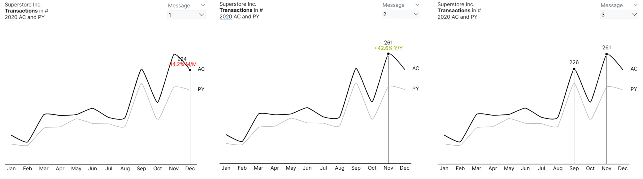 Dynamic Visual Highlighting for Line Charts
Step 1.1: Defining Required Measures
We'll start by creating DAX measures to mark the previously mentioned key points on the line chart: the latest month, the month with the highest number of transactions, and the peak cycle of the trend.
Prerequisite Measure: Total Transactions
_01 Total Transactions = DISTINCTCOUNT(Superstore[Order ID])Measure #01: Transaction for Latest Month
_01 Latest_Transactions (Months) =
VAR latest_month =
  CALCULATE(
      MAX(DimDate[MonthNumber]),
      ALLSELECTED(DimDate)
  )
VAR current_month = SELECTEDVALUE(DimDate[MonthNumber])
VAR check =
  IF(
      current_month = latest_month,
      [_01 Total Transactions],
      BLANK()
  )
RETURN
  check
This measure shows the total number of transactions only for the most recent (latest) month within the current selection (such as the latest month of a year, or of the filtered period). All other months will show blank — this is used to highlight or mark the latest month in visuals.
Read the Explanation
Step-by-step explanation
- Find the latest month in the current filter context
VAR latest_month =
  CALCULATE(
      MAX(DimDate[MonthNumber]),
      ALLSELECTED(DimDate)
)-
MAX(DimDate[MonthNumber])→ finds the highest month number (e.g., 12 for December). -
ALLSELECTED(DimDate)→ looks at the entire set of months currently visible in the report (after slicers or filters are applied). -
Together, this gives the latest month number available in the current filter selection.
- Identify the current month for this data row
VAR current_month = SELECTEDVALUE(DimDate[MonthNumber])- Retrieves the month number for the current row in the visual or table.
Example: if you’re displaying data by month, each row will have a different
current_monthvalue (e.g., Jan = 1, Feb = 2, etc.).
- Compare current month vs. latest month
VAR check =
  IF(
      current_month = latest_month,
      [_01 Total Transactions],
      BLANK()
)-
If this row’s
current_monthequals thelatest_month, return_01 Total Transactions(the number of transactions in that month). -
Otherwise, return
BLANK().
So only the latest month gets a value — all other months will appear empty.
- Return the result
RETURN
  check
The measure finally returns either:
-
The transaction total (for the latest month), or
-
Blank (for all prior months).
Measure #02: Month with the Highest Number of Transactions
_01 Max_Transactions (Months) =
VAR max_val =
MAXX(
  ALLSELECTED(DimDate[MonthNameShort], DimDate[Monthnumber]),
  [_01 Total Transactions]
)
VAR check =
  IF(
      max_val = [_01 Total Transactions],
      max_val,
      BLANK() )

RETURN
check
This measure is used to identify which month has the highest number of transactions (within the filtered period), and display that value only for that month — leaving all other months blank. It is used to highlight or label the peak month in a line or bar chart.
Read the Explanation
Step-by-Step Explanation
- Calculate the highest transaction value among visible months
VAR max_val =
  MAXX(
      ALLSELECTED(DimDate[MonthNameShort], DimDate[Monthnumber]),
      [_01 Total Transactions]
)-
MAXX(...)→ iterates over each month (in the current selection), evaluates[_01 Total Transactions]for each, and returns the maximum transaction amount. -
ALLSELECTED(DimDate[MonthNameShort], DimDate[Monthnumber])→ removes any filters from the month columns but keeps filters from outside the visual, such as the selected year or region. This ensures that the comparison is limited to the currently selected context (e.g., only 2024).
- Compare the current row’s transaction value to the maximum
VAR check =
  IF(
      max_val = [_01 Total Transactions],
      max_val,
      BLANK()
)- For each month in the visual:
- If this month’s total equals the overall maximum → return the value.
- Otherwise → return blank.
So only the peak month shows its transaction value.
- Return the result
RETURN checkReturns either the maximum transaction amount (for the highest month) or blank for other months.
Measure #03: Peak Month(s)
_01 Peak_Transactions (Months) =
VAR current_month = SELECTEDVALUE(DimDate[MonthNameShort])
VAR check =
  IF(
      current_month IN {"Sep", "Nov"},
      [_01 Total Transactions],
      BLANK()
  )
RETURN
  check
This measure identifies specific peak months — in this case, September (“S”) and November (“N”) — and returns the total number of transactions for those months only.
Read the Explanation
Step-by-step explanation
VAR current_month = SELECTEDVALUE(DimDate[MonthAbbr])-
This gets the current month abbreviation from your date table (
DimDate[MonthAbbr]). -
For example:
- January →
"J", - September →
"S", - November →
"N", etc.
- January →
-
It’s the month currently in context (e.g., in a visual showing months).
VAR check =
  IF(
      current_month IN {"S", "N"},
      [_01 Total Transactions],
      BLANK()
)-
This checks if the current month is September (“S”) or November (“N”).
-
If yes, it returns the value of
[_01 Total Transactions]— the total transactions for that month. -
If no, it returns blank, meaning the measure will show nothing for other months.
RETURN
  check
Finally, it returns the check result, either:
-
The total transactions (if it’s a peak month), or
-
Blank (if it’s not).
Step 1.2: Creating a Field Parameter
Next, create a field parameter and add these three measures. Since each marker represents a single key message, be sure to set the slicer to 'Single select' so only one key message is displayed at a time.
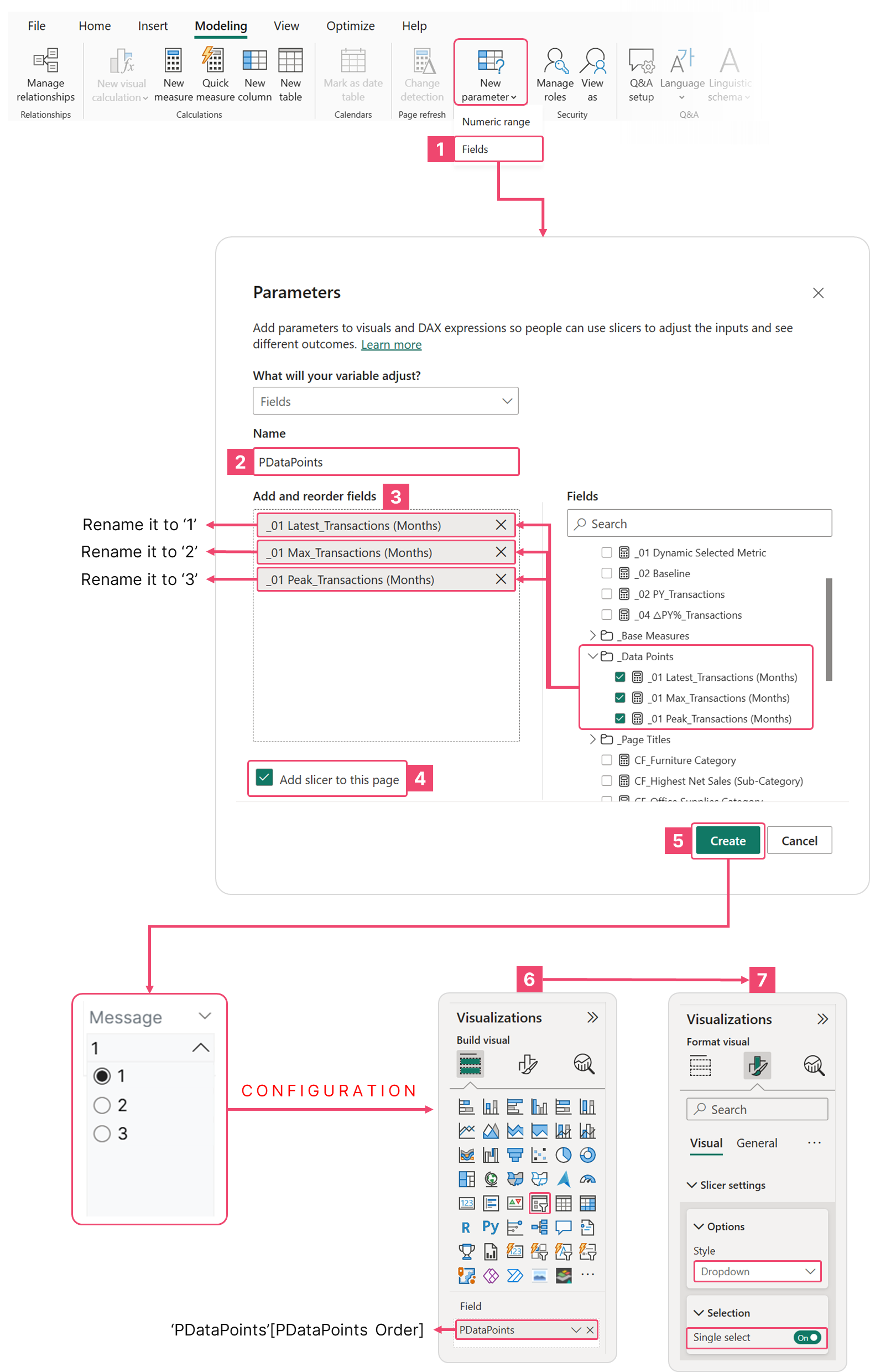 Configuring the Field Parameter Slicer for Dynamic Visual Highlighting
Step 1.3: Generating the Line Chart
Generate a line chart, placing DimDate[MonthNameShort] on the X-axis and the PDataPoints parameter and [_01 Total Transactions] on the Y-axis. To ensure data labels aren't truncated, we need to create headroom. Achieve this by generating a DAX measure that multiplies the maximum number of monthly transactions by a fixed multiplier, then use this measure to conditionally format the Y-axis maximum range.
Measure #04: Y-Axis Maximum Range
Y-Axis Max_Transactions (Months) =
VAR _HighestValue =
MAXX(
  ALLSELECTED(DimDate[MonthAbbr]),
  [_01 Total Transactions]
  )

RETURN
  IF(
      NOT ISBLANK(_HighestValue),
      _HighestValue * 1.2
  )
This measure dynamically calculates the maximum Y-axis value for a chart showing monthly transactions, with a small buffer (20% extra) for better visualization.
Read the Explanation
Step-by-step explanation
- Find the highest transaction value among the selected months
VAR _HighestValue =
MAXX(
  ALLSELECTED(DimDate[MonthAbbr]),
  [_01 Total Transactions]
)-
MAXX()iterates over each month abbreviation in theDimDate[MonthAbbr]column. -
For each month, it evaluates the measure
[_01 Total Transactions]. -
It then returns the maximum value among all those months.
✅ ALLSELECTED() ensures that:
-
It only considers months that are currently visible or selected in the report filter context.
-
So if a slicer or filter limits the months (e.g., only Q2), it finds the highest transaction within that selection, not for the whole year.
- Add spacing for chart readability
RETURN
  IF(
      NOT ISBLANK(_HighestValue),
      _HighestValue * 1.2
)-
The measure checks that
_HighestValueis not blank (to avoid errors if there’s no data). -
If it’s valid, it multiplies the value by 1.2, which adds a 20% buffer above the maximum.
This ensures that:
-
The chart’s Y-axis doesn’t stop exactly at the tallest bar.
-
Instead, it leaves a bit of headroom so the bar doesn’t touch the top edge of the chart — improving readability.
For additional detail, we will display data labels showing period comparisons for the selected data points. Specifically, the latest month's transaction will be compared with the previous month's value, and the peak/highest transaction will be compared with the value from the previous year.
Measure #05: YoY Percentage Net Change in Total Transactions
_04 △PY% Transactions =
IF(
  ISBLANK([_01 Total Transactions]) || [_01 Total Transactions] = 0,
  "--",
  DIVIDE([_01 Total Transactions] - [_02 PY Transactions], [_02 PY Transactions], 0)
)
This DAX calculates the year-over-year percentage change in transactions, comparing the current year to the previous year. It shows the percentage variance in total transactions between the current year and the previous year, formatted as a readable percentage.
Read the Explanation
Step-by-step breakdown
- Handle invalid or missing data first
IF(
  ISBLANK([_01 Total Transactions]) || [_01 Total Transactions] = 0,
  "--",
This checks two conditions for the current year’s transactions:
-
ISBLANK([_01 Total Transactions]): No data available (e.g., missing month or year). -
[_01 Total Transactions] = 0: Data exists but the transaction value is 0.
👉 If either condition is true, the formula returns "--".
This acts as a placeholder string, usually displayed in the visual instead of showing BLANK() or NaN, signaling that a valid comparison can’t be made.
- Otherwise, calculate the YoY percentage change
DIVIDE(
  [_01 Total Transactions] - [_02 PY Transactions],
  [_02 PY Transactions],
  0
)
This uses the DIVIDE() function to safely calculate:
Percentage Change= (CurrentYear - PreviousYear) / PreviousYear
-
Numerator: Difference in transactions = current year minus previous year.
-
Denominator: Previous year’s transactions (the baseline for comparison).
-
The third argument
0ensures that if the denominator is 0, DAX returns 0 instead of an error (to avoid division by zero).
- Return result
If neither of the “blank or zero” conditions applies, the formula outputs the calculated YoY % variance. Otherwise, it displays "--" as a placeholder.
Calculating the Year-over-Year (YoY) net change in total transactions requires us to first define the measure for the previous year's value.
Prerequisite Measure: Previous Year Total Transactions
_03 PY Transactions =
IF(
  HASONEVALUE(DimDate[Year]),
  CALCULATE(
      [_01 Total Transactions],
      SAMEPERIODLASTYEAR(DimDate[Date])
  ),
  BLANK()
)
This measure returns the total transactions from the same period in the previous year — but only when exactly one year is selected.
Read the Explanation
Step-by-step breakdown
- The outer
IF()check
IF(
  HASONEVALUE(DimDate[Year]),
  ...
  ,
  BLANK()
)-
HASONEVALUE(DimDate[Year])checks whether there is exactly one year in the current filter context. -
If true → the calculation inside runs.
-
If false (e.g., multiple years selected) → returns
BLANK().
✅ Why?
This prevents incorrect comparisons when more than one year is selected (because comparing to “previous year” wouldn’t make sense in that case).
- The core calculation
CALCULATE(
  [_01 Total Transactions],
  SAMEPERIODLASTYEAR(DimDate[Date])
)
This part computes the previous year’s value for the same time period.
Let’s unpack it:
-
[_01 Total Transactions]→ your existing measure that sums total transactions. -
CALCULATE()→ changes the filter context. -
SAMEPERIODLASTYEAR(DimDate[Date])→ shifts the current date context back by one year, keeping the same days/months.
- Combine it all
Putting both parts together:
_03 PY Transactions =
IF(
  HASONEVALUE(DimDate[Year]),
  CALCULATE(
      [_01 Total Transactions],
      SAMEPERIODLASTYEAR(DimDate[Date])
  ),
  BLANK()
)-
✅ If only one year (say 2025) is selected, it returns the 2024 transactions for the same months/days.
-
🚫 If multiple years (e.g., 2024 + 2025) are selected, it returns blank to avoid misleading data.
Measure #06: MoM Percentage Net Change in Total Transactions
MoM % Change in Transactions =
VAR CurrentMonth =
  MAX('DimDate'[MonthNumber])
VAR CurrentYear =
  MAX('DimDate'[Year])
VAR CurrentValue =
  CALCULATE(
      [_01 Total Transactions],
      FILTER(
          ALL('DimDate'),
          'DimDate'[Year] = CurrentYear &&
          'DimDate'[MonthNumber] = CurrentMonth
      )
  )
VAR PrevMonthValue =
  CALCULATE(
      [_01 Total Transactions],
      FILTER(
          ALL('DimDate'),
          'DimDate'[Year] * 12 + 'DimDate'[MonthNumber] =
              CurrentYear * 12 + CurrentMonth - 1
      )
  )
RETURN
DIVIDE(CurrentValue - PrevMonthValue, PrevMonthValue)
This measure calculates the Month-over-Month (MoM) % change in transactions, showing how the current month’s total transactions compare to the previous month. It finds how much transactions have increased or decreased in percentage terms compared to the previous month.
Read the Explanation
Step-by-step breakdown
- Identify the current month and year
VAR CurrentMonth = MAX('DimDate'[MonthNumber])
VAR CurrentYear = MAX('DimDate'[Year])-
CurrentMonth→ finds the latest visible month in the current filter context (e.g., November = 11). -
CurrentYear→ finds the year that corresponds to that month.
✅ Example:
If you’re viewing 2025-November data: CurrentMonth = 11, CurrentYear = 2025.
- Get the current month’s transaction value
VAR CurrentValue =
  CALCULATE(
      [_01 Total Transactions],
      FILTER(
          ALL('DimDate'),
          'DimDate'[Year] = CurrentYear &&
          'DimDate'[MonthNumber] = CurrentMonth
      )
)-
Removes any existing date filters with
ALL('DimDate'). -
Re-applies a filter for the specific current month and year.
-
Then calculates total transactions for that month via
[_01 Total Transactions].
✅ Example result:
If November 2025 has 12,000 transactions → CurrentValue = 12,000.
- Get the previous month’s transaction value
VAR PrevMonthValue =
  CALCULATE(
      [_01 Total Transactions],
      FILTER(
          ALL('DimDate'),
          'DimDate'[Year] * 12 + 'DimDate'[MonthNumber] =
              CurrentYear * 12 + CurrentMonth - 1
      )
  )
Because months reset every year (e.g., December → January), this math trick: Year * 12 + MonthNumber converts each year-month combo into a continuous sequence of months — so Power BI can easily move one month backward, even across year boundaries.
- Calculate Month-over-Month % change
RETURN
DIVIDE(CurrentValue - PrevMonthValue, PrevMonthValue)
Computes:
MoM % Change = (Current Month - Previous Month) / Previous Month
-
DIVIDE()safely handles division by zero or blanks. -
Returns a decimal value (e.g.,
0.2= 20%).
To achieve the desired result, configure the line chart with the following settings.
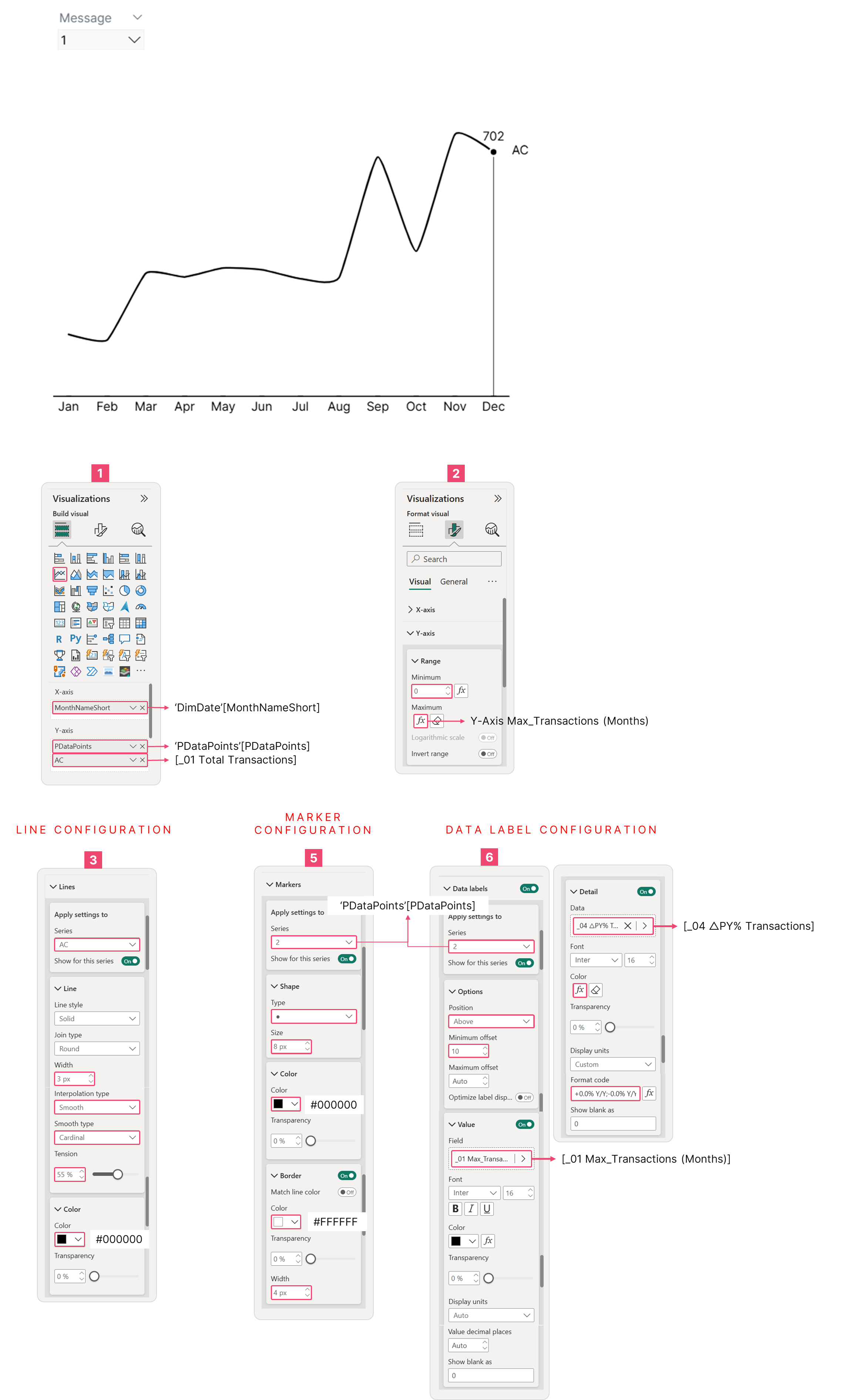 Line Chart Configuration
Step 1.4: Displaying Dynamic Key Messages
We'll connect the slicer to the markers using a separate DAX measure that employs the SWITCH() function, allowing the key message to be displayed dynamically. Here's an example:
Measure #07: Dynamic Message Example
_01 Dynamic Message (Line Chart) - Example =
VAR SelectedMetricOrder = SELECTEDVALUE('PDataPoints'[PDataPoints Order])

RETURN
  SWITCH(
      TRUE(),
      SelectedMetricOrder = 0,
          "[This is your first key message]",

      SelectedMetricOrder = 1,
          "[This is your second key message]",

      SelectedMetricOrder = 2,
          "[This is your third key message]",

      BLANK()
  )
This measure dynamically shows different text messages depending on which metric or data point order is selected — for example, in a slicer or visual interaction.
Read the Explanation
Step-by-step explanation
VAR SelectedMetricOrder = SELECTEDVALUE('PDataPoints'[PDataPoints Order])-
This captures the currently selected value from the column
'PDataPoints'[PDataPoints Order]. -
That column likely defines which metric or data point the user is focusing on (for example:
- 0 = Sales
- 1 = Profit
- 2 = Transactions
- etc.)
-
SELECTEDVALUE()ensures the measure only works when one value is selected (for instance, via a slicer or a visual context).
RETURN
  SWITCH(
      TRUE(),
      SelectedMetricOrder = 0, "[This is your first key message]1",
      SelectedMetricOrder = 1, "[This is your second key message]",
      SelectedMetricOrder = 2, "[This is your third key message]",
      BLANK()
)-
The
SWITCH(TRUE(), …)pattern allows multiple conditional checks to decide what to return. -
Based on the selected metric order, it returns a different message string:
Insert a text box and add the measure [_01 Dynamic Message 1 (Line Chart)] as the dynamic value. The text will then update automatically as you select different options from the slicer.
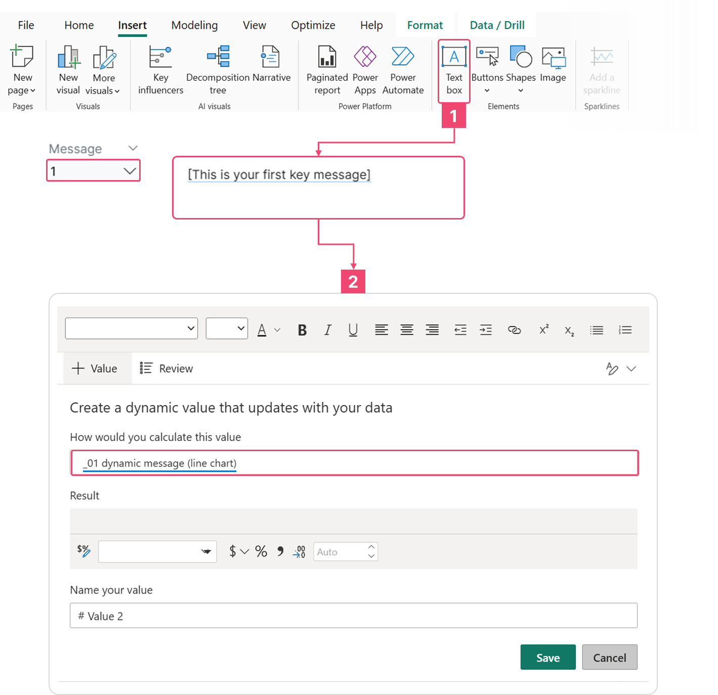 Displaying Dynamic Message Based on Selected Slicer
Step 1.5: Updating Key Messages Based on Filter Selections
Things get more challenging when slicers are introduced, as the visual elements must display context-specific messages. The number of required dynamic messages increases as more slicer types are added to the dashboard. In this example, we will start with a single slicer to illustrate how the core DAX measure must be modified to dynamically respect and adapt to the filter context.
Begin by creating a slicer visual and placing the DimDate[Year] field into the data field. Ensure the slicer setting is configured to 'Single select'. Now, when you choose a year, you will spot different insights, requiring a unique key message for each selected year.
The following is the modified DAX measure required if you need to display a unique key message for each data point and for each selected year.
Measure #08: Modified Dynamic Message (Line Chart) - v1
_01 Dynamic Message (Line Chart) =
VAR SelectedMetricOrder = SELECTEDVALUE('PDataPoints'[PDataPoints Order])
VAR SelectedYear = SELECTEDVALUE(DimDate[Year])
RETURN
  SWITCH(
      TRUE(),
      SelectedMetricOrder = 0 && SelectedYear = 2020,
          "The transactions declined 14.2% month-over-month in December 2020, breaking the strong growth momentum established earlier in the year",

      SelectedMetricOrder = 0 && SelectedYear = 2019,
          "December 2019 transactions declined 3.8% month-over-month—continuing the downturn that began after September's spike",

      SelectedMetricOrder = 0 && SelectedYear = 2018,
          "December 2018 transactions reached 161—up 1.9% from November and finishing the year on a high note",

      SelectedMetricOrder = 0 && SelectedYear = 2017,
          "Transaction volume dropped from 151 in November to 141 in December 2017—a 6.6% decline that requires investigation",

      SelectedMetricOrder = 1 && SelectedYear = 2020,
          "The company experienced exceptional growth in late 2020, with November transactions exceeding prior year by over 40%",

      SelectedMetricOrder = 1 && SelectedYear = 2019,
          "2019 showed volatile transaction patterns with a September peak of 192, followed by sharp declines through year-end",

      SelectedMetricOrder = 1 && SelectedYear = 2018,
          "Transaction volume in 2018 maintained steady upward trajectory, reaching 161 in December with 14.2% year-over-year growth",

      SelectedMetricOrder = 1 && SelectedYear = 2017,
          "2017 transaction volume remained stable until Q4, when business accelerated sharply to 151 transactions in November",

      SelectedMetricOrder = 2 && SelectedYear = 2020,
          "2020's dual-peak pattern (September: 226, November: 261) represents the strongest performance across all years analyzed",

      SelectedMetricOrder = 2 && SelectedYear = 2019,
          "2019 transactions peaked at 192 in September but remained volatile, with November rebounding to 183 after October's dip",

      SelectedMetricOrder = 2 && SelectedYear = 2018,
          "2018 transactions showed healthy Q4 progression with sequential gains: 140 (September) to 158 (December)",

      SelectedMetricOrder = 2 && SelectedYear = 2017,
          "Q4 2017 delivered breakthrough performance—transactions jumped from 130 in September to 151 in November",

      BLANK()
  )
Add a text box and use the modified dynamic message measure for line chart as its value; you'll see the following result:
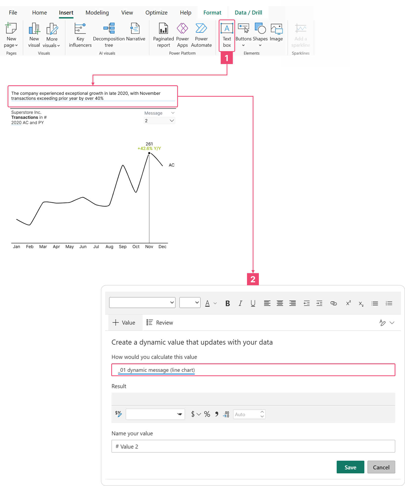
Dynamic Highlighting and Key Message Integration for Line Chart
Bar Chart (Single Series)
The Power of Horizontal Bar Charts
The horizontal bar chart is a great choice for comparing different groups of data (categorical data) because it's so easy to read. It's especially useful when your category names are long. Since most people read from left to right, the categories are easy to scan. This chart design works well with how we process information—our eyes naturally go to the category name first and then smoothly move to the data bar. This simple left-to-right flow means we instantly know what the data represents, unlike a vertical bar chart (column chart) where our eyes often jump back and forth between the data bars and the names below them.
Dynamic Visual Highlighting for Bar Charts
In a bar chart, highlighting is achieved by coloring specific bars with a contrast color (like black) while de-emphasizing the rest with gray. You can further reinforce the message by adding a circle marker next to the data label. Let's look at the example below:
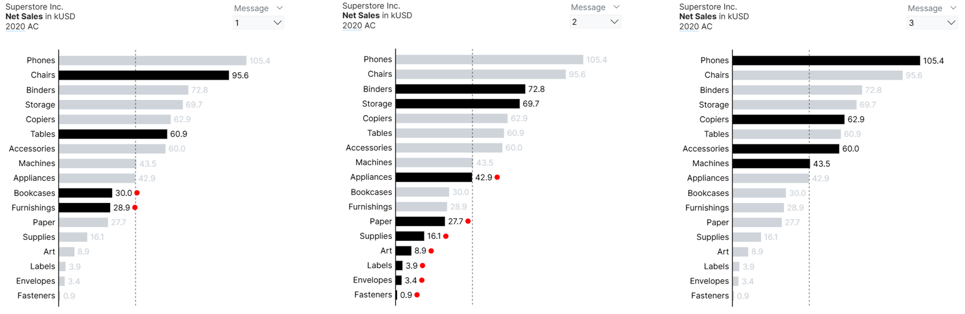 Horizontal Bar Chart Displaying Net Sales by Product Sub-Category
This single-series bar chart shows total net sales by product sub-category, sorted from highest to lowest. The black bar highlights sub-categories belonging to the specific product category selected via the field parameter slicer (Option 1 → Furniture, Option 2 → Office Supplies, Option 3 → Technology). Additionally, the red circle marker next to the data label indicates any sub-category that is underperforming (net sales are below the average) within that parent product category.
Step 2.1: Defining Required Measures
We’ll start by defining the necessary measures to highlight the bars for based on the selected product category.
Prerequisite Measure: Total Net Sales
_01 Total Net Sales = SUM(Superstore[Sales]) / 1000The main reason for dividing the value by 1,000 is to optimize chart readability. By presenting the net sales as a condensed figure (e.g., "1.2") rather than the full number ("1,234"), we ensure concise data labels and avoid truncation issues on the visualization.
Measure #01: Conditional Formatting for “Furniture” Category
CF_Furniture Category =
VAR _category = SELECTEDVALUE(DimProduct[Category])
RETURN
  SWITCH(
      _category,
      "Furniture", "#000000",      // Black
      "#CED4DA"                     // Default gray
  )
This measure assigns a specific color (black) to all items belonging to the Furniture category, and a default gray color to all others. It’s typically used in conditional formatting for visuals such as bar charts, column charts, or custom visuals (like SVG charts).
Read the Explanation
Step-by-step explanation
- Get the current product category
VAR _category = SELECTEDVALUE(DimProduct[Category])-
SELECTEDVALUE()returns the current value ofDimProduct[Category]for the row or data point being evaluated. -
For example, if the chart is grouped by Category,
_categorywill be"Furniture","Office Supplies", or"Technology"depending on the current data point.
- Conditional color assignment
RETURN
  SWITCH(
      _category,
      "Furniture", "#000000",      // Black
      "#CED4DA"                     // Default gray
)-
The
SWITCH()function checks the_categoryvalue. -
If it matches
"Furniture", the measure returns"#000000"(black). -
Otherwise, it returns
"#CED4DA"(a light gray color).
| Category | Furniture | Meaning |
|---|---|---|
| Furniture | #000000 | Highlighted (black) |
| Office Supplies | #CED4DA | Dimmed gray |
| Technology | #CED4DA | Dimmed gray |
Measure #02: Conditional Formatting for “Office Supplies” Category
CF_Office Supplies Category =
VAR _category = SELECTEDVALUE(DimProduct[Category])
RETURN
  SWITCH(
      _category,
      "Office Supplies", "#000000", // Black
      "#CED4DA"                     // Default gray
  )
This measure assigns a specific color (black) to all items belonging to the Office Supplies category, and a default gray color to all others. It’s typically used in conditional formatting for visuals such as bar charts, column charts, or custom visuals (like SVG charts).
Read the Explanation
Step-by-step explanation
- Get the current product category
VAR _category = SELECTEDVALUE(DimProduct[Category])-
SELECTEDVALUE()returns the current value ofDimProduct[Category]for the row or data point being evaluated. -
For example, if the chart is grouped by Category,
_categorywill be"Furniture","Office Supplies", or"Technology"depending on the current data point.
- Conditional color assignment
RETURN
  SWITCH(
      _category,
      "Office Supplies", "#000000",      // Black
      "#CED4DA"                     // Default gray
)-
The
SWITCH()function checks the_categoryvalue. -
If it matches
"Office Supplies", the measure returns"#000000"(black). -
Otherwise, it returns
"#CED4DA"(a light gray color).
| Category | Furniture | Meaning |
|---|---|---|
| Furniture | #CED4DA | Dimmed gray |
| Office Supplies | #000000 | Highlighted (black) |
| Technology | #CED4DA | Dimmed gray |
Measure #03: Conditional Formatting for “Technology” Category
CF_Technology Category =
VAR _category = SELECTEDVALUE(DimProduct[Category])
RETURN
  SWITCH(
      _category,
      "Technology", "#000000",      // Black
      "#CED4DA"                     // Default gray
  )
This measure assigns a specific color (black) to all items belonging to the Technology category, and a default gray color to all others. It’s typically used in conditional formatting for visuals such as bar charts, column charts, or custom visuals (like SVG charts).
Read the Explanation
Step-by-step explanation
- Get the current product category
VAR _category = SELECTEDVALUE(DimProduct[Category])-
SELECTEDVALUE()returns the current value ofDimProduct[Category]for the row or data point being evaluated. -
For example, if the chart is grouped by Category,
_categorywill be"Furniture","Office Supplies", or"Technology"depending on the current data point.
- Conditional color assignment
RETURN
  SWITCH(
      _category,
      "Technology", "#000000",      // Black
      "#CED4DA"                     // Default gray
)-
The
SWITCH()function checks the_categoryvalue. -
If it matches
"Office Supplies", the measure returns"#000000"(black). -
Otherwise, it returns
"#CED4DA"(a light gray color).
| Category | Furniture | Meaning |
|---|---|---|
| Furniture | #CED4DA | Dimmed gray |
| Office Supplies | #CED4DA | Dimmed gray |
| Technology | #000000 | Highlighted (black) |
Step 2.2: Creating a Field Parameter
Next, create a field parameter and add these three measures. Since each marker represents a single key message, be sure to set the slicer to 'Single select' so only one key message is displayed at a time.
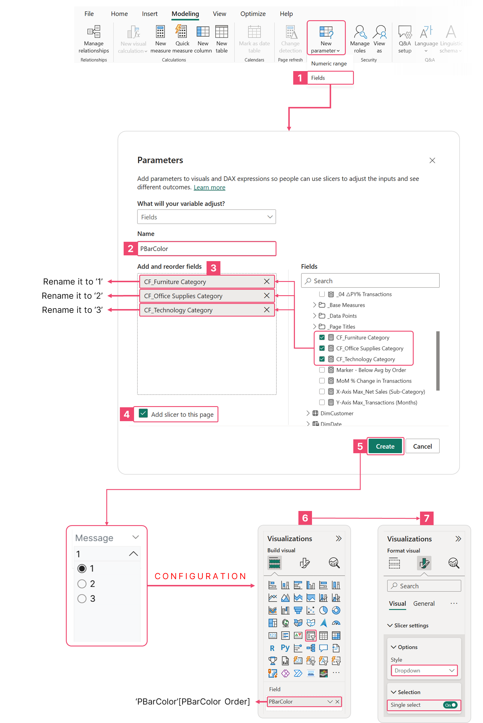 Configuring the Field Parameter Slicer for Dynamic Visual Highlighting
Note that we cannot use this field parameter directly on the bar chart, as field parameters are not supported for use within conditional formatting field values. Instead, we'll generate a DAX measure that uses the SWITCH() function to dynamically change which bars are highlighted based on the selection from the field parameter slicer.
Measure #04: Dynamic Conditional Formatting to Highlight the Bars
_01 Dynamic CF_Highlighted Bars =
VAR SelectedMetricOrder = SELECTEDVALUE('PBarColor'[PBarColor Order])
RETURN
  SWITCH(
      SelectedMetricOrder,
      0, [CF_Furniture Category],
      1, [CF_Office Supplies Category],
      2, [CF_Technology Category],
      BLANK()
  )
This measure dynamically determines which conditional formatting rule (CF) or highlight color/value to apply based on user selection — often used to color or emphasize specific bars in a Power BI chart.
Read the Explanation
Step-by-step explanation
VAR SelectedMetricOrder = SELECTEDVALUE('PBarColor'[PBarColor Order])-
This variable retrieves the currently selected order (number) from the
'PBarColor'table. -
The
'PBarColor'table probably defines which category or metric is currently active. -
For example, it might look like this:
| PBarColor Order | Category Name |
|---|---|
| 0 | Furniture |
| 1 | Office Supplies |
| 2 | Techonology |
SELECTEDVALUE() ensures the measure only works when exactly one value is selected (e.g., from a slicer or user interaction).
RETURN
  SWITCH(
      SelectedMetricOrder,
      0, [CF_Furniture Category],
      1, [CF_Office Supplies Category],
      2, [CF_Technology Category],
      BLANK()
  )
The SWITCH() function chooses which conditional formatting measure to return depending on the selected order.
When SelectedMetricOrder = | Returns this measure | Meaning |
|---|---|---|
| 0 | [CF_Furniture Category] | Use formatting logic for the Furniture category |
| 1 | [CF_Office Supplies Category] | Use formatting logic for Office Supplies |
| 2 | [CF_Technology Category] | Use formatting logic for Technology |
| (none selected) | BLANK() | No formatting applied |
In context (example use case)
-
We have a bar chart showing sales by sub-category.
-
We have a slicer or button that lets the user choose:
- Furniture (0)
- Office Supplies (1)
- Technology (2)
-
When the user selects “Furniture,” Power BI will apply
[CF_Furniture Category]— only bars for that category will be highlighted (others grayed out).
✅ This creates interactive highlighting — the color logic changes dynamically based on user selection.
Step 2.3: Generating the Bar Chart
Create a bar chart by placing the DimProduct[Sub-Category] on the Y-axis and the [_01 Total Net Sales] measure on the X-axis. To establish visual context, add a constant line set to the zero (0) value and an Average line to display the average net sales.
To instantly guide the audience to sub-categories that are underperforming within the selected category, we'll place a red circle marker next to the data label using the following DAX measure:
Measure #05: Marker for Underperforming Sub-Categories
Marker - Below Average (Net Sales) =
VAR current_value = [_01 Total Net Sales]
VAR current_category = SELECTEDVALUE(DimProduct[Category])
VAR current_subcategory = SELECTEDVALUE(DimProduct[Sub-Category])
VAR selected_order = SELECTEDVALUE('PBarColor'[PBarColor Order])
VAR selected_year = SELECTEDVALUE(DimDate[Year])

// Determine which category to mark based on order
VAR target_category =
  SWITCH(
      selected_order,
      0, "Furniture",
      1, "Office Supplies",
      2, "Technology",
      BLANK()
  )

// Calculate average across ALL subcategories for the selected year
VAR overall_average =
  CALCULATE(
      AVERAGEX(
          ALL(DimProduct[Sub-Category]),
          [_01 Total Net Sales]
      ),
      DimDate[Year] = selected_year
  )

// Assign marker ONLY if:
// 1. Current subcategory belongs to target category AND
// 2. Current value is below overall average
VAR marker =
  IF(
      current_category = target_category &&
      current_value < overall_average &&
      NOT(ISBLANK(current_value)),
      "●",
      ""
  )

RETURN
  marker
This measure serves a purpose to display a marker (●) for subcategories that:
-
Belong to a selected category (based on user input).
-
Have net sales below the overall average across all subcategories for the selected year.
It is used for visual cues in a chart — often in a bar or column chart. When used as a data label or custom marker, it helps the viewer instantly see which subcategories are underperforming within the chosen category.
Read the Explanation
Step-by-step breakdown
- Capture current context values
VAR current_value = [_01 Total Net Sales]
VAR current_category = SELECTEDVALUE(DimProduct[Category])
VAR current_subcategory = SELECTEDVALUE(DimProduct[Sub-Category])
VAR selected_order = SELECTEDVALUE('PBarColor'[PBarColor Order])
VAR selected_year = SELECTEDVALUE(DimDate[Year])| Variable | Meaning |
|---|---|
current_value | The total net sales for the currently evaluated subcategory. |
current_category | The category (e.g., Furniture, Office Supplies, Technology) for that subcategory. |
current_subcategory | The name of the subcategory currently being evaluated. |
selected_order | The category index chosen by the user (0 = Furniture, 1 = Office Supplies, 2 = Technology). |
selected_year | The year currently filtered or selected in the visual. |
These variables capture the current evaluation context — think of it as “what row or subcategory Power BI is calculating for.”
- Identify which category to mark
VAR target_category =
  SWITCH(
      selected_order,
      0, "Furniture",
      1, "Office Supplies",
      2, "Technology",
      BLANK()
)-
This
SWITCH()translates the numericselected_orderinto a category name. -
The measure only evaluates subcategories belonging to that target category.
-
If no category is selected, it returns
BLANK(), meaning no marker will appear.
| selected_order | target_category |
|---|---|
| 0 | Furniture |
| 1 | Office Supplies |
| 2 | Technology |
| (no selection) | Blank |
- Calculate the overall average
VAR overall_average =
  CALCULATE(
      AVERAGEX(
          ALL(DimProduct[Sub-Category]),
          [_01 Total Net Sales]
      ),
      DimDate[Year] = selected_year
  )
Here’s what’s happening:
-
ALL(DimProduct[Sub-Category])removes any filters on subcategories, so we can compute the average across all subcategories. -
AVERAGEX()then iterates through all subcategories and calculates the average of[ _01 Total Net Sales ]. -
The filter
DimDate[Year] = selected_yearensures the average is only for the same year currently selected.
✅ Result: A single average value representing “average net sales across all subcategories for the chosen year.”
- Determine when to display the marker
VAR marker =
  IF(
      current_category = target_category &&
      current_value < overall_average &&
      NOT(ISBLANK(current_value)),
      "●",
      ""
  )
This logic controls when to show the dot (●):
| Condition | Meaning |
|---|---|
current_category = target_category | Only check subcategories belonging to the selected category. |
current_value < overall_average | Only mark those that are below the average. |
NOT(ISBLANK(current_value)) | Avoid markers on missing or empty values. |
✅ If all conditions are true → display "●".
❌ Otherwise → return an empty string (""), meaning no marker appears.
- Final return
RETURN
  marker
Configure the following settings to achieve the desired result:
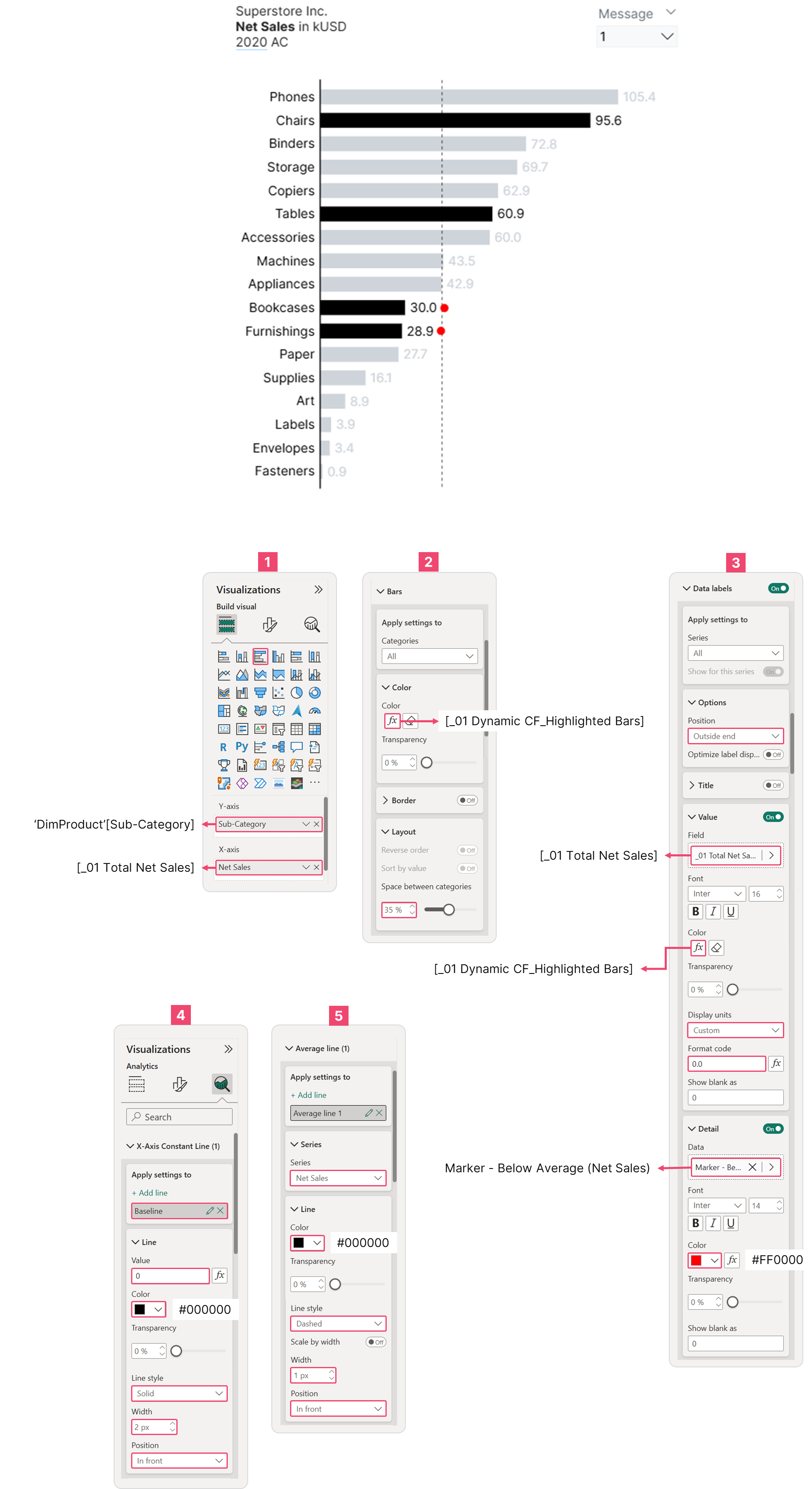 Bar Chart Configuration
Step 2.4: Displaying Key Messages Based on Filter Selections
With the bar chart successfully created, the last remaining step is to integrate the dynamic messaging. Similar to our line chart approach, we will reuse the previous DAX measure logic but update the field parameter to 'PBarColor'[PBarColor Order] for this chart's specific needs.
Measure #07: Modified Dynamic Message (Bar Chart) - v1
_01 Dynamic Message (Bar Chart) =
VAR SelectedMetricOrder = SELECTEDVALUE('PBarColor'[PBarColor Order])
VAR SelectedYear = SELECTEDVALUE(DimDate[Year])
RETURN
  SWITCH(
      TRUE(),
      SelectedMetricOrder = 0 && SelectedYear = 2020,
          "Two Furniture subcategories are dragging down results: Bookcases ($30K) and Furnishings ($28.9K) fall 30% and 33% below the $43.1K store average",

      SelectedMetricOrder = 0 && SelectedYear = 2019,
          "2019 Furniture challenges: Furnishings ($27.9K) and Bookcases ($26.8K) fall 22-25% below the $35.8K average while Chairs lead at $83.9K",

      SelectedMetricOrder = 0 && SelectedYear = 2018,
          "Furnishings is 2018's problem child—at $21.1K, it's the only Furniture subcategory falling below the $27.7K average (down 24%)",

      SelectedMetricOrder = 0 && SelectedYear = 2017,
          "2017 Furniture crisis: Bookcases ($20K) and Furnishings ($13.8K) fall 30% and 52% below the $28.5K average—the worst subcategory performance across all years.",

      SelectedMetricOrder = 1 && SelectedYear = 2020,
          "Office Supplies crisis persists in 2020: 7 of 9 subcategories fall below the $35.8K average—representing systematic underperformance requiring urgent category-level intervention",

      SelectedMetricOrder = 1 && SelectedYear = 2019,
          "Office Supplies crisis: 7 of 9 subcategories fall below the $43.1K average—representing systematic underperformance requiring category-level intervention",

      SelectedMetricOrder = 1 && SelectedYear = 2018,
          "Office Supplies in 2018: 6 of 9 subcategories fall below the $27.7K average—Storage and Binders succeed while majority struggle, confirming multi-year structural issues",

      SelectedMetricOrder = 1 && SelectedYear = 2017,
          "Office Supplies crisis begins in 2017: 7 of 9 subcategories fall below the $28.5K average—Storage and Binders alone succeed while majority struggle at less than half the store average",

      SelectedMetricOrder = 2 && SelectedYear = 2020,
          "Technology achieves 100% subcategory success in 2020—all four items exceed the $43.1K average, with Phones leading at $105.4K (144% above average)",

      SelectedMetricOrder = 2 && SelectedYear = 2019,
          "Technology maintains 100% subcategory success in 2019—all four items exceed the $35.8K average, with Phones leading at $79K (121% above average)",

      SelectedMetricOrder = 2 && SelectedYear = 2018,
          "2018 Technology underperformance is minimal: Copiers misses average by just 5% ($26.2K vs. $27.7K)—far less severe than Office Supplies' 16-98% gaps or Furniture's persistent issues",

      SelectedMetricOrder = 2 && SelectedYear = 2017,
          "Technology's 2017 struggles span from moderate (Accessories at -12%) to severe (Copiers at -62%)—representing the category's only multi-year underperformer in Copiers",

      BLANK()
  )
Add a text box and use the [_01 Dynamic Message (Bar Chart) - v1] as its value; you'll see the following result:
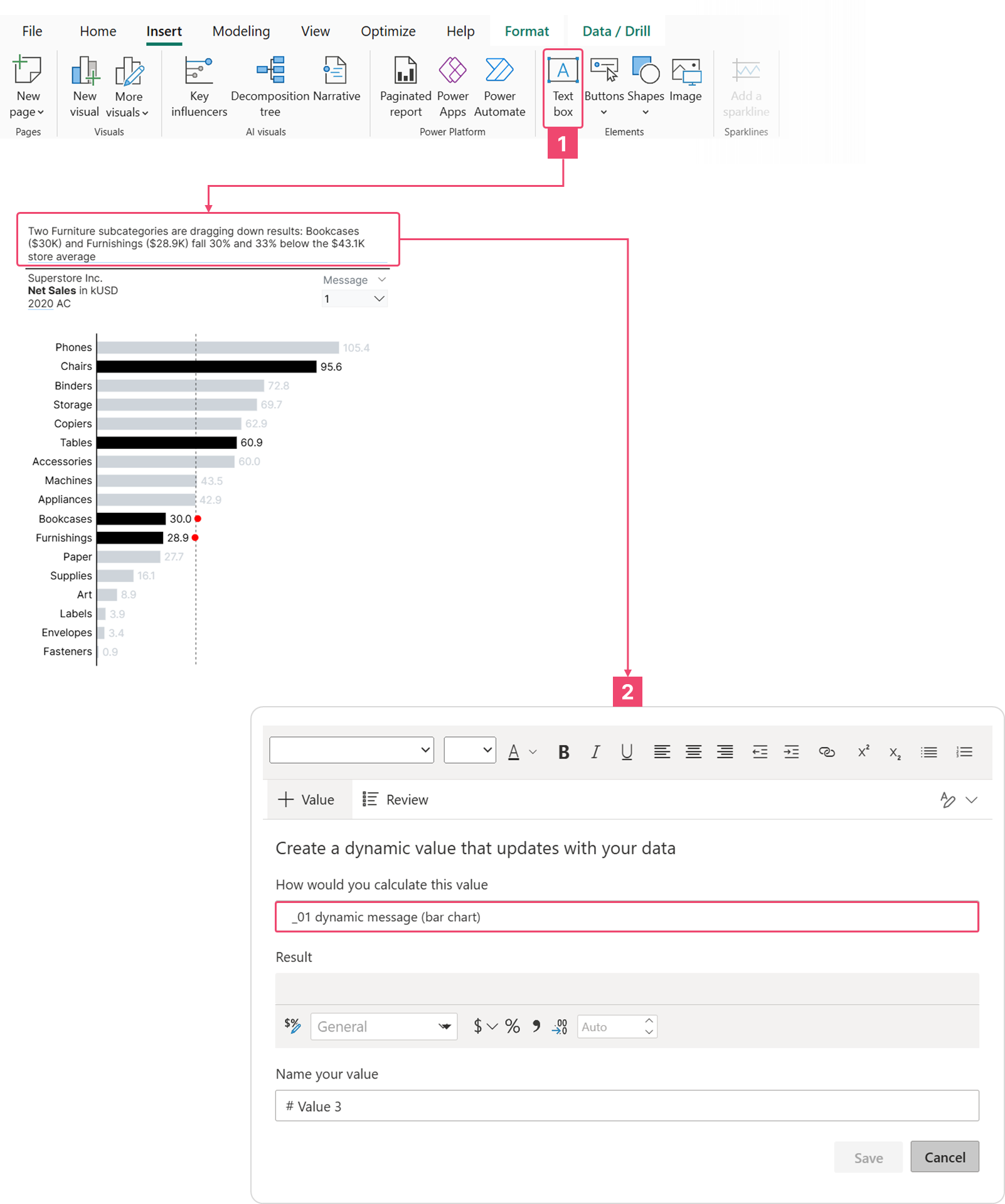 Dynamic Highlighting and Key Message Integration for Bar Chart