Foreword
What is a Waterfall Chart?
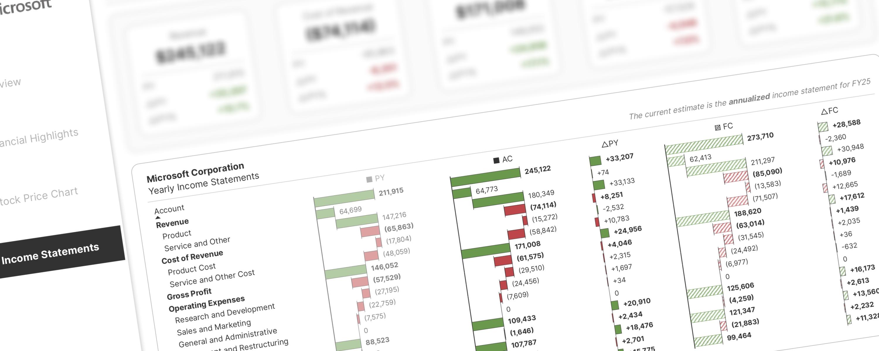
A waterfall chart is a special type of bar chart that shows you the story behind how a number changed from one point to another. Instead of just showing "we started with X and ended with Y," it breaks down all the individual pieces that caused that change.
Think of it like this: imagine you're tracking your bank account balance. A regular chart might show you had $1,000 at the start of the month and $1,200 at the end. A waterfall chart would show you each transaction that got you there - maybe you earned $500 from work, spent $200 on groceries, spent $100 on gas, but received a $200 tax refund.
Why is it Called a "Waterfall"?
The chart gets its name because it looks like water flowing down steps or a waterfall. It starts with one tall bar (your starting amount), then has smaller bars that seem to "float" in the air going up and down like steps, and ends with another tall bar (your final amount).
When Do People Use Waterfall Charts?
These charts are especially useful in:
-
Human Resources: Showing how many people joined or left a company
-
Finance: Tracking money coming in and going out
-
Business: Understanding what caused profits or losses
For example, an HR department might show that while a team still has 20 people at year-end (same as the start), actually 15 people quit during the year, 10 new people were hired, and 5 were transferred from other departments. This tells a much more complete (and possibly concerning) story than just "the team size stayed the same."
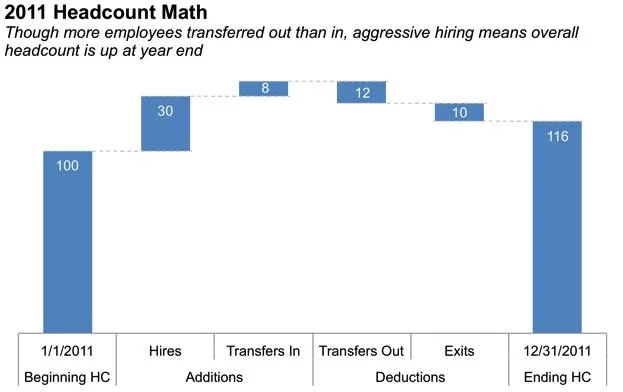 Waterfall Chart Example (source: storytelling with data)
What Makes Them Tricky?
Waterfall charts can be confusing because:
-
The middle bars don't start from the bottom like normal bar charts
-
Some bars point up (increases) and others point down (decreases)
-
It takes practice to read them quickly
The Bottom Line
Waterfall charts are perfect when you need to answer the question "What happened between Point A and Point B?" They show the complexity that simple before-and-after numbers might hide, helping you understand not just what changed, but exactly how it changed step by step.
More info about waterfall chart can be read here:
Understanding the Underlying Concept
Understanding the Visual's Construction
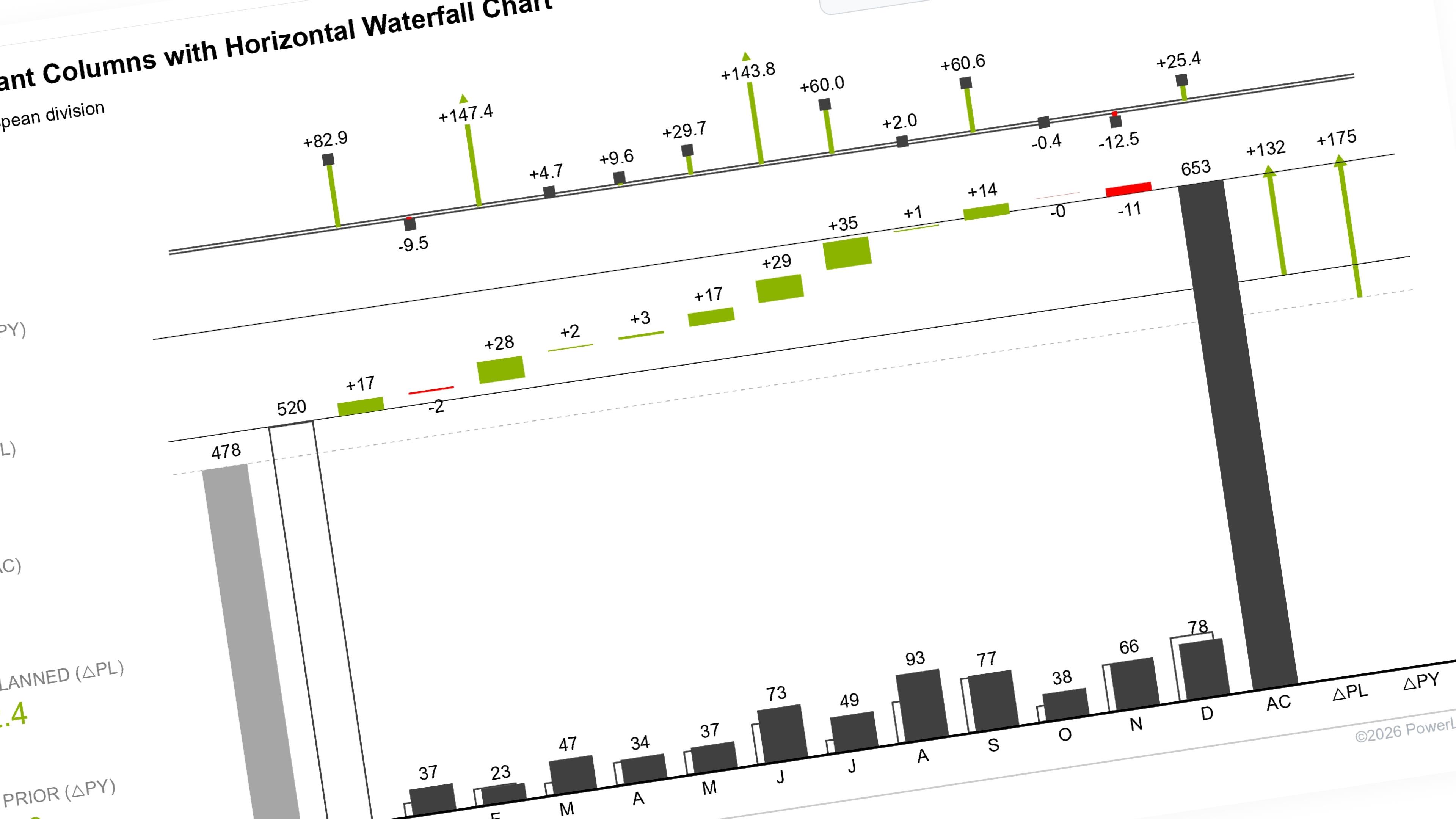
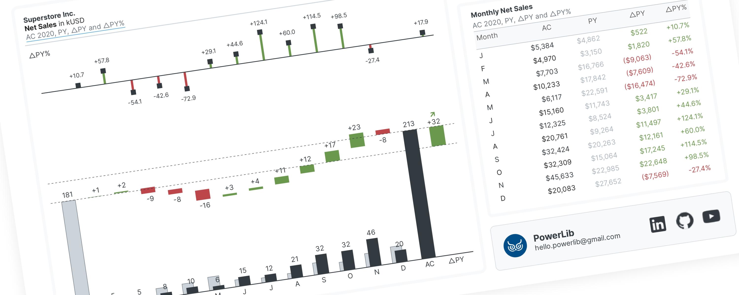
Before you begin, it’s important to understand the core concept behind this visual. This dashboard combines two charts to create a columns-with-waterfall effect. The primary visual is a stacked column chart that emulates a waterfall chart, while a clustered column chart displays the monthly net sales trend.
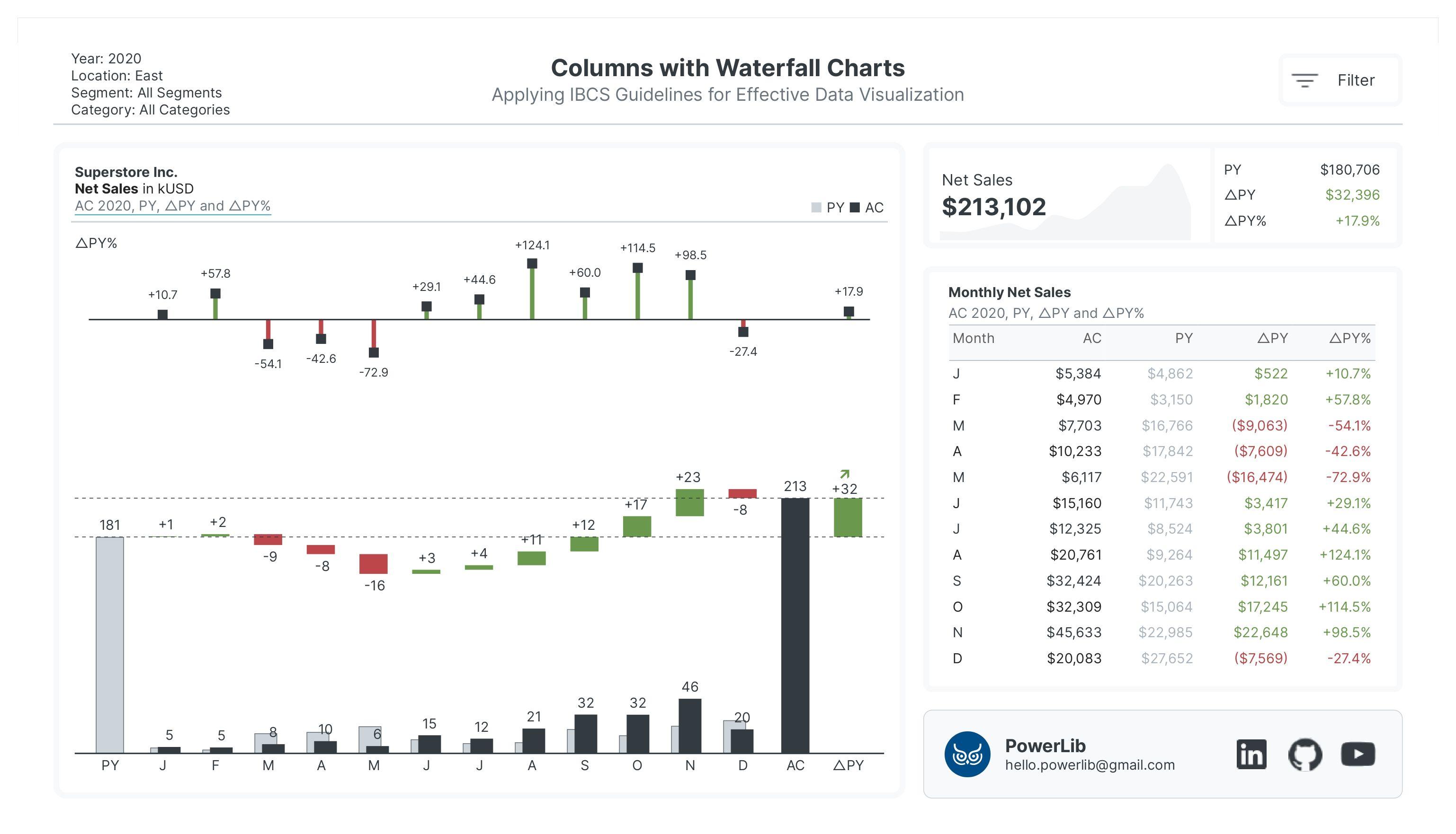 IBCS-Standard Columns with Horizontal Waterfall Charts
Why a Stacked Column Chart?
I used a stacked column chart instead of Power BI's native waterfall chart due to its limitations. The native chart doesn't allow for custom sorting or specific color assignments, which are essential for following IBCS guidelines. The stacked column chart is a workaround that allows us to imitate a waterfall chart and show monthly net changes in net sales.
How it Works
The monthly net changes are represented by "floating" bars, which are achieved by making a hidden, "supporting" bar transparent within the stacked column chart. The total net sales for the current selected year is labeled AC (Actuals), the previous year's total is PY (Previous Year), and the variance between them is △PY (Delta Previous Year).
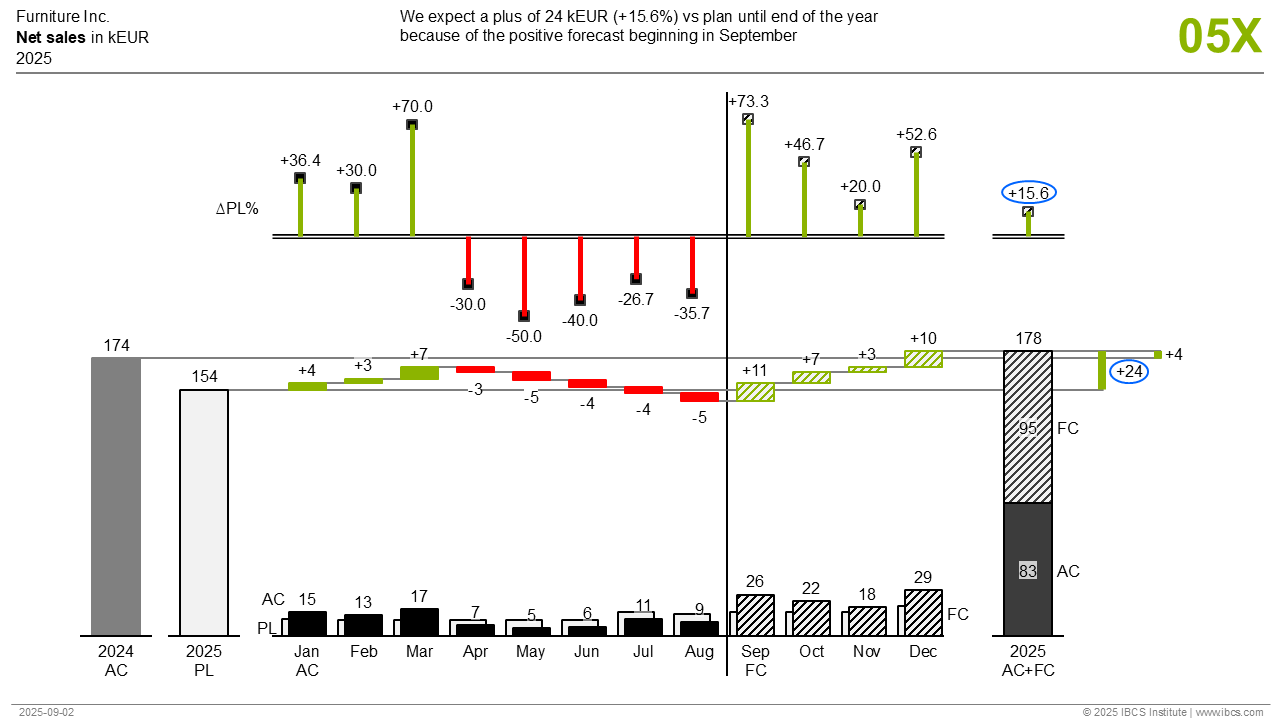 IBCS Columns with Horizontal Waterfall Charts Template (source: International Business Communication Standards/IBCS)
Displaying Data and Ensuring Alignment
Clear Data Labels
To ensure data labels are displayed clearly, a duplicate, invisible waterfall chart is used. This allows for precise font size and positioning, placing positive net change labels above the bars and negative labels below. This same method is applied to the △PY bar as well as the AC and PY totals.
Showing Monthly Percentage Variance
Above the main visual, we display the monthly percentage variance (△PY%) along with the total variance between AC and PY. This is accomplished using a line chart with error bars to show the data clearly.
Maintaining Visual Alignment
A critical aspect of this visual is ensuring that all three charts—the waterfall, the invisible data label chart, and the variance chart—remain perfectly aligned. By default, Power BI hides periods with blank values, which can cause the visuals to become misaligned. To prevent this, a simple measure with a value of 0 is added to the y-axis, forcing all periods to remain visible regardless of filter selections. I have discussed this topic in a separate section, which you can find in the "Related Topics" section.
Documentation
About the Documentation
This guide shows you how to build a waterfall chart using only Power BI's built-in visuals. While other tools like Zebra BI or Inforiver offer a simpler solution, this method demonstrates how to push the limits of what you can achieve with native features.
Step 1: Importing the Dataset
Step 2: Creating a Disconnected Table
This table is the backbone of our waterfall chart. Create a new table using the provided DAX measure.
Disconnected Table 1: Period Table for Waterfall Chart
Table_Waterfall =
DATATABLE(
  "Period", STRING,
  "SortOrder", INTEGER,
  "MonthNumber", INTEGER,
  "PeriodType", STRING,
  "PeriodNameLong", STRING,
  {
      {"PY", 0, -1, "Previous Year", "Previous Year"},
      {"J", 1, 1, "Month","January"},
      {"F", 2, 2, "Month", "February"},
      {"M", 3, 3, "Month", "March"},
      {"A", 4, 4, "Month", "April"},
      {"M ", 5, 5, "Month", "May"},
      {"J ", 6, 6, "Month", "June"},
      {"J  ", 7, 7, "Month", "July"},
      {"A ", 8, 8, "Month", "August"},
      {"S", 9, 9, "Month", "September"},
      {"O", 10, 10, "Month", "October"},
      {"N", 11, 11, "Month", "November"},
      {"D", 12, 12, "Month", "December"},
      {"AC", 13, 0, "Current Year", "Current Year"},
      {"△PY", 14, 0, "Variance", "AC vs. PY"}
  }
)
DAX Explained
Breaking It Down Simply
DATATABLE is like saying "I want to create a new table with these columns and fill it with this data."
The table has 5 columns:
-
"Period" - Short codes (like "J" for January)
-
"SortOrder" - Numbers that control the order things appear (0, 1, 2, 3...)
-
"MonthNumber" - The actual month numbers (1-12, plus special codes)
-
"PeriodType" - Categories like "Month", "Previous Year", etc.
-
"PeriodNameLong" - Full descriptive names like "January", "Current Year"
What Each Row Represents
-
First row: "PY" = Previous Year (your starting point)
-
Rows 2-13: The 12 months of the year (J=January, F=February, etc.)
-
Row 14: "AC" = Current Selected Year (your ending point)
-
Last row: "△PY" = The difference between current year and previous year
Why This Setup?
This table acts like a roadmap for your waterfall chart. It tells the chart:
-
What order to show things in (SortOrder)
-
What to call each piece (PeriodNameLong)
-
How to categorize each piece (PeriodType)
So your waterfall chart will show: Previous Year → January changes → February changes → March changes... → December changes → Current Year Total → Final Variance
Think of it as setting up the skeleton or framework of your waterfall chart before putting the actual data (money, sales, headcount, etc.) into it.
Then, sort the 'Period' column by the 'Sort Order' column to ensure the data displays chronologically.
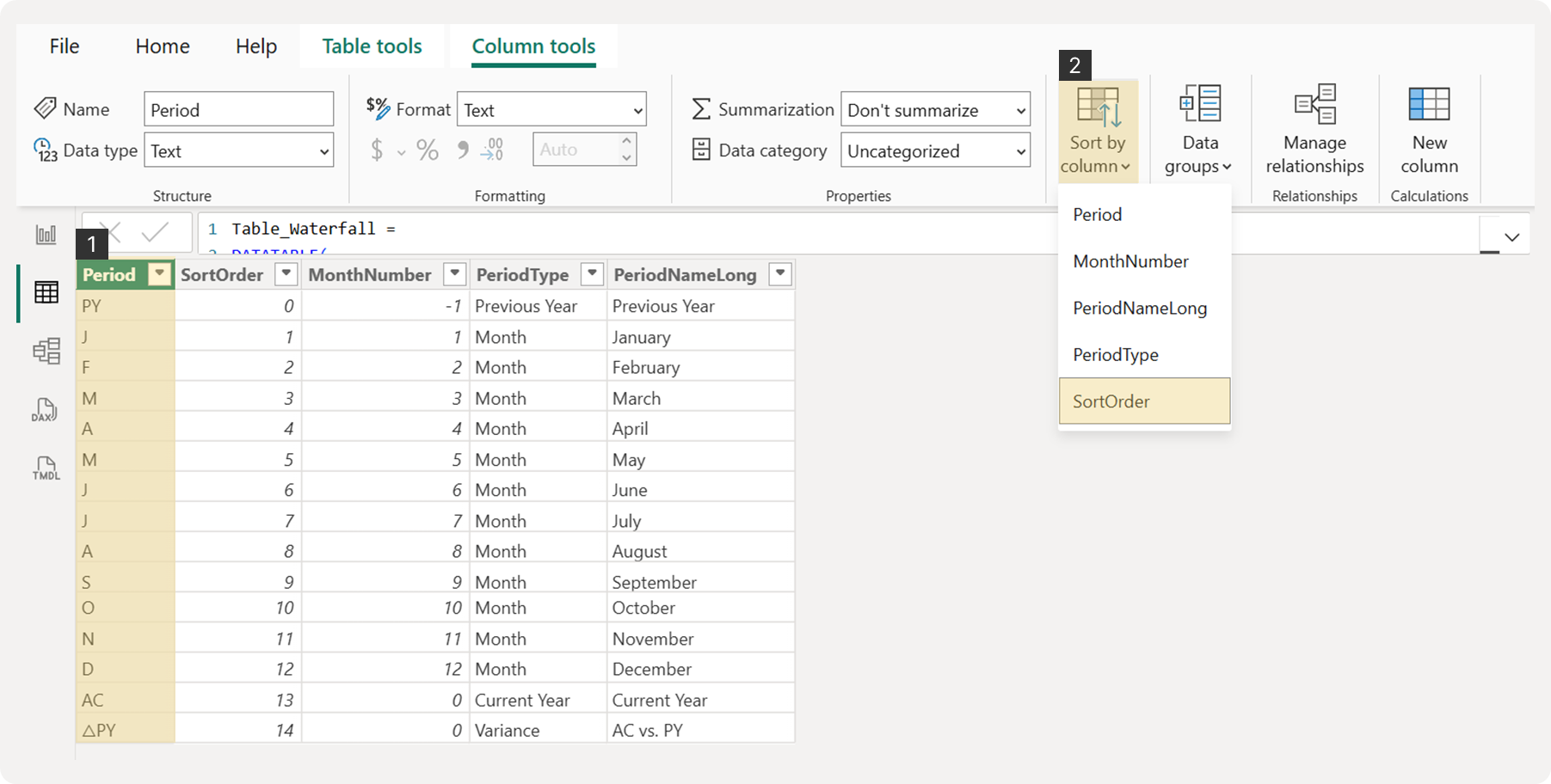 Sorting the ‘Period’ Column by ‘Sort Order’ Column
Note that this table doesn't need to be connected to your other data tables, as we'll link them later using DAX measures.
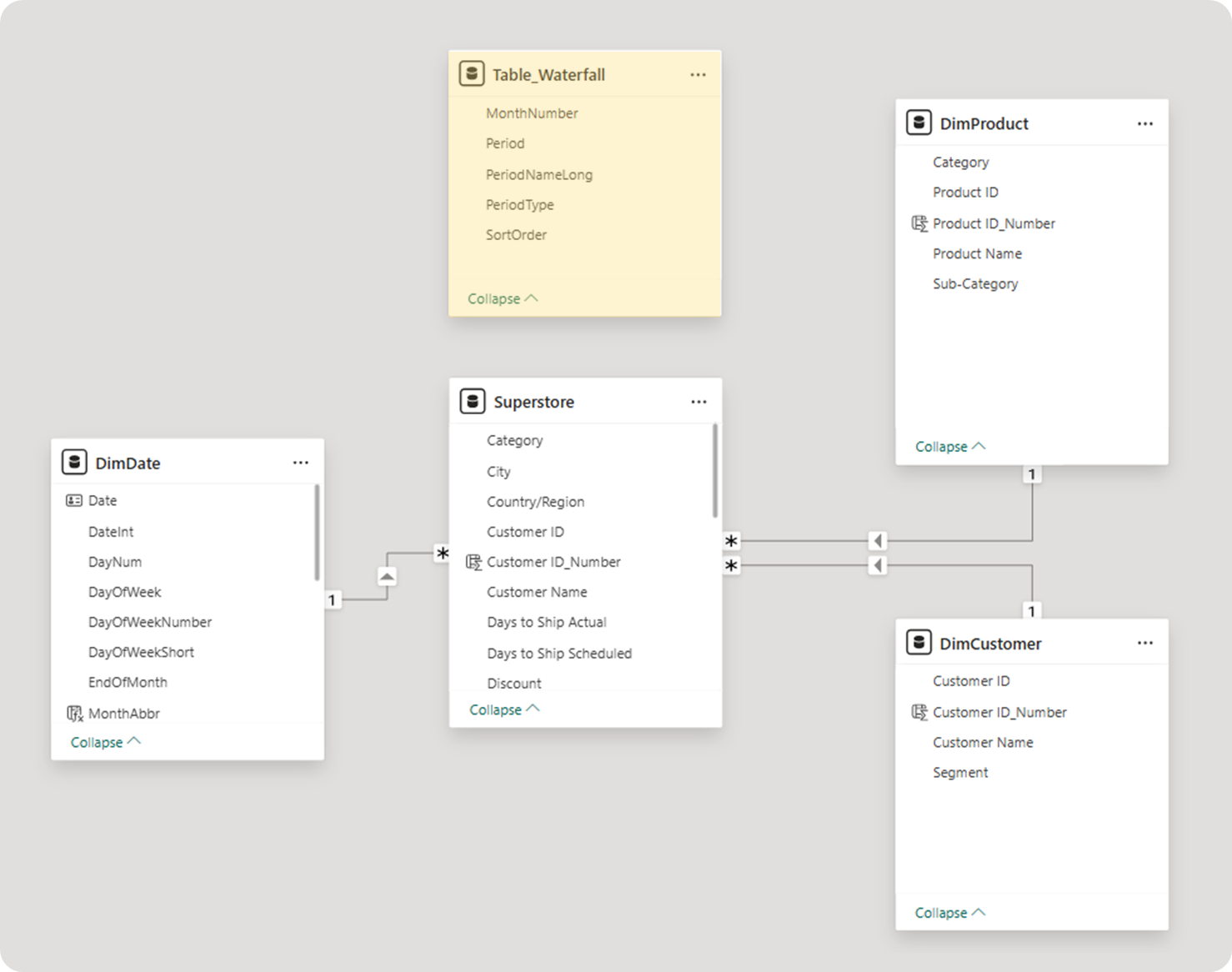 Keep the ‘Table_Waterfall’ Disconnected from Other Tables in Model View
Step 3: Constructing the Waterfall Chart
To begin, go to the Report View and add a slicer. Drag the DimDate[Year] column into the field and enable 'Single selection'. This is crucial because the waterfall chart is designed to compare only two periods: the current selected year (AC) and the previous year (PY), with monthly net changes shown in between.
With a single year now selected, create a stacked column chart. Add the Period column to the X-axis. Next, you will create the necessary DAX measures.
Generating DAX Measures for Each Period
Power BI's conditional formatting has limitations when you want to apply different color rules to multiple measures within a single chart. This is a key challenge for our visual because each period and condition requires a specific color:
-
PY will be gray (#CED4DA) with a border (#6C757D).
-
Monthly net changes from January to December will be green (#6A994E) for positive variance or red (#BC4749) for negative variance.
-
AC will be black (#343A40).
-
△PY will be either green (#6A994E) for a positive variance or red (#BC4749) for a negative variance.
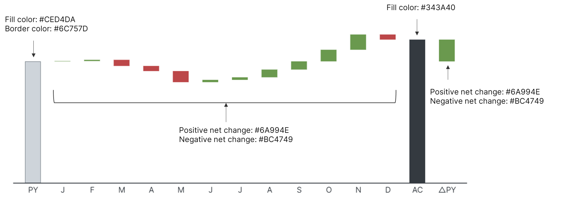 Assigning Colors to Each Period
Since we can't use conditional formatting for all these cases, we must create a separate measure for each period to assign its specific color. While this results in a lot of measures, it's the most effective way to achieve this level of customization with native Power BI visuals.
To show the net change in net sales, we first need to calculate the total net sales. Use the following DAX measure:
Measure #01: Total Net Sales
_01 Total Net Sales = SUM(Superstore[Sales])3.1 Keeping All Periods Visible
Remember our discussion about maintaining visual alignment? This is where we implement that concept. Our goal is to ensure all periods, including the △PY, are always visible regardless of the filter selections, as shown in the example image.
To achieve this, we need a measure that forces all periods to be displayed. We can do this by creating a simple DAX measure and adding it to the chart's Y-axis.
Measure #02: All Periods Visible
_02 All Periods Visible = 0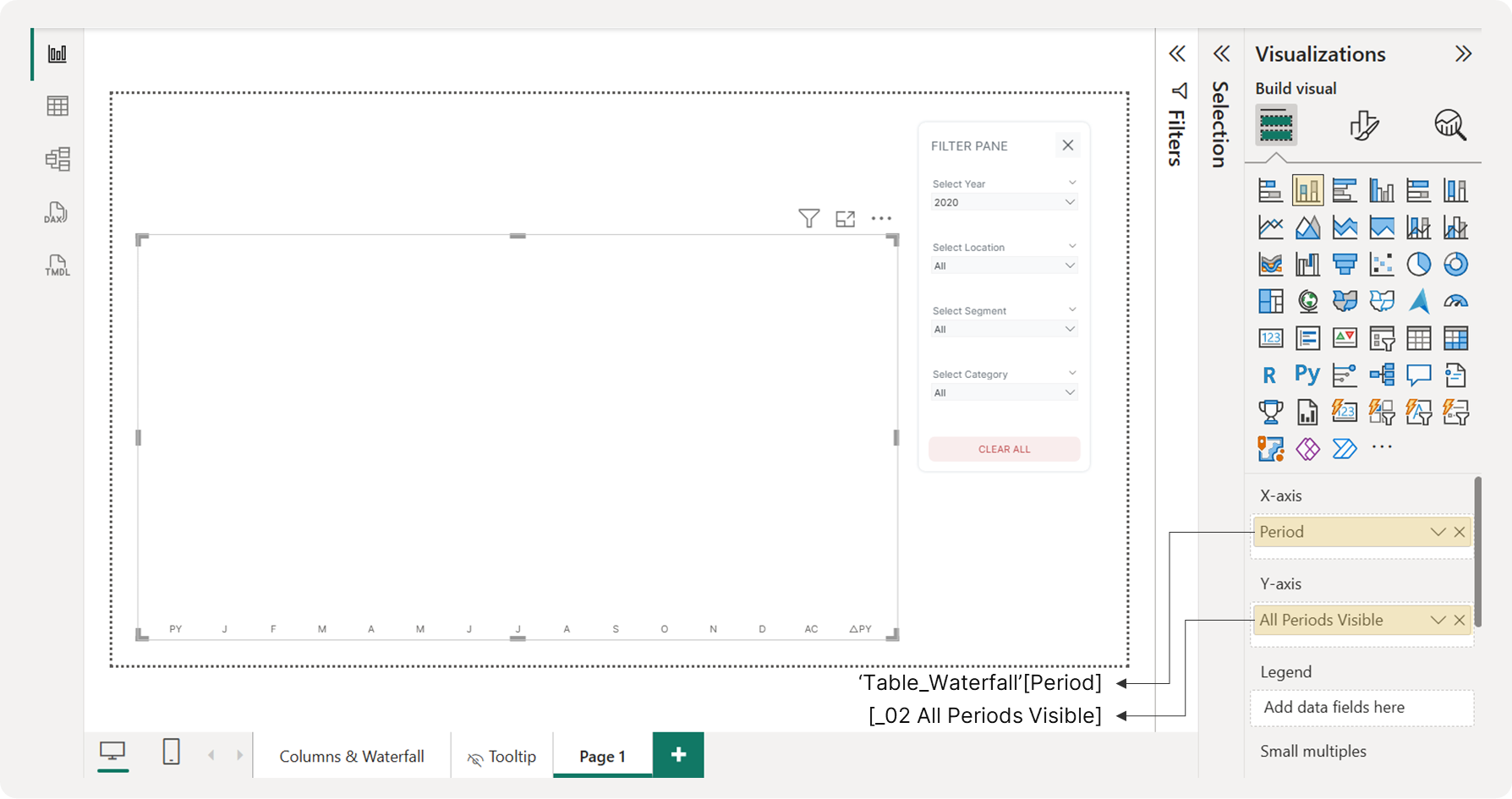 Ensuring All Periods are Visible
3.2 Displaying the Previous Year (PY) Bar on a Waterfall Chart
To make this guide easy to follow, we'll build the bars for each period in chronological order. First, we'll construct is the PY (Previous Year) bar. Create the following DAX measure to display the previous year's total net sales on the waterfall chart:
Measure #03: Previous Year Total Net Sales for Waterfall Chart
_03 PY Total Net Sales_Waterfall =
VAR SelectedYear = SELECTEDVALUE(DimDate[Year])
VAR PeriodType = SELECTEDVALUE(Table_Waterfall[PeriodType])

RETURN
SWITCH(
  PeriodType,
  "Previous Year", CALCULATE([_01 Total Net Sales], DimDate[Year] = SelectedYear - 1),
  BLANK()
)
This measure calculates last year's total net sales but only returns a value for the "Previous Year" data point in your waterfall chart.
DAX Explained
Step-by-Step Breakdown
1. Setting Up Variables (The Preparation)
VAR SelectedYear = SELECTEDVALUE(DimDate[Year])
VAR PeriodType = SELECTEDVALUE(Table_Waterfall[PeriodType])
Think of this like setting up two boxes:
-
Box 1 (SelectedYear): Captures what year you're currently looking at (like 2024)
-
Box 2 (PeriodType): Captures what type of data you want to see (like "Previous Year" or "Current Year")
2. The Decision Logic
SWITCH(
  PeriodType,
  "Previous Year", CALCULATE([_01 Total Net Sales], DimDate[Year] = SelectedYear - 1),
  0
)
This works like a simple if-then statement:
-
IF the PeriodType is "Previous Year"
-
THEN calculate the total net sales for the year before the selected year (so if you're looking at 2024, it gets 2023's net sales)
-
OTHERWISE show nothing 0 (zero)
Once you add this measure to the Y-axis, the PY bar will appear, and the other periods will remain visible thanks to the All Periods Visible measure. Change the bar's color to gray.
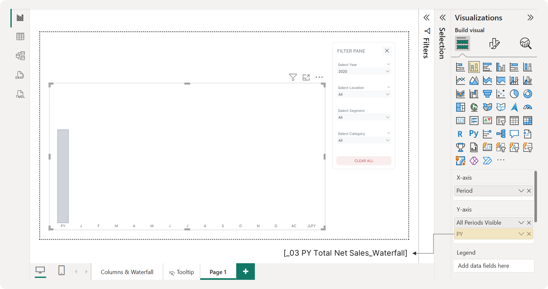 Visualizing Prior Year Net Sales on a Waterfall Chart
3.3 Displaying the Current Selected Year (AC) Bar on a Waterfall Chart
To display the AC bar, we’ll use the same approach as the PY bar, but we'll modify the measure to calculate the total net sales for the selected year instead of the previous year.
Measure #04: Current (Selected) Year Total Net Sales for Waterfall Chart
_04 AC Total Net Sales_Waterfall =
VAR SelectedYear = SELECTEDVALUE(DimDate[Year])
VAR PeriodType = SELECTEDVALUE(Table_Waterfall[PeriodType])

RETURN
SWITCH(
  PeriodType,
  "Current Year", CALCULATE([_01 Total Net Sales], DimDate[Year] = SelectedYear),
  BLANK()
)
This measure returns the current year's total net sales only for the "Current Year" period on your waterfall chart.
DAX Explained
Step-by-Step Breakdown
1. Setting Up Variables (Same Setup as Before)
VAR SelectedYear = SELECTEDVALUE(DimDate[Year])
VAR PeriodType = SELECTEDVALUE(Table_Waterfall[PeriodType])-
SelectedYear: Captures the year you're currently viewing (e.g., 2024)
-
PeriodType: Captures what type of data you want to display
2. The Decision Logic
SWITCH(
  PeriodType,
  "Current Year", CALCULATE([_01 Total Net Sales], DimDate[Year] = SelectedYear),
  0
)
This works as:
-
IF PeriodType equals "Current Year"
-
THEN calculate total net sales for the selected year itself
-
OTHERWISE show 0
Add this measure to the chart's Y-axis. Next, configure the AC bar by changing its fill color to black (#343A40) and removing the border.
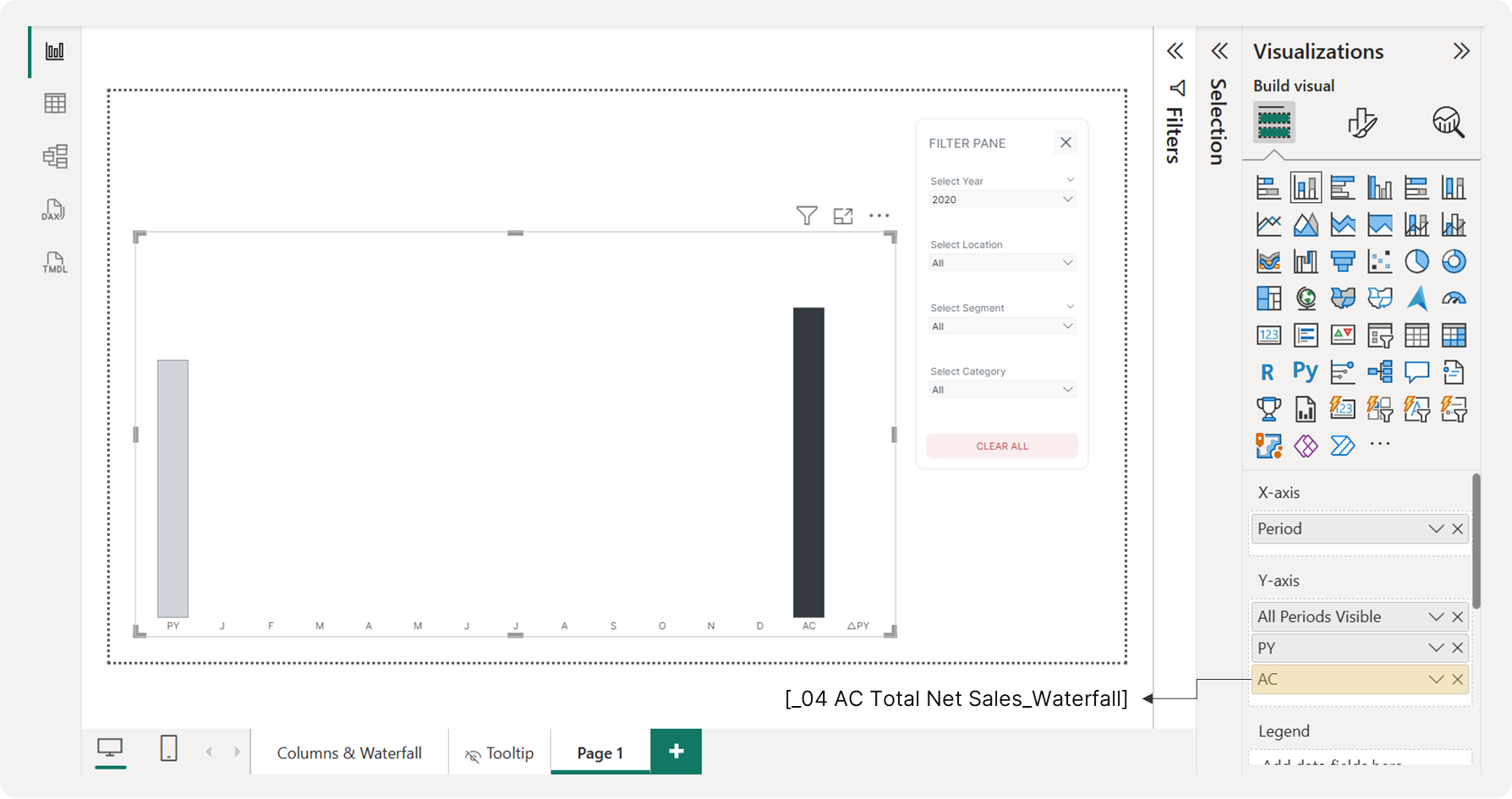 Visualizing Net Sales for the Selected Year on a Waterfall Chart
3.4 Creating the Monthly Net Change Bars
With the AC and PY bars in place, we will now display the monthly net change in between. This variance shows the month-by-month increase or decrease in net sales. Create the following DAX measure and add it to the chart's Y-axis.
Measure #05: Monthly Net Change for Waterfall Chart
_05 Monthly Net Change in Net Sales_Waterfall = -- (Shows variance between AC and PY for each month)
VAR SelectedYear = SELECTEDVALUE(DimDate[Year])
VAR PeriodType = SELECTEDVALUE(Table_Waterfall[PeriodType])
VAR MonthNumber = SELECTEDVALUE(Table_Waterfall[MonthNumber])

-- Current Year Month Value
VAR CurrentYearMonth = CALCULATE([_01 Total Net Sales], DimDate[Year] = SelectedYear, MONTH(DimDate[Date]) = MonthNumber)

-- Previous Year Same Month Value
VAR PreviousYearMonth = CALCULATE([_01 Total Net Sales], DimDate[Year] = SelectedYear - 1, MONTH(DimDate[Date]) = MonthNumber)

-- Variance (Current Year - Previous Year)
VAR MonthVariance = CurrentYearMonth - PreviousYearMonth

RETURN
IF(
  PeriodType = "Month",
  MonthVariance,
  BLANK()
)
This measure calculates the monthly net sales change compared to the same month in the previous year and displays it only for the "Month" periods in the waterfall. It creates the "bridges" that connect the PY and AC columns.
-
Positive values indicate a better-performing month than last year.
-
Negative values indicate a worse-performing month.
DAX Explained
Step-by-Step Breakdown
1. Setting Up the Context Variables
VAR SelectedYear = SELECTEDVALUE(DimDate[Year])
VAR PeriodType = SELECTEDVALUE(Table_Waterfall[PeriodType])
VAR MonthNumber = SELECTEDVALUE(Table_Waterfall[MonthNumber])-
SelectedYear: The year you're viewing (e.g., 2024)
-
PeriodType: What view you're in (e.g., "Month", "Quarter", etc.)
-
MonthNumber: Which specific month (e.g., 3 for March)
2. Getting Current Year's Month Data
VAR CurrentYearMonth = CALCULATE([_01 Total net sales],
  DimDate[Year] = SelectedYear,
  MONTH(DimDate[Date]) = MonthNumber)
Gets net sales for the specific month in the selected year
- Example: March 2024 net sales
3. Getting Previous Year's Same Month Data
VAR PreviousYearMonth = CALCULATE([_01 Total net sales],
  DimDate[Year] = SelectedYear - 1,
  MONTH(DimDate[Date]) = MonthNumber)
Gets net sales for the same month in the previous year
- Example: March 2023 net sales
4. Calculating the Variance
VAR MonthVariance = CurrentYearMonth - PreviousYearMonthSimple subtraction: This Year's Month - Last Year's Same Month
5. The Display Logic
IF(PeriodType = "Month", MonthVariance, BLANK())Only shows the variance when you're specifically looking at monthly data
Now, you can add this measure to the chart’s Y-axis to see the monthly net changes appear between the previous and current year.
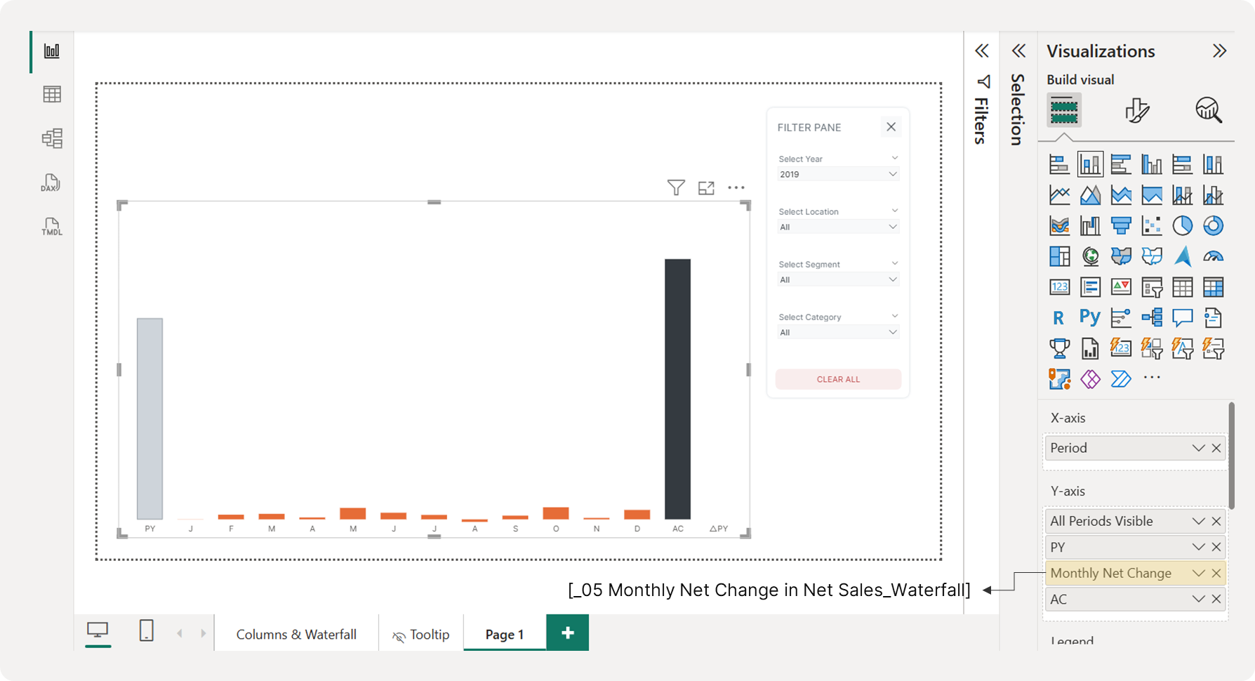 Displaying Monthly Net Change in Net Sales on a Waterfall Chart
However, we will not use this exact measure on the chart. Since we cannot apply conditional formatting to assign different colors for positive and negative values, we need to create two separate measures: one for positive net changes and one for negative net changes.
3.5 Creating the Positive Monthly Net Change Bars
First, create a DAX measure to display only the positive net changes on our waterfall chart. Add it to the Y-axis.
Measure #06: Positive Monthly Net Change for Waterfall Chart
_06 Positive Monthly Net Change in Net Sales_Waterfall =
IF(
  [_05 Monthly Net Change in Net Sales_Waterfall] > 0,
  [_05 Monthly Net Change in Net Sales_Waterfall],
  BLANK()
)
This measure is designed to show only positive values and hide any negative ones.
Change the column's color to green to indicate a positive variance. You should now see the following result:
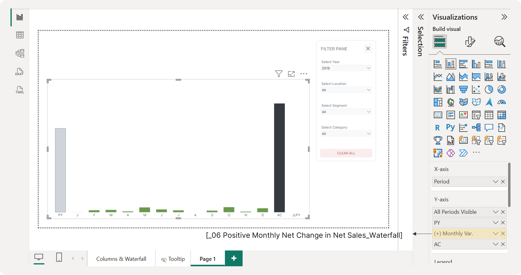 Visualizing Positive Monthly Net Sales Change on a Waterfall Chart
3.6 Creating the Negative Monthly Net Change Bars
To display the negative monthly net changes, duplicate the previous DAX measure and modify it as follows:
Measure #07: Negative Monthly Net Change for Waterfall Chart
_07 Negative Monthly Net Change in Net Sales_Waterfall =
IF(
  [_05 Monthly Net Change in Net Sales_Waterfall] < 0,
  [_05 Monthly Net Change in Net Sales_Waterfall] * -1,
  BLANK()
)
This measure takes negative monthly changes and converts them into positive values for display while hiding any actual positive changes.
You might be wondering, "Why do we multiply it by -1?" In a waterfall chart, the net change bars don't start from the baseline (the zero line); they begin from the end of the previous bar. Multiplying by -1 ensures the visual's positive and negative bars are correctly stacked, which will be explained in more detail in the next section. For now, set the column's color to red to indicate negative variance. Your chart should now look like this:
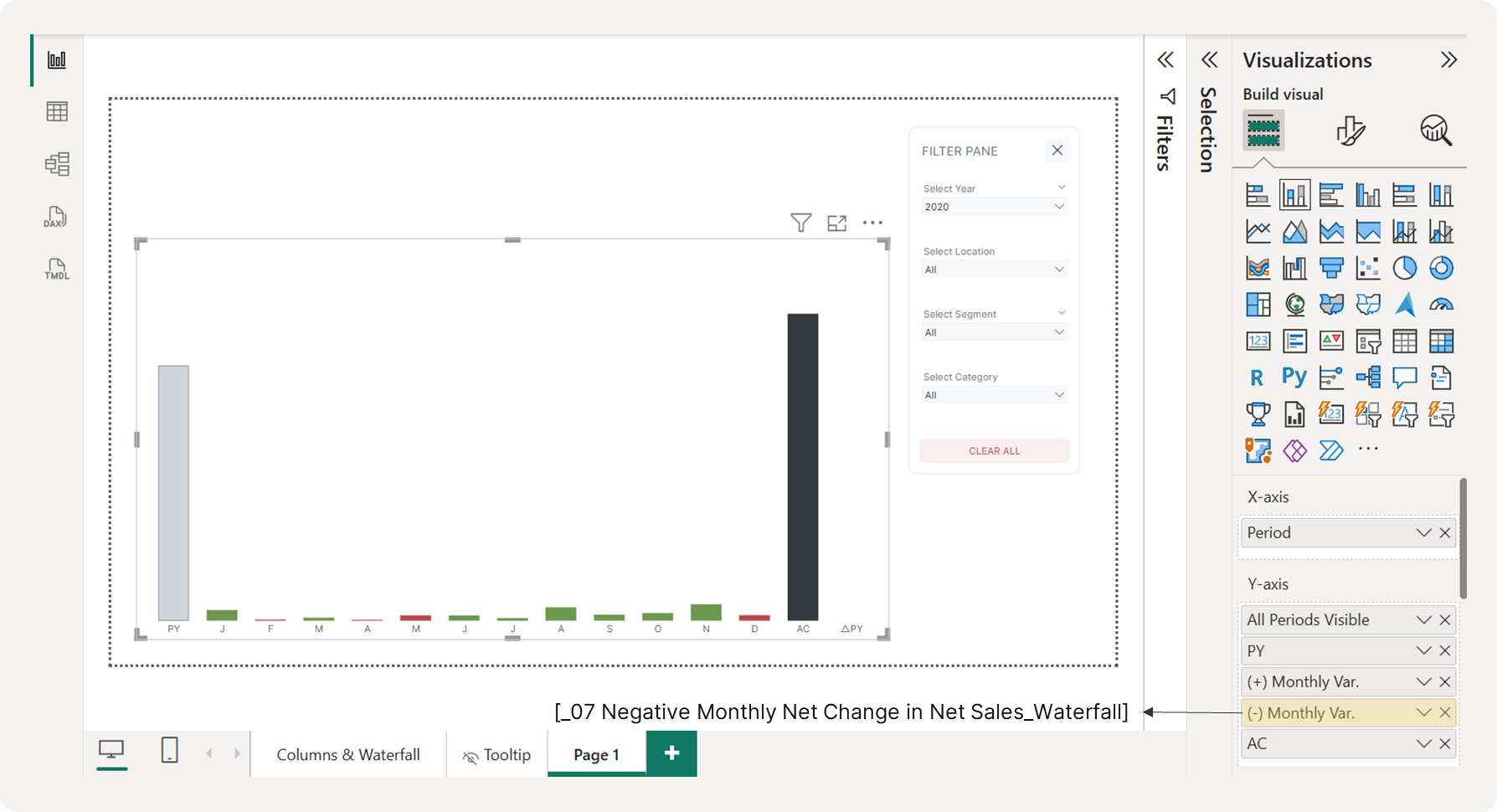 Visualizing Negative Monthly Net Sales Change on a Waterfall Chart
3.7 Building the Base Bars for Monthly Net Change
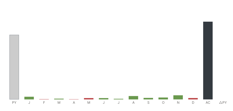 Monthly Net Change Columns
You've likely noticed that the monthly net change columns currently start from the baseline, which is incorrect for a waterfall chart. To make them "float," we use the stacked column chart's layering feature.
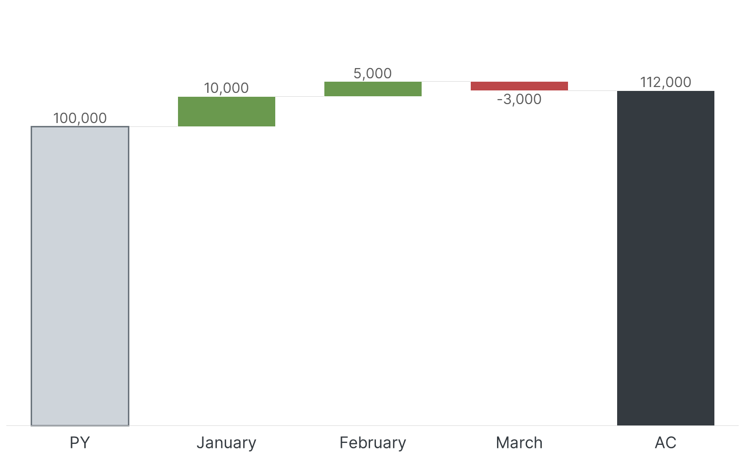 Waterfall Chart Example
The core concept of waterfall charts is cumulative building. They are designed to show cumulative impact - how each component contributes to building from a starting point to an ending point. Each bar represents where you are after that change:
-
Start: 100,000 (PY bar)
-
After January: 100,000 + 10,000 = 110,000 (January bar starts at 100,000, ends at 110,000)
-
After February: 110,000 + 5,000 = 115,000 (February bar starts at 110,000, ends at 115,000)
-
After March: 115,000 - 3,000 = 112,000 (Mar bar starts at 115,000, ends at 112,000)
-
Final: 112,000 (AC bar confirms final total)
To replicate this effect in Power BI, we need a hidden "base" column under each monthly change bar that matches the height of the cumulative total up to the previous month. Take a look at the example below:
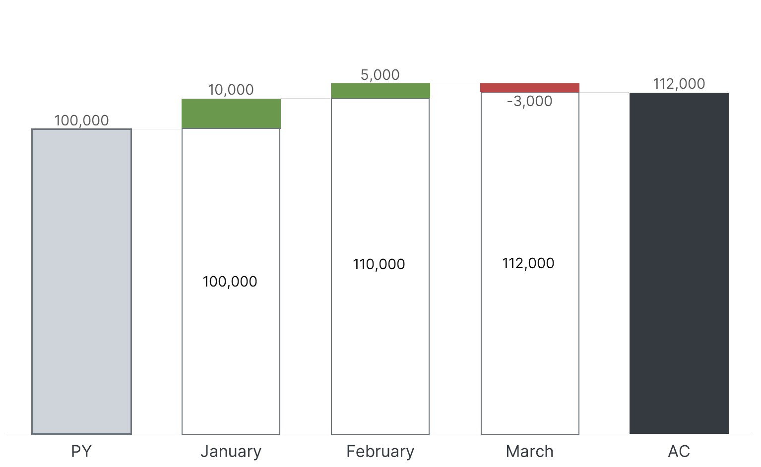 Creating a Floating Effect with a Stacked Column Chart
We'll use the following DAX measure to create these base bars:
Measure #08: Base Bars for Monthly Net Change in Net Sales
_08 Base Bars for Monthly Net Change in Net Sales =
VAR SelectedYear = SELECTEDVALUE(DimDate[Year])
VAR PeriodType = SELECTEDVALUE(Table_Waterfall[PeriodType])
VAR CurrentSortOrder = SELECTEDVALUE(Table_Waterfall[SortOrder])
-- Previous Year Total (starting point)
VAR PreviousYearValue = CALCULATE([_01 Total Net Sales], DimDate[Year] = SelectedYear - 1)
-- Calculate variance for each month (Current Year Month - Previous Year Same Month)
-- Only include months BEFORE the current month
VAR JanVariance = IF(CurrentSortOrder > 1,
  CALCULATE([_01 Total Net Sales], DimDate[Year] = SelectedYear, MONTH(DimDate[Date]) = 1) -
  CALCULATE([_01 Total Net Sales], DimDate[Year] = SelectedYear - 1, MONTH(DimDate[Date]) = 1), 0)
VAR FebVariance = IF(CurrentSortOrder > 2,
  CALCULATE([_01 Total Net Sales], DimDate[Year] = SelectedYear, MONTH(DimDate[Date]) = 2) -
  CALCULATE([_01 Total Net Sales], DimDate[Year] = SelectedYear - 1, MONTH(DimDate[Date]) = 2), 0)
VAR MarVariance = IF(CurrentSortOrder > 3,
  CALCULATE([_01 Total Net Sales], DimDate[Year] = SelectedYear, MONTH(DimDate[Date]) = 3) -
  CALCULATE([_01 Total Net Sales], DimDate[Year] = SelectedYear - 1, MONTH(DimDate[Date]) = 3), 0)
VAR AprVariance = IF(CurrentSortOrder > 4,
  CALCULATE([_01 Total Net Sales], DimDate[Year] = SelectedYear, MONTH(DimDate[Date]) = 4) -
  CALCULATE([_01 Total Net Sales], DimDate[Year] = SelectedYear - 1, MONTH(DimDate[Date]) = 4), 0)
VAR MayVariance = IF(CurrentSortOrder > 5,
  CALCULATE([_01 Total Net Sales], DimDate[Year] = SelectedYear, MONTH(DimDate[Date]) = 5) -
  CALCULATE([_01 Total Net Sales], DimDate[Year] = SelectedYear - 1, MONTH(DimDate[Date]) = 5), 0)
VAR JunVariance = IF(CurrentSortOrder > 6,
  CALCULATE([_01 Total Net Sales], DimDate[Year] = SelectedYear, MONTH(DimDate[Date]) = 6) -
  CALCULATE([_01 Total Net Sales], DimDate[Year] = SelectedYear - 1, MONTH(DimDate[Date]) = 6), 0)
VAR JulVariance = IF(CurrentSortOrder > 7,
  CALCULATE([_01 Total Net Sales], DimDate[Year] = SelectedYear, MONTH(DimDate[Date]) = 7) -
  CALCULATE([_01 Total Net Sales], DimDate[Year] = SelectedYear - 1, MONTH(DimDate[Date]) = 7), 0)
VAR AugVariance = IF(CurrentSortOrder > 8,
  CALCULATE([_01 Total Net Sales], DimDate[Year] = SelectedYear, MONTH(DimDate[Date]) = 8) -
  CALCULATE([_01 Total Net Sales], DimDate[Year] = SelectedYear - 1, MONTH(DimDate[Date]) = 8), 0)
VAR SepVariance = IF(CurrentSortOrder > 9,
  CALCULATE([_01 Total Net Sales], DimDate[Year] = SelectedYear, MONTH(DimDate[Date]) = 9) -
  CALCULATE([_01 Total Net Sales], DimDate[Year] = SelectedYear - 1, MONTH(DimDate[Date]) = 9), 0)
VAR OctVariance = IF(CurrentSortOrder > 10,
  CALCULATE([_01 Total Net Sales], DimDate[Year] = SelectedYear, MONTH(DimDate[Date]) = 10) -
  CALCULATE([_01 Total Net Sales], DimDate[Year] = SelectedYear - 1, MONTH(DimDate[Date]) = 10), 0)
VAR NovVariance = IF(CurrentSortOrder > 11,
  CALCULATE([_01 Total Net Sales], DimDate[Year] = SelectedYear, MONTH(DimDate[Date]) = 11) -
  CALCULATE([_01 Total Net Sales], DimDate[Year] = SelectedYear - 1, MONTH(DimDate[Date]) = 11), 0)
VAR DecVariance = IF(CurrentSortOrder > 12,
  CALCULATE([_01 Total Net Sales], DimDate[Year] = SelectedYear, MONTH(DimDate[Date]) = 12) -
  CALCULATE([_01 Total Net Sales], DimDate[Year] = SelectedYear - 1, MONTH(DimDate[Date]) = 12), 0)
RETURN
IF(
  PeriodType = "Month",
  PreviousYearValue + JanVariance + FebVariance + MarVariance + AprVariance + MayVariance +
  JunVariance + JulVariance + AugVariance + SepVariance + OctVariance + NovVariance + DecVariance,
  BLANK()
)
This measure calculates the running total up to each month, creating the "base" for the next bar. When you add this to the chart's Y-axis, you will see a solid bar that appears to support your monthly net change bars.
DAX Explained
Step-by-Step Breakdown
- Setup Variables
SelectedYear = The year you're analyzing (e.g., 2024)
CurrentSortOrder = Which month you're currently looking at (1=Jan, 2=Feb, etc.)- Find the Starting Point
PreviousYearValue = Total net sales for the entire previous yearThis is like saying "Last year we made $1,000,000 total - that's our baseline.”
- Calculate Monthly Changes
For each month, it calculates:
-
This Year's January minus Last Year's January = January Variance
-
This Year's February minus Last Year's February = February Variance
-
And so on...
But here's the key: It only includes months that happened before the current month you're viewing.
- The Conditional Logic
Each monthly variance uses this logic:
IF(CurrentSortOrder > MonthNumber, CalculateVariance, 0)Translation: "If we're looking at March or later, include January's change. If we're looking at April or later, include February's change, etc."
Let's say you're looking at March 2024:
-
Starting Point: 2023 total net sales = $1,000,000
-
January Change: Jan 2024 vs Jan 2023 = +$10,000
-
February Change: Feb 2024 vs Feb 2023 = +$5,000
-
March Change: Not included (we only count changes BEFORE the current month)
Result: $1,000,000 + $10,000 + $5,000 = $1,015,000
This $1,015,000 becomes the "base" that March's individual performance will be measured against.
The Challenge of Negative Values
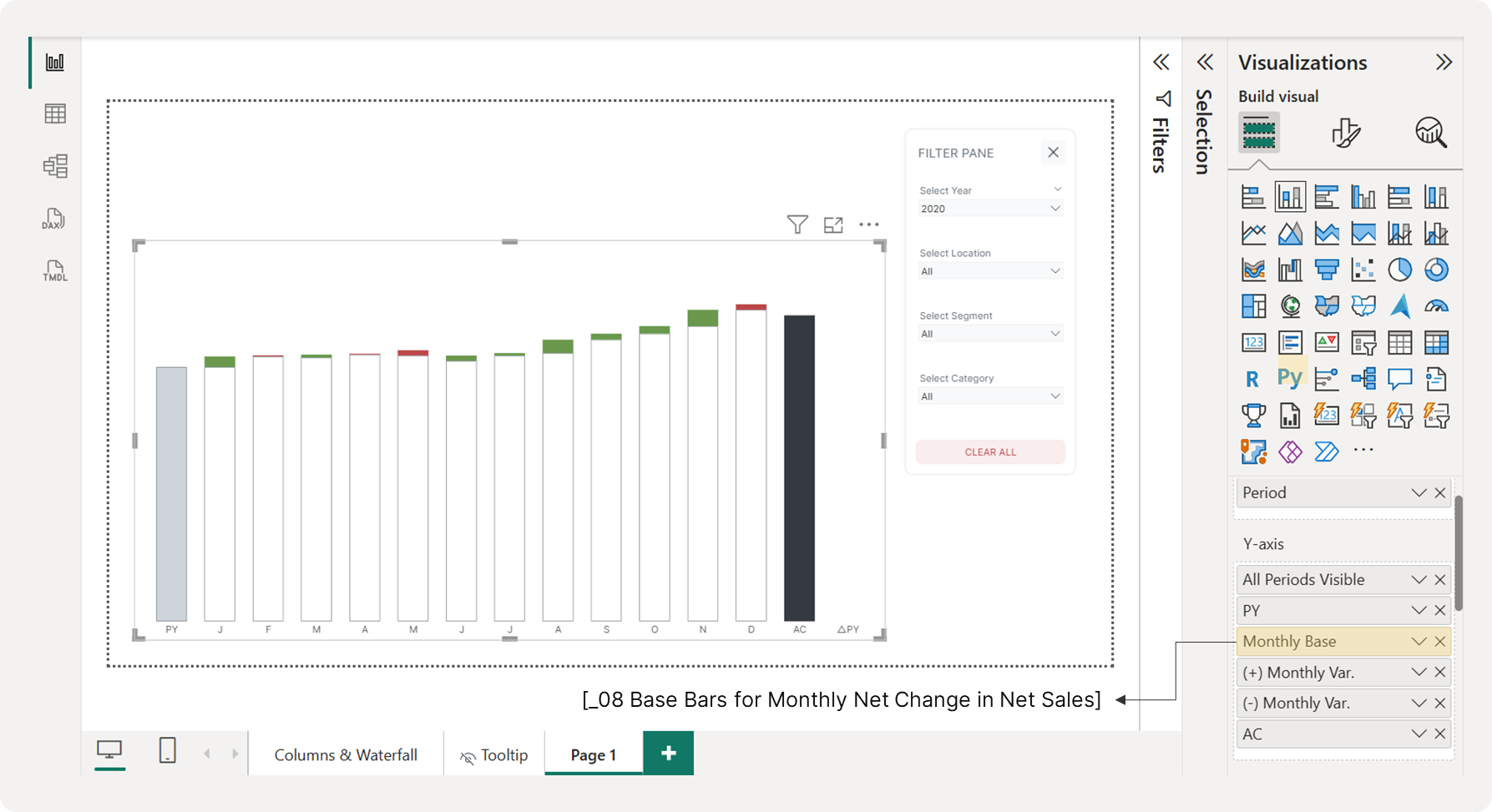 Using Base/Supporting Columns to Create a Floating Effect
You'll quickly notice a problem when you place this measure on the chart. Both positive and negative monthly changes cause the bars to extend upward. This is because we multiplied the negative values by -1 in a previous step to keep them above the baseline.
In a true waterfall chart, positive changes go up, and negative changes go down. To achieve this effect, we need to adjust the base for negative values. The workaround is to create two separate base measures: one for positive changes and one for negative changes.
Measure #09: Base Bars for Positive Monthly Changes
_09 Base Bars for Positive Monthly Net Change in Net Sales =
IF(
  [_06 Positive Monthly Net Change in Net Sales_Waterfall],
  [_08 Base Bars for Monthly Net Change in Net Sales],
  BLANK()
)
This measure creates the supporting bars that appear only under positive changes.
DAX Explained
Step-by-Step Breakdown
The Logic:
IF(There's a positive change, Show the base, Otherwise show nothing)In Detail:
- Check: Is there a positive monthly change in net sales?
- Uses:
[Positive Monthly Net Change in Net Sales_Waterfall] - This returns TRUE if the monthly change is positive, FALSE if not
- If YES (Positive Change):
- Show the base/foundation:
[_08 Base Bars for Monthly Net Change in Net Sales] - This is the cumulative value we explained earlier
- If NO (Negative Change or Zero):
- Show nothing:
BLANK()
Measure #10: Base Bars for Negative Monthly Changes
_10 Base Bars for Negative Monthly Net Change in Net Sales =
IF(
  [_07 Negative Monthly Net Change in Net Sales_Waterfall],
  [_08 Base Bars for Monthly Net Change in Net Sales] - [_07 Negative Monthly Net Change in Net Sales_Waterfall],
  BLANK()
)
This measure adjusts the base so that the negative bar appears to "drop" from the previous cumulative total. We subtract the positive value of the negative change to shorten the base bar.
DAX Explained
Step-by-Step Breakdown
The Logic:
IF(There's a negative change, Show adjusted base, Otherwise show nothing)In Detail:
- Check: Is there a negative monthly change in net sales?
- Uses:
[_07 Negative Monthly Net Change in Net Sales_Waterfall] - This returns the negative value if the change is negative, otherwise BLANK()
- If YES (Negative Change):
- Calculate:
Base - Negative Change - This lowers the supporting bar by the amount of the negative change
- If NO (Positive Change or Zero):
- Show nothing:
BLANK()
Now, replace the previous base measure with these two measures on the Y-axis. Finally, set their transparency to 100% to hide them. You will now have a correctly functioning waterfall chart.
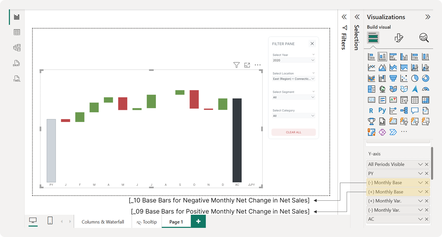 Creating a Floating Effect with Positive and Negative Supporting Columns/Bars
3.8 Displaying the Year-Over-Year Net Sales
The final element of our waterfall chart is the variance between the AC (Actual Current Year) and PY (Previous Year) totals, which we'll call △PY. Just like with the monthly changes, we'll start by creating a hidden base column. This base will ensure the △PY bar is positioned correctly.
The logic for this base is simple:
-
If AC is greater than PY, the base column's value is PY.
-
If AC is less than PY, the base column's value is AC.
This ensures the △PY bar will be "stacked" on top of the smaller of the two totals, visually connecting them.
Measure #11: Base Bars for △PY Net Sales
_11 Base Bars for △PY Net Sales =
VAR SelectedYear = SELECTEDVALUE(DimDate[Year])
VAR PeriodType = SELECTEDVALUE(Table_Waterfall[PeriodType])
VAR CurrentSortOrder = SELECTEDVALUE(Table_Waterfall[SortOrder])

-- Previous Year Total
VAR PreviousYearValue = CALCULATE([_01 Total Net Sales], DimDate[Year] = SelectedYear - 1)

-- Current Year Total
VAR CurrentYearValue = CALCULATE([_01 Total Net Sales], DimDate[Year] = SelectedYear)

-- Calculate variance
VAR VarianceAmount = CurrentYearValue - PreviousYearValue

-- Determine base value based on variance direction
VAR BaseValue = IF(VarianceAmount > 0, PreviousYearValue, CurrentYearValue)

RETURN
IF(
  PeriodType = "Variance" && CurrentSortOrder = 14,
  BaseValue,
  BLANK()
)
This measure calculates the "starting point" or "base" for showing how net sales changed from last year to this year. It's like setting the foundation before you stack the changes on top.
DAX Explained
Step-by-Step Breakdown
1. Getting the Context
VAR SelectedYear = SELECTEDVALUE(DimDate[Year])
VAR PeriodType = SELECTEDVALUE(Table_Waterfall[PeriodType])
VAR CurrentSortOrder = SELECTEDVALUE(Table_Waterfall[SortOrder])
This grabs three key pieces of information:
-
What year we're looking at
-
What type of period this is (looks like it filters for "Variance")
-
The sort order (specifically looking for position 14)
2. Getting Last Year's net sales
VAR PreviousYearValue = CALCULATE([_01 Total Net Sales], DimDate[Year] = SelectedYear - 1)Simple: "What was our total net sales last year?”
3. Getting This Year's net sales
VAR CurrentYearValue = CALCULATE([_01 Total Net Sales], DimDate[Year] = SelectedYear)Simple: "What is our total net sales this year?"
4. Calculating the Change
VAR VarianceAmount = CurrentYearValue - PreviousYearValue"How much did we go up or down?" (Positive = we grew, Negative = we declined)
5. The Smart Part - Choosing the Base
VAR BaseValue = IF(VarianceAmount > 0, PreviousYearValue, CurrentYearValue)Here's the clever logic:
-
If net sales went UP: Use last year's amount as the base (so you can stack the increase on top)
-
If net sales went DOWN: Use this year's amount as the base (so you can show the decrease going down)
6. The Final Decision
IF(PeriodType = "Variance" && CurrentSortOrder = 14, BaseValue, BLANK())Only show this base value when:
-
We're looking at a "Variance" period type, AND
-
We're at sort position 14
-
Otherwise, show nothing (BLANK)
Add this measure to the chart's Y-axis and test it with your filters. It should look like the following image, showing a base column in the final period.
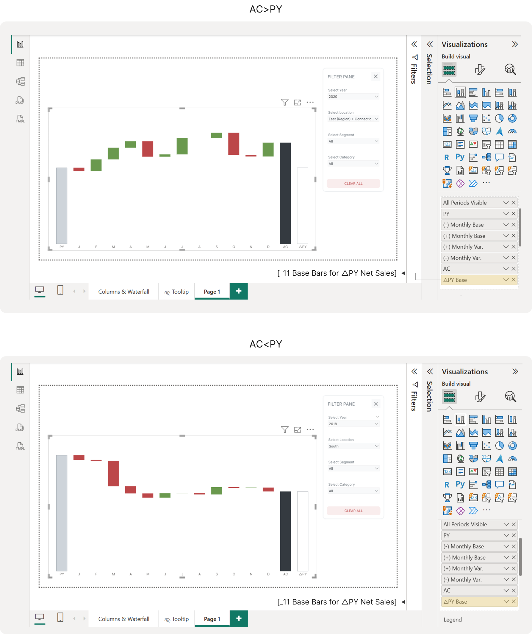 Creating a Floating Effect with Base Bars for △PY Net Sales
3.9 Visualizing Positive and Negative △PY Net Sales
After setting up the base column, you can now add the △PY bar on top. Just like with the monthly changes, you'll need two separate measures to apply different colors for positive (green) and negative (red) net changes. To do this, you'll first need to define the prerequisite measures.
Measure #12: Previous Year’s Total Net Sales
_12 PY Total Net Sales =
IF(
  HASONEVALUE(DimDate[Year]),
  CALCULATE(
      [_01 Total Net Sales],
      SAMEPERIODLASTYEAR(DimDate[Date])
  ),
  BLANK()
)
This measure calculates the total net sales from the same period last year - but only when you're looking at data for a single specific year.
DAX Explained
Breaking it down step by step:
1. The Name: _12 PY Total Net Sales
-
"PY" stands for "Previous Year"
-
So this is showing last year's sales numbers
2. The Logic Check: IF(HASONEVALUE(DimDate[Year])...)
-
This first checks: "Am I looking at data for just ONE specific year?"
-
If yes → proceed with the calculation
-
If no (multiple years selected) → show nothing (BLANK)
3. The Calculation: CALCULATE([_01 Total Net Sales], SAMEPERIODLASTYEAR(DimDate[Date]))
-
Takes your existing sales measure (
_01 Total Net Sales) -
But shifts the time period back by exactly one year using
SAMEPERIODLASTYEAR -
So if you're looking at March 2024, it shows March 2023 sales instead
Why the year check?
Without the HASONEVALUE check, if someone selected multiple years (like 2023 AND 2024), the measure might show confusing results. The check ensures it only works when viewing one specific year at a time.
Measure #13: Year-on-Year Net Sales
_13 △PY Net Sales =
IF(
  HASONEVALUE(DimDate[Year])
  && NOT(ISBLANK([_12 PY Total Net Sales]))
  && NOT(ISBLANK([_01 Total Net Sales]))
  && [_01 Total Net Sales] <> 0,
  [_01 Total Net Sales] - [_12 PY Total Net Sales],
  BLANK()
)
This calculates the difference between this year's and last year's net sales - but only when all the necessary data is available and makes sense to compare.
DAX Explained
Breaking it down:
1. The Name: _13 △PY Net Sales
-
"△" (delta) = difference/change
-
"PY" = Previous Year
-
This shows: This Year minus Last Year
2. The Safety Checks: The measure runs 4 important checks before doing any calculation:
Check #1: HASONEVALUE(DimDate[Year])
-
"Am I looking at just ONE specific year?"
-
(Not multiple years mixed together)
Check #2: NOT(ISBLANK([_12 PY Total Net Sales]))
-
"Do I have last year's sales data?"
-
(Make sure previous year data exists)
Check #3: NOT(ISBLANK([_01 Total Net Sales]))
-
"Do I have this year's sales data?"
-
(Make sure current year data exists)
Check #4: [_01 Total Net Sales] <> 0
-
"Is this year's sales not zero?"
-
(Avoid meaningless comparisons with zero)
3. The Calculation: [_01 Total Net Sales] - [_12 PY Total Net Sales]
-
IF all 4 checks pass → Calculate: This Year - Last Year
-
IF any check fails → Show nothing (BLANK)
Why all these checks?
This prevents showing misleading or meaningless variance numbers when the data isn't suitable for comparison. It's like saying "I'll only tell you the difference if I have complete, reliable data to compare."
Measure #14: Year-in-Year Net Sales for Waterfall Chart
_14 △PY Net Sales_Waterfall =
VAR SelectedYear = SELECTEDVALUE(DimDate[Year])
VAR PeriodType = SELECTEDVALUE(Table_Waterfall[PeriodType])
RETURN
SWITCH(
  PeriodType,
  "Variance", ABS(CALCULATE([_13 △PY Net Sales], DimDate[Year] = SelectedYear)),
  BLANK()
)
This measure creates the bars/columns for a waterfall chart that shows the absolute difference between this year's and last year's net sales - but only for "Variance" periods.
DAX Explained
Breaking it down:
1. The Name: _14 △PY Net Sales_Waterfall
-
"△" (delta) means "change" or "difference"
-
"PY" = Previous Year
-
"Waterfall" indicates this is specifically for waterfall charts
2. The Variables:
VAR SelectedYear = SELECTEDVALUE(DimDate[Year])
VAR PeriodType = SELECTEDVALUE(Table_Waterfall[PeriodType])-
SelectedYear: Captures which year the user is currently viewing
-
PeriodType: Gets the type of period from a special waterfall table (likely contains values like "Actual", "Variance", "Budget", etc.)
3. The Logic: SWITCH(PeriodType, "Variance", [calculation], BLANK())
-
IF the PeriodType is "Variance" → show the calculation
-
IF it's anything else → show nothing (BLANK)
4. The Calculation: ABS(CALCULATE([_13 △PY Net Sales], DimDate[Year] = SelectedYear))
-
Uses another measure
_13 △PY Net Sales(calculates: This Year - Last Year) -
Wraps it in
ABS()to get the absolute value (always positive) -
Filters to only the selected year
Why absolute value?
Waterfall charts often show the magnitude of change as positive bars, regardless of whether sales went up or down. The visual positioning (above/below the line) indicates direction instead of the number sign.
This measure ensures that only the "Variance" portions of your waterfall chart display values, keeping other elements (like labels or connectors) blank.
Now that you've defined the prerequisite measures, you can create two separate DAX measures—one for positive △PY and one for negative. This will allow you to color-code your results, using green for positive values and red for negative.
Measure #15: Positive △PY Net Sales for Waterfall Chart
_15 Positive △PY Net Sales_Waterfall =
IF(
  [_13 △PY Net Sales] > 0,
  [_14 △PY Net Sales_Waterfall],
  BLANK()
)
This measure shows only the positive year-over-year net sales changes.
DAX Explained
Step-by-Step Breakdown
The Logic Check:
[_13 △PY Net Sales] > 0
First, it checks: "Is the year-over-year net sales change positive?"
- This references another measure that calculates the difference between this year and last year's net sales
The Decision:
IF(
  [_13 △PY Net Sales] > 0,    -- If the change is positive...
  [△PY Net Sales_Waterfall],   -- Show the waterfall value
  0                               -- Otherwise, show zero
)
What happens:
-
If net sales INCREASED from last year → Show the waterfall value (likely the actual change amount)
-
If net sales DECREASED from last year → Show zero (hide it from this measure)
Measure #16: Negative △PY Net Sales for Waterfall Chart
_16 Negative △PY Net Sales_Waterfall =
IF(
  [_03 △PY Total net sales] < 0,
  [_14 △PY Net Sales_Waterfall],
  BLANK()
)
This measure shows only the negative year-over-year net sales changes.
DAX Explained
Step-by-Step Breakdown
The Logic Check:
[_03 △PY Total net sales] < 0
First, it checks: "Is the year-over-year net sales change negative?"
- Again, this references the same measure that calculates the difference between this year and last year's net sales
The Decision:
IF(
  [_03 △PY Total net sales] < 0,    -- If the change is negative...
  [△PY Waterfall_Total net sales],   -- Show the waterfall value
  0                               -- Otherwise, show zero
)
What happens:
-
If net sales DECREASED from last year → Show the waterfall value (the actual change amount)
-
If net sales INCREASED from last year → Show zero (hide it from this measure)
Now, add these two measures to the chart’s Y-axis. To finalize the chart, hide the △PY Base column by setting its transparency to 100%. Finally, assign green to the positive △PY column and red to the negative △PY column. Your complete waterfall chart should now display correctly with all elements and color coding, regardless of the filters selected.
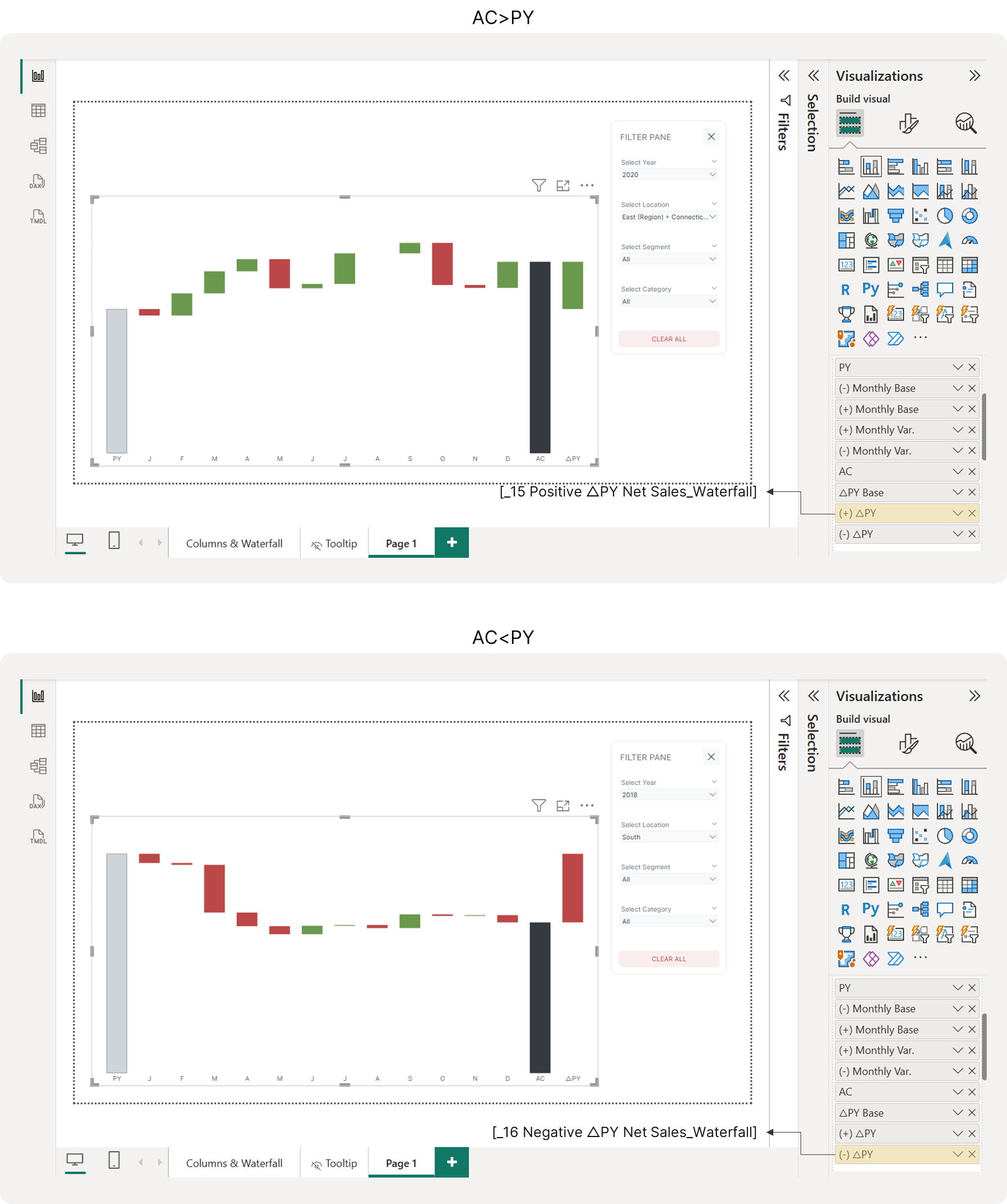 Visualizing Positive and Negative △PY Net Sales on a Waterfall Chart
Step 4: Displaying Data Labels on the Waterfall Chart
This is the trickiest part of the process. While our stacked column chart is almost complete, we need to add data labels to each bar. A key limitation of Power BI's stacked column chart is that we cannot position data labels on the outside end of a bar. We want our positive net change labels to appear on top and negative labels below, so we need a workaround.
The solution is to create duplicate visuals using a clustered column chart instead. This will allow us to place the data labels precisely where we want them: outside the bars.
4.1 Displaying Data Labels for AC & PY Net Sales
First, let's create a DAX measure to display data labels for the AC and PY columns. We can combine these into a single measure since we will display both on the outside end of the column.
Measure #17: Reference Bars for AC & PY Net Sales Data Label
_17 Reference Bars for AC & PY Net Sales Data Label =
VAR SelectedYear = SELECTEDVALUE(DimDate[Year])
VAR PeriodType = SELECTEDVALUE(Table_Waterfall[PeriodType])

RETURN
SWITCH(
  PeriodType,
  "Previous Year", CALCULATE([_01 Total Net Sales], DimDate[Year] = SelectedYear - 1),
  "Current Year", CALCULATE([_01 Total Net Sales], DimDate[Year] = SelectedYear),
  BLANK()
)
This measure dynamically displays either the current or previous year's total net sales depending on the selected period.
DAX Explained
Breaking it down:
Step 1: Store Important Information
VAR SelectedYear = SELECTEDVALUE(DimDate[Year])
VAR PeriodType = SELECTEDVALUE(Table_Waterfall[PeriodType])-
SelectedYear: Captures what year the user has selected (like 2024)
-
PeriodType: Captures whether we want "Previous Year" or "Current Year" data
Step 2: Make a Decision Based on Selection
The SWITCH statement acts like a menu:
If PeriodType = "Previous Year":
-
Calculate total net sales for the year BEFORE the selected year
-
Example: If 2024 is selected, show 2023 net sales
If PeriodType = "Current Year":
-
Calculate total net sales for the currently selected year
-
Example: If 2024 is selected, show 2024 net sales
If neither option:
- Show 0
Now, create a new clustered column chart. Place Table_Waterfall[Period] on the X-axis and this new measure on the Y-axis. Position this new chart directly over your waterfall chart, ensuring the dimensions and configuration match perfectly. To keep the two charts aligned, we will keep the X-axis visible but change its color to white to blend into the background.
Next, navigate to the Data Label section. It is highly recommended to use a custom data format, as the full net sales values may be too long and get truncated.
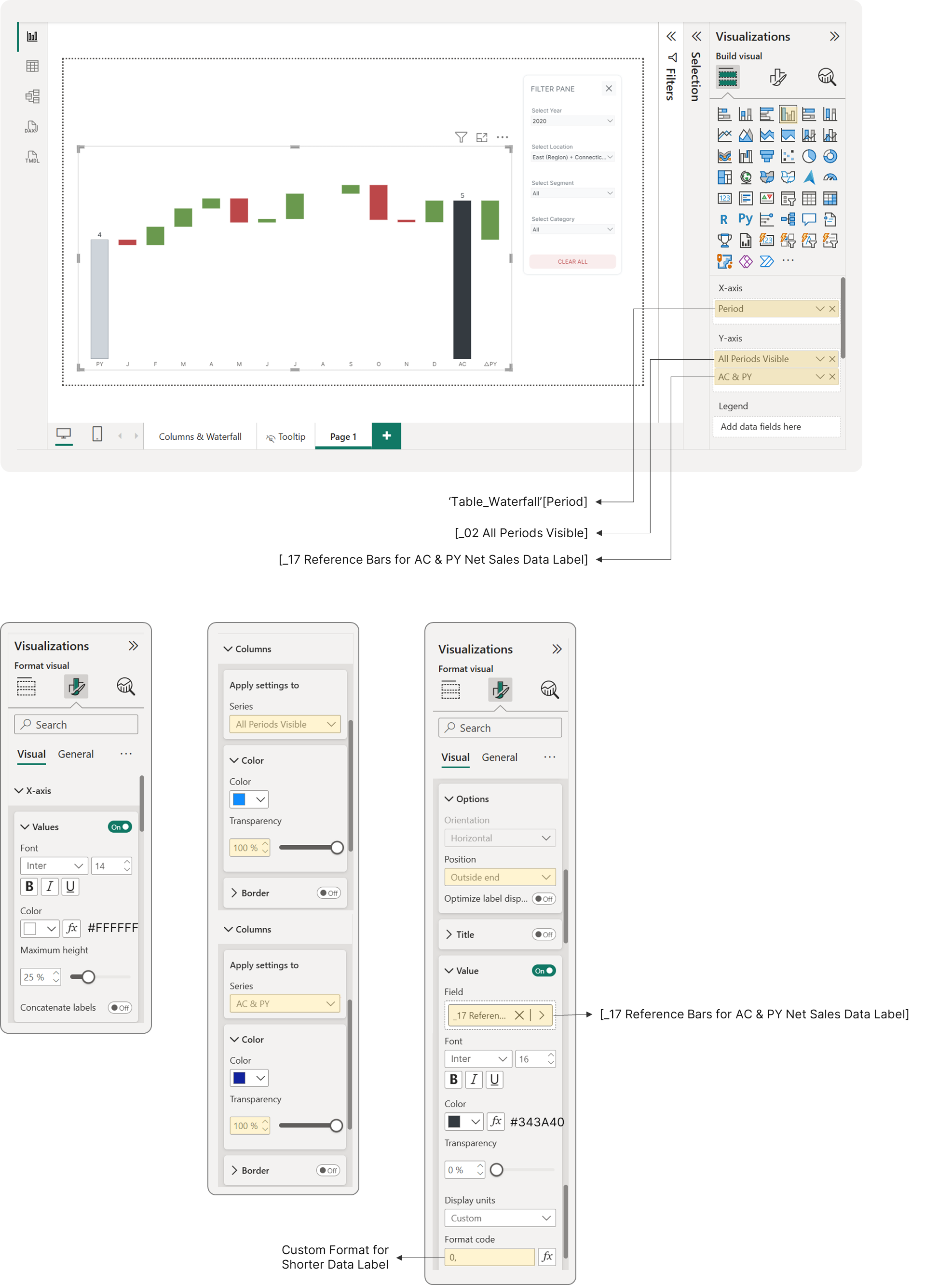 Visualizing Data Labels for Actual and Prior Year Net Sales
Before you proceed, it is critical to ensure that all charts—the waterfall chart and its data label duplicates—have the same Y-axis range. This is essential for proper alignment and scaling when they are layered on top of each other.
Create the following measure to automatically calculate the maximum Y-axis value.
4.2 Setting the Y-Axis Maximum Range for Chart Alignment
This is crucial step to ensure that the position of the data labels are always aligned with the waterfall chart regardless the filter selections. Additionally, this measure will be used later for the clustered column chart displaying the previous year and current (selected) year net sales to ensure correct scaling.
Measure #18: Y-Axis Maximum Range for Waterfall Chart
_18 Y-Axis Max_Net Sales Running Total =
VAR HighestSales =
MAXX(
  ALL(Table_Waterfall[Period]),
  [_08 Base Bars for Monthly Net Change in Net Sales]
)

RETURN
HighestSales * 1.4
This measure finds the highest cumulative value from your base bars and multiplies it by a factor of 1.4 to give you some visual padding.
DAX Explained
Breaking it down:
Step 1: Find the Highest net sales Value
VAR HighestSales =
MAXX(
  ALL(Table_Waterfall[Period]),
  [AC & PY Waterfall_Total net sales]
)
What this does:
-
ALL(): Removes any filters and looks at ALL periods in your waterfall table
-
MAXX(): Finds the maximum (highest) net sales value across all those periods
-
Result: Gets the biggest net sales number from your entire dataset
Step 2: Add Some Breathing Room
RETURN HighestSales * 1.2What this does:
-
Takes the highest value and multiplies it by 1.2 (adds 20% extra space)
-
This creates visual "padding" at the top of your chart
Go to each chart's Y-axis settings and apply this measure's value as the maximum range using conditional formatting. Ensure the height of all charts is identical for perfect alignment.
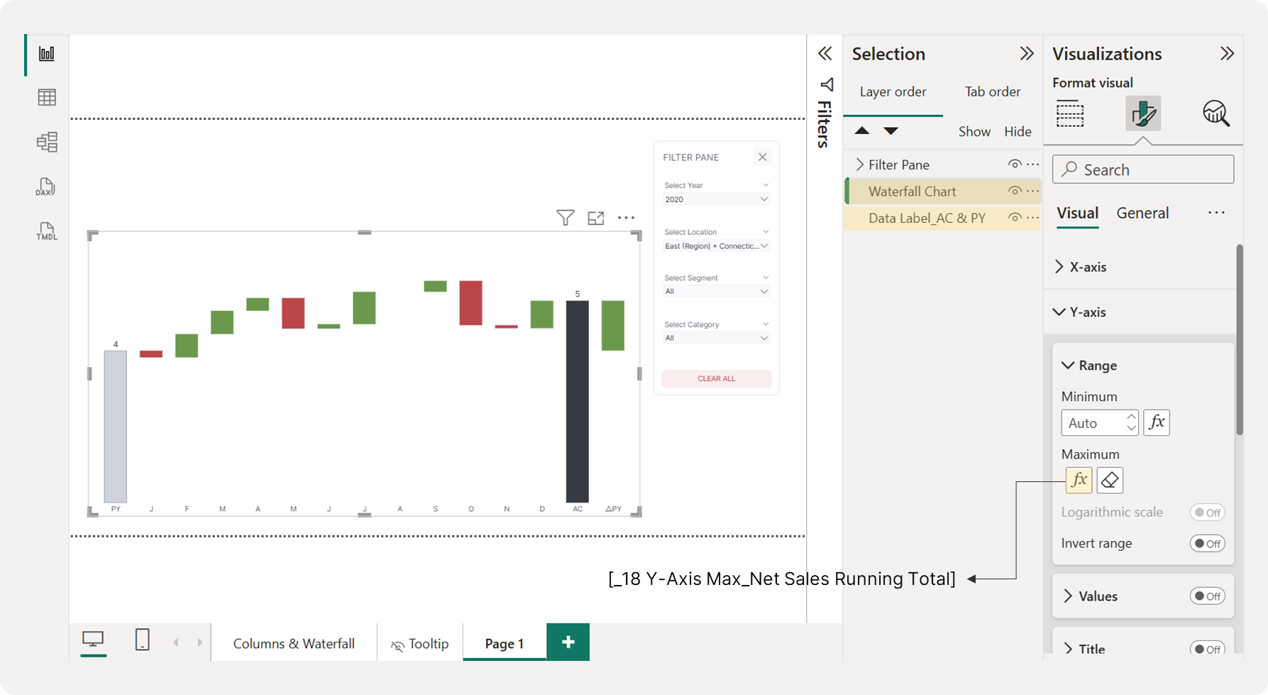 Setting the Y-Axis Maximum Range for Each Chart
4.3 Displaying Positive Monthly Net Changes as Data Labels
To show data labels for positive monthly net changes, you need to display them outside the end of the columns. First, generate this DAX measure and place it on the chart's y-axis. Next, hide the columns by setting their transparency to 100%. Finally, set the data labels to display "outside end" and use the measure [_06 Positive Monthly Net Change in Net Sales_Waterfall] as their value.
Measure #19: Reference Column for Positive Monthly Net Change in Net Sales Data Label
_19 Reference Bars for Positive Monthly Net Change in Net Sales Data Label = [_06 Positive Monthly Net Change in Net Sales_Waterfall] + [_09 Base Bars for Positive Monthly Net Change in Net Sales]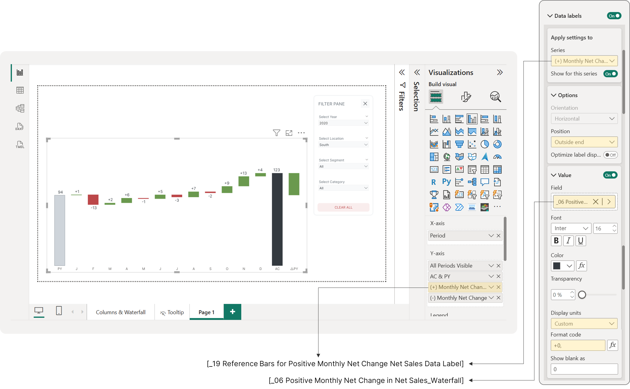 Showing Data Labels for Positive Monthly Net Sales Change Bars
4.4 Displaying Negative Monthly Net Changes as Data Labels
Next, to display data labels for negative monthly net changes, generate the following DAX measure and add it to the chart's y-axis. Hide the columns by setting their transparency to 100%, and then set the data labels to "inside end," using the measure [_07 Negative Monthly Net Change in Net Sales_Waterfall] as their value.
Measure #20: Reference Bars for Negative Monthly Net Change in Net Sales Data Label
_20 Reference Bars for Negative Monthly Net Change in Net Sales Data Label = [_10 Base Bars for Negative Monthly Net Change in Net Sales]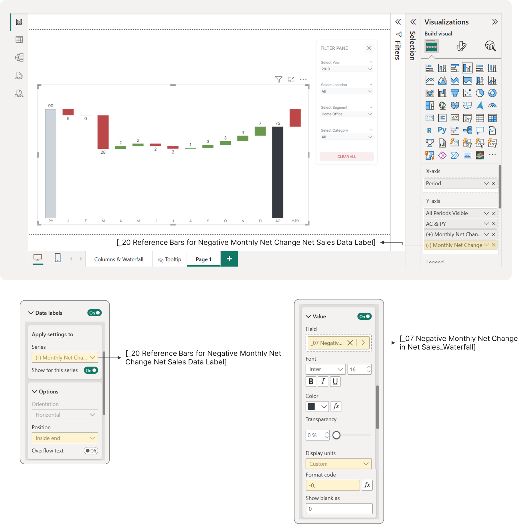 Showing Data Labels for Negative Monthly Net Sales Change Bars
4.5 Displaying Positive and Negative △PY
The last data labels we'll display are for the year-over-year net change (△PY). Similar to our approach for monthly changes, we want to position positive values on the outside of the column and negative values on the inside.
You might think you can display these data labels by simply using your existing base bar measure [_11 Base Bars for △PY Net Sales]. However, a single measure won't let you set different positions for positive and negative labels.
To solve this, we'll create two invisible reference columns—one for positive values and one for negative.
Step 1: Create Reference Measures
Use the following DAX measures to create your invisible reference columns. These measures will hold the position for your data labels.
Measure #21: Reference Bars for Positive △PY Net Sales Data Label
_21 Reference Bars for Positive △PY Net Sales Data Label =
IF(
  [_13 △PY Net Sales] > 0,
  [_11 Base Bars for △PY Net Sales] + [_14 △PY Net Sales_Waterfall],
  BLANK()
)
Measure #22: Reference Bars for Negative △PY Net Sales Data Label
_22 Reference Bars for Negative △PY Net Sales Data Label =
IF(
  [_13 △PY Net Sales] < 0,
  [_11 Base Bars for △PY Net Sales],
  BLANK()
)
Step 2: Configure the Chart
Add both new measures to your chart's y-axis. Then, set their transparency to 100% so they become invisible.
Next, go to the Data Label section. Here, you can position the labels for the positive change on the outside of the column and the labels for the negative change on the inside.
Step 3: Add a Growth Sign
To make the direction of the change instantly clear, we'll replace the default data labels with an icon. Use this DAX measure to create a simple visual indicator.
Measure #23: Growth Sign
_23 Growth Sign =
SWITCH(
  TRUE(),
  [_13 △PY Net Sales] > 0, "🡵",
  [_13 △PY Net Sales] < 0, "🡶",
  BLANK()
)
This measure creates an up arrow (🡵) for positive growth, a down arrow (🡶) for decline, and remains blank for flat or no data.
Step 4: Display the Actual Value
Finally, in the Detail section of your chart, turn it on and add the [_13 △PY Net Sales] measure for both reference columns. This will display the actual net change value alongside the icon, giving you the complete result.
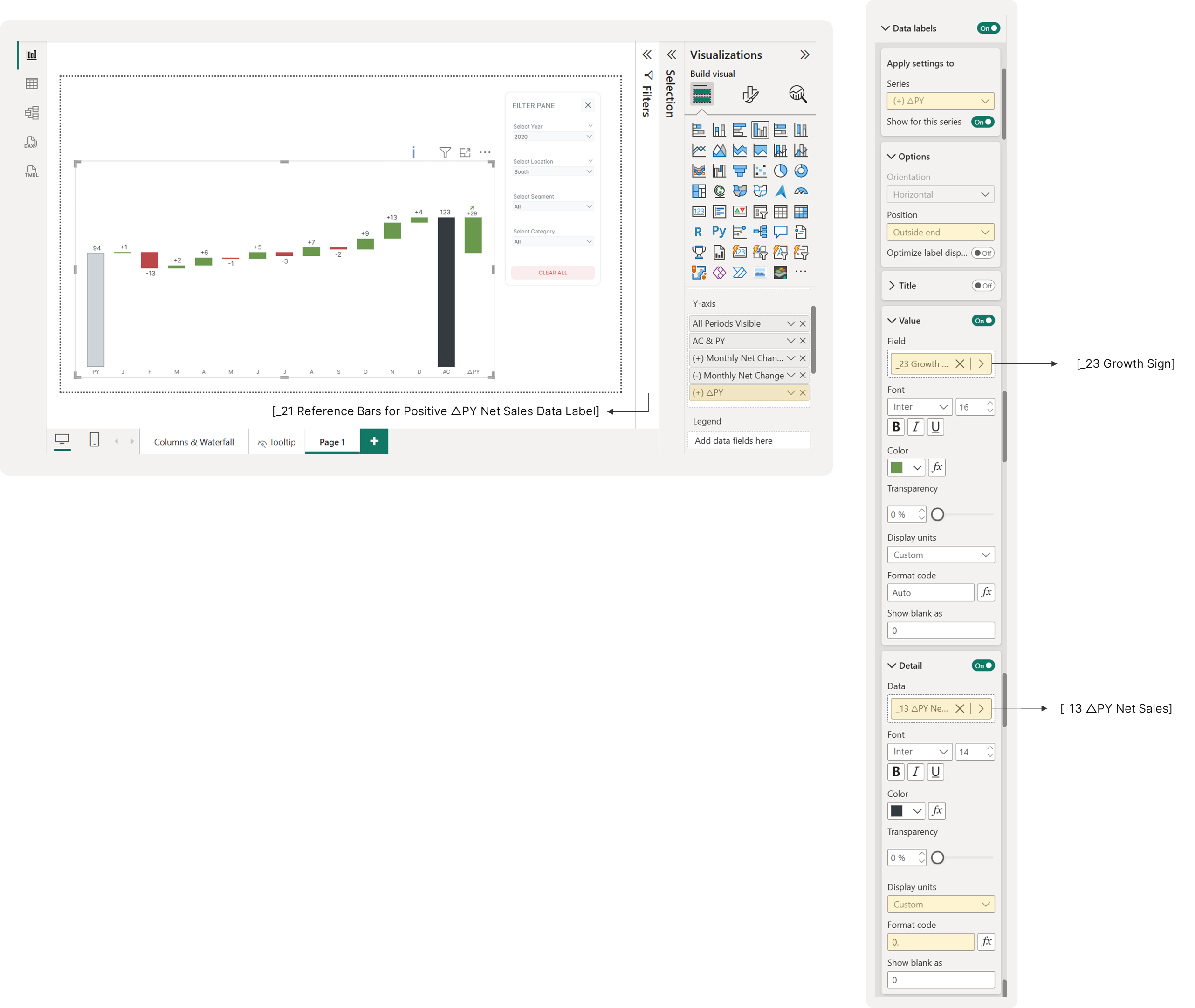 Displaying Data Labels for Positive △PY Net Sales
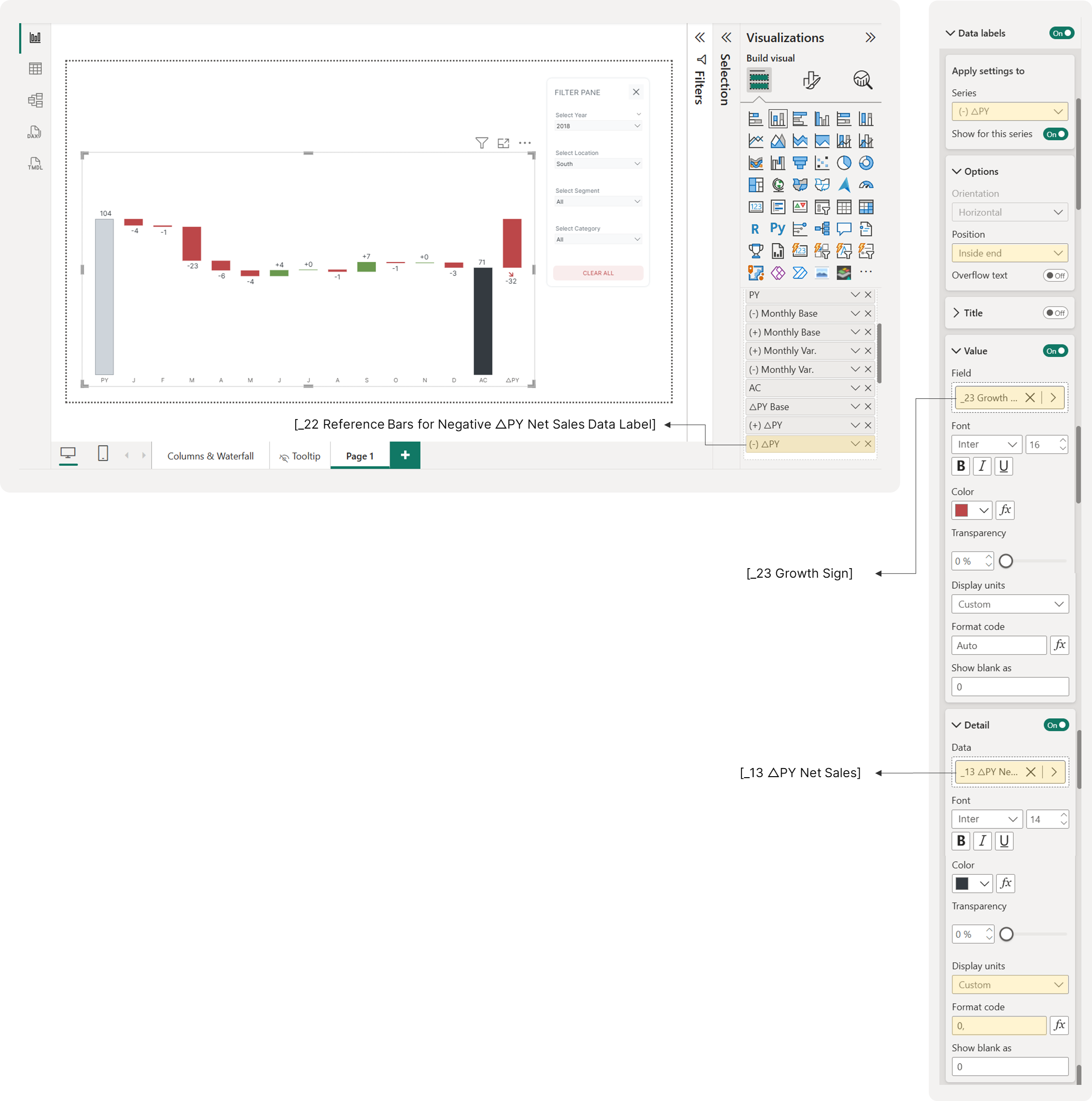 Displaying Data Labels for Negative △PY Net Sales
4.6 Displaying Y-Axis Constant Lines
For the final touches on your waterfall chart, you'll add three constant y-axis lines. The first is a baseline at 0. The other two lines—the PY (Prior Year) line and the AC (Actuals) line—will serve as a guide. They help visualize the upper and lower limits of the △PY net sales bar. To add them, create two new lines. Use [_12 PY Total Net Sales] for the PY line and [_01 Total Net Sales] for the AC line.
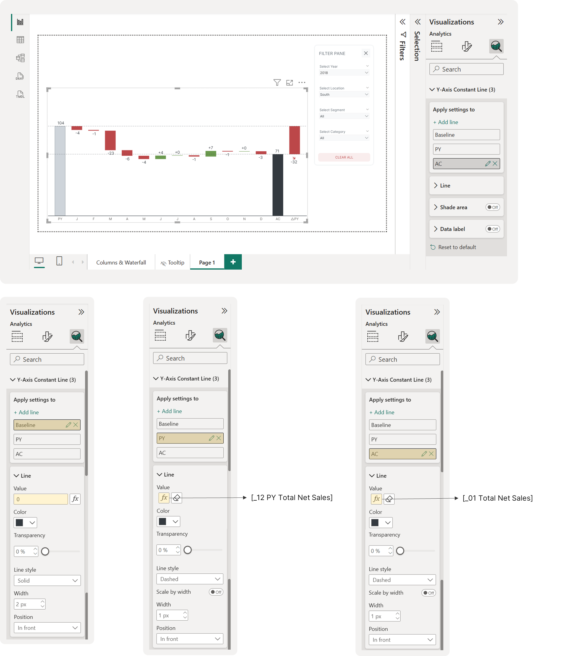 Displaying Y-Axis Constant Lines
Step 5: Constructing the Clustered Column Chart
To build the next chart, you'll create a clustered column chart to compare your AC and PY net sales side-by-side.
First, create a clustered column chart and place the 'MonthAbbr' column from the 'DimDate' table on the x-axis. For the y-axis, you'll need to use two special DAX measures. These are crucial because they ensure all months—even those with no sales—remain visible. This maintains a consistent visual alignment across your charts, which is essential when applying filters.
Here are the measures you'll need to define:
Measure #24: Previous Year Net Sales (All Months Visible)
_24 PY Total Net Sales (All MonthAbbr Visible) =
SUMX(
  VALUES(DimDate[MonthAbbr]),  -- Ensures months remain visible
  VAR RevenueAC = COALESCE([_12 PY Total Net Sales], 0)
  RETURN
      RevenueAC  -- Keeps 0 values visible
)
This creates previous year's total net sales by month, ensuring that all 12 months remain visible in your visual even if some months have zero or no sales data.
DAX Explained
Breaking it down:
1. The Name: _26 PY Total Net Sales (All MonthAbbr Visible)
-
"PY" = Previous Year
-
"MonthAbbr" = Month Abbreviations (Jan, Feb, Mar, etc.)
-
"(All MonthAbbr Visible)" = ensures all months show up
2. The Structure: SUMX(VALUES(DimDate[MonthAbbr]), ...)
-
SUMX: Iterates through each month and sums the results
-
VALUES(DimDate[MonthAbbr]): Gets all unique month abbreviations (Jan through Dec)
-
Forces processing of every month, regardless of data availability
3. The Variable: VAR RevenueAC = COALESCE([_12 PY Total Net Sales], 0)
-
COALESCE: If
_12 PY Total Net Salesreturns BLANK, use 0 instead -
Converts missing/blank values to explicit zeros
4. The Return: RETURN RevenueAC -- Keeps 0 values visible
- Returns the value (guaranteed to be a number, never blank)
Key Difference from Waterfall Measures:
-
Waterfall measures: Used
Table_Waterfall[Period](custom periods) -
This measure: Uses
DimDate[MonthAbbr](calendar months)
Measure #25: Current (Selected) Year Net Sales (All Months Visible)
_25 AC Total Net Sales (All MonthAbbr Visible) =
SUMX(
  VALUES(DimDate[MonthAbbr]),  -- Ensures months remain visible
  VAR RevenueAC = COALESCE([_01 Total Net Sales], 0)
  RETURN
      RevenueAC  -- Keeps 0 values visible
)
This creates current year's actual total net sales by month, ensuring that all 12 months remain visible in your visual even if some months have zero or no sales data.
DAX Explained
Breaking it down:
1. The Name: _27 AC Total Net Sales (All MonthAbbr Visible)
-
"AC" = Actual (current year's actual sales)
-
"MonthAbbr" = Month Abbreviations (Jan, Feb, Mar, etc.)
-
"(All MonthAbbr Visible)" = ensures all months show up
2. The Structure: SUMX(VALUES(DimDate[MonthAbbr]), ...)
-
SUMX: Loops through each month and sums the results
-
VALUES(DimDate[MonthAbbr]): Gets all unique month abbreviations (Jan through Dec)
-
Processes every month, whether it has data or not
3. The Variable: VAR RevenueAC = COALESCE([_01 Total Net Sales], 0)
-
COALESCE: If
_01 Total Net Salesreturns BLANK, substitute 0 -
Converts missing/blank values into explicit zeros
4. The Return: RETURN RevenueAC -- Keeps 0 values visible
- Returns the value (now guaranteed to be a number, never blank)
Now, you can configure the chart. Place both of these new measures on the chart's y-axis. To ensure a consistent visual comparison with other charts, be sure to set the y-axis maximum range to the same measure you used before. Lastly, enable data labels, but only for the AC total net sales measure. The final configuration is shown below.
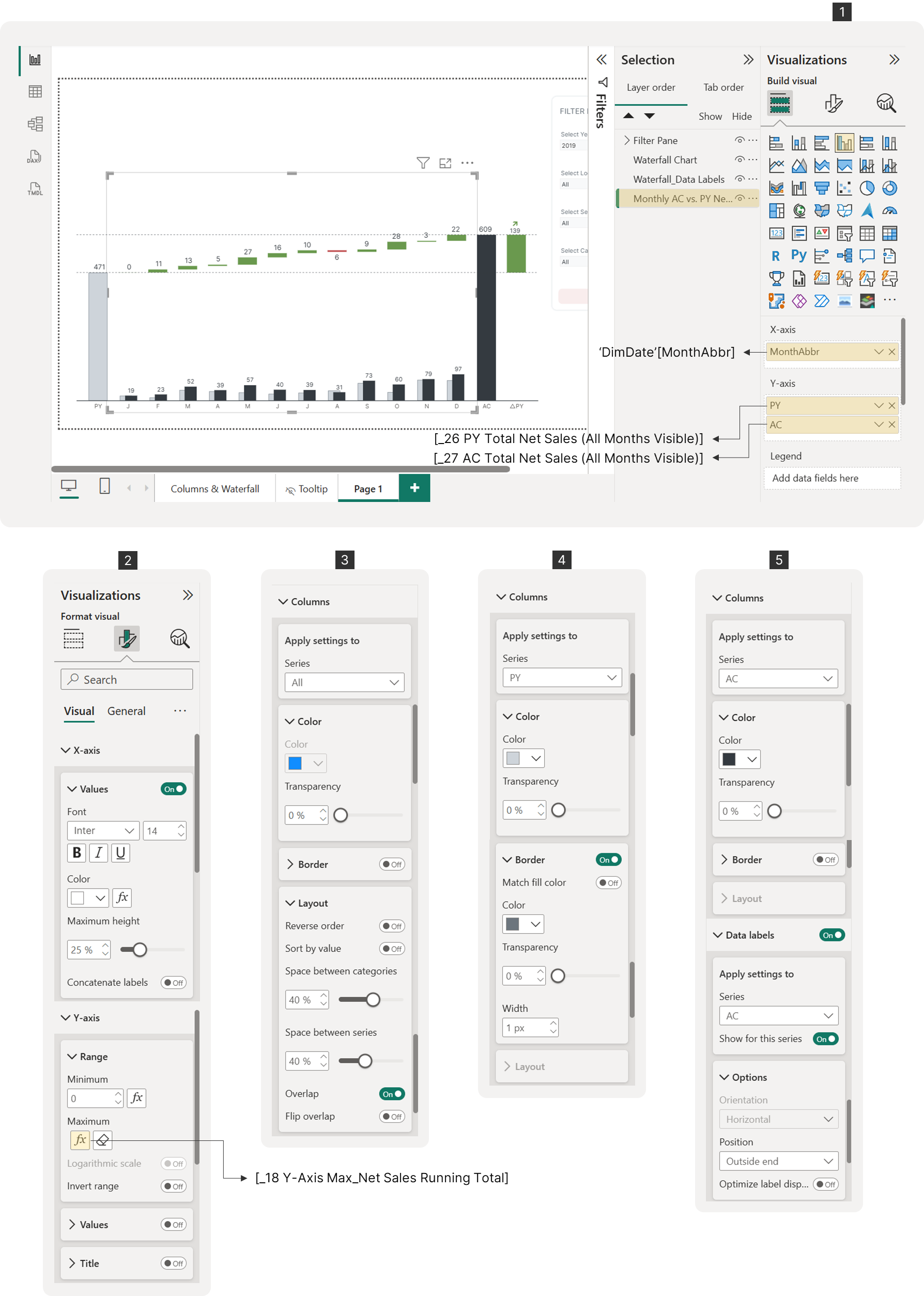 Clustered Column Chart Configuration
Position this chart directly beneath the waterfall chart. To ensure accurate scaling and alignment, make sure its x-axis is perfectly aligned and its height matches the waterfall chart.
Step 6: Constructing the Variance Chart
This is the final chart we'll create. We'll use a simple line chart with error bars to show the percentage variance (%△PY), which will sit above the main waterfall chart.
Note: A line chart was used because it gives us the flexibility to adjust the offset for data labels, adding clear spacing between the markers and the labels.
Setting Up the Chart
First, create a line chart. Set the x-axis to 'Table_Waterfall'[Period] and the y-axis to [_02 All Periods Visible]. This ensures all monthly periods are visible regardless of any filter selections. Next, we'll display the monthly percentage net change. Similar to before, we need to create separate measures to assign different colors (green for positive, red for negative).
DAX Measures for Variance
We'll start with a measure that calculates the monthly percentage change in net sales compared to the same month in the previous year. This is only for "Month" periods in the waterfall chart.
Measure #26: Monthly % Net Change in Net Sales for Waterfall Chart
_26 Monthly % Net Change in Net Sales_Waterfall =
VAR SelectedYear = SELECTEDVALUE(DimDate[Year])
VAR PeriodType = SELECTEDVALUE(Table_Waterfall[PeriodType])
VAR MonthNumber = SELECTEDVALUE(Table_Waterfall[MonthNumber])

VAR CurrentYearMonth = CALCULATE([_01 Total Net Sales], DimDate[Year] = SelectedYear, MONTH(DimDate[Date]) = MonthNumber)
VAR PreviousYearMonth = CALCULATE([_01 Total Net Sales], DimDate[Year] = SelectedYear - 1, MONTH(DimDate[Date]) = MonthNumber)

RETURN
SWITCH(
  TRUE(),
  PeriodType = "Month" && PreviousYearMonth <> 0,
      DIVIDE(CurrentYearMonth - PreviousYearMonth, PreviousYearMonth),
  BLANK()
)
This calculates the monthly percentage change in net sales compared to the same month last year - but only for "Month" periods in a waterfall chart.
DAX Explained
Breaking it down:
1. The Name: _26 Monthly % Net Change in Net Sales_Waterfall
-
Shows percentage change (not absolute dollar change)
-
Monthly comparison (this March vs last March)
-
Specifically for waterfall charts
2. The Variables:
VAR SelectedYear = SELECTEDVALUE(DimDate[Year])
VAR PeriodType = SELECTEDVALUE(Table_Waterfall[PeriodType])
VAR MonthNumber = SELECTEDVALUE(Table_Waterfall[MonthNumber])-
SelectedYear: Current year being viewed (e.g., 2024)
-
PeriodType: Type from waterfall table ("Month", "Variance", etc.)
-
MonthNumber: Which month (1=Jan, 2=Feb, etc.)
3. The Sales Calculations:
VAR CurrentYearMonth = CALCULATE([_01 Total Net Sales],
  DimDate[Year] = SelectedYear,
  MONTH(DimDate[Date]) = MonthNumber)

VAR PreviousYearMonth = CALCULATE([_01 Total Net Sales],
  DimDate[Year] = SelectedYear - 1,
MONTH(DimDate[Date]) = MonthNumber)-
CurrentYearMonth: Sales for specific month in current year
-
PreviousYearMonth: Sales for same month in previous year
4. The Logic:
SWITCH(TRUE(),
  PeriodType = "Month" && PreviousYearMonth <> 0,
      DIVIDE(CurrentYearMonth - PreviousYearMonth, PreviousYearMonth),
  BLANK()
)-
Only shows values when:
- PeriodType is "Month" (not other waterfall elements)
- Previous year had sales (avoids division by zero)
-
Formula: (This Year - Last Year) ÷ Last Year = % Change
Now, we'll create two more measures to isolate positive and negative changes for separate coloring.
Measure #27: Positive Monthly % Net Change in Net Sales for Waterfall Chart
_27 Positive Monthly % Net Change in Net Sales_Waterfall =
IF(
  [_26 Monthly % Net Change in Net Sales_Waterfall] > 0,
  [_26 Monthly % Net Change in Net Sales_Waterfall],
  BLANK()
)
This takes the monthly percentage change and only shows positive values (growth), hiding negative values (declines) for waterfall chart visualization.
DAX Explained
Breaking it down:
1. The Name: *27 Positive Monthly % Net Change in Net Sales*Waterfall
-
"Positive" = only shows positive percentage changes
-
Uses the previous measure as input
-
For waterfall charts
2. The Simple Logic:
IF(
  [_26 Monthly % Net Change in Net Sales_Waterfall] > 0,
  [_26 Monthly % Net Change in Net Sales_Waterfall],
  BLANK()
)-
IF the percentage change is positive → show the value
-
IF the percentage change is zero or negative → show nothing (BLANK)
Why split positive and negative?
Waterfall Chart Visualization:
-
Positive changes (growth) typically show as green bars going UP
-
Negative changes (decline) typically show as red bars going DOWN
-
You need separate measures to control the visual formatting
Measure #28: Negative Monthly % Net Change in Net Sales for Waterfall Chart
_28 Negative Monthly % Net Change in Net Sales_Waterfall =
IF(
  [_26 Monthly % Net Change in Net Sales_Waterfall] < 0,
  [_26 Monthly % Net Change in Net Sales_Waterfall],
  BLANK()
)
This takes the monthly percentage change and only shows negative values (declines), hiding positive values (growth) for waterfall chart visualization.
DAX Explained
Breaking it down:
1. The Name: _28 Negative Monthly % Net Change in Net Sales_Waterfall
-
"Negative" = only shows negative percentage changes
-
Uses the same base measure
_26as input -
For waterfall charts
2. The Simple Logic:
IF(
  [_26 Monthly % Net Change in Net Sales_Waterfall] < 0,
  [_26 Monthly % Net Change in Net Sales_Waterfall],
  BLANK()
)-
IF the percentage change is negative → show the value
-
IF the percentage change is zero or positive → show nothing (BLANK)
Chart Formatting and Error Bars
Add Measures #27 and #28 to the chart's y-axis. Hide the lines for all series and add a constant line at value = 0 on the y-axis to create a baseline for the variance chart.
For the x-axis, hide the axis itself by matching its color to the background (white) but do not hide the labels for easier alignment with other charts.
To display the bars, we’ll use error bars because they have perfect size to display the variance, just like the example from IBCS. To do this, we need a baseline measure.
Measure #29: Baseline
_29 Baseline = 0Finally, navigate to the Error Bars settings and configure each series. For [_27 Positive Monthly % Net Change] and [_28 Negative Monthly % Net Change] series, disable the markers since we only want to display the bars. To add a square marker at the top of each bar, use the [_02 All Periods Visible] series. This allows you to display a single-color marker for all periods.
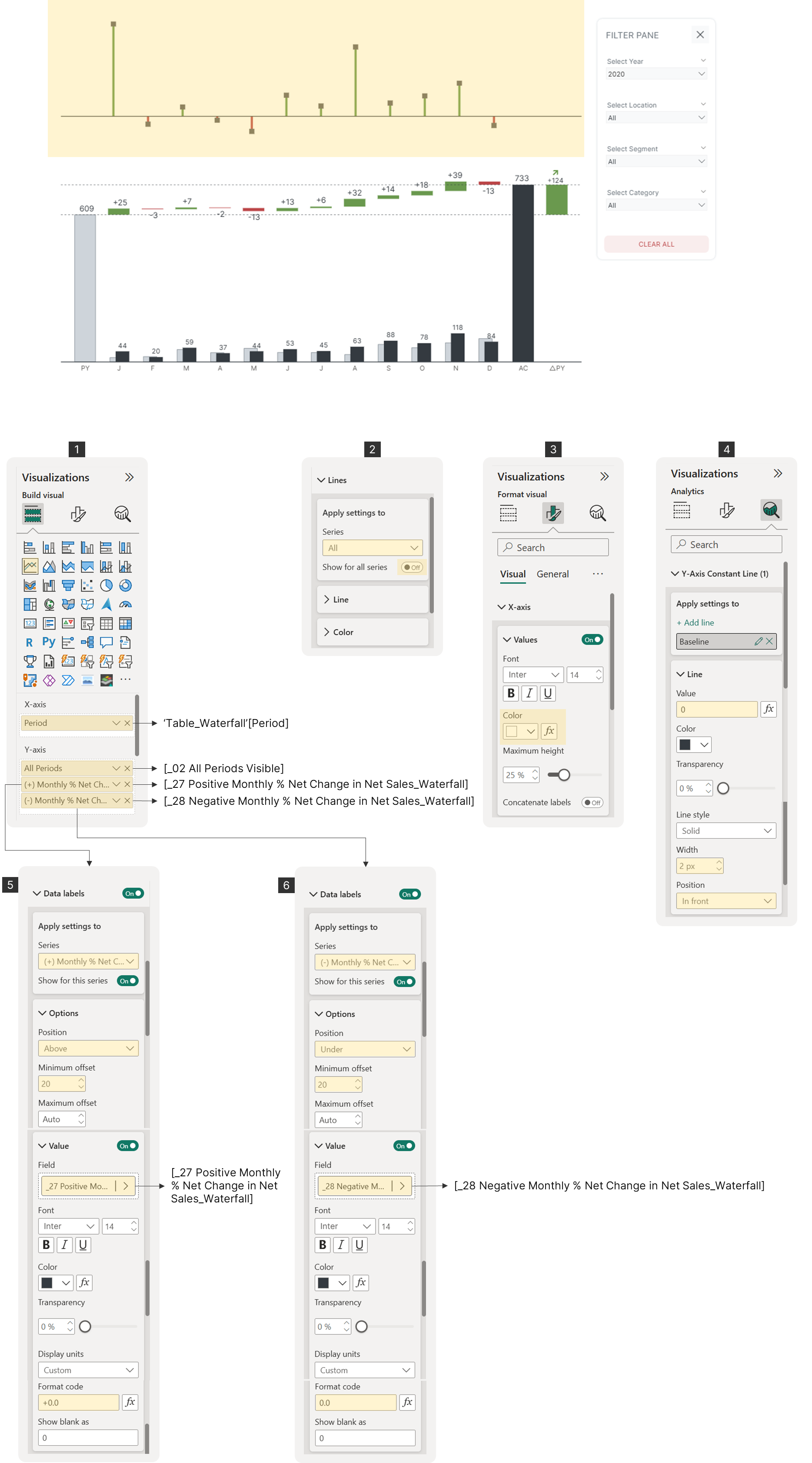
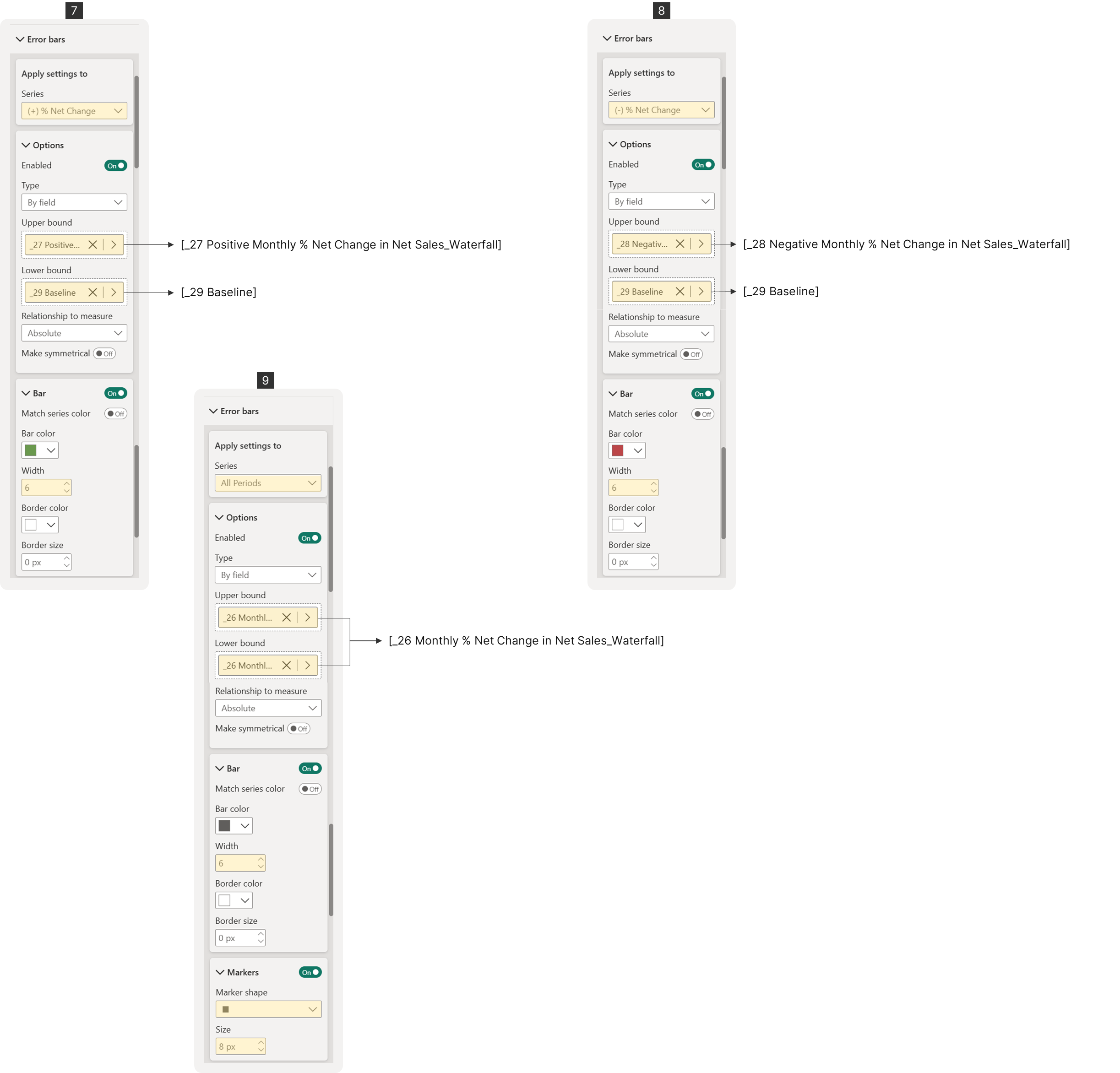 Variance Chart Configuration
Displaying YoY Variance
Next, we'll display the year-on-year (YoY) percentage variance (%△PY) on the variance chart. To show positive and negative variance with different colors, we'll need to create two separate DAX measures, just as we did for the monthly net change. First, let's create a prerequisite measure.
Prerequisites: DAX Measures for YoY Variance
Measure #30: △PY% Net Sales
_30 △PY% Net Sales =
IF(
  ISBLANK([_01 Total Net Sales]) || [_01 Total Net Sales] = 0,
  "--",
  DIVIDE([_01 Total Net Sales] - [_12 PY Total Net Sales], [_12 PY Total Net Sales], 0)
)
This measure calculates the percentage change in net sales compared to the previous year. It returns a double-dash ("--") if the total net sales are blank or zero to prevent errors.
DAX Explained
Breaking it down:
1. The Name: _30 △PY% Net Sales
-
"△" (delta) = change/difference
-
"PY%" = Previous Year percentage
-
Shows: (This Year - Last Year) ÷ Last Year as a percentage
2. The Safety Check:
IF(ISBLANK([_01 Total Net Sales]) || [_01 Total Net Sales] = 0, "--", ...)-
IF current sales are missing (BLANK) OR current sales = 0
-
THEN show "--" (dashes)
-
ELSE proceed with calculation
3. The Calculation:
DIVIDE([_01 Total Net Sales] - [_12 PY Total Net Sales], [_12 PY Total Net Sales], 0)-
Numerator: This Year - Last Year (absolute change)
-
Denominator: Last Year (base for percentage)
-
Third parameter (0): If division fails, return 0 instead of error
This pre-requisite measure will be used to display the percentage variance on the waterfall chart using the following DAX measure:
Measure #31: △PY% Net Sales for Waterfall Chart
_31 △PY% Net Sales_Waterfall =
VAR SelectedYear = SELECTEDVALUE(DimDate[Year])
VAR PeriodType = SELECTEDVALUE(Table_Waterfall[PeriodType])
RETURN
SWITCH(
  PeriodType,
  "Variance", CALCULATE([_30 △PY% Net Sales], DimDate[Year] = SelectedYear),
  BLANK()
)
This measure is used to display the percentage variance on the waterfall chart, but only for the "Variance" period type.
DAX Explained
Breaking it down:
1. The Name: *31 △PY% Net Sales*Waterfall
-
"△PY%" = Previous Year percentage change
-
"Waterfall" = specifically for waterfall charts
-
Shows percentage growth/decline as waterfall elements
2. The Variables:
VAR SelectedYear = SELECTEDVALUE(DimDate[Year])
VAR PeriodType = SELECTEDVALUE(Table_Waterfall[PeriodType])-
SelectedYear: Current year being viewed (e.g., 2024)
-
PeriodType: Type from waterfall table ("Variance", "Month", "Total", etc.)
3. The Logic:
SWITCH(
  PeriodType,
  "Variance", CALCULATE([_30 △PY% Net Sales], DimDate[Year] = SelectedYear),
  BLANK()
)-
IF PeriodType is "Variance" → calculate the percentage change
-
IF PeriodType is anything else → show nothing (BLANK)
. The Calculation:
-
Uses the existing measure
[_30 △PY% Net Sales] -
Filters it to the selected year
-
This gives the year-over-year percentage change
Positive and Negative Variance Measures
Just like before, we'll create separate measures to assign different colors (green for positive, red for negative) to the bars.
Measure #32: Positive △PY% Net Sales for Waterfall Chart
_32 Positive △PY% Net Sales_Waterfall =
IF(
  [_31 △PY% Net Sales_Waterfall] > 0,
  [_31 △PY% Net Sales_Waterfall],
  BLANK()
)
This takes the year-over-year percentage change and only shows positive values (growth percentages), hiding negative values (decline percentages) for waterfall chart visualization.
DAX Explained
Breaking it down:
1. The Name: *32 Positive △PY% Net Sales*Waterfall
-
"Positive" = only shows positive percentage changes
-
Uses measure
_31as input -
For waterfall charts
2. The Simple Logic:
IF(
  [_31 △PY% Net Sales_Waterfall] > 0,
  [_31 △PY% Net Sales_Waterfall],
  BLANK()
)-
IF the percentage change is positive → show the value
-
IF the percentage change is zero or negative → show nothing (BLANK)
Why split positive and negative?
Waterfall Chart Formatting:
-
Positive percentages → Green bars pointing UP
-
Negative percentages → Red bars pointing DOWN
-
Requires separate measures for proper visual formatting
Measure #33: Negative △PY% Net Sales for Waterfall Chart
_33 Negative △PY% Net Sales_Waterfall =
IF(
  [_31 △PY% Net Sales_Waterfall] < 0,
  [_31 △PY% Net Sales_Waterfall],
  BLANK()
)
Chart Configuration
Add Measures #31, #32, and #33 to the chart's y-axis.
-
Measure #31 will be the reference for the error bars to display the △PY% marker.
-
Measure #32 will be the reference for displaying the positive error bars.
-
Measure #33 will be the reference for displaying the negative error bars.
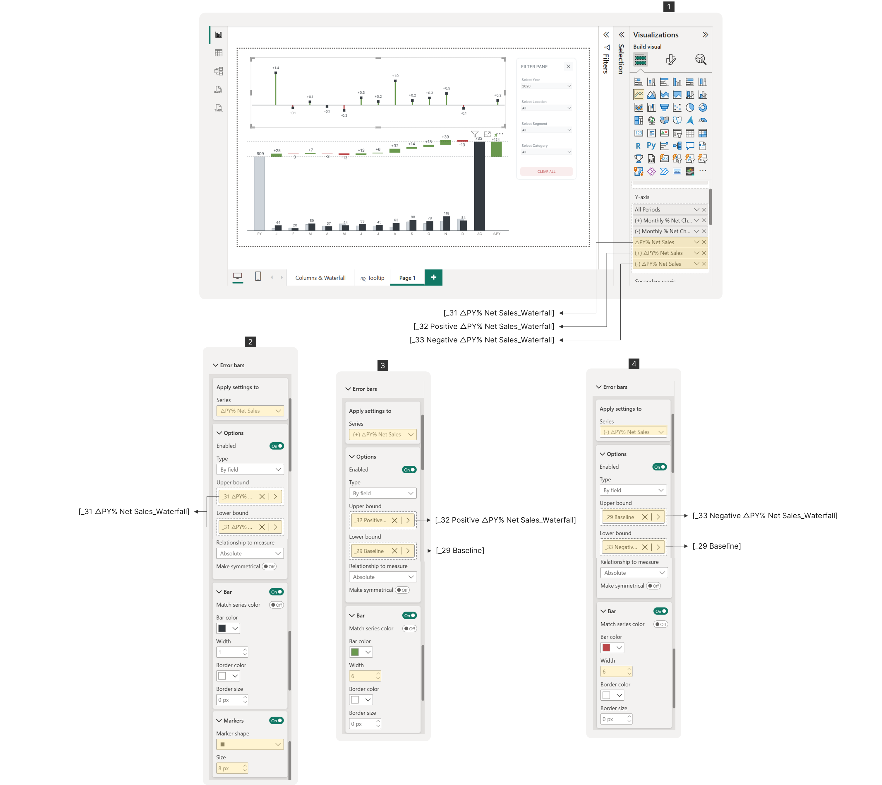 Error Bars Configuration
Optionally, you can adjust the data label format by replacing the value field in the "Data Label" section for each series with a new measure that multiplies the variance by 100.
Measure #34: Formatted Data Labels for Positive Monthly % Net Change in Net Sales
_34 Positive Monthly % Net Change in Net Sales_Waterfall_Formatted =
IF(
  [_26 Monthly % Net Change in Net Sales_Waterfall] > 0,
  [_26 Monthly % Net Change in Net Sales_Waterfall] * 100,
  BLANK()
)
Measure #35: Formatted Data Labels for Negative Monthly % Net Change in Net Sales
_35 Negative Monthly % Net Change in Net Sales_Waterfall_Formatted =
IF(
  [_26 Monthly % Net Change in Net Sales_Waterfall] < 0,
  [_26 Monthly % Net Change in Net Sales_Waterfall] * 100,
  BLANK()
)
Measure #36: Formatted Data Labels for Positive △ PY% Net Sales
_36 Positive △PY% Net Sales_Waterfall_Formatted =
IF(
  [_31 △PY% Net Sales_Waterfall] > 0,
  [_31 △PY% Net Sales_Waterfall] * 100,
  BLANK()
)
Measure #37: Formatted Data Labels for Negative △ PY% Net Sales
_37 Negative △PY% Net Sales_Waterfall_Formatted =
IF(
  [_31 △PY% Net Sales_Waterfall] < 0,
  [_31 △PY% Net Sales_Waterfall] * 100,
  BLANK()
)
Finally, you need to adjust the y-axis maximum range to prevent data labels from being cut off. To do this, create a DAX measure that provides a minimum and maximum range with appropriate spacing, since you have both negative and positive values. Then, assign these measures to the y-axis minimum and maximum ranges using conditional formatting.
Measure #38: Y-Axis Minimum Range for Variance Chart
_38 Y-Axis Min_△PY% Net Sales (Across MonthAbbr) =
VAR _LowestVar =
MINX(
  ALL(DimDate[MonthAbbr]),
  [_30 △PY% Net Sales]
)

RETURN
_LowestVar * 3
This calculates the minimum value for the Y-axis on charts showing year-over-year percentage changes across all months, with extra padding for better visualization.
DAX Explained
Breaking it down:
1. The Name: *31 Y-Axis Min*△PY% Net Sales (Across MonthAbbr)
-
"Y-Axis Min" = sets the bottom boundary of chart
-
"△PY%" = year-over-year percentage changes
-
"Across MonthAbbr" = looks at all months (Jan-Dec)
2. The Variable:
VAR _LowestVar =
MINX(
  ALL(DimDate[MonthAbbr]),
  [_30 △PY% Net Sales]
)-
MINX: Finds the minimum value across all iterations
-
ALL(DimDate[MonthAbbr]): Removes any month filters, looks at all months
-
[_30 △PY% Net Sales]: The percentage change measure for each month
-
Result: Finds the worst-performing (most negative) month
3. The Return:
RETURN _LowestVar * 3-
Takes the lowest percentage and multiplies by 3
-
Creates extra space below the worst value
Measure #39: Y-Axis Maximum Range for Variance Chart
_39 Y-Axis Max_△PY% Net Sales (Across MonthAbbr) =
VAR HighestVar =
MAXX(
  ALL(DimDate[MonthAbbr]),
  [_30 △PY% Net Sales]
)

RETURN
HighestVar * 1.4
This calculates the maximum value for the Y-axis on charts showing year-over-year percentage changes across all months, with padding for better visualization.
DAX Explained
Breaking it down:
1. The Name: *32 Y-Axis Max*△PY% Net Sales (Across MonthAbbr)
-
"Y-Axis Max" = sets the top boundary of chart
-
"△PY%" = year-over-year percentage changes
-
"Across MonthAbbr" = examines all months (Jan-Dec)
2. The Variable:
VAR HighestVar =
MAXX(
  ALL(DimDate[MonthAbbr]),
  [_30 △PY% Net Sales]
)-
MAXX: Finds the maximum value across all iterations
-
ALL(DimDate[MonthAbbr]): Removes month filters, looks at all months
-
[_30 △PY% Net Sales]: The percentage change measure for each month
-
Result: Finds the best-performing (most positive) month
3. The Return:
RETURN HighestVar * 1.4-
Takes the highest percentage and multiplies by 1.4
-
Creates extra space above the best value
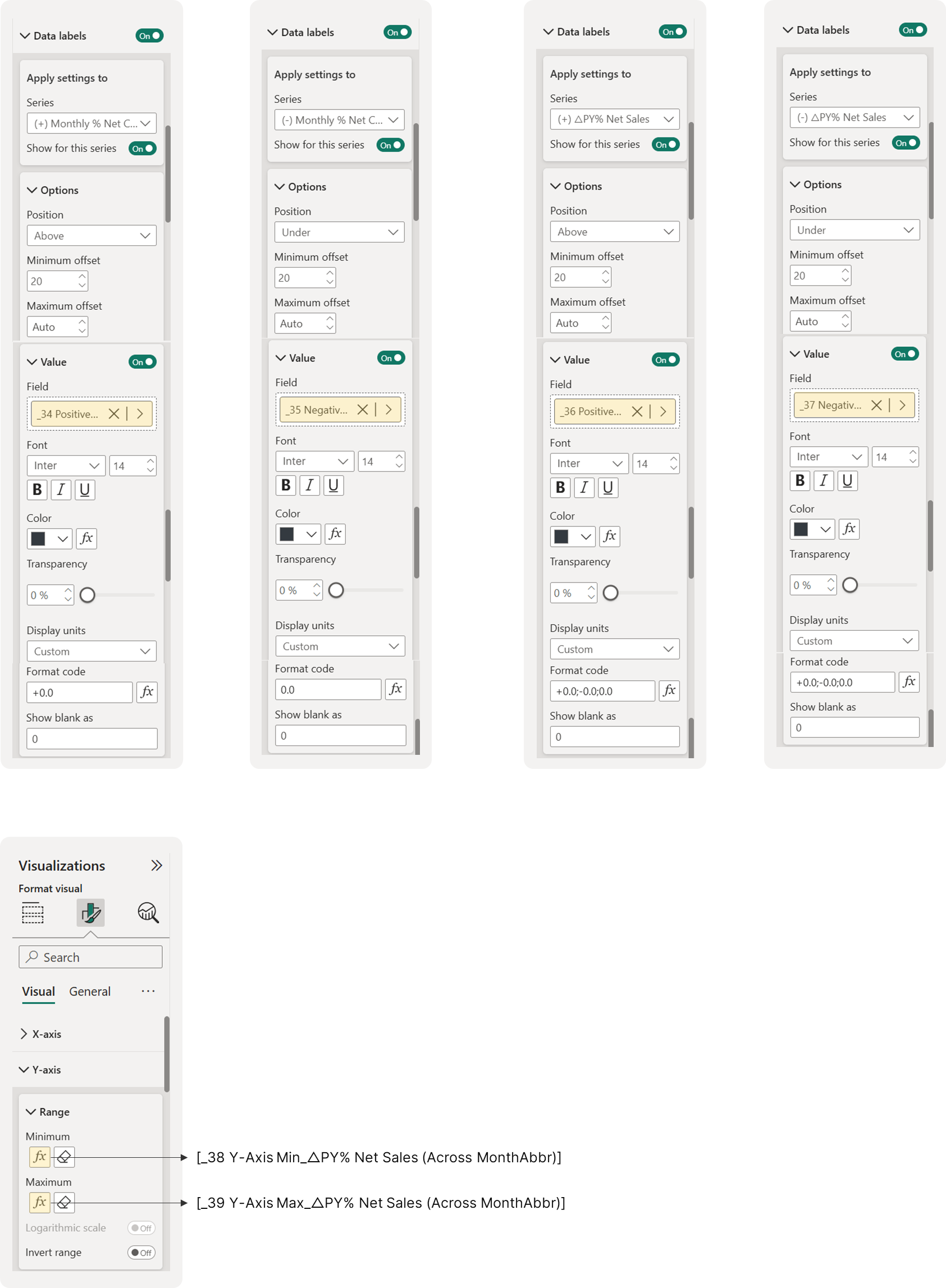 Replacing the Data Labels and Setting the Y-Axis Minimum and Maximum Ranges