Improved version:
Foreword
Scalable Vector Graphics (SVGs) offer greater flexibility for implementing IBCS Notation than native Power BI visuals. While multi-tier bar charts can be built natively using three separate bar charts, this approach faces limitations. Specifically, the third tier, which displays the relative variance, often contains extreme outliers. If these are not truncated, the smaller variance values become difficult to compare. Although achieving the desired result with native visuals is possible, it typically requires significant workarounds. Therefore, using SVGs is the proposed alternative to effectively manage this issue.
The original User Defined Function (UDF) codes required to generate the SVG bar charts were contributed by Andrzej Leszkiewicz and are accessible for download at the following link:
These codes were adapted to align with the specific IBCS notations required for this visual.
About Multi-Tier Bar Charts
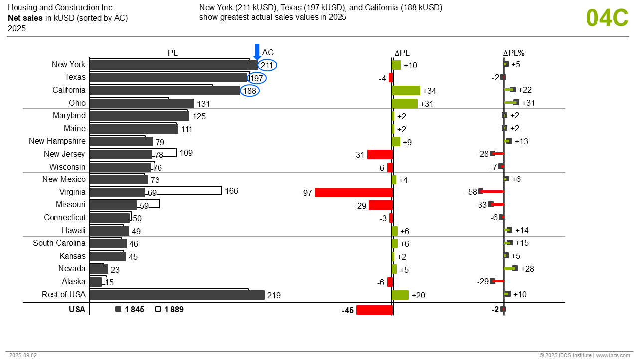 Multi-Tier Bar Charts (source: IBCS)
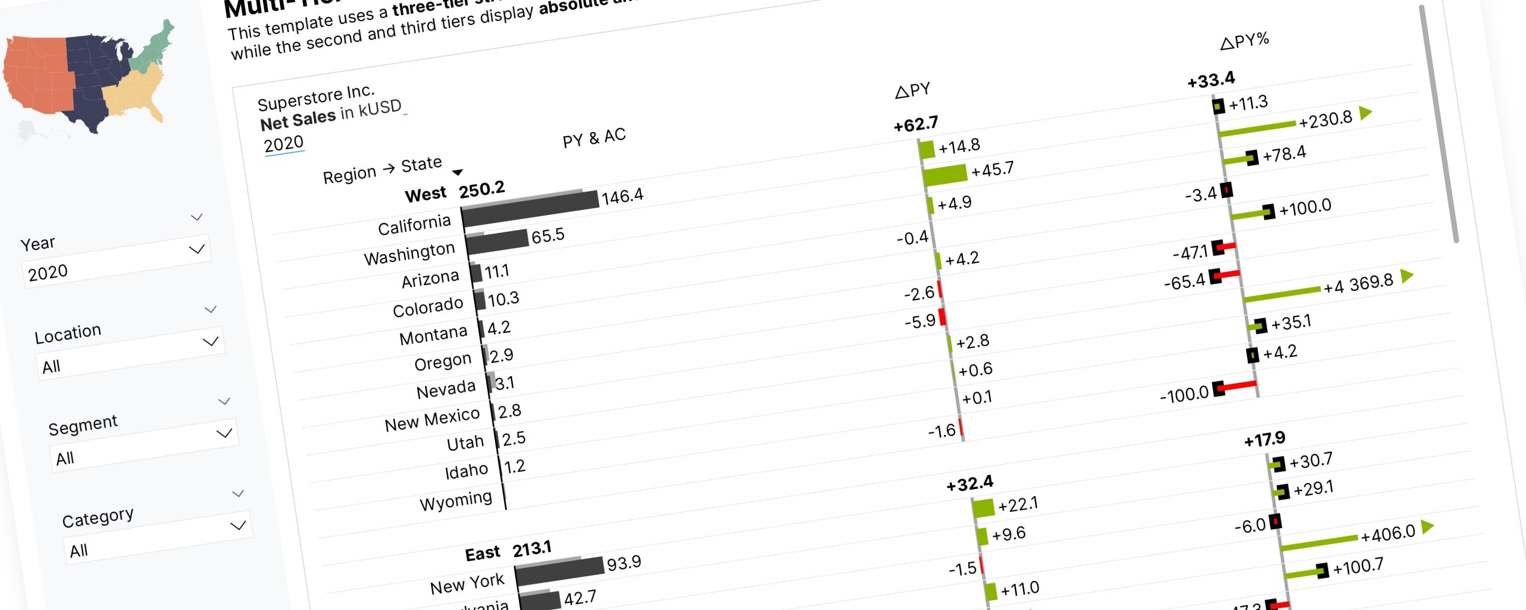
Multi-Tier Bar Charts consist of three tiers structure to analyze data across different scenarios. The first tier presents a grouped bar chart for scenario comparison, while the second and third tiers display absolute and relative variance charts, respectively. For best results, use this template when presenting two scenarios and limiting the content to 25 structure elements or less. To include a third scenario, the data must be displayed using scenario triangles.
Guide to IBCS Notation in this Visual (Semantic Rules)
This section explains the IBCS principles specifically implemented in this visual. The complete IBCS guidelines are available for free download on the IBCS website upon registration.
IBCS Standards 1.2 (pdf) - IBCS.com
Development of a dedicated summary of the IBCS Standards is currently in progress.
UN 3.2 UNIFY SCENARIOS
Scenarios (also known as data categories or versions) represent different layers or assumptions within a business model. Typical scenarios include Actual, Previous Year (PY), Plan, Budget, and Forecast. Benchmarks like competitor data can also be considered scenarios. Reporting often involves showing comparisons and variances between these scenarios to provide business insights.
Three Types of Scenarios
IBCS classifies scenarios into three basic types, visually distinguished by how their visualization element (bar, column, etc.) is filled:
| Type | Description | Typical Terms |
|---|---|---|
| Actual | Data about things that have already happened. | 'Actual' (AC), 'Previous Year' (PY) |
| Planned | Data that is not yet materialized or measured. | 'Plan' (PL), 'Budget' (BU) |
| Forecasted | Data that is fictitious but incorporates measured data (e.g., a sales forecast based on measured order entry). | 'Forecast' (FC) |
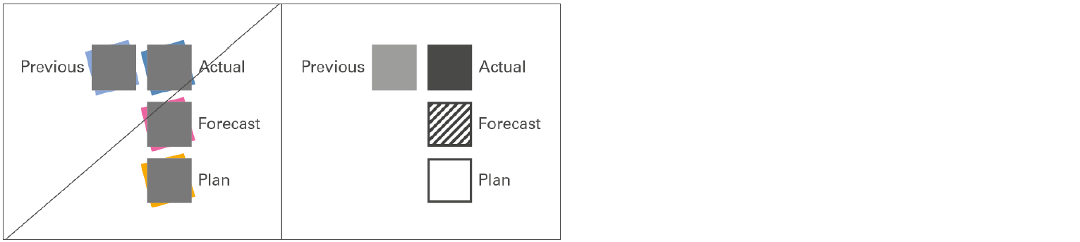 Figure UN 3.2: Unify scenarios — Source: IBCS Standards 1.2
UN 3.3: UNIFY TIME PERIODS & USE HORIZONTAL AXES
Consistent notation for time periods (for flow measures like sales) and points of time (for stock measures like inventory) is vital in all business communication. This requires standards for the visual direction of time, time abbreviations, and category widths in charts.
Visual Direction of Time Periods
Unlike structural comparisons, data series that represent change over time should always be visualized using horizontal axes.
-
In charts, time should progress from left to right.
-
In tables, time series data should also be presented in columns where time moves from left to right.
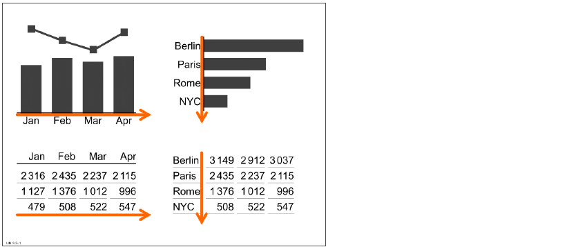 Figure UN 3.3-1: Visualization of time vs. structure (examples) — Source: IBCS Standards 1.2
UN 5.3 UNIFY OUTLIER INDICATORS
Sometimes in a chart, one value is much higher or lower than the others. This is called an outlier. If this outlier is not important for the business (for example, a very high percentage change but based on a very small amount), we should not stretch the whole chart just to include it. Instead, we can keep the chart scale based on the important values and show the outlier using a special indicator — such as a small triangle pointing in the direction of increase or decrease. This keeps the chart clear and easy to read. As shown in Figure UN 5.3, it’s better to remove the pin head and use a triangle to show the outlier. This keeps the design clean and consistent.
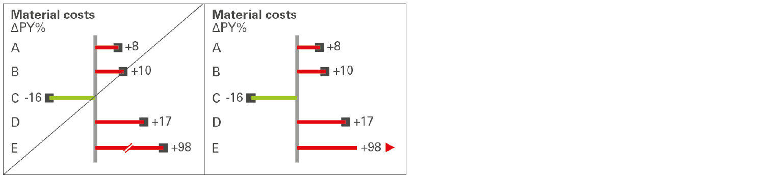 Figure UN 5.3: Unify outlier indicators — Source: IBCS Standards 1.2
Documentation
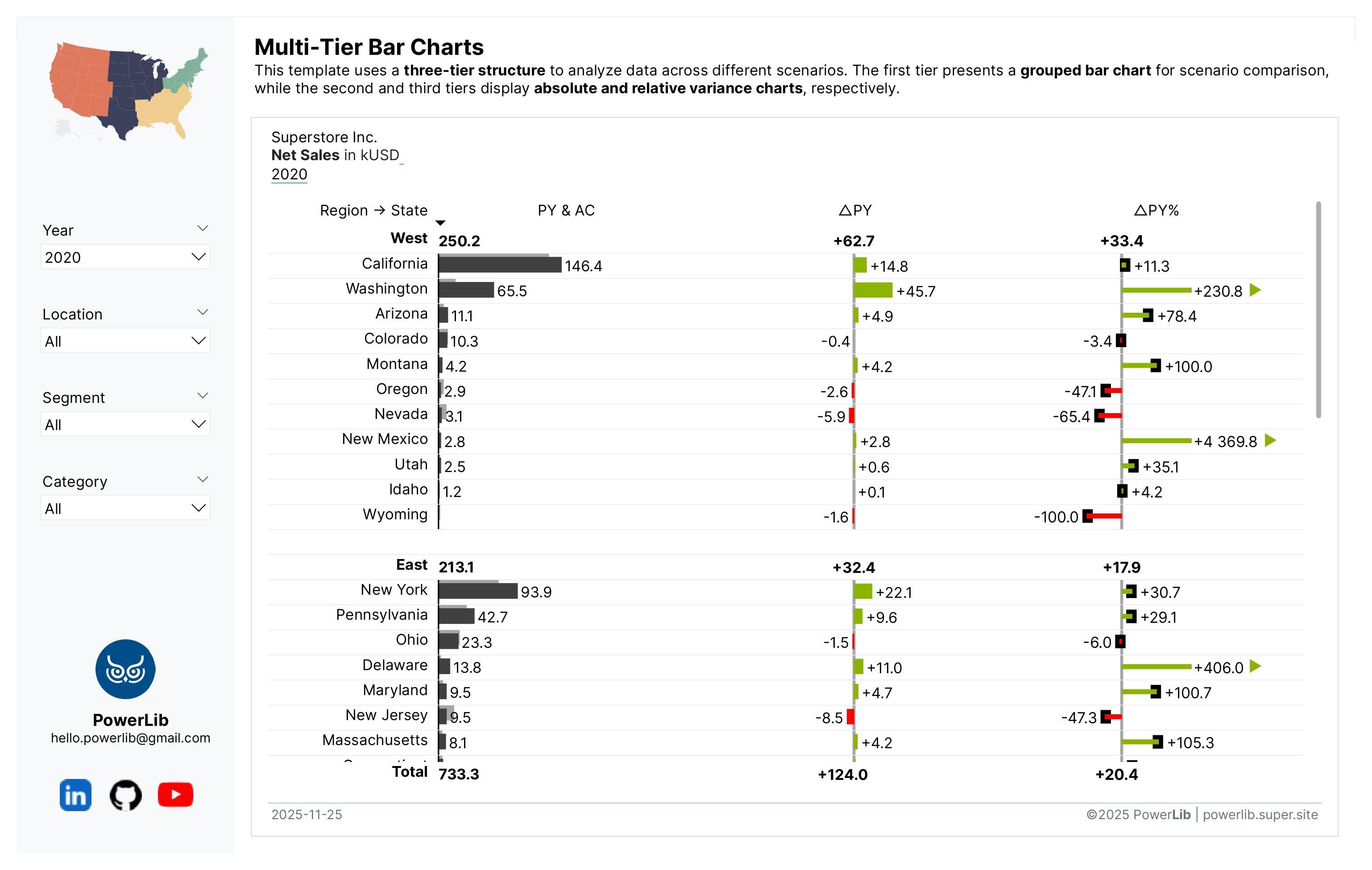 IBCS Multi-Tier Bar Charts
The multi-tier bar charts consist of three distinct tiers, each serving a specific analytical purpose:
-
Grouped Bar Chart (First Tier): A clustered bar chart that displays the current (Actual/AC) versus previous year's (Prior Year/PY) values side-by-side.
-
Absolute Variance Chart (Second Tier): A diverging bar chart illustrating the absolute difference between AC and PY. Green signifies positive variance (desirable), and red signifies negative variance (undesirable).
-
Relative Variance Chart (Third Tier): A "pin chart," displaying the relative variance between AC and PY. The use of thin bars emphasizes that relative variance is a percentage and lacks absolute volume, unlike the values in the first and second tiers.
These charts strictly adhere to the International Business Communication Standards (IBCS) principles, ensuring effective and standardized business reporting.
Understanding the Logic to Display Absolute and Relative Variances for Each State
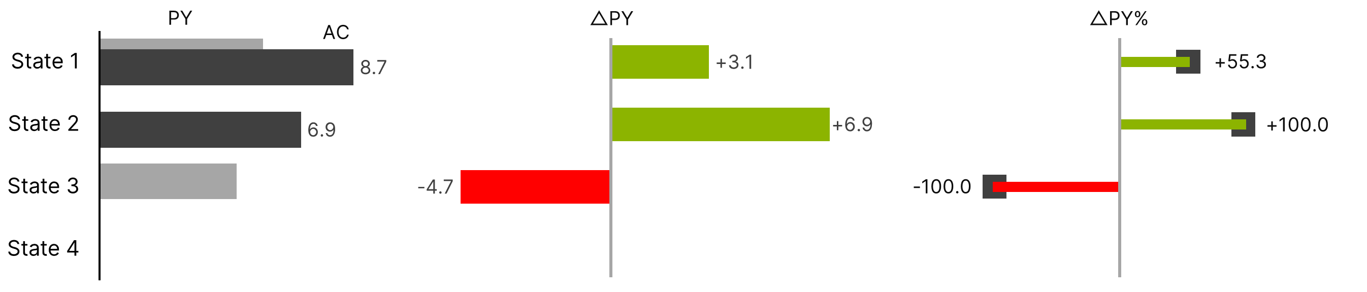
For this sales performance case study (net sales by region and state), the logic for displaying absolute and relative variances for each state must be adjusted based on whether that state has sales values for the current year (AC), the previous year (PY), or both.
| No. | Scenario | AC (Current Selected Year) | PY (Previous Year) | Absolute Variance (△PY) | Relative Variance (△PY%) | Display Behavior |
|---|---|---|---|---|---|---|
| 1. | Normal Comparison | Has Value | Has Value | AC - PY | (AC - PY) / PY | Show all columns |
| 2. | New State | Has Value | Blank | +AC (full value) | +100% | Show all, indicate growth |
| 3. | Closed State | Blank | Has Value | -PY (negative) | -100% | Show all, indicate closure |
| 4. | No Data | Blank | Blank | Blank | Blank | Hide state entirely |
-
Scenario 1: When Both Current and Previous Year Data Exist (AC and PY exist) → The DAX calculates normal variances. For example, if California had 131.6 kUSD in current year sales and 88.5 kUSD last year, it shows the difference (+43.1 kUSD) and the percentage change (+48.7%). This appears as green bars because sales increased.
-
Scenario 2: When a State is New (Has Current Year Sales But No Previous Year) → The DAX treats this as a new business situation. It shows the full current year amount as the variance and displays +100% for the percentage. For example, Wyoming shows +1.6 kUSD in absolute variance and +100.0% because it had 1.6 kUSD this year but no sales last year. This makes sense because the business went from nothing to something.
-
Scenario 3: When a State Closed (Has Previous Year Sales But No Current Year) → The DAX treats this as a complete loss. It shows the negative of the previous year amount and displays -100%. For example, Maine shows -0.6 kUSD and -100.0% because it had sales last year but none this year.
-
Scenario 4: When a State Has No Data at All → If a state has neither current year nor previous year sales, the DAX hides that state completely from the chart There's nothing to analyze, so there's no point showing it.
Step 1: Defining the Prerequisite Measures
For this scenario, the multi-tier bar charts will initially display only one measure: net sales. However, you are welcome to change this to any other metric (e.g., transactions, quantity) or even set up a dynamic metric controlled by a slicer.
Prerequisite Measure #01: Total Net Sales
_01 Total Net Sales = SUM(Superstore[Sales]) / 1000The main reason for dividing the value by 1,000 is to optimize chart readability. By presenting the net sales as a condensed figure (e.g., "1.2") rather than the full number ("1,234"), we ensure concise data labels and avoid truncation issues on the visualization.
Prerequisite Measure #02: PY Net Sales
_02 PY Net Sales =
IF(
  HASONEVALUE(DimDate[Year]),
  CALCULATE(
      [_01 Total Net Sales],
      SAMEPERIODLASTYEAR(DimDate[Date])
  ),
  BLANK()
)
This measure calculates the Net Sales from the same period last year — but only if one year is currently selected. This makes it safe and accurate for year-over-year (YoY) analysis.
Read the Explanation
Step-by-Step Explanation
1. IF condition — ensure only one year is selected
IF(
HASONEVALUE(DimDate[Year]),-
HASONEVALUE(DimDate[Year])checks whether exactly one year is selected in the current filter context. -
This prevents DAX from giving wrong results when multiple years are visible at once (like in a multi-year table).
2. CALCULATE with SAMEPERIODLASTYEAR
CALCULATE(
  [_01 Net Sales],
  SAMEPERIODLASTYEAR(DimDate[Date])
)
This is the core logic. Let’s understand both parts:
-
[_01 Net Sales]: your base measure for total Net Sales (current period). -
CALCULATE(...): modifies the filter context to look at a different period (previous year). -
SAMEPERIODLASTYEAR(DimDate[Date]): shifts the current date filter exactly one year back.
So if your current visual is showing: Jan–Feb 2024 → this part of the formula will pull Jan–Feb 2023 sales.
3. Else part — return BLANK
,
BLANK()
)
If more than one year is selected, the measure safely returns nothing (BLANK()), to avoid confusing or doubled results.
Prerequisite Measure #03: △PY Net Sales
_03 △PY Net Sales =
VAR _AC = [_01 Total Net Sales]
VAR _PY = [_02 PY Net Sales]
RETURN
  SWITCH(
      TRUE(),
      -- Both blank: no variance
      ISBLANK(_AC) && ISBLANK(_PY), BLANK(),

      -- AC exists, PY blank: full AC as variance (new state)
      NOT(ISBLANK(_AC)) && ISBLANK(_PY), _AC,

      -- AC blank, PY exists: negative PY as variance (closed state)
      ISBLANK(_AC) && NOT(ISBLANK(_PY)), -_PY,

      -- Both exist: normal calculation
      _AC - _PY
  )
This measure compares Net Sales of the current year (AC) with Net Sales of the previous year (PY) and calculates the difference / variance. It handles all possible situations when comparing current year vs previous year sales. It identifies new entries, discontinued entries, and calculates growth or decline when data exists for both years.
Read the Explanation
Logic Breakdown
The logic checks 4 different situations:
| Case | Situation | What It Means | Result |
|---|---|---|---|
| 1 | Both AC and PY are blank | No sales data for both years | Show blank |
| 2 | AC has value, PY is blank | New state – first time sales appear | Show full AC value |
| 3 | AC is blank, PY has value | State is gone / discontinued | Show negative PY |
| 4 | Both AC and PY exist | Normal comparison | AC – PY |
Step-by-Step Explanation
1. Define Variables
VAR _AC = [_01 Total Net Sales]
VAR _PY = [_02 PY Net Sales]
Store current year and previous year’s net sales in variables.
2. Compare Situations
SWITCH(TRUE(),SWITCH(TRUE()) lets us check multiple conditions easily.
3. Handle Each Situation
Case 1 – No Data for Both Years
ISBLANK(_AC) && ISBLANK(_PY), BLANK(),If there’s no data for both years → show nothing.
Case 2 – AC Exists, PY is Blank
NOT(ISBLANK(_AC)) && ISBLANK(_PY), _AC,If there's sales in current year, but none last year → That means new sales entry → show full AC value.
Case 3 – AC is Blank, PY Exists
ISBLANK(_AC) && NOT(ISBLANK(_PY)), -_PY,If no sales this year, but there were sales last year → That state/city/product likely stopped selling → show negative PY.
Case 4 – Normal Comparison
_AC - _PYBoth years have sales → calculate variance normally.
Prerequisite Measure #04: △PY% Net Sales
_04 △PY% Net Sales =
VAR _AC = [_01 Total Net Sales]
VAR _PY = [_02 PY Net Sales]
RETURN
  SWITCH(
      TRUE(),
      -- Both blank: no comparison
      ISBLANK(_AC) && ISBLANK(_PY), BLANK(),

      -- AC exists, PY blank: treat as +100% (new state)
      NOT(ISBLANK(_AC)) && ISBLANK(_PY), 1,

      -- AC blank, PY exists: -100% (closed state)
      ISBLANK(_AC) && NOT(ISBLANK(_PY)), -1,

      -- Both exist: normal calculation
      DIVIDE(_AC - _PY, _PY, BLANK())
  )
This DAX calculates the percentage change of Net Sales compared to last year — also known as % variance vs PY. But this measure also handles special cases (new or closed states) intelligently.
Read the Explanation
Step-by-Step Logic
1. Define variables
VAR _AC = [_01 Total Net Sales]
VAR _PY = [_02 PY Net Sales]
Store current year (AC) and previous year (PY) net sales.
2. Check Different Scenarios Using SWITCH(TRUE())
| Case | Situation | Meaning | Result |
|---|---|---|---|
| 1 | Both AC & PY are blank | No data | Show blank |
| 2 | AC exists, PY is blank | New entry this year | +100% (1) |
| 3 | AC blank, PY exists | Stopped selling | 100% (-1) |
| 4 | Both exist | Standard % change | (AC − PY) / PY |
3. DAX Logic Explanation
Case 1 – No Data
ISBLANK(_AC) && ISBLANK(_PY), BLANK(),No data for both years → no comparison → return BLANK().
Case 2 – AC Exists, PY Blank
NOT(ISBLANK(_AC)) && ISBLANK(_PY), 1,Sales only appear this year → new state / new customer → So it’s treated as **+100% growth (**represented as 1).
Case 3 – AC Blank, PY Exists
ISBLANK(_AC) && NOT(ISBLANK(_PY)), -1,Sales disappear this year → lost customer / stopped selling → So it’s treated as 100% decline.
Case 4 – Normal % Calculation
DIVIDE(_AC - _PY, _PY, BLANK())Standard formula: (AC – PY) / PY. Using DIVIDE() prevents error if PY = 0.
Step 2: Defining UDFs to Display the SVG Bar Charts
We will now define the User Defined Functions (UDFs) for generating the tiers of the multi-tier bar charts. We based these UDFs on the original code by Andrzej Leszkiewicz, making slight adjustments to achieve the proper results for this case study.
UDF #01: Grouped Bar Chart (First Tier)
DEFINE
  FUNCTION PowerofBI.IBCS.BarChart.AbsoluteValues = /// Creates a bar chart (SVG-image) that compares absolute values (actual value vs base value)
/// @param {scalar} valueMain
/// @param {scalar} valueSecond
/// @param {scalar} valueBase
/// @param {string} baseType
/// @param {string} dataLabel
/// @param {voolean} isTotalRow
/// @param {scalar} valueMax
/// @returns SVG image
(
  // Main value (actual)
  valueMain: SCALAR VAL,
  // Secondary value (forecasted)
 valueSecond: SCALAR VAL,
 // Base value (previous year)
 valueBase: SCALAR VAL,
 // Base value type: "grey" or "outlined"
 baseType: STRING VAL,
 // Data (bar) label
 dataLabel: STRING VAL,
 // Is it a total row? - to treat total rows differently
 isTotalRow: BOOLEAN VAL,
 // Max of main, secondary and base values for all items in the visual (ALLSELECTED) - for scaling
 valueMax: SCALAR VAL
)
=>
//=================================================================================================
//Project: an UDF for generating IBCS-styled charts (as SVG images)
//  The visualization design follows IBCS guidelines https://www.ibcs.com/ibcs-standards-1-2/
//  Although it is not produced, not certified, not authorized, not endorsed by IBCS® https://www.ibcs.com/
//  The charts can be embedded into Table, Matrix, and New Card core Power BI visuals
//=================================================================================================
//Author: Andrzej Leszkiewicz, an IBCS® Certified Analyst
//  For more information, visit https://powerofbi.org/
//  Connect on LinkedIn at https://www.linkedin.com/in/avatorl/
//  Contact via email at andrzej@powerofbi.org
//=================================================================================================
//License: MIT Expat License https://en.wikipedia.org/wiki/MIT_License (free)
//=================================================================================================
//Description: This UDF Generates an SVG image featuring a bar chart (to show absolute values)
//  The chart includes a base value bar: grey for the Previous Year (PY) or outlined for the Budget (BU)
//  The main and second value stacked bars are represented with the main value (AC, actuals) in solid black and the second value (FC, forecast) hatched
//  It also includes data labels for and reference value triangles: outlined for the Budget (BU) or in grey  the Previous Year (PY)
//=================================================================================================
//CONFIG: chart formatting options
//=================================================================================================//
VAR _SVG_Width = 400
VAR _FontSize = 16
VAR _SVG_LeftPadding =  5 --left side padding (before Y axis)
VAR _SVG_RightPadding = 355 --right side padding (space for data labels)
VAR _ColorMain = "#404040"
VAR _ColorSecond = "#A6A6A6"
VAR _Rank =
  1000000000000 + ROUND ( valueMain, 0 ) --a value that will be used to sort the column (main value converted into a sortable string)
VAR _ColorBase =
  SWITCH ( baseType, "grey", _ColorSecond, "outlined", "#FFFFFF" ) --base value columns are either grey or white with black outline
VAR _ColorBaseOutline =
  SWITCH ( baseType, "grey", _ColorSecond, "outlined", _ColorMain ) --base value columns are either grey or white with black outline
VAR _Em =
  ROUND ( _FontSize * 4 / 3, 0 ) --convert Pt font size to Px font size
VAR _AxisLineWidth = _Em * 0.1
VAR _mainBarYPosition = _Em * 0.25
VAR _LabelOffset = 5 --offset between bars and data labels
VAR _FontWeight =
  --bold font for the total row
  IF ( isTotalRow, "bold", "normal" ) //
// set image width (Format Pane) to [SVG Width]
// set image height (Format Pane) to _Em*1.6 (=36 for Font Size 18)
//=================================================================================================
//SCALING: converting data values into X and Y positions on the SVG plot
//=================================================================================================
VAR _SVG_ColumnWidth = _SVG_Width - _SVG_LeftPadding - _SVG_RightPadding
VAR _Scale =
  DIVIDE ( _SVG_ColumnWidth, valueMax ) -- how many pixels per value unit
VAR _WidthMain =
  ROUND ( valueMain * _Scale, 0 ) --Main bar width (length)
VAR _WidthSecond =
  ROUND ( valueSecond * _Scale, 0 ) --Second bar width (length), stacked with the main bar
VAR _WidthBase =
  ROUND ( valueBase * _Scale, 0 ) --Base bar width (length)
//
//=================================================================================================
//GENERATE SVG: concatenating parts of the SVG image
//=================================================================================================
VAR _SVG_Header = "data:image/svg+xml;utf8,"
VAR _SVG_Open = "<svg xmlns='http://www.w3.org/2000/svg' width='" & _SVG_Width & "' >"
VAR _SVG_Close = "</svg>"
VAR _SVG_Style = "<style>
    text{
      font-family: Inter, sans-serif;
      font-size: " & _Em & "px;
      font-weight: " & _FontWeight & ";
      dominant-baseline: central;
    }
</style>"
VAR SVG_HatchedPattern =
  "/*hatched pattern*/
  <defs >
  <pattern id='diagonal-stripe' patternUnits='userSpaceOnUse' width='8' height='8'>
      /*white background*/<rect x='0' y='0' width='8' height='8' fill='#FFFFFF' stroke-width='0'/>
      /*black stripes*/
      <path d='
          M-2,2 l4,-4
          M0,8 l8,-8
          M6,10 l4,-4'
      style='stroke:black; stroke-width:2' />
  </pattern>
  </defs>"
VAR _SVG_SortBy = "/*SortBy:" & _Rank & "*/"
VAR _SVG_Box = "" --"<rect x='0%' y='0%' width='100%' height='100%' fill='#FFAAAA' />"
VAR _SVG_LineAxisY = "<line id='line-axisY'  x1='" & _SVG_LeftPadding & "px' x2='" & _SVG_LeftPadding & "' y1='0%' y2='100%' stroke='#000000' stroke-width='" & _AxisLineWidth & "'></line >"
VAR _SVG_BarBase = "<rect id='rect-base-value' x='" & _SVG_LeftPadding & "px' width='" & _WidthBase & "' y='0' height='" & _Em & "' fill='" & _ColorBase & "' stroke='" & _ColorBaseOutline & "' stroke-width='1'></rect>"
VAR _SVG_BarMain = "<rect id='rect-main-value' x='" & _SVG_LeftPadding & "px' width='" & _WidthMain & "' y='" & _mainBarYPosition & "' height='" & _Em & "' fill='" & _ColorMain & "' stroke='" & _ColorMain & "' stroke-width='1.5'></rect>" //
VAR _SVG_BarSecond = "<rect x='" & _SVG_LeftPadding + _WidthMain & "px' width='" & _WidthSecond & "' y='" & _Em * 0.25 & "' height='" & _Em & "' fill='" & "url(#diagonal-stripe)" & "' stroke='" & _ColorMain & "' stroke-width='0.5'></rect>" //
VAR _SVG_TextACFCLabel = "<text x='" & _SVG_LeftPadding + _WidthMain + _WidthSecond & "' dx='" & _LabelOffset & "' y='50%' >" & dataLabel & "</text>"
VAR _SVG_TextACFCLabelTotal = "<text x='" & _SVG_LeftPadding & "' dx='" & 0 & "' y='50%' >" & dataLabel & "</text>"
VAR _SVG_Total = _SVG_Header & _SVG_Open & _SVG_TextACFCLabelTotal & _SVG_Style & _SVG_Close
VAR _SVG_Row = _SVG_Header & _SVG_Open & _SVG_SortBy & _SVG_Box & SVG_HatchedPattern & _SVG_BarBase & _SVG_BarMain & _SVG_BarSecond & _SVG_LineAxisY & _SVG_TextACFCLabel & _SVG_Style & _SVG_Close //
VAR _SVG =
  IF ( isTotalRow, _SVG_Total, _SVG_Row )
RETURN
  _SVG

EVALUATE
  {
      PowerofBI.IBCS.BarChart.AbsoluteValues()
  }
This is a User-Defined Function (UDF) in DAX that generates an IBCS-style bar chart as an SVG image inside Power BI — so you can embed it into a table, matrix, or card visual.
Read the Explanation
What This Function Does
It creates a bar chart in SVG format that shows:
| Element | Meaning |
|---|---|
| Base bar (gray or outlined) | Previous Year (PY) or Budget (BU) |
| Main bar | Actuals (AC) |
| Hatched bar | Forecast (FC) → stacked beside AC |
| Text label | Shows the data label next to bar |
| Total rows appear differently | Text only (no bars) |
| Scales bar size based on max value | So all rows fit proportionally |
Inputs/Parameters
| Parameter | What It Means |
|---|---|
valueMain | Actual value (AC) → solid black bar |
valueSecond | Forecast (FC) → hatched bar |
valueBase | PY or BU → gray or outlined bar |
baseType | "grey" = PY, "outlined" = budget |
dataLabel | Text label shown next to the bar |
isTotalRow | If TRUE → only show label (no bars) |
valueMax | The maximum among all values 👉 used for scaling (important!) |
valueMax must come from MAXX(ALLSELECTED(...)), so that all bars are drawn fairly and proportionally.
Main Concept: Scaling the Bars
To convert values into pixel widths:
_SVG_ColumnWidth = _SVG_Width - _SVG_LeftPadding - _SVG_RightPadding

_Scale = DIVIDE( _SVG_ColumnWidth, valueMax )
_WidthMain  = ROUND ( valueMain  * _Scale, 0 )   -- AC bar
_WidthSecond = ROUND ( valueSecond * _Scale, 0 ) -- FC bar
_WidthBase  = ROUND ( valueBase  * _Scale, 0 )   -- PY/BU bar
Meaning: if valueMax = 100 and chart width is 300px → every 1 sales unit = 3px width. That keeps the bars visually consistent.
How the Chart Is Drawn
SVG is just text + shapes. The function builds the image using DAX strings:
Base Bar (Previous Year / Budget)
_SVG_BarBase =
"<rect x='5' width='100' height='20' fill='#A6A6A6' ... ></rect>"
Main Bar (Actuals)
_SVG_BarMain =
"<rect x='5' width='150' height='20' fill='#404040'></rect>"
Second Bar (Forecast – hatched!)
_SVG_BarSecond =
"<rect fill='url(#diagonal-stripe)' ... ></rect>"
Label
_SVG_TextACFCLabel =
"<text x='200' y='50%'>AC 150 | FC 30</text>"
Total Rows Are Treated Differently
VAR _SVG =
  IF ( isTotalRow, _SVG_Total, _SVG_Row )
✔ If it's a subtotal or total row → ❌ bars are not drawn → 🟢 only the label is shown (bold font). This avoids cluttering totals visually.
Bonus: How to Call the Function
Example usage:
_Chart =
PowerofBI.IBCS.BarChart.AbsoluteValues (
  [_AC],
  [_FC],
  [_PY],
  "grey",
  FORMAT([_AC], "#,##0"),
  FALSE(),
  [_Max]
)
This function converts your AC, PY, and FC values into a fully IBCS-compliant bar chart using SVG — ready to be shown directly inside Power BI tables/matrix visuals.
UDF #02: Absolute Variance Chart (Second Tier)
DEFINE
  FUNCTION PowerofBI.IBCS.BarChart.AbsoluteVariance = /// Creates a bar chart that shows the absolute variance between two values
/// @param {scalar} valueMain
/// @param {string} dataLabel
/// @param {boolean} isTotalRow
/// @param {scalar} valueMax
/// @param {scalar} valueMin
/// @param {scalar} valueScale
/// @returns SVG image
(
  // Absolute variance = actual value - base (previous year) value
  valueMain: SCALAR VAL,
  // Data label - formatted variance value. Use FORMAT()
  dataLabel: STRING VAL,
  // Is it a total row? Use NOT ( ISINSCOPE () )
  isTotalRow: BOOLEAN VAL,
  // Max of the variance for all items in the table (ALLSELECTED)
  valueMax: SCALAR VAL,
  // Min of the variance for all items in the table (ALLSELECTED)
  valueMin: SCALAR VAL,
  // Max of the both (main and base) absolute values for all items in the table (ALLSELECTED)
  valueScale: SCALAR VAL
)
=>
//=================================================================================================
//Project: an UDF for generating IBCS-styled charts (as SVG images)
//  The visualization design follows IBCS guidelines https://www.ibcs.com/ibcs-standards-1-2/
//  Although it is not produced, not certified, not authorized, not endorsed by IBCS® https://www.ibcs.com/
//  The charts can be embedded into Table, Matrix, and New Card core Power BI visuals
//=================================================================================================
//Author: Andrzej Leszkiewicz, an IBCS® Certified Analyst
//  For more information, visit https://powerofbi.org/
//  Connect on LinkedIn at https://www.linkedin.com/in/avatorl/
//  Contact via email at andrzej@powerofbi.org
//=================================================================================================
//License: MIT Expat License https://en.wikipedia.org/wiki/MIT_License (free)
//=================================================================================================
//Description: This UDF Generates an SVG image featuring a diverging bar chart (to show absolute variance)
//  The chart includes diverging bars value bar: green for positive variance, red for negative variance
//  It also includes data labels (for all bars)
//=================================================================================================
//CONFIG: chart formatting options
//=================================================================================================//
VAR _Rank =
  1000000000000
      + ROUND ( valueMain + ABS ( valueMin ), 0 ) --row value converted to a string that allows correct column sorting
VAR _SVG_Width = 400
VAR _ColorGrey = "#A6A6A6"
VAR _ColorRed = "#FF0000"
VAR _ColorGreen = "#8CB400"
VAR _Em = 16 * 4 / 3 --px
VAR _SVG_LeftPadding = 180
VAR _SVG_RightPadding = 180
VAR _SVG_ColumnWidth = _SVG_Width - _SVG_LeftPadding - _SVG_RightPadding
VAR _Scale =
  DIVIDE ( _SVG_ColumnWidth, valueScale )
VAR _FontWeight =
  --'normal' font for sales persons, 'bold' font for total row (average)
  IF (
      isTotalRow,
      "bold",
      "normal"
  ) //
//=================================================================================================
//SCALING: converting data values into X and Y positions on the SVG plot
//=================================================================================================
VAR _AxisYPosition =
  _SVG_LeftPadding
      + IF (
          valueMin >= 0,
          0,
          ROUND (
              DIVIDE ( ABS ( valueMin ), ABS ( valueMin ) + valueMax ) * _SVG_ColumnWidth,
              0
          )
      )
VAR _WidthValue =
  --bar width (numeric value)
  ROUND ( ABS ( valueMain ) * _Scale, 0 )
VAR _barColor =
  --green or red
  IF ( valueMain > 0, _ColorGreen, _ColorRed )
VAR _X =
  --x position of a bar
  SWITCH (
      TRUE (),
      valueMain >= 0, _AxisYPosition,
      valueMain < 0, _AxisYPosition - _WidthValue
  )
VAR _XText =
  --x position of a label
  SWITCH (
      TRUE (),
      valueMain >= 0, _AxisYPosition + _WidthValue,
      valueMain < 0, _X
  )
VAR _Anchor =
  --text anchor
  IF (
      isTotalRow,
      "middle",
      IF ( valueMain >= 0, "start", "end" )
  )
VAR _DX =
  --text offset along axis X
  SWITCH (
      TRUE (),
      valueMain >= 0, 5,
      valueMain < 0, -5
  ) //
//=================================================================================================
//GENERATE SVG: concatenating parts of the SVG image
//=================================================================================================
VAR _SVG_Header = "data:image/svg+xml;utf8,"
VAR _SVG_Open = "<svg xmlns='http://www.w3.org/2000/svg' width='" & _SVG_Width & "' >"
VAR _SVG_Style = "<style>
    text{
      font-family: Inter, sans-serif;
      font-size: " & _Em & "px;
      font-weight: " & _FontWeight & ";
      dominant-baseline: central;
      text-anchor: " & _Anchor & ";
    }
</style>"
VAR _SVG_Close = "</svg>"
VAR _SVG_SortBy = "/*SortBy:" & _Rank & "*/" //VAR _SVG_Box = "<rect x='0%' y='0%' width='100%' height='100%' fill='#FFAAAA' />"
VAR _SVG_AxisY = "<line  x1='" & _AxisYPosition & "' x2='" & _AxisYPosition & "' y1='0%' y2='100%' stroke='" & _ColorGrey & "' stroke-width='" & _Em * 0.2 & "'></line >"
VAR _SVG_BarDeltaPY = "<rect x='" & _X & "' width='" & _WidthValue & "' y='" & _Em * 0.25 & "' height='" & _Em & "' fill='" & _barColor & "' stroke='" & _barColor & "' stroke-width='0.5'></rect>"
VAR _SVG_TextDeltaPYLabel = "<text x='" & _XText & "' dx='" & _DX & "' y='50%' >" & dataLabel & "</text>"
VAR _SVG_TextDeltaPYLabelTotal = "<text x='" & _AxisYPosition & "' dx='" & 0 & "' y='50%' >" & dataLabel & "</text>"
VAR _SVG_Total = _SVG_Header & _SVG_Open & _SVG_TextDeltaPYLabelTotal & _SVG_Style & _SVG_Close
VAR _SVG_Row = _SVG_Header & _SVG_Open & _SVG_SortBy & _SVG_SortBy & _SVG_AxisY & _SVG_BarDeltaPY & _SVG_TextDeltaPYLabel & _SVG_Style & _SVG_Close //VAR _SVG_SubRow = _SVG_Header & _SVG_Open & "<text x='" & _SVG_LeftPadding & "' dx='" & 0 & "' y='50%' font-weight='" & _FontWeight & "' text-anchor='end'>" & dataLabel & "</text>" & _SVG_Style & _SVG_Close
VAR _SVG =
  IF ( isTotalRow, _SVG_Total, _SVG_Row )
RETURN
  _SVG

EVALUATE
  {
      PowerofBI.IBCS.BarChart.AbsoluteVariance()
  }
This DAX function creates an SVG diverging bar chart that shows the variance between two values, including:
| Term | Meaning |
|---|---|
valueMain | Actual variance (AC - PY) |
| Green bar | Positive variance (good result) |
| Red bar | Negative variance (bad result) |
| Vertical line | Zero line (the starting point) |
Read the Explanation
Parameter Explanation (Inputs)
| Parameter | Meaning |
|---|---|
valueMain | The variance value (AC – PY) |
dataLabel | Text to display (usually formatted variance like "+5%" or "-10%") |
isTotalRow | TRUE if this row is a total/summary row |
valueMax | Highest variance in the table (used to scale bar size) |
valueMin | Lowest variance in the table |
valueScale | Max absolute value of AC & PY (for scaling) |
MAIN LOGIC – What the Code Does
1. Calculate Bar Size and Position
_Scale = DIVIDE(_SVG_ColumnWidth, valueScale)
_WidthValue = ROUND(ABS(valueMain) * _Scale, 0)
Purpose: Convert variance value into pixels (so bigger variance = longer bar).
2. Decide Where the ZERO Line Is
_AxisYPosition = _SVG_LeftPadding + IF(
  valueMin >= 0,
  0,
  ROUND(DIVIDE(ABS(valueMin), ABS(valueMin) + valueMax) * _SVG_ColumnWidth, 0)
)
Purpose:
-
If all values are positive → zero is at the left
-
If there are negative values → find where the ZERO line should be placed
3. Decide Bar Color
_barColor = IF(valueMain > 0, _ColorGreen, _ColorRed)✔ Positive = Green
❌ Negative = Red
4. Decide Where to Start Drawing the Bar
_X = SWITCH(
  TRUE(),
  valueMain >= 0, _AxisYPosition,
  valueMain < 0, _AxisYPosition - _WidthValue
)-
If positive → start at zero and go RIGHT
-
If negative → start at zero and go LEFT
5. Place the Label
_XText = IF(valueMain >= 0, _AxisYPosition + _WidthValue, _X)Labels go at the END of the bar.
6. Generate the SVG
_SVG_Row = _SVG_Header & _SVG_Open & _SVG_SortBy &
         _SVG_AxisY & _SVG_BarDeltaPY &
         _SVG_TextDeltaPYLabel & _SVG_Style & _SVG_Close
⚠️ Important Note
To guarantee consistent scaling across all chart tiers (particularly between the first and second tiers), the total sum of the left and right padding must be identical for every tier. This rule is critical because the padding total defines the available space for the axis scale.
The padding can be adjusted by simply replacing the values from the following lines:
VAR _SVG_LeftPadding =  5 --left side padding (before Y axis)
VAR _SVG_RightPadding = 355 --right side padding (space for data labels)
Example and Justification
-
Tier 1 (Base Chart): Often uses asymmetrical padding to fit labels or totals.
- Padding: Left 5 + Right 355 = Total 360
-
Tier 2 (Absolute Variance Chart): Must match the total padding of Tier 1 while maintaining a symmetrical axis. Since a variance chart contains both negative and positive values, the zero line must be centered.
- Required Total Padding: 360
- Required Symmetry: The padding must be split evenly (360 / 2 = 180).
- Resulting Padding: Left 180 and Right 180
By ensuring both tiers have a total padding of 360, the scales remain consistent. The symmetrical padding in Tier 2 ensures its axis remains centered around zero.
UDF #03: Relative Variance Chart (Third Tier)
DEFINE
  FUNCTION PowerofBI.IBCS.BarChart.RelativeVariance = /// Creates a bar chart that shows the relative (%) variance between two values
/// @param {scalar} valueMain
/// @param {string} dataLabel
/// @param {boolean} isTotalRow
/// @param {scalar} valueMax - Maximum value in the dataset for proper scaling
/// @returns SVG image
(
  // Actual value
  valueMain: SCALAR VAL,
  // Data label
  dataLabel: STRING VAL,
  // is it a total row: TRUE() or FALSE(); ; use NOT ( ISINSCOPE () )
  isTotalRow: BOOLEAN VAL,
  // Maximum value from all rows (for scaling)
  valueMax: SCALAR VAL
)
=>
//=================================================================================================
//Project: an UDF for generating IBCS-styled charts (as SVG images)
//  The visualization design follows IBCS guidelines https://www.ibcs.com/ibcs-standards-1-2/
//  Although it is not produced, not certified, not authorized, not endorsed by IBCS® https://www.ibcs.com/
//  The charts can be embedded into Table, Matrix, and New Card core Power BI visuals
//=================================================================================================
//Author: Andrzej Leszkiewicz, an IBCS® Certified Analyst
//  For more information, visit https://powerofbi.org/
//  Connect on LinkedIn at https://www.linkedin.com/in/avatorl/
//  Contact via email at andrzej@powerofbi.org
//=================================================================================================
//License: MIT Expat License https://en.wikipedia.org/wiki/MIT_License (free)
//=================================================================================================
//Returns an SVG image code with a pin chart
//Relative variance, for example ΔPY% = ((AC+FC)-PY)/PY in %
//red pins - negative values, green pins - positive values
//grey axis Y (PY)
//
//======================================================================================
//CONFIG - ADJUST THESE VALUES TO CONTROL OUTLIER TRUNCATION
//======================================================================================
VAR _outlierCap = 2
  --Maximum value to display in DECIMAL format (e.g., 1.5 = 150%, 2.0 = 200%)
  --Values larger than this will be truncated and marked with a triangle
  --ADJUST THIS VALUE based on your data:
  --  For values like 43.7 (4,370%), try: 1.5 to 3.0
  --  1.0 = 100%, 1.5 = 150%, 2.0 = 200%, 2.5 = 250%, 3.0 = 300%
//======================================================================================
VAR _minDelta = 0
VAR _Rank =
  1000000000000
      + ROUND ( valueMain + 100, 0 ) --row value converted to a string that allows correct column sorting
VAR _IsOutlier =
  NOT( ISBLANK( valueMain ) ) && ABS( valueMain ) > _outlierCap --Check if value exceeds the cap

VAR _ValueForDisplay =
  --Truncate values that exceed the outlier cap
  IF(
      ABS( valueMain ) > _outlierCap,
      _outlierCap * IF( valueMain < 0, -1, 1 ),
      valueMain
  )

VAR _ColorGrey = "#A6A6A6"
VAR _ColorRed = "#FF0000"
VAR _ColorGreen = "#8CB400"

//======================================================================================
// TRIANGLE MARKER OPTIONS - Choose one by uncommenting:
//======================================================================================
VAR _OutlinerTriangle = UNICHAR(9654)   -- ► Black Right-Pointing Pointer (recommended)
// VAR _OutlinerTriangle = UNICHAR(9656)   -- ▸ Black Right-Pointing Small Triangle
// VAR _OutlinerTriangle = UNICHAR(9658)   -- ► Black Right-Pointing Triangle
// VAR _OutlinerTriangle = UNICHAR(8227)   --  Triangular Bullet
// VAR _OutlinerTriangle = UNICHAR(9205)   -- ⏵ Medium Right-Pointing Triangle
// VAR _OutlinerTriangle = "►"             -- Direct character (may work better in some fonts)
//======================================================================================

VAR _Em = 16 * 4 / 3 --px
VAR _FontWeight =
  --'normal' font for sales persons, 'bold' font for total row (average)
  IF (
      isTotalRow,
      "bold",
      "normal"
  )
//Use the smaller of: the outlier cap or the max value from dataset
VAR _maxValue = MIN( _outlierCap, ABS( valueMax ) )
VAR _SVG_Width = 400
VAR _SVG_Height = _Em * 1.62
VAR _SVG_LeftPadding = 150
VAR _SVG_RightPadding = 150
VAR _SVG_ColumnWidth = _SVG_Width - _SVG_LeftPadding - _SVG_RightPadding
//SCALING
VAR _AxisYPosition =
  _SVG_LeftPadding
      + IF (
          _minDelta >= 0,
          0,
          ROUND ( DIVIDE ( ABS ( _minDelta ), _maxValue ) * _SVG_ColumnWidth, 0 )
      )

VAR _WidthValue =
  --bar width (numeric value) - use the display value (capped)
  ROUND (
      DIVIDE ( ABS ( _ValueForDisplay ), _maxValue ) * _SVG_ColumnWidth,
      0
  )

VAR _barColor =
  --green or red
  IF ( valueMain > 0, _ColorGreen, _ColorRed )

VAR _X =
  --x position of a bar
  SWITCH (
      TRUE (),
      _ValueForDisplay >= 0, _AxisYPosition,
      _ValueForDisplay < 0, _AxisYPosition - _WidthValue
  )

VAR _XPinhead =
  --x position of a bar (pinhead)
  SWITCH (
      TRUE (),
      _ValueForDisplay >= 0,
          _AxisYPosition + _WidthValue - _Em * 0.4,
      _ValueForDisplay < 0,
          _AxisYPosition - _WidthValue - _Em * 0.3
  )

VAR _Anchor =
  --text anchor
  IF (
      isTotalRow,
      "middle",
      IF ( _ValueForDisplay >= 0, "start", "end" )
  )

VAR _DX =
  --text offset along axis X
  SWITCH (
      TRUE (),
      _ValueForDisplay >= 0,
          IF ( _IsOutlier, _Em * 0.3, _Em * 0.7 ) + 5,
      _ValueForDisplay < 0, - 5
  )
VAR _LabelLength =
  --Approximate label width in pixels (average character width * number of characters)
  LEN(dataLabel) * _Em * 0.5
VAR _XTriangle =
  --x position for outlier triangle marker (to the right of data label)
  IF(
      _ValueForDisplay >= 0,
      _XPinhead + _DX + _LabelLength + 15,
      _XPinhead + _DX - 15
  )

//=================================================================================================
//GENERATE SVG: concatenating parts of the SVG image
//=================================================================================================
VAR _SVG_Header = "data:image/svg+xml;utf8,"
VAR _SVG_Open = "<svg xmlns='http://www.w3.org/2000/svg' width='" & _SVG_Width & "' height='" & _SVG_Height & "' >"
VAR _SVG_Style = "<style>
    text{
      font-family: Inter, sans-serif;
      font-size: " & _Em & "px;
      font-weight: " & _FontWeight & ";
      dominant-baseline: central;
      text-anchor: " & _Anchor & ";
    }
    #markoutlier{
      dominant-baseline: middle;
      font-size: " & _Em * 1 & "px;
    }
</style>"
VAR _SVG_Close = "</svg>"
VAR _SVG_SortBy = "/*SortBy:" & _Rank & "*/"
VAR _SVG_AxisY = "<line id='line-axisy' x1='" & _AxisYPosition & "' x2='" & _AxisYPosition & "' y1='0%' y2='100%' stroke='" & _ColorGrey & "' stroke-width='" & _Em * 0.2 & "'></line >"
VAR _SVG_BarDeltaPY = "<rect id='rect-variancepin' x='" & _X & "' width='" & _WidthValue & "' y='" & _Em * 0.6 & "' height='" & _Em * 0.3 & "' fill='" & _barColor & "' stroke='" & _barColor & "' stroke-width='0.5'></rect>"
VAR _SVG_PinHead = "<rect id='rect-pinhead' x='" & _XPinhead & "' width='" & _Em * 0.7 & "' y='" & _Em * 0.3 & "' height='" & _Em * 0.9 & "' fill='#000000'></rect>"
VAR _SVG_TextDeltaPYLabel = "<text id='text-label' text-anchor='" & _Anchor & "' x='" & _XPinhead & "' dx='" & _DX & "' y='50%' >" & dataLabel & "</text>"
VAR _SVG_Outliner =
  "<text id='markoutlier' text-anchor='start' x='" & _XTriangle & "' fill='" & _barColor & "' y='50%'>" & _OutlinerTriangle & "</text>"
VAR _SVG_PinHeadX =
  IF ( _IsOutlier, "", _SVG_PinHead )

VAR _SVG_OutlierMarker =
  IF ( _IsOutlier, _SVG_Outliner, "" )

VAR _SVG_Debug = "<!--IsOutlier:" & _IsOutlier & " Value:" & valueMain & " Cap:" & _outlierCap & "-->"
VAR _SVG_TextDeltaPYLabelTotal = "<text id='text-labeltotal' x='" & _AxisYPosition & "' y='50%' >" & dataLabel & "</text>"
VAR _SVG_Total = _SVG_Header & _SVG_Open & _SVG_TextDeltaPYLabelTotal & _SVG_Style & _SVG_Close
VAR _SVG_Row = _SVG_Header & _SVG_Open & _SVG_Debug & _SVG_SortBy & _SVG_AxisY & _SVG_PinHeadX & _SVG_BarDeltaPY & _SVG_TextDeltaPYLabel & _SVG_OutlierMarker & _SVG_Style & _SVG_Close
VAR _SVG =
  IF ( isTotalRow, _SVG_Total, _SVG_Row )
RETURN
  _SVG

EVALUATE
  {
      PowerofBI.IBCS.BarChart.RelativeVariance()
  }
This User-Defined Function (UDF) in DAX generates an SVG image — a small bar chart (pin chart) inside a table or matrix visual in Power BI. It follows IBCS standards to show relative variance (%) between scenarios.
Read the Explanation
Function Purpose
It creates a small bar chart with:
| Visual Element | Meaning |
|---|---|
| Gray vertical line | PY baseline (previous year) |
| Green bar | Positive variance (Actual > PY) |
| Red bar | Negative variance (Actual < PY) |
| Black rectangle | Pinhead (end of bar) |
| Text | % value label like +23% |
| Triangle marker | If variance is too big → show triangle to indicate “Outlier” |
Function Parameters Explained
The function takes 4 inputs:
| Parameter | Meaning |
|---|---|
valueMain | The ΔPY% value (the variance %) |
dataLabel | Text shown next to it (e.g., “+23%”) |
isTotalRow | TRUE if this is a Total/Average row |
valueMax | The highest variance value in the dataset → used for scaling |
Key Logic
1. Outlier Detection
VAR _outlierCap = 2   // → Anything above 200% will be capped
VAR _IsOutlier = ABS(valueMain) > _outlierCap
If the variance is too big (e.g., +430%), it will not draw the full bar. Instead, it cuts it and shows a triangle ( ► ) to warn users.
2. Capping the Value
VAR _ValueForDisplay =
  IF( ABS(valueMain) > _outlierCap,
      _outlierCap * IF(valueMain < 0, -1, 1),
      valueMain
)-
If value is within limit → draw normally
-
If too large → cut at the limit but keep the direction (positive/negative)
3. Choosing Bar Color
VAR _barColor = IF (valueMain > 0, _ColorGreen, _ColorRed)-
Positive → Green
-
Negative → Red
4. SVG Creation
At the end, all pieces are glued together into an SVG code:
VAR _SVG =
  IF ( isTotalRow, _SVG_Total, _SVG_Row )
RETURN _SVG-
If it’s a Total row → show only label (no bar).
-
If it’s a normal row → show full bar + label + triangle (if needed).
Final Output
It returns a string starting with:
data:image/svg+xml;utf8,<svg ...>-
Power BI interprets this string as an image.
-
When used in a Table/Matrix, it becomes a mini visual bar/chart.
Step 3: Generating the SVG Bar Charts
Once the necessary User-Defined Functions (UDFs) are defined, the next step is to create the DAX measure required to generate the SVG image output. The DAX measure for the first-tier bar chart, which displays the grouped bar chart, is defined as follows:
Measure #01: Grouped Bar Chart (First Tier)
_01 Grouped Bar (AC & PY) =
VAR _AC = [_01 Total Net Sales]
VAR _PY = [_02 PY Net Sales]
VAR _HasData = NOT(ISBLANK(_AC)) || NOT(ISBLANK(_PY))
RETURN
  IF(
      _HasData,
      PowerofBI.IBCS.BarChart.AbsoluteValues (
          _AC,
          0,  -- or your FC value
          _PY,
          "grey",  -- or "outlined"
          FORMAT(_AC, "#,##0.0"),  -- your label format
          NOT ( ISINSCOPE ( DimLocation[State] ) ),
          MAX(
              MAXX(ALLSELECTED(DimLocation), [_01 Total Net Sales]),
              MAXX(ALLSELECTED(DimLocation), [_02 PY Net Sales])
          )
      ),
      BLANK()
  )
This measure generates an IBCS-style bar chart (using SVG) to compare PY (Previous Year) and AC (Actual / Current Year). It uses the PowerofBI.IBCS.BarChart.AbsoluteValues function to draw two bars: one for AC and one for PY.
Read the Explanation
Step-by-Step Explanation
1. Get the values
VAR _AC = [_01 Total Net Sales]
VAR _PY = [_02 PY Net Sales]
We get the actual (current) net sales and previous year net sales.
2. Check if at least one value exists
VAR _HasData = NOT(ISBLANK(_AC)) || NOT(ISBLANK(_PY))-
If both are blank → don’t show the bar chart
-
If at least one exists → show the chart
3. If data exists → generate the bar chart
IF( _HasData,
  PowerofBI.IBCS.BarChart.AbsoluteValues (...),
  BLANK()
)-
If data exists → call the custom IBCS bar chart function
-
If no data → return BLANK (Power BI will show nothing)
4. Parameters Passed into the Chart Function
The chart function requires several inputs, let’s explain each:
PowerofBI.IBCS.BarChart.AbsoluteValues (
  _AC,                           -- Actual Net Sales
  0,                            -- FC (Forecast) → not used here
  _PY,                          -- PY Net Sales
  "grey",                       -- Chart style → grey bars (IBCS style)
  FORMAT(_AC, "#,##0.0"),       -- Label format (will display AC value)
  NOT(ISINSCOPE(DimLocation[State])), -- TRUE for total row
  MAX(                          -- Find the maximum value for scaling the bars
      MAXX(ALLSELECTED(DimLocation), [_01 Total Net Sales]),
      MAXX(ALLSELECTED(DimLocation), [_02 PY Net Sales])
  )
)
The following DAX measure defines the absolute variance between AC and PY values displayed in the second-tier bar chart.
Measure #02: Absolute Variance Chart (Second Tier)
_02 Absolute Variance Bar (△PY) =
VAR _HasVariance = NOT(ISBLANK([_03 △PY Net Sales]))
VAR _HasAnyPYData =
  CALCULATE(
      COUNTROWS(
          FILTER(
              ALLSELECTED(DimLocation[State]),
              NOT(ISBLANK([_02 PY Net Sales]))
          )
      )
  ) > 0
RETURN
  IF(
      _HasVariance && _HasAnyPYData,  -- Show only if variance exists AND at least one state has PY data
      PowerofBI.IBCS.BarChart.AbsoluteVariance (
          [_03 △PY Net Sales],
          FORMAT ( [_03 △PY Net Sales], "+0.0;-0.0;0" ),
          NOT ( ISINSCOPE ( DimLocation[State] ) ),
          MAXX ( ALLSELECTED ( DimLocation ), [_03 △PY Net Sales] ),
          MINX ( ALLSELECTED ( DimLocation ), [_03 △PY Net Sales] ),
          MAX (
              MAXX ( ALLSELECTED ( DimLocation ), [_01 Total Net Sales] ),
              MAXX ( ALLSELECTED ( DimLocation ), [_02 PY Net Sales] )
          )
      ),
      BLANK()
  )
This DAX creates a visual bar chart (using SVG) that shows the absolute variance (difference in sales) between AC and PY (also called ΔPY (Delta PY)). It only shows the visual if it makes sense — meaning:
-
There must be a variance value
-
There must be at least one state with PY data
Otherwise, Power BI shows blank (to avoid misleading visuals).
Read the Explanation
Step-by-Step Breakdown
1. Check if there is any variance
VAR _HasVariance = NOT(ISBLANK([_03 △PY Net Sales]))-
If _03 △PY Net Sales is blank → nothing to show
-
If it has a value → there is a difference between AC and PY
2. Check if there is ANY PY data in the dataset
VAR _HasAnyPYData =
  CALCULATE(
      COUNTROWS(
          FILTER(
              ALLSELECTED(DimLocation[State]),
              NOT(ISBLANK([_02 PY Net Sales]))
          )
      )
  ) > 0
What it does:
-
Looks at all selected states
-
Checks how many states have a PY value (not blank)
-
If at least 1 state has PY data → returns TRUE
3. Only show chart if BOTH conditions are TRUE
IF(
  _HasVariance && _HasAnyPYData,
  PowerofBI.IBCS.BarChart.AbsoluteVariance (...),
  BLANK()
)
Final decision:
| Condition | Show Chart? |
|---|---|
| No variance | No |
| No PY data | No |
| Both exist | Yes |
4. If TRUE → Draw Absolute Variance Bar Chart
PowerofBI.IBCS.BarChart.AbsoluteVariance (
  [_03 △PY Net Sales],                            -- actual variance value
  FORMAT([_03 △PY Net Sales], "+0.0;-0.0;0"),     -- label format (+5.2 / -3.1)
  NOT(ISINSCOPE(DimLocation[State])),             -- total row check
  MAXX(ALLSELECTED(DimLocation), [_03 △PY Net Sales]), -- highest variance
  MINX(ALLSELECTED(DimLocation), [_03 △PY Net Sales]), -- lowest variance
  MAX(                                         -- scale limit
      MAXX(ALLSELECTED(DimLocation), [_01 Total Net Sales]),
      MAXX(ALLSELECTED(DimLocation), [_02 PY Net Sales])
  )
)
What These Parameters Do:
| Parameter | Purpose |
|---|---|
| Variance value | Draws bar length & direction |
| Label format | Shows + or – number |
| ISINSCOPE | Handles total row formatting |
| MAX variance | Scaling (positive side) |
| MIN variance | Scaling (negative side) |
| Largest AC/PY value | Ensures chart size is consistent |
The following DAX measure defines the relative variance between AC and PY values displayed in the third-tier bar chart.
Measure #03: Relative Variance Chart (Third Tier)
_03 Relative Variance Bar (△PY%) =
VAR _HasVariance = NOT(ISBLANK([_04 △PY% Net Sales]))
VAR _HasAnyPYData =
  CALCULATE(
      COUNTROWS(
          FILTER(
              ALLSELECTED(DimLocation[State]),
              NOT(ISBLANK([_02 PY Net Sales]))
          )
      )
  ) > 0
VAR _MaxValue =
  MAXX (
      ALLSELECTED ( DimLocation[State] ),
      ABS ( [_04 △PY% Net Sales] )
  )
RETURN
  IF(
      _HasVariance && _HasAnyPYData,  -- Show only if variance exists AND at least one state has PY data
      PowerofBI.IBCS.BarChart.RelativeVariance (
          [_04 △PY% Net Sales],
          IF (
              ABS ( [_04 △PY% Net Sales_Formatted] ) >= 1000,
              FORMAT ( [_04 △PY% Net Sales_Formatted], "+# ##0.0;-# ##0.0;0" ),
              FORMAT ( [_04 △PY% Net Sales_Formatted], "+0.0;-0.0;0" )
          ),
          NOT ( ISINSCOPE ( DimLocation[State] ) ),
          _MaxValue
      ),
      BLANK()
  )
This measure creates a relative (%) variance chart using the IBCS pin-style visual. It only shows the visual when it makes sense:
-
There must be a real variance.
-
There must be PY data for at least one state.
Otherwise → Power BI shows blank to avoid misleading visuals.
Read the Explanation
MAIN PURPOSE
To show how much we grew/shrank compared to last year, in percentage (%).
Example:
| AC (Current Year) | PY (Previous Year) | Result |
|---|---|---|
| 120 | 100 | +20% |
| 70 | 100 | -30% |
| (Blank) | 100 | -100% |
| 200 | (Blank) | +100% |
Step-by-Step Breakdown
1. Check if there is any variance
VAR _HasVariance = NOT(ISBLANK([_04 △PY% Net Sales]))If _04 △PY% Net Sales has no value → no need to show anything
2. Check if ANY PY data exists
VAR _HasAnyPYData =
  CALCULATE(
      COUNTROWS(
          FILTER(
              ALLSELECTED(DimLocation[State]),
              NOT(ISBLANK([_02 PY Net Sales]))
          )
      )
  ) > 0
Why this is important? We cannot calculate % variance if PY values are all missing. So this checks: Is there at least 1 state with PY data?
3. Get the largest value (for scaling the visual)
VAR _MaxValue =
  MAXX (
      ALLSELECTED ( DimLocation[State] ),
      ABS ( [_04 △PY% Net Sales] )
  )
Used to scale the bar length properly inside the SVG visual. Example: If the highest variance is +213%, the visual will use that as its scaling limit.
4. Final Output – Draw the chart OR show blank
RETURN
  IF(
      _HasVariance && _HasAnyPYData,
      PowerofBI.IBCS.BarChart.RelativeVariance (
[_04 △PY% Net Sales], -- Main numeric value-
If both conditions are TRUE → generate the chart
-
If FALSE → return BLANK()
5. Handle Label Formatting (Smart Formatting)
IF (
  ABS ( [_04 △PY% Net Sales_Formatted] ) >= 1000,
  FORMAT ( [_04 △PY% Net Sales_Formatted], "+# ##0.0;-# ##0.0;0" ),
  FORMAT ( [_04 △PY% Net Sales_Formatted], "+0.0;-0.0;0" )
)
What this does:
| Variance Value | Formatting Used |
|---|---|
| Less than 1,000% | +5.6% / 3.2% |
| Greater than 1,000% | +1 234.5% (uses space for thousands, following the IBCS principle) |
6. Detect Total Row
NOT ( ISINSCOPE ( DimLocation[State] ) ),If it’s a total row, the visual uses bold font & centered label (IBCS rule).
7. Pass the Max Value (for scaling)
_MaxValueUsed to normalize all bars so they are visually comparable.
⚠️ IMPORTANT NOTES
In the relative variance chart (tier 3), thinner bars are used to emphasize that the value is a relative measure, not an absolute volume (for example, 10% is 10% whether the base is small or large). The actual comparison period (AC) is denoted by a pinhead with a solid dark fill, and the comparison basis (PY) by the underlying gray axis line. To enable practical visualization for values that can drastically vary up to 4,000% in this specific scenario, all relative variance pins are capped at 200%.
Following IBCS recommendations, bars that exceed the cap are visually truncated; the pinhead is removed, and a triangle marker is placed next to the data label, pointing in the correct direction to signify that the value continues beyond the displayed bar.
After defining all the DAX measures:
-
Change Data Category: For all defined DAX measures, change the Data Category to "Image URL" to render the SVG files.
-
Configure Matrix Visual: Generate a matrix visual.
- Place 'DimLocation'[Region] and 'DimLocation'[State] in the Rows field.
- Place these three measures in the Values field.
- Ensure Correct Sizing: To display the SVGs properly, match the image size setting within the matrix visual to the dimensions defined in the UDFs.
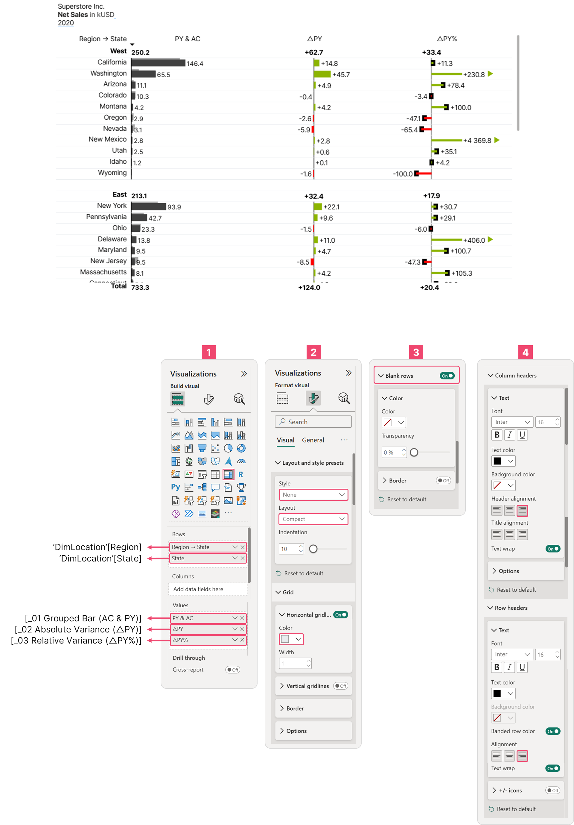 Matrix Visual Configuration
Reference
Multi-tier bar charts • IBCS - International Business Communication Standards