Matrix/TableMember-Only
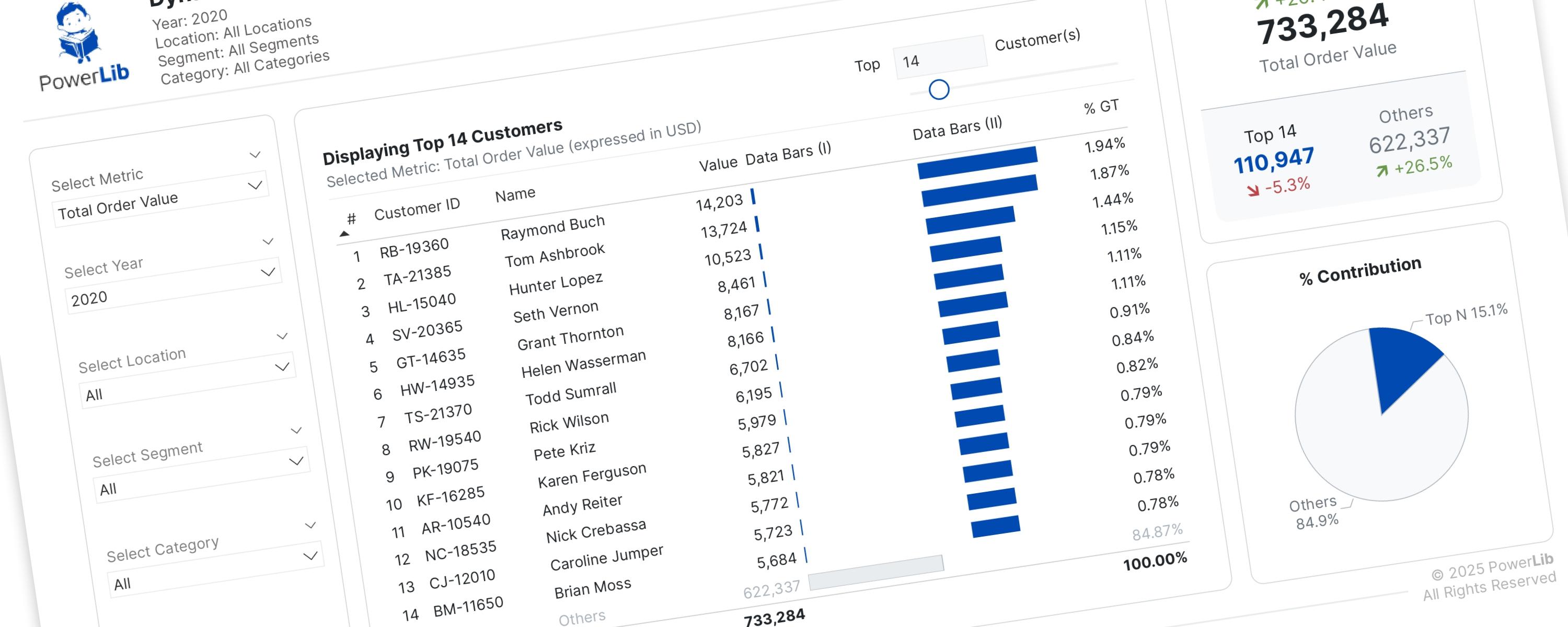
Dynamically Show Top N and Others Based On Metric Selection
I’ve previously discussed creating Pareto dashboards to help you identify your “vital few” and “trivial many” customers.
26 October 202532 min read
Documented Power BI techniques — the model change, the DAX, and the exact visual settings. Most are free to read; the rest come with the model files for members.
Matrix/TableMember-Only
I’ve previously discussed creating Pareto dashboards to help you identify your “vital few” and “trivial many” customers.
Matrix/TableMember-Only
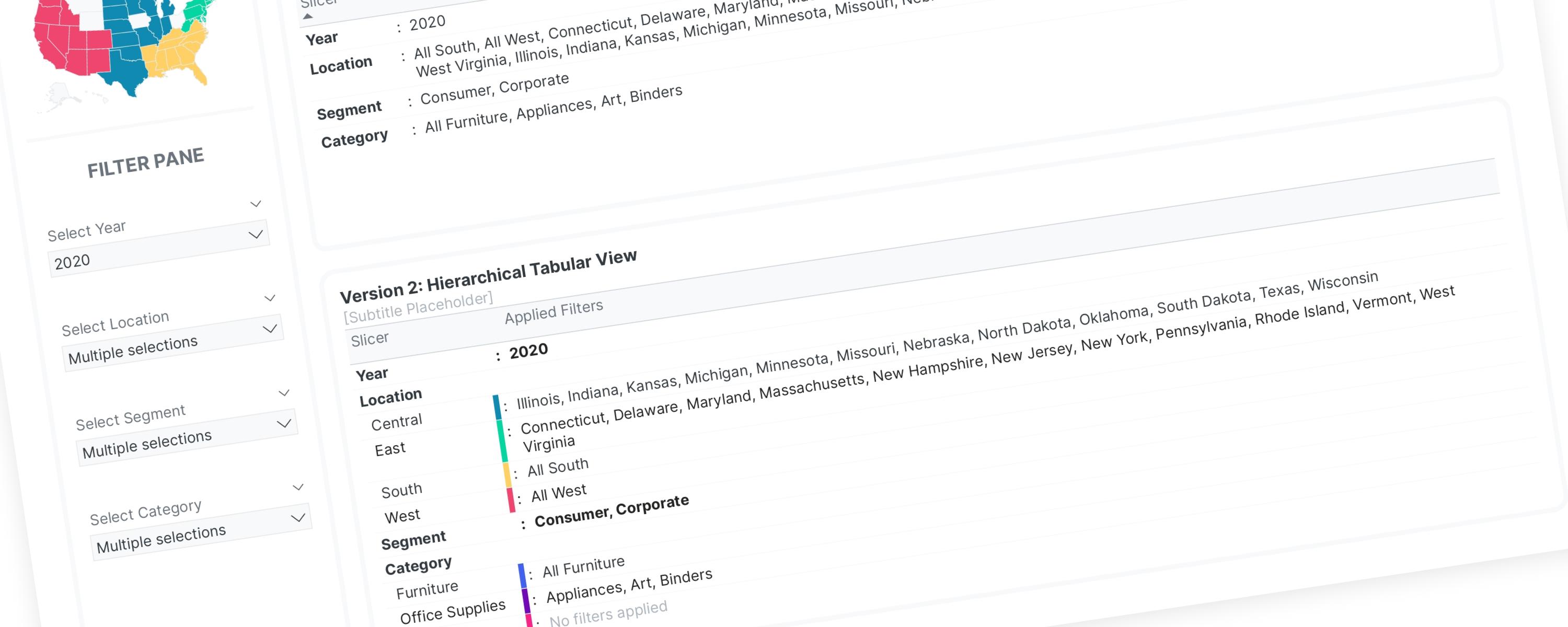
Inspired by Gustaw Dudek's work on displaying applied filters, I have developed two versions of a filter-display solution.
LineFree
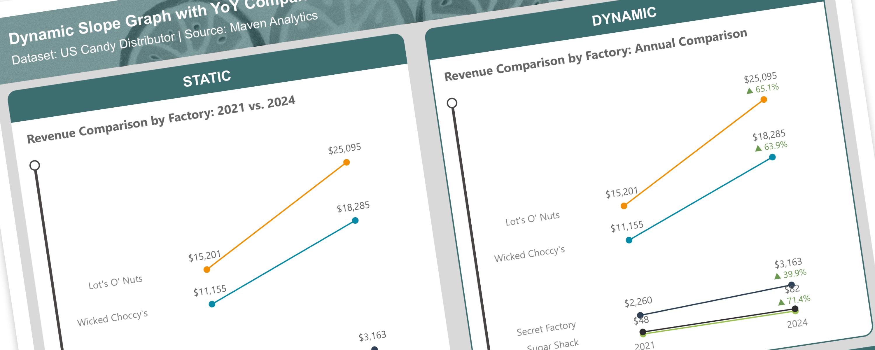
A slope graph is a type of line chart that shows changes between two points in time or two different states.
LineFree
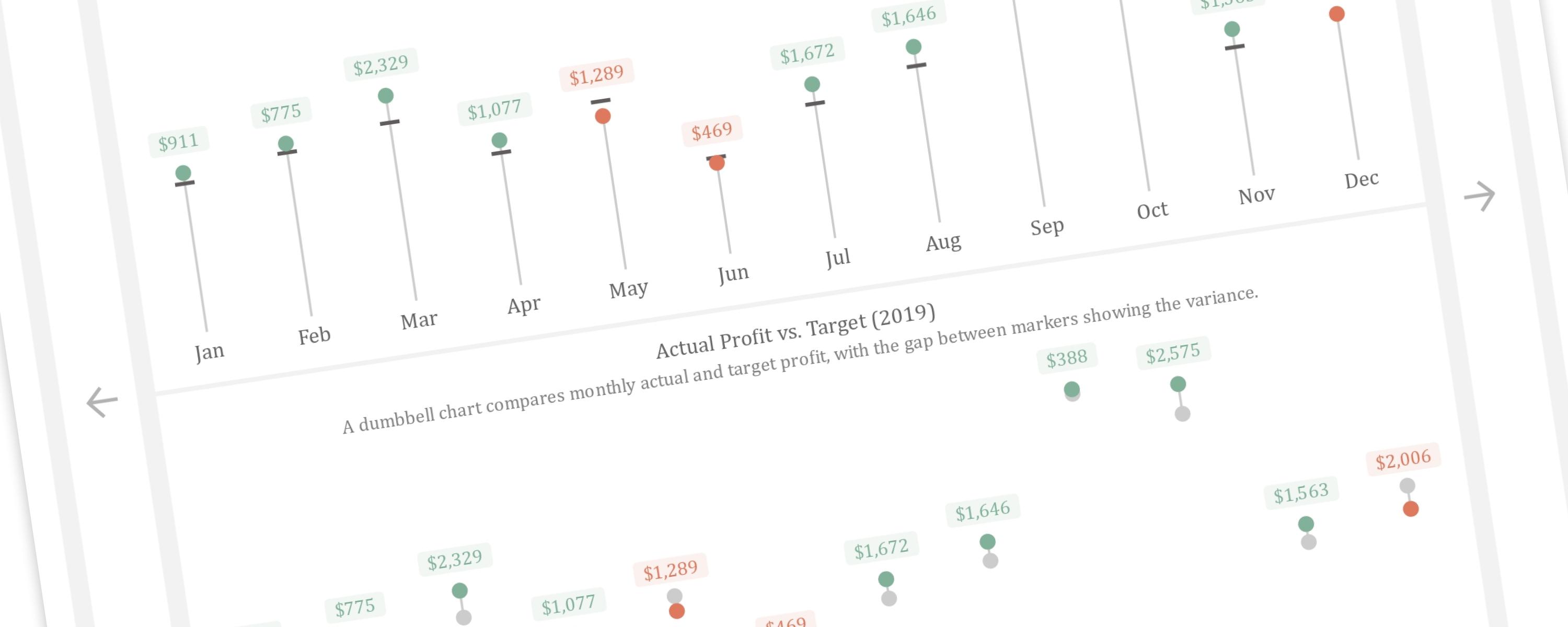
This article demonstrates how to create a dynamic vertical lollipop and dumbbell chart in Power BI.
LineFree
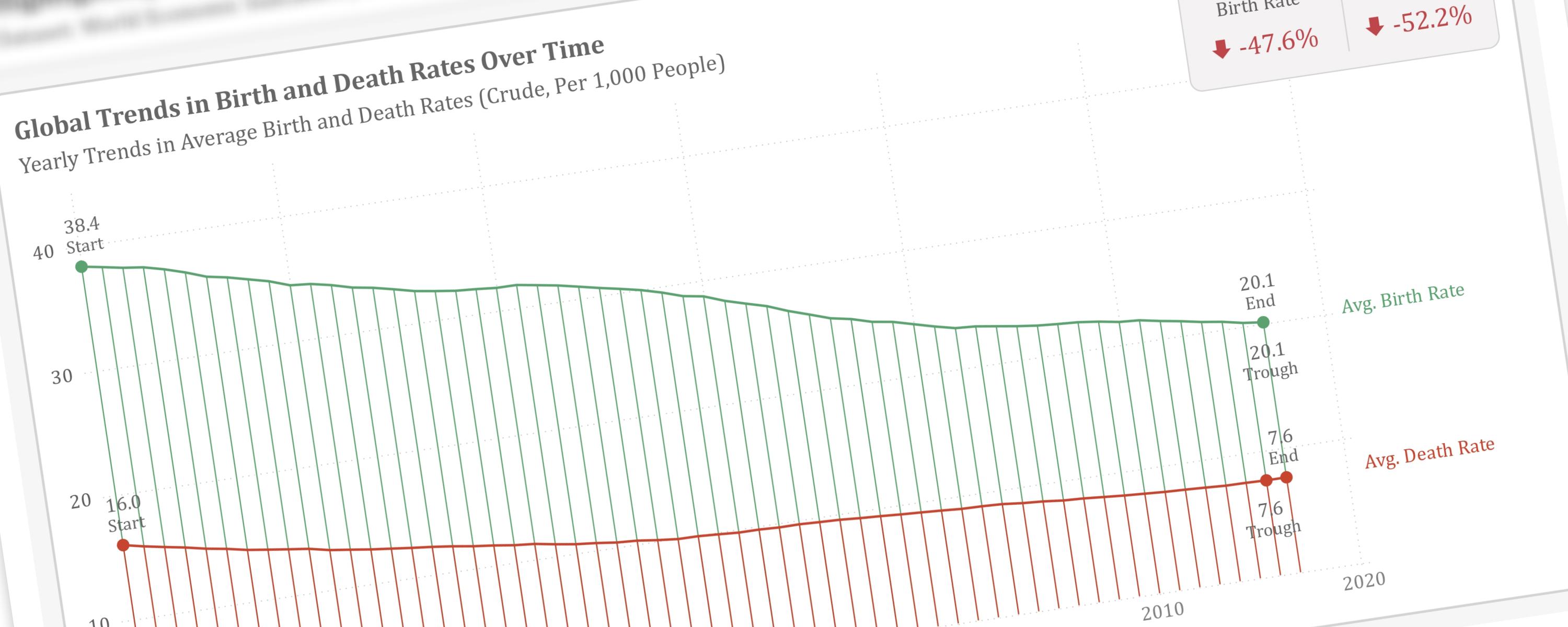
This article will guide you through the process of visually emphasizing key data points within a line chart.
ColumnFree
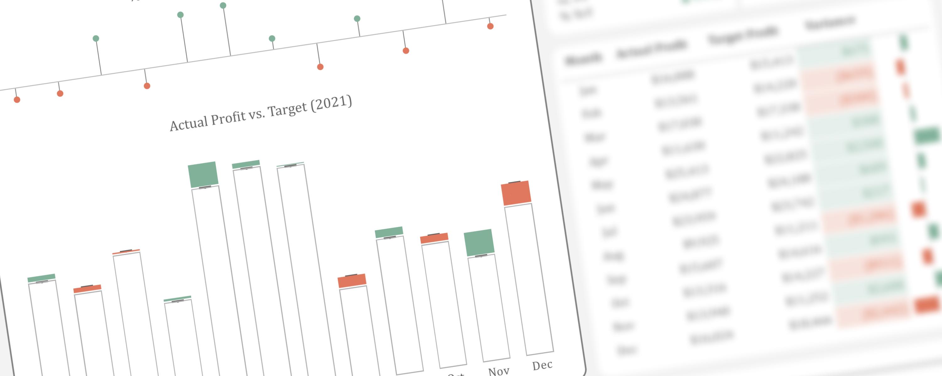
This article presents an alternative method for visualizing actual performance against target values.
ColumnFree
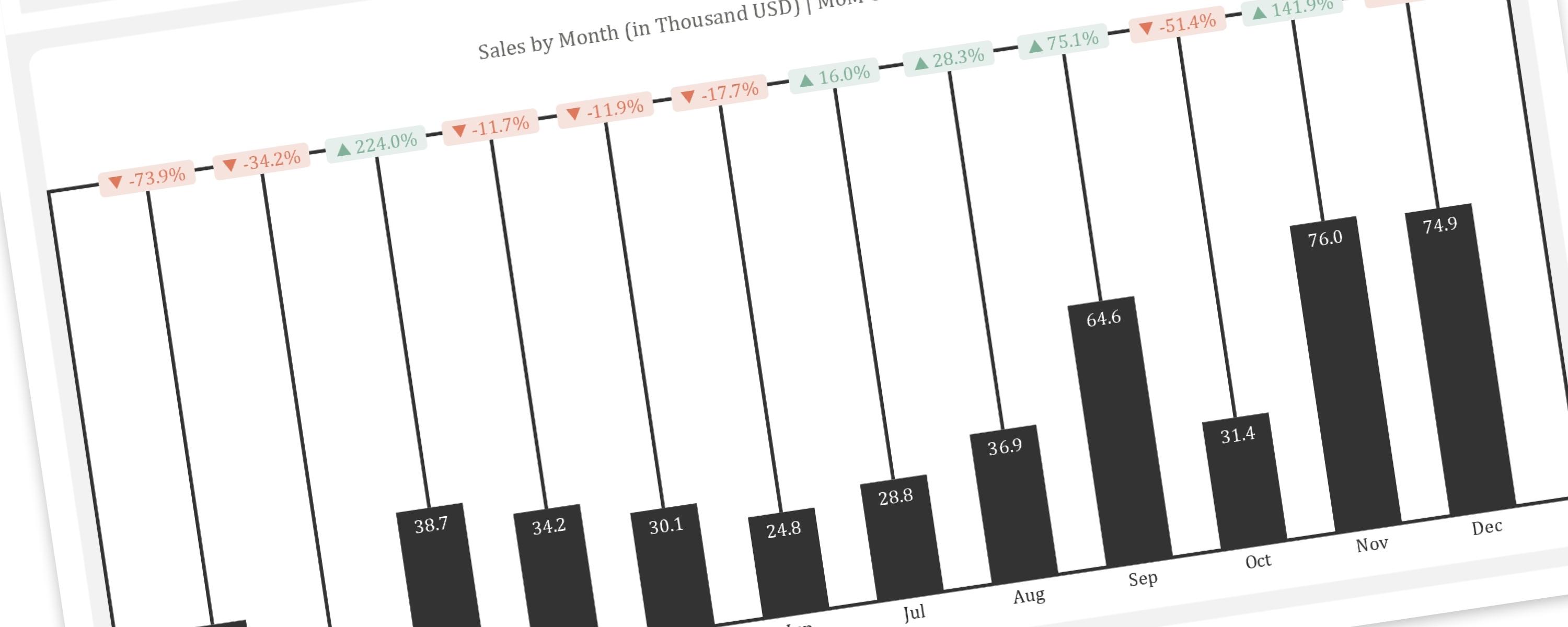
This article provides a step-by-step guide to replicating the “Piano” or “Delta” chart, a creative visualization for showing changes between two points in time, within Power BI.
Matrix/TableFree
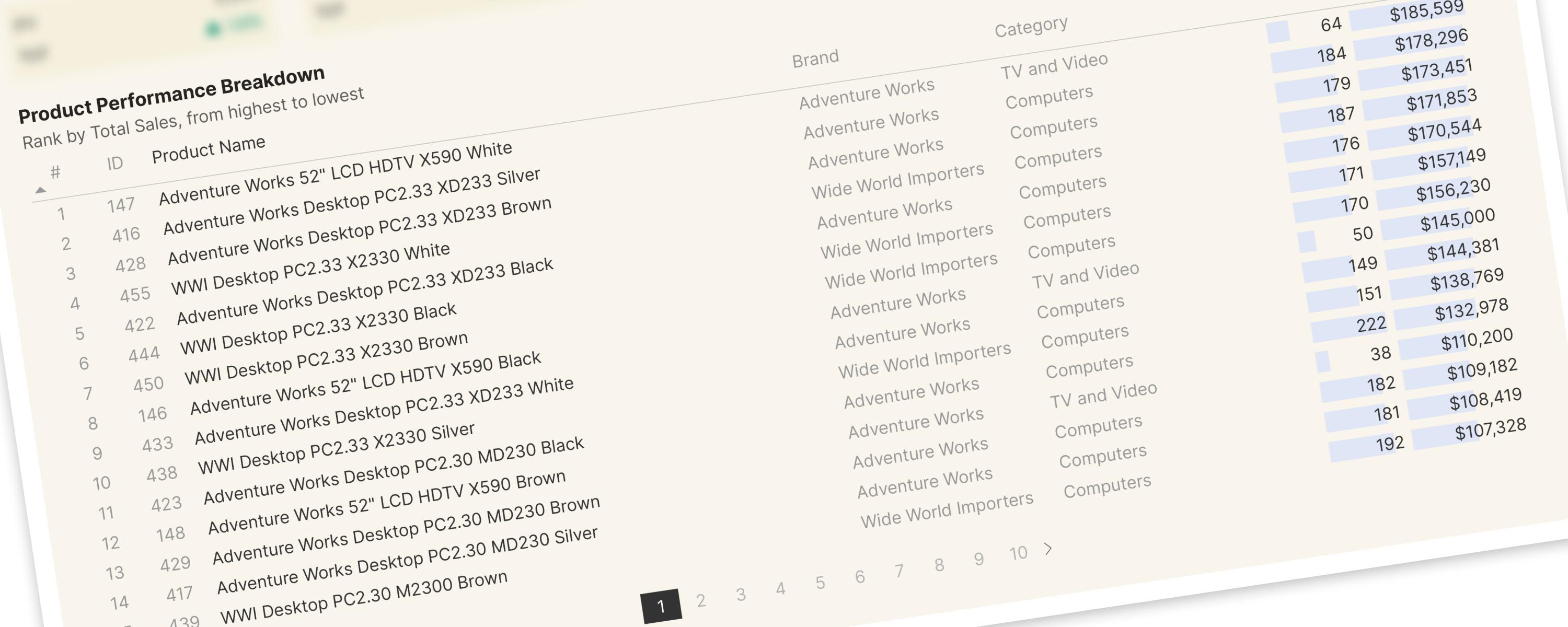
For the improved version, please refer to the following documentation page:
ColumnMember-Only
The DAX measures used here have been improved and modified for better readability and performance. </Callout>