Definition
What is a Slope Graph?
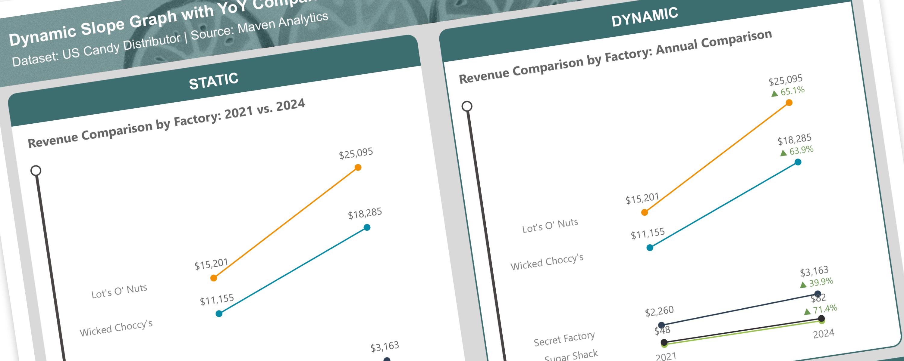
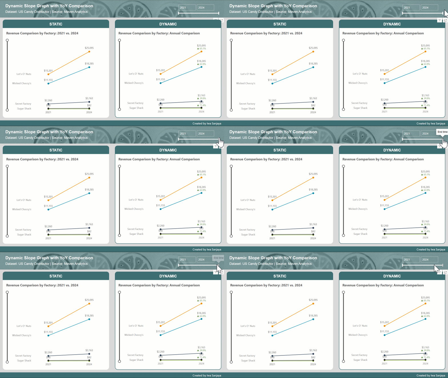
A slope graph is a type of line chart that shows changes between two points in time or two different states. It simplifies comparisons by focusing on just two points per category, making both absolute and relative changes easy to see. Slope graphs work best with a limited number of categories.
Documentation
The provided DAX formula is designed to create a slope graph that compares the total sales between the first and last selected years. Here’s a breakdown of the formula:
Sales_Slope Graph =
VAR FirstYear = MINX(ALLSELECTED(DimDate), DimDate[Year]) -- First selected year
VAR LastYear = MAXX(ALLSELECTED(DimDate), DimDate[Year]) -- Last selected year
RETURN
  IF(
      SELECTEDVALUE(DimDate[Year]) = FirstYear || SELECTEDVALUE(DimDate[Year]) = LastYear,
      SUM(Candy_Sales[Sales]),
      BLANK() -- Ensure intermediate years return BLANK()
  )
1. Identifying First and Last Years:
FirstYearandLastYearvariables useMINXandMAXXfunctions to determine the minimum and maximum years within the current filter context. This ensures that the formula adapts to the user's selections in slicers or filters.
2. Conditional Calculation:
-
The
IFstatement checks if the current year is either the first or the last year. -
If it’s the first or last year, the
SUM(Candy_Sales[Sales])is calculated to get the total sales for that year. -
If it’s any other year,
BLANK()is returned, effectively filtering out those years from the visualization.
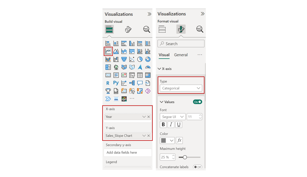
After creating the DAX measure, create a line chart. Set the x-axis to DimDate[Year] (formatted as categorical) and the y-axis to the Sales_Slope Graph measure. This will display the values for the first and last years, highlighting the change over time.
The Importance of Adding Percentage Comparison in Slope Graph
While it’s easy to identify the largest absolute changes in values by looking at the steepness of the slopes, this doesn’t necessarily indicate the greatest percentage change. To provide a more accurate comparison, we can add percentage change labels to each category on the slope graph. This will allow us to see the relative change in values, rather than just the absolute difference.
Revenue_YoY_Change_Graph =
VAR FirstYear =
  CALCULATE(
      MIN(DimDate[Year]),
      ALLSELECTED(Candy_Sales)
  )

VAR LastYear =
  CALCULATE(
      MAX(DimDate[Year]),
      ALLSELECTED(Candy_Sales)
  )

VAR LastYearValue =
  CALCULATE(
      SUM(Candy_Sales[Sales]),
      DimDate[Year] = LastYear
  )

VAR FirstYearValue =
  CALCULATE(
      SUM(Candy_Sales[Sales]),
      DimDate[Year] = FirstYear
  )

VAR YoYChange =
  IF(
      FirstYearValue > 0,
      DIVIDE(LastYearValue - FirstYearValue, FirstYearValue, 0),
      0
  )

RETURN
  IF(
      SELECTEDVALUE(DimDate[Year]) = FirstYear,
      BLANK(),
      IF(
          YoYChange > 0,
          "▲ " & FORMAT(YoYChange, "0.0%"),
          IF(
              YoYChange < 0,
              "▼ " & FORMAT(YoYChange, "0.0%"),
              BLANK()
          )
      )
  )
The primary goal of this DAX formula is to calculate the year-over-year (YoY) change in revenue and display it in a visually appealing format, including up and down arrows to indicate the direction of change.
Step-by-Step Breakdown:
1. Identifying First and Last Years:
FirstYearandLastYearvariables useCALCULATEandALLSELECTEDto determine the minimum and maximum years within the current filter context. This ensures that the calculation is based on the selected time period.
2. Calculating Revenue for First and Last Years:
LastYearValueandFirstYearValuecalculate the total revenue for the last and first years, respectively.
3. Calculating YoY Change:
- The
YoYChangevariable calculates the percentage change between the last and first years. It handles potential division by zero errors by using theDIVIDEfunction with a default value of 0.
4. Formatting the Output:
The RETURN statement conditionally formats the output based on the YoY change:
-
If the current year is the first year, a blank value is returned (Note: To ensure that the percentage change is only displayed for the last year, the first year’s data point is omitted from the slope graph).
-
If the YoY change is positive, an upward arrow (
▲) is displayed along with the formatted percentage change. -
If the YoY change is negative, a downward arrow (
▼) is displayed along with the formatted percentage change. -
If there’s no change, a blank value is returned.
Optional: Conditional Formatting
To further enhance the visualization, we can apply conditional formatting to the percentage comparison labels. Positive changes can be shown in green, and negative changes in red.
CF_Revenue_YoY Change =
VAR FirstYear =
  CALCULATE(
      MIN(DimDate[Year]),
      ALLSELECTED(Candy_Sales)
  )

VAR LastYear =
  CALCULATE(
      MAX(DimDate[Year]),
      ALLSELECTED(Candy_Sales)
  )

VAR LastYearValue =
  CALCULATE(
      SUM(Candy_Sales[Sales]),
      DimDate[Year] = LastYear
  )

VAR FirstYearValue =
  CALCULATE(
      SUM(Candy_Sales[Sales]),
      DimDate[Year] = FirstYear
  )

VAR YoYChange =
  IF(
      FirstYearValue > 0,
      DIVIDE(LastYearValue - FirstYearValue, FirstYearValue, 0),
      0
  )

RETURN
  IF(
      YoYChange > 0,
      "#6A994E",  -- Green for positive change
      IF(
          YoYChange < 0,
          "#BC4749",  -- Red for negative change
          BLANK()     -- No color if YoYChange is 0 or undefined
      )
  )