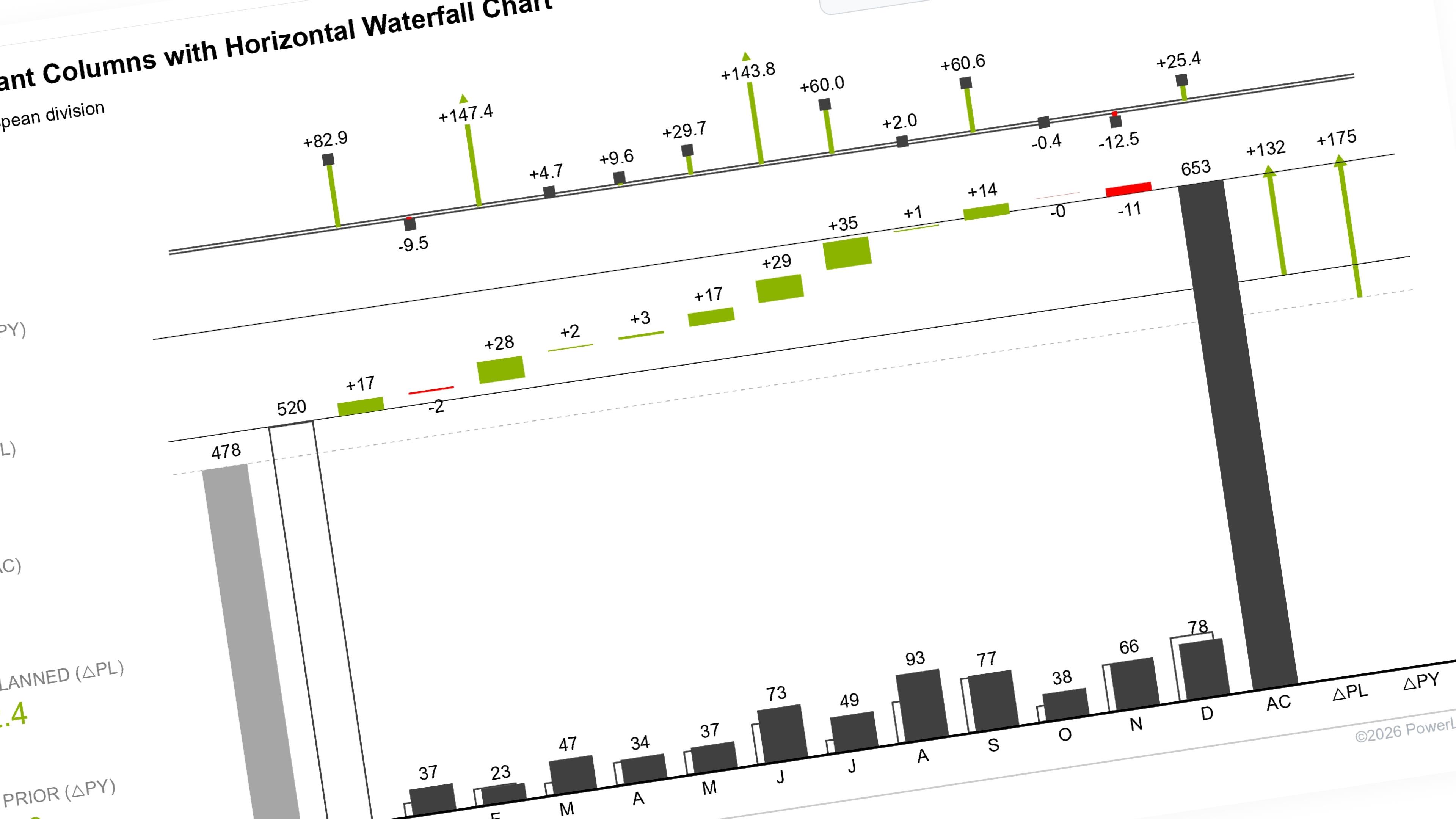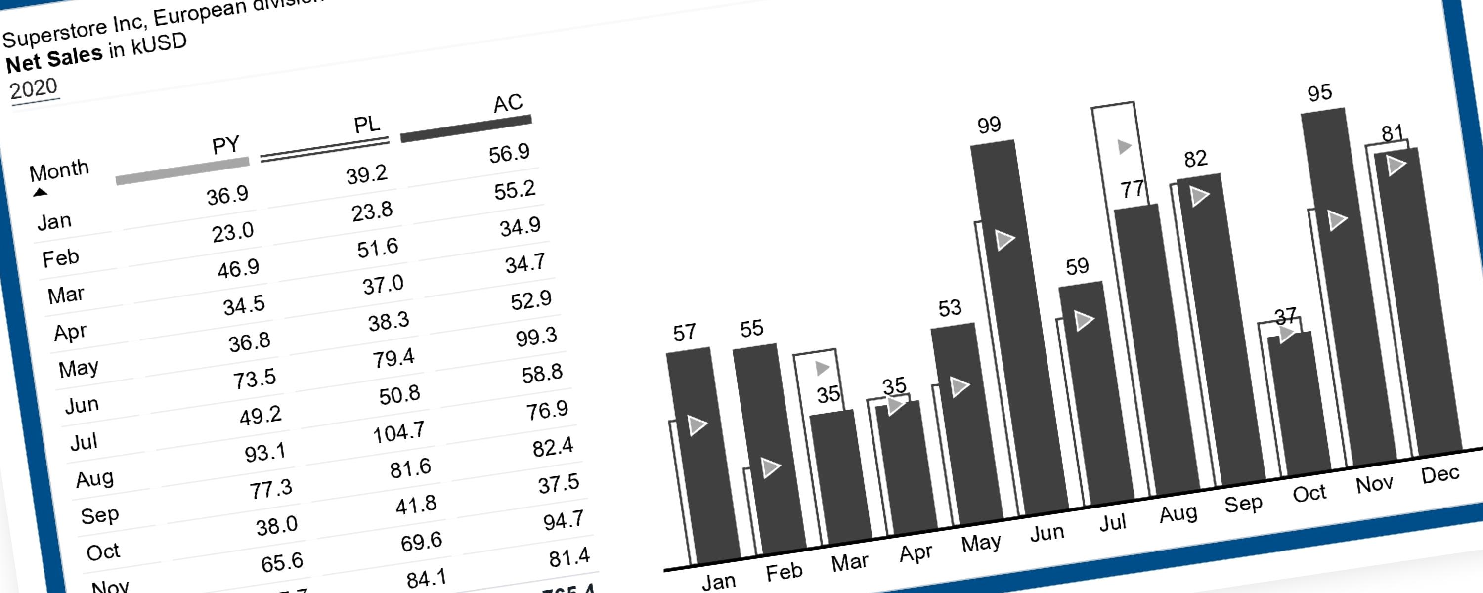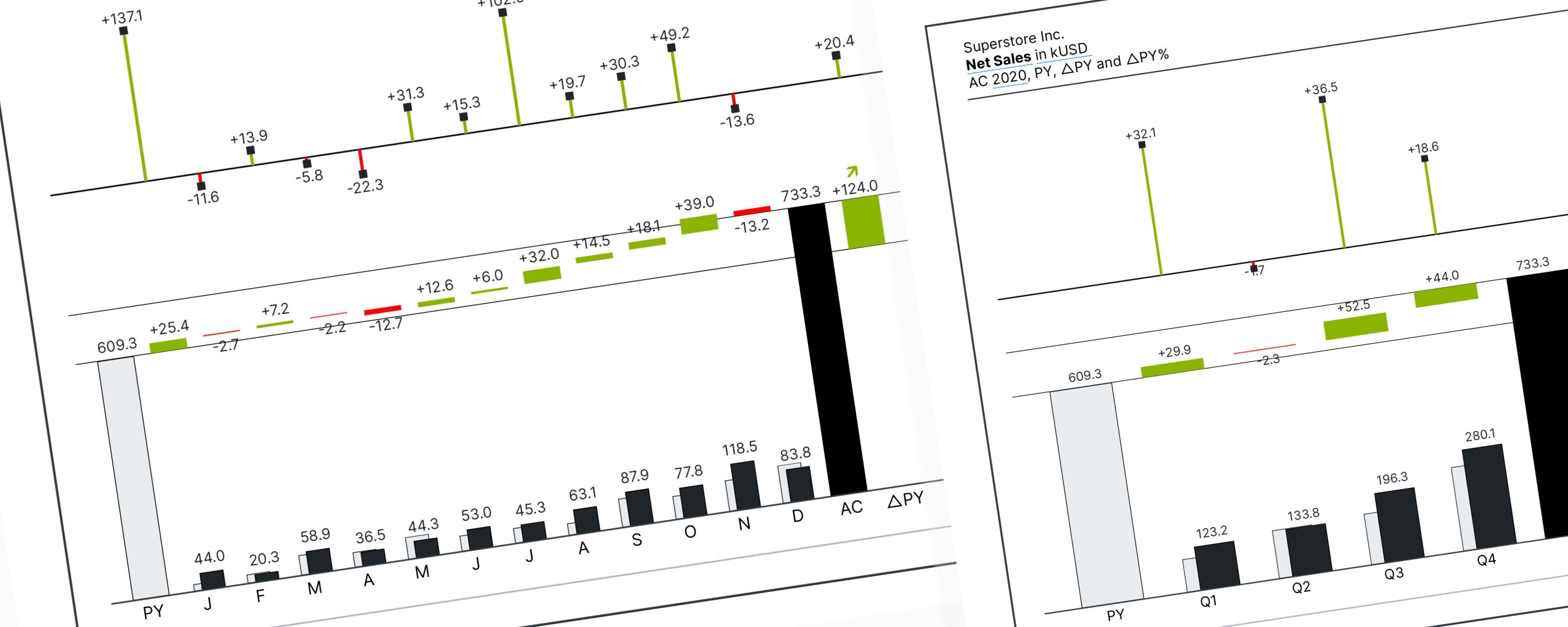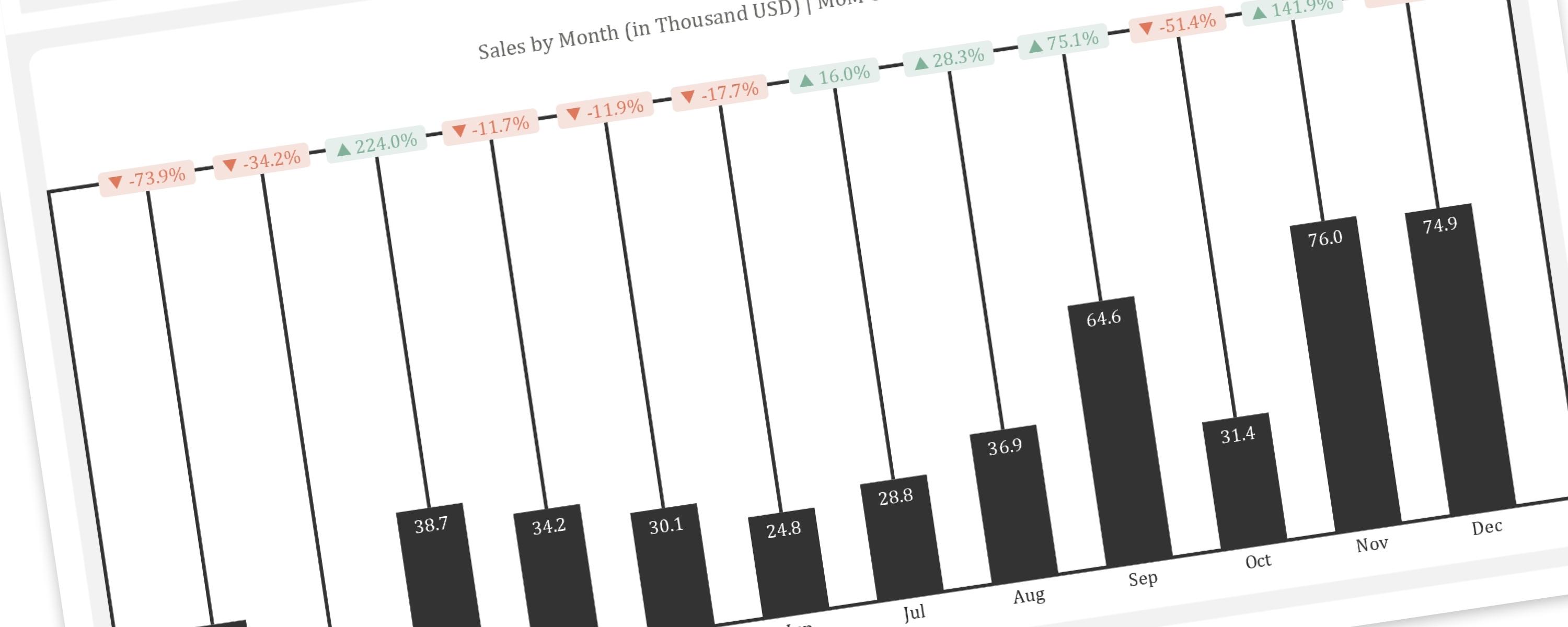
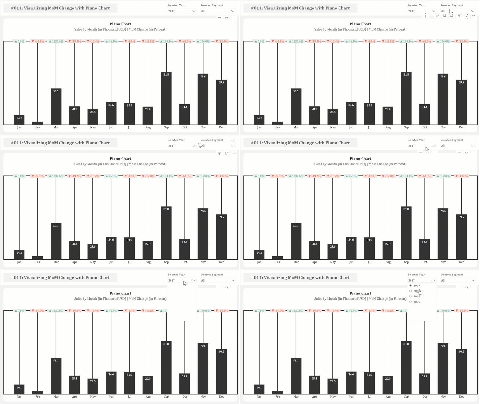
This article provides a step-by-step guide to replicating the “Piano” or “Delta” chart, a creative visualization for showing changes between two points in time, within Power BI. This chart, originally created in Tableau by Guido Jongbloed, is particularly effective for emphasizing percentage changes between months.
Limitations
Documentation
Step 1: Visualizing Monthly Sales Trends Using a Line and Clustered Column Chart
This chart combines a line and clustered column chart. The line’s y-axis will later serve as a reference for displaying month-on-month (MoM) change data labels. We begin by defining a [Total Sales] measure to visualize the monthly sales trend.
#01 Measure: [Total Sales]
Total Sales = SUM('Sample - Superstore_Orders'[Sales])To show MoM changes above the columns, including percentage change and directional arrows (indicating increases or decreases), we’ll create additional measures to calculate the previous month’s sales and the percentage difference.
#02 Measure: [Total Sales PM]
Total Sales PM =
CALCULATE(
  [Total Sales],
  PREVIOUSMONTH(DimDate[Date])
)
#03 Measure: [% MoM Change_Icon]
% MoM Sales_Icon =
VAR MoMChange =
  DIVIDE(
      [Total Sales] - [Total Sales PM],
      [Total Sales PM],
      0
  )
RETURN
  IF(
      MoMChange < 0,
     "▼ " & FORMAT(MoMChange, "0.0%"),
      "▲ " & FORMAT(MoMChange, "0.0%")
  )
Finally, place the month on the x-axis and the [Total Sales] measure on the y-axis, then configure the columns as follows:”
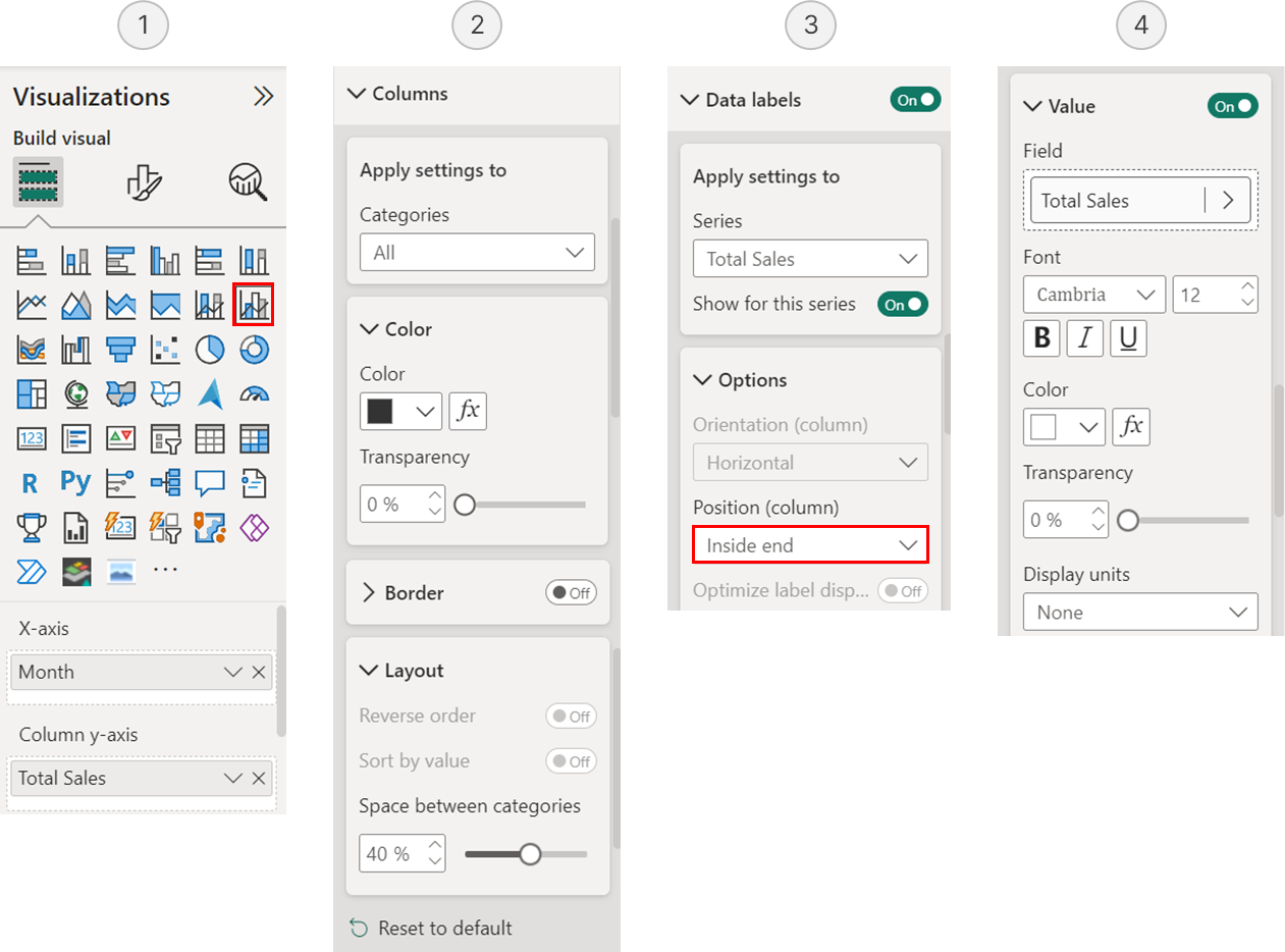 Column Chart Configuration
Step 2: Creating Reference Line to Position MoM Data Labels Above Columns
To add reference lines for month-over-month (MoM) change data labels above each column, we need to create vertical space. This is achieved by creating a calculated measure: multiplying the maximum sales value by a scaling factor. This resulting space separates the columns from the reference lines and labels.
#04 Measure: [Reference Line for Data Labels]
Reference Line for Data Labels =
VAR _MaxValue =
  MAXX(
      ALL(DimDate), -- Ignores all filters on DimDate
      [Total Sales]
  )
RETURN
  _MaxValue * 4.6
Next, add this measure to the upper bound of the [Total Sales] measure’s error bars. For visual clarity, align the zero and maximum values of both the primary and secondary axes. This requires an additional measure to ensure proper alignment between the column and line axes.
#05 Measure: [Y-Axis Max]
Y-Axis Max =
VAR _MaxValue =
MAXX(
ALL(DimDate), -- Ignores all filters on DimDate
[Total Sales]
)
RETURN
_MaxValue * 5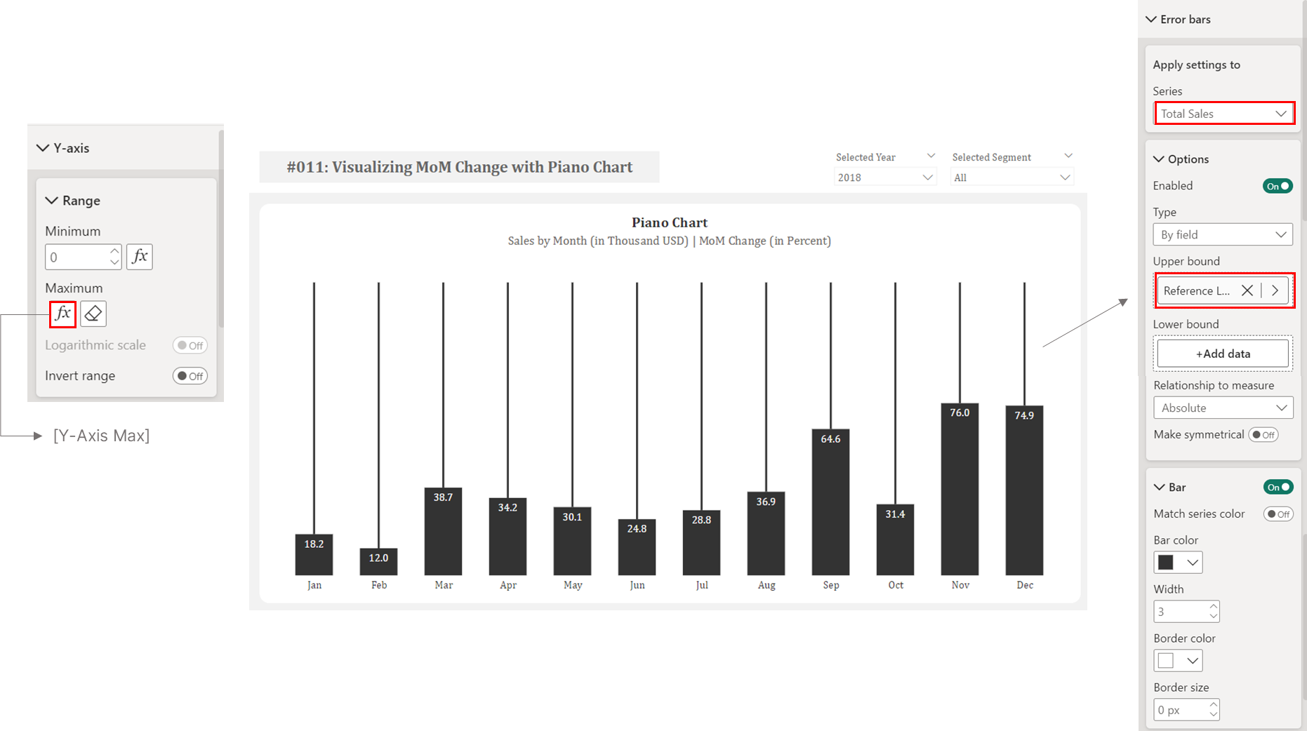 Creating Reference Line to Position MoM Data Labels Above Columns
The chart will then resemble piano keys by adding a surrounding rectangle:
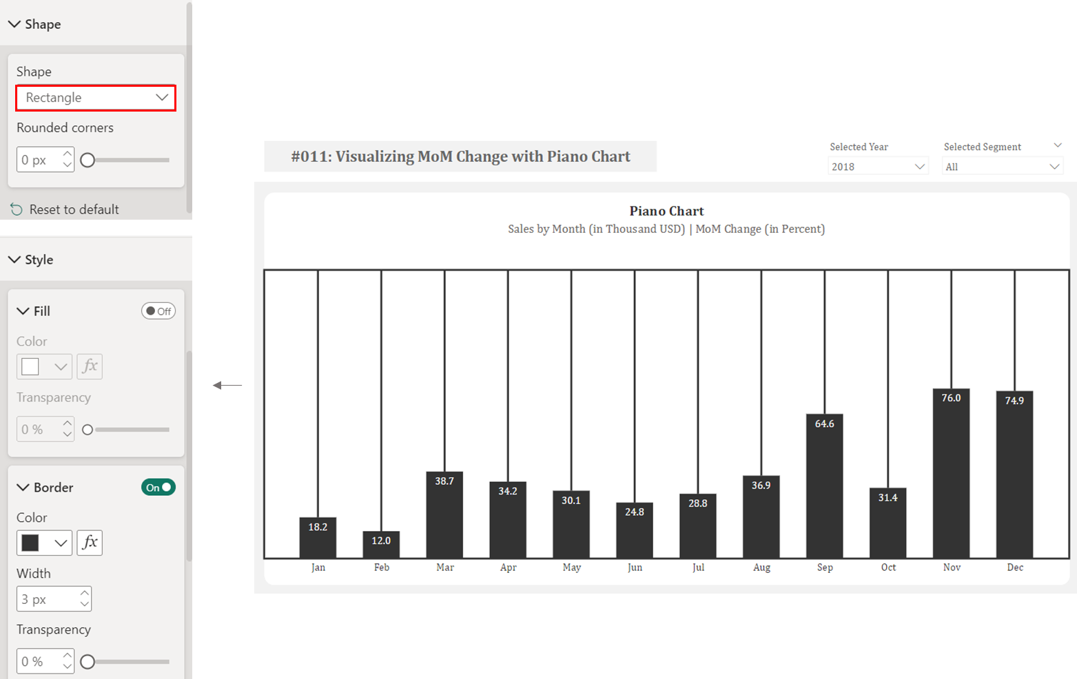 Adding a Rectangular Border to the Chart
Step 3: Adding and Centering MoM Data Labels
Power BI lacks a native option for centering data labels on lines. To work around this limitation, we’ll create a secondary reference line positioned slightly below our main reference line. This is accomplished by duplicating our [Reference Line for Data Labels] measure with a smaller multiplier, allowing us to position data labels at the center of the primary reference line.
#06 Measure: [Reference Line for Data Labels_Duplicate]
Reference Line Data Label_Duplicate =
VAR _MaxValue =
  MAXX(
      ALL(DimDate), -- Ignores all filters on DimDate
      [Total Sales]
  )
RETURN
  _MaxValue * 4.42
It’s important to note that while Power BI supports conditional formatting for data label font color, it doesn’t offer the same for background colors. Therefore, we need to create separate measures to display increases and decreases in distinct colors.
Positive Changes: Create a measure that displays the [Reference Line Data Label_Duplicate] value only when the current month’s total sales exceed the previous month’s total sales; otherwise, it returns a blank.
#07 Measure: [Positive MoM Data Label]
Positive MoM Data Label =
  IF(
      [Total Sales] > [Total Sales PM],
      [Reference Line Data Label_Duplicate]
  )
Negative Changes: Create a similar measure that displays [Reference Line Data Label_Duplicate] value only when the current month’s total sales are less than the previous month’s total sales; otherwise, it returns a blank.
#08 Measure: [Negative MoM Data Label]
Negative MoM Data Label =
  IF(
      [Total Sales] < [Total Sales PM],
      [Reference Line Data Label_Duplicate]
  )
By placing these measures on the line’s y-axis and enabling data labels (using the “[% MoM Sales_Icon]” measure), the labels appear centered. Since we have separate measures for positive and negative changes, we can apply distinct colors. In this example, #81B29A (green) for increases and #E07A5F (red) for decreases. The corresponding background colors are #E6EFEB for positive values and #F8E3DD for negative values.
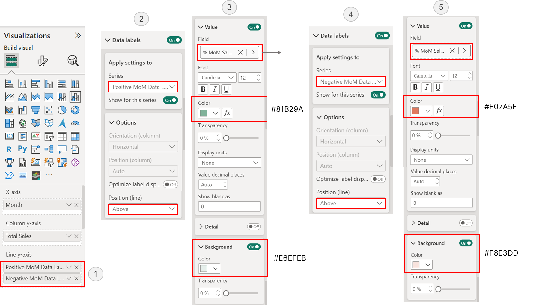 % MoM Change Data Label Configuration
The end result is a dynamic visualization where both the bubbles and their centered data labels update automatically based on slicer selections, providing a clear view of month-over-month changes with appropriate color coding to instantly indicate performance trends.