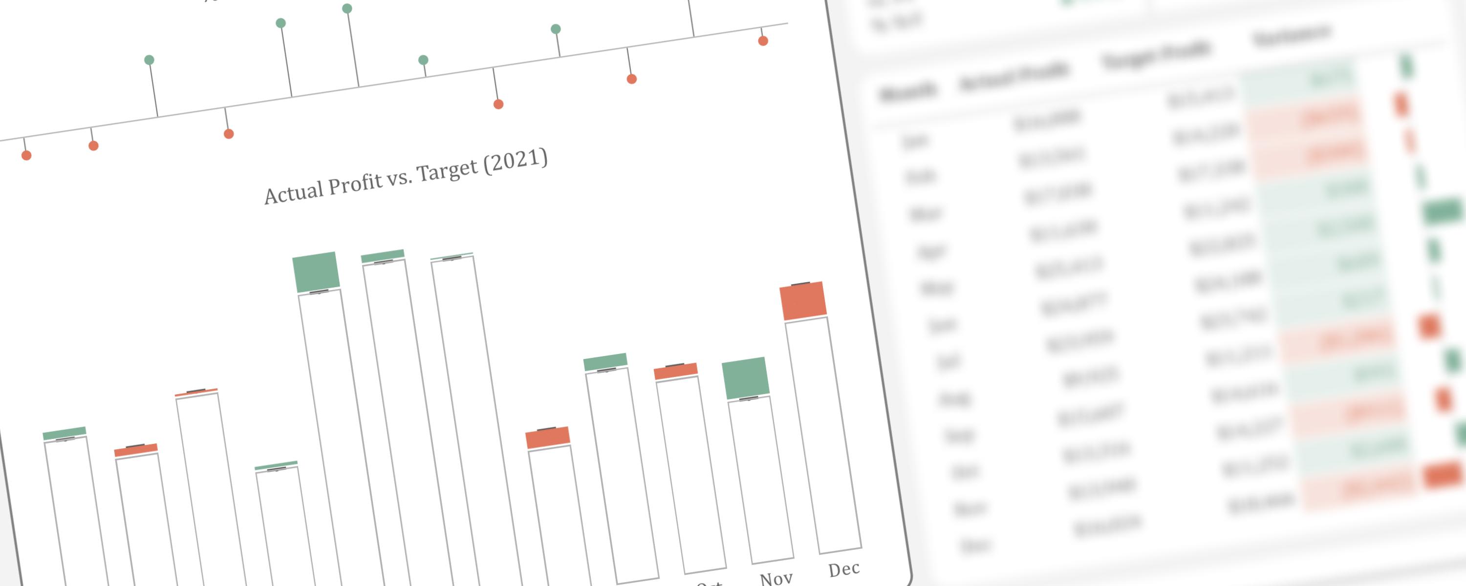
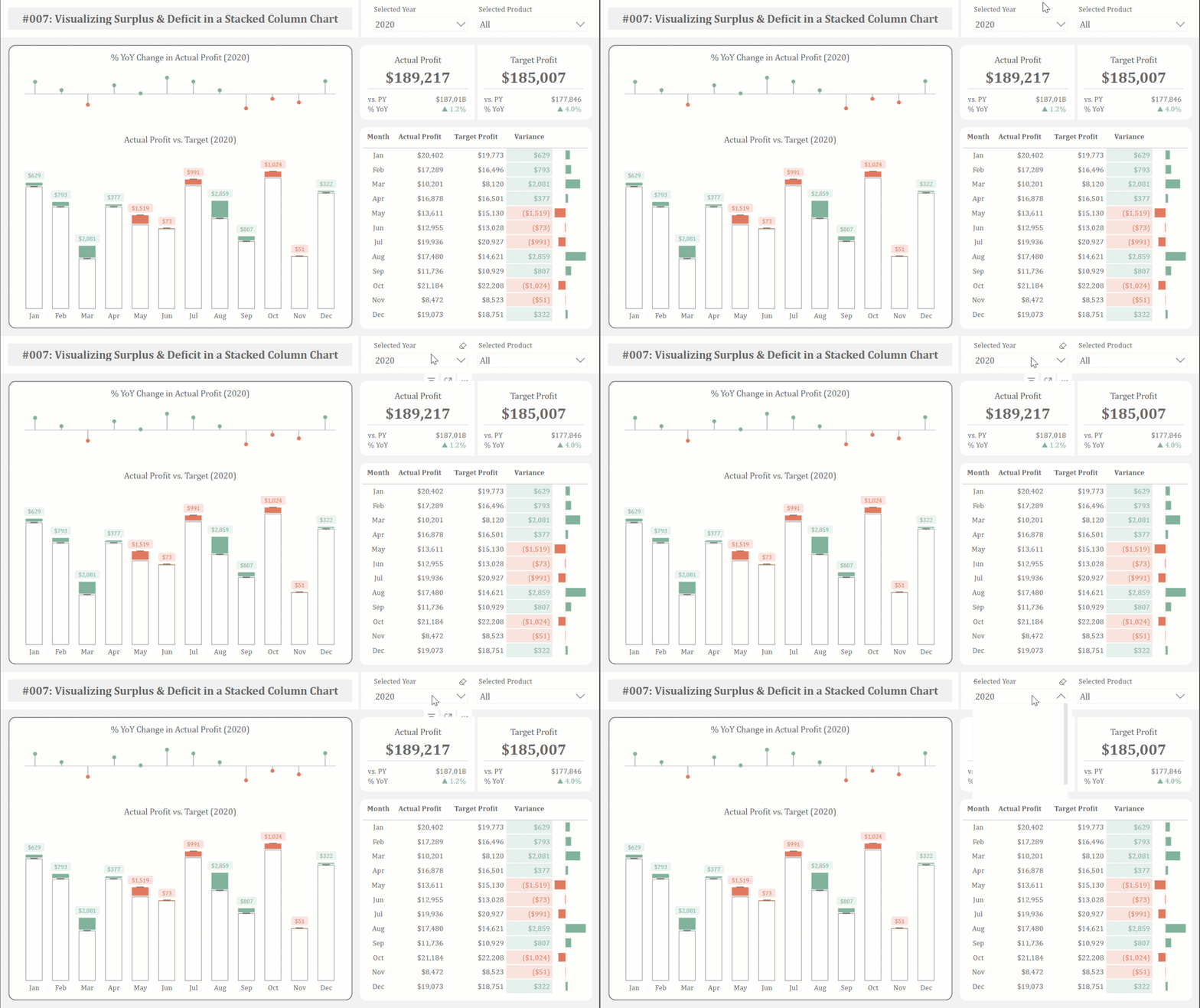
This article presents an alternative method for visualizing actual performance against target values. By leveraging the native stacked column chart in Power BI, we can effectively highlight the magnitude of monthly surpluses and deficits, enabling stakeholders to quickly grasp the performance variance.
Foreword
Various charting techniques can be employed to visualize actual performance against a target. I’ve previously explored this in detail in a separate article, which you can find here.
In the context of Power BI, implementing this visualization requires the use of DAX measures. To effectively represent surplus and deficit within a stacked column chart, we’ll create separate measures for surplus, deficit, target profit, and actual profit. This approach is necessary due to the multiple conditions that need to be met to accurately depict the desired outcome.
-
Surplus refers to an excess or an amount that exceeds the required or expected level.
-
Deficit or Shortfall refers to a situation where there is a deficiency or a lack of something, such as not meeting a target or having less than required.
Documentation
Part 1: Creating DAX Measures to Visualize Surplus
In a stacked column chart, the surplus and target profit can be displayed together since their combined total represents the actual profit. However, since not all months generate a surplus, we’ll need to handle months with deficits strategically in the visualization. To accomplish this, we’ll create specific measures that selectively show surplus values.
Variance_Surplus =
IF(
    [Actual Profit] - [Target Profit] > 0,
    [Actual Profit] - [Target Profit],
    BLANK()
)
This formula calculates the surplus between “Actual Profit” and “Target Profit”.
-
If Actual Profit is greater than Target Profit, the formula calculates the difference between the two values, representing the surplus amount.
-
If Actual Profit is less than or equal to Target Profit, the formula returns a blank value, as there is no surplus in this case.
Essentially, this formula isolates and calculates only the surplus values, providing a clear picture of instances where actual performance exceeds the target.
For Surplus_Display Target Profit =
IF(
    [Variance_Surplus] > 0,
    [Actual Profit] - [Variance_Surplus],
    BLANK()
)
This formula is used to dynamically calculate and display the “Target Profit” value based on the calculated “Variance_Surplus.”
-
If a surplus exists, the formula subtracts the “Variance_Surplus” from the “Actual Profit” to determine the original “Target Profit.”
-
If no surplus exists, the formula returns a blank value, as the “Target Profit” cannot be determined in this scenario using the surplus calculation.
Part 2: Creating DAX Measures to Visualize Deficit
Conversely, deficits or shortfalls can be visualized alongside actual profits, as their combined total represents the target profit. However, because not all months experience a deficit, we need to strategically address months with surpluses in the visualization. To achieve this, we will create specific measures that selectively display deficit values.
Variance_Deficit =
IF(
    [Target Profit] - [Actual Profit] > 0,
    [Target Profit] - [Actual Profit],
    BLANK()
)
This formula calculates the deficit between “Target Profit” and “Actual Profit” in a Power BI model.
- If Target Profit is greater than Actual Profit, the formula calculates the difference between the two values, representing the deficit amount.
- If Target Profit is less than or equal to Actual Profit, the formula returns a blank value, as there is no deficit in this case.
Essentially, this formula isolates and calculates only the deficit values, providing a clear picture of instances where actual performance falls short of the target.
For Deficit_Display Actual Profit =
IF(
    [Variance_Deficit] > 0,
    [Actual Profit],
    BLANK()
)
This formula is used to dynamically display the “Actual Profit” value specifically when a deficit occurs.
-
If a deficit exists, the formula returns the actual “Actual Profit” value.
-
If no deficit exists, the formula returns a blank value.
Essentially, this formula isolates and displays the “Actual Profit” only in scenarios where the target profit exceeds the actual profit, providing a clear visualization of the actual profit in relation to the deficit and target profit.
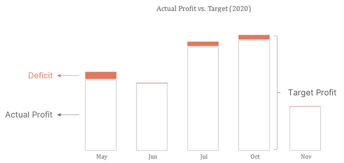 Actual profit and deficit displayed using stacked columns
When these measures are added to the y-axis of the stacked column chart, the visualization displays the deficit values for each month within the selected year (2020, based on the current slicer selection). The chart highlights months where actual profit exceeded the target, represented by negative variance in May, June, July, October, and November. Months with either a surplus or where actual profit met the target exactly are not displayed in the chart due to the filter logic incorporated in the measures.
Part 3: Combining Measures for Surplus/Deficit Visualization
Part 4: Displaying Data Labels for Surplus and Deficit
After exploring various approaches to display surplus and deficit data labels above the columns, I discovered a solution using the combined line and stacked column chart within Power BI. This approach leverages two key measures: one for visualizing actual profit in a line chart and another for visualizing target profit, also as a line chart.
The line charts serve as reference points for data label placement. Notably, these line charts will be hidden in the final visualization, as their sole purpose is to facilitate the positioning of data labels.
The first measure displays the actual profit value only when a surplus exists. This is crucial because the actual profit value represents the total height of the stacked column in cases where a surplus occurs (i.e., Actual Profit = Target Profit + Surplus). By displaying the actual profit value as a line, we can accurately position data labels above the corresponding stacked columns.
Reference_Data Labels for Surplus =
IF(
    [Variance_Surplus] > 0,
    [Actual Profit],
    BLANK()
)
This formula works in conjunction with the “Variance_Surplus” calculation and the stacked column chart visualization. When a surplus exists, the formula returns the “Actual Profit” value. This value is then used as a reference point for the line chart that will be plotted above the stacked column, allowing for accurate placement of data labels for the surplus segment.
Similarly, the second measure displays the target profit value only when a deficit exists. In this scenario, the target profit value represents the total height of the stacked column (i.e., Target Profit = Actual Profit + Deficit). This allows us to position data labels accurately above the stacked columns in cases where a deficit occurs.
Reference_Data Labels for Deficit =
IF(
    [Variance_Deficit] > 0,
    [Target Profit],
    BLANK()
)
This formula works in conjunction with the “Variance_Deficit” calculation and the stacked column chart visualization. When a deficit exists, the formula returns the “Target Profit” value. This value is then used as a reference point for the line chart that will be plotted above the stacked column, allowing for accurate placement of data labels for the deficit segment.
Finally, add both reference measures to the line y-axis of the line and stacked column chart. Configure the chart to hide the lines and markers for these series, displaying only the data labels positioned above the respective lines. To accurately reflect the surplus and deficit values, replace the default values with the corresponding positive variance (surplus) and negative variance (deficit). For enhanced visual clarity, consider customizing the color of the data labels based on whether they represent a surplus or deficit.