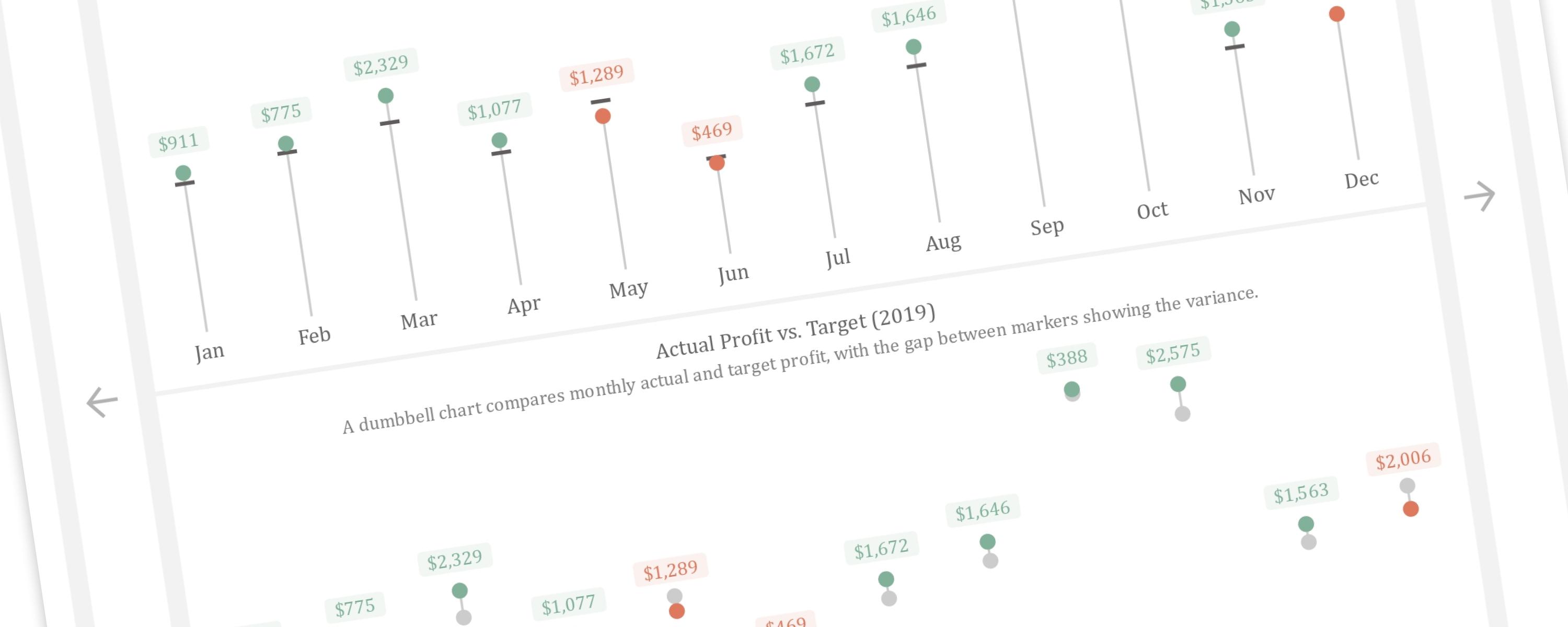
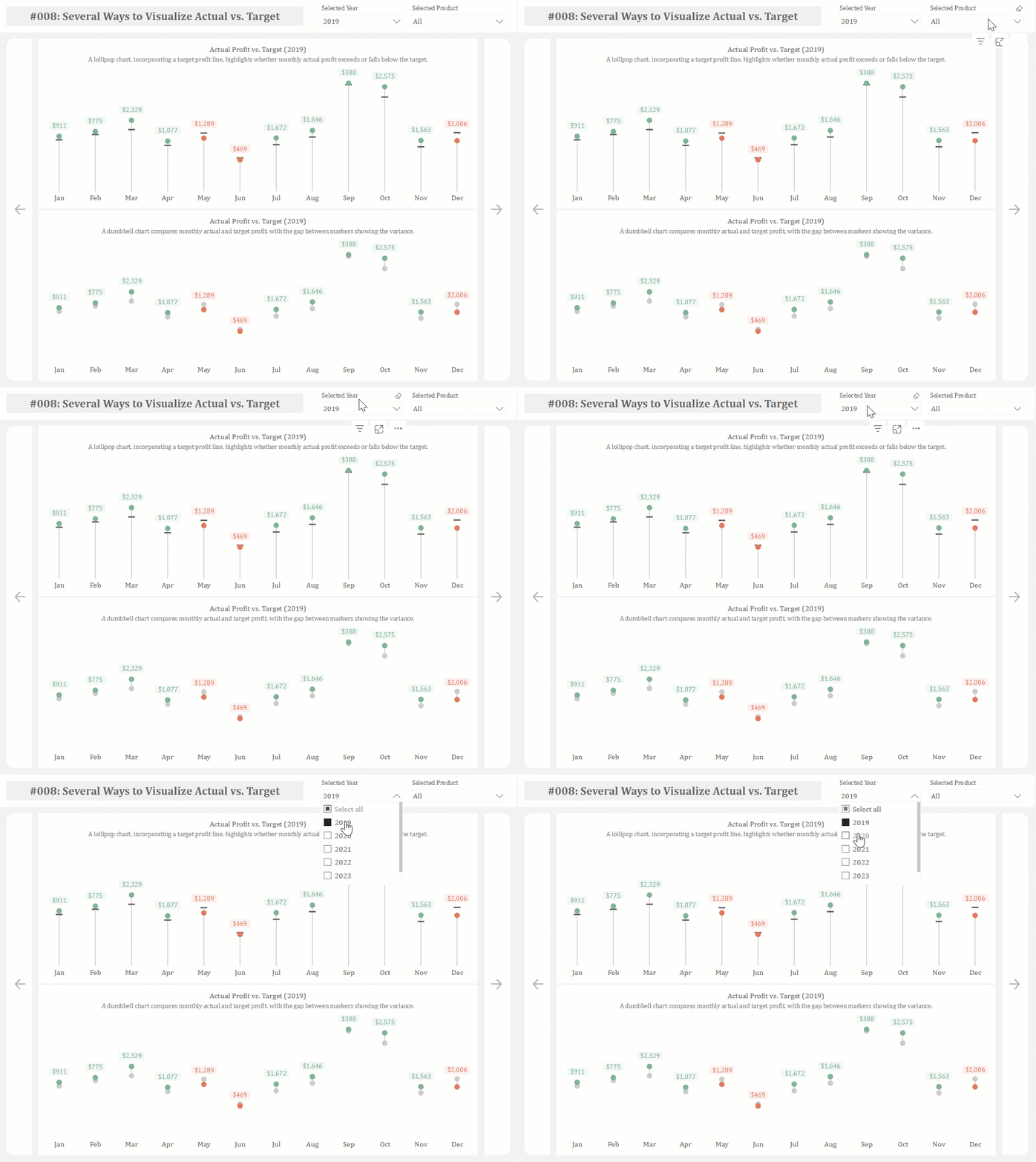
This article demonstrates how to create a dynamic vertical lollipop and dumbbell chart in Power BI. The chart’s dots will change color based on a specified condition, utilizing only native Power BI visuals.
Definition
What is a Lollipop Chart?
A vertical lollipop chart is essentially a column chart where each column is replaced by a line and a dot. It visually represents the relationship between a numeric and a categorical variable.
Lollipop charts are used in the same situations as column or bar charts. However, they are particularly effective when dealing with several bars of similar heights, as they prevent the chart from becoming cluttered.
What is a Dumbbell Chart?
A dumbbell chart (also known as a barbell chart/plot, dumbbell plot, or connected dot plot) is a visualization used to illustrate the change between two points, whether those points represent different times, conditions, or groups. It is particularly effective for comparing quantitative value ranges across different categories, clearly visualizing the magnitude of differences or changes.
Documentation
How to Visualize Vertical Lollipop Chart
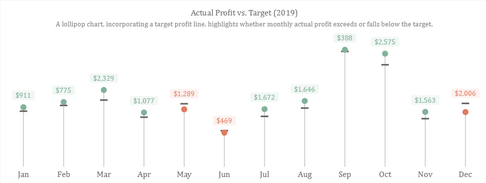 Visualizing a vertical lollipop chart using Power BI native visual
Vertical lollipop charts can be readily created in Power BI by using a column chart with transparent columns and displaying error bars as markers. However, conditional formatting of these error bar markers is not currently supported.
To work around this limitation, we can use a line chart instead. While line chart markers cannot be directly conditionally formatted either, we can first convert our conditionally formatted column chart to a line chart, then leverage its markers to achieve the desired effect.
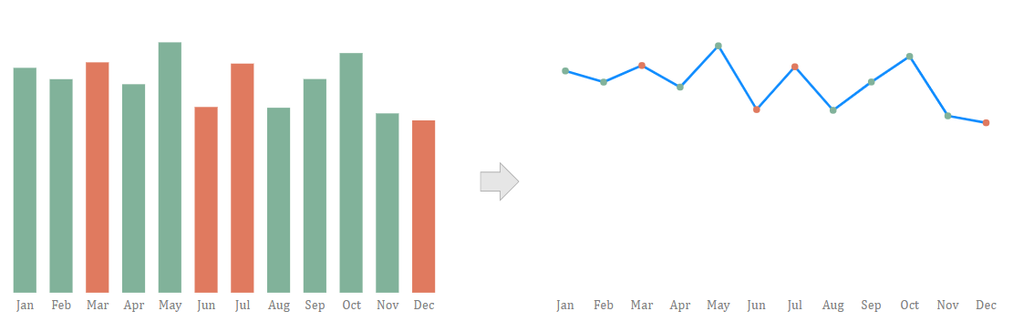 Converting conditionally formatted column chart to line chart
We begin by creating a measure for conditional formatting. This DAX measure will assign a red color to columns where actual profit is less than target profit, and a green color where it is greater.
CF_Actual vs. Target =
IF(
  [Actual Profit] > [Target Profit],
  "#81B29A",  -- Cambridge Blue
  "#E07A5F"   -- Burnt Sienna
)
After applying the conditional formatting measure to the column chart, simply change the chart type to line. The line chart markers will retain the conditional formatting from the column chart.
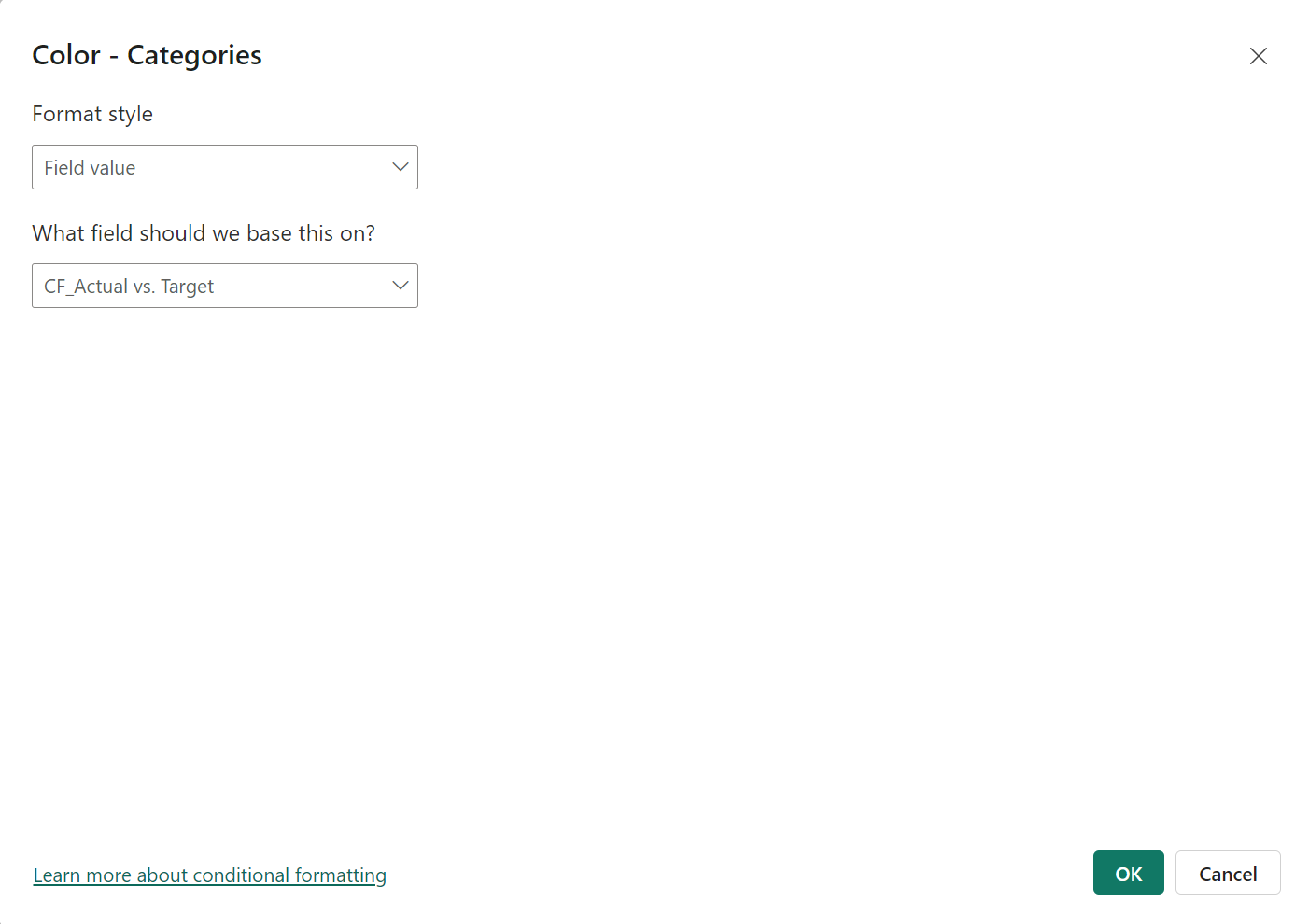 Applying conditional formatting to the column chart
After hiding the lines and adjusting the marker size, we need to add the lines connecting the markers to the horizontal axis. This can be achieved using error bars on the Actual Profit series, setting the actual profit as the upper bound and a baseline value as the lower bound. The baseline measure is provided below.
Baseline = 0Target profit lines can be displayed by setting the target profit as the upper bound and leaving the lower bound blank.
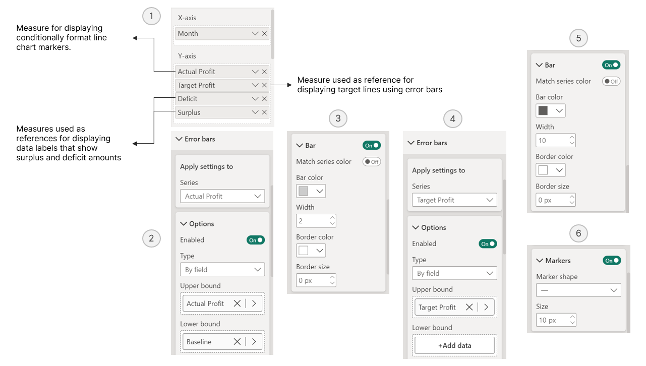 Lollipop Chart Configuration
How to Visualize Vertical Dumbbell Chart
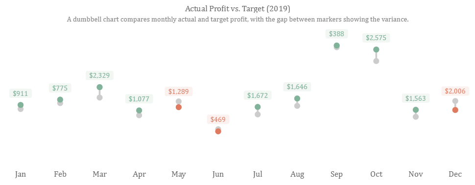 Visualizing a dumbbell chart using Power BI native visual
In a dumbbell chart, each data point is represented by a symbol, often a circle, positioned according to its quantitative value. These symbols are connected by a line, the length of which visually represents the difference between the two values. Typically, the categories or groups are displayed along one axis, while the quantitative values are plotted along the other.
Creating a dumbbell chart in Power BI is similar to creating a lollipop chart, with the key difference being how the connecting line (representing the “dumbbell”) is constructed using error bars. Instead of using a baseline and actual value for the lower and upper bounds of the error bars (as in a lollipop chart), a dumbbell chart uses the target value as the upper bound and the actual value as the lower bound (or vice versa). To complete the visual, ensure both the error bar lines and markers (dots) are displayed, and that the marker size matches the size of any other markers used in the chart.
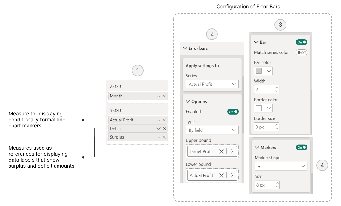 Dumbbell Chart Configuration