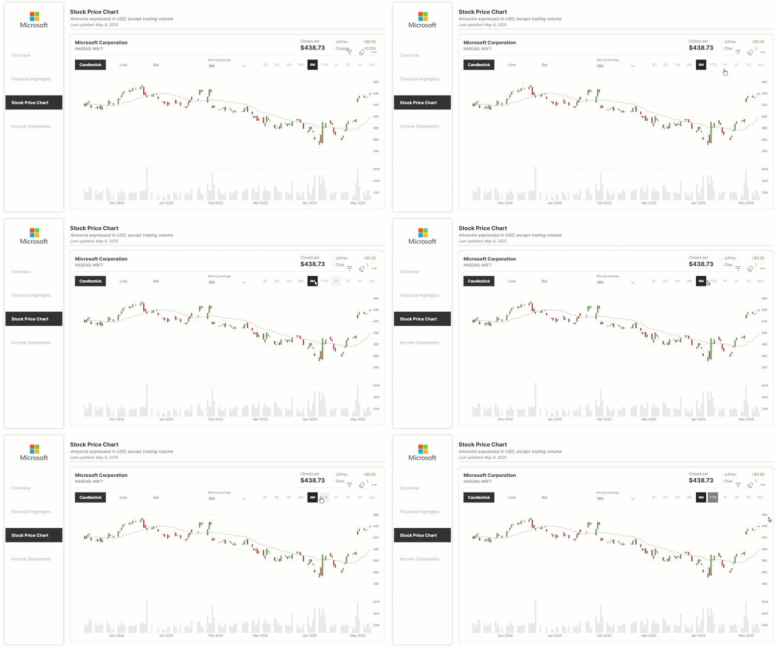
Foreword
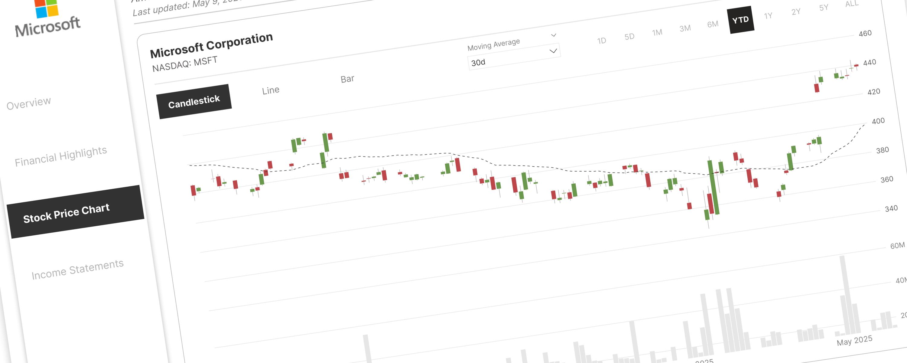
Understanding Candlestick Charts
Components of a candlestick
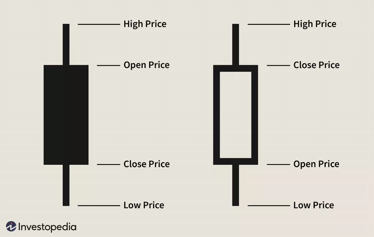 Credit: Investopedia / Julie Bang
Think of each candlestick as a data point summarizing price movement over a specific time. It's built from three key pieces:
The rest of this walkthrough is for members
You have read the problem. What is behind the paywall is the fix:
- The full step-by-step build, from measures to formatting
- Every DAX measure with the reasoning behind it
- The .pbix with the model already wired up
PowerLib Insideror $99 a year — two months free$9.99 / mo
Get accessAlready a member? Sign in with your email