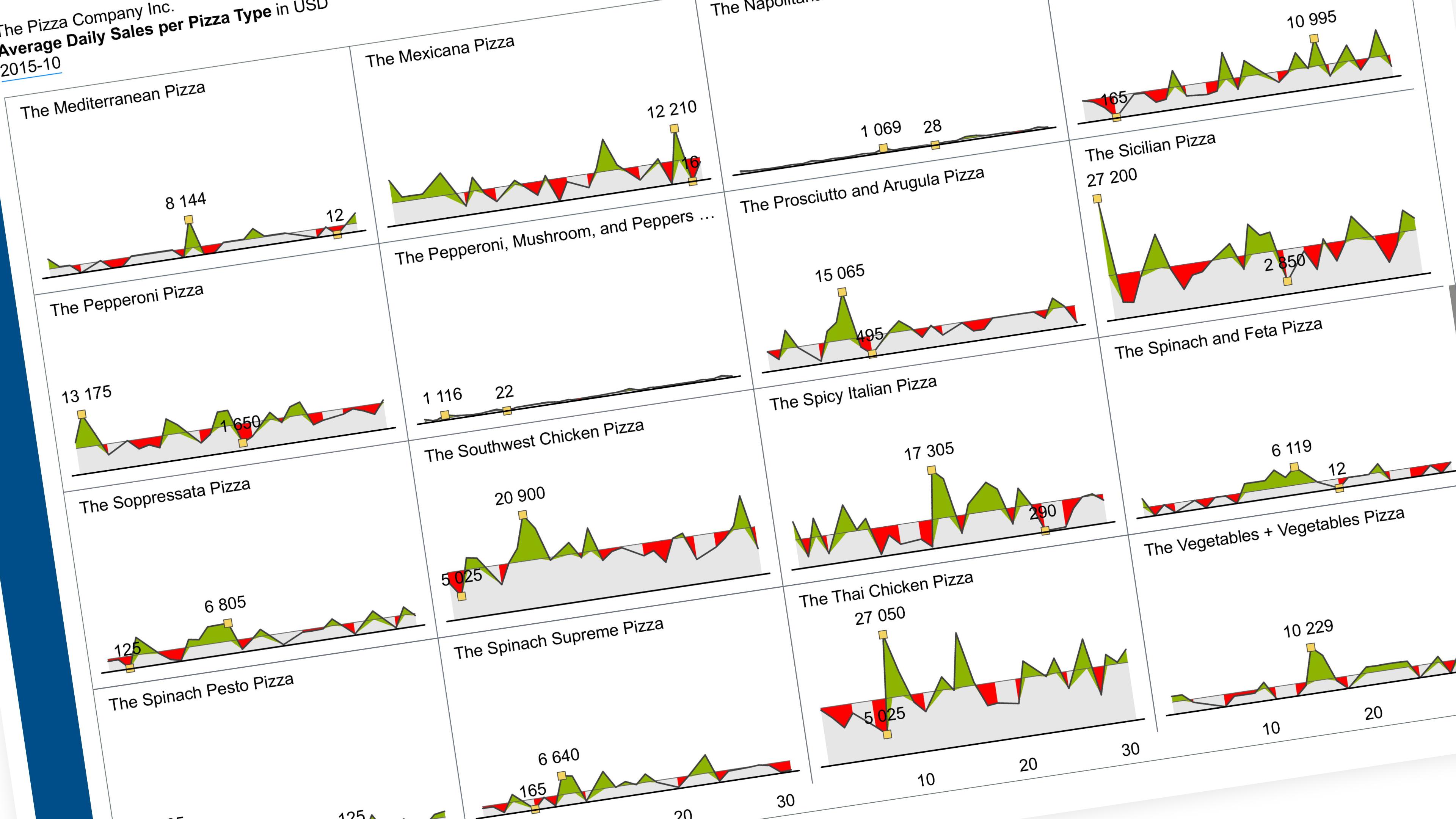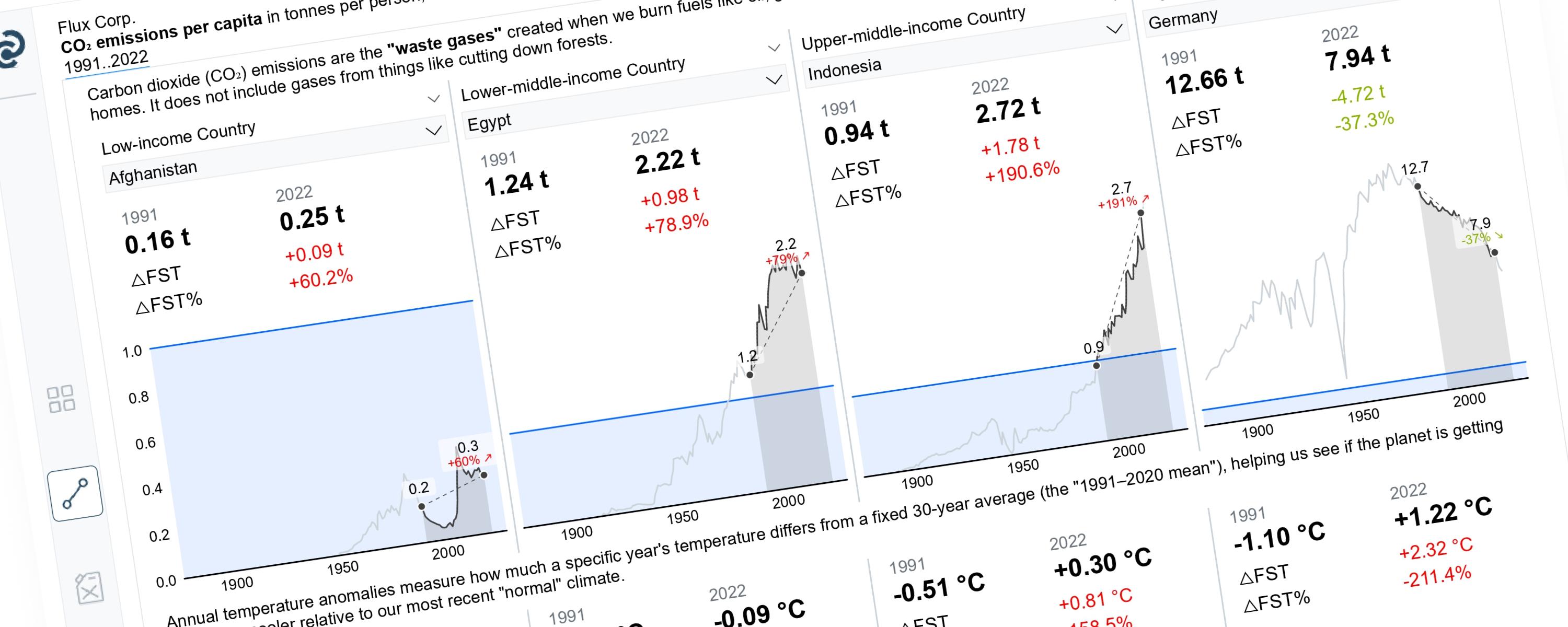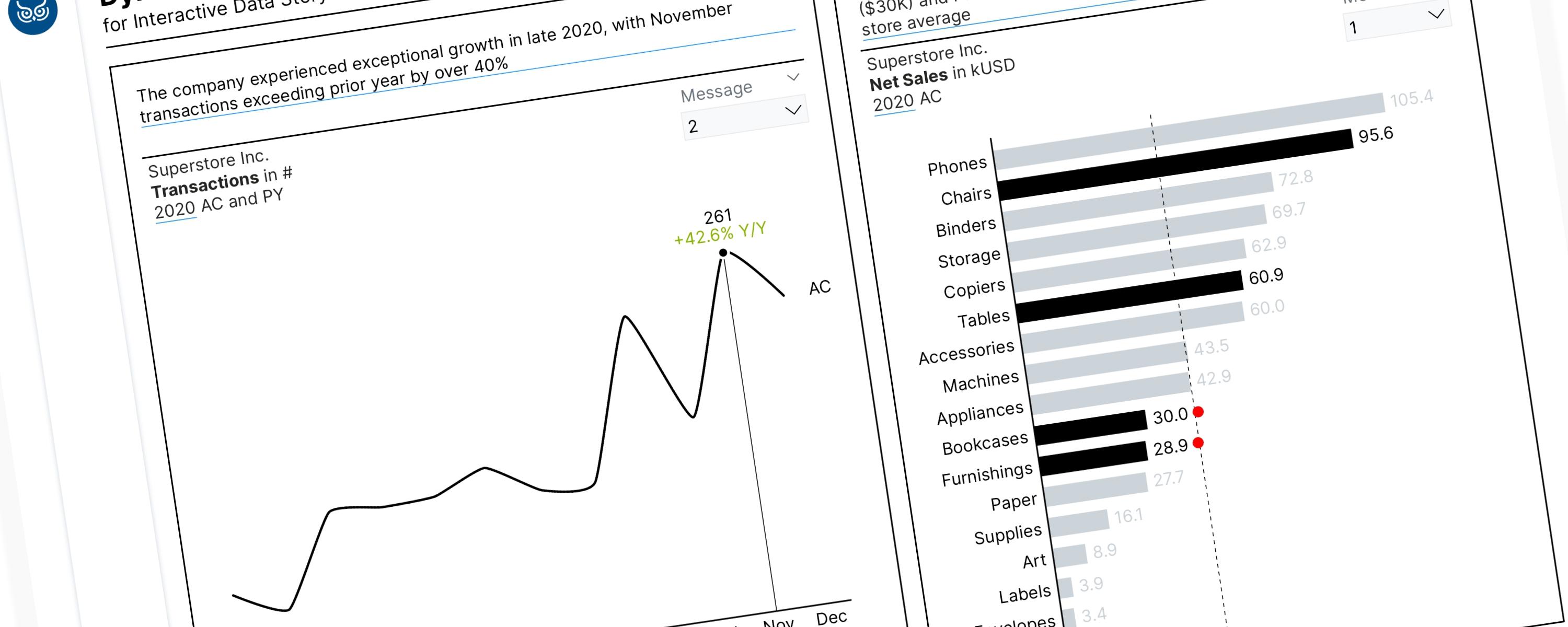
This article will guide you through the process of visually emphasizing key data points within a line chart. We will focus on highlighting the highest, lowest, first, and last values using markers and informative data labels.
Foreword
Documentation
Step 1: Constructing a Line Chart
Since markers alone only indicate single data points (highest and lowest values), the line is essential for visualizing the trend over time. To demonstrate this step-by-step, I’ll use a dataset from Maven Analytics, specifically the World Economic Indicators.
Let’s create a line chart with the date table (year) on the x-axis and the ‘Avg. Birth Rate’ and ‘Avg. Death Rate’ measures on the y-axis. For now, we’ll focus on just the line without the markers.
Measure #1 – DAX expression to calculate average birth rate:
Avg. Birth Rate = AVERAGE('Development Indicators'[Birth rate, crude (per 1,000 people)])Measure #2 – expression to calculate average death rate:
Avg. Death Rate = AVERAGE('Development Indicators'[Death rate, crude (per 1,000 people)])Step 2: Showing the Maximum and Minimum Values
Now let’s identify the peaks in our data by creating measures that spots the maximum values. This will highlight where birth and death rates hit their highest points over time.
Measure #3 – DAX expression to identify the year with the highest average birth rate:
Max_Avg. Birth Rate =
VAR max_val =
MAXX(
  ALL('Development Indicators'[Year]),
  [Avg. Birth Rate]
)
VAR check = IF(max_val = [Avg. Birth Rate], max_val, BLANK() )
RETURN
check
Measure #4 – DAX expression to identify the year with the highest average death rate:
Max_Avg. Death Rate =
VAR max_val =
MAXX(
  ALL('Development Indicators'[Year]),
  [Avg. Death Rate]
)
VAR check = IF(max_val = [Avg. Death Rate], max_val, BLANK() )
RETURN
check
Similarly, we will create new DAX measures to identify the years with the lowest average birth and death rates, respectively, for visualization on the line graph. Measure #5 – DAX expression to identify the year with the lowest average birth rate:
Min_Avg. Birth Rate =
VAR min_val =
MINX(
  ALL('Development Indicators'[Year]),
  [Avg. Birth Rate]
)
VAR check = IF(min_val = [Avg. Birth Rate], min_val, BLANK() )
RETURN
check
Measure #6 – DAX expression to identify the year with the lowest average death rate:
Min_Avg. Death Rate =
VAR min_val =
MINX(
  ALL('Development Indicators'[Year]),
  [Avg. Death Rate]
)
VAR check = IF(min_val = [Avg. Death Rate], min_val, BLANK() )
RETURN
check
Step 3: Showing the First and Last Values
Let’s create DAX measures that shows the average birth and death rates starting from the first year with available data. The measures will skip any years with missing values, ensuring our line graph only displays actual data points. Measure #7 – DAX expression to calculate the average birth rate for the first year where data exists:
First_Avg. Birth Rate =
VAR FirstNonBlankYear =
  CALCULATE(
      MIN('Development Indicators'[Year]),
      FILTER(
          ALL('Development Indicators'[Year]),
          NOT(ISBLANK([Avg. Birth Rate]))
      )
  )

VAR Result =
SWITCH(
  TRUE(),
  SELECTEDVALUE('Development Indicators'[Year]) = FirstNonBlankYear, [Avg. Birth Rate],
  BLANK()
)

RETURN
  Result
Measure #8 – DAX expression to calculate the average death rate for the first year where data exists:
First_Avg. Death Rate =
VAR FirstNonBlankYear =
  CALCULATE(
      MIN('Development Indicators'[Year]),
      FILTER(
          ALL('Development Indicators'[Year]),
          NOT(ISBLANK([Avg. Death Rate]))
      )
  )

VAR Result =
SWITCH(
  TRUE(),
  SELECTEDVALUE('Development Indicators'[Year]) = FirstNonBlankYear, [Avg. Death Rate],
  BLANK()
)

RETURN
  Result
Next, we will also create a new measure to display data from the average birth and death rates for the most recent year on the line graph, while ignoring years without data.
Measure #9 – DAX expression to calculate the average death rate for the last year where data exists:
Last_Avg. Birth Rate =
VAR LastNonBlankYear =
  CALCULATE(
      MAX('Development Indicators'[Year]),
      FILTER(
          ALL('Development Indicators'[Year]),
          NOT(ISBLANK([Avg. Birth Rate]))
      )
  )

VAR Result =
SWITCH(
  TRUE(),
  SELECTEDVALUE('Development Indicators'[Year]) = LastNonBlankYear, [Avg. Birth Rate],
  BLANK()
)

RETURN
Measure #10 – DAX expression to calculate the average birth rate for the last year where data exists:
Last_Avg. Death Rate =
VAR LastNonBlankYear =
  CALCULATE(
      MAX('Development Indicators'[Year]),
      FILTER(
          ALL('Development Indicators'[Year]),
          NOT(ISBLANK([Avg. Death Rate]))
      )
  )

VAR Result =
SWITCH(
  TRUE(),
  SELECTEDVALUE('Development Indicators'[Year]) = LastNonBlankYear, [Avg. Death Rate],
  BLANK()
)

RETURN
  Result
Step 4: Applying Conditional Formatting for Data Label
In some cases, the peak or minimum average birth or death rates coincide precisely with the values from the first or last year in the dataset. This can lead to overlapping data labels in a single point on the graph, creating visual clutter. To improve the graph’s readability, we’ll implement a formatting strategy: when the maximum or minimum values match the initial or final data points, we’ll render the labels transparent, effectively hiding them from view.
Measure #11 – DAX expression to dynamically adjust the font color based on the following condition: If the minimum average birth rate is equal to the average birth rate of the first or last year in the dataset, the font color will be transparent. Otherwise, the font color will be dark gray.
CF_Min Avg. Birth Rate =
IF(
  [Min_Avg. Birth Rate] = [First_Avg. Birth Rate] || [Min_Avg. Birth Rate] = [Last_Avg. Birth Rate],
  "#FFFFFF00",  -- Transparent effect (white with alpha for full transparency)
  "#666666"     -- Highlight color (dark grayish)
)
Measure #12 – DAX expression to dynamically adjust the font color based on the following condition: If the minimum average death rate is equal to the average death rate of the first or last year in the dataset, the font color will be transparent. Otherwise, the font color will be dark gray.
CF_Min Avg. Death Rate =
IF(
  [Min_Avg. Death Rate] = [First_Avg. Death Rate] || [Min_Avg. Death Rate] = [Last_Avg. Death Rate],
  "#FFFFFF00",  -- Transparent effect (white with alpha for full transparency)
  "#666666"     -- Highlight color (dark grayish)
)
Measure #13 – DAX expression to dynamically adjust the font color based on the following condition: If the maximum average birth rate is equal to the average birth rate of the first or last year in the dataset, the font color will be transparent. Otherwise, the font color will be dark gray.
CF_Max Avg. Birth Rate =
IF(
  [Max_Avg. Birth Rate] = [First_Avg. Birth Rate] || [Max_Avg. Birth Rate] = [Last_Avg. Birth Rate],
  "#FFFFFF00",  -- Transparent effect (white with alpha for full transparency)
  "#666666"     -- Highlight color (dark grayish)
)
Measure #14 – DAX expression to dynamically adjust the font color based on the following condition: If the maximum average death rate is equal to the average death rate of the first or last year in the dataset, the font color will be transparent. Otherwise, the font color will be dark gray.
CF_Max Avg. Death Rate =
IF(
  [Max_Avg. Death Rate] = [First_Avg. Death Rate] || [Max_Avg. Death Rate] = [Last_Avg. Death Rate],
  "#FFFFFF00",  -- Transparent effect (white with alpha for full transparency)
  "#666666"     -- Highlight color (dark grayish)
)
Step 5 (Optional): Displaying Data Labels on Min, Max, First, and Last Values Dynamically
After creating all the necessary calculations, the next steps are:
-
Create Line Graph: Place all the above calculations on the Y-axis of the line graph.
-
Determine Colors: Use green to represent birth rates and red to represent death rates.
-
Mark Important Points: Mark the first year (First_Avg. Birth Rate, First_Avg. Death Rate), last year (Last_Avg. Birth Rate & Last_Avg. Death Rate), highest values (Max_Avg. Birth Rate & Max_Avg. Death Rate), and lowest values (Min_Avg. Birth Rate & Min_Avg. Death Rate) with markers on the graph. Add data labels to each point to show their values.
-
Add Series Labels: Display the labels “Avg. Birth Rate” and “Avg. Death Rate” to the right of their respective lines.
-
Format Data Labels: Configure the data labels for the highest and lowest values (Max_Avg. Death Rate, Max_Avg. Birth Rate, Min_Avg. Death Rate & Min_Avg. Birth Rate) to only appear if they do not overlap with the first or last year data (First_Avg. Death Rate, First_Avg. Birth Rate, Last_Avg. Birth Rate, Last_Avg. Death Rate). If overlap occurs, make these labels transparent using the calculations created in section 4 (CF_Min. Avg Birth Rate, CF_Max. Avg Death Rate, CF_Min. Avg Birth Rate, CF_Max. Avg Death Rate).
Part 6 (Optional): Dynamically Adding Text to Indicate Highest, Lowest, First, and Last Values
To enhance data interpretation, we can incorporate informative text labels to highlight key data points. Specifically, we will label:
-
Peak: Points representing the highest average birth and death rates.
-
Trough: Points representing the lowest average birth and death rates.
-
Start: The data point corresponding to the average birth and death rates for the earliest year with available data.
-
End: The data point corresponding to the average birth and death rates for the latest year with available data.
It’s crucial to handle potential missing values at the beginning or end of the data series. To ensure consistent text display, we will utilize DAX measures that dynamically determine and label only those data points where actual values exist.
Measure #15: DAX expression to dynamically display the text ‘Start’ as a label for the data point representing the average birth rate of the first year.
Earliest Year_Avg. Birth Rate_Detail Label =
VAR FirstNonBlankYear =
  CALCULATE(
      MIN('Development Indicators'[Year]),  -- Get the earliest year for the selected country
      FILTER(
          'Development Indicators',  -- Keep the country filter context
          NOT(ISBLANK([Avg. Birth Rate]))  -- Ensure the value is not blank
      )
  )

VAR Result =
IF(
  SELECTEDVALUE('Development Indicators'[Year]) = FirstNonBlankYear && NOT(ISBLANK([Avg. Birth Rate])),
  "Start",
  BLANK()
)

RETURN
  Result
Measure #16: DAX expression to dynamically display the text ‘Start’ as a label for the data point representing the average death rate of the first year.
Earliest Year_Avg. Death Rate_Detail Label =
VAR FirstNonBlankYear =
  CALCULATE(
      MIN('Development Indicators'[Year]),  -- Get the earliest year for the selected country or region
      FILTER(
          'Development Indicators',  -- Keep the country or region filter context
          NOT(ISBLANK([Avg. Death Rate]))  -- Ensure the value is not blank
      )
  )

VAR Result =
IF(
  SELECTEDVALUE('Development Indicators'[Year]) = FirstNonBlankYear && NOT(ISBLANK([Avg. Death Rate])),
  "Start",
  BLANK()
)

RETURN
  Result
Measure #17: DAX expression to dynamically display the text ‘End’ as a label for the data point representing the average birth rate of the last year.
Latest Year_Avg. Birth Rate_Detail Label =
VAR LastNonBlankYear =
  CALCULATE(
      MAX('Development Indicators'[Year]),  -- Get the latest year for the selected country
      FILTER(
          'Development Indicators',  -- Keep the country filter context
          NOT(ISBLANK([Avg. Birth Rate]))  -- Ensure the value is not blank
      )
  )

VAR Result =
IF(
  SELECTEDVALUE('Development Indicators'[Year]) = LastNonBlankYear && NOT(ISBLANK([Avg. Birth Rate])),
  "End",
  BLANK()
)

RETURN
  Result
Measure #18: DAX expression to dynamically display the text ‘End’ as a label for the data point representing the average death rate of the last year.
Latest Year_Avg. Death Rate_Detail Label =
VAR LastNonBlankYear =
  CALCULATE(
      MAX('Development Indicators'[Year]),  -- Get the latest year for the selected country
      FILTER(
          'Development Indicators',  -- Keep the country filter context
          NOT(ISBLANK([Avg. Death Rate]))  -- Ensure the value is not blank
      )
  )

VAR Result =
IF(
  SELECTEDVALUE('Development Indicators'[Year]) = LastNonBlankYear && NOT(ISBLANK([Avg. Death Rate])),
  "End",
  BLANK()
)

RETURN
  Result
Measure #19: DAX expression to dynamically display the text ‘Peak’ as a label for the data point representing the highest average birth rate.
Highest Avg. Birth Rate_Detail Label =
IF(
  MAXX(
  ALL('Development Indicators'[Year]),
  [Avg. Birth Rate]),
  "Peak",
  BLANK()
)
Measure #20: DAX expression to dynamically display the text ‘Peak’ as a label for the data point representing the highest average death rate.
Highest Avg. Death Rate_Detail Label =
IF(
  MAXX(
  ALL('Development Indicators'[Year]),
  [Avg. Death Rate]),
  "Peak",
  BLANK()
)
Measure #21: DAX expression to dynamically display the text ‘Trough’ as a label for the data point representing the lowest average birth rate.
Lowest Avg. Birth Rate_Detail Label =
IF(
  MINX(
  ALL('Development Indicators'[Year]),
  [Avg. Birth Rate]),
  "Trough",
  BLANK()
)
Measure #22: DAX expression to dynamically display the text ‘Trough’ as a label for the data point representing the lowest average death rate.
Lowest Avg. Death Rate_Detail Label =
IF(
  MINX(
  ALL('Development Indicators'[Year]),
  [Avg. Death Rate]),
  "Trough",
  BLANK()
)
Part 7: Displaying Error Bars in a Line Chart
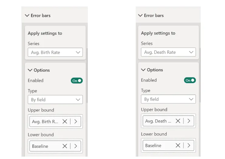
Error bars on a line chart help viewers see how uncertain or variable the data points are. They show the possible range of values around each point, making it easier to understand the reliability of the trend. When two lines have overlapping error bars, it helps viewers compare how the data might be changing and whether the differences between the lines are truly significant.
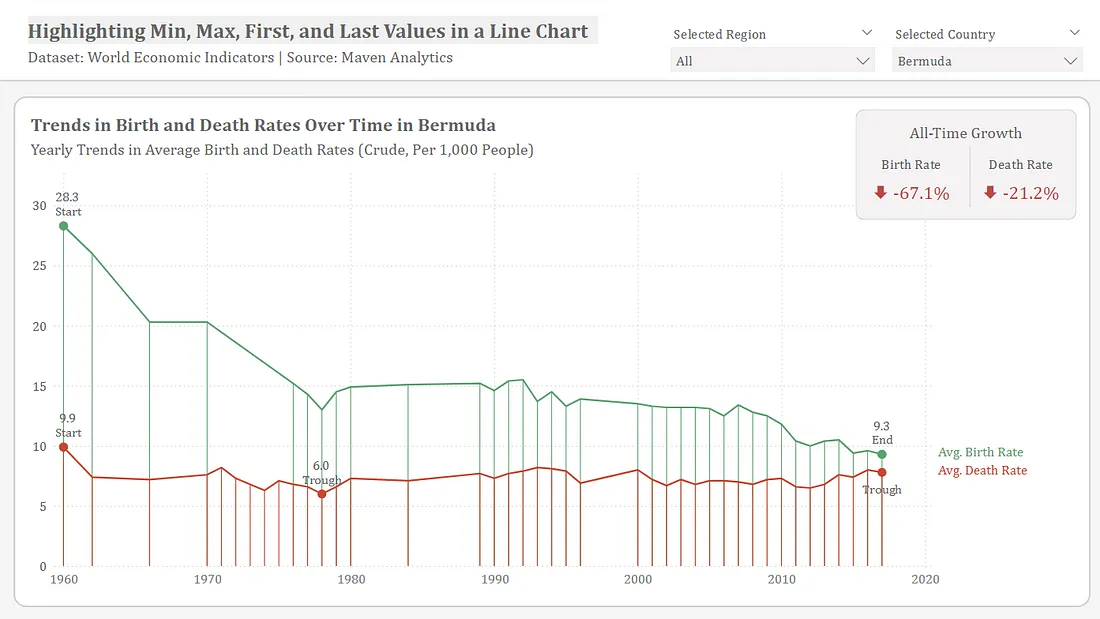
To create error bars, we need to define two boundary values: a lower limit and an upper limit. For the lower limit, we’ll establish a baseline at zero on the y-axis, ensuring the bars start from this point. The upper limit will be determined by calculating the average death rate and birth rate for each line, which helps represent the potential variability in the data. Measure #23: DAX expression to create baseline.
Baseline = 0