Metric/KPIFree
Creating a Dynamic Customer Pareto Dashboard (First Version)
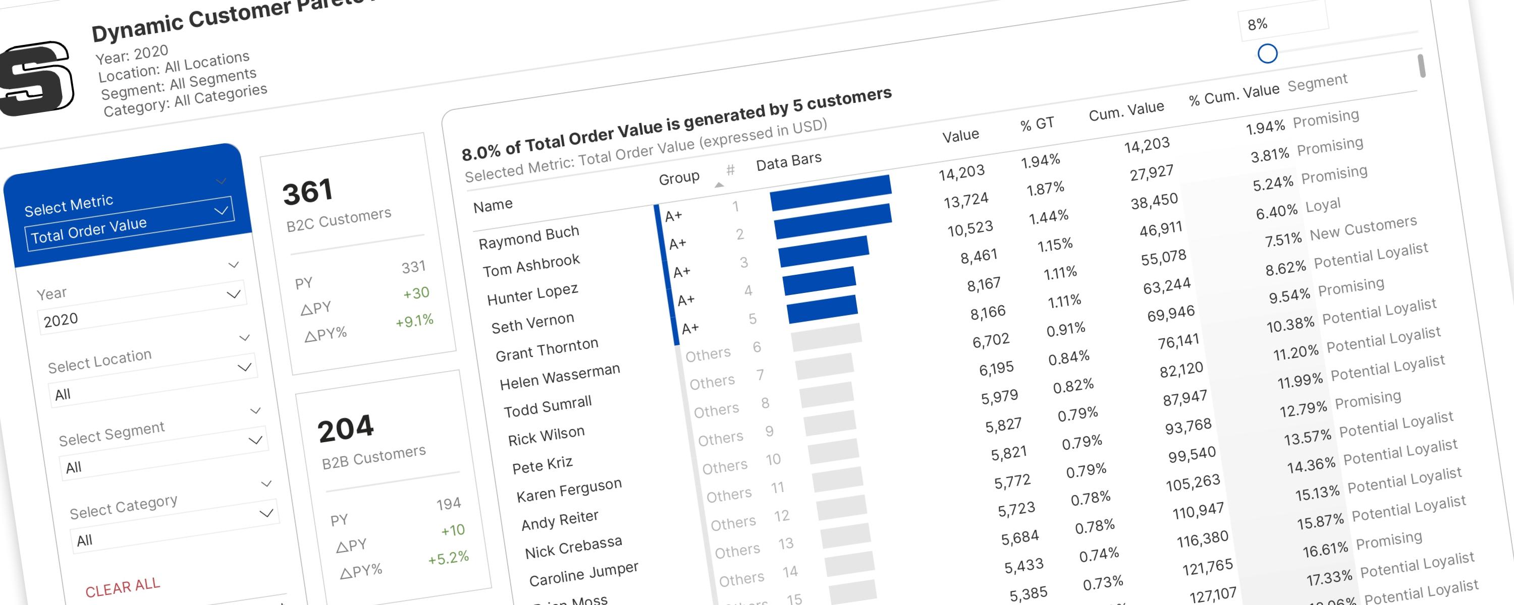
This documentation provides a step-by-step approach to building the first version of the one-for-all customer Pareto analysis dashboard.
26 October 202517 min read
Documented Power BI techniques — the model change, the DAX, and the exact visual settings. Most are free to read; the rest come with the model files for members.
Metric/KPIFree
This documentation provides a step-by-step approach to building the first version of the one-for-all customer Pareto analysis dashboard.
Metric/KPIFree
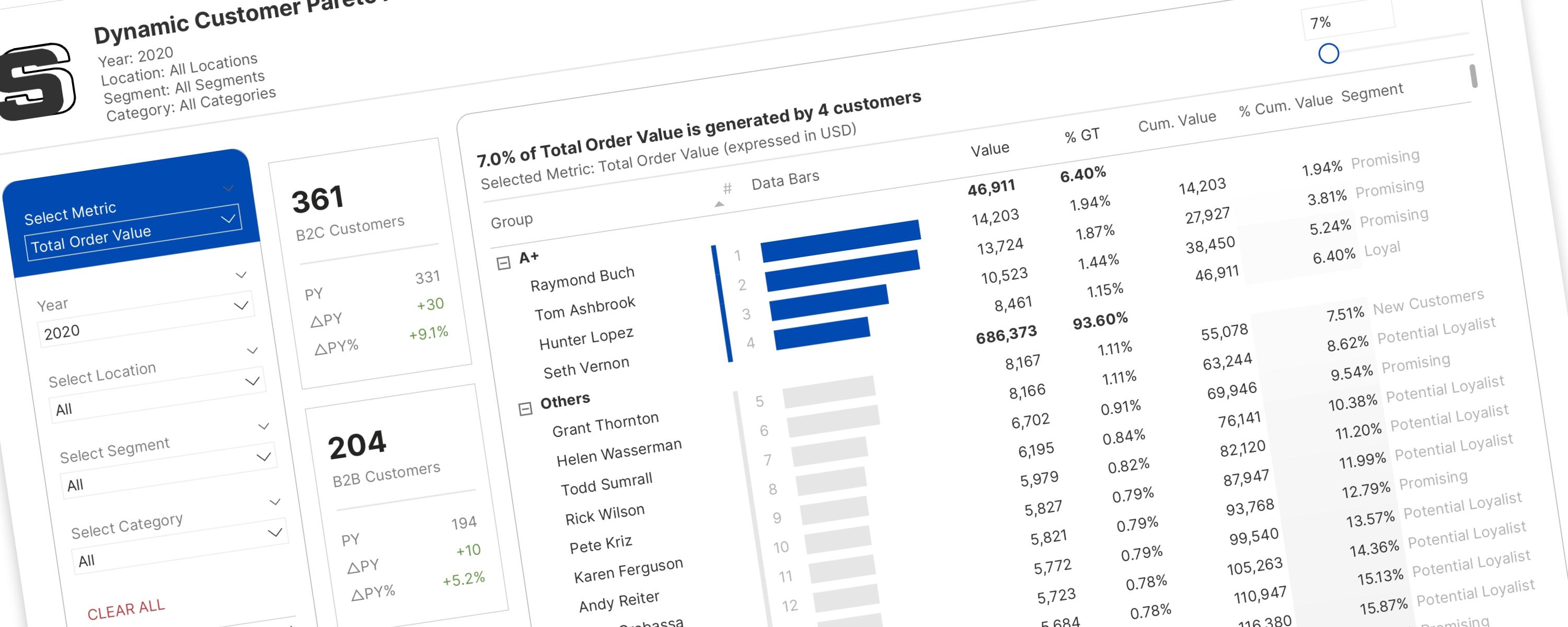
Imagine you have a big pile of something – let's say, 100 colorful building blocks.
Metric/KPIFree
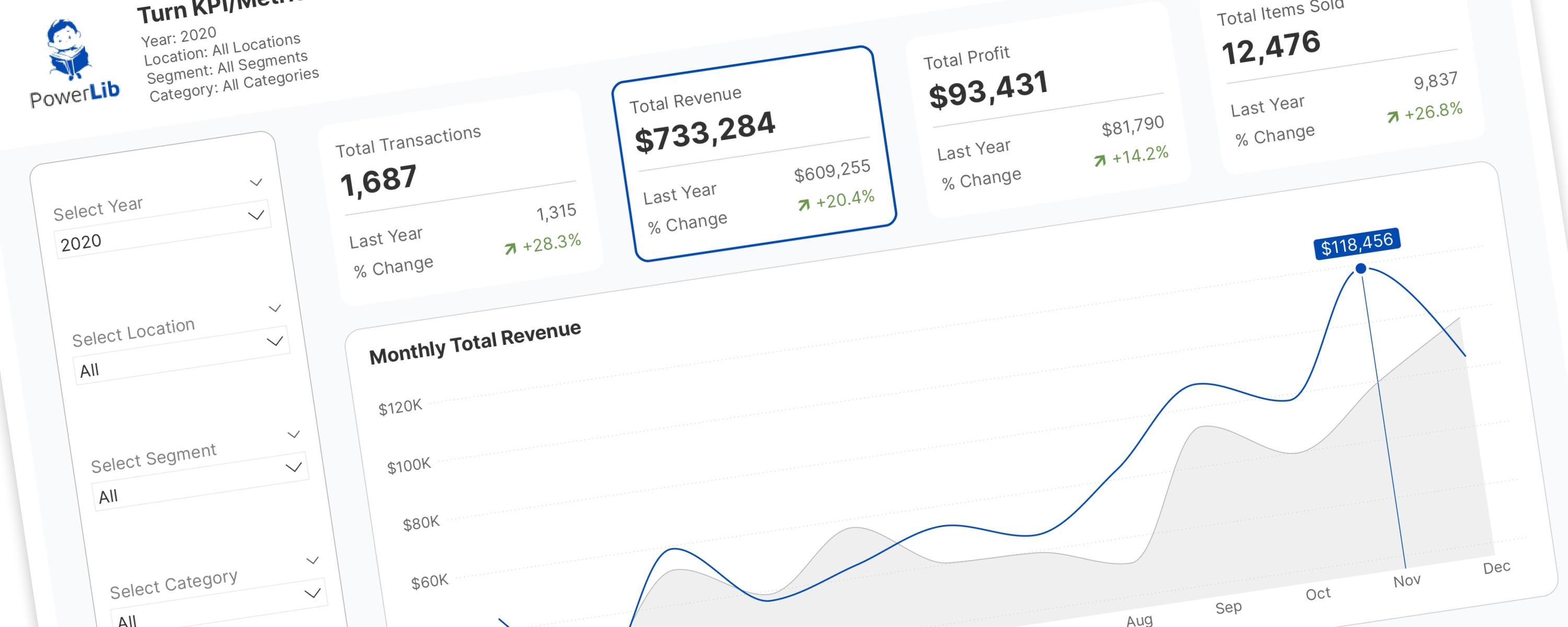
In the world of Power BI, Key Performance Indicator (KPI) and metric cards are essential.
BarFree
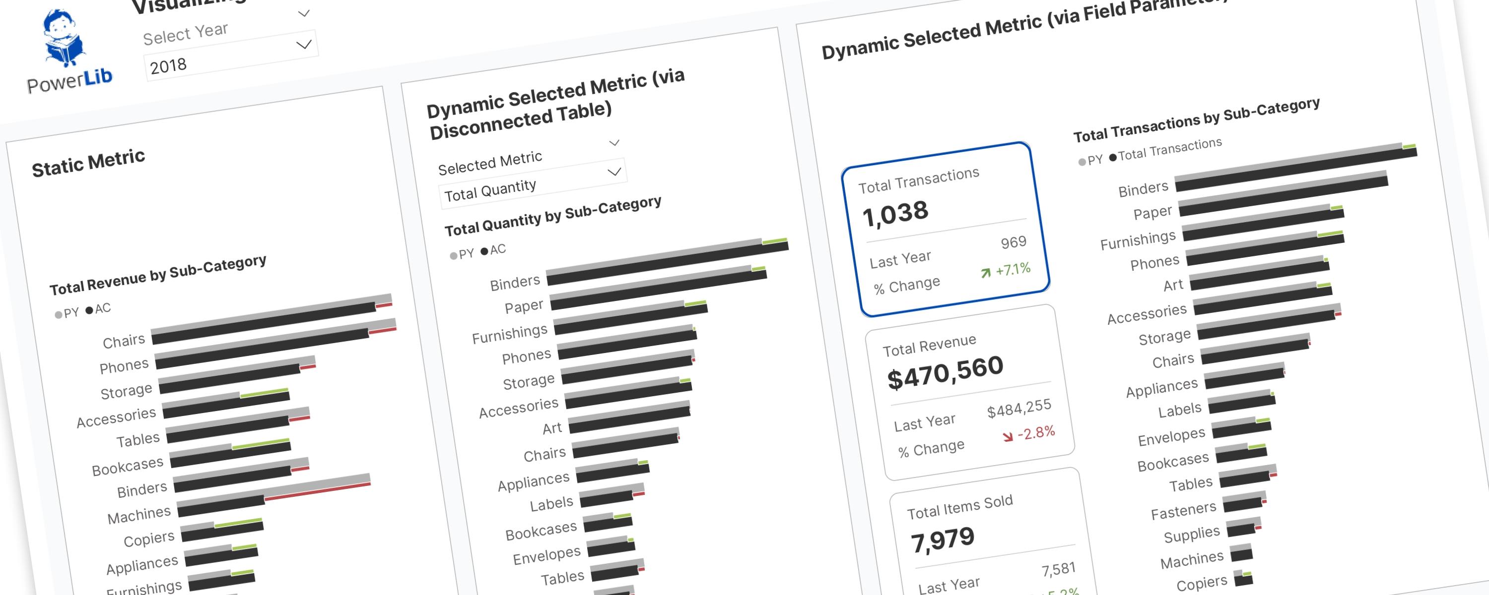
RETURN SWITCH( SelectedMetric, "Total Transactions", "Total Transactions by Sub-Category", "Total Revenue", "Total Revenue by Sub-Category", "Total Quantity", "Total Quantity by…
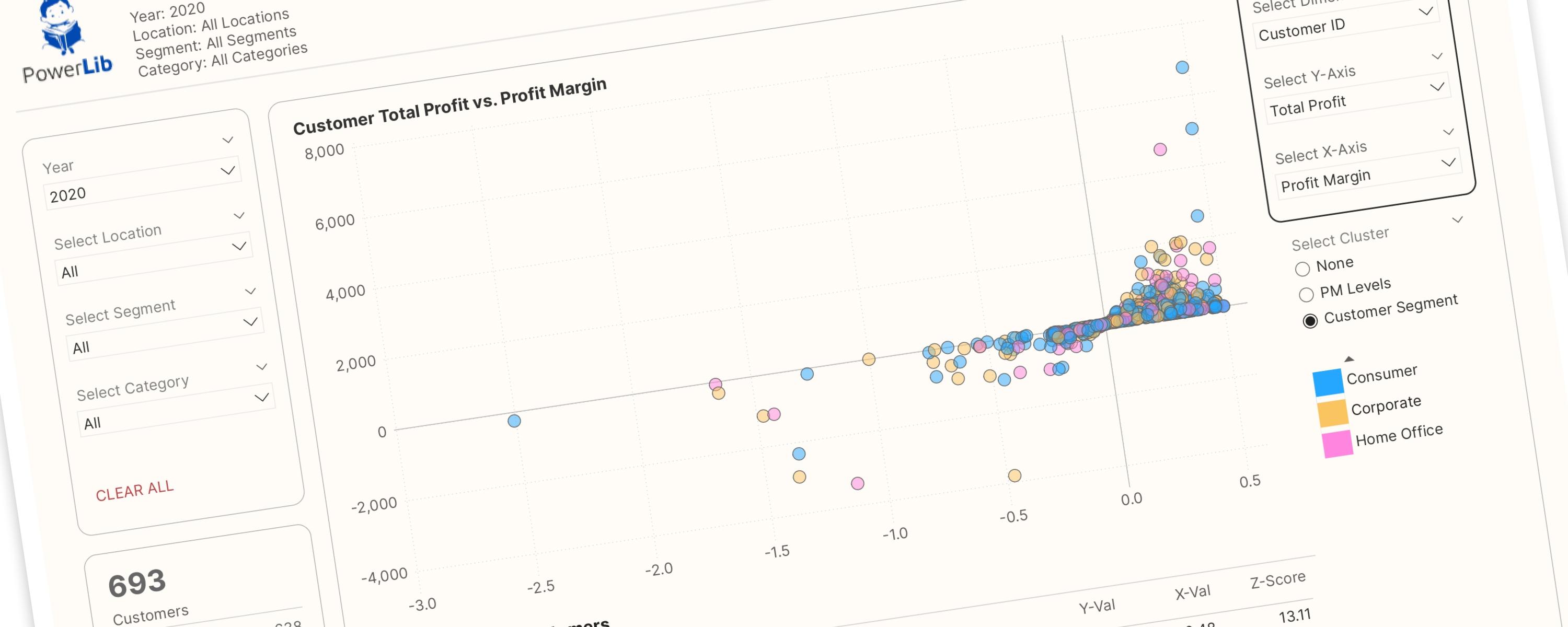
Scatter PlotMember-Only
This interactive scatter plot is designed to empower users to interactively explore relationships between different dimensions and metrics. Key features include:
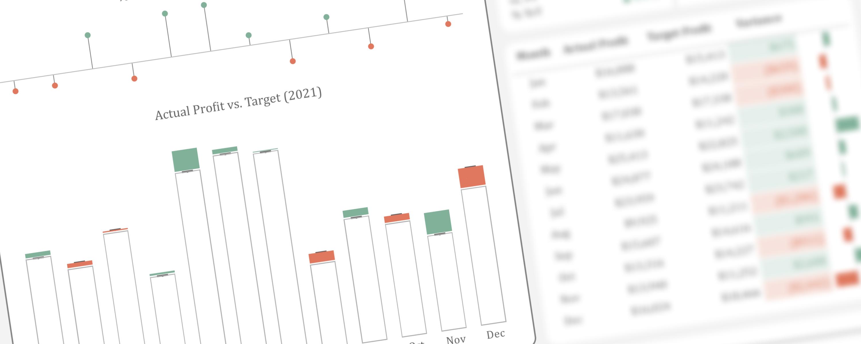
ColumnFree
This article presents an alternative method for visualizing actual performance against target values.
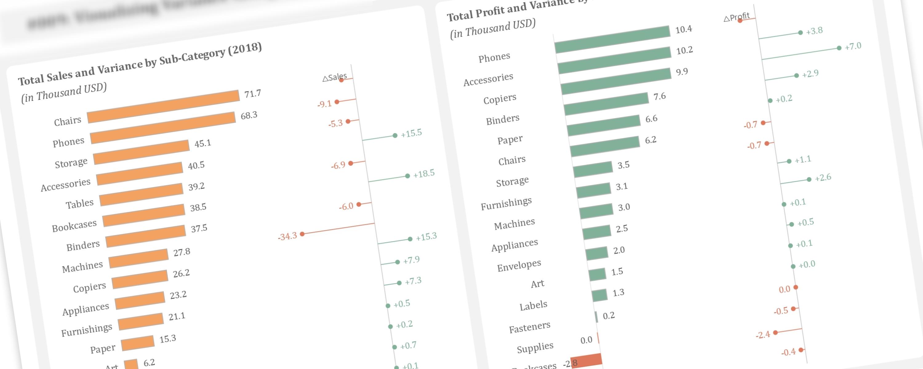
BarFree
This article demonstrates how to create additional lollipop charts alongside bar charts to visualize year-over-year variance, a technique inspired by Bas Dohmen.
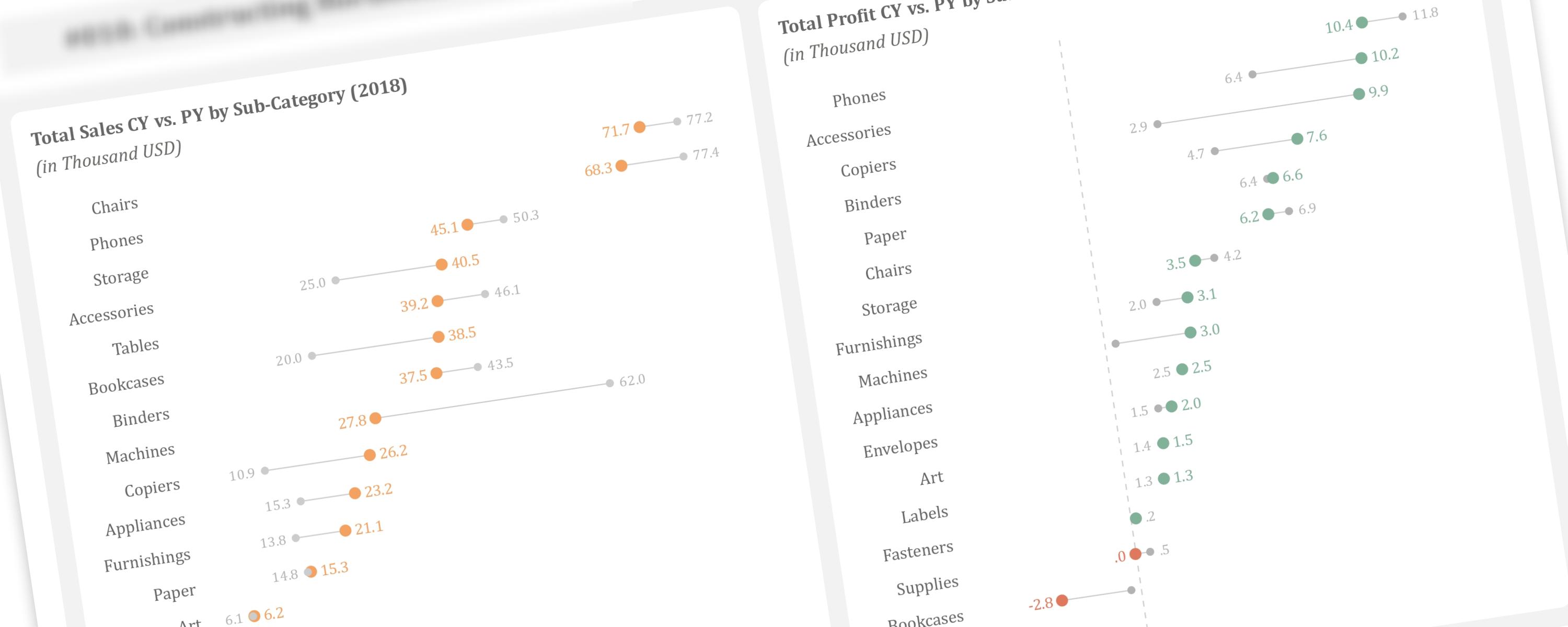
BarFree
In the previous article, we discussed creating vertical dumbbell plots using line markers and error bars.
ColumnFree
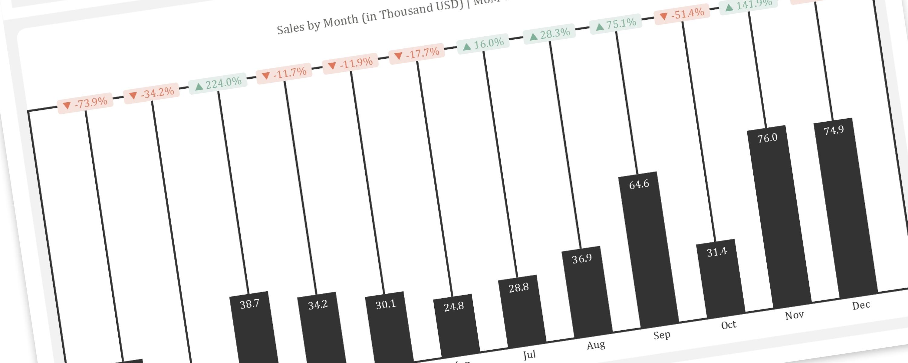
This article provides a step-by-step guide to replicating the “Piano” or “Delta” chart, a creative visualization for showing changes between two points in time, within Power BI.