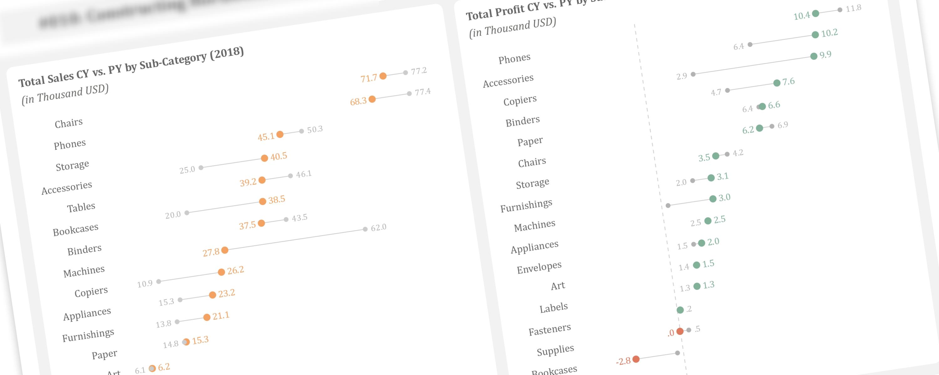
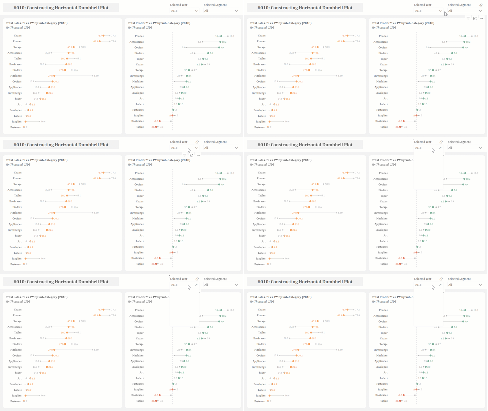
In the previous article, we discussed creating vertical dumbbell plots using line markers and error bars. This article demonstrates how to create horizontal dumbbell plots using bar charts and error bars. Credit to Bas Dohmen for the video tutorial.
Use Cases
Limitations
Creating dumbbell plots in Power BI comes with specific challenges around data labels. These charts show two data points connected by a line, like a dumbbell shape, with labels typically appearing at both ends. One common issue occurs when working with large numbers like $1,234 or $12,345 – the labels can get cut off or disappear completely. Fortunately, we can solve this by adjusting the format settings to show the values in a more compact way.
Furthermore, dumbbell plots may look simple, but they need several different measures to work properly. Don’t worry though – I’ll guide you through the process step by step to help you build these charts confidently and efficiently.
To demonstrate these concepts, we’ll walk through a practical example: creating a dumbbell chart that shows how profit changed between years for different product sub-categories. This example will show you both the technical steps and how to make your visualization clear and professional.
Documentation
Step 1: Defining the Required Measures
Let’s begin by creating a clustered bar chart showing total profit for each sub-category. This will serve as our foundation for building the dumbbell plot. First, we need to define the measure for calculating total profit:
#01 Measure: [Total Profit]
Total Profit = SUM('Sample - Superstore_Orders'[Profit]Arrange your data by sorting the bars from highest to lowest total sales. This will make the profit trends easier to understand at a glance.
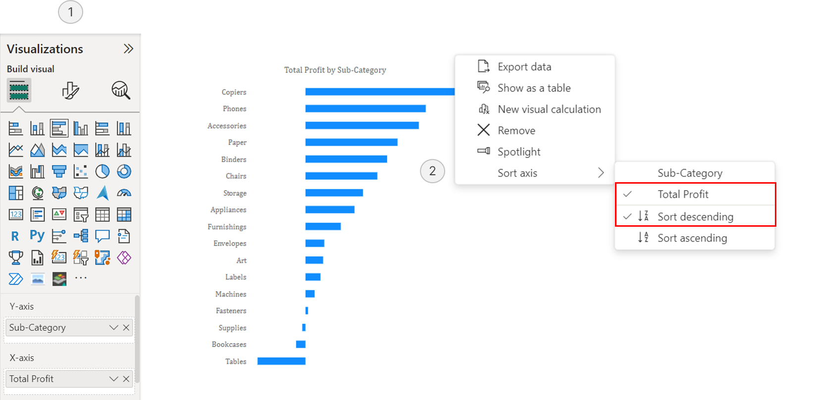 Visualizing Sub-Category Profitability with a Bar Chart
Since we want to compare profits across years, we need to create several measures.
Previous Year’s Total Profit Measure: This measure calculates how much profit each sub-category made in the previous year, serving as our baseline for comparison.
#02 Measure: [Total Profit PY]
Total Profit PY =
CALCULATE(
  SUM('Sample - Superstore_Orders'[Profit]),
  SAMEPERIODLASTYEAR(DimDate[Date])
)
Variance Measure: This measure calculates the difference between current and previous year’s profit, which will create the connecting line in our dumbbell chart.
#03 Measure: [Total Profit CY vs. PY]
Total Profit CY vs PY =
[Total Profit] - [Total Profit PY]
Note: The dots representing positive and negative values have distinct colors. To further differentiate dots where the current year’s value is above or below the previous year’s, we need two separate measures for [Total Profit]: one for when it’s greater than [Total Profit PY] and one for when it’s lower.
Negative Profit Measure: This DAX measure will only display profit values that are below zero, helping us identify loss-making sub-categories.
#04 Measure: [Negative_Total Profit]
Positive_Total Profit =
IF(
  [Total Profit] > 0,
  [Total Profit]
)
Positive Profit Measure: This DAX measure will only show profit values that are above zero, highlighting profitable sub-categories.
#05 Measure: [Positive_Total Profit]
Negative_Total Profit =
IF(
  [Total Profit] < 0,
  [Total Profit]
)
Now that we have all our measures, place them on the x-axis with sub-categories on the y-axis. The final step is to adjust the layout: set the bars to transparent, overlap the bars and enable the flip overlap option. This will align everything properly and ensure the “Total Profit” tooltip appears when you hover over the chart.
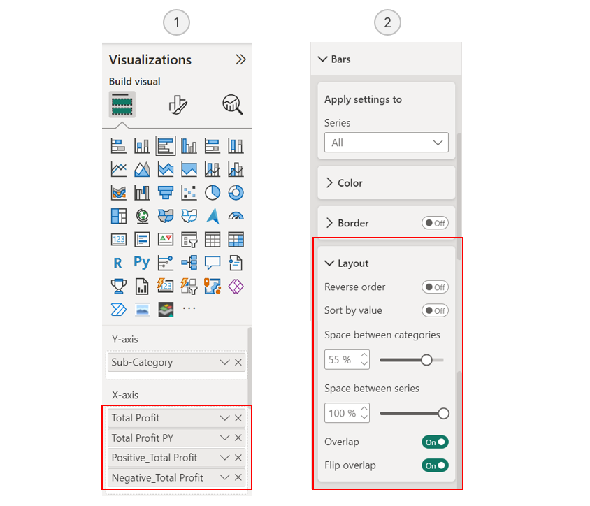 Configuring the Bar Chart
Step 2: Building the Dumbbell Plot Points
Now we’ll create the endpoints of our dumbbell chart by using error bars to show this year’s and last year’s sales.
To represent current year sales with dots, we’ll use error bars for both [Positive_Total Profit] and [Negative_Total Profit]. This allows us to show increases and decreases in different colors. If you prefer all dots to be the same color, you can simply use the [Total Profit] measure instead (similar to what I did in the total sales by sub-category dumbbell plot).
The points in a dumbbell chart are crucial visual elements that instantly show where values start and end. Using different colors for increases and decreases helps readers quickly identify trends.
Step 2.1: Setting Up Dots for Current Year’s Profits and Losses
To create distinct dots for current year’s profits, we’ll set up two different error bar configurations. For profits or positive values, start by enabling error bars for the [Positive_Total Profit] measure and apply this same measure to both the upper and lower bounds. Then, assign a color that represents growth – I chose a green shade (#81B29A), but you can select any color that fits your design preferences. For losses or negative values, follow the same process with the [Negative_Total Profit] measure, again using it for both upper and lower bounds of the error bars. In this case, choose a contrasting color that clearly indicates decline – I used a red shade (#E07A5F) to make loses instantly recognizable.
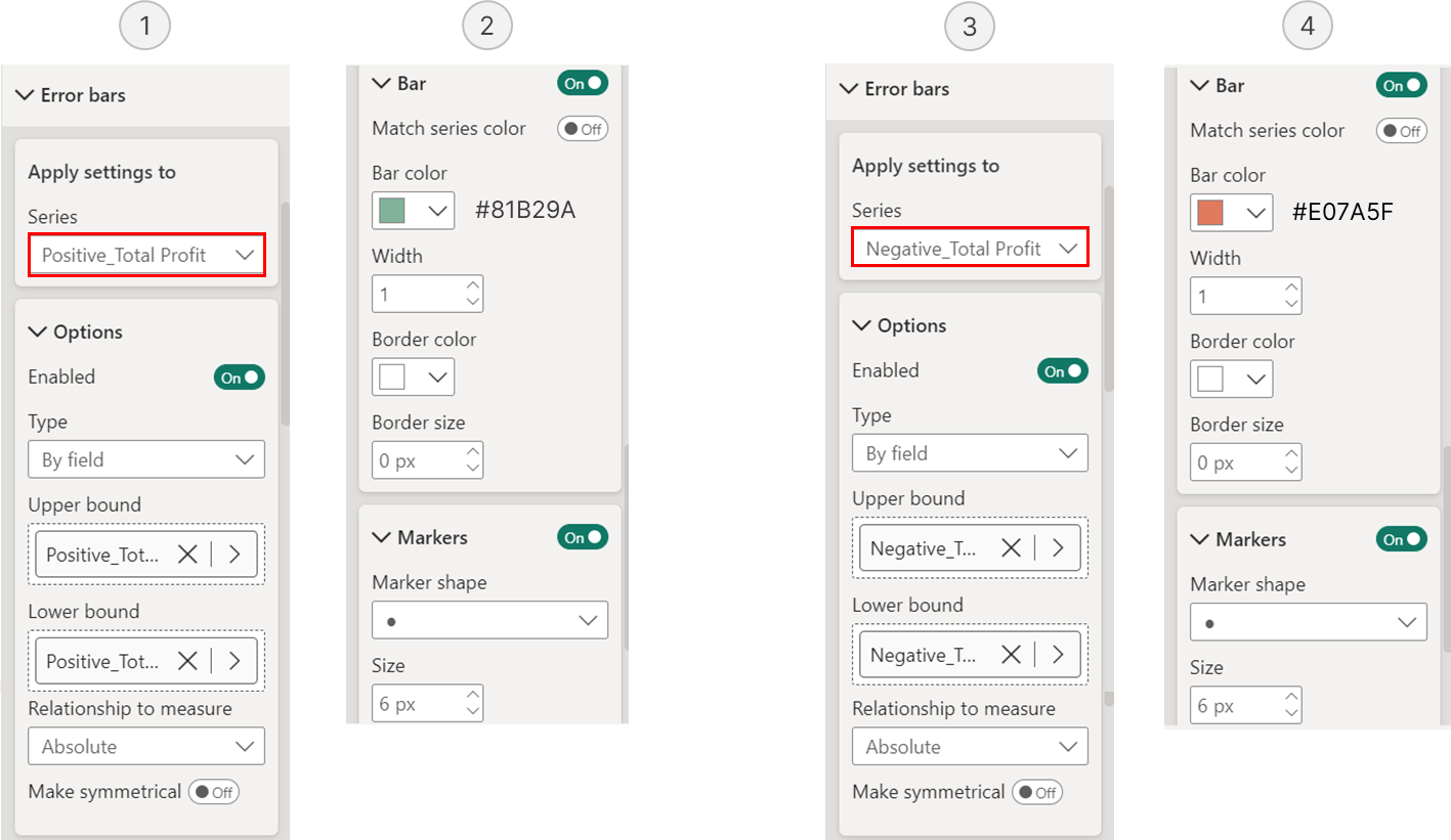
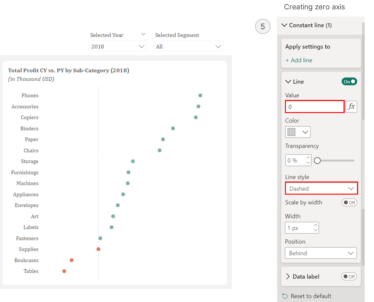 Setting Up Dots for CY Profit
Step 2.2: Setting Up Dots for Previous Year’s Profits
To display the previous year’s profits, we’ll create another set of dots using error bars. First, enable error bars for the [Total Profit PY] measure and use this same measure for both the upper and lower bounds. Set the measurement type to relative, and format the dots in grey to distinguish them from the current year’s values.
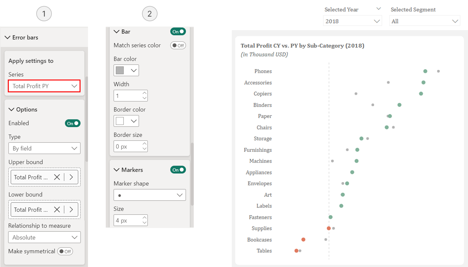 Setting Up Dots for PY Profit
Step 2.3: Adding Connector Lines Between Data Points
The lines connecting our data points are actually error bars without visible markers. While we need the [Total Profit PY] measure as a reference point, we can’t use it directly since we’ve already used its error bars to create the previous year’s dots. Instead, let’s create a duplicate measure called [Total Profit PY Dummy] and place it on the x-axis.
Total Profit PY Dummy = [Total Profit PY]Next, set the bars to transparent, enable error bars for this [Total Profit PY Dummy] measure and set the [Total Profit CY vs. PY] measure as the upper bound. To create clean connector lines, simply hide the markers – this will leave us with just the lines connecting our profit dots.
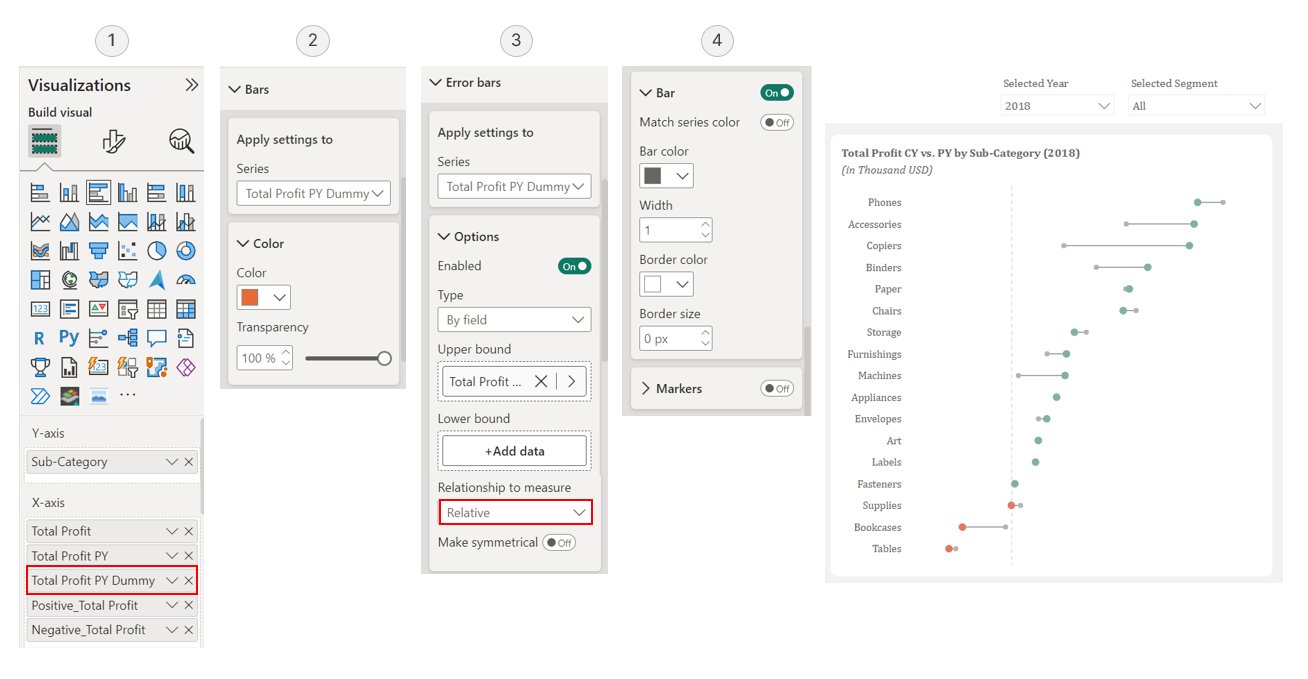 Adding Connector Lines Between Data Points
Step 3: Positioning and Formatting Data Labels
To ensure a clean and professional look, we need to carefully position the data labels so they don’t overlap the dumbbell chart elements. This involves placing labels to the left of the left dots and to the right of the right dots. Because we’re working with both positive and negative values, this requires eight separate DAX measures.
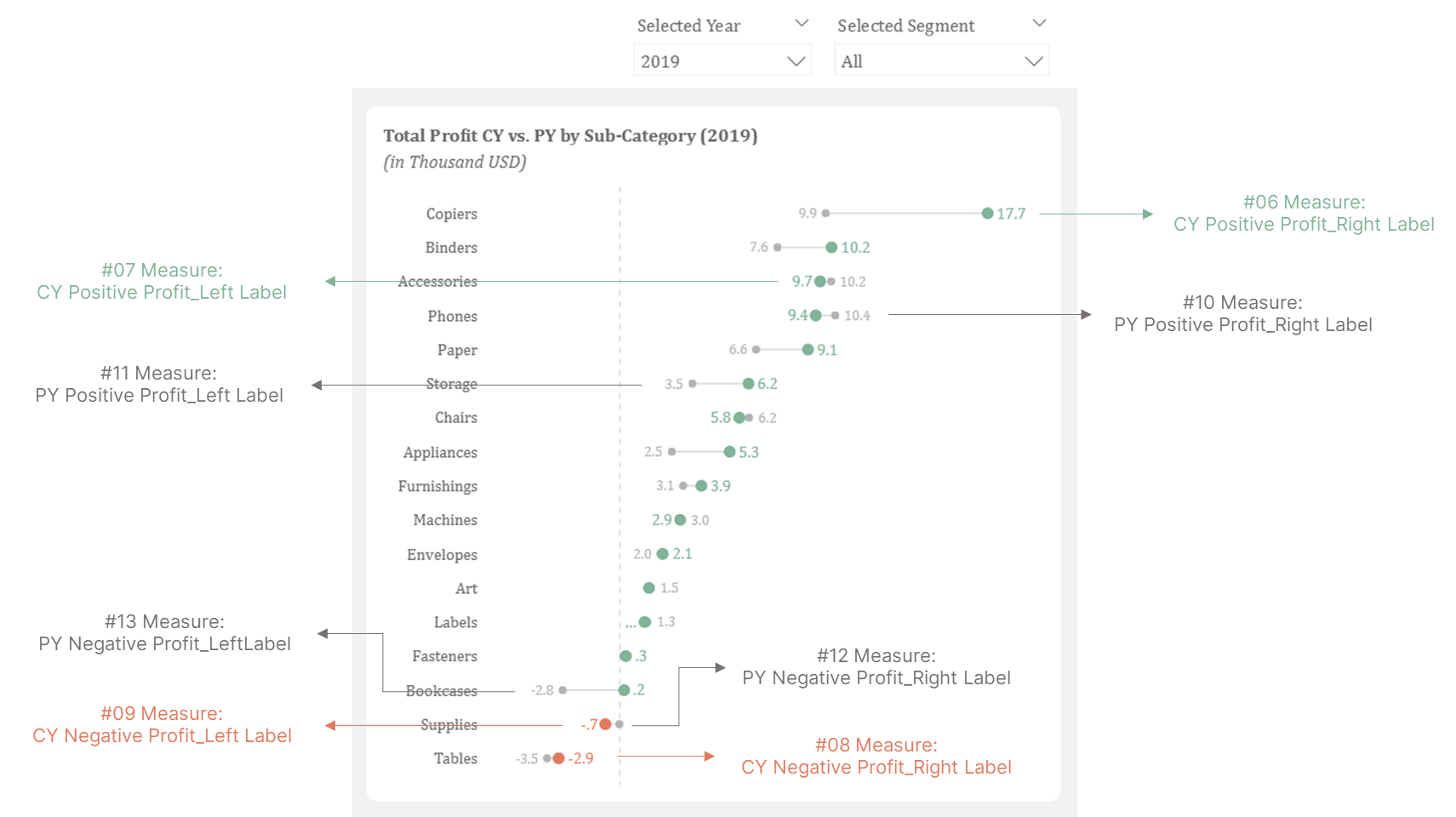 Positioning and Formatting Data Labels
Current Year Higher Values (CY > PY) for Positive Profit: Creates reference bars for data labels when current year positive profits exceed previous year (labels appear on right).
#06 Measure: [CY Positive Profit_Right Label]
CY Positive Profit_Right Label =
IF(
  [Positive_Total Profit] > [Total Profit PY],
  [Positive_Total Profit]
)
Current Year Lower Values (CY < PY) for Positive Profit: Creates reference bars for data labels when current year positive profits are below previous year (labels appear on left).
#07 Measure: [CY Positive Profit_Left Label]
CY Positive Profit_Left Label =
IF(
  [Positive_Total Profit] < [Total Profit PY],
  [Positive_Total Profit]
)
Current Year Higher Values (CY > PY) for Negative Profit (Loss): Creates reference bars for data labels when current year negative profits exceed previous year (labels appear on right).
#08 Measure: [CY Negative Profit_Right Label]
CY Negative Profit_Right Label =
IF(
  [Negative_Total Profit] > [Total Profit PY],
  [Negative_Total Profit]
)
Current Year Lower Values (CY < PY) for Negative Profit (Loss): Creates reference bars for data labels when current year negative profits are below previous year (labels appear on left).
#09 Measure: [CY Negative Profit_Left Label]
CY Negative Profit_Left Label =
IF(
  [Negative_Total Profit] < [Total Profit PY],
  [Negative_Total Profit]
)
Previous Year Higher Values (PY > CY) for Positive Profit: Creates reference bars for data labels when previous year positive profits exceed current year (labels appear on right)
#10 Measure: [PY Positive Profit_Right Label]
PY Positive Profit_Right Label =
IF(
  [Positive_Total Profit PY] > [Total Profit],
  [Positive_Total Profit PY]
)
Previous Year Lower Values (PY < CY) for Positive Profit: Creates reference bars for data labels when previous year positive profits are below current year (labels appear on left).
#11 Measure: [PY Positive Profit_Left Label]
PY Positive Profit_Left Label =
IF(
  [Positive_Total Profit PY] < [Total Profit],
  [Positive_Total Profit PY]
)
Previous Year Higher Values (PY > CY) for Negative Profit (Loss): Creates reference bars for data labels when previous year negative profits exceed current year (labels appear on right)
#12 Measure: [PY Negative Profit_Right Label]
PY Negative Profit_Right Label =
IF(
  [Negative_Total Profit PY] > [Total Profit],
  [Negative_Total Profit PY]
)
Previous Year Lower Values (PY < CY) for Negative Profit (Loss): Creates reference bars for data labels when previous year negative profits are below current year (labels appear on left).
#13 Measure: [PY Negative Profit_Left Label
PY Negative Profit_Left Label =
IF(
  [Negative_Total Profit PY] < [Total Profit],
  [Negative_Total Profit PY]
)
After creating these measures, add them all to the x-axis of your bar chart and make the bars transparent. Set the label position to “Outside End” for right-side labels and “Inside End” for left-side labels. Make sure to leave enough space between bars to accommodate the labels. To keep the display clean, we’ll use a simplified number format – converting values like “$1,234” to “1.2” (showing thousands of USD without the currency symbol).
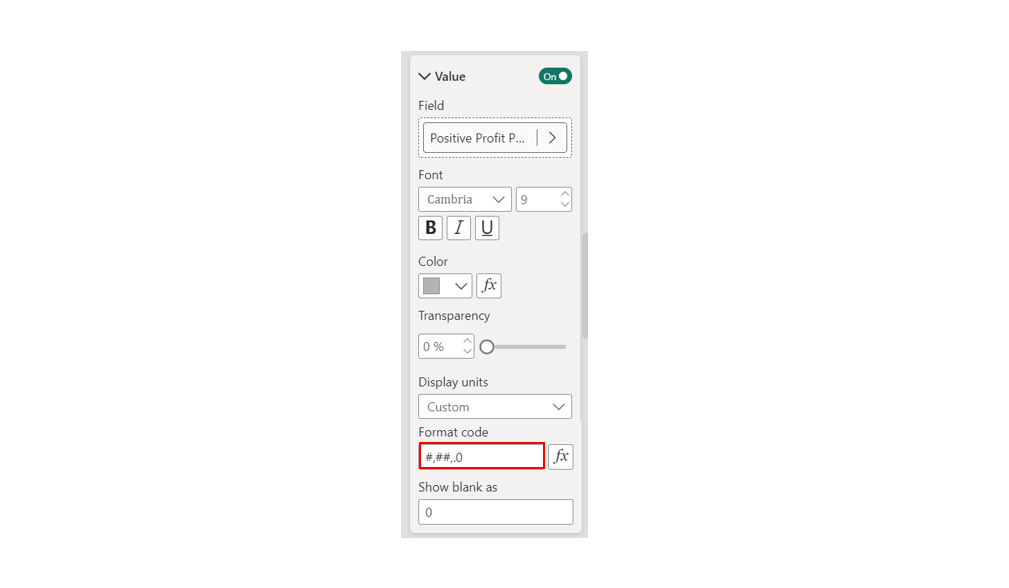 Using Custom Format Code to Display Concise Values
The result is a dynamic visualization where both dots and labels automatically change color to indicate whether values have increased or decreased compared to the previous year.