Foreword
Elevating Your Dashboards from Static to Strategic
In the world of Power BI, Key Performance Indicator (KPI) and metric cards are essential. They give you a quick, at-a-glance summary of your most important business goals and performance numbers. They're great for showing you the big picture.
However, a common challenge for anyone building dashboards is that these cards often just show one static number. While they’re excellent for a single value, they don’t easily show deeper details like trends over time or how different parts of your data relate. This can lead to dashboards that are either too crowded or don’t offer enough insight to help with decisions.
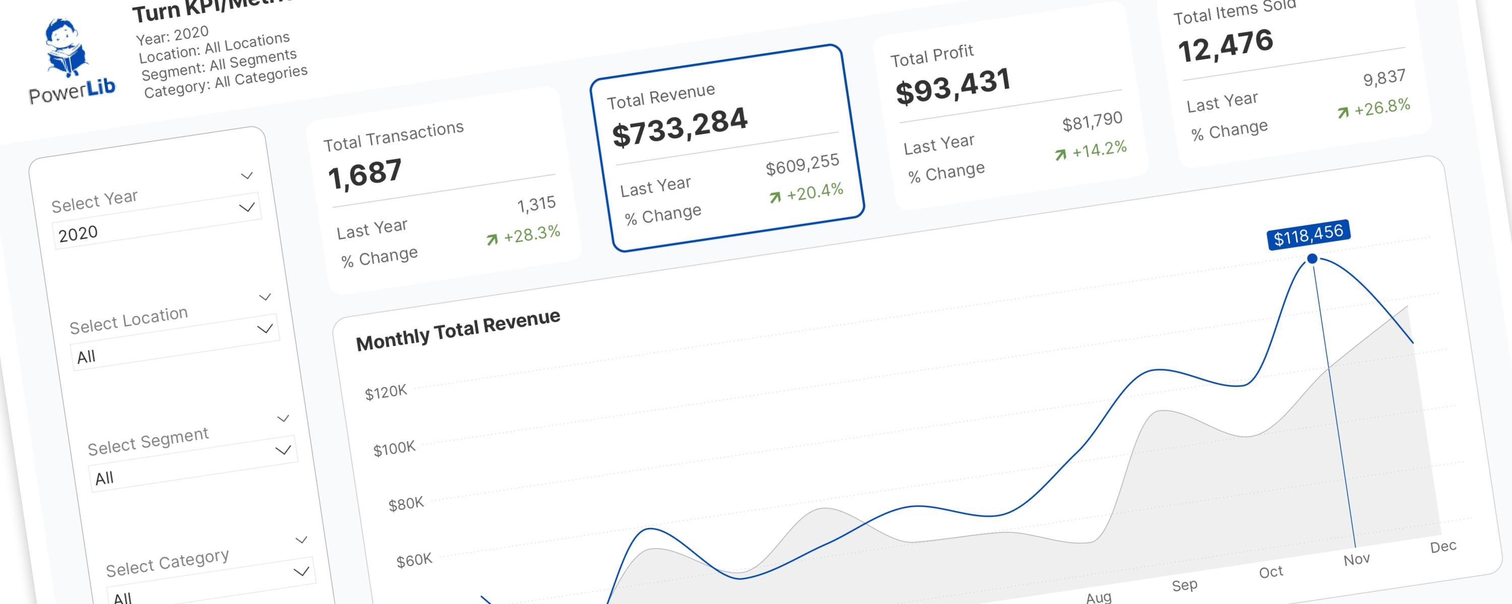
Consider a common situation: you have four key metric cards — Total Transactions, Total Revenue, Total Profit, and Total Items Sold. You’ll naturally want to see how these numbers have changed over time. Traditional ways to do this often have their own problems:
-
Showing trends directly on the cards: This lets you see a quick comparison, but it’s hard to show detailed trends or labels because there’s simply not enough space.
-
Displaying the trend of only one metric: This is a common practice, but it limits users to seeing just one trend at a time. They can’t easily compare trends across all your important metrics without extra clicks or navigation.
-
Using Power BI Bookmarks: Bookmarks can make visuals appear and disappear, which is useful. However, for this specific trick, they usually mean you have to create a separate visual for each metric’s trend. Imagine: four metric cards, four hidden line charts. This adds many extra visuals to your dashboard, which can make it slower to load and less responsive. Also, setting up and managing many bookmarks can be complicated and hard for others to understand later.
This article introduces a better, more efficient, and user-friendly solution: turning your regular KPI and metric cards into interactive “slicers.” By smartly using Power BI’s built-in button slicers and the powerful field parameters feature, this technique lets users explore data trends and related visuals with just one click on a card. This moves your dashboards beyond just showing data to truly interactive tools that help with decisions. And the best part? You can achieve this in just three simple steps.
Get ready to transform your Power BI dashboards and make them much more engaging and insightful. Let’s get started!
Why Go Dynamic? Big Benefits for Your Modern Dashboards
Turning static KPI/metric cards into interactive slicers offers major advantages, greatly improving how users experience your reports and how well your reports perform.
Better Interactivity and User Control
The main benefit of this technique is that it lets users actively explore data instead of just looking at it. Imagine users clicking on "Total Revenue" and instantly seeing its monthly trend, then clicking "Total Profit" and seeing its trend, all in the same chart! This is possible thanks to Field Parameters, a key Power BI feature. They allow you to give users dynamic control over how data is shown. This means users can switch between different measures or categories within a single visual with just a click, helping them understand the data better and encouraging them to ask more questions.
Simpler Design and Easier Growth
This approach significantly reduces clutter by combining what might be many separate charts into one dynamic visual. This results in cleaner, easier-to-understand dashboards that are simpler to navigate and manage over time. Field parameters specifically help with simpler design and easier growth. By letting you combine visuals into one dynamic chart or table, this technique directly supports a cleaner look and reduces the time you spend building and maintaining reports.
Improved User Experience (UX)
An easy-to-use and interactive dashboard leads to faster insights, less confusion, and more confident decisions. Being able to click on a KPI card and immediately see its related trend feels natural and powerful. Field parameters directly improve the user experience , helping you create intuitive, user-friendly dashboards that provide valuable insights. This technique focuses on the user, putting control directly into their hands so they can get the insights they need.
Better Performance Than Older Methods
Field parameters offer significant performance benefits, especially when compared to using bookmarks for dynamic visual switching. While bookmarks can hide visuals, those hidden visuals might still use up memory and slow down the initial load time of your report. Field parameters, however, dynamically change the fields (like measures or columns) within a single visual. This is more efficient because it avoids the extra work of managing multiple, duplicated visuals on your dashboard. Experts often point out that field parameters replace the "workaround" of "multiple layers of duplicated visuals" and "bookmarks controlling which was showing," which clearly means better performance because fewer actual visual objects need to be drawn or managed.
This performance benefit isn't just about faster loading; it's about making your report simpler and more robust. By changing how dynamism works—from hiding visuals (bookmarks) to directly changing fields within one visual (field parameters)—this approach follows a key Power BI rule: "do as much as possible in the model." This means your report will be stronger, less prone to errors, and easier to maintain. A report with fewer visual objects, even if they are dynamic, is always easier to manage, fix, and expand. Duplicating visuals for every option, as often needed with bookmarks, can become a big maintenance headache. So, choosing field parameters is not just about what they can do, but also a smart design choice that leads to better scalability, easier maintenance, and overall healthier reports for developers.
Quick Look: Field Parameters vs. Bookmarks
To help you clearly see the advantages of field parameters for dynamic visuals, here's a simple comparison with bookmarks:
| Feature/Aspect | Field Parameters | Bookmarks |
|---|---|---|
| How it Works | Creates a special DAX table; changes fields in visuals. | Saves and returns to specific report views (like visual visibility, filters). |
| Dynamic Content | Changes measures or dimensions dynamically. | Swaps entire visuals, changes visual properties (e.g., color, size). |
| Visual Consolidation | High (combines many views into one visual). | Low (often needs duplicating visuals for each view). |
| Setup Complexity | Easy to moderate (once you understand the idea). | Moderate to high (can involve many hidden visuals and complex actions). |
| Maintenance | Easier (fewer objects to manage, based in the data model). | Harder (many objects, specific to the report page, tough for others to take over). |
| Performance Impact | Generally better (fewer visual objects). | Can be worse (more hidden visual objects). |
| Best For | Dynamic content in visuals (e.g., switching metrics/categories in charts, dynamic slicers). | Page navigation, showing/hiding filter panes, specific report views, changing visual types. |
| Learning Curve | Moderate | Moderate |
This table clearly shows the main differences, benefits, and best uses for Field Parameters versus Bookmarks when creating dynamic visuals. It supports why field parameters are the better choice for this specific task.
Documentation
This article provides a clear, step-by-step guide to adding a powerful feature to your KPI or metric cards, allowing users to interact with other visuals that automatically change based on what they select.
Step-by-Step Guide: Building Your Interactive KPI/Metric Slicers
This section explains how to actually build your interactive KPI cards, giving you a complete guide for Power BI.
Step 1: Setting Up the Basics: Your KPI/Metric Cards
Start by creating the standard KPI or metric card visuals that will be the interactive parts of your dashboard.
Initial Setup of Card Visuals
Create individual card visuals for each key number you want to display. For this example, our measures are:
Measure #01: Total Transactions
_01 Total Transactions = DISTINCTCOUNT(Superstore[Order ID])Measure #02: Total Revenue
_01 Total Revenue = SUM(Superstore[Sales])Measure #03: Total Profit
_01 Total Profit = SUM(Superstore[Profit])Measure #04: Total Quantity
_01 Total Quantity = SUM(Superstore[Quantity])Just drag each of these measures into the "Data" field of its own card visual.
Adding Helpful Reference Labels
To make these KPI cards even more useful, it’s good to include extra information directly on them. This gives immediate context and deeper understanding without needing more clicks. For example, showing the previous year’s value and the year-on-year (YoY) change for each metric provides valuable comparison data at a glance. This follows good user experience practices by giving “at-a-glance” insights and showing “trend lines to show movement over time.” This makes your initial card very informative and engaging.
The measures for these extra labels are:
Measure #05: Previous Year's Total Transactions
_02 PY Total Transactions =
IF(
  HASONEVALUE(DimDate[Year]),
  CALCULATE(
      [_01 Total Transactions],
      SAMEPERIODLASTYEAR(DimDate[Date])
  ),
  BLANK()
)
Measure #06: Previous Year's Total Revenue
_02 PY Total Revenue =
IF(
  HASONEVALUE(DimDate[Year]),
  CALCULATE(
      [_01 Total Revenue],
      SAMEPERIODLASTYEAR(DimDate[Date])
  ),
  BLANK()
)
Measure #07: Previous Year's Total Profit
_02 PY Total Profit =
IF(
  HASONEVALUE(DimDate[Year]),
  CALCULATE(
      [_01 Total Profit],
      SAMEPERIODLASTYEAR(DimDate[Date])
  ),
  BLANK()
)
Measure #08: Previous Year's Total Quantity
_02 PY Total Quantity =
IF(
  HASONEVALUE(DimDate[Year]),
  CALCULATE(
      [_01 Total Quantity],
      SAMEPERIODLASTYEAR(DimDate[Date])
  ),
  BLANK()
)
Measure #09: YoY Change of Total Transactions
_04 △PY% Total Transactions =
IF(
  ISBLANK([_01 Total Transactions]) || [_01 Total Transactions] = 0,
  "--",
  DIVIDE([_01 Total Transactions] - [_02 PY Total Transactions], [_02 PY Total Transactions], 0)
)
Measure #10: YoY Change of Total Revenue
_04 △PY% Total Revenue =
IF(
  ISBLANK([_01 Total Revenue]) || [_01 Total Revenue] = 0,
  "--",
  DIVIDE([_01 Total Revenue] - [_02 PY Total Revenue], [_02 PY Total Revenue], 0)
)
Measure #011: YoY Change of Total Profit
_04 △PY% Total Profit =
IF(
  ISBLANK([_01 Total Profit]) || [_01 Total Profit] = 0,
  "--",
  DIVIDE([_01 Total Profit] - [_02 PY Total Profit], [_02 PY Total Profit], 0)
)
Measure #012: YoY Change of Total Quantity
_04 △PY% Total Quantity =
IF(
  ISBLANK([_01 Total Quantity]) || [_01 Total Quantity] = 0,
  "--",
  DIVIDE([_01 Total Quantity] - [_02 PY Total Quantity], [_02 PY Total Quantity], 0)
)
Set up the card layout, paying close attention to the space between cards.
Important Layout and Spacing Settings
Getting the exact alignment and consistent spacing of your card visuals is crucial for this technique to work. This careful attention to detail is vital for the “invisible” button slicer to perfectly overlap and create a smooth, natural user experience. A well-organized layout, like a grid, greatly helps with visual flow and navigation. The button slicer itself lets you adjust its grid layout and control card spacing down to the pixel, which must perfectly match your KPI/metric cards for precise overlapping.
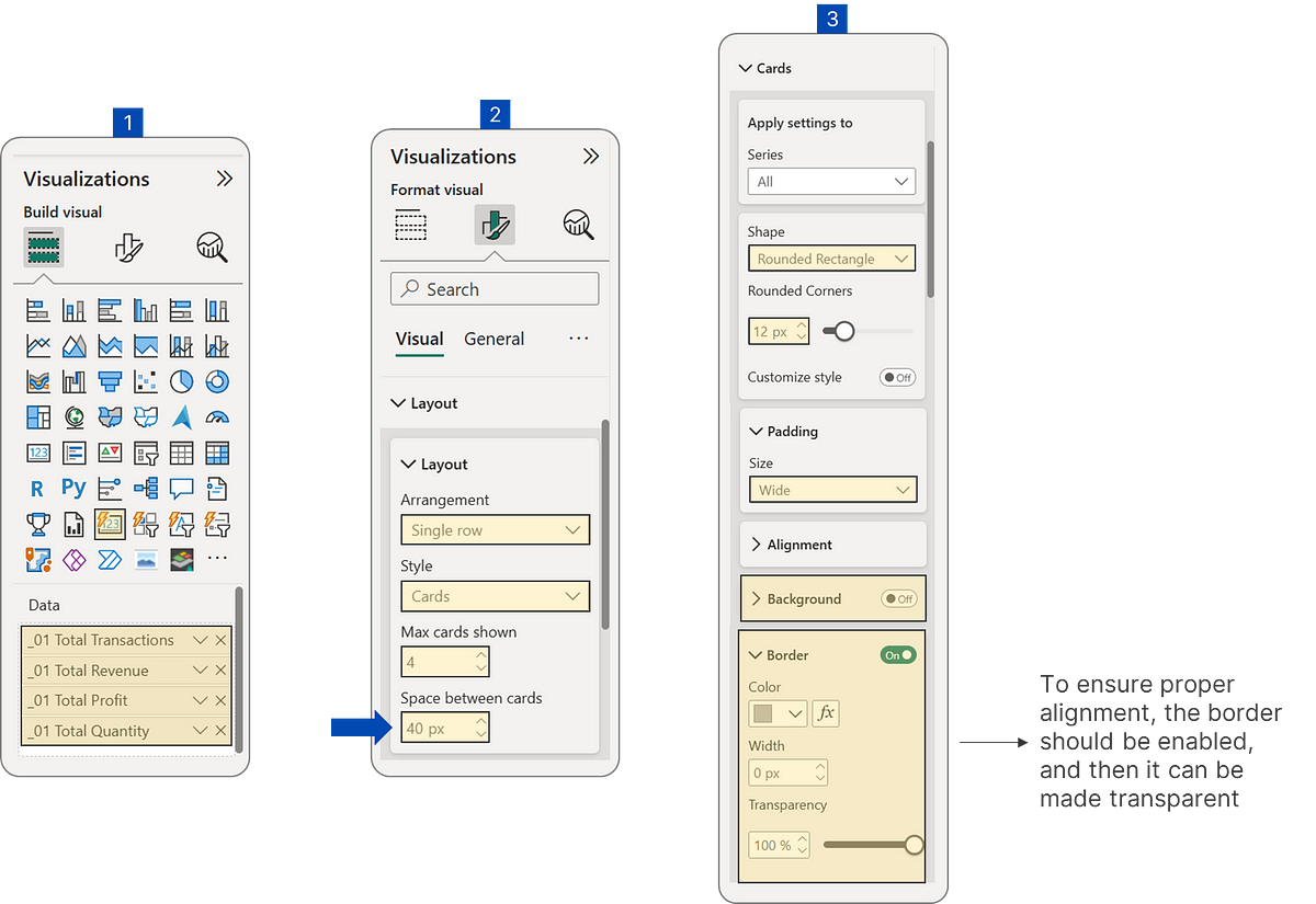 KPI/Metric Card Configuration
This careful attention to spacing and alignment is a basic rule of good user experience design. When the “invisible” button slicer is placed over the KPI/metric cards, even a small misalignment will break the illusion that it’s one interactive element. This can frustrate users and make them trust the dashboard less. This detail ensures that what the user thinks they are clicking (the KPI card) perfectly matches what they are actually clicking (the hidden slicer), leading to a smooth and intuitive experience. Without this precision, the seamless interaction you want won’t happen, and your goal of easy understanding and engagement won’t be fully met.
 Metric Cards
Step 2: The Invisible Magic: Creating the Button Slicer
Now that your KPI cards are in place, the next step is to create the “invisible” button slicer that will make them dynamic.
What are Field Parameters? (A Quick Explanation)
Field parameters are a powerful and relatively new feature in Power BI that let report creators give users dynamic control over how data is shown. They allow users to switch between different measures or categories within a single visual without changing the underlying data model or creating duplicate visuals. When you create a field parameter, Power BI automatically creates a special DAX table that stores the selected measures or categories and their numerical order. This internal structure is then used to update visuals dynamically. This method is better than older ways like bookmarks, offering simpler design, easier growth, better interactivity, and less time spent on development and maintenance.
Creating the Field Parameter for Metric Selection
To start, create a new field parameter for selecting metrics. You’ll find this under the “Modeling” tab in Power BI Desktop, then “New parameter” > “Fields.” Add the measures you want to display in your dynamic visual (like a line chart showing trends) to this parameter. It’s important to note that the measures in this field parameter don’t have to be the exact same ones shown on your KPI/metric cards. This gives you flexibility in what data you dynamically explore. For example, if your KPI card shows “Total Revenue,” the field parameter could include “Total Revenue (Monthly Trend)” for the dynamic chart.
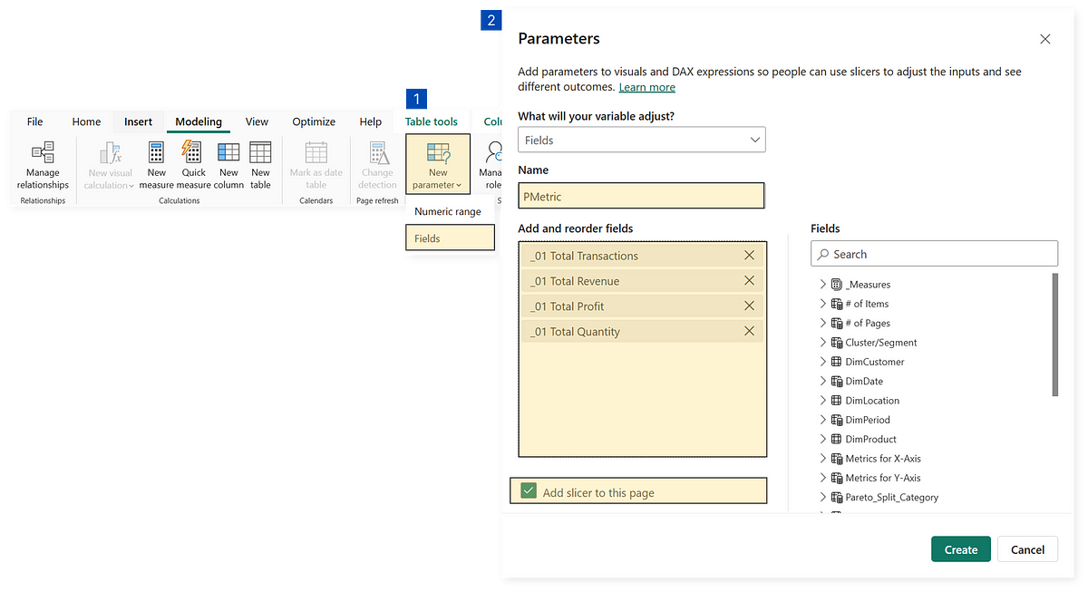 Creating Metric Selection Slicer Using Field Parameter
Setting Up the ‘Invisible’ Button Slicer
After creating your metric cards, the next step is to “convert” them into slicers. This allows a dynamic visual (like a column chart) to automatically show trends based on the selected metric.
Start by creating a button slicer and add the field parameter you just made for metric selection. The order of measures in the field parameter should match the order of your metric cards for an intuitive setup.
Configure the button slicer to make it transparent, ensuring it aligns perfectly with the KPI cards underneath. Key settings include:
-
Disable Background Color and Fill Color: This makes the button slicer transparent, so your KPI cards remain visible.
-
Configure Interactive States: Customize how the button looks when it’s “Resting,” “Hovered over,” or “Selected” to give subtle visual feedback without revealing the slicer itself. The button slicer offers customizable styles and interactive states. It’s worth noting that the button slicer is no longer strictly in “preview” and is generally enabled by default in recent Power BI Desktop versions.
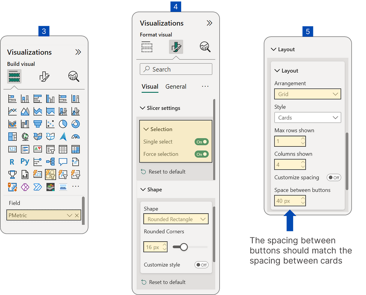 Button Slicer Configuration
For this example, the suggested settings are:
-
Rest State: No border is shown, keeping the illusion that the user is interacting directly with the KPI card.
-
Hover State: A subtle gray border appears on unselected buttons when the mouse moves over them, showing that the area is clickable.
-
Selected State: A clear blue border appears around the unselected cards, while the selected card itself might have a border around the entire card visual to show it’s active. Since we’ll set it to allow only a single selection, the selected card can’t be unselected unless another card is chosen.
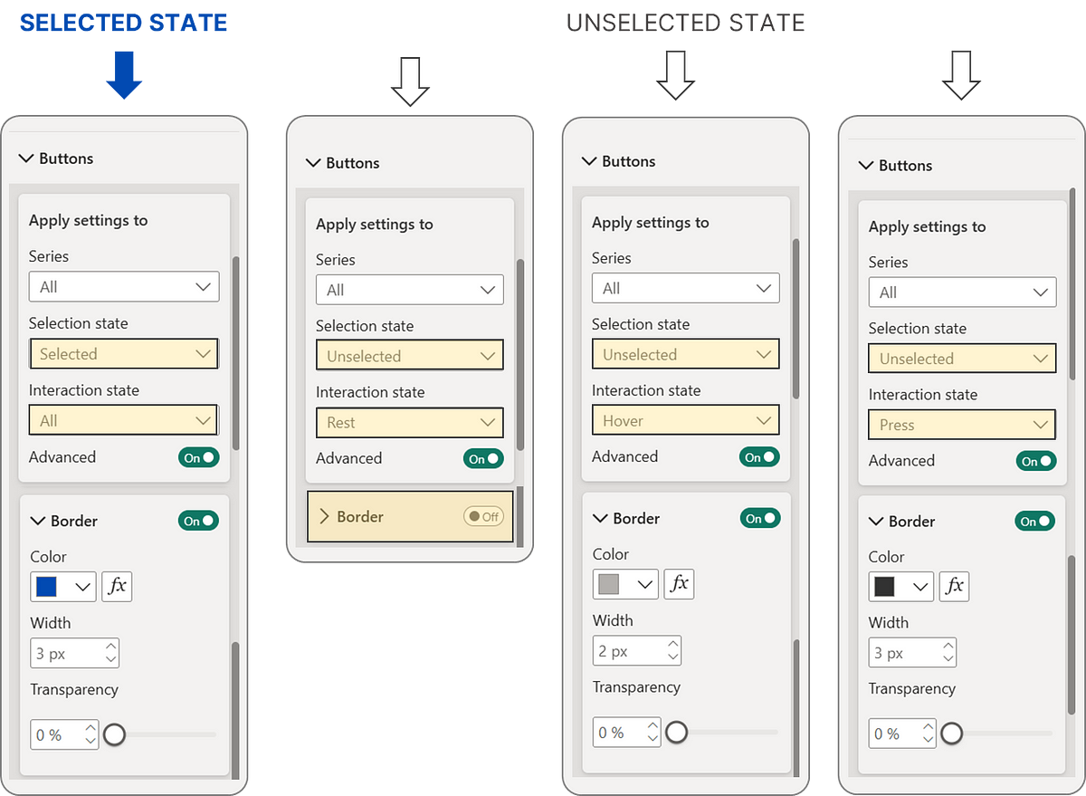 Button Selection and Interaction State Settings
Place the configured button slicer precisely on top of your metric cards. The exact size and spacing of the button slicer must match the cards underneath for a seamless visual effect.
 Final Result of Metric Card Slicer
The “invisible” nature of the button slicer is a very effective use of advanced user experience principles. By making the slicer transparent, the user feels like they are interacting directly with the KPI/metric card. This design choice makes it much easier to use, making the interaction feel more natural and intuitive. It follows UX rules like the “Law of Proximity” (things close together seem related) and “Hick’s Law” (fewer choices make decisions simpler) by making the interaction smooth and the clickable area obvious without adding visual clutter. This design choice isn’t just a visual trick; it’s a deliberate UX strategy to make the dashboard feel very responsive, integrated, and seamless, directly helping to create content that is easy to understand and engaging.
Step 3: Activating Functionality: Enabling the Metric Card Slicer
Now that your metric cards are converted into slicers, the final step is to connect them to the line chart by displaying the previously established ‘PMetric’ parameter on the y-axis.
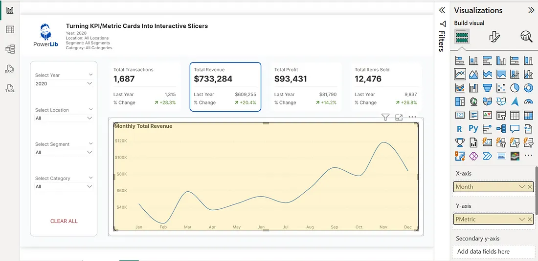 Displaying ‘PMetric’ Parameter on the Line Chart’s Y-Axis
To make this line chart even more insightful, you can add more helpful measures:
- Previous Year’s Dynamic Selected Metric: This measure shows the value of the currently selected metric from the previous year. This is super useful for comparing performance year-over-year!
Measure #013 (Prerequisite Measure): Dynamic Selected Metric
_01 Dynamic Selected Metric (based on selected metric card) =
VAR SelectedMetricOrder = SELECTEDVALUE('PMetric'[PMetric Order])
RETURN
  SWITCH(
      SelectedMetricOrder,
      0, [_01 Total Transactions],
      1, [_01 Total Revenue],
      2, [_01 Total Profit],
      3, [_01 Total Quantity],
      BLANK()
  )
Measure #014: Previous Year’s Dynamic Selected Metric
_02 PY Dynamic Selected Metric (based on selected metric card) =
IF(
  HASONEVALUE(DimDate[Year]),
  CALCULATE(
      [_01 Dynamic Selected Metric (based on selected metric card)],
      SAMEPERIODLASTYEAR(DimDate[Date])
  ),
  BLANK()
)
• Maximum Dynamic Selected Metric: This measure highlights the highest value achieved by the currently selected metric within the current view. This helps users quickly spot peak performance periods.
Measure #015: Maximum Dynamic Selected Metric
_01 Max_Dynamic Selected Metric (based on selected metric card) =
VAR max_val =
MAXX(
  ALLSELECTED(DimDate[MonthNameShort], DimDate[Monthnumber]),
  [_01 Dynamic Selected Metric (based on selected metric card)]
)
VAR check = IF(max_val = [_01 Dynamic Selected Metric (based on selected metric card)], max_val, BLANK() )
RETURN
check
Placing these three measures on the line chart’s Y-axis and the [MonthNameShort] column on the X-axis makes the visual much richer. Including “Previous Year” and “Maximum Value” alongside the current trend helps provide essential context. Users don’t just want to see a trend; they want to understand how it compares to past performance or peak performance. These extra measures directly answer those questions, supporting the user experience principle of “providing context” and helping to identify “trends, patterns, and insights.” This turns raw data into useful information.
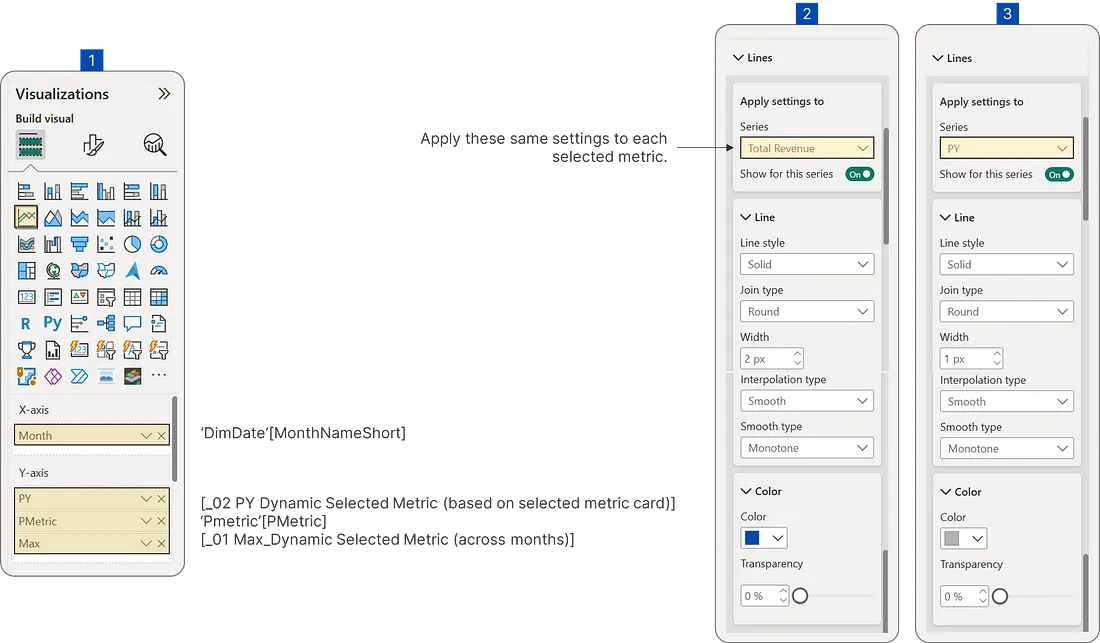 Line Chart Configuration (1)
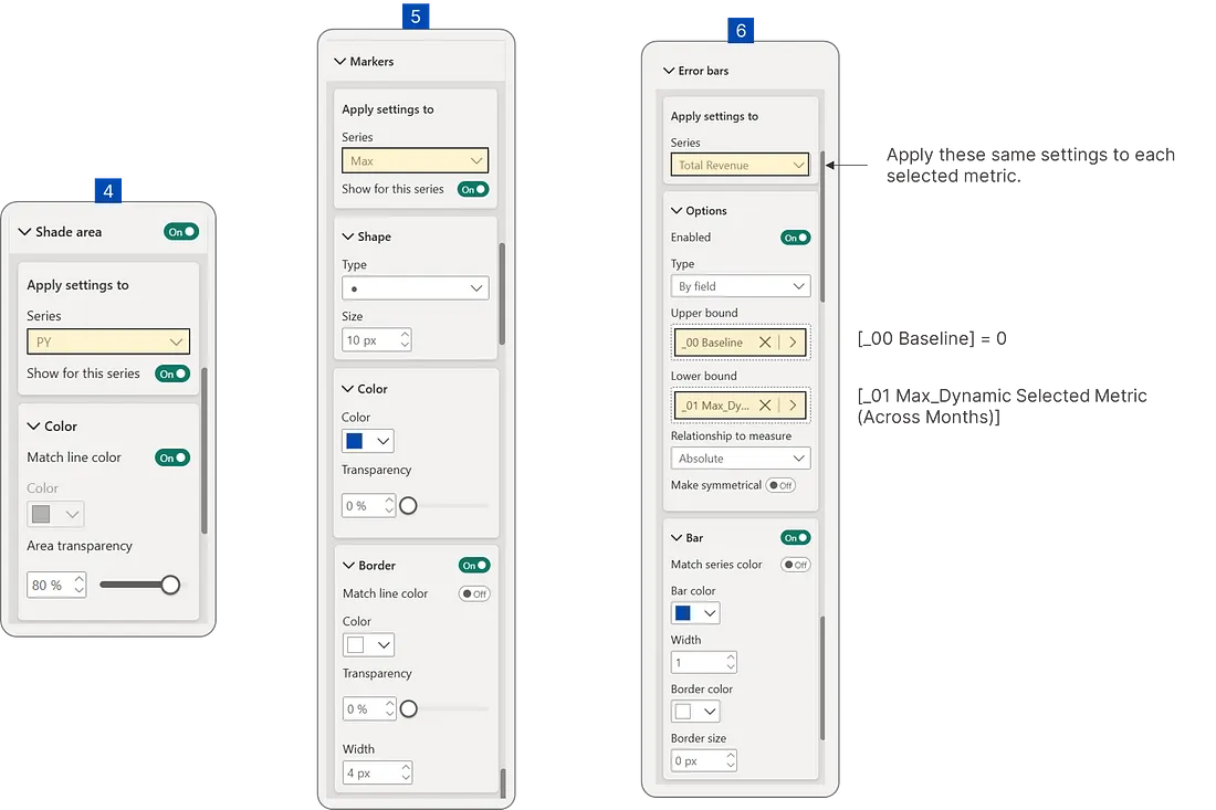 Line Chart Configuration (2)
Dynamic Line Chart Title
Adding a title that changes automatically for your line chart further helps users understand and engage with your report. Dynamic titles in Power BI are report titles that change based on user actions, like selecting items in a slicer or applying filters. They greatly improve clarity, reduce confusion, and make the report more interactive and engaging.
Measure #016: Dynamic Line Chart Title
_01 Dynamic Selected Line Chart Title (based on selected metric card) =
VAR _SelectedMetricOrder = SELECTEDVALUE('PMetric'[PMetric Order])

RETURN
SWITCH(
  _SelectedMetricOrder,

  -- Transaction Metrics
  0, "Monthly Total Transactions",

  -- Revenue Metrics
  1, "Monthly Total Revenue",

  -- Profit Metrics
  2, "Monthly Total Profit",

  -- Quantity Metrics
  3, "Monthly Total Quantity",

  -- Default when no selection
  "Monthly Trends"
)
Dynamic titles are a small but incredibly powerful way to improve user experience. In an interactive dashboard where content changes often based on user selections, a static title can quickly become confusing. A dynamic title removes this confusion by clearly stating what the user is currently viewing, preventing misunderstandings and making the dashboard feel responsive and smart. This perfectly aligns with the principles of "clarity and focus" and "providing immediate context." This small but important addition greatly improves the overall usability and professionalism of your dashboard, reinforcing the idea that "great dashboards tell a story" by guiding the narrative and ensuring the user always understands the current view.
And just like that, you've got a fully functional, interactive metric card slicer!
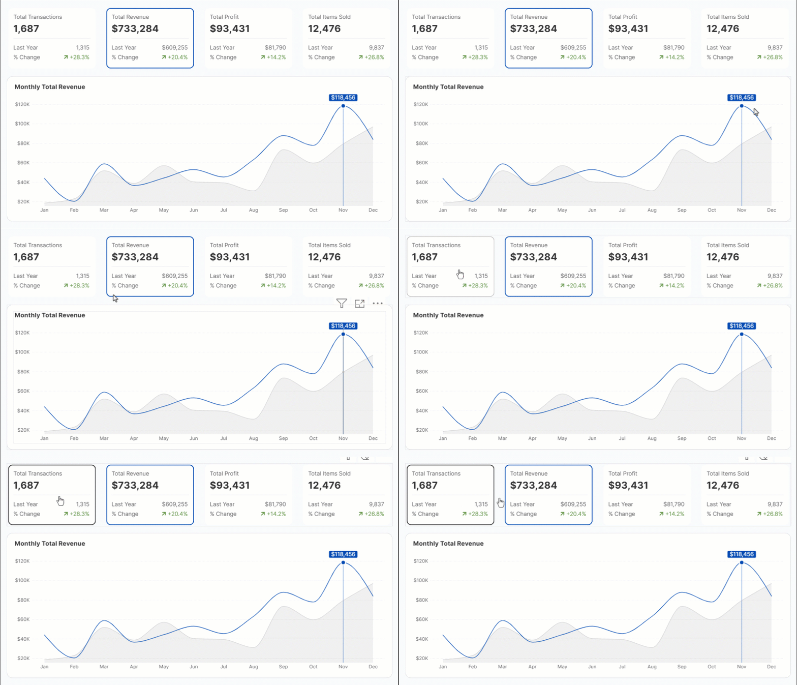 Dynamic Selected Metric Card Slicer In Action