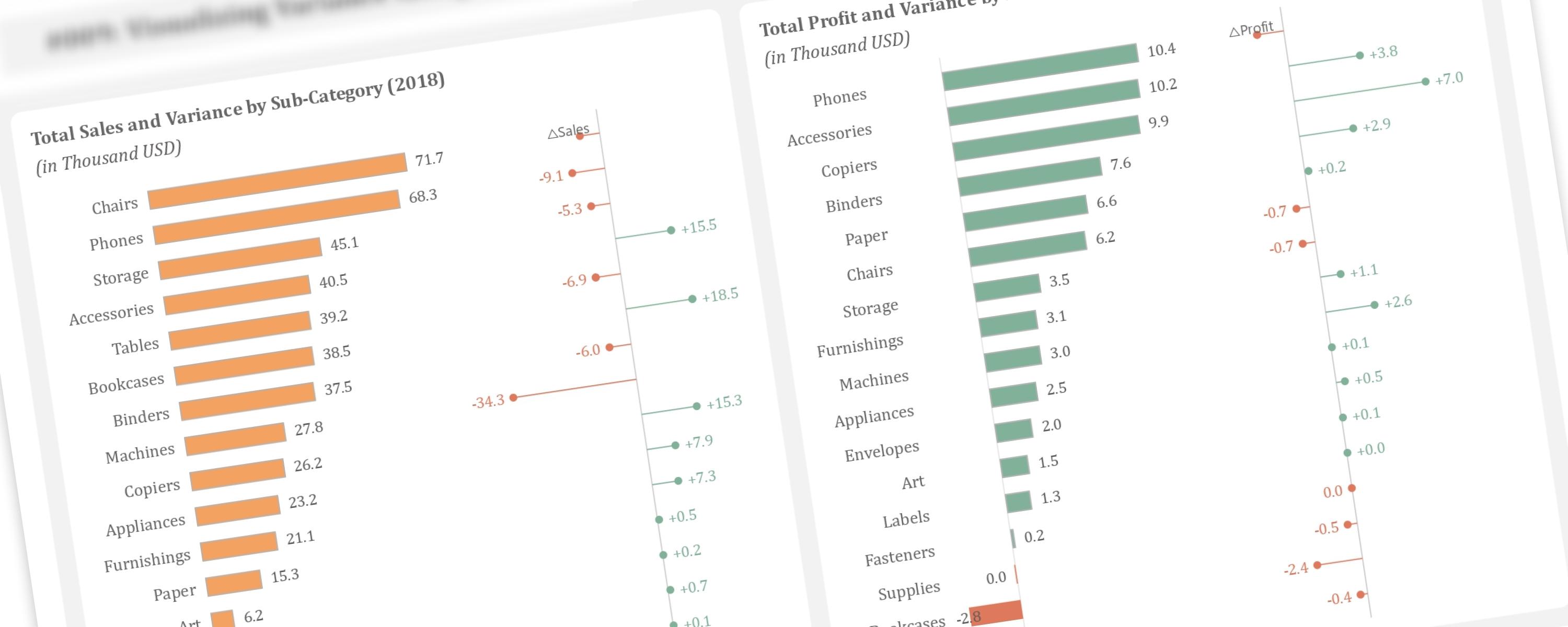
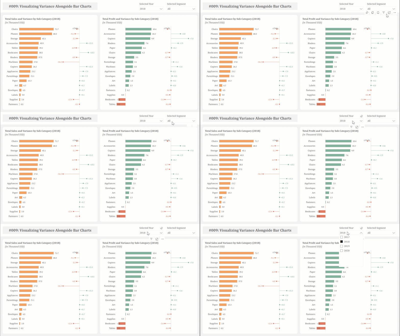
This article demonstrates how to create additional lollipop charts alongside bar charts to visualize year-over-year variance, a technique inspired by Bas Dohmen.
Use Case and Limitations
Documentation
Step 1: Generating the Bar Chart
Step 2: Configuring the Y-Axis and Error Bars for the Variance Bar Chart
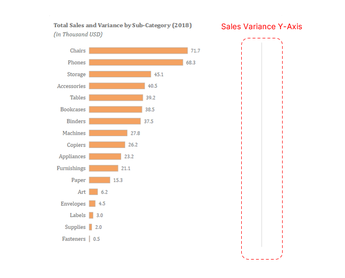 Y-Axis for Variance Bar Chart
Next, we’ll create a constant line on the same axis as the total sales bar chart, positioned alongside the bars. This will be accomplished by defining a new measure.
Sales Variance Y-Axis =
MAXX(
  ALLSELECTED('Sample - Superstore_Orders'[Sub-Category]), [Total Sales]
)* 1.75
This formula calculates a value for the y-axis by finding the highest total sales among the currently selected sub-categories and then multiplying that highest value by 1.75.
To create the y-axis for the variance bar chart, add the defined measure to the bar chart’s y-axis and set the bars’ transparency to 100%, effectively hiding them. To ensure the error bars align correctly in the middle, the bar series must be 100% overlapped. The y-axis will then be represented by a constant line, configured as follows:
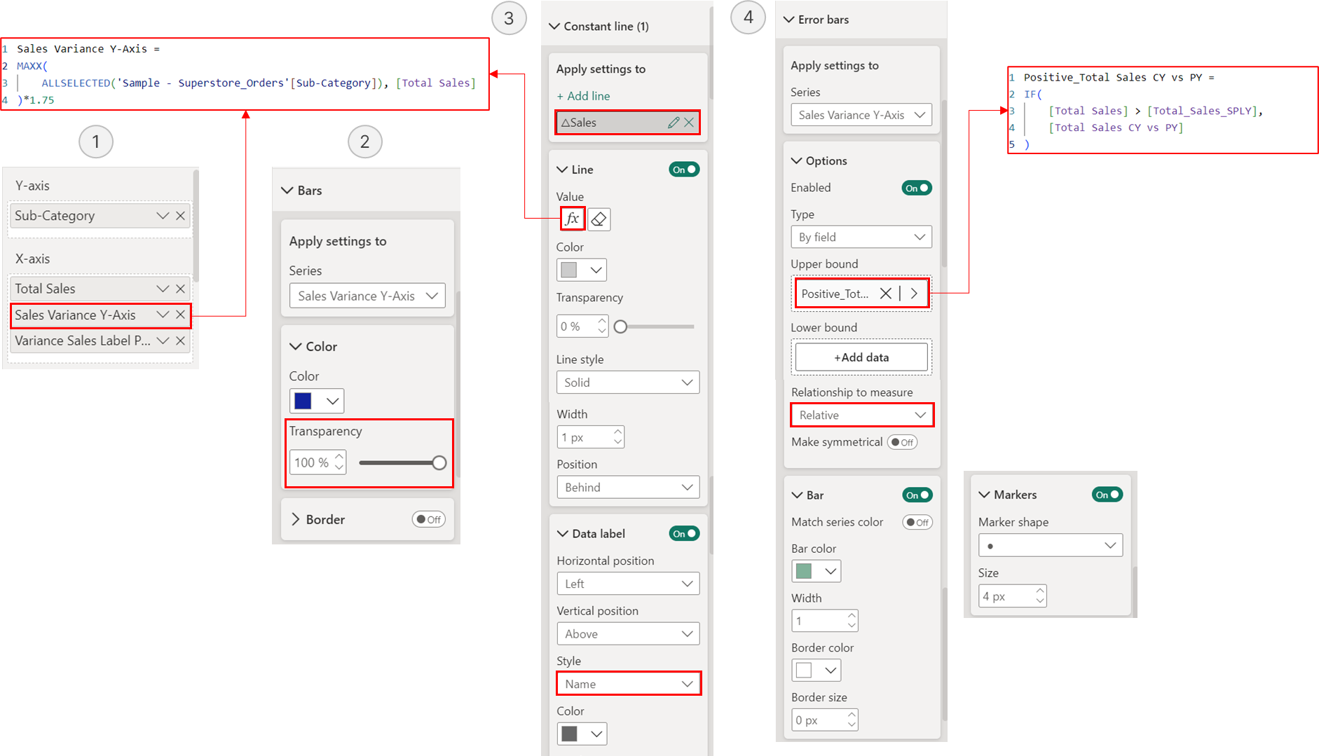 Configuring Y-Axis and Positive Error Bars for Variance Bar Chart
We want to color error bars according to variance direction: green for positive and red for negative. However, because conditional formatting cannot be applied directly to error bars, we’ll use a workaround. We’ll define separate measures for positive and negative variance. The positive variance measure will be used as the upper bound for the error bars of the “Sales Variance Y-Axis” measure, and the negative variance measure will be used as the upper bound for the error bars of a duplicate of this measure. This method enables manual color assignment.
The first step in calculating positive variance is to calculate the previous year’s total sales using the following measure:
Total_Sales_SPLY =
CALCULATE(
  SUM('Sample - Superstore_Orders'[Sales]),
  SAMEPERIODLASTYEAR(DimDate[Date])
)
The variance is then calculated as the difference between the current year’s total sales and the previous year’s total sales.
Total Sales CY vs PY =
[Total Sales] - [Total_Sales_SPLY]
To show only the positive variance, we will define a new measure that ensures the variance is displayed only if the total sales of the current year are greater than the total sales of the previous year.
Positive_Total Sales CY vs PY =
IF(
  [Total Sales] > [Total_Sales_SPLY],
  [Total Sales CY vs PY]
)
A similar approach will be used to show negative variance, but the measure will only display a value if current year total sales are less than previous year total sales.
Negative_Total Sales CY vs PY =
IF(
  [Total Sales] < [Total_Sales_SPLY],
  [Total Sales CY vs PY]
)
To display the negative variance, we will need to create a duplicate measure for the y-axis of the variance bar chart, because error bars are already enabled on the original measure to show positive variance.
Sales Variance Y-Axis Dummy = [Sales Variance Y-Axis]We will then simply repeat the same methods used to create the positive error bars to display the negative error bars, but we will not recreate the constant line for the y-axis, as it already exists.
Step 3: Adding Data Labels to Error Bars
The final step involves displaying data labels on the error bars. We want positive variance labels on the right and negative variance labels on the left. To achieve clear label placement, we’ll define new reference measures. For positive variance, the reference measure sums the “Sales Variance Y-Axis” value and the corresponding “Total Sales CY vs PY” value, but only if current year total sales are greater than the previous year’s total sales (indicating a positive variance). These sums are visualized as bars, with data labels positioned at their outer ends.
Variance Sales Label Position Right =
IF(
  [Total Sales] > [Total_Sales_SPLY],
  [Sales Variance Y-Axis] + [Total Sales CY vs PY]
)
Add the defined measure to the x-axis of the bar chart. Set the transparency of the bars to 100%, as we only need to display the data labels. Position the data labels at the outer ends of the bars, replacing their default values with the positive variance values.
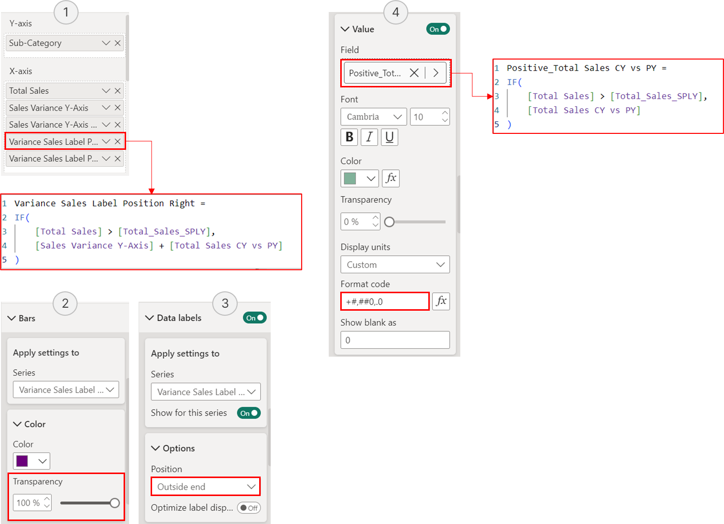 Configuration for Positive Variance Data Labels
As for negative variance, the reference measure sums the “Sales Variance Y-Axis” value and the corresponding “Total Sales CY vs PY” value, but only if current year total sales are lower than the previous year’s total sales (indicating a negative variance). These sums are visualized as bars, with data labels positioned at their inside ends.
Variance Sales Label Position Left =
IF(
  [Total Sales] < [Total_Sales_SPLY],
  [Sales Variance Y-Axis] + [Total Sales CY vs PY]
)
Add the defined measure to the x-axis of the bar chart. Set the transparency of the bars to 100%, as we only need to display the data labels. Position the data labels at the inside ends of the bars, replacing their default values with the negative variance values.
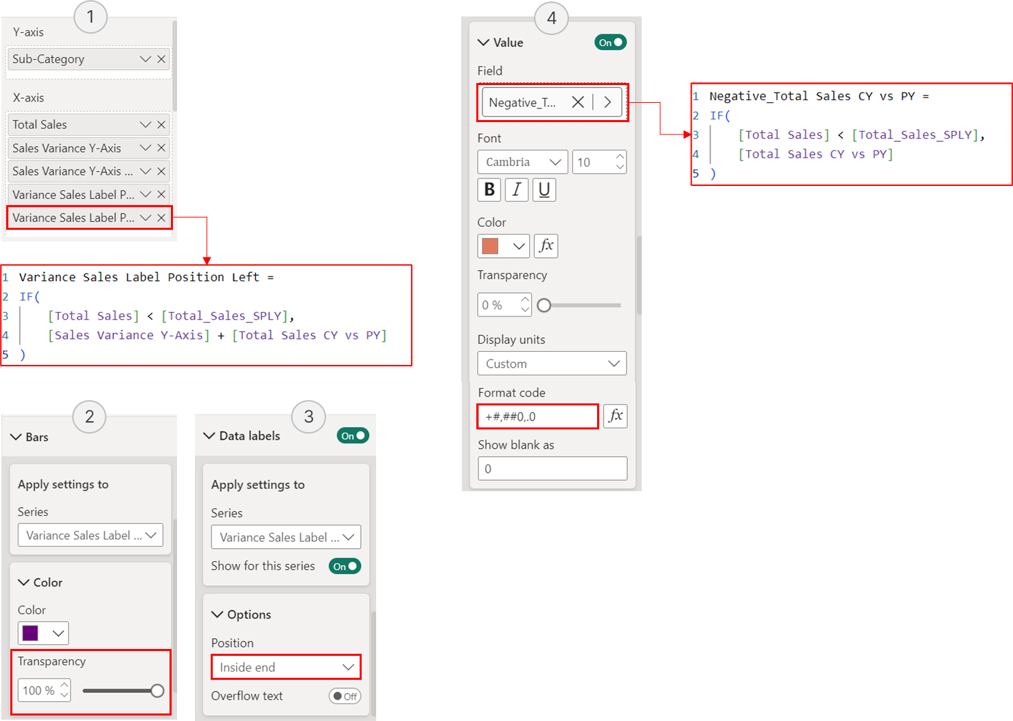 Configuration for Positive Variance Data Labels
In addition, the ‘Flip Overlap’ option should be enabled. This ensures that when hovering over the total sales bar chart, the tooltip displays the first measure placed on the x-axis (‘Total Sales’) rather than the last measure placed.
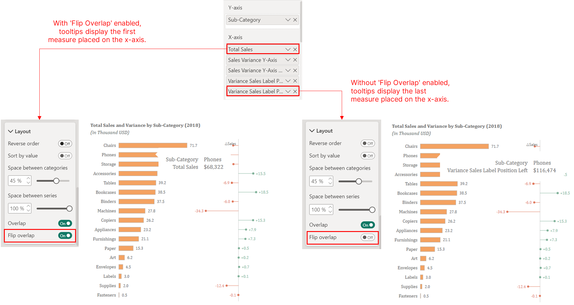 Enabling the “Flip Overlap” Option in Bar Layout Settings