Foreword
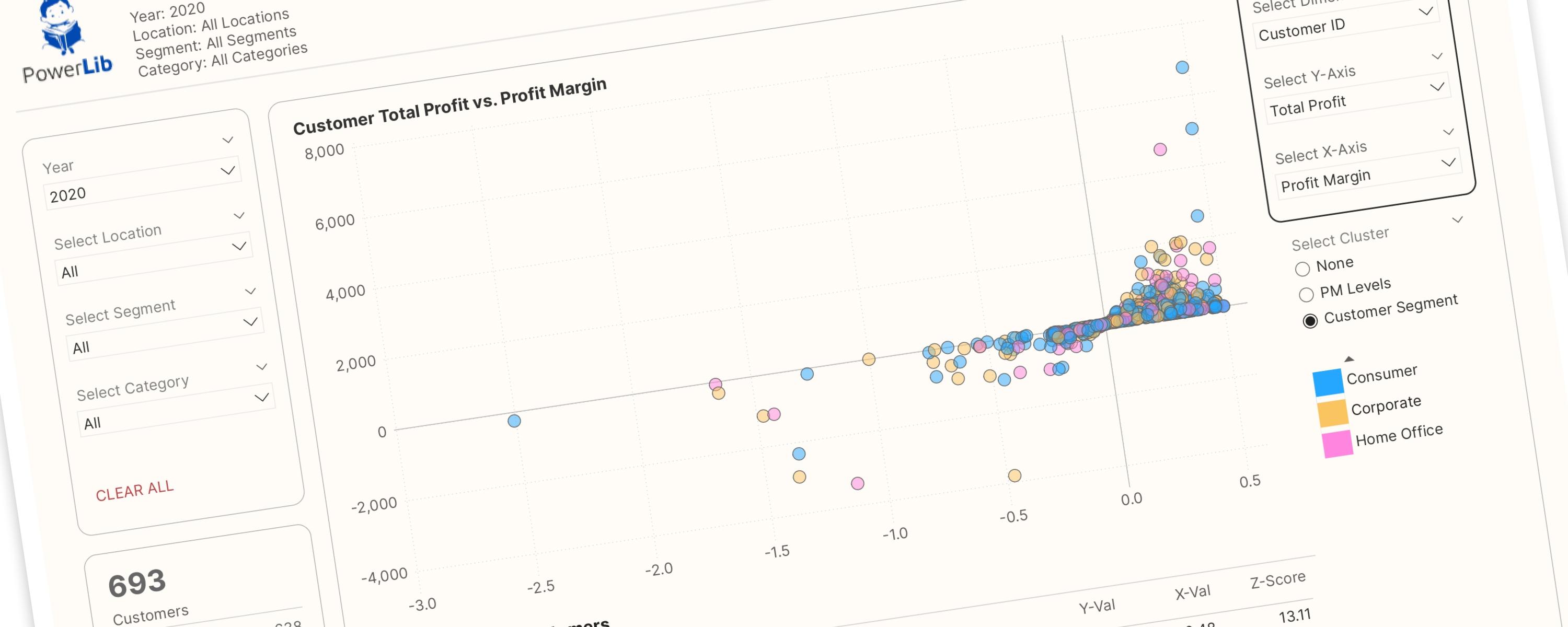
This interactive scatter plot is designed to empower users to interactively explore relationships between different dimensions and metrics. Key features include:
-
Flexible Dimension Selection: Easily switch between "Customer" and "Product" views to analyze different dimensions.
-
Prevent Duplicate Metrics: Prevents users from selecting the same metric for both the X and Y axes, ensuring meaningful comparisons.
-
Dynamic Clustering: Visually categorize data points based on various criteria. For example, cluster by profit margin (red for negative, gray for zero, green for positive) or by specific attributes like product category (for products) and customer segment (for customers).
-
Z-Score Ranking: Understand top-performing customers and products with a balanced Z-score ranking, providing fair comparisons across diverse metrics.
The rest of this walkthrough is for members
You have read the problem. What is behind the paywall is the fix:
- The full step-by-step build, from measures to formatting
- Every DAX measure with the reasoning behind it
- The .pbix with the model already wired up
Already a member? Sign in with your email