LineFree
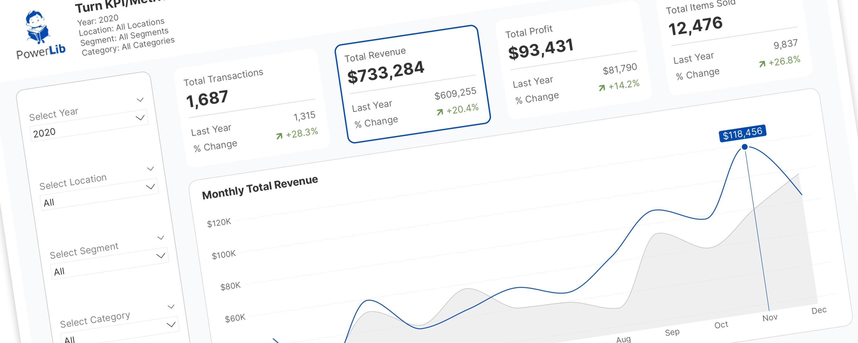
Turning KPI/Metric Cards Into Interactive Slicers
In the world of Power BI, Key Performance Indicator (KPI) and metric cards are essential.
26 October 202516 min read
Documented Power BI techniques — the model change, the DAX, and the exact visual settings. Most are free to read; the rest come with the model files for members.
LineFree
In the world of Power BI, Key Performance Indicator (KPI) and metric cards are essential.
Donut/PieFree
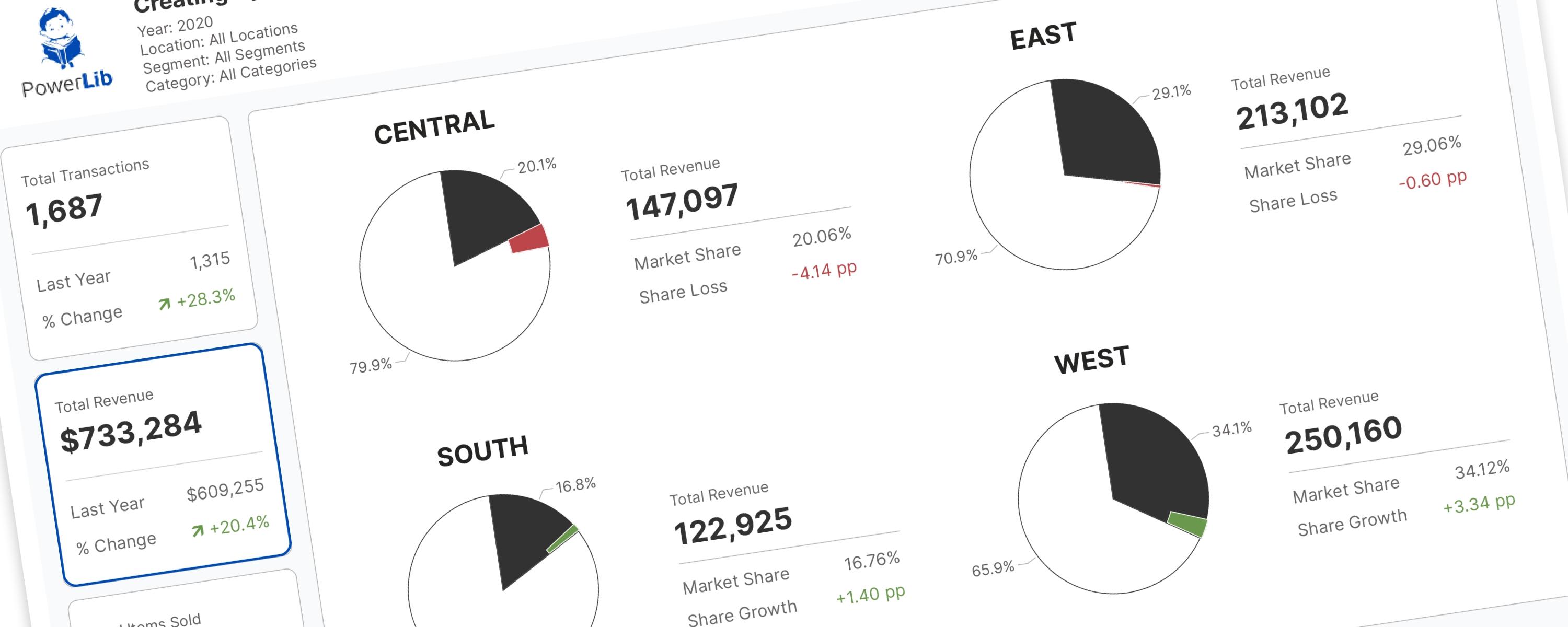
RETURN SWITCH( SelectedMetricOrder, -- Transaction Metrics 0, "Total Transactions", -- Revenue Metrics 1, "Total Revenue",
Scatter PlotMember-Only
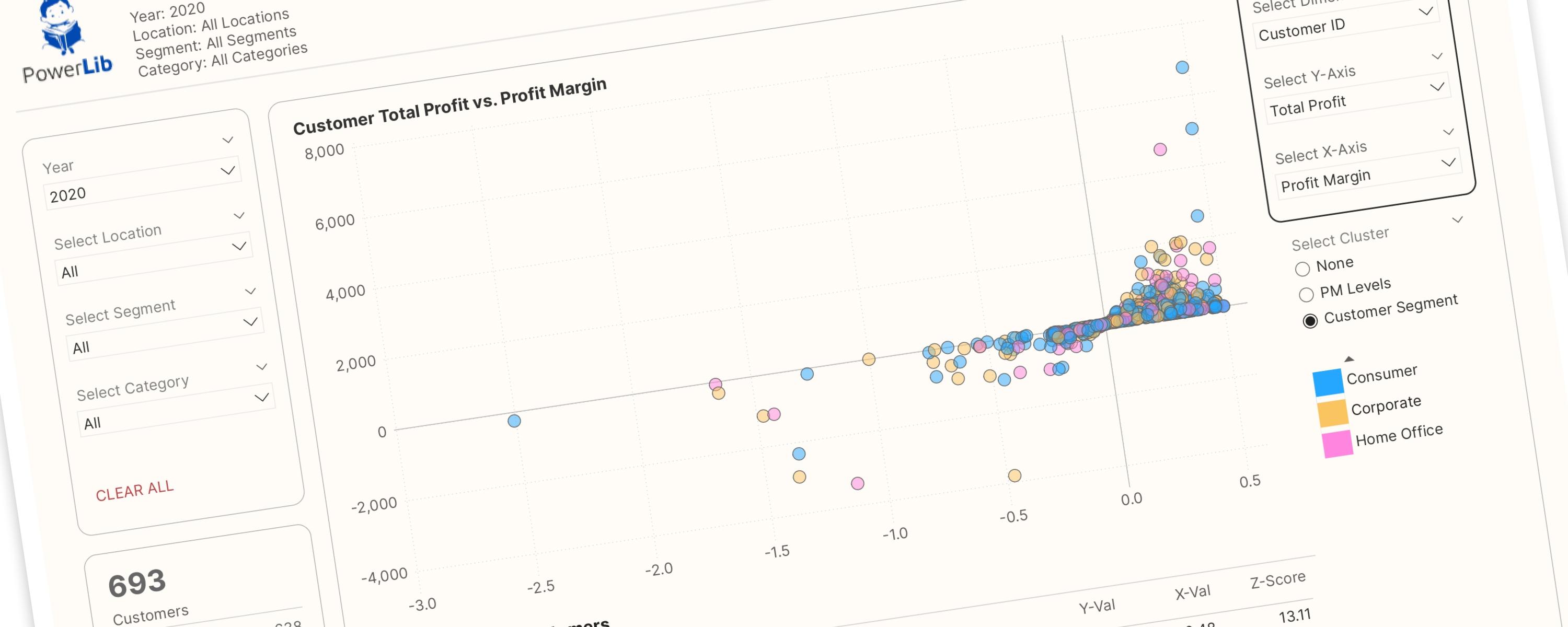
This interactive scatter plot is designed to empower users to interactively explore relationships between different dimensions and metrics. Key features include:
LineFree
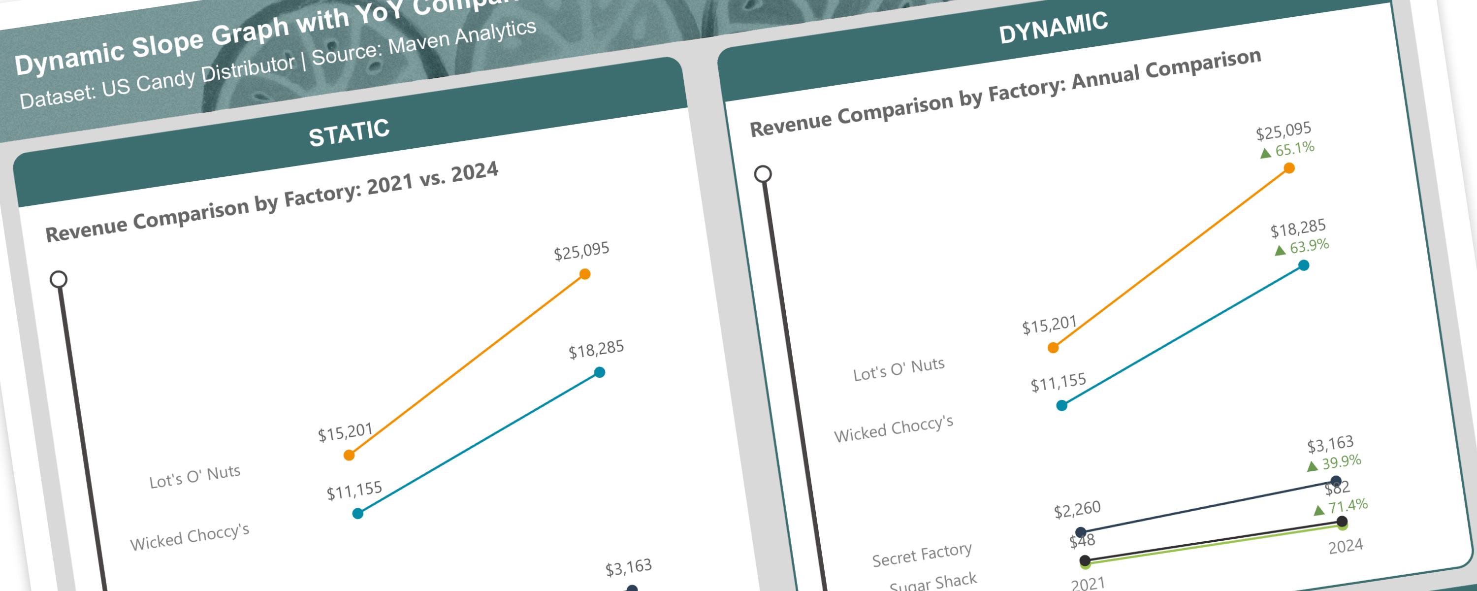
A slope graph is a type of line chart that shows changes between two points in time or two different states.
LineFree
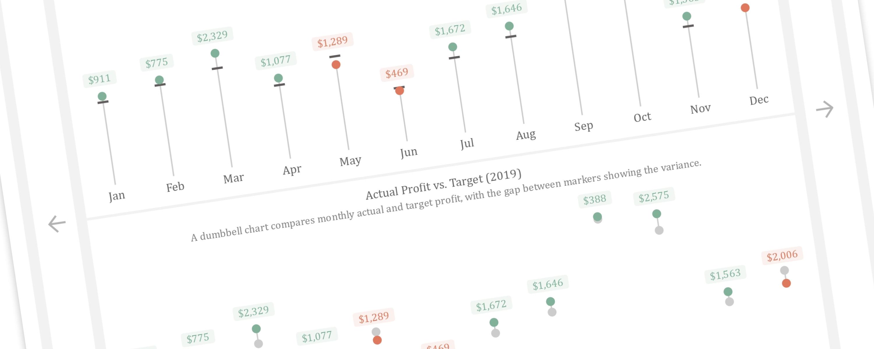
This article demonstrates how to create a dynamic vertical lollipop and dumbbell chart in Power BI.
LineFree
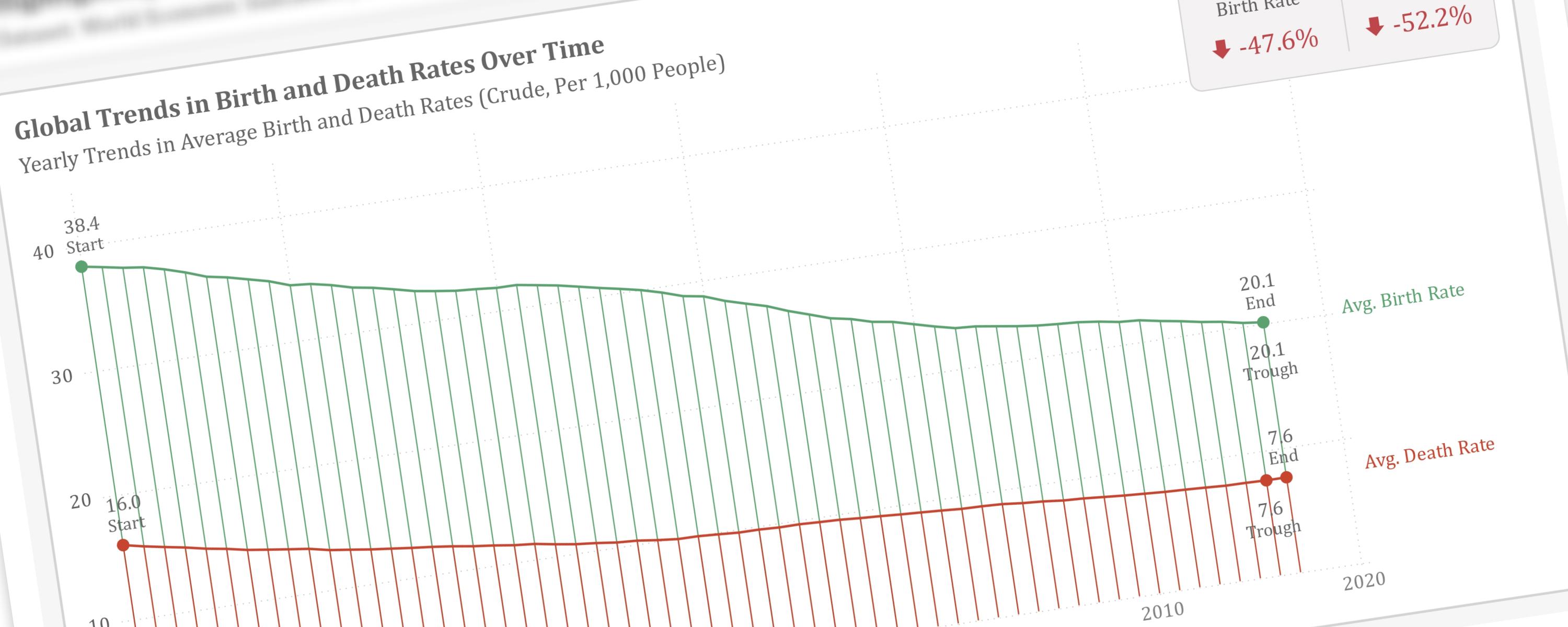
This article will guide you through the process of visually emphasizing key data points within a line chart.
Metric/KPIFree
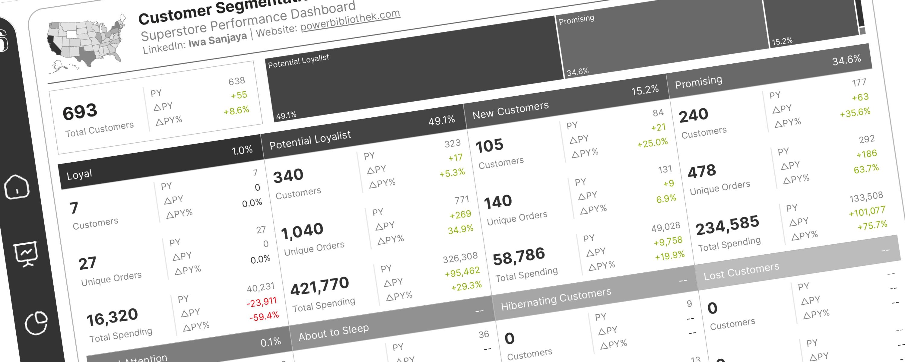
This documentation guides you on how to perform RFM analysis for customer segmentation in Power BI.
Donut/PieFree
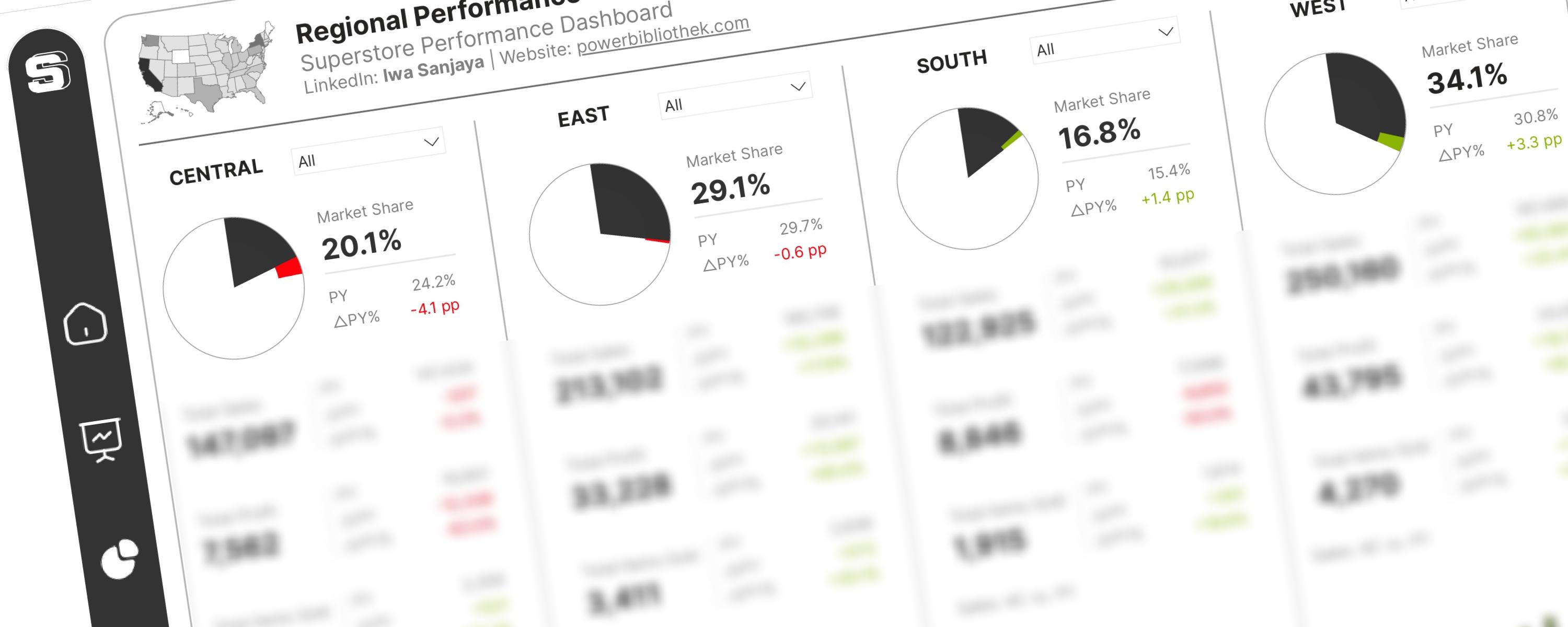
The International Business Communication Standards (IBCS®) provide a set of rules for designing business reports, presentations, and dashboards to ensure clear and effective…
LineMember-Only
The DAX measures used here have been improved and modified for better readability and performance. </Callout>