Matrix/TableFree
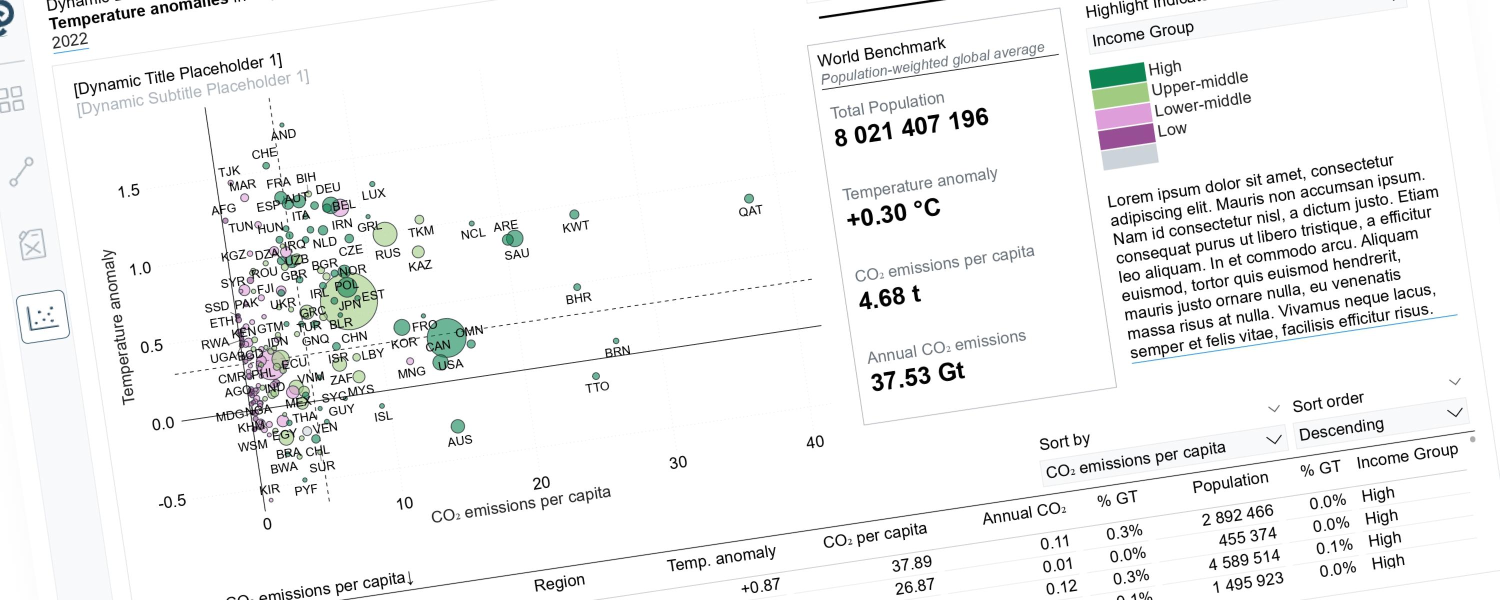
Dynamic Storytelling Using Scatterplots
Scatterplots can tell very different stories depending on the perspective we choose to highlight.
4 February 202667 min read
Documented Power BI techniques — the model change, the DAX, and the exact visual settings. Most are free to read; the rest come with the model files for members.
Matrix/TableFree
Scatterplots can tell very different stories depending on the perspective we choose to highlight.
LineFree
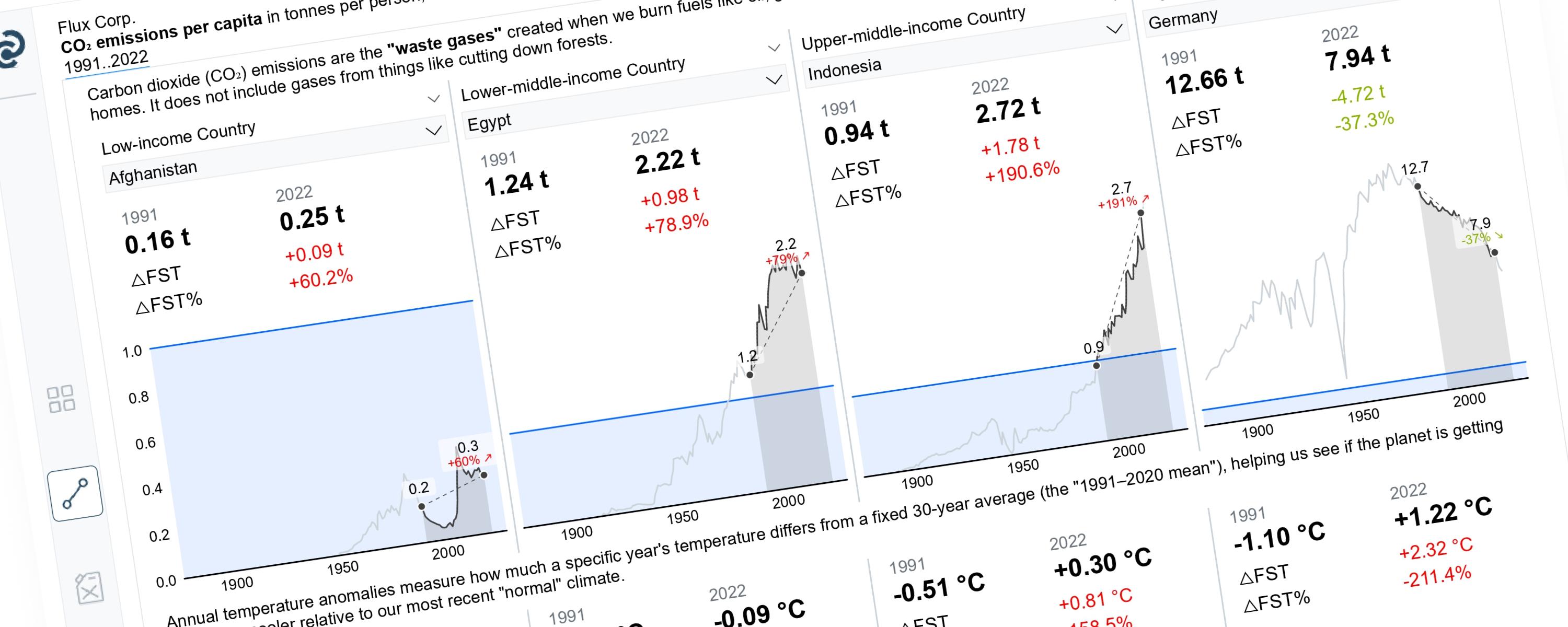
This article demonstrates how to build a Power BI line chart that dynamically highlights a selected year range while greying out the rest.
BarFree
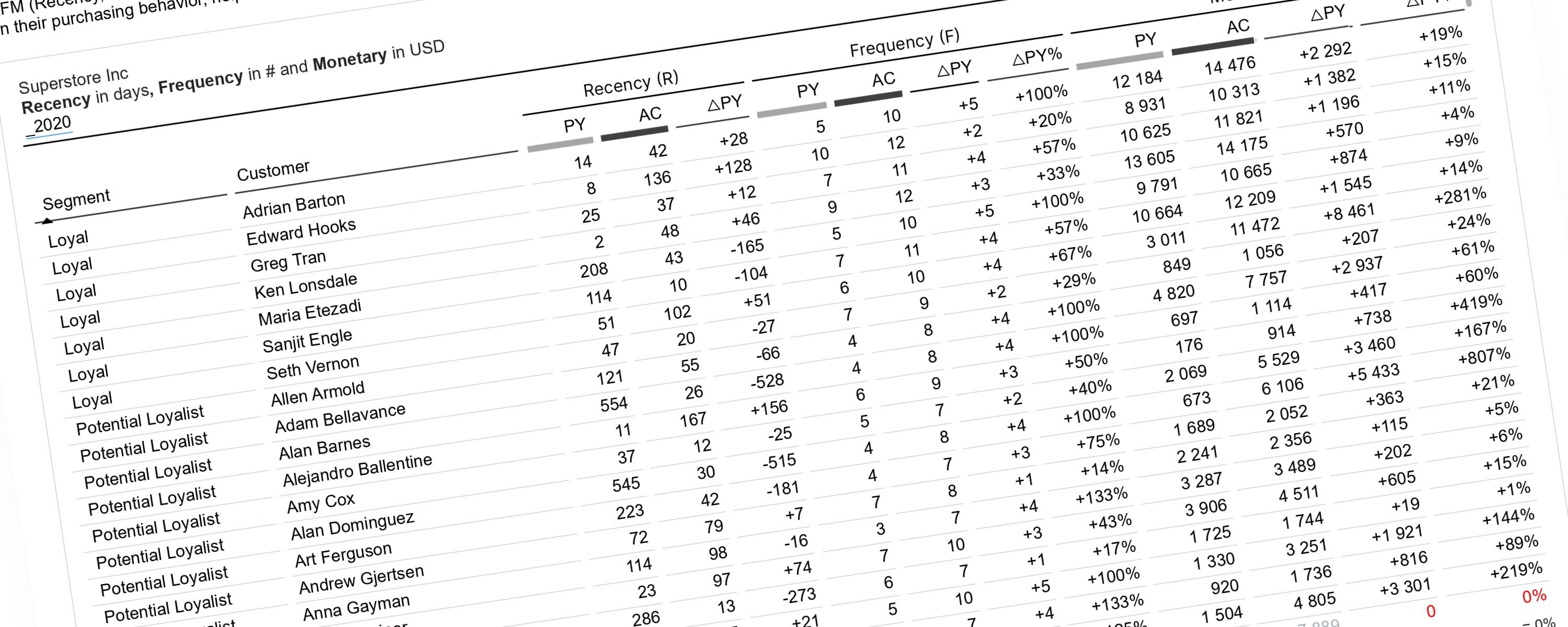
This documentation explains how to perform RFM analysis in Power BI using a dynamic, time-aware approach.
WaterfallMember-Only
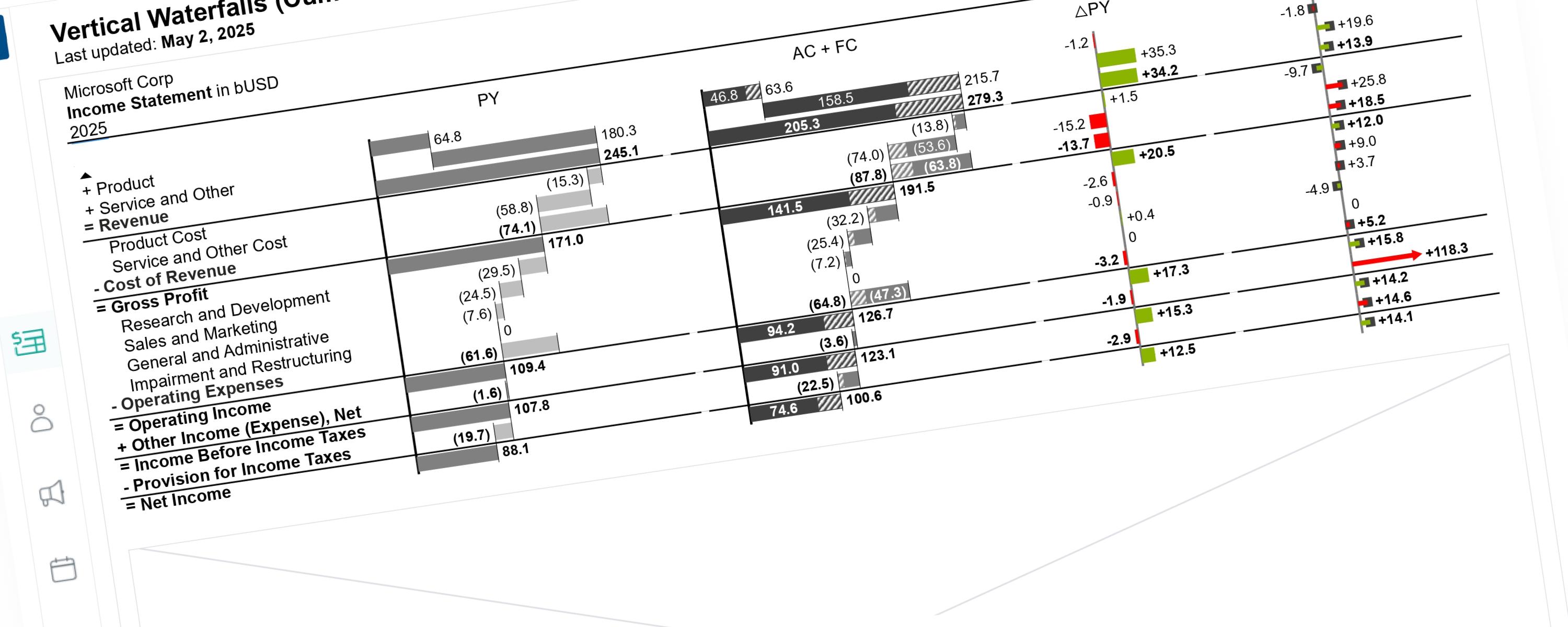
This documentation details the enhancements made to the previous visualization version. These updates focus on global scaling logic and cumulative data representation.
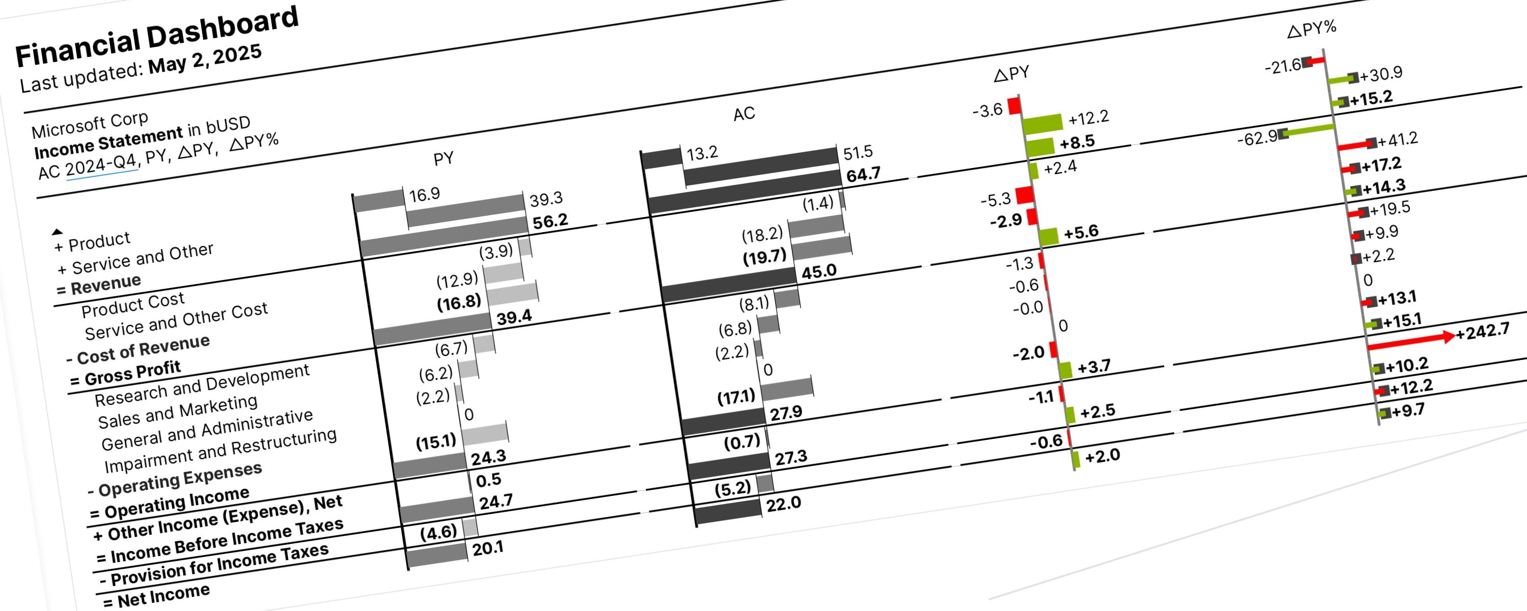
WaterfallMember-Only
Vertical waterfall charts (also called bar waterfalls) show you why a value changed between two different points. They are read from top to bottom and consist of three main parts:
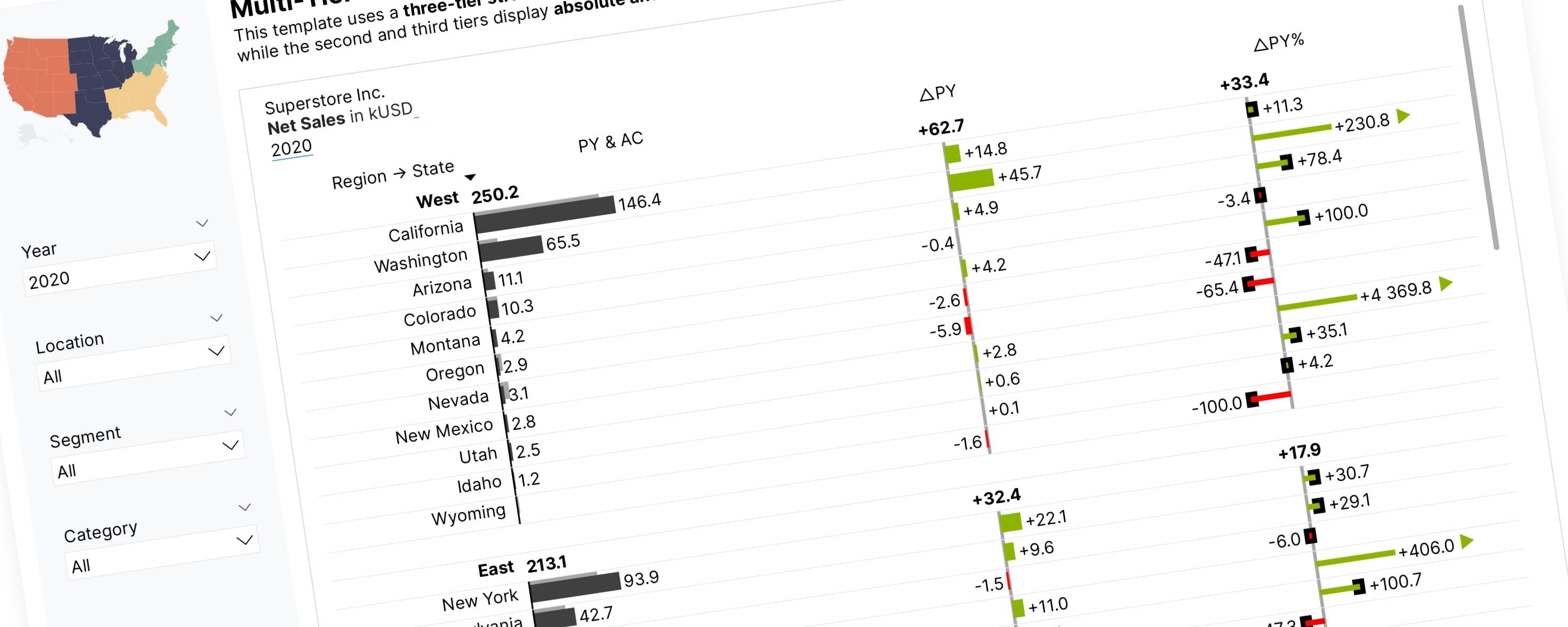
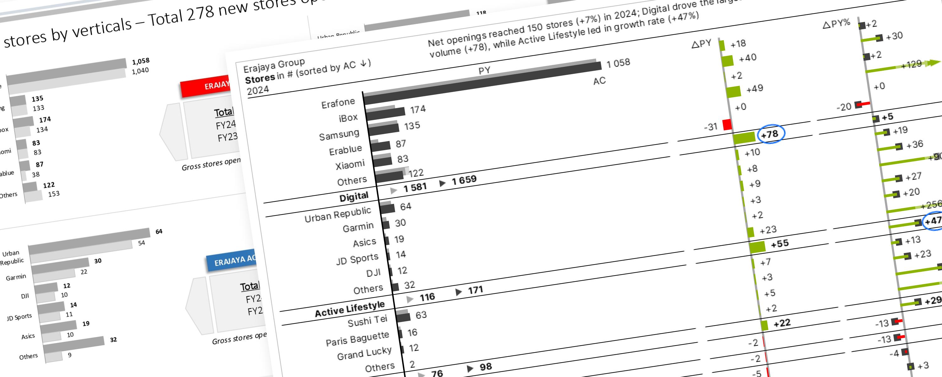
BarFree
This section focuses on using the core IBCS principles to redesign (makeover) various public company reports.
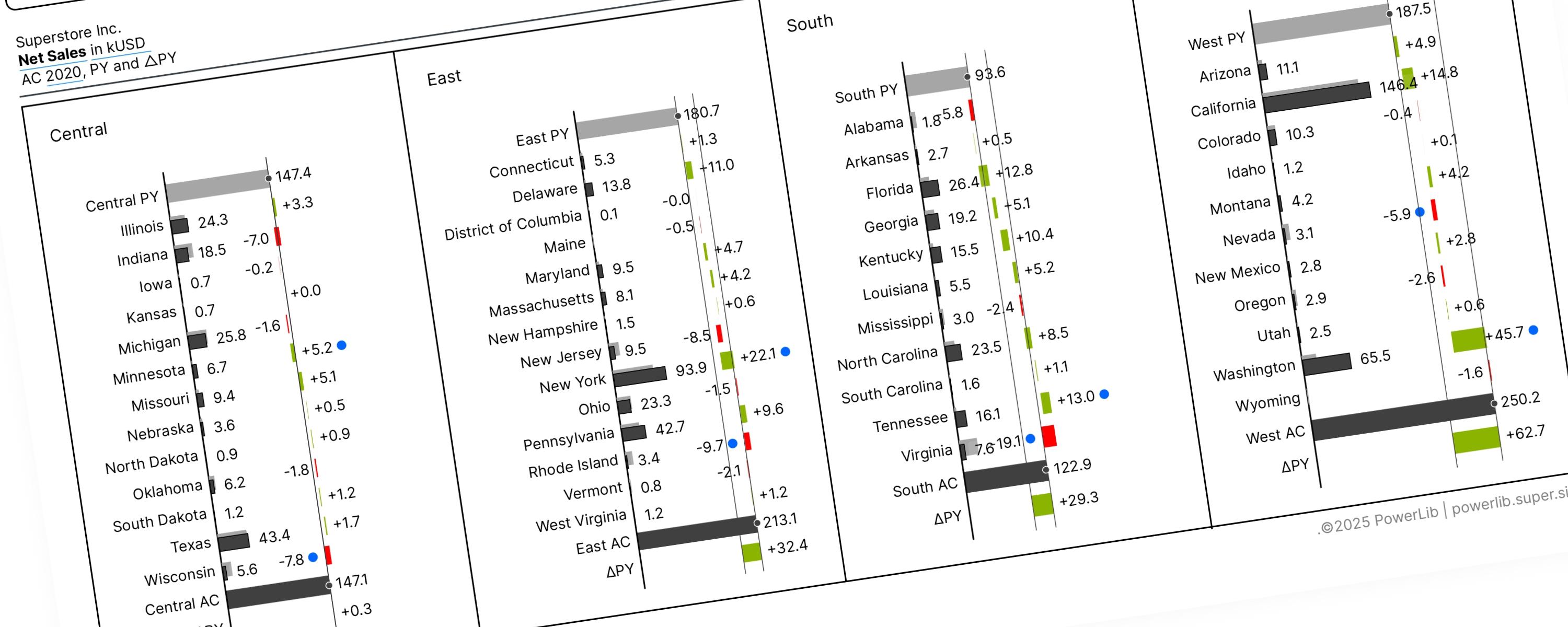
WaterfallMember-Only
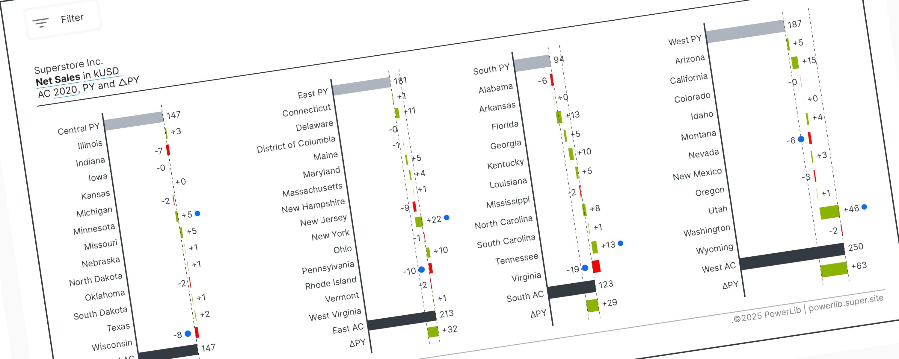
A Vertical Waterfall Chart is a way to clearly show why two numbers are different by breaking down the changes that happened in between.
WaterfallMember-Only
When using a waterfall chart, visual direction determines its purpose: Vertical charts break down data by categories or factors (non-time series), while Horizontal charts track…