Foreword
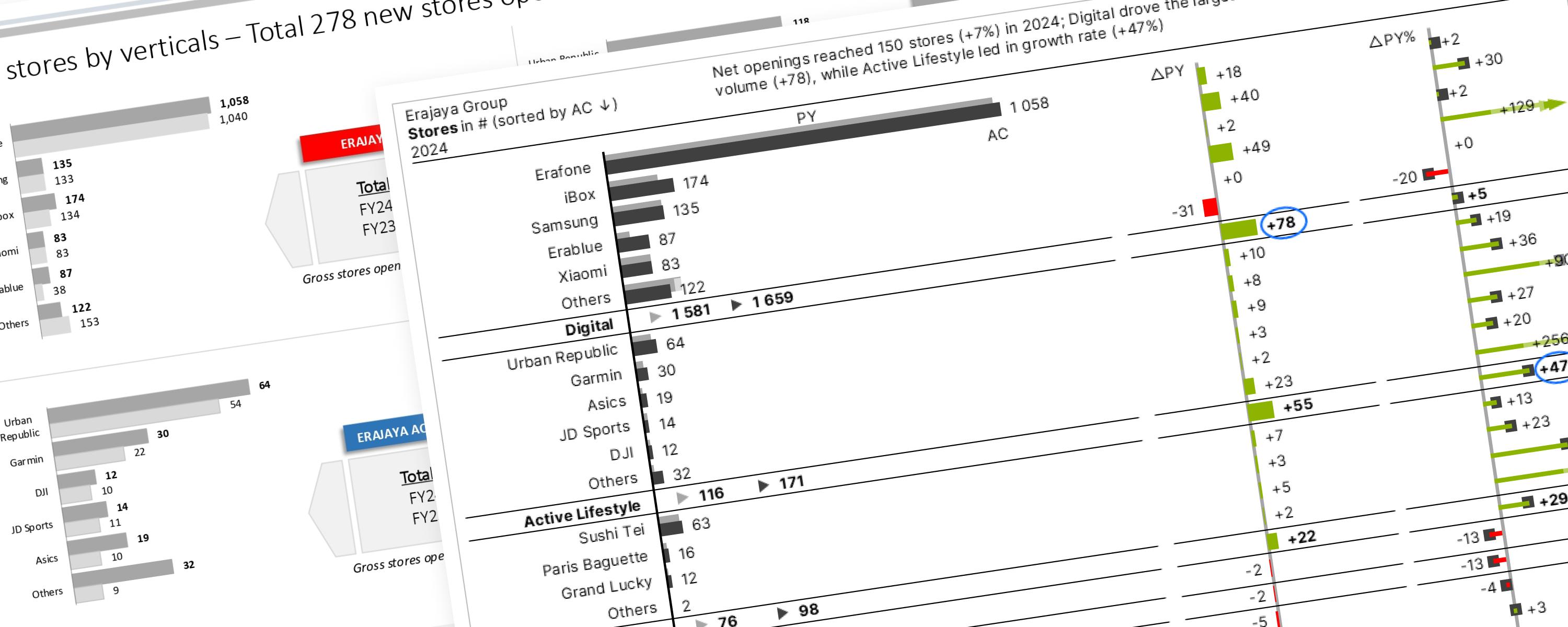
This section focuses on using the core IBCS principles to redesign (makeover) various public company reports. The goal here is to help you understand the fundamentals of clear business communication.
The technical aspects of how to build the charts in specific software won’t be covered; the focus is on why the visual decisions are made. The IBCS principles applied in each makeover step are included here, but for the complete, comprehensive guide, you can download the official IBCS Standards PDF directly from their website (free registration required).
IBCS Standards 1.2 • IBCS - International Business Communication Standards
If you find this type of content helpful and want to see more examples of report makeovers, please let me know!
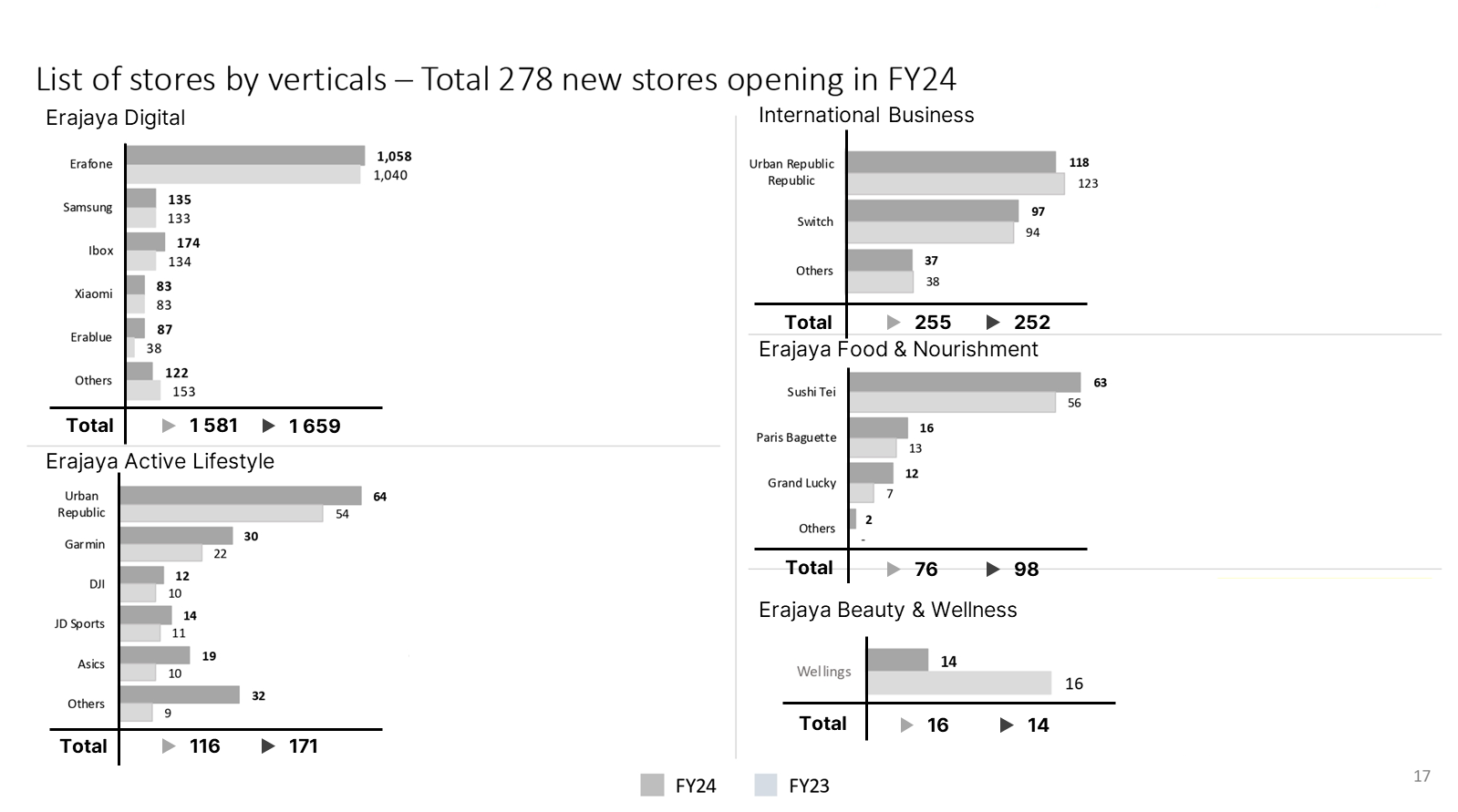
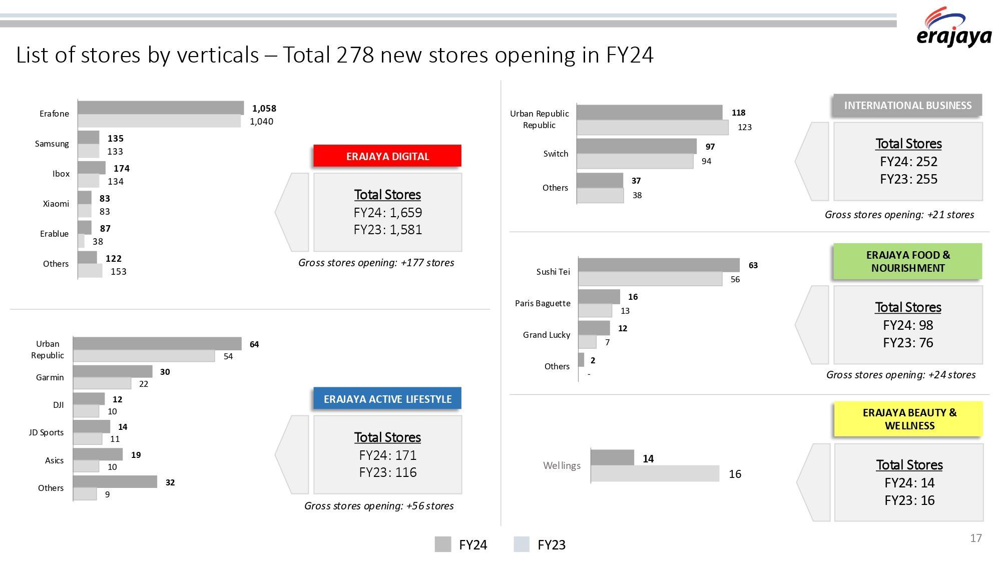 Original report before IBCS
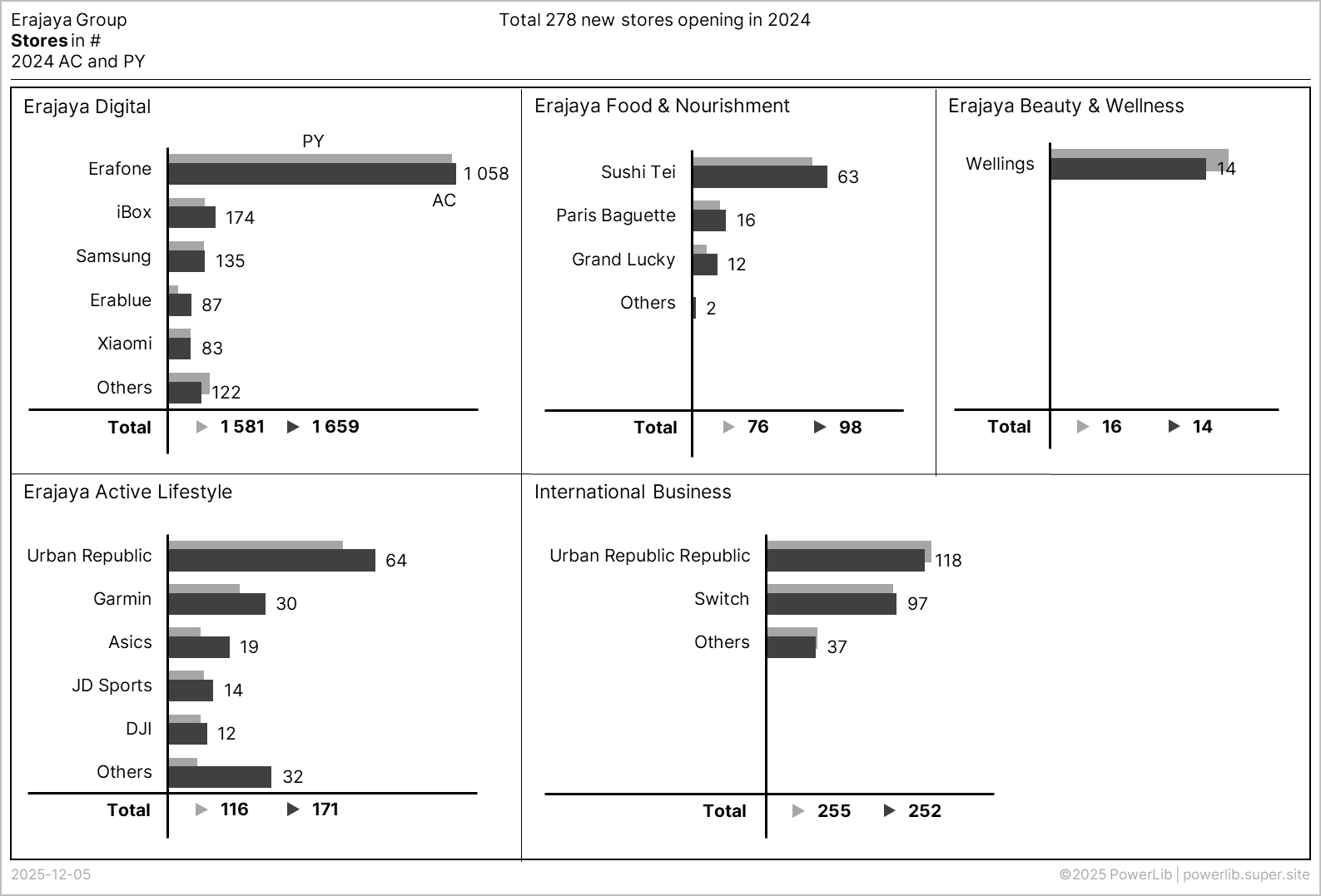
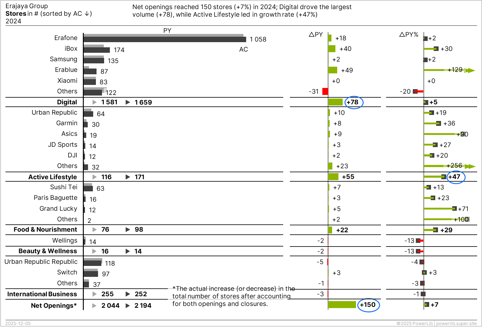 Report makeover with IBCS
About the Company
For this case study, we will analyze the company presentation slide provided by Erajaya Group.
Erajaya (PT Erajaya Swasembada Tbk.) is a leading Indonesian company primarily engaged in the distribution and retail of mobile telecommunication devices, consumer electronics, and value-added services. Established in 1996, it has grown into one of the largest and most trusted companies in its business sector in Indonesia, with a broad nationwide omnichannel network. The company is known for distributing products from various international brands and operating numerous retail outlets.
Business Verticals (Line of Verticals)
Erajaya Group has diversified its business into four main verticals:
-
Erajaya Beauty & Wellness:
- Focus: Health, beauty, and wellness products.
- Retail Concepts: Pharmacies and beauty product outlets, such as Apotek Wellings and The Face Shop outlets.
-
Erajaya Food & Nourishment (EFN):
- Focus: Food and beverage businesses.
- Retail Concepts: Chain restaurants, cafes, bakeries, and grocery stores. Examples include Paris Baguette (bakery) and Grand Lucky (grocery store).
-
Erajaya Active Lifestyle (EAL):
- Focus: Lifestyle-related products, including accessories, Internet of Things (IoT) devices, wearable devices, sport fashion apparel, and products for outdoor activities.
- Retail Concepts: Multi-brand stores like Urban Republic and JD Sports (through joint venture), as well as monobrand stores for brands like Garmin and Asics.
-
Erajaya Digital:
- Focus: Consumer electronics, handsets (mobile phones, tablets), laptops, computers, operator products (SIM cards, vouchers), and accessories.
- Retail Concepts: Multi-brand stores like Erafone and mono-brand stores such as iBox (Apple Authorized Reseller), Samsung, and Mi-store.
In addition to retail and distribution, Erajaya also offers Value Added Services, such as mobile phone protection services (e.g., TecProtec) and handset leasing services.
IBCS “SUCCESS” Formula
The International Business Communication Standards (IBCS) are practical rules for designing clear and effective business reports, presentations, and dashboards. The heart of IBCS is the "SUCCESS" formula, a set of rules covering seven key areas. Following these rules ensures your reports are immediately understandable and actionable.
| Acronym | Rule Area | Simple Explanation |
|---|---|---|
| S AY | Convey a message | Every report must start with a clear main takeaway. It's not enough to just show data—you must tell the reader what it means. |
| U NIFY | Apply semantic notation | Things that mean the same must look the same. This is the foundation: standardizing all visuals (colors, words, formats) so that readers instantly recognize patterns. |
| C ONDENSE | Increase information density | Fit everything needed on one page, if possible. Use space efficiently so all related content is visible together without sacrificing readability. |
| C HECK | Ensure visual integrity | Don't lie with visuals. Present information truthfully, avoiding deceptive techniques like improper scaling or misleading charts. |
| E XPRESS | Choose proper visualization | Use the right chart (diagram, table, etc.) to convey your message as intuitively as possible. |
| S IMPLIFY | Avoid Clutter | Get rid of distractions. Remove complicated, redundant, or purely decorative elements. Focus on the essential data. |
| S TRUCTURE | Organize Content | Follow a logical flow. Arrange content in a consistent, non-overlapping, and easy-to-follow way. |
The recommended steps for applying the "SUCCESS" formula are: SIMPLIFY → UNIFY → CHECK → SAY → STRUCTURE → EXPRESS → CONDENSE.
Case Study
Review the provided company presentation slide from the Erajaya Company Update for 2024.
-
What are the primary findings or messages a reader is intended to take away from this report?
-
Identify the key issues or inconsistencies with how the data is currently presented on the slide, especially concerning clarity and IBCS standards.
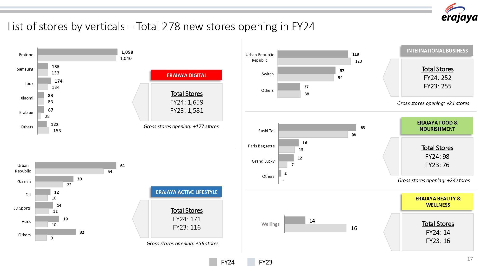 PT Erajaya Swasembada Tbk (ERAA) Company Update (Page 17) — Source: erajaya.com
Implementing IBCS Standards
SIMPLIFY: Avoid Clutter
Get rid of distractions. Remove complicated, redundant, or purely decorative elements. Focus on the essential data.
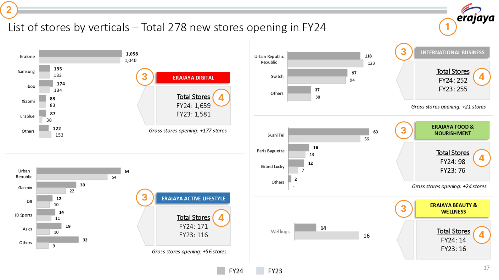
1. Remove the Logo Repetition
The company logo is usually only needed on the cover page. Including it on every single page is repetitive and takes up space. If you must include it (e.g., for public or external reporting), make it very small and place it discreetly in a top corner.
2. Eliminate Decorative Lines
The gray lines across the top are just decoration. Remove them so the reader can focus better on the data.
3. Reduce Color and Box Clutter
-
Get rid of the decorative colors for each business vertical (red, blue, etc.). These colors don't add meaning to the report.
-
The large-sized boxes showing the Total Stores are unnecessary and take up too much room. Integrate the total figures (2024 and 2023) directly into the charts, placed right below the last category for each section.
4. Integrate Totals into Visuals
The recommendation is to display the total values numerically but use a small graphic element to indicate the period (2024 vs. 2023) without creating a large visual element. The total values (2024 and 2023) should be placed directly beneath the last category of each business vertical. IBCS suggests using small triangle markers (or other compact markers) next to the numerical totals. The fill color of the triangle marker should indicate the period:
-
Light Gray: For the Previous Period (PY), which is 2023.
-
Dark Gray: For the Actual Period (AC), which is 2024.
It's important that the total store counts for each vertical (e.g., Erajaya Digital Total: 1 659 stores) are not visualized using a bar. If a bar were used for the total (1 659) alongside brands like Xiaomi (83), the Xiaomi bar would be visually insignificant, making meaningful comparison of the smaller brand values impossible.
After applying the SIMPLIFY principles, the result is as follows:
Applied IBCS Principles
SI 1 AVOID UNNECESSARY COMPONENTS
Get rid of anything purely decorative, like backgrounds, extra pictures, or repeated logos. If a component doesn't help explain the data, it's just visual noise and should be removed.
SI 1.1 AVOID CLUTTERED LAYOUTS
SI 2 AVOID DECORATIVE STYLES
Simplify complicated charts and graphs to make them easier and faster to understand. While the "Avoid unnecessary components" step removes entire items (like decorative lines), this step is about choosing the clearest and simplest possible style for the charts themselves.
SI 2.1 AVOID FRAMES, SHADES, AND PSEUDO-3D WITHOUT MEANING
SI 4 AVOID REDUNDANCIES
We should avoid using redundant terms because they usually make charts and tables harder to read. Though some repetition is okay (like showing the time period in both the title and the chart), any unnecessary redundancy slows down the reader.
SI 4.1 AVOID SUPERFLUOUS EXTRA WORDS
SI 4.3 AVOID REPEATED WORDS
UNIFY: Apply Semantic Notation
Things that mean the same must look the same. This is the foundation: standardizing all visuals (colors, words, formats) so that readers instantly recognize patterns.
1. Improve Title and Message
-
A report's heading should be unified, clearly separating the title from the key message. The message must fully describe the visual content. The current heading combines the Title and the Message. To follow best practices, these two components must be separated. The Title identifies the content, and the Message highlights the main takeaway.
-
The current title, "List of stores by verticals," is confusing. The charts display the number of stores for each brand (not just a plain list). The title should reflect this to avoid reader confusion.
-
The terminology in the message and the data must match. The main header uses "new stores," while the business vertical summaries use "gross stores opening." Use a single, consistent term (e.g., "Gross Store Openings") across the entire report to ensure clarity.
⚠️ IMPORTANT NOTES
The term "Gross stores opening" is specific to retail metrics and can be ambiguous. While "stores opening" clearly indicates new locations, the prefix "Gross" adds necessary context that may be missed. In the retail industry, Gross Stores Opening (or simply Gross Openings) refers to all new stores opened during the year, without considering any stores that may have closed. For example, Erajaya Digital has Gross stores opening: +177 stores.
| Business Line | Total Stores (2023) | Total Stores (2024) | Net Openings | Gross Openings |
|---|---|---|---|---|
| Erajaya Digital | 1 659 | 1 581 | +78 | +177 |
The difference between the Gross Opening (+177) and the Net Openings (+78) is due to the number of stores that closed during the year (177 - 78 = 99 store closures). This naturally leads to the concept of Net Stores Opening, which is the actual increase or decrease in the total number of stores after accounting for both openings and closures (Gross Openings minus Closures).
Note: Should this term be retained, it is highly suggested to include a brief, supplementary explanation below the chart to define the term.
2. Adjust the Chart’s Dimension
The current choice of using grouped bar charts (or column charts) to show store counts is a good one. It makes comparing the stores for each brand quite straightforward. The report correctly follows an IBCS suggestion by placing the business line/category names (structure) on the vertical axis. It provides more horizontal space for long brand names (like Paris Baguette or Urban Republic) so they can be read fully without being cut off (truncated). However, notice that some brand names, like "Urban Republic" and “Urban Republic Republic”, are wrapping onto two lines. IBCS emphasizes maximizing space for clarity. If possible, you should extend the width of the chart area to give the brand names enough space to display on a single line. Clear presentation prevents readers from having to squint or re-read wrapped text.
3. Sort the Data
A major rule in IBCS is to sort your data logically to allow for quick comparison and analysis. Looking at the charts, it's unclear how the brands are currently ordered. They aren't consistently sorted by the highest store count in 2024, nor are they sorted alphabetically. For example, in Erajaya Digital, Erafone (1 058 stores in 2024) is first, but then Samsung (135 stores in 2024) is followed by iBox (174 stores in 2024) – this looks random.
To improve clarity, all charts should be sorted consistently. The most common and effective IBCS method is to sort the brands based on the key measure (usually the latest, most important data point), which in this case is the 2024 Total Stores, from highest to lowest. This immediately highlights the most and least significant brands in the current period.
4. Eliminate the Legend
The separate legend at the bottom of the slide, showing dark gray for 2024 and light gray for 2023, creates "eye ping-pong." The reader has to look at a bar, then down to the legend, and then back up to the bar to understand the period it represents. Following IBCS principles, the period should be stated directly into the page title, on the third line (”WHEN”: Time, Scenario, and Variance). The scenario can be added as well on this line or integrated into charts, not positioned directly. This will improve legibility and speed up comprehension of charts.
⚠️ IMPORTANT NOTE
The report is comparing two periods (2024 and 2023). IBCS recommends a specific, time-based visual structure for this. When showing a comparison between a past period and a current/actual period, the flow should be Past (2023) on top, followed by Actual (2024) on the bottom. This is a vertical top-to-bottom reading structure.
For a bar chart like this, IBCS recommends a single, overlapped bar where:
-
The Past Period (2023) bar is positioned behind and displayed in a lighter, less emphasized color (light gray).
-
The Actual Period (2024) bar is positioned in front of the 2023 bar, using a strong, actual-data color (dark gray).
After applying the UNIFY principles, the result is as follows:
Applied IBCS Principles
UN 1 UNIFY TERMINOLOGY
Terms are the written elements of your business communication. Using unified terms and abbreviations, along with standard formats for numbers, units, and dates, makes it much faster for the reader to understand the data.
UN 1.2 UNIFY NUMBERS, UNITS, AND DATES
To make reports easier to read, always use the same format throughout the organization for numbers, units, and dates.
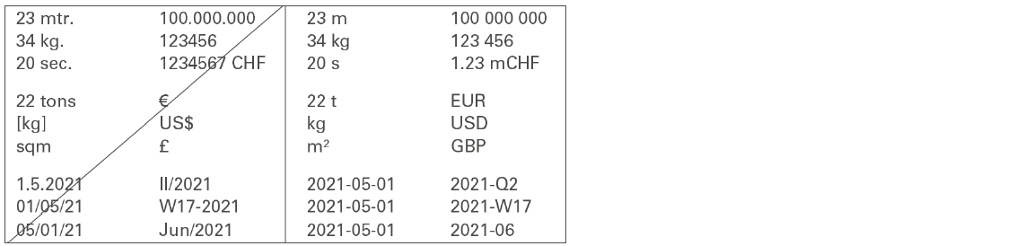 Figure UN 2.1: Unify numbers, units, and dates — Source: IBCS Standards 1.2
Consistency in how you write numbers, units, and dates is crucial for global reports. Different countries use different formats (e.g., commas vs. dots for decimals), so standardizing these formats organization-wide is mandatory.
1. Numbers
To unify formats, follow the international SI recommendation (ISO 80000-1):
-
Thousands Separator: Use a narrow blank space (not a comma or dot) to separate thousands (e.g., 1 234 567).
-
Decimal Sign: You can use either a comma or a dot (1,23 or 1.23), but be consistent across all documents.
-
Avoid Long Numbers: To simplify the view and avoid distractions (see SIMPLIFY), use metric prefixes (k, m, b) to limit the number of digits to a maximum of three in charts and four in tables.
-
Negative Values: Use a consistent format for all negative numbers, either the minus sign (123) or parentheses ((123)).
-
Positive Values: Do not use a plus sign (+) unless the number represents a variance (a difference or change).
2. Currencies
For clear and consistent currency representation:
-
Use ISO Codes: Use the three-letter ISO 4217 abbreviations (e.g., EUR, CHF, USD). If your report includes many different currencies, do not use special symbols (like €, $, or £).
-
Metric Prefixes: Use consistent single-digit metric prefixes in lowercase alongside the currency unit to save space:
- k for thousand (e.g., 1 kEUR)
- m for million (e.g., 1 mEUR)
- b for billion (e.g., 1 bEUR)
3. Physical Units
-
For physical measurements (weight, distance, volume), use the International System of Units (SI) (e.g., kg, t, m, km).
-
For non-monetary values expressed in thousands or millions, SI also suggests metric prefixes like k, M, or G.
4. Dates
- Use the international ISO 8601 standard format for dates: YYYY-MM-DD (e.g., 2025-12-31).
(Note: Additional rules for unifying time periods are covered in the UNIFY rule UN 3.3).
UN 2 UNIFY DESCRIPTIONS
Descriptions are the words used to explain charts and graphs. To help people understand the visuals faster, this section shows how to use unified (consistent) layouts for all your descriptions.
UN 2.1 UNIFY MESSAGES
UN 2.2 UNIFY TITLES AND SUBTITLES
Titles identify the entire content of a page or its objects, ensuring that readers have all the information needed to understand what they are seeing. Unlike messages, titles must remain neutral and should not include any evaluation, such as conclusions, interpretations, or propositions.
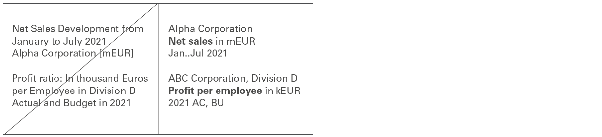 Figure UN 2.2: Unify titles and subtitles — Source: IBCS Standards 1.2
If a page contains more than one object (like multiple charts), use a page title for the entire page and subtitles for the different objects.
The combination of the title and any applicable subtitle must always include:
-
The name of the reporting unit (e.g., "Sales Department").
-
The measure (e.g., "Revenue").
-
The time period (e.g., "FY 2024").
Any elements that apply to the whole report page should be included in the page title, while elements that relate to only a subset of the report should be included in the relevant subtitle.
UN 2.3 UNIFY THE POSITION OF LEGENDS AND LABELS
By standardizing (making consistent) the way you write legends and labels, you make charts clearer and help people grasp the information more quickly.
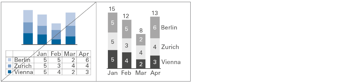 Figure UN 2.3: Unify the position of legends and labels — Source: IBCS Standards 1.2
Legends
Legends (or "data series labels") identify the different data groups in your chart. Whenever possible, place the legends directly within the chart itself, not outside of it. Always write legends horizontally so they are easy to read.
For basic single column or bar charts, the legends are usually best included in the chart's main title. Place the legends either to the left of the first column or to the right of the last column . Stacked Columns: Place the legends either to the left of the first column or to the right of the last column .
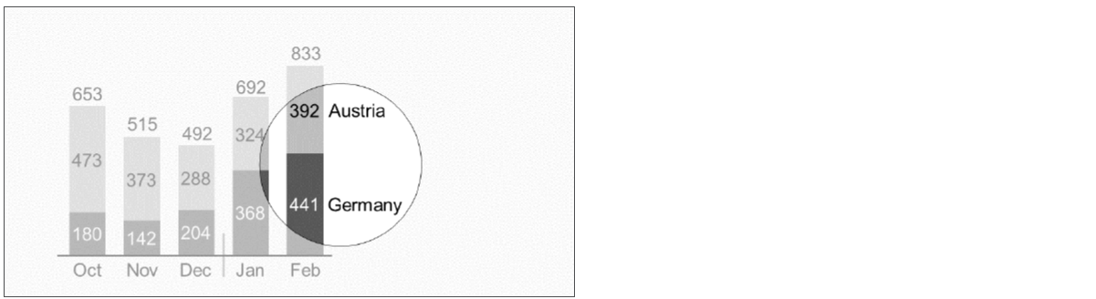 Figure UN 2.3: Legends of a stacked column chart (example) — Source: IBCS Standards 1.2
Stacked Bars: Center the legends above the top bar .
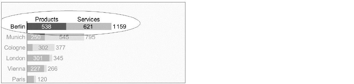 Figure UN 2.3-2: Legends of a stacked bar chart (example) — Source: IBCS Standards 1.2
Grouped Charts: For grouped columns or bars, you can use assisting lines to help clearly connect the legend to the correct visual element
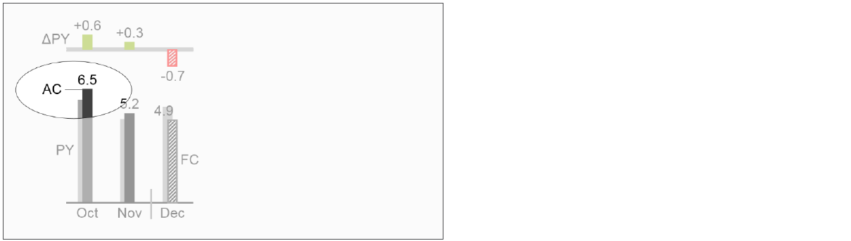 Figure UN 2.3-3: Legend with assisting line (example) — Source: IBCS Standards 1.2
Line Charts: Position legends either to the right where the line ends or close to the line's path throughout the chart .
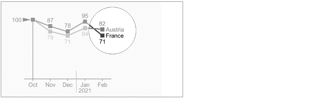 Figure UN 2.3-4: Legends of a line chart (example) — Source: IBCS Standards 1.2
Complex Charts (Two Axes): For charts that have two vertical axes, it's often best to place legends externally next to their corresponding symbols. If helpful, you can integrate them by putting them right next to data points or bubbles .
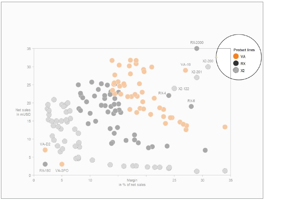 Figure UN 2.3-5: Legends in a chart with two value axes (example) — Source: IBCS Standards 1.2
Labels
Labels (or data labels) are the actual numbers that show the value of each chart element (like the number "50" on a bar). To make your charts cleaner and easier to read, follow these simplification rules:
-
Keep it Brief: Use labels with no more than three digits (e.g., use "100" instead of "100.00").
-
Remove Clutter: Omit the labels for very small chart elements to avoid crowding the visual. Also, avoid any other labels that are unnecessary or distracting.
-
Keep it Horizontal: Always write labels horizontally for the best legibility.
Position labels next to their visualization elements. If there isn't enough space, use connecting lines to link the label to the correct element.
Charts with Horizontal Axes (Column Charts): Place labels above or below the visual elements. For stacked columns, you can either center the label inside the data point (if it's large enough) or place it just outside the data point.
 Figure UN 2.3-6: Labels in a column chart (example) — Source: IBCS Standards 1.2
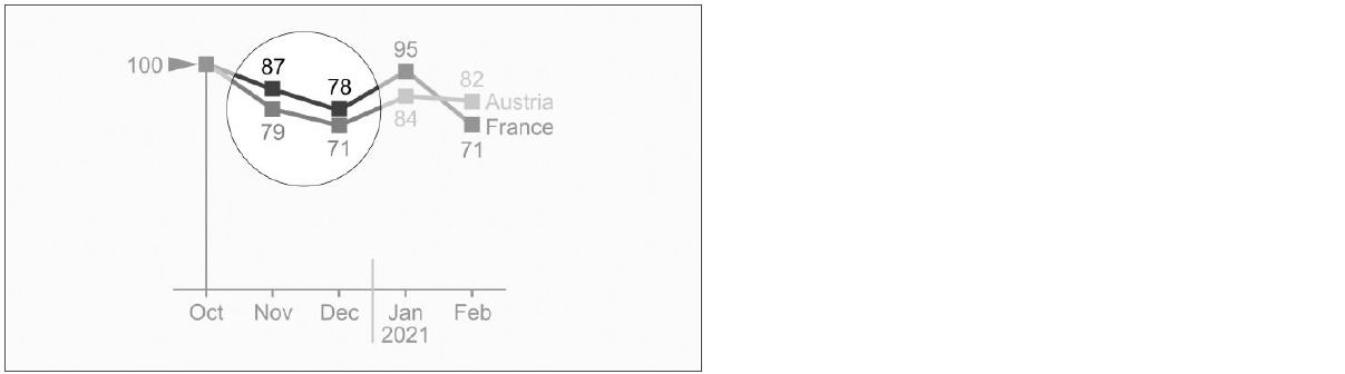 Figure UN 2.3-7: Labels in a line chart (example) — Source: IBCS Standards 1.2
Charts with Vertical Axes (Bar Charts): Place labels to the right or left of the visual elements. For stacked bars, you can either center the label inside the data point (if it's large enough) or place it just outside the data point .
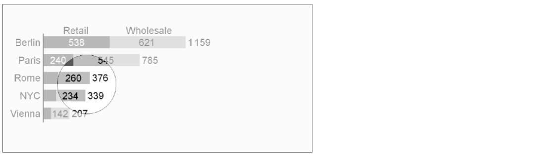 Figure UN 2.3-8: Labels in a chart with vertical category axis (example) — Source: IBCS Standards 1.2
Complex Charts (Two Axes): Position labels next to the elements (above, below, right, or left). If you have large bubble elements, you can also center the label inside the bubble.
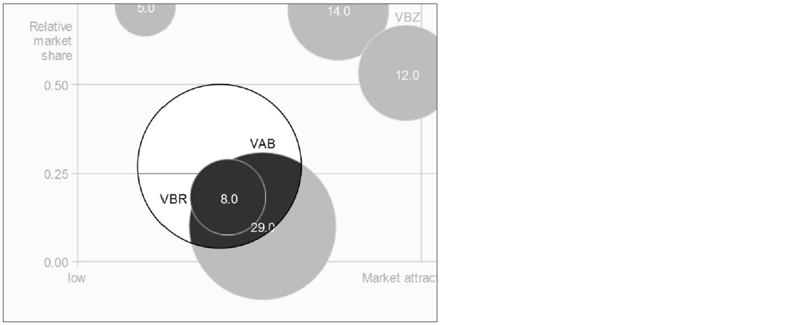 Figure UN 2.3-9: Labels in a chart with two value axes (example) — Source: IBCS Standards 1.2
UN 3 UNIFY DIMENSIONS
Data in reports can be looked at from different viewpoints, which we call dimensions. For example:
-
Measure Dimension: Includes business metrics like sales, profit, and margin.
-
Time Dimension: Includes periods like months, quarters, or years.
Identifying these different dimensions using uniform (consistent) visualization helps everyone understand the data quickly. This section suggests standards for how to visualize key dimensions like measures, scenarios (e.g., actual vs. budget), time periods, and structure (e.g., organization hierarchy).
UN 3.2 UNIFY SCENARIOS
Scenarios represent the different layers or versions of your business data. They are crucial for comparison and insight. Typical scenarios include Actual, Plan, Budget, and Forecast.
It is essential to visually distinguish the three basic types of data so readers instantly know if they are looking at real results, expectations, or targets, without needing to read the labels.
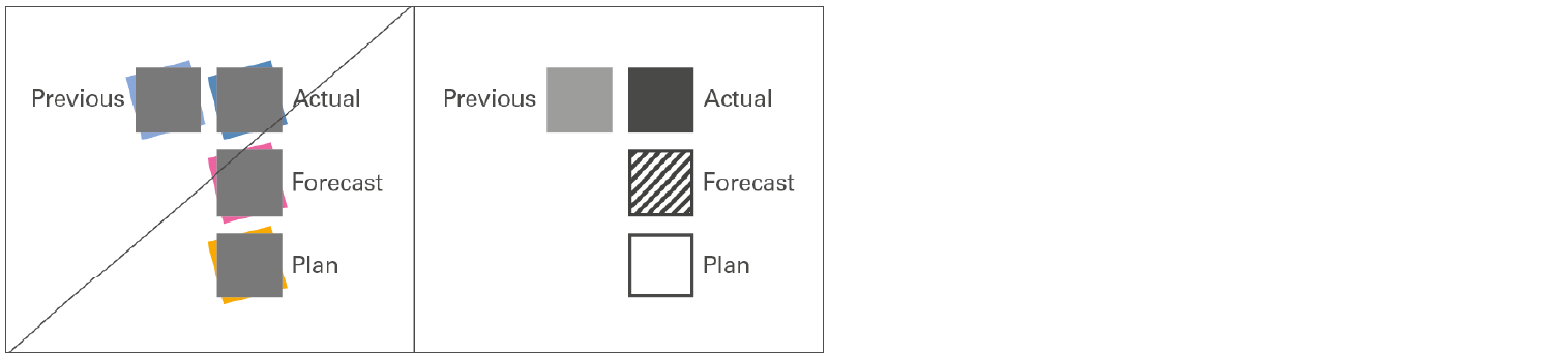 Figure UN 3.2: Unify scenarios — Source: IBCS Standards 1.2
1. Actual Scenarios: Measured Data
These refer to results that have already happened (past or present).
| Scenario Type | Description | Visual Rule | Abbreviation (Standard) |
|---|---|---|---|
| Actual | Current measured data. | Solid dark fill (e.g., dark gray). | AC |
| Previous Year | Measured data from an earlier period. | Lighter solid fill (e.g., light gray) when compared directly to 'Actual'. | PY |
Note: When presenting data over a period of time (a time series), there is no need to color the earlier periods lighter.
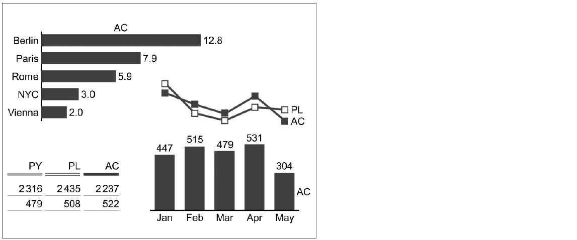 Figure UN 3.2-1: Visualization of measured data (examples) — Source: IBCS Standards 1.2
2. Planned Scenarios: Fictitious Data
These refer to targets or goals that have not yet happened.
| Scenario Type | Description | Visual Rule | Abbreviation (Standard) |
|---|---|---|---|
| Plan/Budget | Fictitious (not-yet-realized) data. | Outlined (bordered/framed) area with no internal fill. The empty space shows the data hasn't "filled up" yet. | PL / BU |
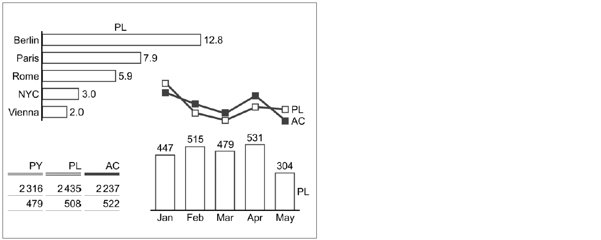 Figure UN 3.2-2: Visualization of fictitious data (examples) — Source: IBCS Standards 1.2
3. Forecasted Scenarios: Expected Data
These refer to expected results. They are technically fictitious but are based on current measured data, making them more certain than a simple "Plan."
| Scenario Type | Description | Visual Rule | Abbreviation (Standard) |
|---|---|---|---|
| Forecast | Expected data based on current results. | Outlined area with a hatched fill (striped pattern). The dark stripes match the 'Actual' data color. | FC |
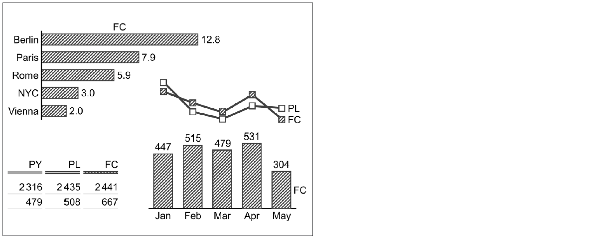 Figure UN 3.2-3: Visualization of expected data (examples) — Source: IBCS Standards 1.2
Special Visual Rules
-
Chart Elements: This scenario notation (solid fill, outline, or hatched) applies to standard chart elements like bars, columns, line markers, and area fills.
-
Variance Charts: In charts that show the difference (variance) between two scenarios, the notation is applied to the axes to show which scenario is the main point of reference.
-
Complex Charts (Stacked/Multiple Layers): For charts like stacked columns, apply the scenario notation only to the lowest segment. Fill all segments above it with different shades of gray. If the upper segments represent Plan or Forecast data, add an outline (frame) or hatch pattern to those segments.
UN 3.4 UNIFY STRUCTURE DIMENSIONS, USE VERTICAL AXES
What are Structure Dimensions?
Structure Dimensions are any labels that are not numbers you are measuring (measures), not different versions of the data (scenarios like Budget vs. Actual), and not time periods (like months or years). They are the categories that define the data.
Common examples of these labels include:
-
Products (e.g., Samsung, Apple)
-
Regions (e.g., Asia, Europe)
-
Organization Units (e.g., departments)
The Vertical Rule
You should almost always display these structure dimensions on the vertical axis of your chart. This means you'll be using a horizontal bar chart layout. Why Vertical? Placing categories on the vertical axis gives long names enough horizontal space to be written out fully without being cut off or wrapped. However, there are very few times you wouldn't follow this rule, usually when a specific industry standard requires something different (like certain specialized statistical charts).If you want to help the reader quickly tell different categories apart (like using a little globe symbol for regions or a box symbol for products), you can use custom symbols next to the labels.
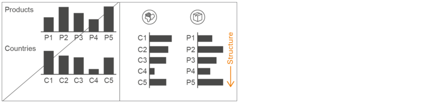 Figure UN 3.4: Unify structure dimensions, use vertical axes — Source: IBCS Standards 1.2
CHECK: Ensure visual integrity
Don't lie with visuals. Present information truthfully, avoiding deceptive techniques like improper scaling or misleading charts.
Use Consistent Scaling
When you're comparing data across different charts, it's crucial for the X-axis (horizontal axis) scale to be the same (or "shared") because the difference in scale can mislead your audience. The charts for each business line (verticals) do not use the same maximum value for their bars. They're scaled independently based on the largest number within that specific chart. This prevents a meaningful comparison of the actual size of the different business lines.
Example: The actual year’s bar for Erafone (1 058 stores) is the longest bar in its chart, while the previous year’s bar for Urban Republic (123 stores) is the longest bar in its chart. Even though 1,058 is more than eight times larger than 123 (1 058 / 123 ≈ 8.6x), the bar representing 1 058 and the bar representing 123 appear to be almost the same length on the page. This is because the maximum length on the "Erajaya Digital" chart represents 1 058 stores, while the maximum length on the "International Business" chart represents only 123 stores.
To create an accurate and meaningful visual comparison across all business lines, the horizontal scale (X-axis) needs to be standardized. Instead of scaling each chart based on its individual maximum, a single, consistent maximum X-axis range must be chosen and applied to all charts. This fixed maximum value should be:
-
Greater than the highest value across all business lines, which is 1 058 (Erafone).
-
A round number that provides a clear visual margin, such as 1 200.
Additionally, ensure the X-axis minimum starts from 0.
Always ensure charts intended for direct comparison use a common axis scale. If you are comparing a small value (like 10) to a large value (like 1,000), they should both be judged against the same visual maximum, otherwise the chart will overemphasize the smaller data points.
After applying the CHECK principles, the result is as follows:
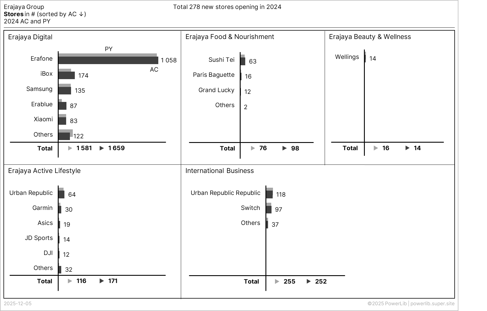
Applied IBCS Principles
CH 4 USE THE SAME SCALES
For accurate visual comparison, charts that show the same unit of measure (like comparing "Sales" to "Sales") must use identical scales. If you absolutely cannot use the same scale, you must clearly indicate the difference. Try to use one consistent scaling concept throughout the entire report or presentation material.
CH 4.1 USE IDENTICAL SCALE FOR THE SAME UNIT
SAY: Convey a message
Every report must start with a clear main takeaway. It's not enough to just show data—you must tell the reader what it means.
Enhance the Message
The least goal of this specific slide is to inform the reader about an interesting detection, which is the company's performance in opening 278 new stores across all business verticals in FY24. However, the current visual presentation doesn't directly support this message. A major issue is the inconsistency in terminology: the message states "new stores opening" while the original visuals used the term "gross stores opening," which can confuse readers trying to match the narrative to the data. Furthermore, the overall message itself is not highlighted or emphasized in the visual, forcing readers to observe and deduce the intended takeaway themselves.
This leads to a visual limitation regarding data support. The existing bar charts only visualize the final number of stores for each period (2024 and 2023) within each vertical. They cannot directly support the message of "gross stores opening" (stores opened without factoring in closures). However, these charts do naturally support conveying the Net Store Openings, which is calculated as the difference, or variance, between the periods (2024 stores minus 2023 stores, thereby accounting for closures). Therefore, the suggestion is to revise the message to focus on displaying the Net Store Openings as this is the detection the current chart structure can directly support, though it requires converting the bar chart into a multi-tier variance chart (as detailed in the CONDENSE section).
Finally, the message needs to be more compelling. The current message only shows the overall data (e.g., a total of 278 new stores opened) but does not state the cause or identify the brand/vertical that was the biggest contributor to that result. Adding this contextual detail to the message will significantly increase the detection's interest and impact for the reader, which is a key objective of the SAY principle.
After applying the SAY principles, the result is as follows:
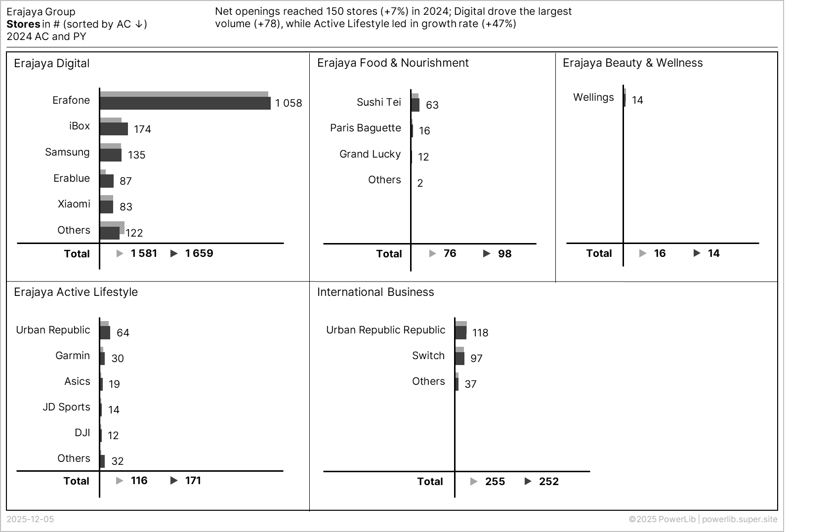
Applied IBCS Principles
SA 1 KNOW OBJECTIVES
Good message conveying reports and presentations successfully achieve both the goals of the writer (speaker) and of the readers (audience).
SA 1.1 KNOW OWN GOALS
SA 4 SUPPORT MESSAGE
This section discusses the practical and technical details of how to effectively deliver and support your main message in a report.
SA 4.2 USE PRECISE WORDS
SA 4.3 HIGHLIGHT MESSAGE
STRUCTURE: Organize Content
Follow a logical flow. Arrange content in a consistent, non-overlapping, and easy-to-follow way.
Combine the Charts
The report currently presents five separate charts spread across the page. Since the main purpose of a horizontal bar chart is to compare the length of the bars (the store counts), having them separated requires the reader's eye to jump between different visual fields, still causing a kind of "eye ping-pong" that hinders quick comparison.
The suggestion would be combining all five business verticals into a single, unified horizontal bar chart. This arrangement allows for direct visual comparison of every single brand's store count across the entire Erajaya Group. The categories should be listed continuously down the vertical axis. This consolidation maximizes space efficiency and allows the reader to instantly compare Erafone (Digital) against Urban Republic (Active Lifestyle) or Wellings (Beauty & Wellness) in one glance.
After applying the STRUCTURE principles, the result is as follows:
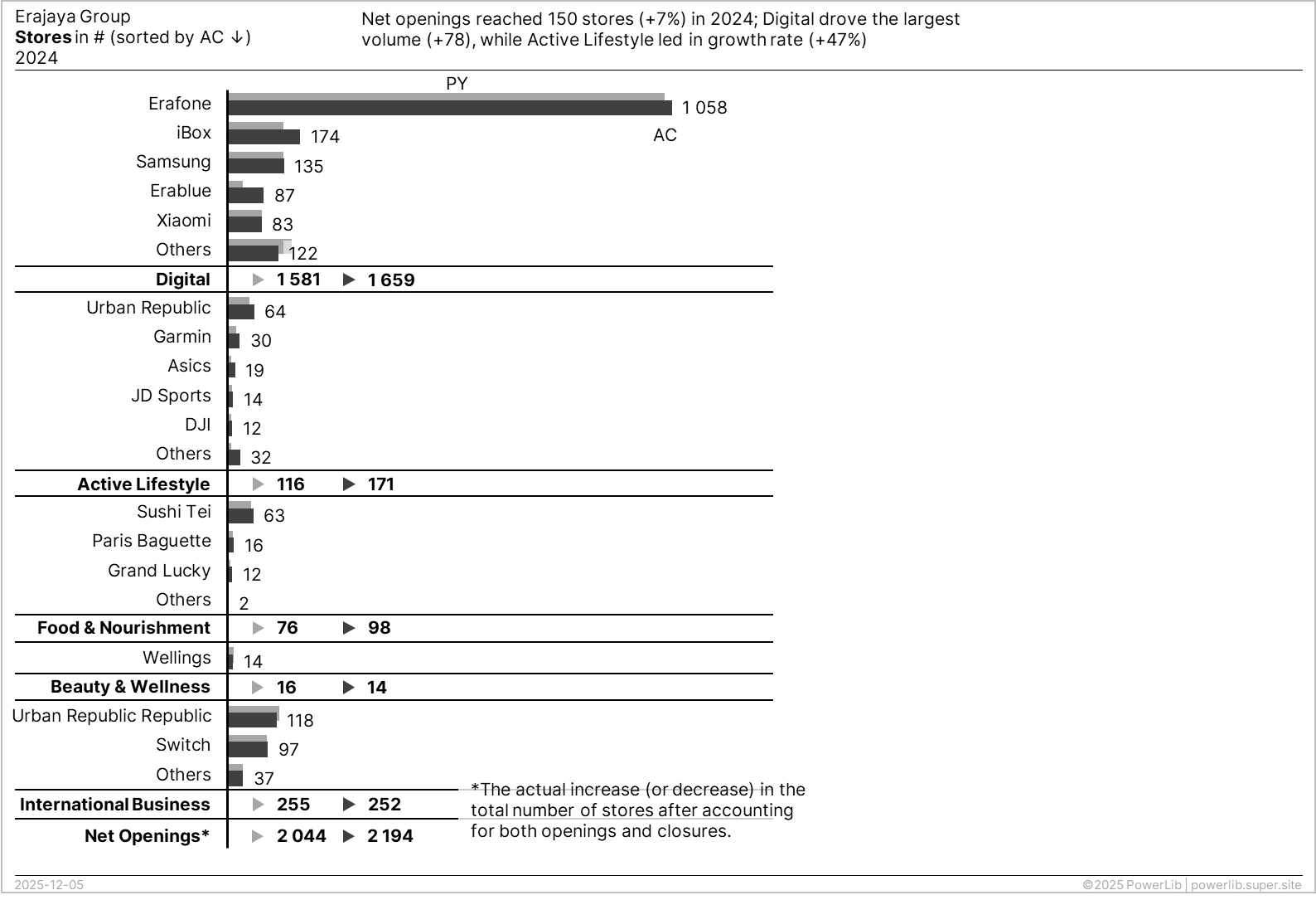
⚠️ IMPORTANT NOTE
To eliminate redundancy and improve chart readability, we can significantly reduce the amount of text used for vertical labels.
-
Remove Redundant Terms: We can remove the redundant word "Total" from the summary boxes. We can also remove "Erajaya" from the beginning of each business line name (e.g., "Erajaya Digital"). Readers are assumed to already know these are part of Erajaya's businesses.
-
Implement Concise Labels: The names can be shortened and simplified as follows:
- Erajaya Digital → Digital
- Erajaya Active Lifestyle → Active Lifestlye
- Erajaya Food & Nourishment → Food & Nourishment
- Erajaya Beauty & Wellness → Beauty & Wellness
- Total Net Openings → Net Openings
-
Visual Distinction: To ensure the totals for each business line are still easily distinguished without the large boxes, we can use visual cues such as bold font and a separator line.
Applied IBCS Principles
ST 5 VISUALIZE STRUCTURE
When the arguments have been organized hierarchically, visualize the structure to make the flow of the storyline clear and easy to understand.
ST 5.2 VISUALIZE STRUCTURE IN TABLES
CONDENSE: Increase information density
Fit everything needed on one page, if possible. Use space efficiently so all related content is visible together without sacrificing readability.
1. Maximize Use of Space
IBCS recommends using narrower page margins to display more information. By doing this, the width of charts (like grouped bar charts) can be extended to make smaller values more visible. This also creates the space needed to add multi-tier charts, which further increases the reader's comprehension.
2. Add Variance Charts
By combining the bar charts, we've created more space. We can now apply the CONDENSE principle to maximize information density. We will use this extra space to transform the data into a multi-tier bar chart. This chart type is highly effective for displaying variance (the difference between 2024 and 2023), which represents the net store openings. The multi-tier chart will display two crucial types of variance:
-
Absolute Variance: This figure shows the actual number of store opening differences, helping the reader quickly see which business vertical and brand had the highest or lowest total quantity of store openings.
-
Relative Variance: This figure shows the percentage growth in store openings, helping the reader understand which business vertical and brand had the highest or lowest rate of growth compared to the previous year.
After applying the CONDENSE principles, the result is as follows:
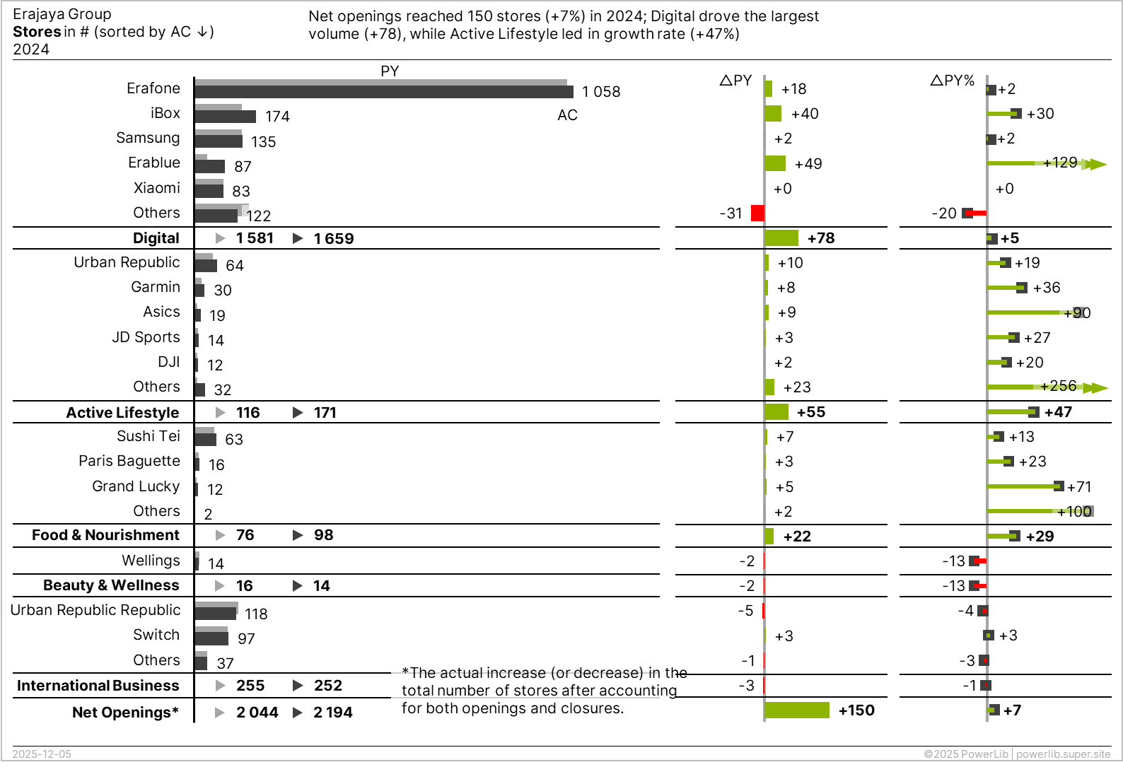
⚠️ IMPORTANT NOTES
When comparing the total number of stores a company has in one year (like 2024) versus the previous year (2023), simply looking at the final count doesn't tell the whole story. Net Openings is usually a better choice because it tells you the true change in the store network.
-
Gross Openings is just the number of new stores opened. It completely ignores any stores that closed during the same time.
-
Net Openings is calculated by taking the number of new stores opened (Gross Openings) and subtracting the number of stores closed.
Displaying Net Openings is more transparent because it shows the actual number of stores gained (or lost) that are still operating at the end of the year. If you opened 10 stores but closed 5, your Net Opening is 5—which is the number that matters for the final count difference. While Net Openings is better for showing the network's final status, Gross Openings can be useful to highlight the company's expansion efforts or investment in new locations.
If you decide to show Gross Openings, you should always provide extra information (like a separate figure for store closures) so the reader can understand why the final store count difference might not match the Gross Openings figure. This gives the full context to the numbers.
Applied IBCS Principles
CO 2: MAXIMIZE USE OF SPACE
The fastest and easiest way to increase information density is by utilizing free space. Make better use of unnecessarily wide margins, empty frames, or blank pages by filling them with helpful data that relates to the context.
CO 2.1 USE NARROW PAGE MARGINS
CO 2.2 REDUCE EMPTY SPACE
CO 4: ADD ELEMENTS
To create higher information density, it is often useful to combine two or more basic chart types (like combining bars and lines). These combined charts should be treated as a single unit, not as separate visuals.
Three main types of combined charts exist:
-
Overlay charts: Where one chart is drawn on top of another.
-
Multi-tier charts: Where charts are stacked vertically.
-
Extended charts: Where standard charts are expanded with extra elements.
Additionally, individual chart elements can be embedded in tables, and helpful explanations can be integrated directly into the chart area.
CO 4.2 SHOW MULTI-TIER CHARTS
Multi-tier charts are used to increase information density by stacking several related charts together, all sharing the same category axis (like months or products). These charts are most often used to show variances (differences) alongside the basic values.
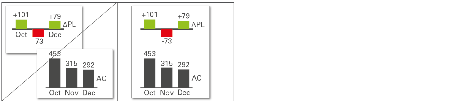 Figure CO 4.2: Show multi-tier charts — Source: IBCS Standards 1.2
-
Two-Tier Charts: A second chart is placed right next to the main (primary) chart.
- For horizontal charts, the secondary chart is placed above the primary chart.
- For vertical charts, the secondary chart is placed to the right of the primary chart.
-
Axes: The category axes (the labels that name the items being measured) are repeated in the secondary chart, often showing a different scenario (like "Plan"). Both the primary and secondary charts have their own value axes.
-
Scaling Rule: Value axes that measure the same unit (e.g., both measuring Euros) should be scaled identically for fair comparison.
-
Three or More Tiers: A third chart is placed next to the existing two-tier arrangement. For instance, you can take a primary chart showing Actual and Plan values, add a secondary chart showing the absolute difference, and then add a third chart showing the relative percentage difference.
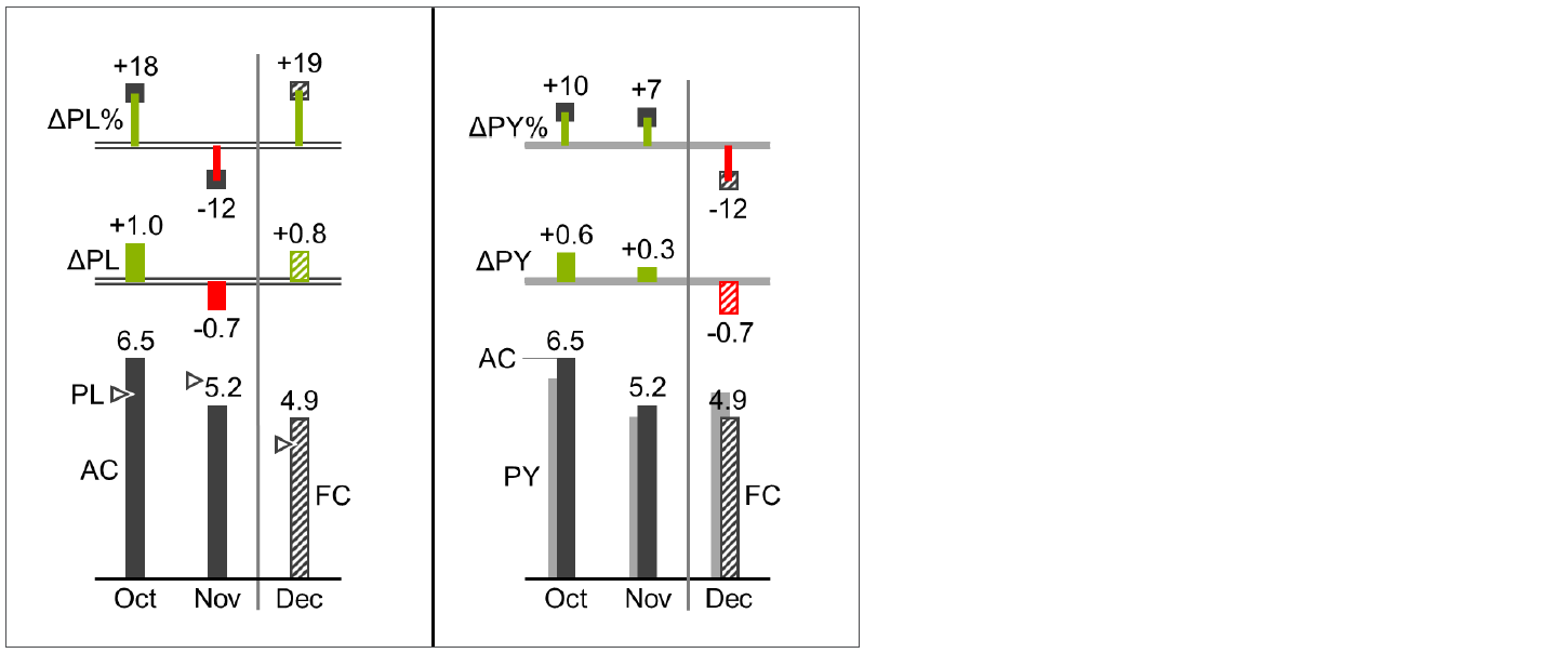 Figure CO 4.2-1: Horizontal multi-tier chart (example) — Source: IBCS Standards 1.2
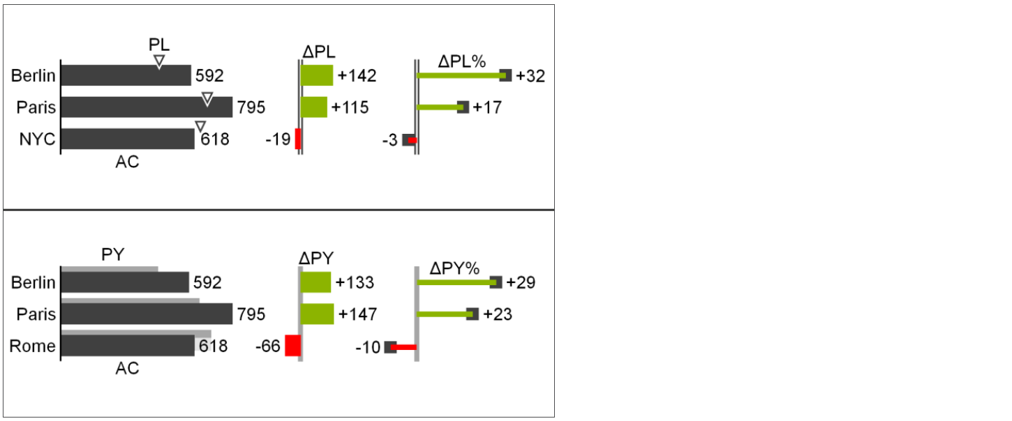 Figure CO 4.2-2: Vertical multi-tier chart (example) — Source: IBCS Standards 1.2
FINAL CHECK
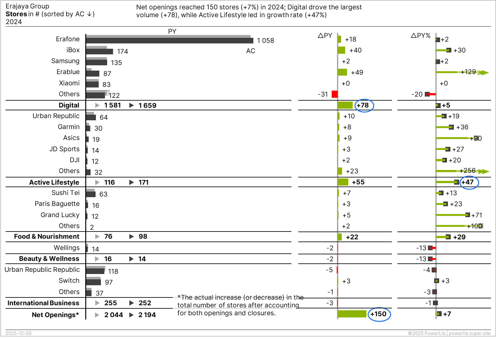
1. Use Highlighting Elements
To ensure faster comprehension, use highlighting elements to draw the reader's attention to the most important message in the visual. Based on the chart and the intended message, we need to emphasize three key aspects:
-
Overall Performance: The total net store openings (150 stores or +7% growth).
-
Top Contributor (Quantity): Erajaya Digital has the highest absolute number of store openings (78 stores).
-
Top Contributor (Rate): Active Lifestyle has the highest percentage rate of growth (+47%).
IBCS recommends using specific highlighting indicators to achieve this. One effective method is to use a blue ellipse to visually underline or circle the specific values you want to stress.
2. Make Chart Size Proportional to Data
The data in this chart has a vast range, from the smallest value (0) to the largest (1,058). To ensure the visualization remains meaningful and that even the smallest bars are readable, you must make the chart size proportional to the data it contains. Extend the width of the chart until all data points are visible enough for easy comparison. This action ensures the information is displayed clearly and takes up adequate space for immediate comprehension.
3. Use Outlier Indicators
For relative variances over 100%, extremely large outlier values (e.g., 1,000%) prevent meaningful comparison with smaller values. The best solution is to use a special indicator (e.g., an arrow) to visually "truncate" the large values. This practice allows the chart's scale to focus on the smaller data, ensuring effective comparison.
Applied IBCS Principles
CH 4 USE THE SAME SCALES
For accurate visual comparison, charts that show the same unit of measure (like comparing "Sales" to "Sales") must use identical scales. If you absolutely cannot use the same scale, you must clearly indicate the difference. Try to use one consistent scaling concept throughout the entire report or presentation material.
CH 4.2 SIZE CHARTS TO GIVEN DATA
CH 4.4 USE OUTLIER INDICATORS IF NECESSARY
UN 5 UNIFY INDICATORS
Indicators (like arrows, symbols, or highlighting) in reports serve different goals, such as drawing attention (highlighting) or setting chart limits (scaling). Using the same design for the same purpose every time helps readers identify the situation much faster.