Scatter PlotFree
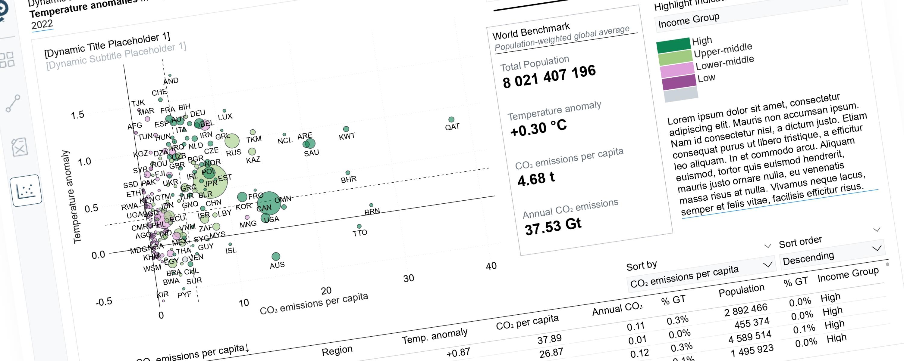
Dynamic Storytelling Using Scatterplots
Scatterplots can tell very different stories depending on the perspective we choose to highlight.
4 February 202667 min read
Documented Power BI techniques — the model change, the DAX, and the exact visual settings. Most are free to read; the rest come with the model files for members.
Scatter PlotFree
Scatterplots can tell very different stories depending on the perspective we choose to highlight.
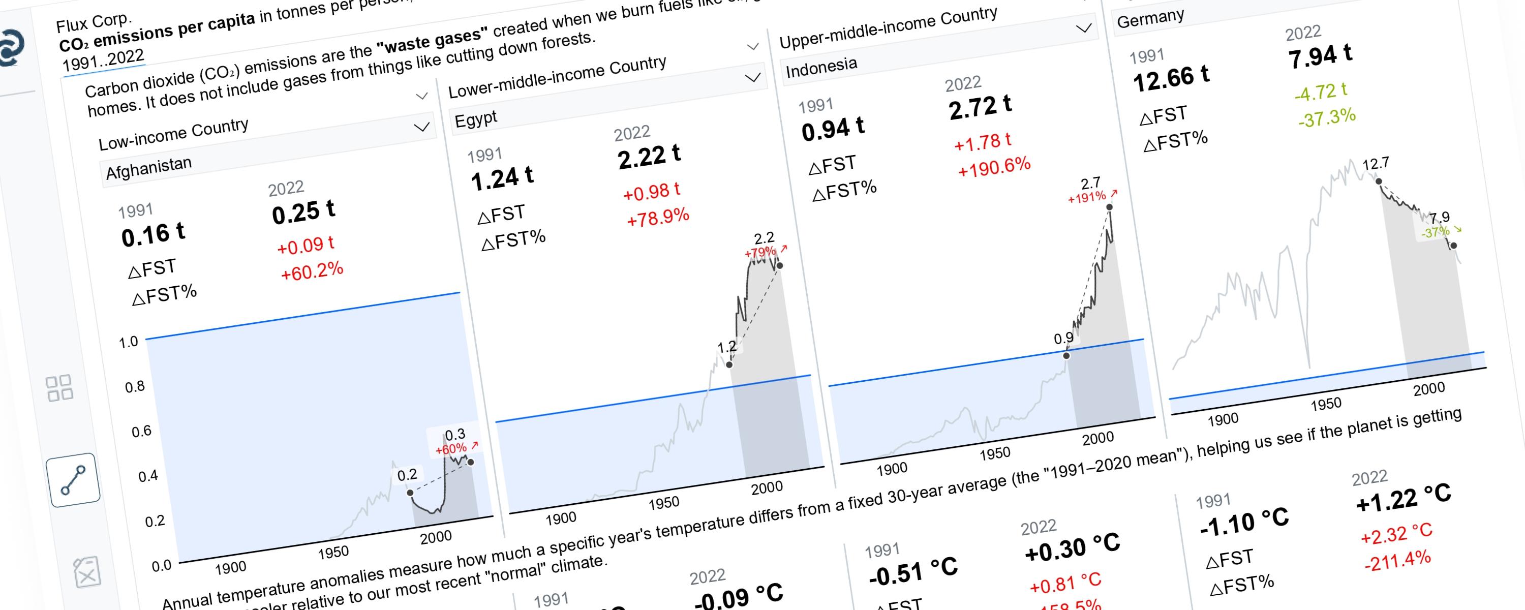
LineFree
This article demonstrates how to build a Power BI line chart that dynamically highlights a selected year range while greying out the rest.
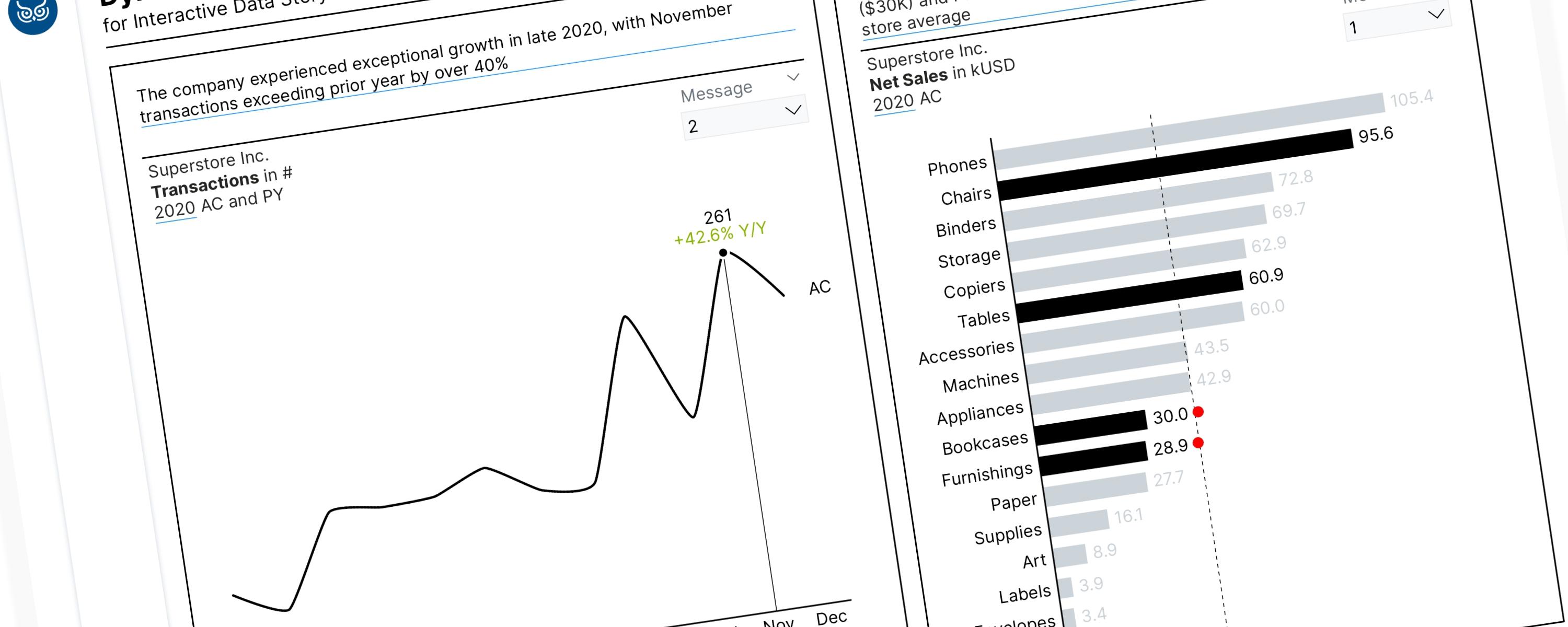
LineFree
Field parameters are a powerful feature in Power BI. When combined with the SWITCH() function, these tools allow us to tell a compelling data story by dynamically highlighting…
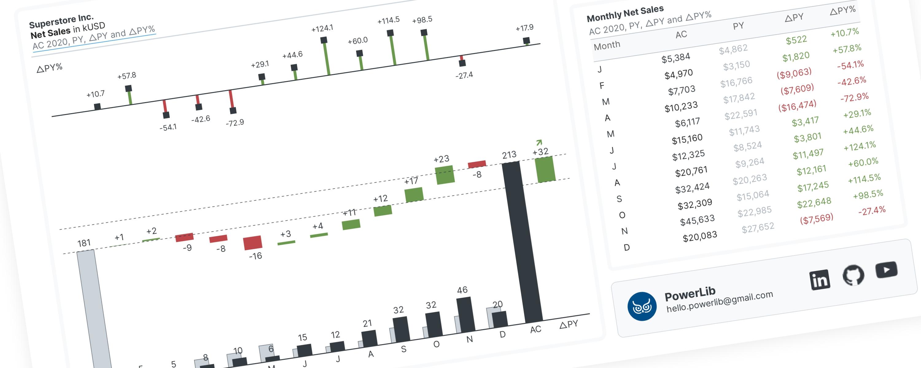
WaterfallFree
A waterfall chart is a special type of bar chart that shows you the story behind how a number changed from one point to another.
LineFree
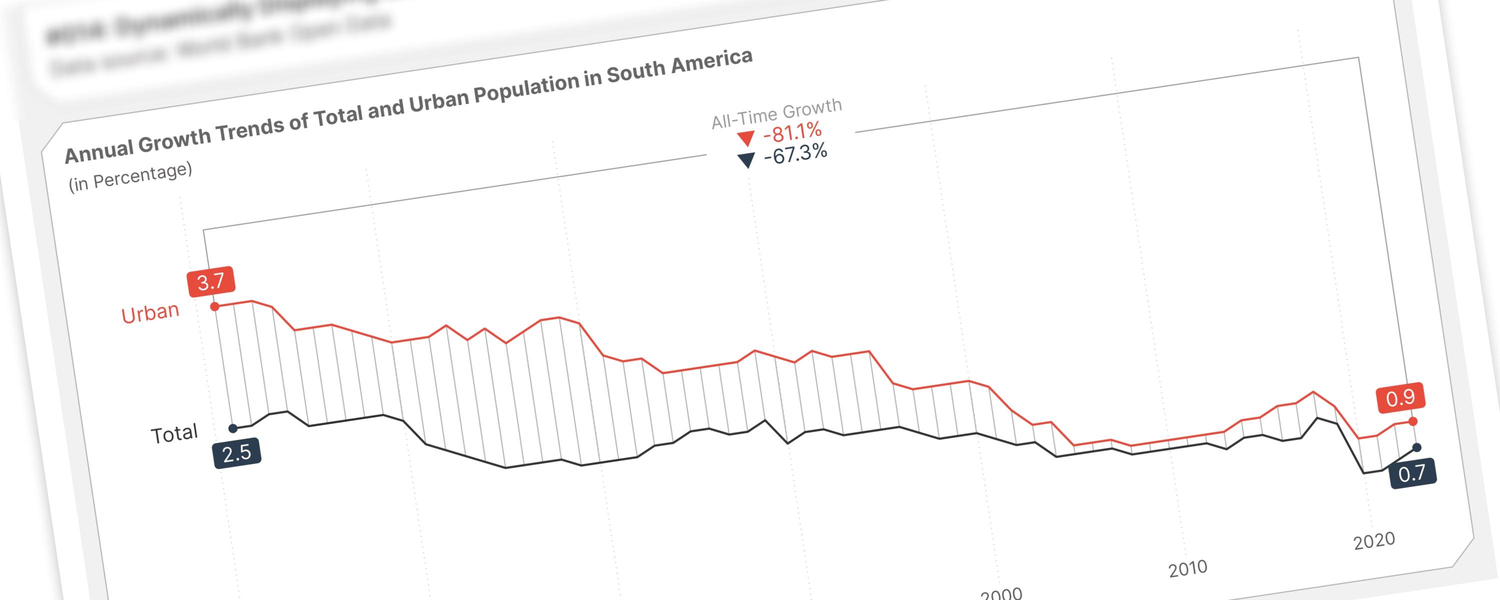
This documentation provides a guide on marking the earliest and latest selected years on a line chart and visualizing growth over time with reference lines.
Metric/KPIFree
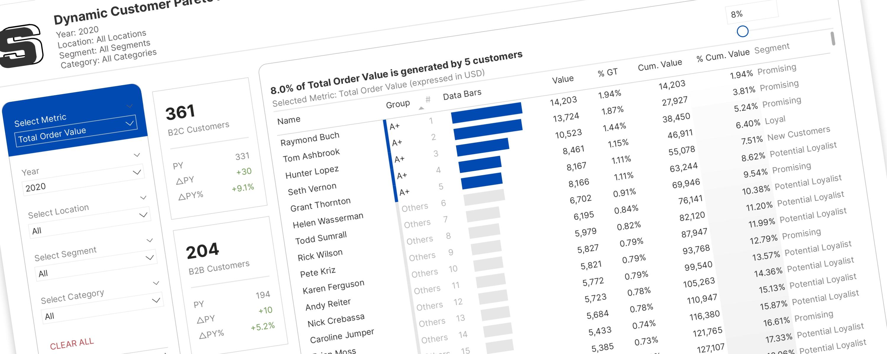
This documentation provides a step-by-step approach to building the first version of the one-for-all customer Pareto analysis dashboard.
Metric/KPIFree
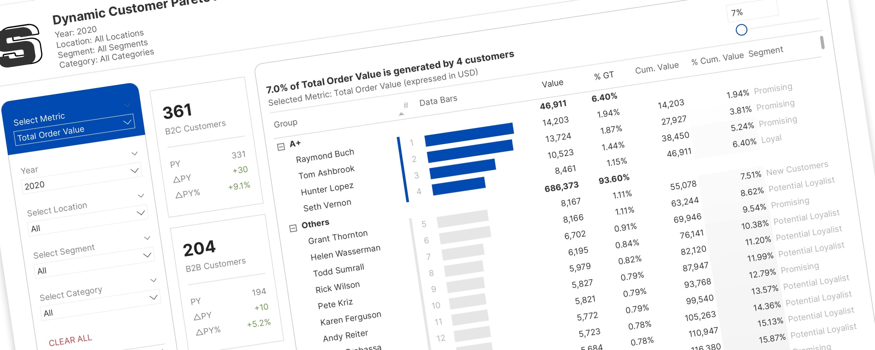
Imagine you have a big pile of something – let's say, 100 colorful building blocks.
Metric/KPIFree
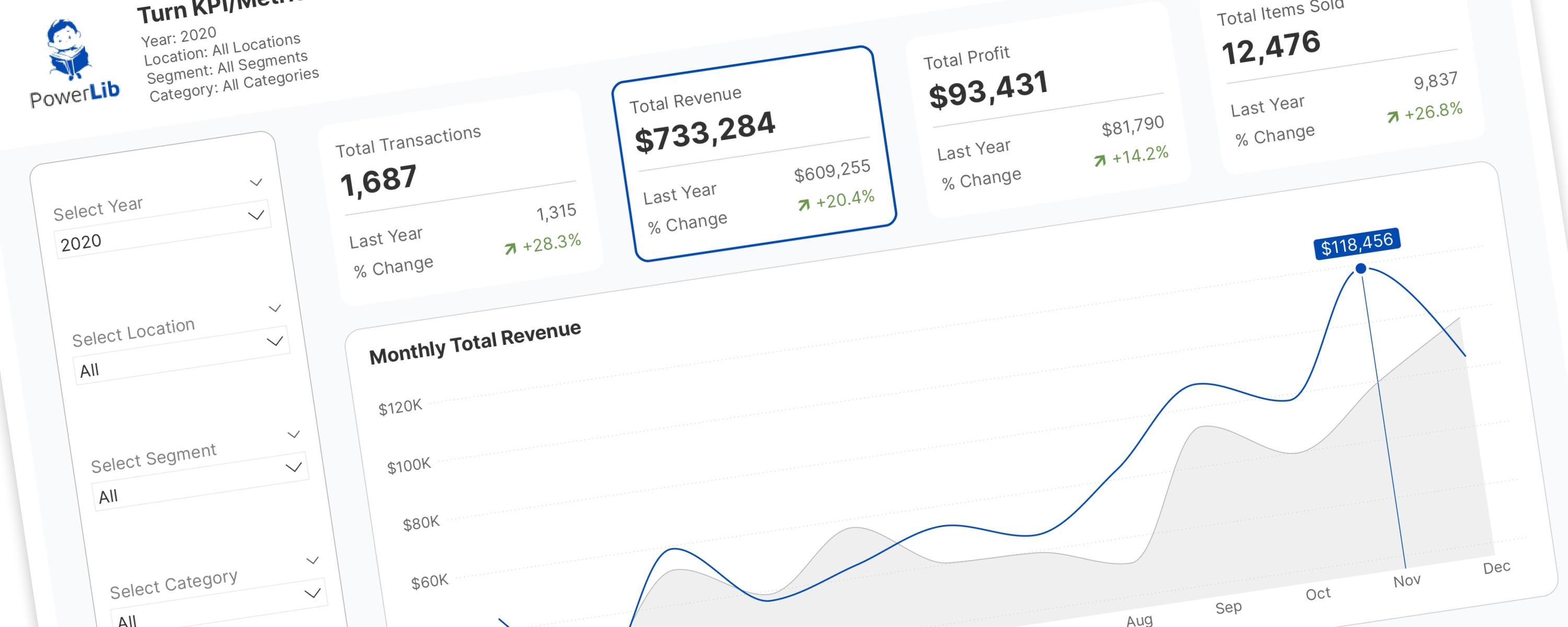
In the world of Power BI, Key Performance Indicator (KPI) and metric cards are essential.
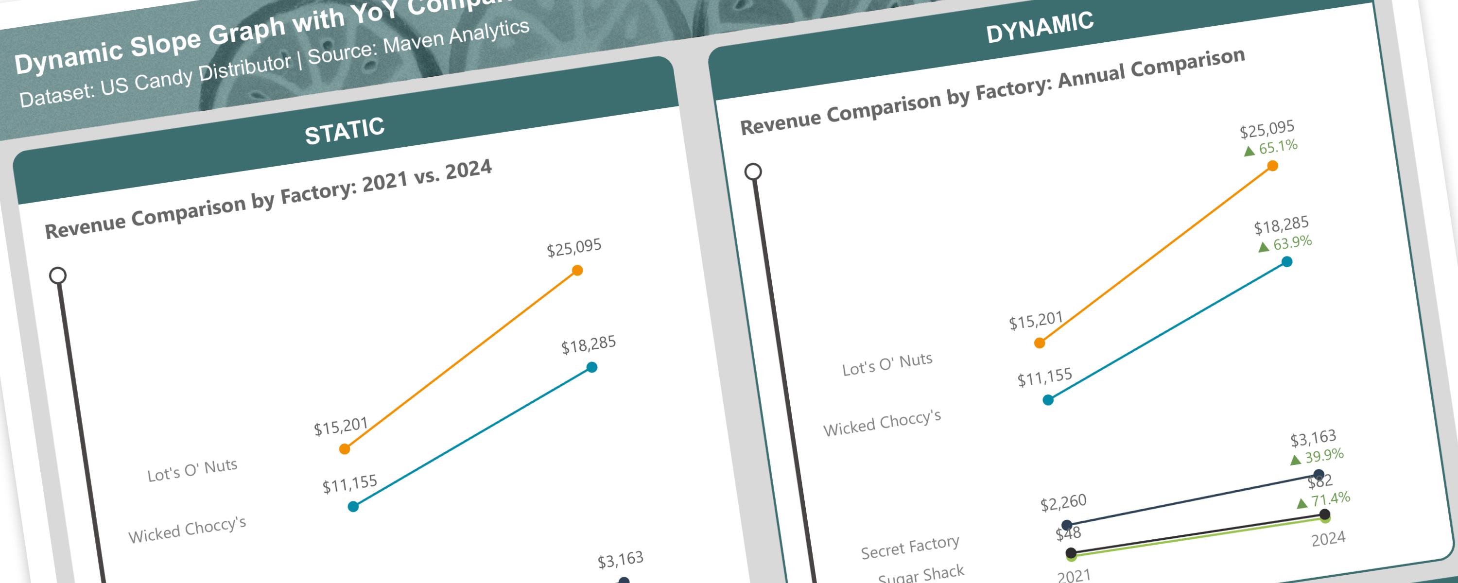
LineFree
A slope graph is a type of line chart that shows changes between two points in time or two different states.