LineFree
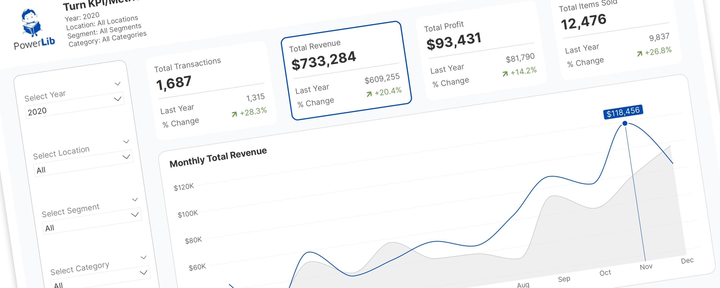
Turning KPI/Metric Cards Into Interactive Slicers
In the world of Power BI, Key Performance Indicator (KPI) and metric cards are essential.
26 October 202516 min read
Documented Power BI techniques — the model change, the DAX, and the exact visual settings. Most are free to read; the rest come with the model files for members.
LineFree
In the world of Power BI, Key Performance Indicator (KPI) and metric cards are essential.
LineFree
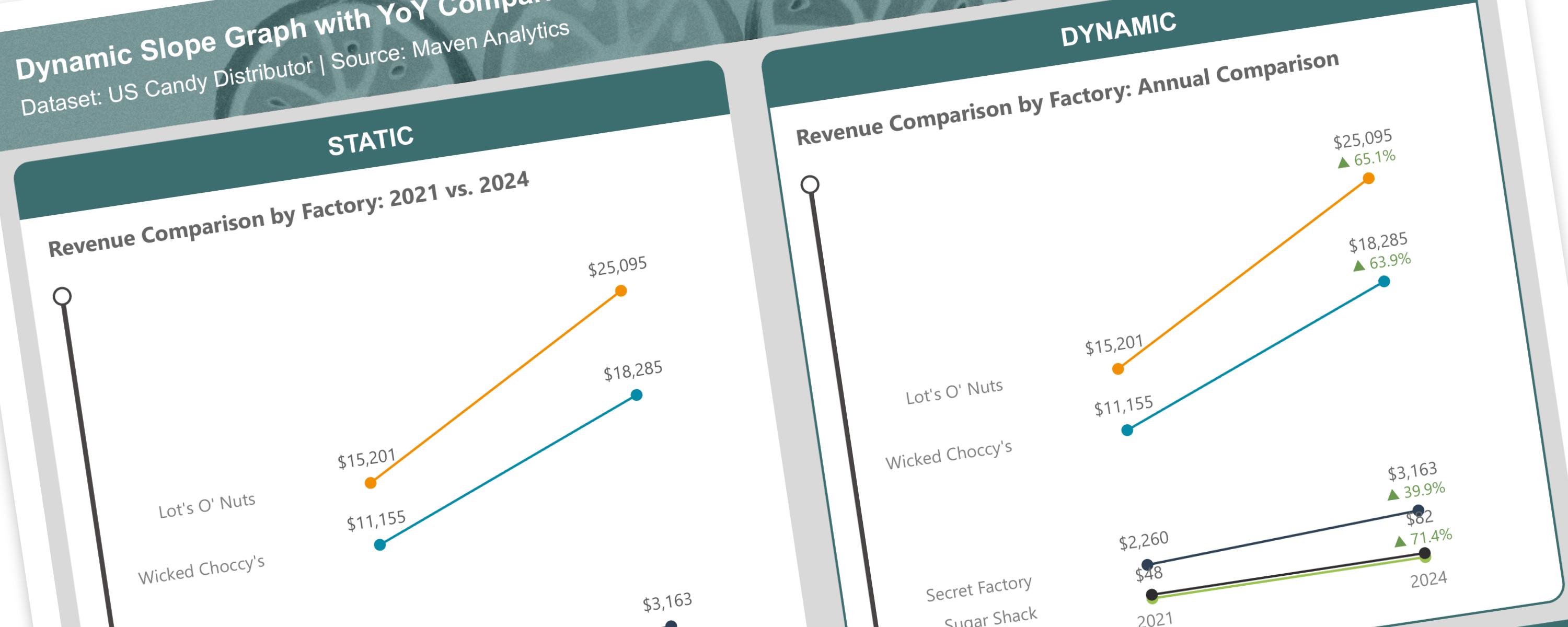
A slope graph is a type of line chart that shows changes between two points in time or two different states.
LineFree
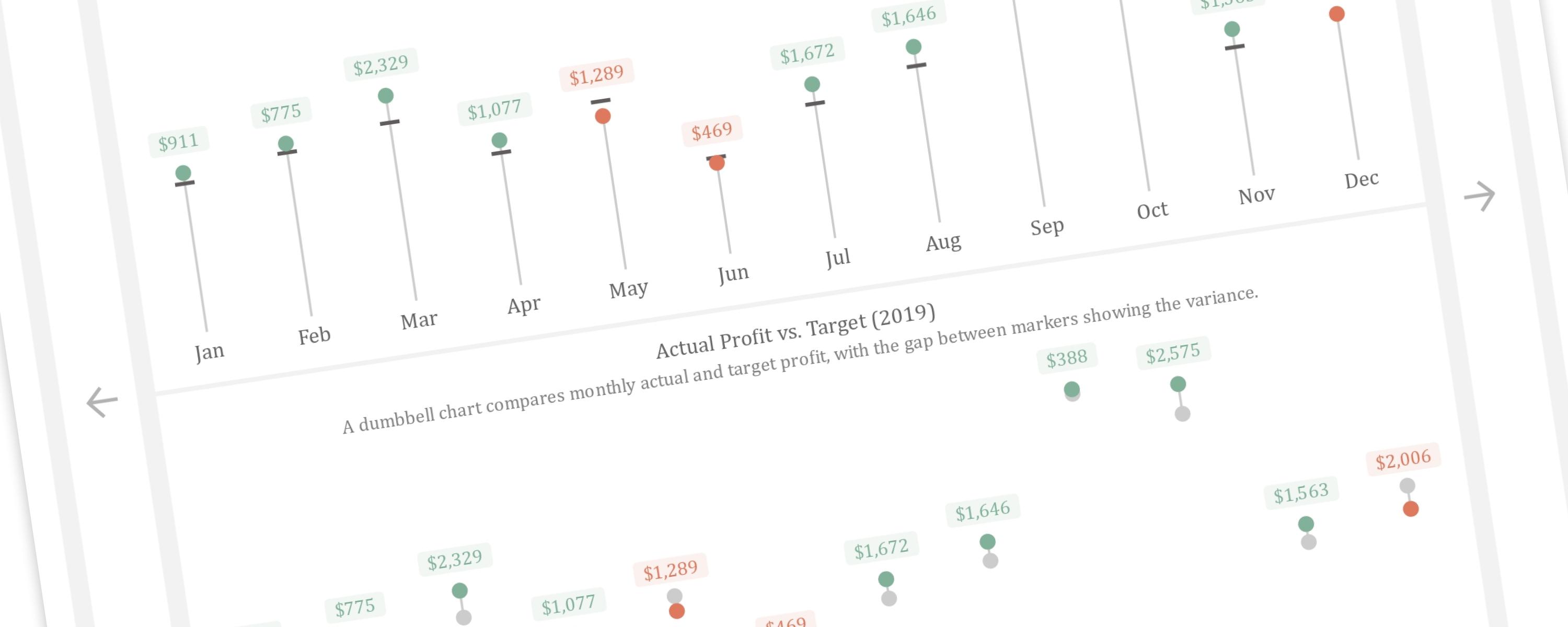
This article demonstrates how to create a dynamic vertical lollipop and dumbbell chart in Power BI.
LineFree
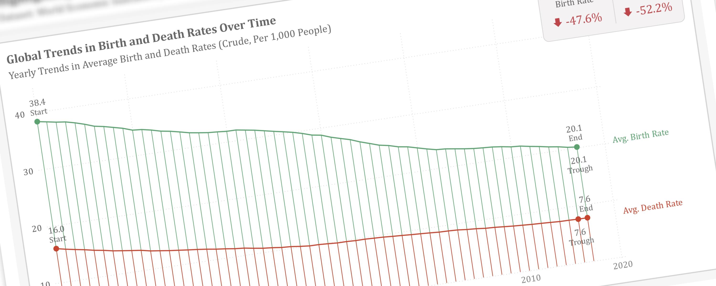
This article will guide you through the process of visually emphasizing key data points within a line chart.
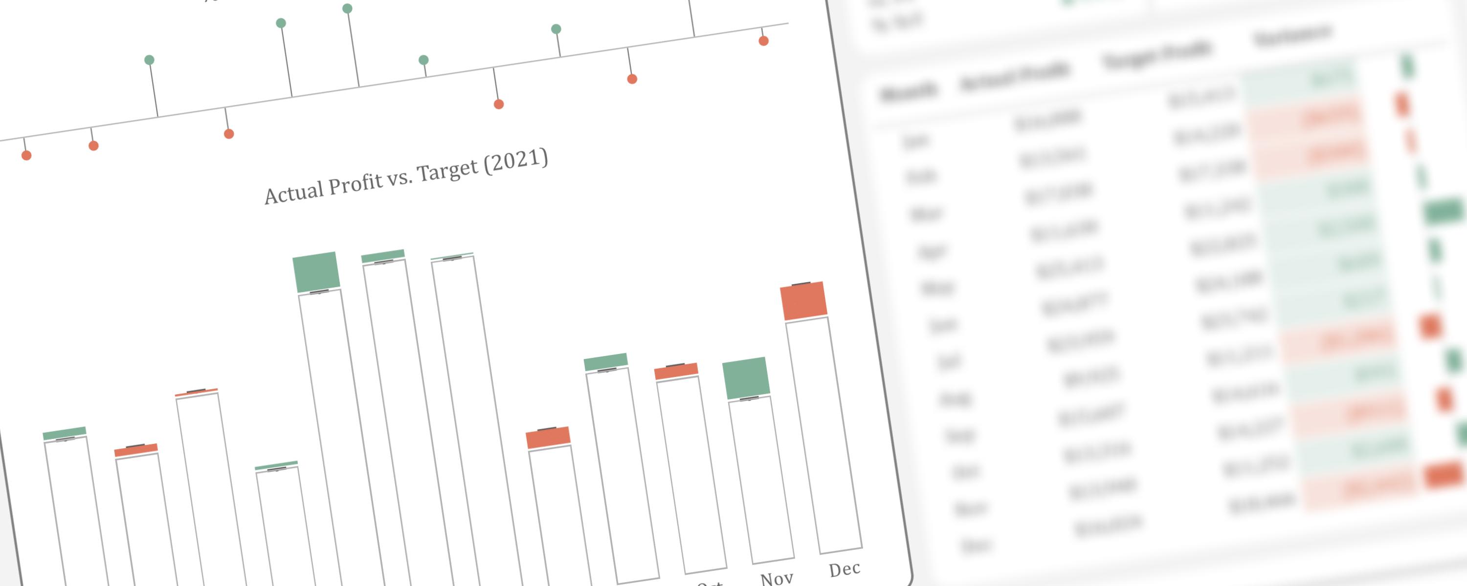
ColumnFree
This article presents an alternative method for visualizing actual performance against target values.
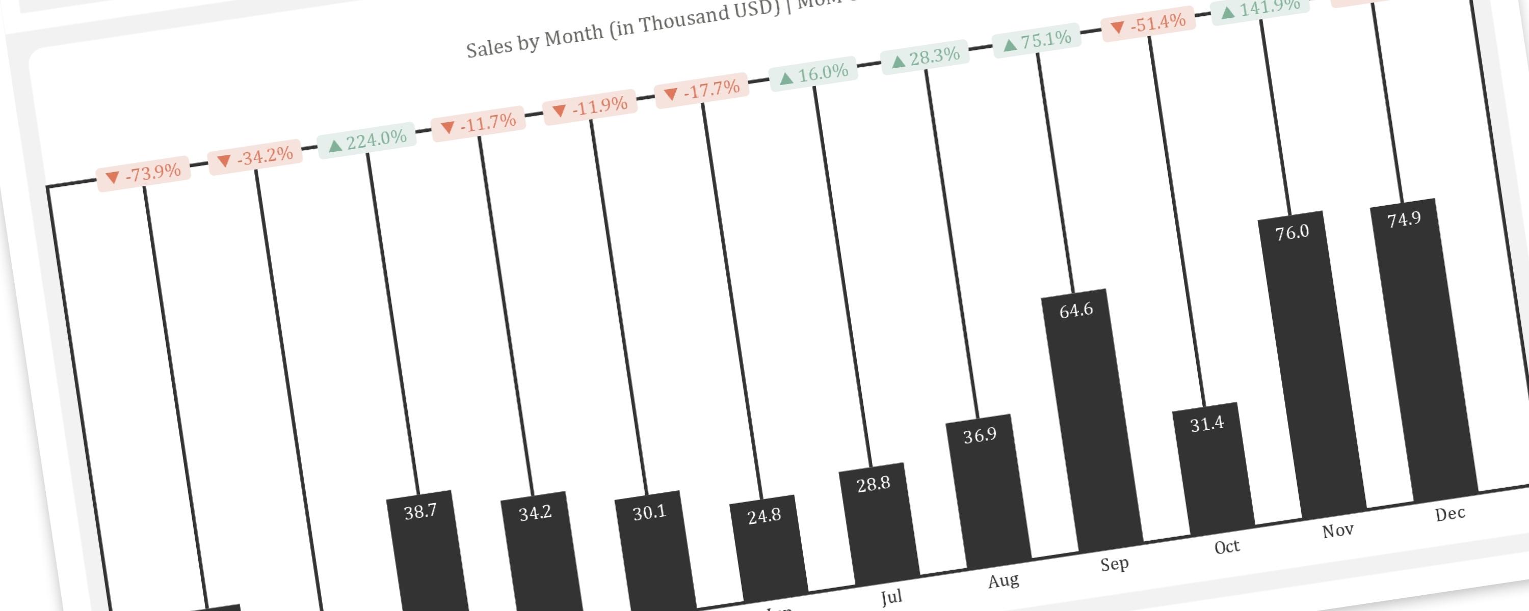
ColumnFree
This article provides a step-by-step guide to replicating the “Piano” or “Delta” chart, a creative visualization for showing changes between two points in time, within Power BI.
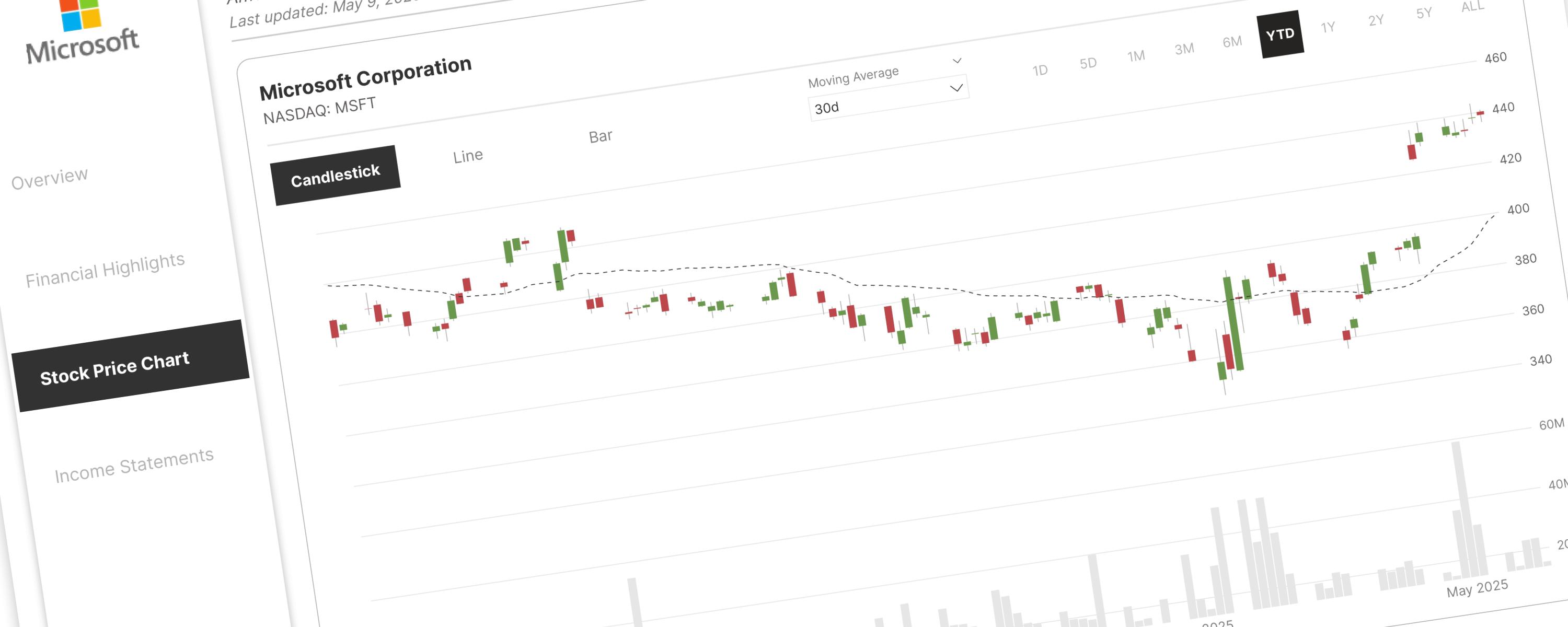
LineMember-Only
The DAX measures used here have been improved and modified for better readability and performance. </Callout>