Matrix/TableMember-Only
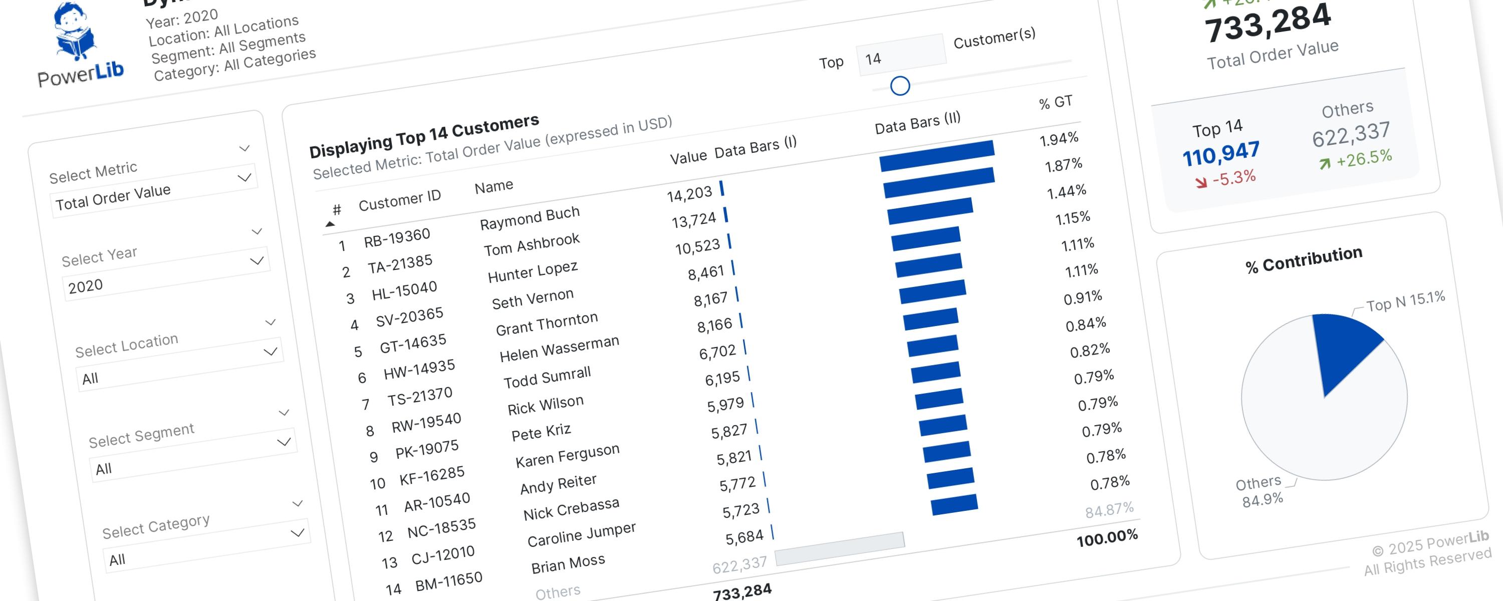
Dynamically Show Top N and Others Based On Metric Selection
I’ve previously discussed creating Pareto dashboards to help you identify your “vital few” and “trivial many” customers.
26 October 202532 min read
Documented Power BI techniques — the model change, the DAX, and the exact visual settings. Most are free to read; the rest come with the model files for members.
Matrix/TableMember-Only
I’ve previously discussed creating Pareto dashboards to help you identify your “vital few” and “trivial many” customers.
Matrix/TableMember-Only
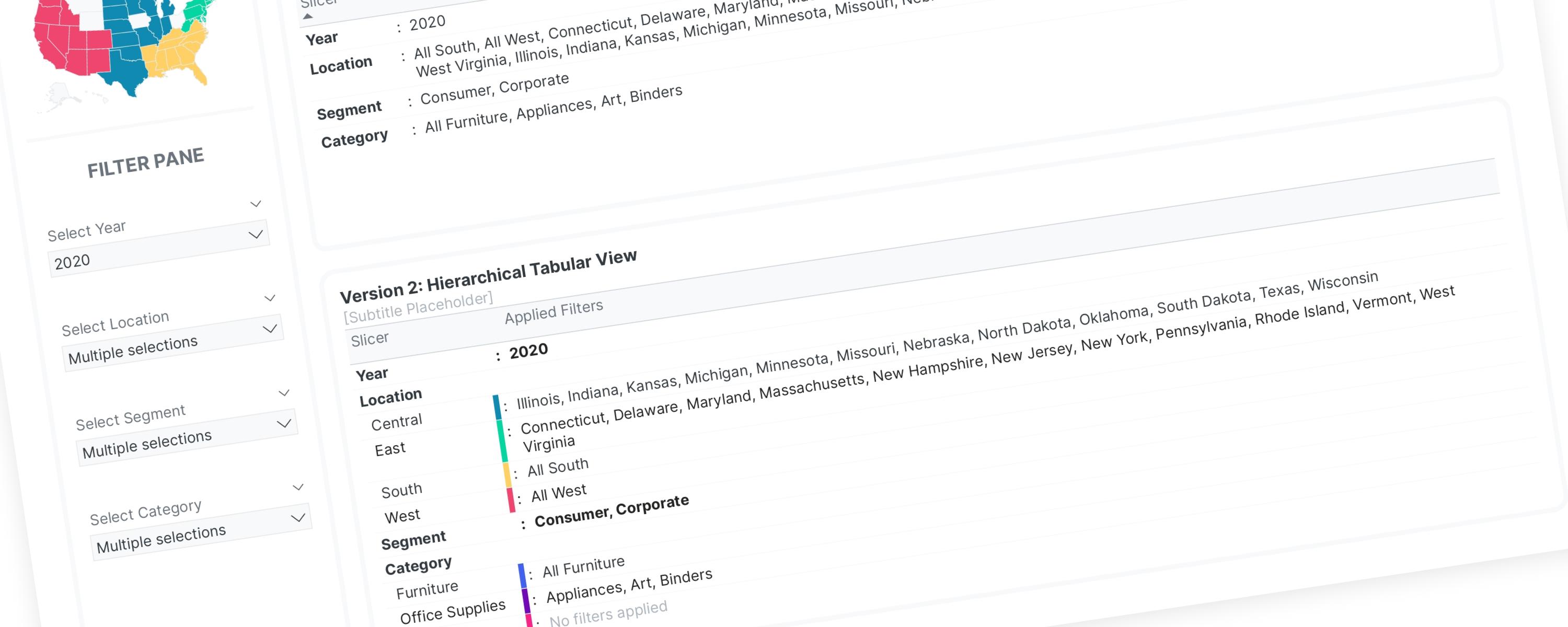
Inspired by Gustaw Dudek's work on displaying applied filters, I have developed two versions of a filter-display solution.
BarFree
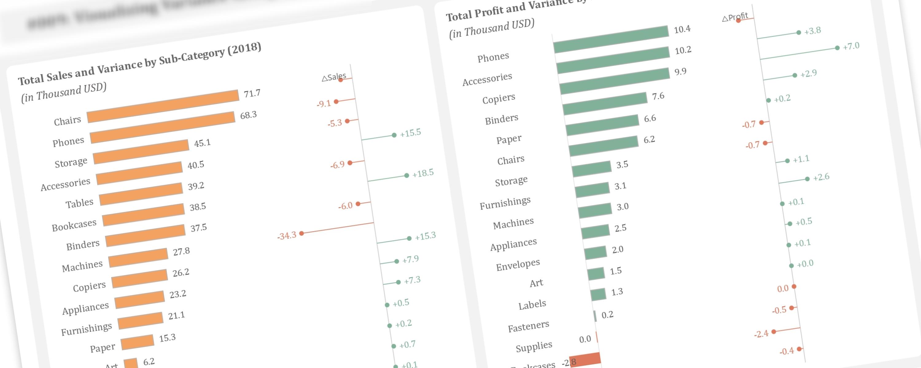
This article demonstrates how to create additional lollipop charts alongside bar charts to visualize year-over-year variance, a technique inspired by Bas Dohmen.
BarFree
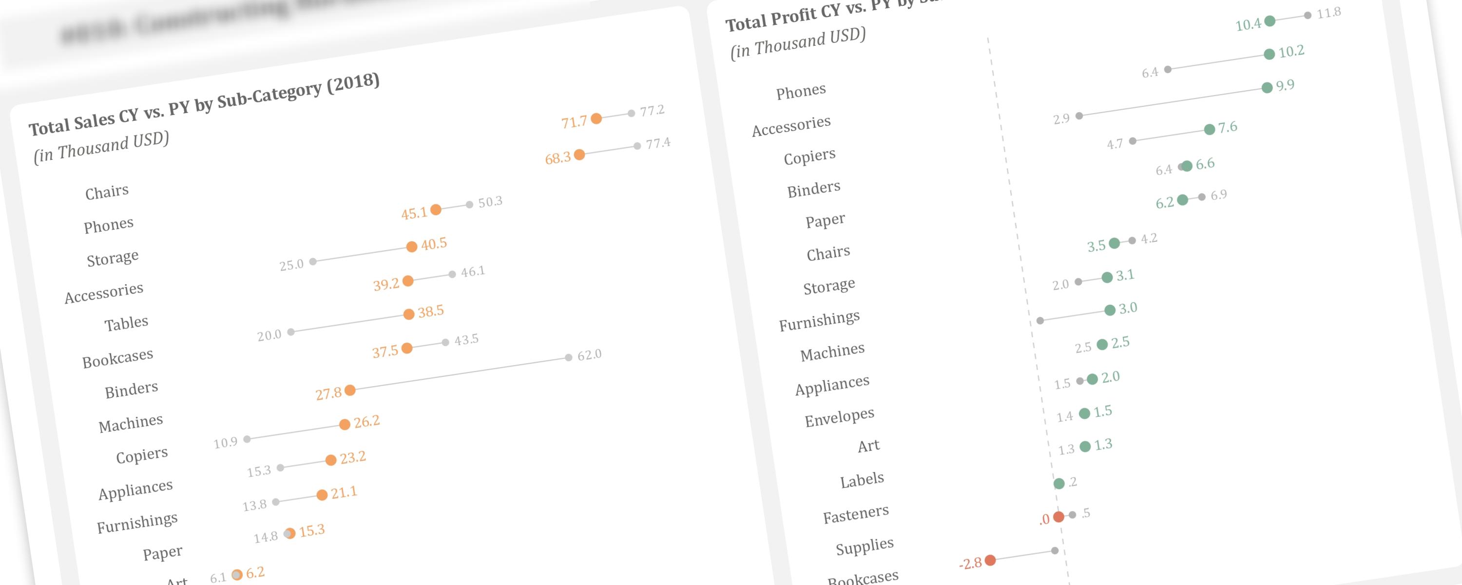
In the previous article, we discussed creating vertical dumbbell plots using line markers and error bars.
BarFree
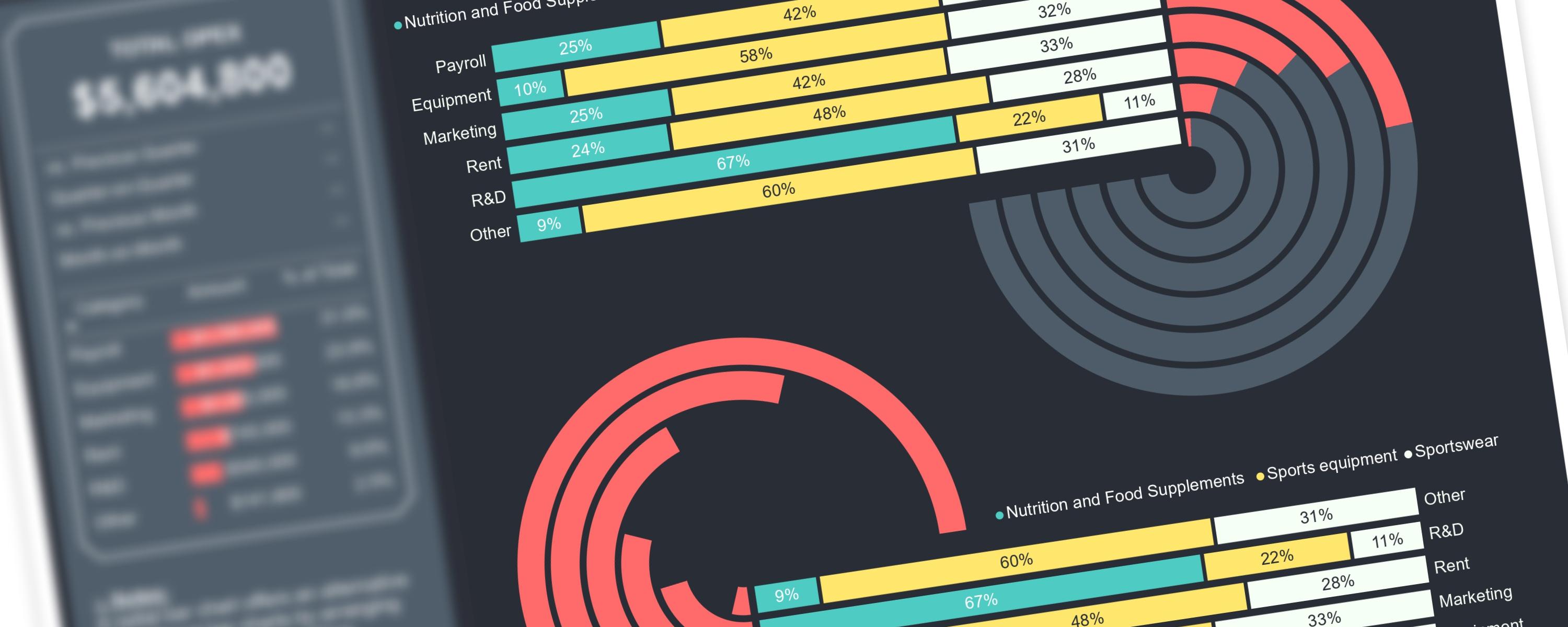
Creating complex visualizations in Power BI can be challenging when working with native visuals.
Matrix/TableFree
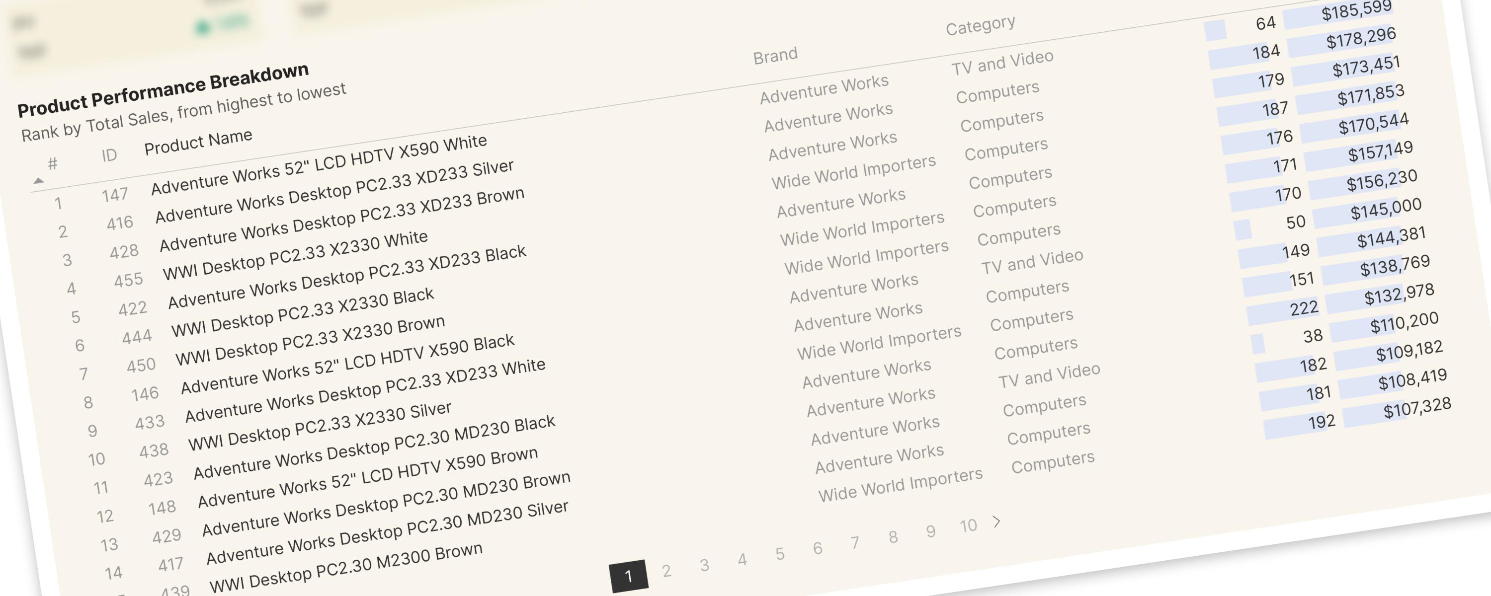
For the improved version, please refer to the following documentation page:
Donut/PieFree
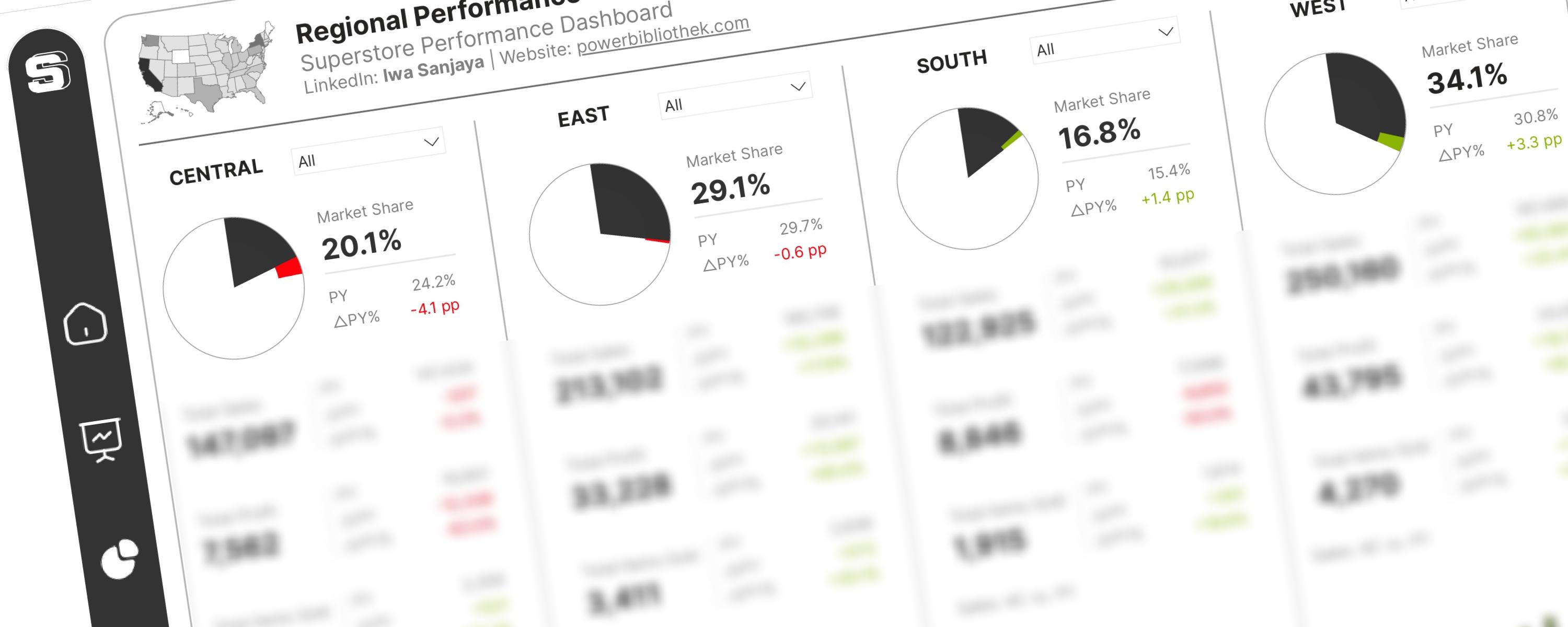
The International Business Communication Standards (IBCS®) provide a set of rules for designing business reports, presentations, and dashboards to ensure clear and effective…