BarFree
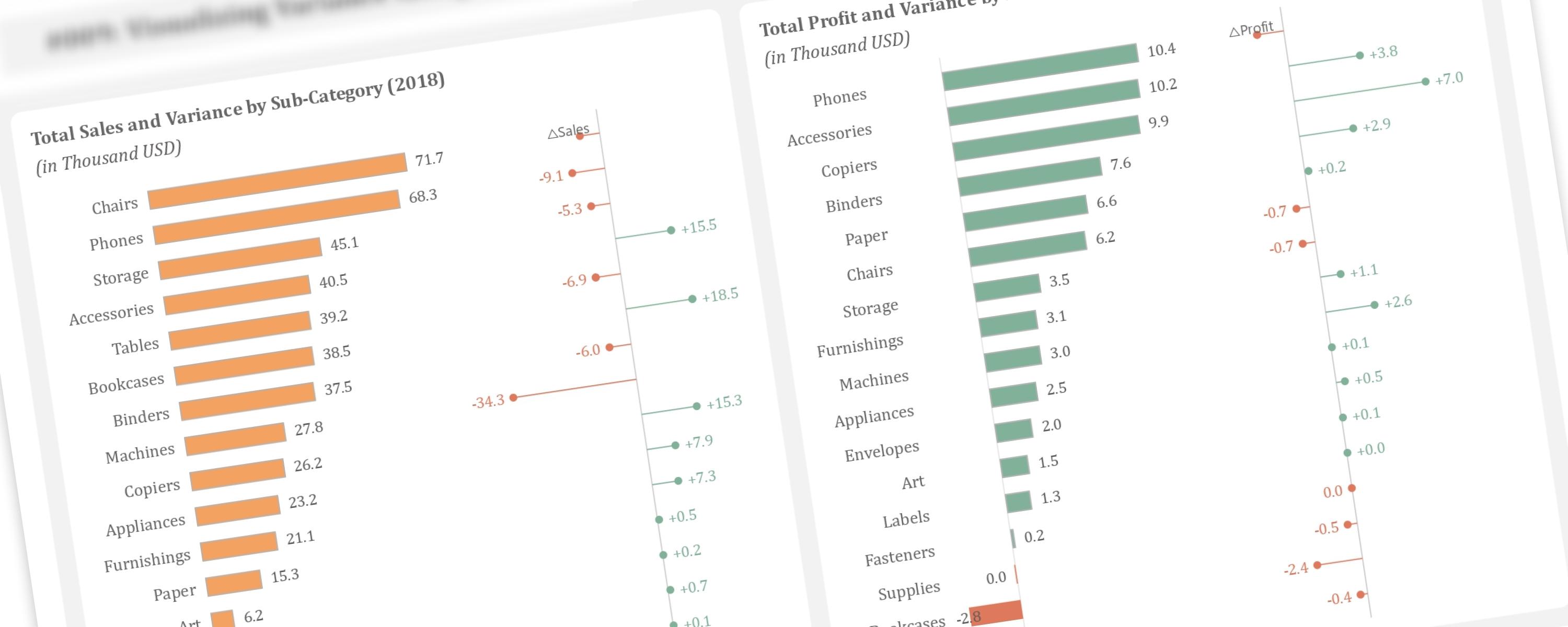
Visualizing Variance Alongside Bar Chart
This article demonstrates how to create additional lollipop charts alongside bar charts to visualize year-over-year variance, a technique inspired by Bas Dohmen.
29 September 20255 min read
Documented Power BI techniques — the model change, the DAX, and the exact visual settings. Most are free to read; the rest come with the model files for members.
BarFree
This article demonstrates how to create additional lollipop charts alongside bar charts to visualize year-over-year variance, a technique inspired by Bas Dohmen.
BarFree
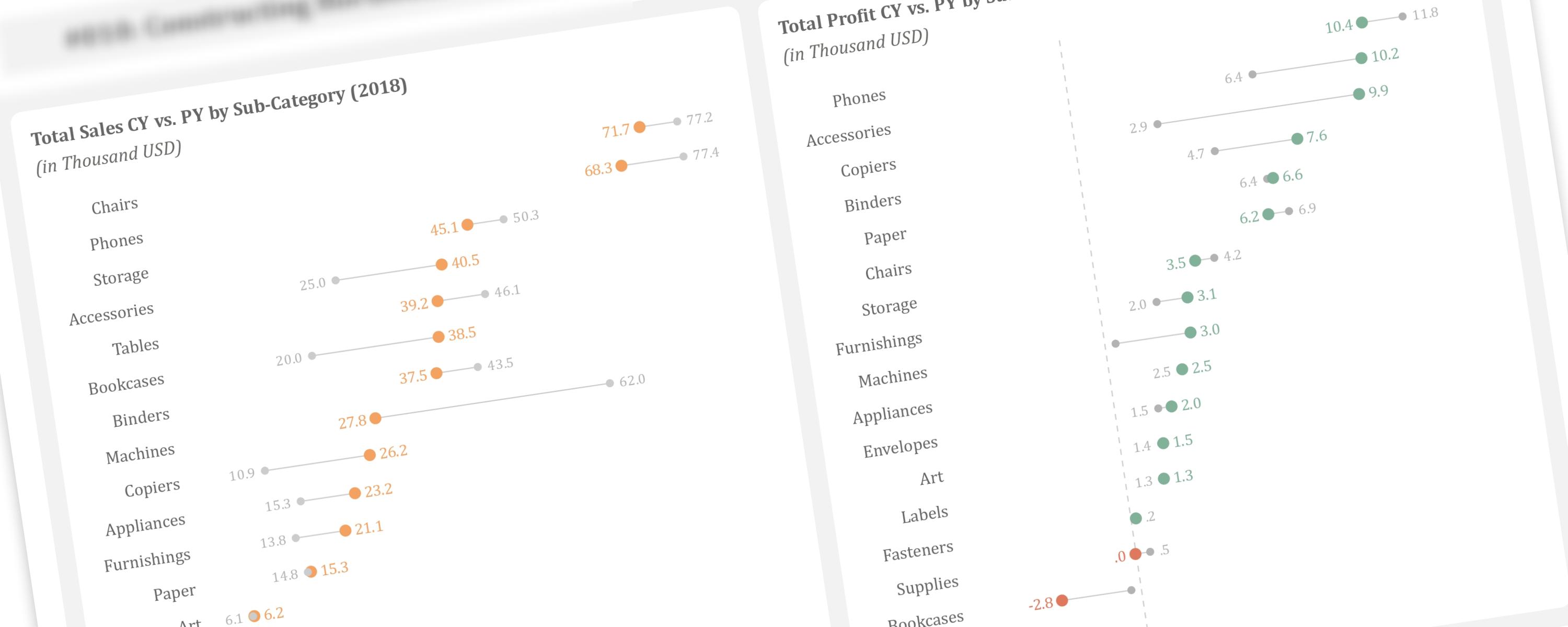
In the previous article, we discussed creating vertical dumbbell plots using line markers and error bars.
ColumnFree
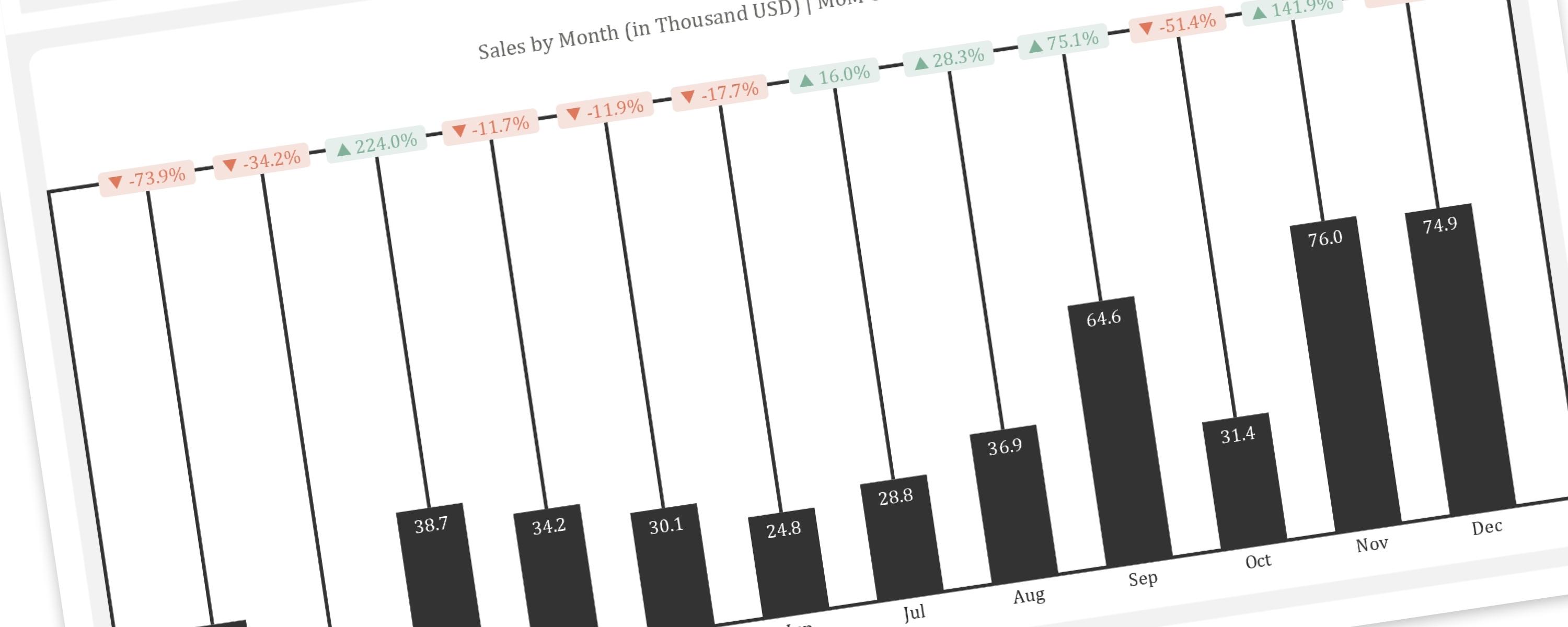
This article provides a step-by-step guide to replicating the “Piano” or “Delta” chart, a creative visualization for showing changes between two points in time, within Power BI.
BarFree
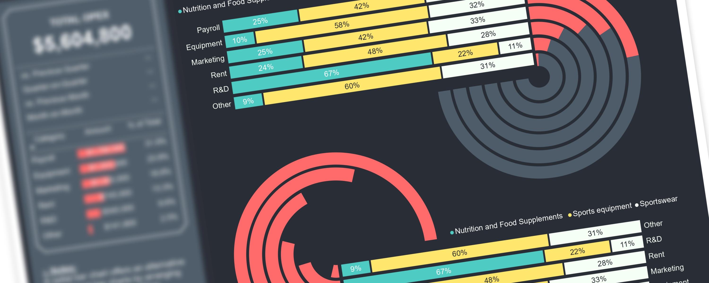
Creating complex visualizations in Power BI can be challenging when working with native visuals.
ColumnMember-Only
The DAX measures used here have been improved and modified for better readability and performance. </Callout>