ColumnFree
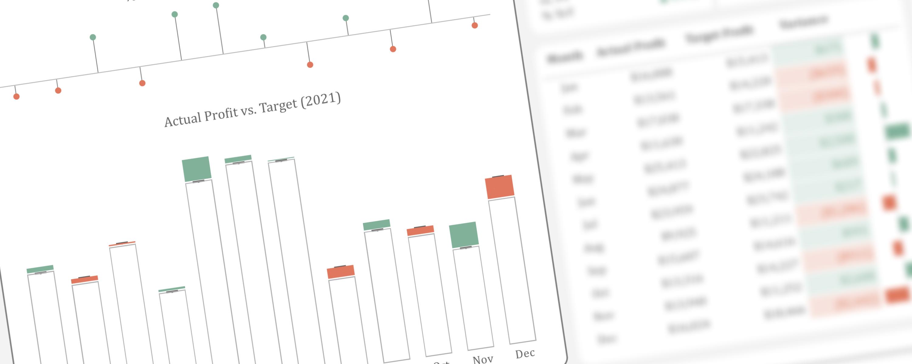
Visualizing Surplus and Deficit Using Stacked Column Chart
This article presents an alternative method for visualizing actual performance against target values.
29 September 20257 min read
Documented Power BI techniques — the model change, the DAX, and the exact visual settings. Most are free to read; the rest come with the model files for members.
ColumnFree
This article presents an alternative method for visualizing actual performance against target values.
ColumnFree
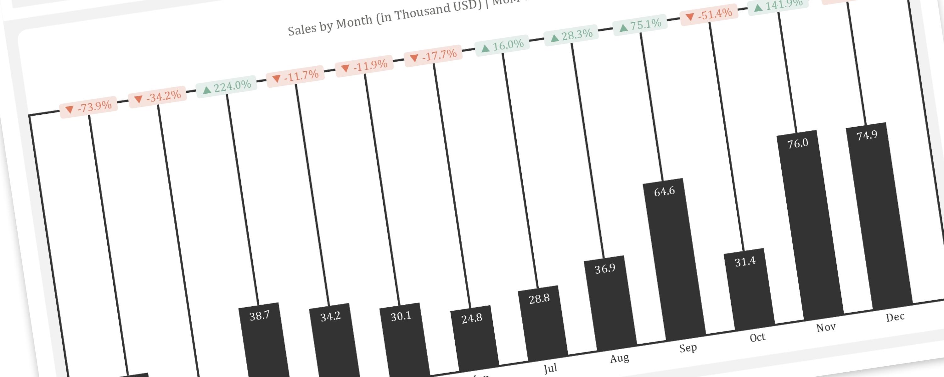
This article provides a step-by-step guide to replicating the “Piano” or “Delta” chart, a creative visualization for showing changes between two points in time, within Power BI.
Metric/KPIFree
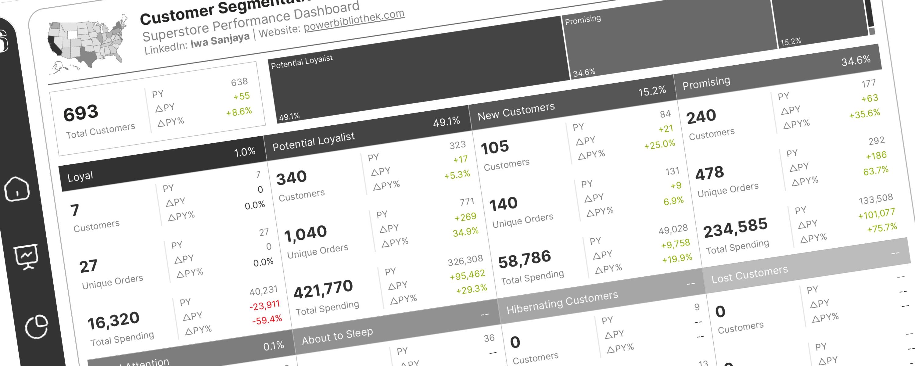
This documentation guides you on how to perform RFM analysis for customer segmentation in Power BI.
Donut/PieFree
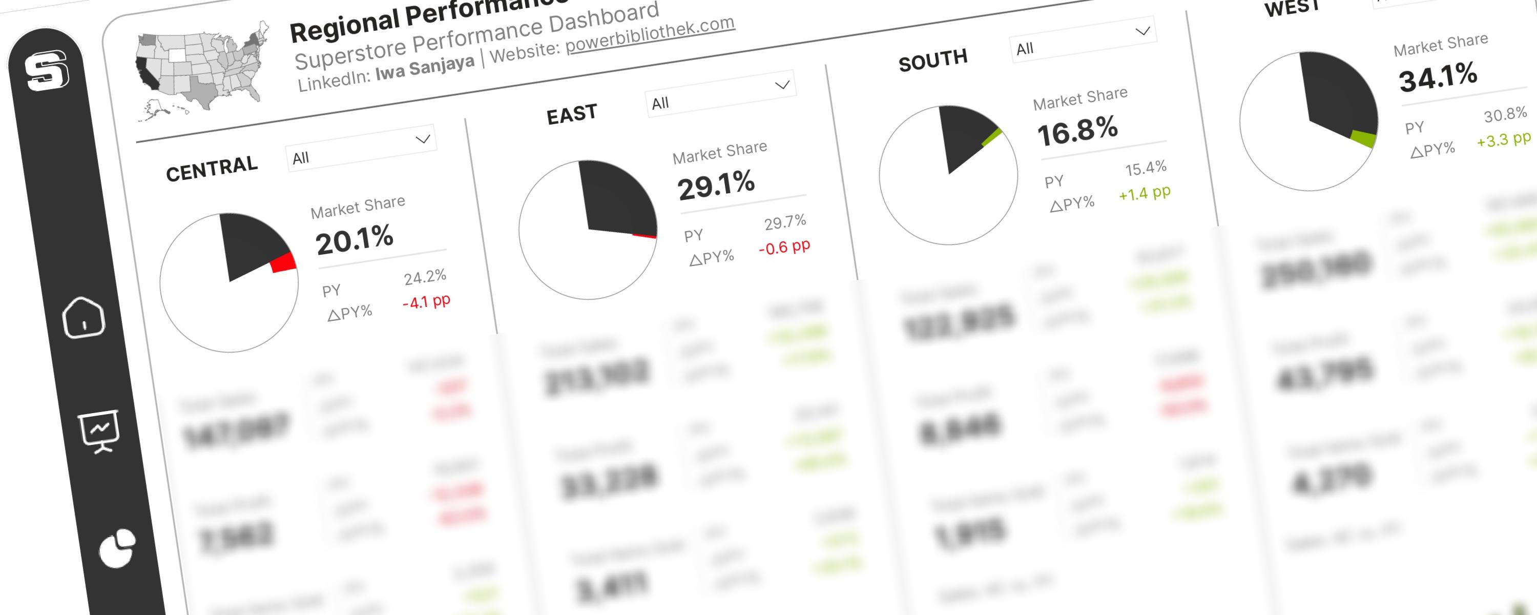
The International Business Communication Standards (IBCS®) provide a set of rules for designing business reports, presentations, and dashboards to ensure clear and effective…
ColumnMember-Only
The DAX measures used here have been improved and modified for better readability and performance. </Callout>