I. Foreword
This guide walks you through building a scenario-comparison column chart in Power BI that follows IBCS (International Business Communication Standards) — a set of rules that make business charts easier to read and compare.
II. What is an IBCS-Compliant Chart?
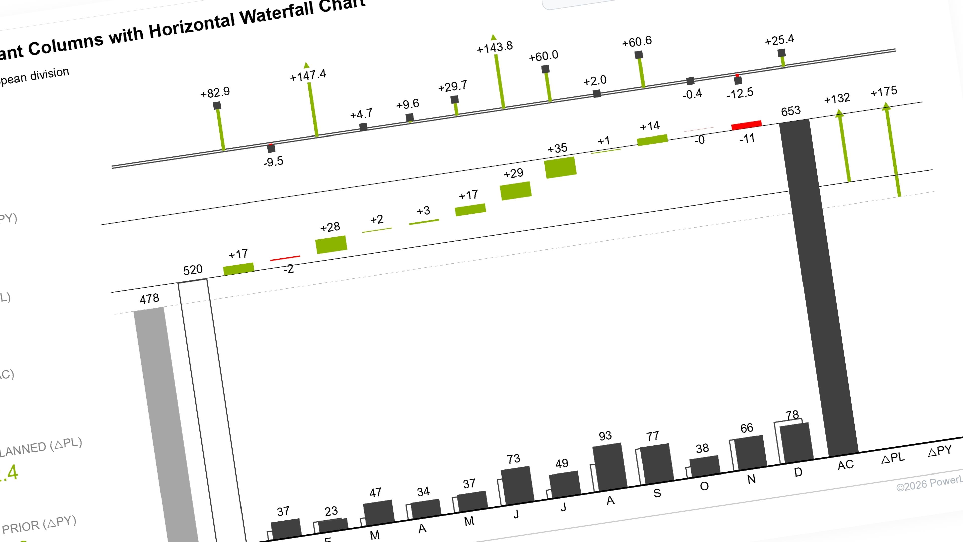
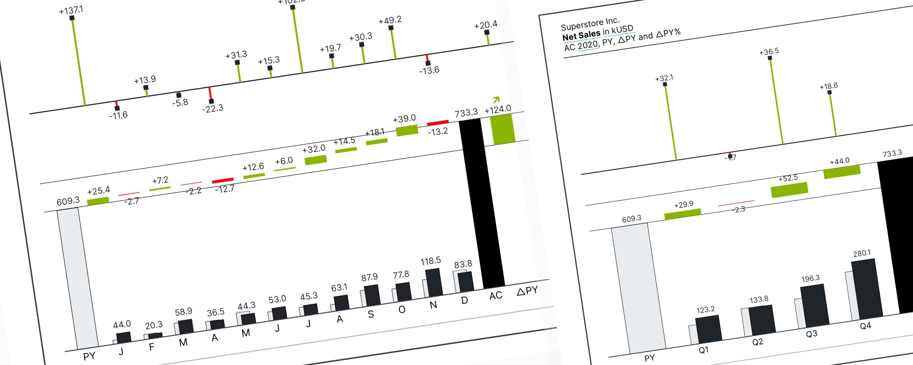
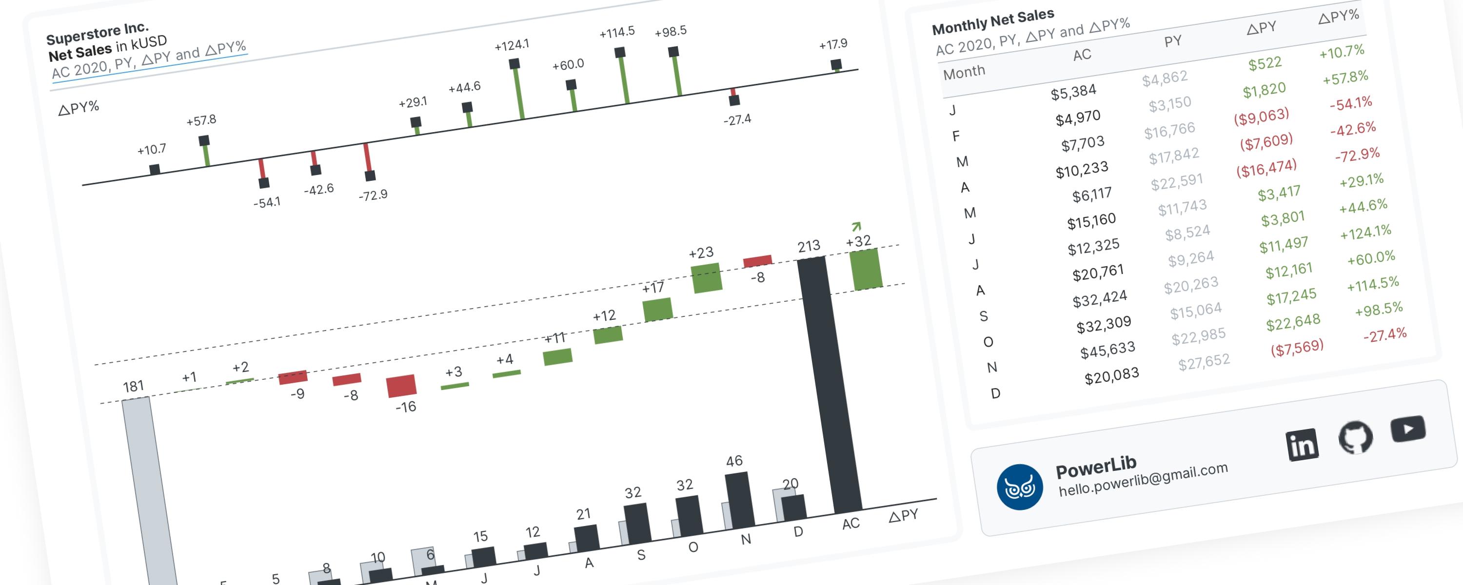
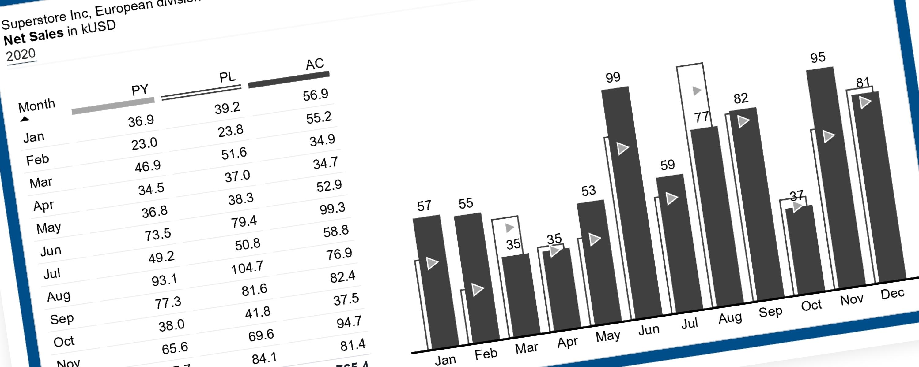
An IBCS column chart follows one core rule: time always goes on the X-axis (horizontal), and the metric you're measuring goes on the Y-axis (vertical). But what makes it especially powerful is the addition of scenario comparisons — overlaying multiple versions of the same data so you can instantly see how reality compares to the plan, or to last year.
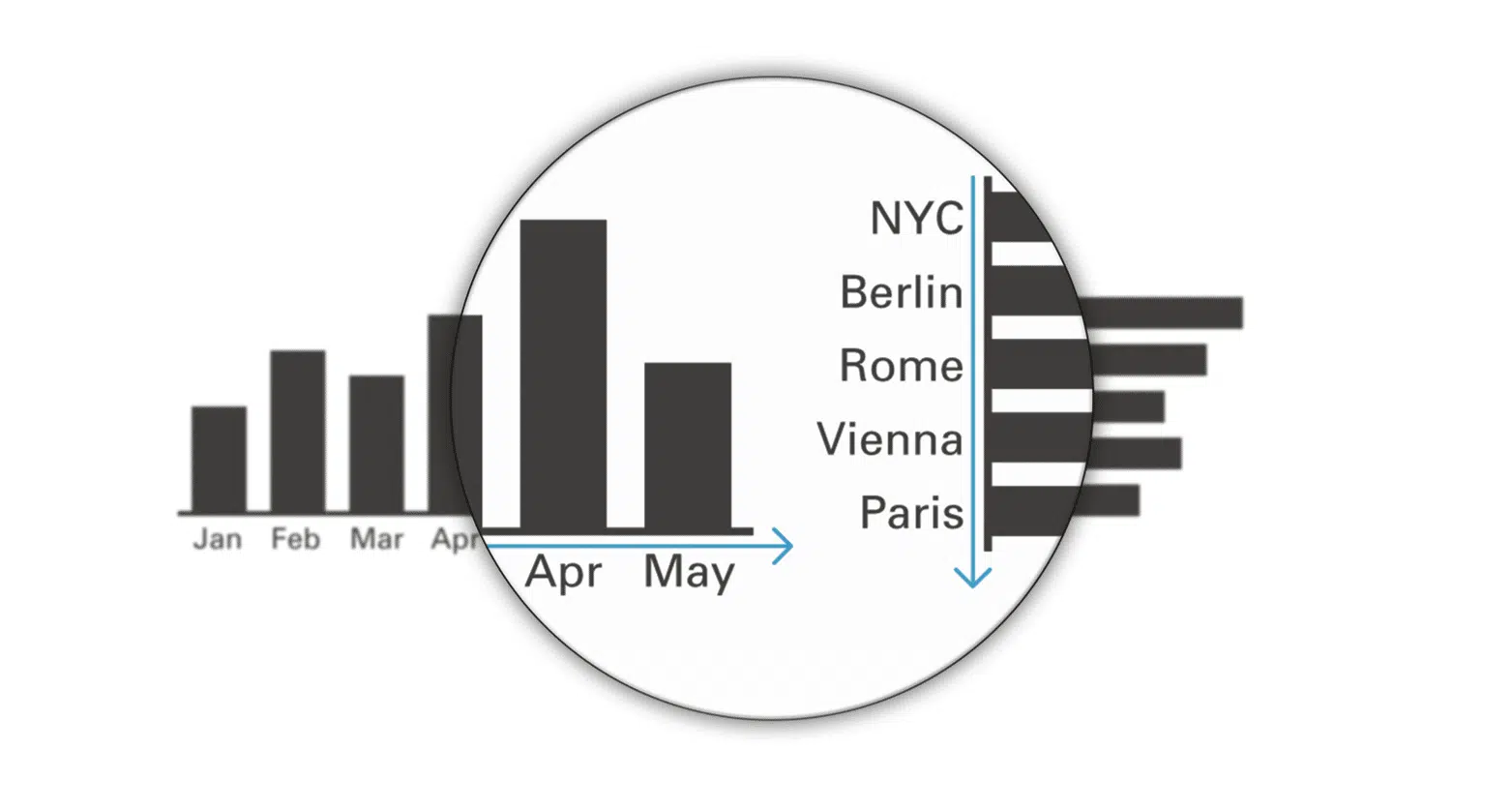 UNIFY time periods, use horizontal axes (source: IBCS)
2.1. Understanding Scenarios
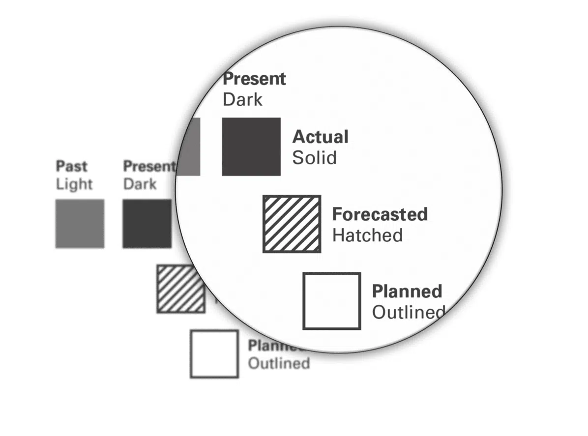 UNIFY scenarios (source: IBCS)
A scenario is a specific version of your data. This chart supports up to four scenarios:
- AC (Actual) → what really happened
- PY (Previous Year) → the same period last year
- PL (Plan) → the target or budget set in advance
- FC (Forecast) → a future projection (used when the year is still in progress)
How many scenarios can you show?
- Full year (complete data): up to 3 scenarios
- Ongoing year: up to 4 scenarios (including FC)
Scenario Order
Scenarios are always arranged left to right in chronological order — from the event that happened earliest to the one that will happen last: PY → PL → AC → FC (if a forecast exists)
Why this order? PY already happened in the past, so it comes first. PL was created before the actual results came in, so it comes second. AC is the current reality. FC, if it exists, represents what hasn't happened yet — so it goes last.
Which Scenario Gets the "Triangle" Treatment?
Each chart shows a primary, secondary, and optionally a third scenario. The third scenario is displayed using small scenario triangles (markers on a line) rather than columns — a visual signal that it's supplementary context.
The AC scenario is always the primary. The second and third scenarios depend on what question you're trying to answer:
- Comparing actual vs. plan? → Second scenario = PL, Third scenario = PY
- Comparing actual vs. last year? → Second scenario = PY, Third scenario = PL
2.2. Making It Dynamic in Power BI
Rather than building two separate charts, we can make the second and third scenarios switchable using a slicer, powered by a Power BI feature called a field parameter. This lets the report consumer toggle between comparison views without any rebuilding.
The chart type we'll use is a Line and Clustered Column Chart:
- The columns display AC alongside the dynamically selected second scenario (PL or PY)
- The line markers (triangles) display the third scenario
III. Known Limitations & Why a Workaround Is Needed
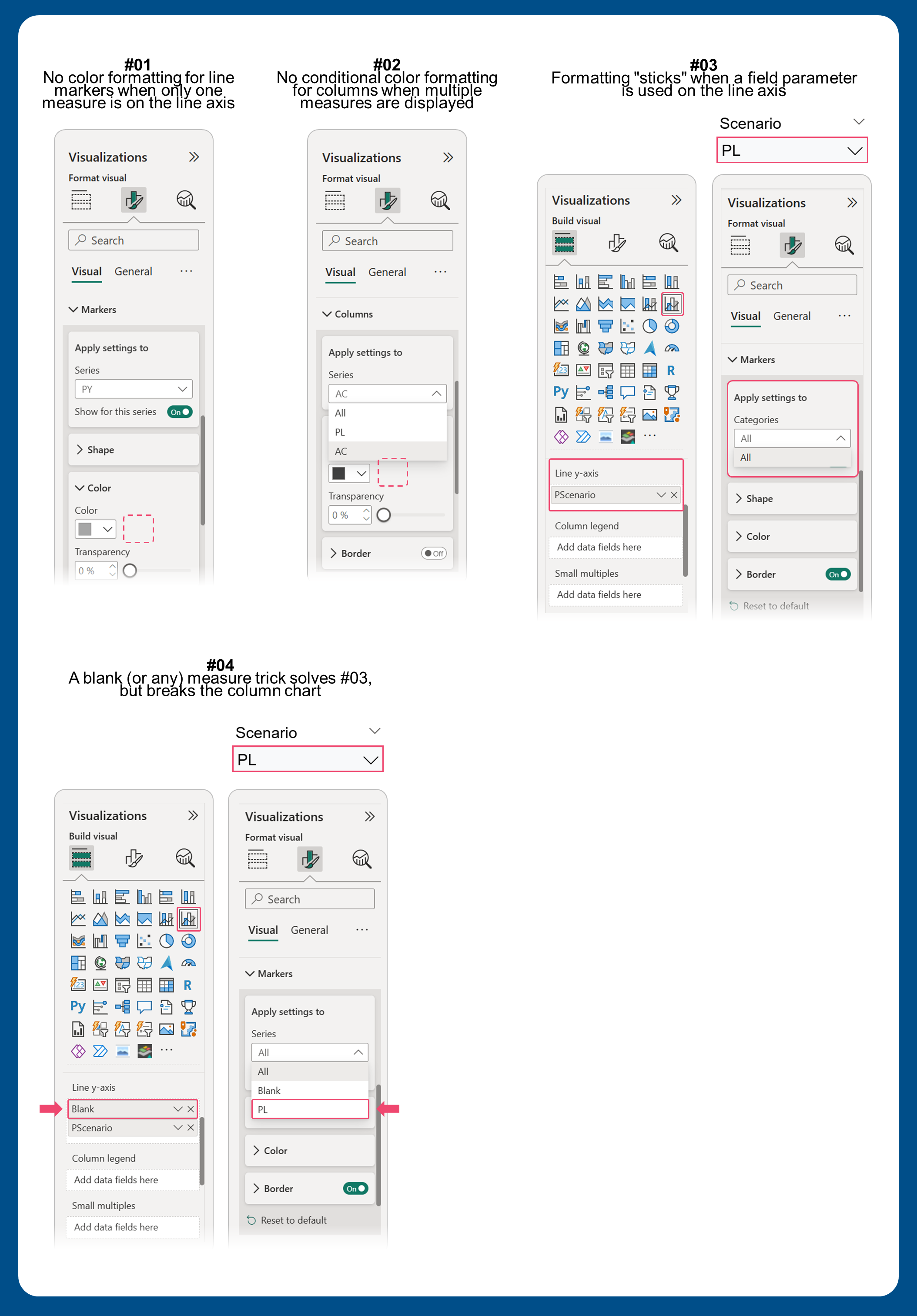 Figure 1: Several formatting constraints in line and clustered column chart
Power BI has several formatting constraints that prevent a straightforward implementation. Here's an explanation of each:
- No color formatting for line markers when only one measure is on the line axis. You can't conditionally color the scenario triangles based on which scenario is selected.
- No conditional color formatting for columns when multiple measures are displayed. Since the column chart needs to show two scenarios at once (AC + either PL or PY), you can't use conditional formatting to color them differently.
- Formatting "sticks" when a field parameter is used on the line axis. If you configure the chart for one scenario and then switch to another via slicer, the old formatting doesn't update — it stays locked to the previous selection.
- A blank (or any) measure trick solves #3, but breaks the column chart. Adding a blank placeholder measure to the line axis unlocks separate formatting per scenario, but then the field parameter can no longer be used on the column axis. And without the field parameter there, you're back to the conditional formatting problem from limitation #2.
The Workaround
Given these constraints, here's the approach we'll use:
- The field parameter goes on the column chart (not the line axis). This lets us configure the PL and PY columns independently.
- Two separate DAX measures power the line markers. One measure shows PY triangles only when PL is selected, and the other shows PL triangles only when PY is selected. Because these are two distinct measures on the line axis, Power BI treats them as separately configurable — which is exactly what we need.
IV. Video Demonstration
The video below walks through the full build from start to finish — no commentary, just the steps in action. If you enjoy this kind of content, more data visualization tutorials are waiting on my YouTube channel. Likes and subscriptions are always appreciated!
V. Step-by-Step Explanation
Step 1: Define Your Core Metrics
We'll start by creating the three base measures that calculate net sales for each scenario.
Measure #01 — Actual Net Sales (AC)
This calculates total net sales for the currently selected year.
_01 AC Net Sales = SUM( 'Fact_EU Superstore'[Sales] ) / 1000Measure #02: Previous Year Net Sales (PY)
This returns net sales from the same period last year. It only calculates when a single year is selected in the report — otherwise it returns blank to avoid misleading totals.
_02 PY Net Sales =
IF(
  HASONEVALUE( DimDate[Year] ),
  CALCULATE(
      [_01 Net Sales],
      SAMEPERIODLASTYEAR( DimDate[Date] )
  ),
  BLANK()
)
Measure #03: Planned Net Sales (PL)
This pulls in the planned (budgeted) sales figures.
_03 PL Net Sales = SUM( 'Planned Sales'[Planned Sales] )Step 2: Create a Field Parameter for the Second Scenario
A field parameter is a Power BI feature that lets you swap which measure is displayed in a visual using a slicer — without editing the report.
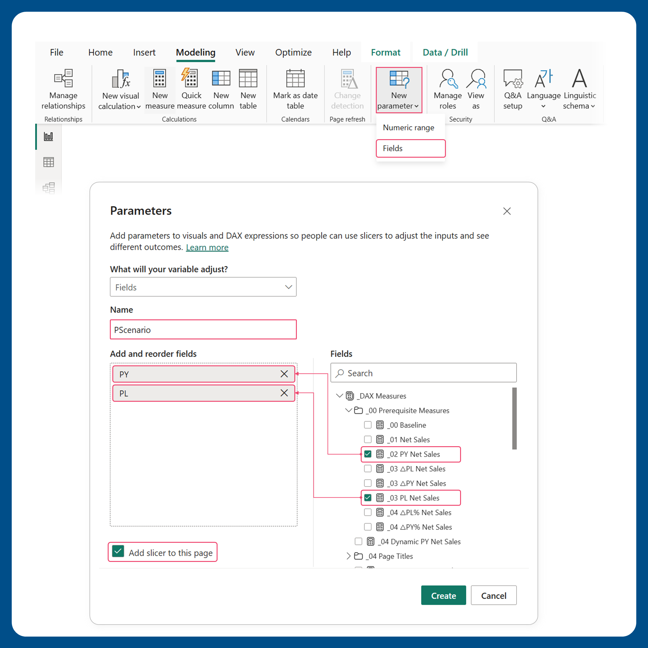 Figure 2.1: Creating a field parameter for the second scenario
Create a new field parameter and add both [_02 PY Net Sales] and [_03 PL Net Sales] to it. This becomes your second-scenario switcher.
Once the field parameter slicer is added on your report page, set the slicer to single-select mode — only one scenario should be active at a time.
Step 3: Build the Chart and Configure Column Colors
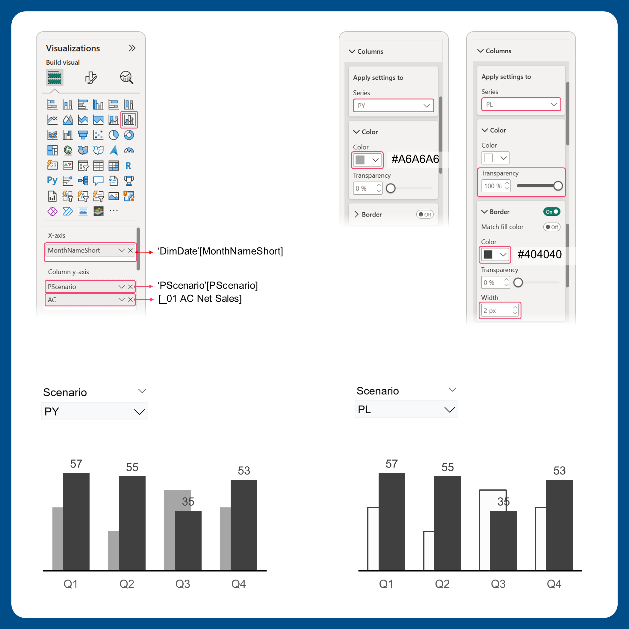 Figure 3.1: Displaying the first (AC) and dynamic second scenarios (PY ↔ PL) on the column chart
Add a Line and Clustered Column Chart to your canvas. Then configure the fields as follows:
- X-axis →
DimDate[MonthNameShort](or your month column) - Column Y-axis →
[_01 AC Net Sales]+PScenario[PScenario](the field parameter)
Next, apply column colors for each scenario. Use the slicer to select each scenario before configuring it:
- AC (Actual): Solid dark gray fill —
#404040 - PY (Previous Year): Solid light gray fill —
#A6A6A6→ select "PY" in the slicer first - PL (Plan): No fill (fully transparent) or white fill (
#FFFFFF) with a dark gray border —#404040→ select "PL" in the slicer first
Why these colors? IBCS uses a specific visual hierarchy: dark = actual, light gray = past/previous, outline-only = planned/target. This makes it instantly clear which bar represents what.
Step 4: Add the Dynamic Third Scenario (Scenario Triangles)
This is where the workaround comes into play. We'll create two measures — one for each direction of the switcher — and place both on the line axis.
Measure #04 — PY as the Third Scenario
This shows PY data only when PL is selected as the second scenario. When PY is selected instead, it returns blank (hiding the marker).
_04 Third Scenario_PY Net Sales =
VAR _SelectedMetricOrder = SELECTEDVALUE( PScenario[PScenario Order] )
RETURN
  SWITCH(
      _SelectedMetricOrder,
      1, [_02 PY Net Sales],
      BLANK()
  )
Measure #05 — PL as the Third Scenario
This shows PL data only when PY is selected as the second scenario. When PL is selected, it returns blank.
_05 Third Scenario_PL Net Sales =
VAR _SelectedMetricOrder = SELECTEDVALUE( PScenario[PScenario Order] )
RETURN
  SWITCH(
      _SelectedMetricOrder,
      0, [_03 PL Net Sales],
      BLANK()
  )
Place both measures on the Line Y-axis (secondary axis). Having two separate measures here is what unlocks independent formatting for each.
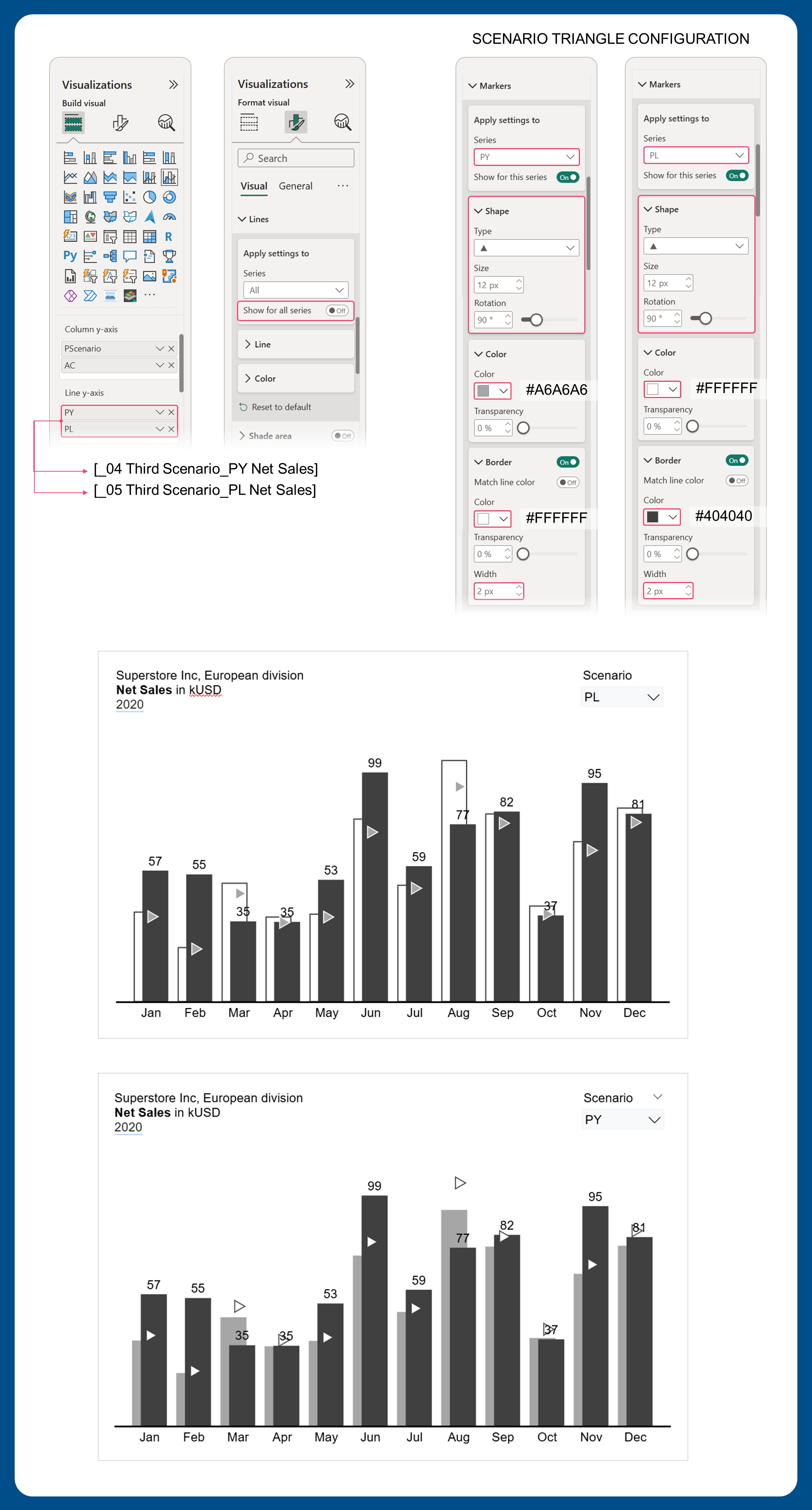 Figure 4.1: Configuring scenario triangles for the third scenario
Now configure the line markers:
- Hide the line and hide data labels for both measures — show only the markers
- Marker shape: Triangle, rotated 90°
- PY marker: Light gray fill (
#A6A6A6) with white border - PL marker: White fill (
#FFFFFF) with dark gray border (#404040)
Tips & Troubleshooting
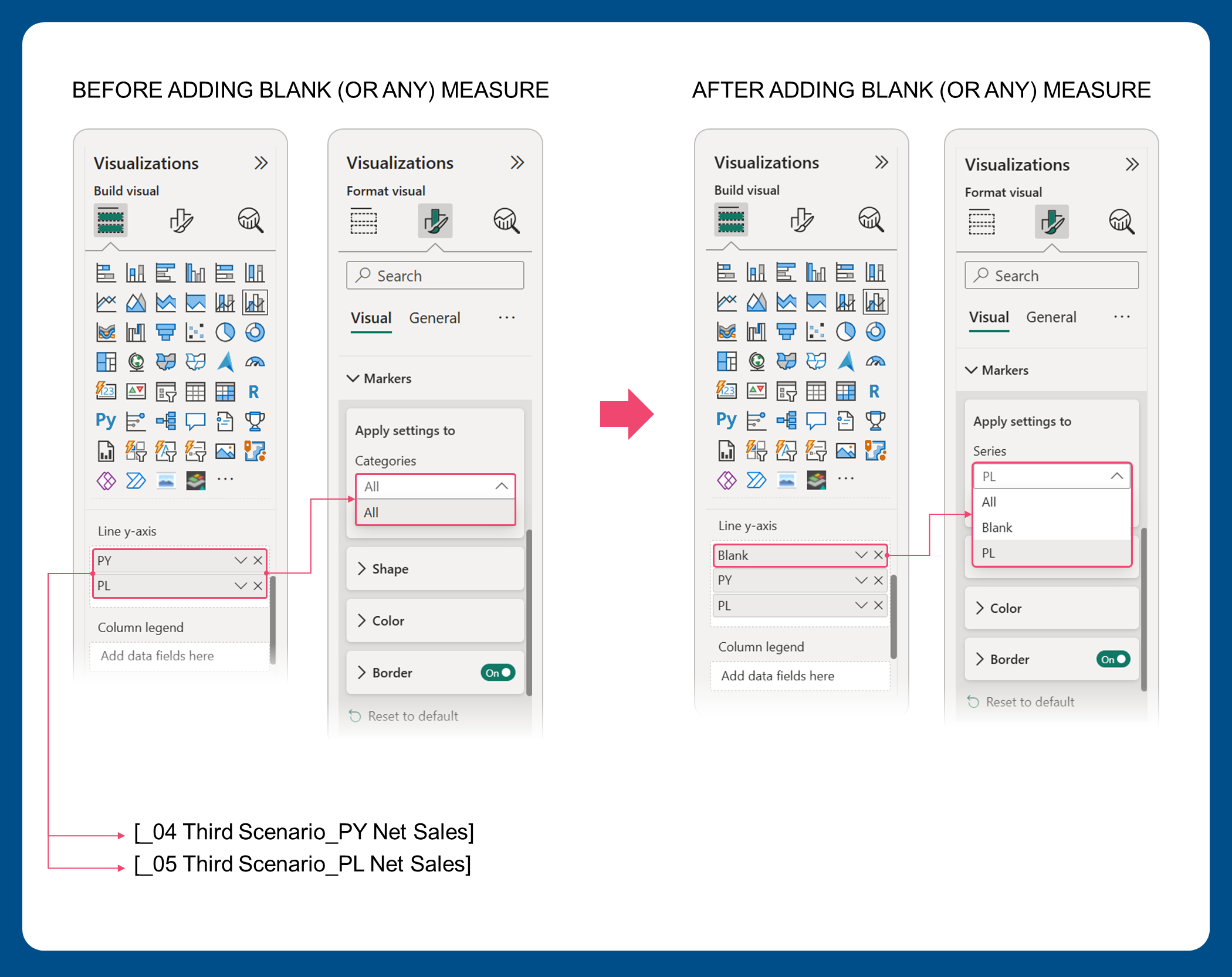 Figure 4.2: Forcing Power BI to configure series separately
Problem: I only see "All" in the series selector when trying to configure one scenario.
This happens when Power BI doesn't have enough context to separate the scenarios. Here's the fix:
-
Temporarily add a blank measure (a measure that simply returns
BLANK()) to the Line Y-axis field -
This forces Power BI to show individual series — you'll now see each scenario listed separately for configuration
-
Configure each scenario's markers
-
Remove the blank (or any) measure once you're done
Step 5: Setting the Y-Axis Minimum and Maximum Range
To keep both axes scaled consistently and prevent data labels from being cut off, we need to manually define the Y-axis range for both the primary (column) and secondary (line) axes.
- Minimum range: Since net sales can never be negative, we'll set the minimum to 0.
- Maximum range: Rather than letting Power BI auto-scale the axis, we'll calculate it ourselves. The idea is simple — find the single highest value across all scenarios and all months, then add a 20% buffer on top. This extra breathing room ensures data labels always display cleanly above the tallest bar.
Measure #06: Y-Axis Maximum Range
Y-Axis Max. Range_Net Sales =
VAR _HighestValue =
  MAXX(
      ALLSELECTED(DimDate[MonthNameShort]),
      MAX(
          MAX([_01 AC Net Sales], [_02 PY Net Sales]),
          [_03 PL Net Sales]
      )
  )
RETURN
  IF(
      NOT ISBLANK(_HighestValue),
      _HighestValue * 1.2
  )
Once the measure is created, apply it to both the primary and secondary Y-axes by setting:
- Minimum →
0 - Maximum →
[Y-Axis Max. Range_Net Sales]
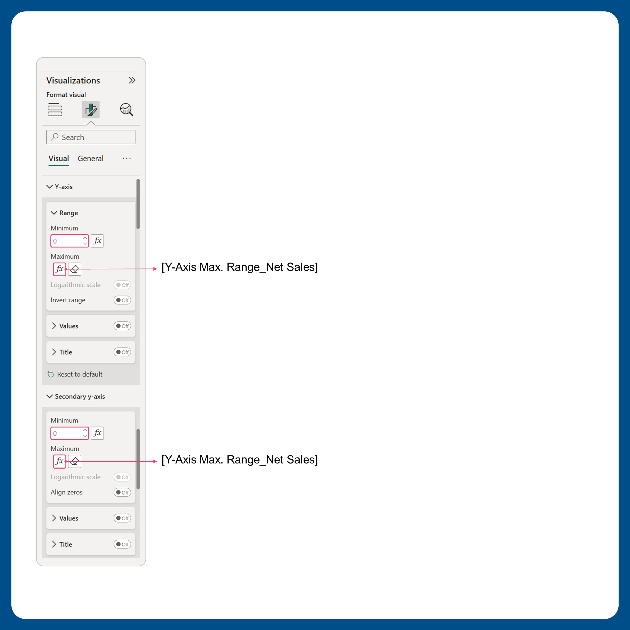 Figure 5.1: Applying the same maximum range to both axes
Applying the same maximum range to both axes ensures the column heights and line markers are always on the same scale — preventing any visual misalignment between the two.
What IBCS Formatting Can't Be Achieved with Native Power BI Visuals?
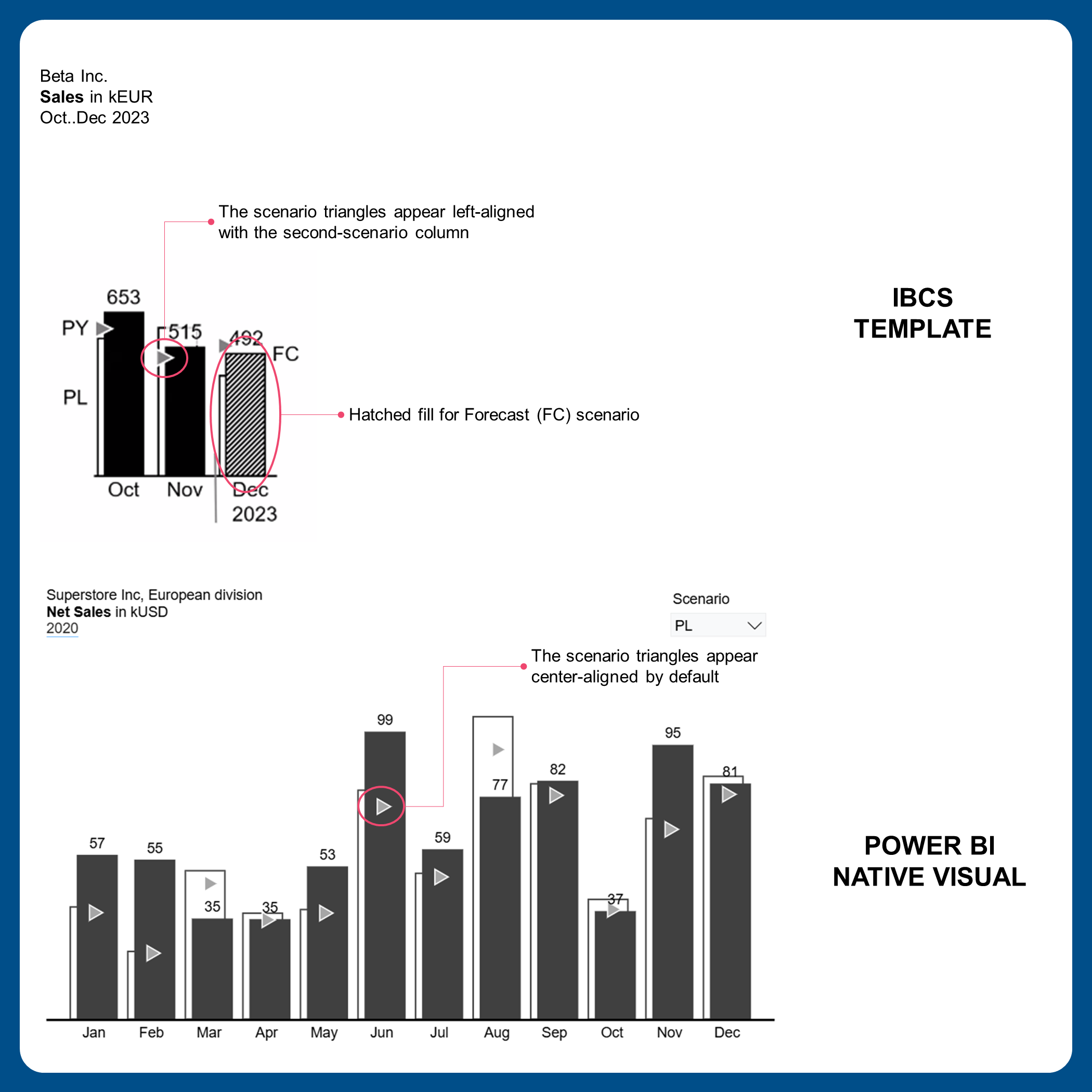
The chart we've built gets us most of the way to a fully IBCS-compliant visual, but there are two areas where Power BI's native capabilities fall short:
- Hatched fill for the Forecast (FC) scenario. IBCS recommends using a hatched (striped) pattern to visually distinguish forecast data from actual or historical data. Power BI's column formatting currently only supports solid fills, so this cannot be replicated natively.
- Left-aligned scenario triangles. According to IBCS, the third-scenario markers (triangles) should be left-aligned with the second-scenario column. Because we're using line markers as a workaround, they will always appear center-aligned by default — and this cannot be adjusted in native visuals.
These are cosmetic gaps, but worth noting if your organization strictly follows IBCS standards. Custom visuals or external tools may be able to address them.
Notes on Field Parameters
As of the March 2026 Power BI update, the limitations described in this guide remain unresolved.
Field parameters are a powerful feature, but they come with quirks — especially when multiple chart elements need to respond to the same slicer selection. In this guide, the column chart and the scenario triangles both need to react to whichever scenario is selected, which requires a hybrid approach.
Here's a simple decision framework for when to use each method:
- The visual element cannot be configured via conditional formatting or separate measures → Use a field parameter
- Conditional formatting is available for the element → Use a single DAX measure with
SWITCH() - Both field parameters and conditional formatting are unavailable or broken for that element → Use two separate DAX measures with
SWITCH()
In our case, the second-scenario columns use a field parameter because conditional formatting is blocked when multiple measures share the same axis. The scenario triangles use two separate DAX measures because conditional formatting isn't available on the secondary line axis, and the field parameter has a known configuration bug there.
Hopefully, future Power BI updates will address these limitations and make IBCS-compliant chart building more straightforward.