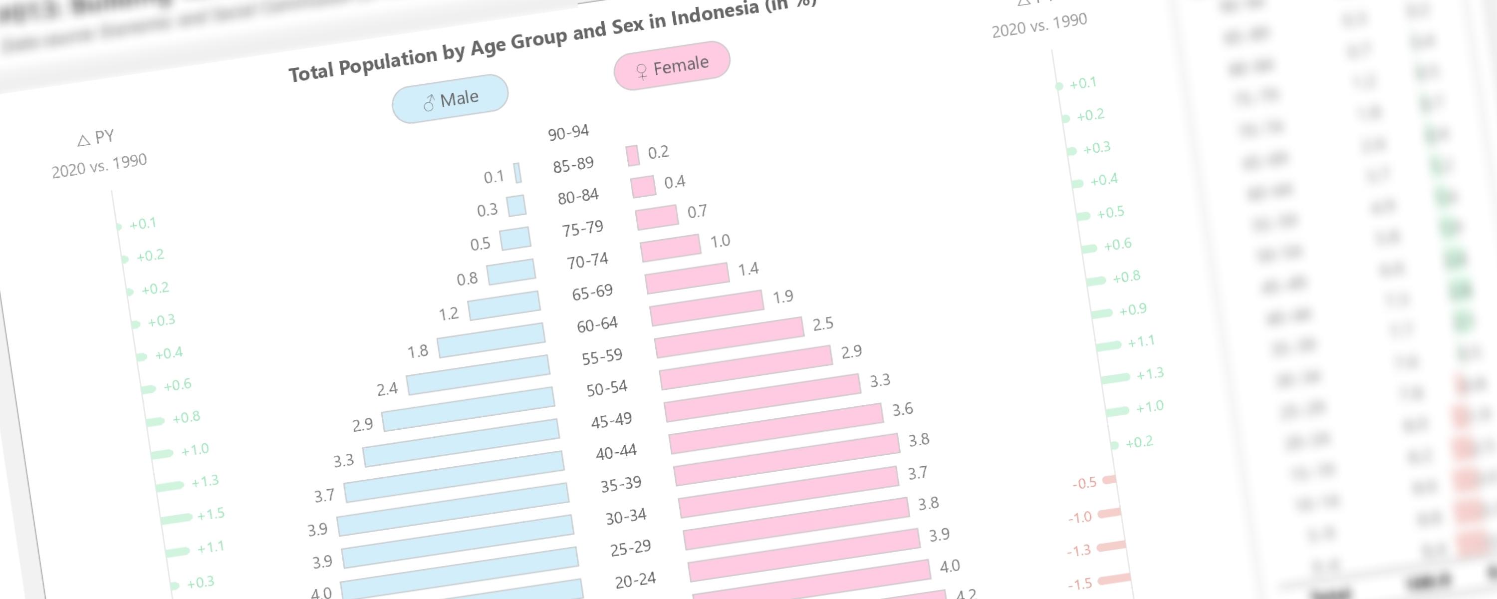
This documentation will guide you how to create tornado chart, also known as tornado diagram or butterfly chart, in Power BI using entirely native visuals.
Definition
Understanding the Concept
Power BI doesn’t have a tornado chart, but we can make one with a stacked bar chart. We’ll use stacked bars to show the different parts of the chart. Think of it like five layers stacked horizontally. The two outer layers hold the labels for each category. The next two layers show the size of the values, like the bars in a tornado chart. The middle layer shows the middle value to show the age groups. If we want to show the age group (y-axis) on the left or right side, we only need four layers. By changing the size and color of these layers, we can make it look like a tornado chart and easily see which factors are most important.
Now that we get the idea, let’s build the chart!
Context
Documentation
The documentation covers three crucial steps to construct tornado / butterfly chart using Power BI native visual.
Step 1: Sorting Age Group Column
You may notice that the age groups are not sorted chronologically. Since Power BI cannot directly sort text data, we need to create a new reference table to establish the correct sorting order.
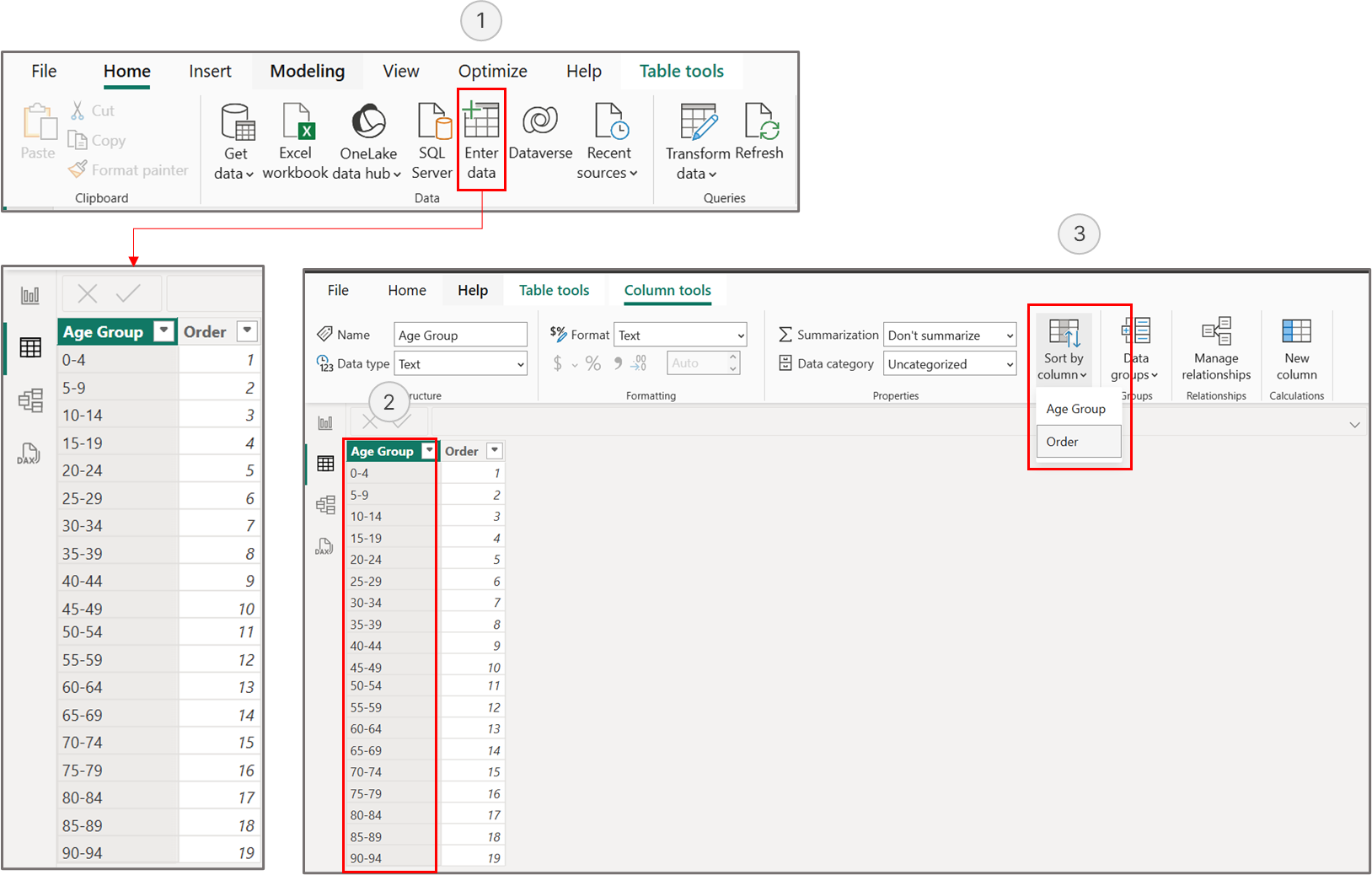 Create a new table to sort age groups in chronological order
Create a new table with two columns: one containing the age group values that match our main table, and another with order numbers from 1 to 19. These numbers will define the sorting sequence, starting with the youngest age group (0-4) as 1 and ending with the oldest age group (90-94) as 19. We’ll then create a relationship between the age group columns to apply this custom sorting.
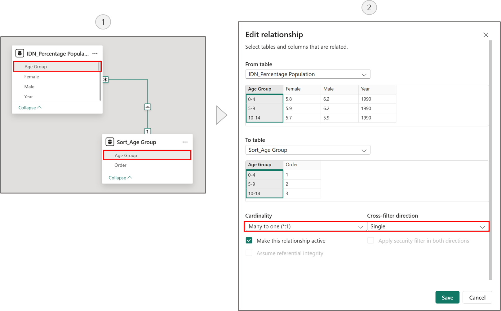 Creating a relationship between the main table and the sorted age group table
Replace the “Age Group” column in the main table with the sorted “Age Group” column from the newly created table.
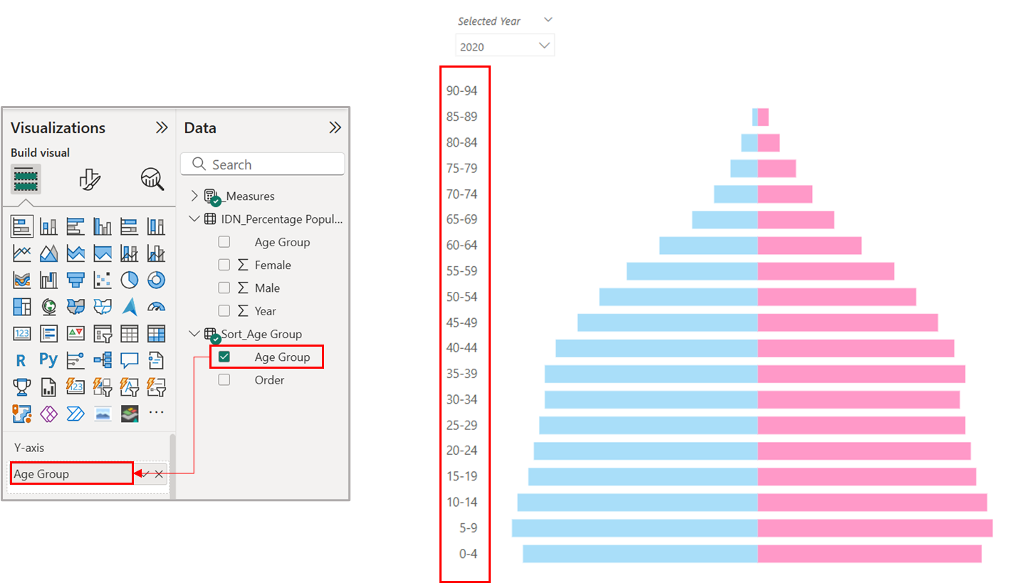 The Y-axis is in chronological order
Step 2: Defining Required Measures
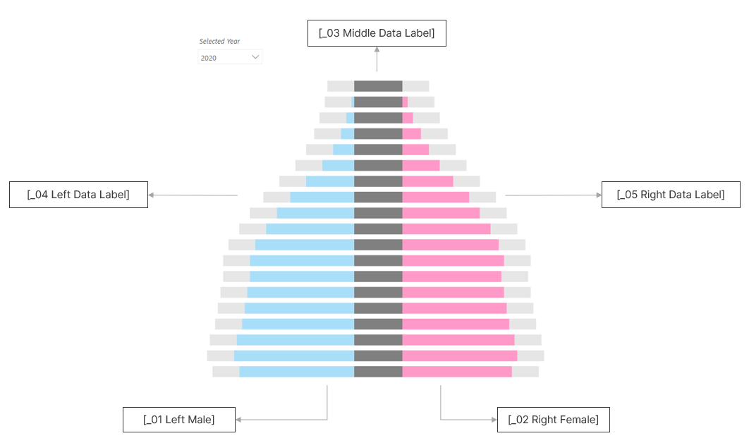 Required measures to construct a tornado chart
The measures shown above are used to create the tornado chart, which consists of five layers of stacked bars, each designed to display particular values.
_01 Left_Male = SUM('IDN_Percentage Population'[Male]) * -1
In a tornado chart, categories extend in opposite directions. Since males are displayed on the left, their values are multiplied by -1 to ensure the bars extend leftward.
_02 Middle_Age Group Bars = 1.8
To separate male and female categories, a DAX measure adds stacked spacer bars. The width of these bars is a fixed value, ensuring sufficient space for the “Age Group” labels.
_03 Right_Female = SUM('IDN_Percentage Population'[Female])
Because the female category is displayed on the right, its values remain positive.
_04 Left Data Label = -1
This DAX measure creates reference bars to position data labels for the male category on the left side. While the bars themselves will be hidden, their data labels will remain visible.
_06 Right Data Label = 1
This DAX measure creates reference bars to position data labels for the female category on the right side. While the bars themselves will be hidden, their data labels will remain visible.
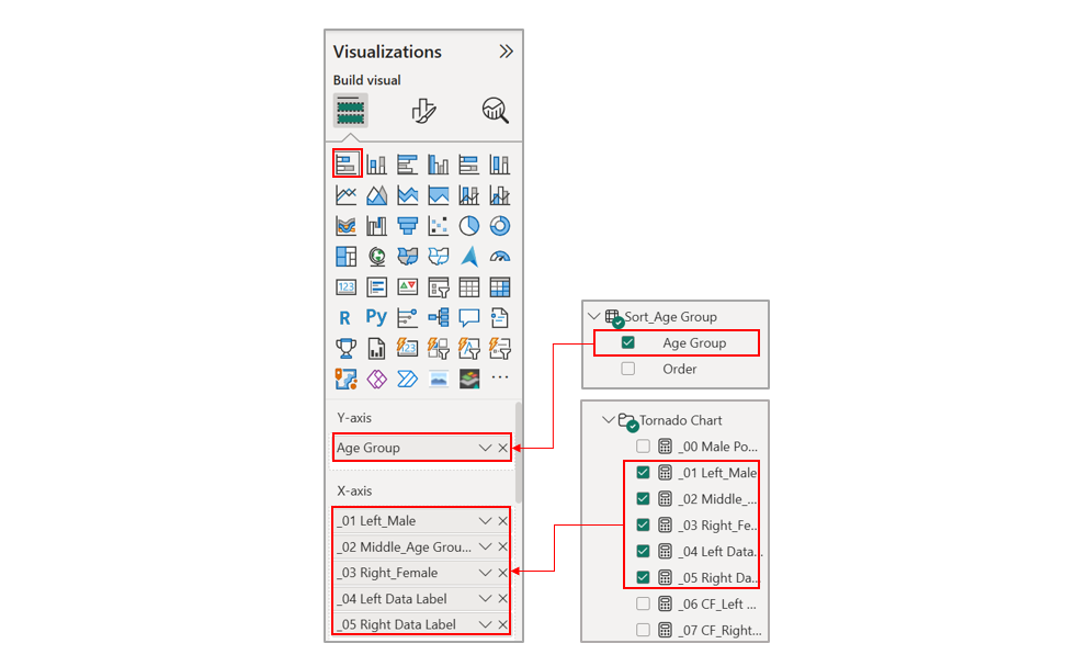 Place the required columns and measures to the y-axis and x-axis.
With the measures defined, place them on the x-axis and the sorted age groups on the y-axis. This creates stacked bars representing the population percentage by age group and gender.
Step 3: Configuring the Chart
Step 3.1: Configuring Middle Y-Axis
Step 3.2: Configuring Male and Female Categories
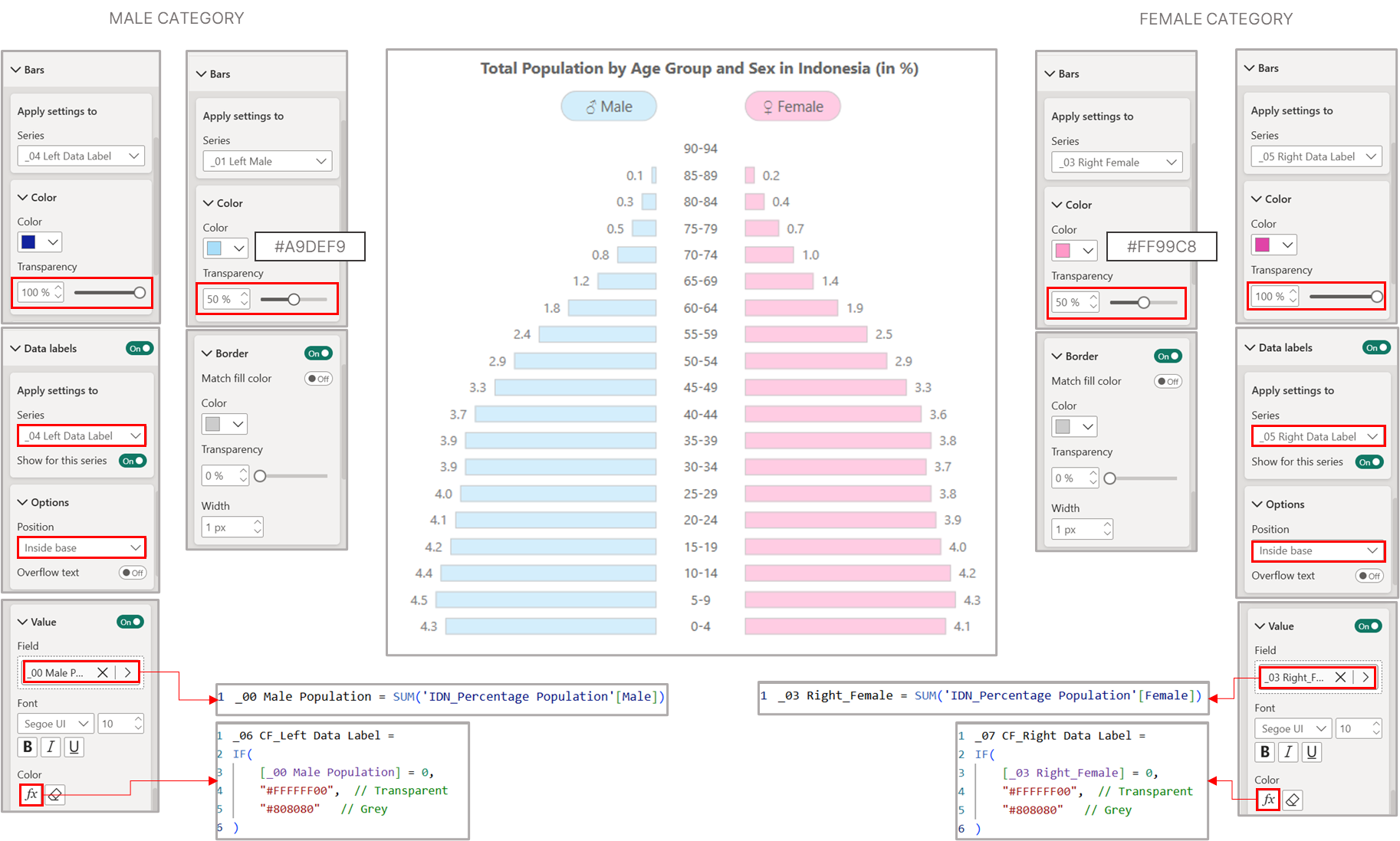 Chart configuration for male and female categories
Let’s configure the left side of the tornado chart for the male category. We need to create two additional measures here. The first measure will calculate the actual male population values for the data labels, since we previously multiplied these values by -1 to make the bars extend leftward.
_00 Male Population = SUM('IDN_Percentage Population'[Male])
The second measure applies conditional formatting to hide data labels when there are no values, making them transparent instead of displaying zeros.
_06 CF_Left Data Label =
IF(
    [_00 Male Population] = 0,
    "#FFFFFF00",  // Transparent
    "#808080"   // Grey
)
For the right side of the tornado chart, we’ll mirror the same approach used for the female category. We’ll use the previously defined [_03 Right_Female] measure for the data labels and create a similar conditional formatting measure to hide zero values.
_07 CF_Right Data Label =
IF(
    [_03 Right_Female] = 0,
    "#FFFFFF00",  // Transparent
    "#808080"   // Grey
)